

Earth tone wall art brings the calming beauty of nature indoors. These warm colors create spaces that feel both grounded and welcoming. Think terracotta sunsets, sage green landscapes, and warm ochre abstracts.
The appeal lies in versatility. Earth tones work with nearly any design style. They complement modern minimalism and cozy farmhouse aesthetics equally well.
This natural palette has surged in popularity recently. Designers and homeowners seek refuge from stark whites and bold accent walls. Earth tones offer something different - a connection to the organic world that feels timeless rather than trendy.
Whether you're refreshing a single room or redesigning your entire home, earth tone wall art provides the perfect foundation. These pieces add warmth without overwhelming your space. They create visual interest while maintaining a sense of calm.

Curated Earth Tone Prints That Capture This Aesthetic
If you love this earthy, grounded aesthetic, here are three prints that bring this mood into any room. Each piece showcases the natural warmth and sophistication of earth tone palettes.

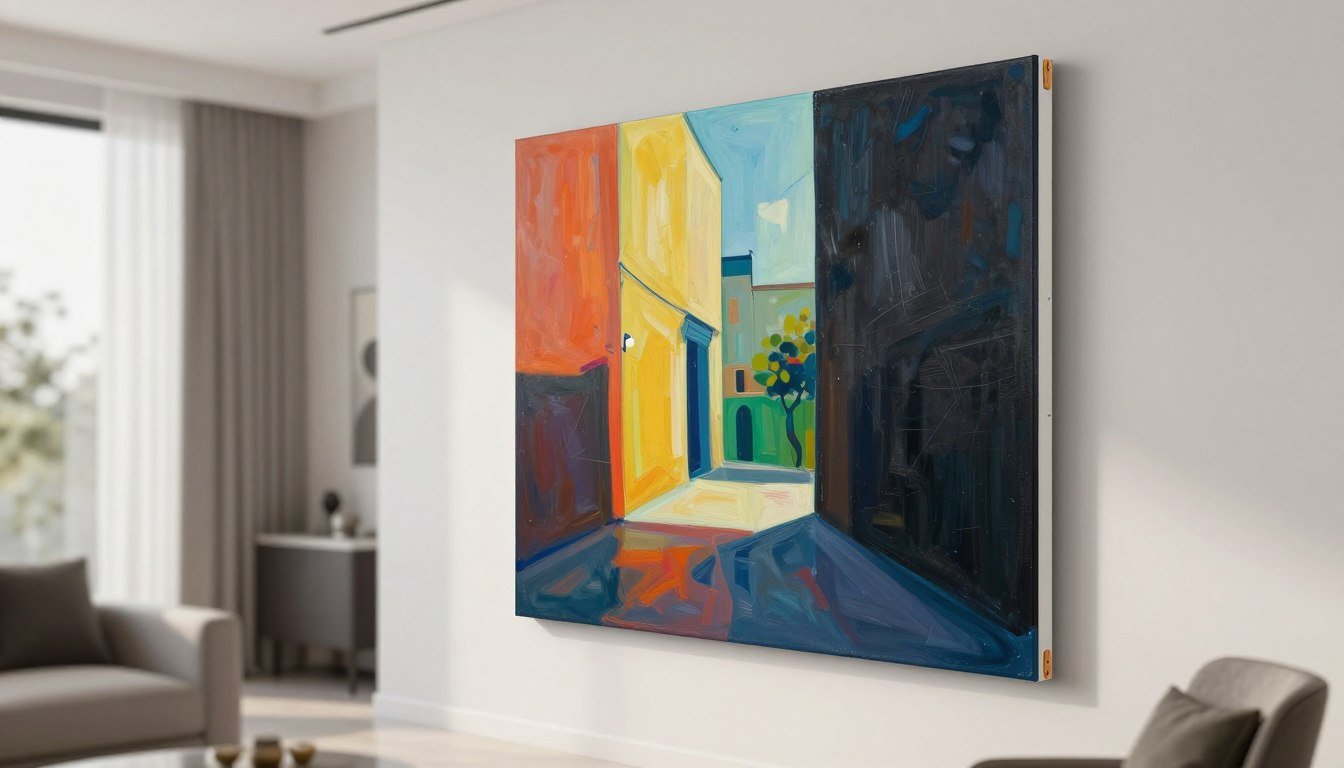
Desert Warmth Abstract
This abstract piece features flowing terracotta and ochre tones. The organic shapes evoke desert landscapes at sunset. Perfect for adding warmth to minimalist spaces.

Sage Botanical Study
Featuring lush foliage in muted sage and olive tones, this botanical print brings the outdoors in. The natural green hues create a calming focal point for any wall.

Layered Horizons
This landscape interpretation uses warm browns and tans to create depth. The layered mountains add dimension while maintaining the peaceful earth tone aesthetic throughout.
Each of these pieces demonstrates how earth tone wall art can anchor a room. They work beautifully alone or as part of a gallery wall. The key is choosing pieces that resonate with your personal style while staying within the warm, natural palette.
For more curated collections, explore our complete canvas prints collection. Every piece is designed by artist Chiara Rossetti with attention to detail and contemporary aesthetics.
Understanding the Earth Tone Color Palette

Earth tones draw inspiration directly from nature. These colors appear in soil, stone, wood, and plant life. The palette creates instant warmth and familiarity in any space.
The core earth tone family includes several distinct color groups. Terracotta and burnt sienna bring warmth. Sage and olive greens add natural coolness. Ochre and mustard provide golden accents. Browns ranging from taupe to chocolate create grounding neutrals.
The Psychology Behind Earth Tones
Colors affect our emotional state. Earth tones trigger feelings of stability and comfort. According to research from the Verywell Mind color psychology guide, these natural hues reduce stress and promote relaxation.
Warm earth tones like terracotta energize without overwhelming. Cool earth tones like sage calm and refresh. This balance makes the palette incredibly versatile for different rooms and purposes.

Combining Earth Tones Effectively
The beauty of earth tones lies in their compatibility. Nearly any combination works harmoniously. Start with one dominant color and add two or three supporting tones.
A popular combination pairs sage green with terracotta and cream. Another classic blend uses ochre, warm brown, and soft taupe. For bolder spaces, try combining burnt sienna with olive and charcoal.
The 60-30-10 rule applies perfectly here. Use your primary earth tone for 60% of the visual space. Apply a secondary tone for 30%. Add a third accent tone for the remaining 10%.
Our abstract canvas prints showcase expertly balanced earth tone combinations. Each piece demonstrates how these colors work together to create visual harmony.

Earth Tones vs. Neutrals
While related, earth tones differ from pure neutrals. True neutrals include white, black, and gray. Earth tones add warmth that pure neutrals lack.
Earth tones bring personality to spaces that neutrals might leave feeling cold. They create depth and interest while maintaining the flexibility of a neutral palette. This makes them ideal for those who want color without commitment to bold hues.
Think of earth tones as the bridge between stark neutrals and vibrant colors. They offer the best of both worlds - visual interest with timeless appeal.
Choosing Earth Tone Wall Art for Every Room
Different spaces benefit from different earth tone approaches. The right art transforms each room into a cohesive, welcoming environment. Consider function, lighting, and existing decor when selecting pieces.

Living Room Earth Tone Art
The living room demands presence. Choose larger pieces that command attention without overwhelming the space. Abstract art in warm terracotta and ochre creates inviting conversation areas.
Consider the room's natural light when selecting colors. South-facing rooms with abundant sunshine can handle cooler earth tones like sage and olive. North-facing rooms benefit from warmer terracottas and ochres that compensate for limited natural light.
Scale matters tremendously in living spaces. A large canvas print measuring 40x60 inches works beautifully above a standard sofa. For gallery walls, combine three to five pieces in varying sizes while maintaining the earth tone palette throughout.
Explore our curated living room wall art collection for pieces specifically designed for these gathering spaces. Each work balances visual impact with the calming effect earth tones provide.

Bedroom Earth Tone Selections
Bedrooms require calming energy. Opt for softer earth tones that promote relaxation. Sage greens, soft taupes, and muted ochres work exceptionally well in sleeping spaces.
Botanical prints in earth tones bring nature's tranquility indoors. Abstract pieces with gentle curves and organic shapes also support restful environments. Avoid overly energetic compositions or high-contrast combinations.
Size recommendations differ for bedrooms. A piece measuring 30x40 inches typically works well above a queen bed. For king beds, consider 40x50 inches or a diptych arrangement.
Our bedroom canvas prints collection features carefully selected pieces that enhance sleep sanctuary aesthetics. The earth tone selections prioritize serenity and visual comfort.

Office and Workspace Art
Work environments benefit from earth tones that ground and focus. Warm browns and ochres provide stability. Touches of sage or olive add refreshing accents that combat screen fatigue.
For home offices, choose art that inspires without distracting. Landscape interpretations in earth tones offer visual escape during work breaks. Abstract pieces with strong horizontal lines create calm, organized feelings.
Consider dual monitor setups when planning placement. Position art where eyes naturally rest during screen breaks. This typically means walls opposite or adjacent to the desk rather than directly behind monitors.
Browse our office canvas art collection for pieces that enhance productivity. The earth tone options provide visual interest that supports focus rather than fragmenting attention.

Dining Room Statement Pieces
Dining rooms offer opportunities for bolder earth tone statements. These gathering spaces can handle larger, more dramatic pieces. Consider rich terracottas paired with deep browns for sophisticated impact.
Abstract art works particularly well in dining areas. The lack of specific subject matter encourages conversation without competing for attention during meals. Organic shapes and flowing compositions complement the social nature of dining spaces.
Artwork in dining rooms typically hangs at eye level for seated guests. This differs from standard hanging heights. Plan for the center of your piece to sit approximately 60 inches from the floor.
Our dining room wall art collection includes pieces designed for these special spaces. The earth tone selections add elegance while maintaining the warmth essential for comfortable dining.

Entryway First Impressions
Entryways set the tone for entire homes. Earth tone wall art in these spaces creates immediate warmth and welcome. Choose pieces that reflect your overall home aesthetic while making guests feel comfortable.
Vertical compositions often work better in narrow entryway spaces. A tall, slim piece draws the eye upward and makes ceilings feel higher. For wider entries, consider a horizontal piece or small gallery arrangement.
Lighting matters tremendously in entryways, which often lack natural light. Warm earth tones combat dimness better than cool colors. Add picture lights or spot lighting to enhance artwork impact.
View our entryway wall art collection for pieces that create memorable first impressions. The earth tone options establish welcoming, sophisticated atmospheres from the moment guests arrive.
Styling Tips for Earth Tone Wall Art

Placement and presentation dramatically impact how earth tone art functions in your space. Strategic styling amplifies the natural beauty these pieces bring to rooms.
Frame Selection for Earth Tone Prints
Frame choices significantly affect overall presentation. Natural wood frames enhance the organic quality of earth tones. Light oak or walnut frames complement warm terracottas and ochres beautifully.
For contemporary spaces, consider floating frames in warm metallics. Bronze or brushed gold frames add sophistication without competing with the art. Black frames create striking contrast with lighter earth tones like sage and taupe.
Frameless canvas prints offer clean, modern alternatives. The wrapped canvas edges continue the artwork around the sides. This approach works exceptionally well with abstract earth tone pieces.
All pieces in our canvas prints collection come ready to hang. You can choose framed or gallery-wrapped options based on your aesthetic preferences.

Complementary Decor Elements
Earth tone art shines when supported by thoughtful accessories. Natural materials echo the organic palette. Consider ceramic vases in terracotta, woven baskets, and wooden bowls.
Textile choices matter significantly. Linen curtains in cream or natural tones support earth tone art without competing. Throw pillows in complementary earth tones create visual connections between art and furnishings.
Plants provide living elements that enhance earth tone aesthetics. Terracotta pots filled with greenery create natural color echoes. Dried elements like pampas grass add texture while maintaining the neutral palette.
Avoid overcrowding. Earth tone art creates calm, grounded spaces. Too many accessories undermine this effect. Select a few meaningful pieces rather than filling every surface.

Lighting Considerations
Proper lighting reveals the depth and richness of earth tone art. Natural light brings out subtle color variations during daytime hours. Position pieces where morning or afternoon sun can illuminate them without creating glare.
For evening appreciation, add dedicated art lighting. Picture lights mounted above frames create gallery-like presentation. Track lighting offers flexibility for illuminating multiple pieces. Aim for warm-toned LED bulbs that enhance rather than cool the earth tone palette.
Avoid placing earth tone art in direct, harsh sunlight. Extended exposure fades prints over time. Our museum-quality canvas prints resist fading better than standard prints, but strategic placement extends longevity.
Creating Gallery Walls with Earth Tones
Gallery walls allow you to showcase multiple earth tone pieces cohesively. Start with a central anchor piece, typically the largest artwork. Arrange smaller pieces around it in balanced asymmetry.
Maintain consistent spacing between frames. Two to three inches between pieces creates visual unity. Use paper templates to plan arrangements before hanging. This prevents unnecessary wall damage from repositioning.
Vary sizes while maintaining color cohesion. Mix large abstracts with smaller botanical prints. Include different orientations - vertical, horizontal, and square formats create dynamic interest.
The earth tone palette naturally unifies diverse pieces. Abstract art can live harmoniously with photography or botanical prints when colors align. This flexibility makes earth tones ideal for eclectic gallery wall approaches.

Matching Earth Tone Art to Design Styles
Earth tones adapt to virtually any design aesthetic. In modern minimalist spaces, choose abstract pieces with clean lines and limited color variations. Sage and taupe combinations support this restrained approach.
Bohemian interiors embrace richer, more varied earth tone palettes. Layer multiple pieces in terracottas, ochres, and warm browns. Botanical prints with detailed foliage work beautifully in boho settings.
Farmhouse and rustic styles naturally align with earth tones. Landscape interpretations in warm browns and greens enhance these aesthetics. Consider pieces with visible texture that echoes natural materials.
Mid-century modern design pairs earth tones with clean lines and organic shapes. Abstract pieces in ochre and sage complement iconic furniture silhouettes. The warm palette softens the sometimes stark geometric elements characteristic of this style.
Traditional interiors benefit from more subdued earth tones. Taupe, warm gray, and soft brown pieces integrate seamlessly with classic furnishings. Framed prints in substantial wood frames enhance traditional aesthetics.
Match This Vibe to Your Space
Explore Curated Earth Tone Collections
Ready to bring these warm, grounded aesthetics into your home? Our curated collections make it easy to find the perfect earth tone pieces for every room and style. From abstract expressions to botanical studies, each work is designed by artist Chiara Rossetti with careful attention to color harmony and contemporary appeal.
Browse by style to discover abstract interpretations, botanical prints, and line art in earth tone palettes. Or explore by room to find pieces specifically curated for living rooms, bedrooms, offices, and dining spaces. Every collection showcases how earth tones create cohesive, welcoming environments.

Popular Art Styles in Earth Tone Palettes
Earth tones lend themselves beautifully to various artistic styles. Understanding these approaches helps you select pieces that resonate with your aesthetic preferences and complement your existing decor.

Abstract Earth Tone Art
Abstract art in earth tones offers maximum versatility. Without recognizable subjects, these pieces integrate seamlessly into any room. The focus shifts to color, shape, and composition rather than literal representation.
Organic abstracts with flowing, curved forms echo natural landscapes. These pieces create movement while maintaining the calm earth tones provide. Geometric abstracts bring structure and order through repeated shapes in warm, natural colors.
Color blocking techniques work exceptionally well with earth tones. Large sections of terracotta meet sage green at clean edges. This approach suits modern and contemporary interiors particularly well.
Textured abstract pieces add dimensional interest. Visible brushstrokes or layered paint create depth that flat prints lack. This texture catches light differently throughout the day, creating subtle variations in appearance.
Our abstract canvas prints collection showcases diverse approaches to earth tone abstraction. Each piece demonstrates how color and form combine to create compelling visual experiences.

Botanical and Nature-Inspired Prints
Botanical art brings literal nature indoors through earth tone palettes. Leaves, stems, and flowers rendered in muted greens, browns, and taupes create organic focal points. These pieces work beautifully in spaces seeking direct connections to the natural world.
Modern botanical prints simplify traditional scientific illustrations. Clean lines and negative space create contemporary interpretations of classic subjects. This approach suits minimalist and modern interiors while maintaining botanical authenticity.
Oversized leaf prints make dramatic statements. A single monstera or palm frond in sage green tones commands attention without overwhelming. The organic shapes soften angular modern furniture and architecture.
Pressed flower aesthetics adapted to earth tones offer delicate, feminine alternatives. These prints work particularly well in bedrooms and reading nooks. The subtle colors support rather than demand attention.
Browse our botanical wall art prints collection for nature-inspired pieces in earth tone palettes. Each work celebrates natural forms through contemporary color interpretation.

Landscape Interpretations
Landscape art in earth tones captures the essence of natural scenery. These pieces don't necessarily replicate specific locations. Instead, they evoke the feeling of mountains, deserts, or forests through color and simplified forms.
Minimalist landscapes reduce scenery to essential elements. Layered mountain ridges in graduating browns create depth with minimal detail. This approach suits modern interiors seeking subtle natural connections.
Desert landscapes naturally align with warm earth tones. Terracotta and ochre capture the warmth of arid regions. These pieces bring energy to spaces while maintaining the grounded quality earth tones provide.
Forest scenes interpreted through sage and olive greens create cooling effects. These work particularly well in spaces with abundant warm tones elsewhere. The green earth tones provide visual balance and freshness.

Line Art in Earth Tone Palettes
Line art offers sophisticated minimalism through earth tone application. Single-line drawings in warm brown or terracotta ink create visual interest without color complexity. These pieces suit spaces seeking subtle elegance.
Figurative line drawings bring human elements while maintaining earth tone restraint. Continuous line portraits or abstract forms in ochre tones add personality without overwhelming. The simplicity supports rather than competes with other design elements.
Architectural line art in earth tones bridges artistic and structural interests. Building silhouettes or interior perspectives rendered in warm browns appeal to design enthusiasts while maintaining aesthetic cohesion.
Our line art canvas prints collection features minimalist pieces in earth tone palettes. Each work demonstrates how restraint in both line and color creates powerful visual statements.

Textural and Mixed Media Approaches
Textural pieces add dimensional interest to earth tone collections. Visible brushstrokes, layered materials, or embossed elements create surfaces that engage touch as well as sight. These works particularly suit tactile, bohemian, or eclectic spaces.
Impasto techniques build thick paint layers that catch and reflect light. In earth tones, this creates subtle shadow play throughout the day. The dimensional quality adds luxury and craftsmanship signals.
Mixed media combinations might include fabric, paper, or natural materials. Burlap, jute, or reclaimed wood incorporated into earth tone compositions emphasize organic qualities. These pieces work beautifully in farmhouse or rustic settings.
Sizing and Placement Guidelines for Earth Tone Art
Proper sizing and placement transform good art into great room design. These technical considerations ensure your earth tone pieces achieve maximum visual impact.

Calculating Proper Art Size
The relationship between furniture and art determines appropriate sizing. For pieces above sofas, the general rule suggests art width should measure between two-thirds and three-quarters of the furniture width.
A standard 84-inch sofa pairs well with art measuring 56 to 63 inches wide. This proportion creates visual balance without overwhelming or underwhelming the space. The same principle applies to art above beds, consoles, and dining buffets.
For standalone walls without furniture anchors, consider wall dimensions instead. Art should occupy roughly 60-75% of the available wall width for balanced impact. Leave adequate breathing room on all sides.
Ceiling height influences vertical sizing. Standard 8-foot ceilings accommodate pieces up to 40 inches tall comfortably. Higher ceilings can handle taller pieces or vertically stacked arrangements without visual crowding.
Multiple smaller pieces can replace single large works. Three 16x20 inch pieces arranged horizontally approximate one 40x60 inch piece visually. This approach offers flexibility and interest through variety.
Standard Canvas Print Sizes
Understanding available sizes helps planning. Small formats (16x20, 18x24 inches) work for tight spaces, bathrooms, or gallery wall components. These sizes also suit offices and reading nooks.
Medium sizes (24x36, 30x40 inches) represent versatile middle ground. These dimensions work above beds, in dining rooms, and on feature walls. They command presence without dominating rooms.
Large formats (40x60, 48x72 inches) create dramatic impact. Reserve these for spacious living rooms, above king beds, or as dining room statements. Ensure adequate wall space surrounds these substantial pieces.
Square formats (20x20, 30x30, 40x40 inches) offer contemporary alternatives. These work particularly well in modern spaces or when creating grid-pattern gallery walls with multiple pieces.

Hanging Height Standards
Eye level represents the gold standard for art placement. The center of artwork should sit approximately 57-60 inches from the floor. This height accommodates average human eye level in standing positions.
Adjust for furniture relationships. When hanging art above sofas or beds, allow 6-8 inches between furniture top and frame bottom. This creates visual connection while maintaining breathing room.
Dining room art follows different rules. Center pieces at seated eye level, roughly 60 inches from floor. Diners appreciate art at their sight line during meals.
Stairway galleries require stepped arrangements. Follow the stair angle, maintaining consistent spacing from the diagonal line formed by stair edges. This creates cohesive flow despite varying individual piece heights.
Multi-Piece Arrangements
Gallery walls demand careful planning. Treat the entire arrangement as one large piece when determining placement. The collection's overall center should hit standard eye level even though individual pieces vary.
Maintain consistent spacing between pieces. Two to three inches creates unified appearance. Inconsistent gaps produce chaotic rather than curated effects.
Anchor arrangements with the largest piece. Place this central element first, then build surrounding pieces around it. This prevents unbalanced compositions where visual weight concentrates on one side.
Create paper templates matching your frames. Tape these to walls before hanging actual pieces. This allows experimentation without wall damage. Photograph template arrangements to evaluate options.

Diptych and Triptych Considerations
Multi-panel pieces create impact through connected composition. Diptychs (two panels) and triptychs (three panels) tell visual stories across connected canvases. Proper spacing between panels matters significantly.
Maintain 2-4 inches between panels in multi-piece works. Too much space fragments the composition. Too little makes panels appear incorrectly hung. Consistent spacing preserves artistic intent.
Align panels perfectly. Uneven alignment disrupts visual flow and appears unprofessional. Use levels and careful measurement. Consider hiring professional installers for expensive multi-panel works.
Our canvas print sets collection includes coordinated multi-piece works designed to hang together. These sets solve sizing and coordination challenges through pre-planned arrangements.
Quality Considerations for Earth Tone Canvas Prints
Not all canvas prints offer equal quality. Understanding material and production differences helps you invest in pieces that remain beautiful for years rather than months.

Canvas Material Quality
Premium canvas prints use heavy-weight cotton or poly-cotton blends. These materials resist sagging and maintain tautness over time. Lighter weight canvases develop wrinkles and waves with age.
Look for canvases rated at 340-400 GSM (grams per square meter). This weight provides durability without excessive thickness. The tight weave creates smooth surfaces that showcase earth tone subtleties beautifully.
Cotton canvas offers traditional appeal and archival qualities. Polyester blends provide water resistance and consistent texture. Both work excellently for earth tone prints when sourced from quality manufacturers.
Avoid thin, loosely woven canvases. These show through when backlit and fail to support high-quality printing. The texture should feel substantial and professional-grade when touched.
Printing Technology and Inks
Giclée printing represents the gold standard for fine art reproduction. This inkjet-based process uses archival pigment inks that resist fading for 100+ years under proper conditions. Earth tones particularly benefit from giclée accuracy.
UV-resistant inks prevent color degradation from sunlight exposure. This protection proves essential for earth tone prints, where subtle color variations define visual appeal. Standard inks fade noticeably within years.
Color accuracy matters tremendously with earth tones. The difference between warm ochre and cool taupe affects entire room aesthetics. Professional color calibration ensures what you see online matches delivered prints.
Ask about ink types before purchasing. Dye-based inks produce vibrant colors but fade quickly. Pigment-based archival inks cost more but preserve earth tone integrity indefinitely.

Stretcher Bars and Framing
Quality stretcher bars use kiln-dried wood resistant to warping. Cheap pine bars bend over time, distorting canvas surfaces. Look for hardwood or engineered wood frames for long-term stability.
Standard depth measures 0.75 inches for traditional looks. Gallery-wrap depth of 1.5 inches creates contemporary presentation where image wraps around canvas edges. Both suit earth tone art depending on aesthetic preferences.
Corner joints should use proper woodworking joinery, not just staples. Mortise and tenon or finger joints provide strength that maintains canvas tension through temperature and humidity changes.
For framed pieces, seek real wood frames rather than plastic alternatives. Natural wood complements earth tone art beautifully while providing structural integrity. Metal frames in warm bronze or copper also pair well with earth tones.
Protective Coatings
UV-protective coatings add another layer of fade resistance. These clear sprays or laminates filter harmful light wavelengths without affecting color appearance. The protection extends print life significantly in sunny rooms.
Water-resistant coatings protect against humidity and accidental splashes. This proves particularly valuable for bathroom or kitchen installations where moisture exists. The coating shouldn't alter print texture or appearance noticeably.
Avoid excessive coating that creates glossy appearances unless intentional. Most earth tone art benefits from matte or satin finishes that reduce glare and maintain natural, understated aesthetics.
Current Trends in Earth Tone Wall Art
Earth tone aesthetics continue evolving as designers explore new applications. Understanding current trends helps you select pieces that feel fresh while maintaining timeless appeal.

The Rise of Warm Minimalism
Warm minimalism combines minimal aesthetic principles with earth tone palettes. This trend rejects stark white minimalism in favor of warmer, more inviting neutrals. Terracotta, ochre, and warm taupe create spaces that feel both clean and comfortable.
Art in warm minimalist spaces features simple compositions with limited color variations. A single organic shape in terracotta against cream background exemplifies this approach. The restraint emphasizes form and color relationships.
According to interior design experts at Architectural Digest, this trend reflects broader cultural desires for comfort and connection to nature in living spaces.
Pieces supporting warm minimalism avoid busy patterns or multiple focal points. The goal centers on creating calm, grounded environments where earth tones provide warmth that pure minimalism lacks.

Terracotta as the New Neutral
Terracotta has emerged as a standout earth tone. This warm, clay-inspired color appears everywhere from accent walls to art. Its versatility allows pairing with cool grays, warm woods, and other earth tones equally well.
Art featuring terracotta as the dominant color creates instant warmth. Abstract pieces in varying terracotta shades from pale clay to burnt sienna offer depth without additional colors. This monochromatic approach suits contemporary spaces beautifully.
The color's association with natural clay and pottery adds artisanal qualities. Terracotta art suggests handcrafted authenticity even in printed formats. This perceived craftsmanship appeals to consumers seeking meaningful, quality home goods.
Pair terracotta art with sage green accents for the most popular current combination. This pairing appears throughout design magazines and social media. The warm-cool balance creates dynamic yet harmonious spaces.
Organic Shapes and Flowing Forms
Angular, geometric art gives way to organic, flowing shapes. Earth tone art increasingly features curved lines, biomorphic forms, and nature-inspired abstract compositions. These shapes feel inherently calming and align with earth tone intentions.
Arch motifs appear frequently in current earth tone art. The curved architectural element rendered in warm ochre or terracotta creates focal points without harsh edges. This shape complements both modern and traditional interiors.
Flowing, watercolor-style compositions in earth tones suggest movement and fluidity. These pieces often blend multiple earth tones seamlessly, creating depth through subtle color transitions rather than defined edges.
The organic shape trend extends to frame selections. Arched frames or unusual proportions move beyond standard rectangles. These alternatives suit earth tone art seeking distinctive rather than conventional presentation.

Textural Depth and Dimensional Elements
Flat prints give way to pieces emphasizing texture and dimension. Earth tone art with visible brushstrokes, layered elements, or embossed details creates tactile interest. This trend reflects desires for authentic, handcrafted aesthetics.
Digital printing techniques now replicate painted textures convincingly. High-quality giclée prints capture brush strokes and paint layers with remarkable accuracy. The result appears hand-painted from normal viewing distances.
Some pieces incorporate actual dimensional elements. Raised paint, embedded materials, or three-dimensional shapes create shadow play. In earth tones, these textures add sophistication and visual complexity.
The texture trend connects to broader movements toward natural materials and artisanal goods. Consumers increasingly value items that appear handmade or show evidence of artistic process.
Sage Green Resurgence
Sage green has exploded in popularity as a versatile earth tone. This muted green-gray hybrid works in virtually any setting. Art featuring sage as the primary color creates calming, nature-connected focal points.
Botanical prints in sage tones particularly benefit from this trend. Leaves and stems rendered in various sage shades create monochromatic botanical studies. These pieces suit modern farmhouse and Scandinavian aesthetics beautifully.
Sage pairs exceptionally well with other earth tones. Combined with terracotta, it creates temperature balance. Paired with warm browns, sage adds refreshing coolness. Mixed with ochre, it produces sophisticated, complex palettes.
The color's neutrality makes it a safe earth tone choice for uncertain decorators. Sage reads as neutral enough to work with existing decor while adding gentle color interest. This versatility drives its current popularity.
Earth Tone Wall Art in Styled Spaces
Seeing earth tone art in real environments helps visualize how these pieces transform spaces. These videos showcase styling techniques and installation approaches that bring earth tone aesthetics to life.
This video demonstrates how earth tone canvas prints integrate into modern living spaces. You'll see styling techniques, placement strategies, and how different earth tone palettes affect room atmospheres. The real-world examples provide practical inspiration for your own spaces.
Explore additional earth tone styling approaches in this second video. The content covers multiple rooms and design styles, showing the versatility of earth tone wall art across different aesthetic preferences and functional spaces.
For more inspiration and design tips, visit our blog, where we regularly share styling guides, artist insights, and trend analysis to help you create beautifully curated spaces.
Caring for Your Earth Tone Canvas Prints
Proper care ensures your earth tone wall art remains beautiful for decades. These maintenance practices protect your investment and preserve color integrity.

Regular Cleaning and Dusting
Dust accumulation dulls earth tone colors over time. Gentle, regular cleaning maintains vibrancy. Use soft, dry microfiber cloths to remove dust from canvas surfaces. Avoid feather dusters that can catch on canvas texture.
Wipe in gentle, straight motions rather than circular patterns. Work from top to bottom to prevent dust redistribution. Perform this cleaning monthly in most environments, more frequently in dusty areas.
Never use water or cleaning solutions directly on uncoated canvas. Moisture damages canvas fibers and causes colors to run. For stubborn marks on coated canvases, slightly dampen the cloth with distilled water only.
Vacuum attachment can remove dust from large pieces if used carefully. Cover the nozzle with cheesecloth to prevent direct contact. Use lowest suction setting to avoid canvas damage.
Protecting from Environmental Damage
Sunlight represents the primary threat to earth tone prints. Even UV-resistant inks fade with prolonged direct sun exposure. Position art away from windows receiving intense, direct sunlight for hours daily.
If sun exposure proves unavoidable, use UV-filtering window treatments. These films or curtains block harmful wavelengths while allowing light transmission. Alternatively, glass-framed pieces with UV-protective glazing offer protection.
Humidity affects canvas tension and can promote mold growth. Maintain relative humidity between 40-60% for optimal preservation. Avoid hanging canvas prints in bathrooms or other high-moisture environments unless specifically treated for moisture resistance.
Temperature fluctuations cause canvas expansion and contraction. This repeated stress loosens canvas over time. Maintain consistent temperatures and avoid placement near heating vents or air conditioning units.
Long-Term Storage Recommendations
When storing canvas prints, protect them from dust, moisture, and physical damage. Wrap pieces in acid-free paper or clean cotton sheets. Never use plastic wrap which traps moisture.
Store canvas prints vertically when possible. Horizontal storage can cause pressure points that create permanent creases. If horizontal storage proves necessary, ensure nothing sits on top of wrapped pieces.
Climate-controlled storage prevents environmental damage during extended storage periods. Basements and attics experience temperature and humidity extremes harmful to canvas. Choose interior closets or storage units with climate control.
Check stored pieces annually. Unwrap briefly to inspect for moisture, mold, or insect damage. Address issues immediately to prevent irreversible harm.
Professional Restoration Options
Even well-maintained canvas prints may eventually need professional attention. Tears, water damage, or significant fading require expert intervention. Seek professional art restorers for valuable or sentimental pieces.
Minor sagging from age can often be corrected by professional re-stretching. This process removes canvas from stretcher bars, applies tension, and re-staples for taut appearance. Many frame shops offer this service affordably.
For museum-quality pieces, consider periodic professional cleaning. Art conservators use specialized techniques and materials unavailable to consumers. This service makes sense for valuable original works or limited edition prints.
Shopping Guide for Earth Tone Wall Art
Finding the perfect earth tone pieces requires knowing where to look and what questions to ask. This guide helps you navigate the purchasing process confidently.

Online vs. In-Store Shopping
Online shopping offers unmatched selection and convenience. Browse thousands of earth tone options from home, comparing styles and prices easily. Digital shopping allows you to visualize pieces in your space through augmented reality apps.
In-store shopping provides physical interaction. You can assess print quality, canvas texture, and true colors firsthand. This tangible evaluation helps ensure satisfaction, particularly for first-time canvas print buyers.
Many online retailers offer generous return policies addressing online shopping concerns. Free return shipping allows you to evaluate pieces at home risk-free. This combines online convenience with in-store confidence.
At Rossetti Art, we provide detailed product photography showing prints from multiple angles. Color accuracy receives careful attention to ensure digital representations match delivered pieces. Our canvas prints ship with quality guarantees and hassle-free returns.
Questions to Ask Before Purchasing
Canvas weight and material composition affect longevity. Ask about GSM ratings and whether cotton, polyester, or blends comprise the canvas. Higher weights (340+ GSM) indicate quality materials.
Inquire about ink types and fade resistance. Archival, pigment-based inks should be standard for quality earth tone prints. Ask about UV protection and expected lifespan under normal conditions.
Understand what "ready to hang" means specifically. Does this include installed hanging hardware? Are corners properly finished? Clarifying these details prevents post-delivery surprises.
Ask about return policies explicitly. What condition must returns maintain? Who pays return shipping? What timeframe applies? Clear return policies indicate reputable sellers confident in their products.
Question customization options. Can you order custom sizes? Are framing options available? Understanding flexibility helps ensure pieces meet your specific needs.
Price Considerations and Value
Earth tone canvas print prices vary dramatically based on size, quality, and seller. Small 16x20 inch prints range from $30-$100. Large 40x60 inch pieces typically cost $200-$500 for quality options.
Extremely low prices often indicate poor materials or printing. Canvas that costs $20 for a 30x40 inch piece likely uses thin material and dye-based inks that fade quickly. This represents false economy.
Consider price per square inch when comparing options. A $300 40x60 inch print (2,400 square inches) costs $0.125 per square inch. A $100 24x36 inch print (864 square inches) costs $0.116 per square inch, making the larger piece better value.
Factor in shipping costs when comparing prices. Free shipping on a $150 print may offer better value than $120 with $40 shipping. Total delivered cost represents true price.
Quality earth tone art serves as long-term investment. Pieces you still love in five years provide better value than trendy options you tire of quickly. Earth tones' timeless nature supports this long-term value proposition.

Original Art vs. Prints
Original paintings offer unique, one-of-a-kind pieces with inherent value. Owning an original earth tone work means no one else has that exact piece. Visible brushstrokes and paint texture create depth prints cannot fully replicate.
Original art costs significantly more than prints. A small original painting might cost $500-$2,000, while a comparable print costs $100-$200. This price difference reflects the artist's time and the work's uniqueness.
High-quality canvas prints provide affordability without sacrificing aesthetic impact. Modern printing technology replicates colors and even textures convincingly. For most decorating purposes, quality prints serve beautifully.
Consider originals for spaces where you want conversation pieces or investment potential. Choose prints for larger spaces requiring multiple pieces, where original art budgets prove prohibitive.
Our original paintings collection features unique earth tone works by Chiara Rossetti. Each original offers the texture and presence only hand-painted work provides.
For sculptural elements that complement earth tone wall art, explore our modern sculptures collection. These three-dimensional pieces add another layer of interest to earth tone aesthetic spaces.
Bring Earth Tone Elegance Home
Museum-Quality Canvas Prints by Chiara Rossetti
Every piece in our earth tone collection features archival-quality materials designed to maintain color integrity for generations. We use premium canvas, fade-resistant pigment inks, and professional stretching techniques that ensure your art looks as stunning in ten years as it does today.
Each canvas print arrives ready to hang with pre-installed hardware. We ship worldwide at no charge, delivering museum-quality art directly to your door. Your investment comes protected by our satisfaction guarantee - if a piece doesn't meet your expectations, returns are always hassle-free.
From abstract expressions to botanical studies, our earth tone selections showcase the warm, natural aesthetic you've been searching for. Artist Chiara Rossetti designs each work with careful attention to color harmony and contemporary appeal.

Frequently Asked Questions About Earth Tone Wall Art
What colors are considered earth tones for wall art?
Earth tones include colors found in nature's landscapes and materials. The primary earth tone family consists of terracotta, burnt sienna, ochre, mustard, sage green, olive green, warm browns from taupe to chocolate, and warm neutrals like beige and cream. These colors derive from soil, stone, wood, and plant life.
Warm earth tones like terracotta and ochre create energizing yet grounded spaces. Cool earth tones like sage and olive provide calming, refreshing effects. The palette works beautifully because these colors naturally complement each other, just as they do in nature.
When selecting earth tone wall art, look for pieces featuring these natural colors as dominant or accent elements. Our abstract collection showcases various earth tone combinations in contemporary compositions.
How do I choose the right size earth tone art for my wall?
Size selection depends on your furniture and wall dimensions. For art above sofas, choose pieces measuring two-thirds to three-quarters of the sofa width. An 84-inch sofa pairs well with art measuring 56-63 inches wide.
For standalone walls, art should occupy roughly 60-75% of the available wall width. Leave adequate breathing room on all sides - typically 6-12 inches from wall edges and 6-8 inches above furniture tops.
Consider ceiling height as well. Standard 8-foot ceilings accommodate pieces up to 40 inches tall comfortably. Higher ceilings can handle taller pieces without overwhelming the space. When in doubt, use paper templates to visualize different sizes before purchasing.
Can earth tone wall art work in modern minimalist spaces?
Absolutely! Earth tones actually enhance modern minimalist aesthetics beautifully. The warm, natural palette adds comfort to spaces that might otherwise feel cold or stark. This combination creates what designers call "warm minimalism."
Choose earth tone art with clean lines and simple compositions for minimalist spaces. Abstract pieces featuring limited color variations work particularly well. A single organic shape in terracotta against a cream background exemplifies this approach perfectly.
Avoid busy patterns or multiple focal points. The goal centers on creating calm, grounded environments where earth tones provide warmth while maintaining the restraint minimalism requires. Our line art collection offers excellent minimalist-friendly earth tone options.
What's the best room for earth tone wall art?
Earth tone art works beautifully in every room, though certain spaces benefit particularly from this palette. Living rooms gain warmth and invitation from earth tones, making them ideal for gathering spaces. The natural colors create comfortable environments for conversation and relaxation.
Bedrooms benefit tremendously from earth tones' calming properties. Sage greens and soft taupes promote restful sleep. Avoid overly energetic terracottas in sleeping spaces unless balanced with cooler tones.
Offices and workspaces gain grounding energy from earth tones. Warm browns and ochres provide stability while touches of sage combat screen fatigue. Dining rooms can handle bolder earth tone statements that energize without overwhelming.
Explore our room-specific collections including living room art, bedroom prints, and office pieces for curated earth tone options.
How do I prevent earth tone canvas prints from fading?
Preventing fade requires both quality materials and proper placement. Start by purchasing canvas prints with archival, pigment-based inks rather than dye-based alternatives. Pigment inks resist fading for 100+ years under proper conditions.
Position art away from direct, intense sunlight. Windows receiving hours of direct sun daily cause even UV-resistant inks to fade over time. If sun exposure proves unavoidable, use UV-filtering window treatments or glass framing with UV-protective glazing.
Maintain consistent humidity (40-60%) and temperature. Extreme fluctuations stress canvas materials and affect color stability. Avoid placement near heating vents or air conditioning units that create temperature swings.
Dust regularly with soft, dry microfiber cloths. Dust accumulation dulls colors over time. Monthly cleaning maintains vibrancy in most environments. All our canvas prints use fade-resistant archival inks and receive UV-protective coatings for maximum longevity.
Should I frame earth tone canvas prints or leave them unframed?
Both options work beautifully depending on your aesthetic preferences and existing decor. Gallery-wrapped canvases (where the image wraps around the edges) create clean, contemporary presentation. These work exceptionally well in modern and minimalist spaces.
Framing adds polish and protection. Natural wood frames enhance earth tones' organic qualities beautifully. Light oak or walnut frames complement warm terracottas and ochres. For contemporary spaces, consider floating frames in warm metallics like bronze or brushed gold.
Black frames create striking contrast with lighter earth tones like sage and taupe. This approach suits spaces needing more visual definition or contrast. White frames lighten and brighten earth tone art, though this combination requires careful consideration to avoid washing out the natural warmth.
Consider your room's overall style. Traditional spaces often benefit from framed pieces. Modern spaces typically favor unframed, gallery-wrapped canvases. Both approaches preserve and present earth tone art effectively.
Can I mix earth tone art with other color schemes?
Earth tones' neutrality makes them remarkably compatible with other color schemes. The natural palette serves as foundation or bridge between bolder colors. This versatility represents one of earth tones' greatest strengths.
Earth tones pair beautifully with jewel tones. Deep emerald or sapphire accents gain warmth when combined with terracotta or ochre earth tone art. The rich colors complement rather than clash with natural earth tones.
Monochromatic schemes benefit from earth tone texture and variety. A cream and beige room gains depth through terracotta or warm brown art. The earth tones add interest while maintaining the cohesive, calm feeling monochromatic approaches create.
Black and white spaces warm considerably with earth tone art additions. Sage green or ochre pieces soften stark contrast while maintaining contemporary aesthetics. The earth tones humanize spaces that might otherwise feel too austere.
Even bold, colorful rooms accommodate earth tone art. The natural palette grounds energetic spaces, providing visual rest areas amid stimulating colors. Earth tones' inherent neutrality prevents them from competing with statement colors.
What's the difference between earth tone prints and photographs?
Earth tone prints typically refer to artistic interpretations using earth tone palettes - abstracts, paintings, or illustrated works. These pieces use earth tones deliberately as part of artistic composition. Colors may be enhanced or stylized for aesthetic effect.
Photographs in earth tones capture natural subjects where these colors occur organically. Desert landscapes, autumn forests, or architectural studies often feature earth tones naturally. The colors appear as they exist rather than being artistically interpreted.
Both options work beautifully depending on your preferences. Artistic prints offer more design flexibility - colors and compositions created specifically to work in interiors. Photography provides authentic representations of natural earth tone occurrence.
Consider mixing both approaches. A botanical photograph paired with abstract earth tone art creates interesting dialogue between realistic and interpretive representation. Both celebrate the earth tone palette while offering visual variety.
Our collections include both artistic interpretations and nature-inspired pieces. Explore botanical prints for nature-based earth tones or abstract pieces for artistic interpretations.
Creating Your Earth Tone Sanctuary

Earth tone wall art transforms houses into homes. These natural colors create environments that feel both sophisticated and welcoming. Whether you choose bold terracotta abstracts or subtle sage botanicals, earth tones bring timeless elegance to every space.
The versatility of this palette allows personal expression while maintaining broad appeal. Earth tones work across design styles from modern minimalism to cozy farmhouse. They complement existing decor rather than demanding complete redesigns.
Quality matters tremendously with canvas prints. Invest in pieces using archival materials and professional printing techniques. These considerations ensure your earth tone art remains beautiful for decades rather than fading within years.
Start small if you're uncertain. A single earth tone piece above a sofa or bed demonstrates how these colors affect your space. You can always expand your collection as you develop preferences and confidence.
Remember that art should bring you joy. Choose pieces that resonate emotionally, not just ones that match your sofa. The best earth tone art creates daily moments of appreciation and calm in your home.
For ongoing inspiration and styling guidance, visit our design blog. We regularly share tips, trends, and techniques for creating beautiful, art-filled spaces.

Earth tone wall art represents more than decoration. These pieces create atmosphere, influence mood, and express personal style. The natural palette connects us to the organic world even in urban environments. Through thoughtful selection and placement, earth tone art transforms ordinary rooms into extraordinary sanctuaries.

Leave a comment
This site is protected by hCaptcha and the hCaptcha Privacy Policy and Terms of Service apply.