Color drenching transforms a space by bathing it in a single hue across walls, trim, and sometimes even the ceiling. When done right, it creates a sophisticated, immersive atmosphere that feels both bold and surprisingly calming. But there's a fine line between "cohesively drenched" and "completely overwhelmed." This guide will walk you through the art of color drenching with confidence, including how to select the perfect complementary artwork that elevates rather than competes with your monochromatic vision.
Quick Answer (Color Drenching in 30 Seconds)
- Choose a softened, muted version of your favorite color (dusty blue over electric blue) for a sophisticated look
- Commit to painting walls, trim, and woodwork in the same color; consider the ceiling for small rooms
- Control intensity with strategic finishes: matte for walls, eggshell or satin for trim and high-touch areas
- Layer lighting with warm-temperature bulbs to prevent the space from feeling flat or cold
- Select art that either complements with tone-on-tone harmony or provides one controlled point of contrast

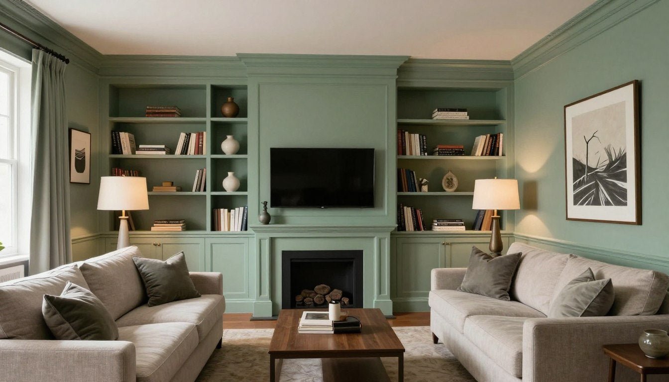
A perfectly executed color-drenched living room in muted sage green with complementary tone-on-tone artwork
What Is Color Drenching (and why it can look expensive)
Color drenching is a design technique where you apply the same color to multiple surfaces in a room—walls, trim, moldings, doors, and sometimes even the ceiling. Unlike traditional approaches where trim is painted white or in a contrasting shade, color drenching creates a seamless, enveloping effect that can make a space feel both larger and more intentional.
When executed properly, color drenching creates a high-end, designer look for several reasons. First, it highlights architectural details through shadow and dimension rather than contrast. Second, it creates a sense of thoughtful intention—the opposite of the "I just painted the walls" approach. Finally, it provides the perfect backdrop for carefully curated furniture and art, allowing interior decorating trends (including color drenching) to shine without competing elements.

Before and after: Notice how color drenching creates a more cohesive, expensive-looking space
The "No-Overwhelm" Rules (the framework)
The secret to successful color drenching lies in controlling the intensity. Follow these five essential rules to create a color-drenched space that feels sophisticated rather than suffocating.
Rule 1: Start with a muted version of your color (dusty > neon)
The most successful color-drenched rooms typically use softened, complex hues rather than bright, saturated colors. Think dusty sage instead of kelly green, terracotta instead of bright orange, or navy with gray undertones instead of royal blue. These muted tones create depth without overwhelming the senses and tend to shift beautifully as lighting changes throughout the day.

Muted colors (right) create a more sophisticated, livable color-drenched space compared to bright, saturated hues (left)
Rule 2: Use matte/eggshell strategically (gloss can amplify intensity)
Paint finish dramatically affects how color is perceived. For color drenching, matte finishes on walls help diffuse light and create a soft, velvety appearance that feels intentional rather than overwhelming. Reserve eggshell or satin finishes for trim, doors, and high-traffic areas that need to be wipeable. This subtle variation in sheen creates just enough textural interest without breaking the monochromatic effect.
Rule 3: Let texture do the talking (linen, boucle, wood)
When color variation is minimal, texture becomes crucial for creating visual interest. Incorporate natural materials like wood, stone, and textiles with tactile qualities. A color-drenched blue room comes alive with a nubby boucle chair, a wooden coffee table, and linen curtains—all within the same color family but offering textural contrast that prevents the space from feeling flat.

Varied textures prevent this terracotta color-drenched room from feeling flat despite the monochromatic palette
Rule 4: Lighting is non-negotiable (warm bulbs + layered light)
Proper lighting transforms a color-drenched room from potentially cave-like to cozy and inviting. Incorporate multiple light sources at different heights: ceiling fixtures, wall sconces, table lamps, and floor lamps. Choose bulbs with a warm color temperature (2700-3000K) to enhance the richness of your chosen hue. Natural light is also crucial—if your room has limited windows, position mirrors strategically to bounce light throughout the space.
Rule 5: Choose where to include the ceiling (small-room trick)
Including the ceiling in your color drenching scheme is a design decision that depends on your room's proportions. In small rooms with standard ceiling heights, painting the ceiling the same color as the walls can actually make the space feel larger by eliminating the visual break between wall and ceiling. In larger rooms with higher ceilings, you might opt to keep the ceiling lighter (either white or a lighter version of your wall color) to maintain a sense of height and airiness.

In small rooms, including the ceiling in your color drenching (right) can actually make the space feel larger
Color Drenching "Intensity Control" Matrix
| Room Size | Best Color Depth | Recommended Finish | Ceiling Decision | Best Art Approach | Overwhelm Warning |
| Small (under 120 sq ft) | Light to mid-tone | Matte walls, eggshell trim | Yes - include ceiling | Tone-on-tone or soft contrast | Avoid dark colors without adequate lighting |
| Medium (120-250 sq ft) | Light to deep | Matte walls, satin accents | Optional - depends on height | Monochrome or one accent color | Balance deep colors with ample lighting |
| Large (250+ sq ft) | Mid-tone to deep | Mix of matte and satin | No - keep ceiling lighter | Bold contrast or gallery wall | Avoid too many competing textures |
| Open Plan | Light to mid-tone | Matte throughout | No - keep ceiling white | Statement piece with color pull | Define zones with furniture arrangement |
Art Pairing Tips for Color-Drenched Rooms
Selecting the right artwork for a color-drenched room requires a thoughtful approach. The art should complement your monochromatic scheme without disappearing into it or fighting against it. Here are three effective strategies:
Art Pairing Cheat Sheet
- If walls are deep → choose tone-on-tone or soft contrast (ivory/charcoal)
- If walls are mid-tone → choose monochrome or one accent
- If walls are light → you can go bolder with art color (still limit to 1–2 hero hues)
Option A: Tone-on-tone art (same family, different values)
Tone-on-tone artwork creates a sophisticated, cohesive look that enhances your color-drenched space without disrupting it. Look for pieces that use variations of your room's color—lighter and darker shades within the same color family. This approach creates subtle depth while maintaining the enveloping feel of your monochromatic scheme. A monochrome abstract canvas print works beautifully in this context, adding textural interest without introducing competing colors.

A tone-on-tone abstract artwork enhances this blue color-drenched bedroom without disrupting the monochromatic scheme
Option B: Soft contrast (ivory/charcoal) to "frame" the wall
For a more defined visual statement, consider artwork that offers soft contrast through neutral tones. In a color-drenched room, a minimalist black & white abstract art piece creates a focal point without introducing competing colors. This approach works particularly well in deeply saturated rooms, where the neutral artwork provides a visual "rest" for the eye while still complementing the overall aesthetic.

Black and white abstract art provides elegant contrast in this emerald green color-drenched dining room
Option C: One accent color pulled from the artwork (repeat 2–3 times)
For a more dynamic approach, select artwork that introduces a single accent color, then repeat that color in small doses throughout the room. For instance, in a color-drenched terracotta room, a terracotta abstract canvas print with touches of blue could be complemented by blue accent pillows, a small blue vase, or blue details in other decorative objects. The key is consistency—limit yourself to one accent color and use it intentionally.
For a deeper understanding of how to select art that perfectly complements your color scheme, our color palette + abstract wall art pairing guide provides comprehensive insights into creating harmonious combinations.

The cobalt blue accent from the artwork is strategically repeated in small accessories throughout this taupe color-drenched living room
Room-by-Room Mini Guides
Living Room
Living rooms benefit from mid-tone color drenching that creates a welcoming, cohesive atmosphere. Consider muted greens, blues, or warm neutrals that foster conversation and relaxation. For larger living spaces, you might keep the ceiling white or a lighter version of your wall color. Art selection should complement your furniture scale—a large sofa calls for a proportionally sized piece or grouping. For maximum impact, follow the 2/3 rule from our big wall art ideas (2/3 to 3/4 rule) guide.
Perfect for Living Rooms
The rich depth of this cobalt blue abstract canvas print creates a stunning focal point in color-drenched living rooms, especially those with warm neutral or complementary blue tones.
View Canvas PrintBedroom
Bedrooms are ideal for complete color drenching—walls, trim, and ceiling—creating a cocooning effect that promotes rest. Opt for soothing hues like dusty blues, soft greens, or warm terracottas. The bedroom is where lighting becomes particularly important; include bedside lamps, overhead lighting with dimmers, and possibly wall sconces for a layered approach. For artwork, position a statement piece above the bed or create a small gallery of complementary pieces on an adjacent wall.

A fully color-drenched bedroom creates a cocooning effect that promotes rest and relaxation
Home Office
For home offices, color drenching can create focus and minimize visual distractions. Consider the mood you want to foster: deep greens or blues for concentration, warmer terracottas or ochres for creativity. Include the ceiling if the space is small to create a sense of continuity. Artwork should complement your work style—calming abstracts for high-stress work, or more energizing pieces for creative pursuits. An emerald green abstract canvas print can enhance concentration while adding sophisticated visual interest.
Entryway
Entryways make excellent candidates for bold color drenching, setting the tone for your entire home. Since these spaces are typically transitional rather than places where you spend extended time, you can experiment with deeper or more saturated hues. Consider adding a sculptural element rather than just flat artwork—modern sculptures for home decor create dimensional interest against color-drenched walls without adding competing colors.

A sculptural element creates dimensional interest against this boldly color-drenched entryway
For more complex spaces like open-concept areas, consider creating a gallery wall that ties together different functional zones. Our guide on how to mix and match art prints for a gallery wall provides helpful strategies for curating a cohesive collection.
Common Mistakes + Fast Fixes
Too Shiny
Mistake: Using high-gloss paint throughout a color-drenched space, creating an overwhelming, reflective effect.
Fix: Reserve glossier finishes for trim and doors only. Use matte or flat finish on walls and ceilings to create depth and softness.
Too Dark Without Adequate Lighting
Mistake: Color drenching with deep hues without sufficient lighting, creating a cave-like effect.
Fix: Layer multiple light sources at different heights and use warm-temperature bulbs (2700-3000K) to enhance the richness of dark colors.
Tiny Art on Big Drenched Walls
Mistake: Using undersized artwork that gets visually lost against a bold, color-drenched backdrop.
Fix: Scale up your art—aim for pieces that occupy at least 2/3 of the wall space above furniture, or create a gallery of smaller pieces with proper spacing.
Competing Metals and Finishes
Mistake: Introducing too many different metal finishes and decorative elements that fight for attention.
Fix: Limit yourself to 1-2 metal finishes throughout the space and ensure they complement your color choice (warm metals with warm colors, cool with cool).

Before and after: Common color drenching mistakes and their simple fixes
FAQ
What is color drenching in interior design?
Color drenching is a design technique where you apply the same color to multiple surfaces in a room—walls, trim, moldings, doors, and sometimes the ceiling. Unlike traditional approaches where trim is painted white or in a contrasting shade, color drenching creates a seamless, enveloping effect that can make a space feel both larger and more intentional.
Should I color drench the ceiling too?
It depends on your room size and ceiling height. In small rooms with standard ceiling heights (8-9 feet), including the ceiling in your color drenching can actually make the space feel larger by eliminating the visual break between wall and ceiling. In larger rooms with higher ceilings, you might opt to keep the ceiling lighter (either white or a lighter version of your wall color) to maintain a sense of height and airiness.
What paint finish looks best for color drenching?
For most color-drenched spaces, a combination of finishes works best: matte or flat finish for walls and ceilings to create depth and softness, with eggshell or satin finish for trim, doors, and high-traffic areas that need to be wipeable. This subtle variation in sheen creates just enough textural interest without breaking the monochromatic effect.
How do I choose wall art for a color-drenched room?
There are three effective approaches: 1) Tone-on-tone art using variations of your room's color for a cohesive look, 2) Soft contrast through neutral artwork (black/white/ivory) that creates a focal point without competing colors, or 3) Artwork that introduces one accent color that you can repeat in small doses throughout the room. The best choice depends on your room's color depth and your desired visual impact.
Can color drenching work in small apartments?
Absolutely! Color drenching can be particularly effective in small apartments. By eliminating the visual breaks between walls, trim, and sometimes ceilings, color drenching can actually make small spaces feel larger and more cohesive. For apartments, consider lighter to mid-tone hues and include adequate lighting to prevent the space from feeling closed in.
What lighting makes color drenching look cozy instead of heavy?
Layered lighting is key: combine ambient lighting (overhead fixtures), task lighting (desk or reading lamps), and accent lighting (wall sconces, picture lights). Choose bulbs with a warm color temperature (2700-3000K) to enhance the richness of your chosen hue. Position lights at different heights to create depth, and consider dimmers to adjust the mood throughout the day.
How do I add contrast without breaking the monochrome look?
Focus on textural contrast rather than color contrast. Incorporate natural materials like wood, stone, and textiles with tactile qualities. Vary the finish of your paint slightly between surfaces (matte walls with satin trim). For visual interest, introduce one carefully chosen accent color through small accessories or artwork, keeping it to 10-15% of the overall scheme.
What size art works best on a color-drenched wall?
Scale is crucial in color-drenched spaces. As a general rule, artwork should occupy approximately 2/3 to 3/4 of the wall space above furniture. For example, art above a sofa should be about 2/3 the width of the sofa. Alternatively, create a gallery of smaller pieces that collectively fill a similar proportion. Undersized art tends to get visually lost against a bold, color-drenched backdrop.
Embracing Color Drenching with Confidence
Color drenching offers a sophisticated approach to interior design that can transform even the most ordinary spaces into cohesive, intentional environments. By following the "no-overwhelm" framework—muted colors, strategic finishes, textural interest, proper lighting, and thoughtful ceiling decisions—you can create color-drenched rooms that feel both bold and balanced. Pair your monochromatic backdrop with carefully selected artwork that either complements or provides controlled contrast, and you'll achieve a designer-worthy space that expresses your personality without overwhelming the senses.
Ready to Complete Your Color-Drenched Space?
Explore our collection of original monochrome paintings and abstract prints designed to complement color-drenched interiors with sophisticated style.
Browse Art Collection
Leave a comment
This site is protected by hCaptcha and the hCaptcha Privacy Policy and Terms of Service apply.