The right piece of art can completely redefine how a living room feels the moment you walk in. It sets tone, creates focal points, and tells a story about who lives there. Yet choosing art for interior design living room spaces often feels overwhelming when you're staring at blank walls wondering where to even start.
Whether you're drawn to bold abstract paintings that add energy or prefer calming landscapes that bring nature indoors, the art you choose becomes the heart of your space. It anchors furniture arrangements, influences color choices throughout the room, and gives guests something meaningful to notice beyond the sofa and coffee table.

Why Art Matters in Living Room Interior Design
Art serves as the visual anchor that pulls together every other design element in your living room. Without it, even beautifully furnished spaces can feel incomplete or lack personality. The right artwork creates a focal point that naturally draws the eye and gives purpose to the entire room layout.
Think of art as the punctuation mark in your interior design sentence. It completes the thought. When you choose pieces that resonate with your style and space, they do more than just fill wall space. They establish mood, introduce texture, and create conversation.

Interior designers consistently emphasize that artwork influences how we experience spaces on an emotional level. A vibrant painting can energize a room used for entertaining, while softer, muted pieces create calm in spaces meant for relaxation. The scale, color, and subject matter all contribute to this atmospheric quality.
Living rooms serve multiple functions in most homes today. They're where families gather, where guests visit, and often where we spend quiet evenings. Art helps define these different moments. Large-scale pieces make bold statements perfect for entertaining spaces, while smaller, more intimate works suit reading corners.

The connection between art and interior design goes beyond aesthetics. It's about creating spaces that feel authentically yours. Mass-produced furniture can look similar from home to home, but your art choices make your living room distinctly different from anyone else's.
Choosing the Right Size Art for Your Living Room
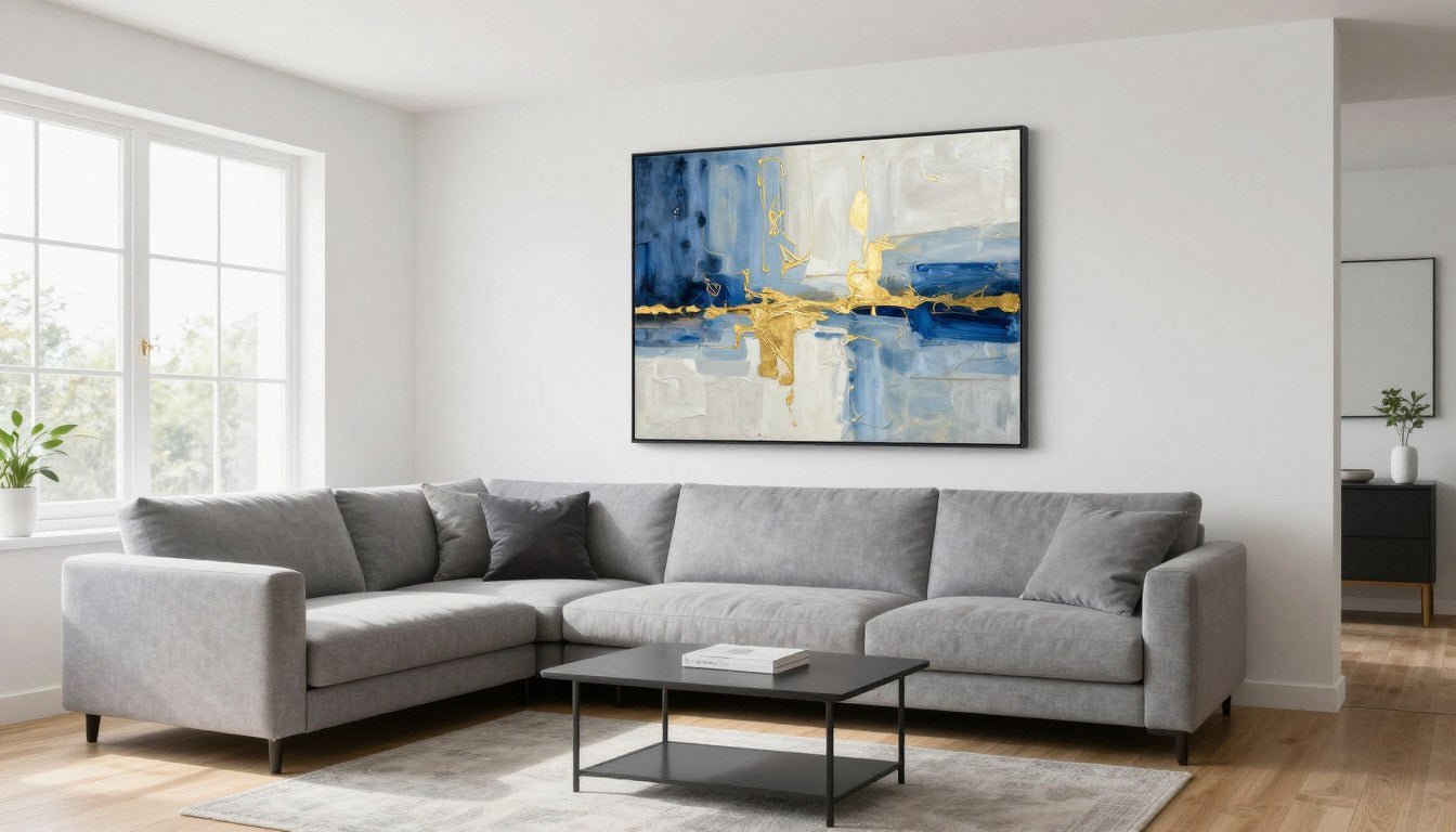
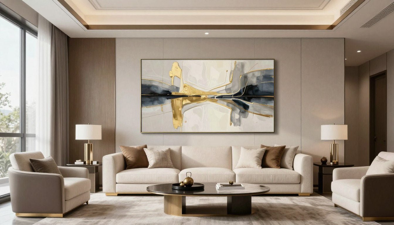
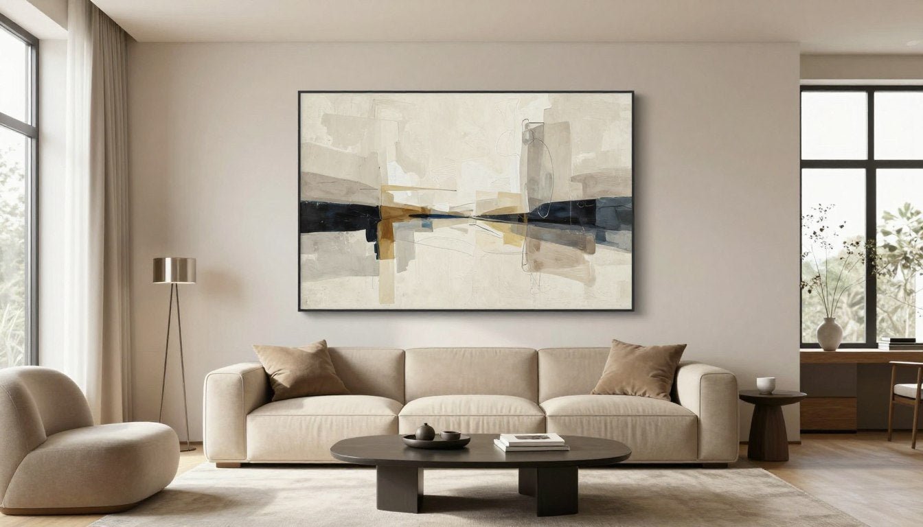
Size matters more than almost any other factor when selecting art for interior design living room projects. A piece that's too small disappears on the wall, while oversized art can overwhelm the space and throw off balance. Getting proportions right creates harmony between your walls, furniture, and artwork.

The most reliable guideline: your artwork should span 60-75% of your furniture's width. If you're hanging art above a sofa, measure the sofa's length and aim for a piece or arrangement that fills roughly two-thirds of that space. This creates visual connection between the furniture and wall art.
For walls without furniture beneath them, consider the wall's dimensions. A piece that takes up 50-60% of the wall's width typically looks balanced. Larger living rooms can handle bigger, bolder pieces that might overwhelm smaller spaces. Scale creates impact without overpowering the room.

Small Living Rooms (Under 200 sq ft)
Stick with pieces between 24-36 inches in width. Multiple smaller pieces often work better than one large statement piece. The goal is to add visual interest without making the space feel cramped or cluttered.
Medium Living Rooms (200-400 sq ft)
You have flexibility here. Pieces ranging from 36-60 inches work well, depending on wall length and furniture placement. This is where living room canvas prints in various sizes give you the most options.
Large Living Rooms (400+ sq ft)
Go bold with pieces 60 inches or larger. These spaces can handle dramatic, oversized art that becomes the room's defining feature. Consider gallery-quality pieces with strong presence and detail that holds up at scale.
Don't forget to account for ceiling height. Rooms with tall ceilings benefit from vertical pieces that draw the eye upward and make use of that extra wall space. Standard 8-foot ceilings work better with horizontal or square formats that complement the room's proportions.

Color Palette Coordination and Visual Balance
Color creates the emotional foundation of any living room, and your art choices either enhance or clash with that foundation. The most successful interiors feature artwork that picks up existing colors from the space while introducing new accent tones that add depth and visual interest.
Start by identifying your room's dominant colors. These are usually found in large furniture pieces, wall paint, and flooring. Your art should complement these foundation colors rather than fight against them. This doesn't mean everything needs to match perfectly, but there should be intentional color relationships.

The 60-30-10 rule works brilliantly for art selection. Your room's dominant color covers 60% of the space, a secondary color takes up 30%, and accent colors fill the remaining 10%. Choose artwork that introduces or emphasizes your accent colors. This creates cohesion while keeping things interesting.

Monochromatic Harmony
Stick with variations of a single color family. Black and white art brings sophistication and works with virtually any decor. This approach creates calm, unified spaces where texture and form take center stage over color.

Complementary Contrast
Choose art featuring colors opposite each other on the color wheel. Blue and orange, purple and yellow. These combinations create energy and visual excitement perfect for spaces where you entertain or want to make a bold statement.

Analogous Flow
Select artwork with colors that sit next to each other on the color wheel. Think blues flowing into greens, or warm oranges transitioning to reds. This creates smooth, harmonious spaces that feel naturally balanced and easy to live with.
Temperature matters as much as specific hues. Warm colors (reds, oranges, yellows) energize spaces and make rooms feel cozier and more intimate. Cool colors (blues, greens, purples) have a calming effect and can make smaller living rooms feel more spacious. Consider the mood you want to create.

Neutral spaces offer the most flexibility for art. If your living room features beige, gray, or white walls with neutral furniture, you can go bold with colorful artwork or keep things subtle with neutral pieces that add texture. Abstract canvas prints work particularly well in neutral spaces because they introduce color and movement without overwhelming the minimalist aesthetic.
Don't match too literally. If your sofa is royal blue, you don't need royal blue in your artwork. Instead, look for pieces with tones that harmonize rather than replicate. A painting with navy, turquoise, or even purple creates connection without looking overly coordinated or staged.

Placement and Height Guidelines for Maximum Impact
Even the most beautiful art fails to impress when hung at the wrong height or in the wrong spot. Proper placement makes pieces feel intentional and professional rather than randomly placed. The standard rule is simple: hang art so the center sits at eye level, typically 57-60 inches from the floor.
This eye-level guideline comes from museum and gallery practices where art is displayed for optimal viewing. When the center of your piece aligns with average eye height, viewers naturally engage with the work without straining to look up or down. It creates comfortable, intuitive viewing experiences.

Furniture complicates this standard. When hanging art above a sofa or console table, leave 6-8 inches of space between the furniture top and the art's bottom edge. This creates visual connection while preventing the piece from feeling like it's floating disconnected from the furniture below.
Quick Height Formula: For art above furniture, measure 6-8 inches up from the furniture top, mark that point, then position your piece so it starts there. For walls without furniture, measure 57 inches up from the floor and mark the wall's center point, then hang so the art's center aligns with your mark.

Consider the room's flow and focal points. In most living rooms, the wall behind the main seating area serves as the primary focal point. This is where your largest, most impactful piece should live. Additional walls can feature smaller works or collections that complement without competing.
Corners often get overlooked but offer interesting opportunities. A tall vertical piece in a corner can activate dead space and add unexpected visual interest. Diagonal walls from fireplace corners or architectural features benefit from art that acknowledges the angle rather than fights it.

Living rooms with fireplaces present a special case. Art above the mantel should be approximately two-thirds the width of the fireplace opening, not the entire mantel width. Hang it 4-6 inches above the mantel top, accounting for the mantel's visual weight in your overall composition.
Multiple pieces on one wall need careful planning. Gallery walls should be treated as one large unit, hung so the collective center sits at eye level. Map out arrangements on the floor first, measuring distances between pieces. Consistent spacing of 2-3 inches between frames creates cohesive groupings.

Lighting affects perceived placement. Art in dimly lit corners may need to hang slightly lower than the standard rule to remain visible and impactful. Similarly, pieces in spaces with abundant natural light can handle standard or even slightly higher placement since they're clearly visible.
Don't forget about sight lines from different parts of the room. Walk around your living space and view the art from various angles and seating positions. Pieces visible from multiple vantage points need positioning that works from all perspectives, not just one primary viewing spot.

Matching Art Style to Your Interior Design
Your living room's design style guides art selection more than any other factor. A mid-century modern space calls for different artwork than a traditional farmhouse or contemporary minimalist room. The goal is creating visual dialogue between your art and existing design elements rather than forcing pieces that feel out of place.
Contemporary and modern interiors thrive with abstract pieces, geometric patterns, and bold minimalist compositions. These spaces often feature clean lines, neutral color palettes, and uncluttered layouts. Modern wall art with strong graphic elements or fluid abstract forms complements these aesthetics beautifully.

Traditional spaces benefit from classic subjects and representational art. Landscapes, still life paintings, and figurative works feel at home with ornate furniture, rich wood tones, and detailed architectural elements. These rooms can handle gold or ornate frames that would overwhelm more modern spaces.
Transitional design, which blends traditional and contemporary elements, offers the most flexibility. Here you can mix modern abstract pieces with more classical subjects, creating interesting tension between old and new. This style rewards experimentation and personal expression more than strict adherence to rules.
Minimalist Spaces
Choose art with breathing room and negative space. Single large-scale pieces work better than collections. Stick with limited color palettes and avoid busy, detailed compositions.
- Abstract compositions with clean lines
- Monochromatic or limited color schemes
- Large format pieces that create impact through scale
- Work with significant negative space
Eclectic Interiors
Mix and match with intention. Combine different art styles but maintain color consistency or visual themes that tie the collection together across your walls.
- Mix of abstract and representational work
- Various sizes creating dynamic walls
- Unified through color or subject themes
- Balance between bold and subtle pieces
Industrial Aesthetic
Raw, urban-inspired art complements exposed brick, metal, and concrete. Black and white photography, gritty abstracts, and pieces with metallic elements enhance the industrial vibe.
- Black and white photography or prints
- Abstract work with metallic accents
- Urban or architectural subject matter
- Pieces with raw, unfinished aesthetic
Coastal and Organic
Bring in nature-inspired pieces, ocean scenes, and work in soft, weathered palettes. Textures matter here, with hand-stretched canvas and visible brushwork adding to the organic feel.
- Beach and ocean-inspired imagery
- Soft blues, greens, and sandy neutrals
- Natural textures and organic shapes
- Horizontal compositions echoing horizons

Scandinavian and Nordic design favors simplicity with organic elements. Think muted colors, natural materials, and uncomplicated compositions. Black and white prints, simple line drawings, and nature-inspired abstracts feel right at home in these pared-back spaces.
Bohemian and maximalist rooms can handle more adventurous art choices. Vibrant colors, intricate patterns, and layered collections create the richness these styles embrace. Multiple pieces grouped together, mixed frames, and eclectic subjects all contribute to the "more is more" philosophy.

Farmhouse and rustic styles call for artwork with warmth and authenticity. Avoid anything too polished or contemporary. Instead, choose pieces with visible texture, earthy colors, and subjects that feel grounded and natural. Works with vintage or handmade qualities enhance the rustic charm.
Art deco and glam interiors shine with bold geometric patterns, metallic accents, and luxurious color palettes. Think deep jewel tones, gold and brass elements, and sophisticated abstracts. These spaces can handle drama and visual richness that might overwhelm more subdued design styles.

Mixing Mediums and Textures for Depth
Layering different art mediums and textures adds dimension that flat, uniform walls can't achieve. The interplay between smooth canvas prints and heavily textured paintings creates visual interest that holds attention and rewards closer inspection. Your living room walls become more engaging when they offer varied tactile and visual experiences.
Canvas prints bring gallery-quality reproductions of artwork into accessible price points. Modern printing technology using archival inks on hand-stretched canvas delivers stunning color accuracy and longevity. UV-resistant treatments ensure your pieces maintain their vibrancy for years, making them practical choices for living rooms with natural light.

Original paintings offer something no reproduction can match: unique texture and the artist's hand. Brush strokes, palette knife marks, and layered paint create shadows and depth that change as light moves across the surface throughout the day. These pieces become focal points that draw people in for closer examination.
Mixing both mediums in one space creates budget-friendly versatility. Invest in original paintings for your primary focal point, then surround them with carefully selected canvas prints that complement the style and color palette. This approach delivers high-end look without overwhelming your budget.

Frames add another texture dimension. Pine wood frames bring warmth and traditional appeal, perfect for classic and transitional spaces. Oak floater frames create contemporary sophistication, allowing the canvas edges to show and emphasizing the artwork's presence as an object, not just an image.
Pro Tip: When mixing frames in one room, stay consistent within each grouping but feel free to use different frame styles on different walls. A gallery wall might feature uniform black frames while a single statement piece across the room uses a natural oak floater frame.

Photography offers yet another texture to consider. Black and white photographs bring graphic punch and documentary feeling that balances more abstract or colorful pieces. The smooth, detailed surface of photographic prints contrasts beautifully with painterly textures elsewhere on your walls.
Textured paintings create shadows and dimension that shift as natural light changes throughout the day. Morning light might reveal subtle impasto techniques that disappear in afternoon shadows, only to re-emerge under evening lamps. This dynamic quality makes heavily textured pieces endlessly interesting.

Metal prints and acrylic-mounted photographs introduce sleek, modern textures. These alternative mediums work well in contemporary spaces where you want reflective surfaces that interact with light differently than traditional canvas. They create subtle shine that adds luminosity to the room.
Consider varying not just what's on your walls but how far pieces project from the wall surface. Deep gallery-wrapped canvas creates three-dimensional presence. Float-mounted pieces hover slightly away from the wall, casting shadows that add drama. Flush-mounted work feels more integrated with the architecture.

Creating Gallery Walls That Work
Gallery walls transform ordinary living room spaces into curated art collections that reflect personal style. Done well, they create stunning focal points that command attention. Done poorly, they look cluttered and confusing. The difference comes down to intentional planning and cohesive design choices that unify diverse pieces.
Start with a theme or visual anchor. This might be a consistent color palette running through all pieces, a shared subject matter, or similar frame styles. Without this unifying element, even beautiful individual pieces can feel random when grouped. Your theme provides the thread connecting everything together.

Map your layout before hammering a single nail. Use paper templates cut to each piece's exact size, tape them to the wall, and experiment with arrangements. This simple step prevents walls full of holes from trial and error. Stand back, assess from different angles, and adjust until the composition feels balanced.

Gallery Wall Layout Strategies
Grid Layout: Uniform spacing creates order. Use identical frames and equal distances between each piece. Works beautifully in modern, minimalist spaces where symmetry matters.
Salon Style: Mix sizes and orientations with tighter spacing. This traditional approach feels collected-over-time and works for eclectic and transitional interiors.
Horizontal Line: Align the tops or bottoms of different-sized pieces along an invisible horizontal line. Creates clean, contemporary arrangements above sofas.
Centered Focus: Build around one larger central piece with smaller works surrounding it. The main piece anchors everything while supporting works create visual orbit.
Spacing matters as much as the pieces themselves. Maintain consistent gaps of 2-3 inches between frames for cohesive gallery walls. Tighter spacing creates density and richness, while wider gaps feel more airy and modern. Choose one spacing measurement and stick with it throughout the entire arrangement.

Odd numbers create more visually interesting compositions than even numbers. Groups of three, five, or seven pieces feel more dynamic and naturally balanced than pairs or groups of four. This principle comes from design theory about asymmetrical balance creating visual tension that pleases the eye.
Consider the wall's architecture. Gallery walls over sofas should span about two-thirds of the furniture's width. On blank walls, aim for arrangements that fill 60-70% of the available wall space, leaving breathing room around the edges. Too small and the arrangement gets lost; too large and it overwhelms.

Vary sizes but maintain some consistency. If every piece is drastically different in scale, the wall feels chaotic. Include a mix of larger anchor pieces and smaller supporting works, but keep the size range within reason. Pieces ranging from 8x10 to 24x36 inches work well together without extreme size jumps.
Orientation diversity adds interest. Mix vertical, horizontal, and square pieces rather than using all the same orientation. The varied shapes create dynamic compositions that lead the eye around the entire arrangement rather than marching in predictable patterns.

Test lighting before finalizing placement. Gallery walls in shadowy corners lose impact no matter how well arranged. Ensure adequate lighting reaches the entire grouping. Consider adding picture lights or adjusting nearby lamps to properly illuminate your carefully curated wall.
Leave room for growth. Many successful gallery walls evolve over time as you discover new pieces. Design with a few strategic gaps where future additions can slot in naturally. This living, growing approach prevents the wall from feeling too precious or complete.

Lighting Considerations for Wall Art
Even extraordinary art disappears in poor lighting. The right illumination transforms good pieces into stunning focal points while protecting your investment from damage. Living rooms require lighting strategies that enhance artwork while serving the space's functional needs for everyday living.
Natural light presents both opportunities and challenges. Large windows flood rooms with beautiful daylight that makes colors vibrant and spaces feel alive. But direct sunlight causes fading over time, especially in prints and paintings without UV protection. Position valuable art on walls perpendicular to windows rather than directly across from them.

UV-resistant glazing and coatings provide essential protection for pieces in sunny rooms. Quality canvas prints made with archival inks and UV-resistant treatments maintain color accuracy even in naturally lit spaces. This protection extends the life of your artwork significantly, making it worthwhile investment for pieces you love.
Avoid These Lighting Mistakes: Never position artwork where direct sunlight hits it for extended periods. Don't use halogen bulbs directly spotlighting art, as they generate heat that damages paintings. Skip fluorescent lighting near artwork, as it emits UV radiation that fades colors over time.

Ambient lighting creates overall room brightness but rarely shows art at its best. Layer in accent lighting specifically for artwork. Track lighting with adjustable heads lets you direct beams exactly where needed, creating drama while maintaining flexibility as you rearrange or add new pieces.
Picture lights mounted above frames provide museum-quality illumination. These dedicated fixtures cast even light across the entire surface without creating glare or hot spots. They work particularly well for larger statement pieces where you want focused attention without overwhelming the room.

Temperature of light bulbs affects how colors appear. Warm light (2700-3000K) enhances reds, oranges, and yellows, making artwork feel cozy and inviting. Cool light (4000-5000K) brings out blues and greens, creating crisp, modern feeling. Choose bulb temperature matching your room's overall aesthetic and color palette.
Avoid fixtures that create glare on glass-covered art. Position lights at 30-degree angles from the wall rather than straight-on perpendicular. This angle illuminates the surface while preventing reflective hotspots that obscure the image. Adjustable fixtures let you fine-tune angles for each specific piece.

Dimmers provide flexibility for different times of day and occasions. Bright illumination showcases art during gatherings, while softer light creates intimate atmosphere for quiet evenings. Install dimmers on all lighting circuits that affect artwork zones, giving you complete control over ambiance.
Consider artwork visibility from room entry points. The pieces you see immediately upon entering should be well-lit, as they create first impressions. Secondary works can use subtler lighting that rewards discovery as you move through the space.

LED strips behind floating frames create modern, architectural lighting effects. The soft glow emphasizes the artwork's dimensionality while adding ambient light to the room. This technique works especially well in contemporary spaces with minimalist aesthetics where traditional fixtures might feel too prominent.
Evaluate lighting at different times throughout the day and evening. Art that looks perfect in afternoon sun may disappear at night if you haven't planned for artificial lighting. Walk through your space morning, afternoon, and evening, noting which pieces need additional illumination for 24-hour impact.

Budget-Friendly Options Without Sacrificing Quality
Beautiful, impactful art doesn't require emptying your savings. Smart choices about where to invest and where to economize create gallery-quality living rooms at accessible price points. The key is understanding which quality factors matter most and finding pieces that deliver those elements without unnecessary premium costs.
Canvas prints democratize access to stunning artwork. High-quality reproductions using archival inks on hand-stretched canvas look remarkably similar to original paintings at a fraction of the cost. You get the texture, presence, and visual impact of canvas art without the price tag of original work.

Prioritize quality where it matters. Invest in pieces for high-visibility locations like the main living room wall where everyone looks. Use more affordable options for secondary walls and less prominent spaces. This strategic approach maximizes impact where it counts while controlling overall costs.
Start with One Statement Piece
Focus your budget on a single large, quality piece for your primary wall. This creates an instant focal point and sets the tone for the entire room. Add smaller, less expensive pieces gradually over time as budget allows.
Mix Originals with Prints
Invest in one or two small original paintings as accent pieces, then surround them with quality canvas prints that complement the originals. This approach gives you authentic artwork without paying original prices for every piece.
Buy Made-to-Order
Made-to-order pieces eliminate middleman markups and inventory costs that traditional galleries pass to consumers. You get quality work directly from the source at better prices, often with customization options for size and framing.
Size impacts price significantly, but bigger isn't always necessary. A perfectly scaled 24x36 inch piece creates more impact than an oversized 60-inch work that overwhelms the space. Choose appropriate dimensions for your walls rather than automatically assuming larger equals better.

Frame choices affect costs substantially. Simple gallery-wrapped canvas without additional framing looks clean and modern while keeping prices accessible. When you do want frames, pine wood frames offer natural warmth at lower costs than premium hardwoods, while still looking sophisticated and well-made.
Watch for seasonal promotions and collection releases. Many art retailers offer significant discounts during specific times of year. Subscribe to newsletters from brands you love to catch these opportunities. Patience and timing can save considerable money on the exact pieces you want.
Quality Markers to Prioritize: Look for archival inks that won't fade, UV-resistant treatments for longevity, hand-stretched canvas for proper tension and presentation, and solid construction with pine or oak frames. These factors ensure your affordable art still delivers lasting quality.

Building a collection gradually spreads costs over time while letting your style evolve naturally. Start with one or two pieces, live with them, then add complementary works as you better understand what you love and what works in your space. This organic approach prevents costly mistakes.
Consider abstract and geometric work for budget-conscious choices. These styles often cost less than detailed figurative or representational pieces while delivering equal or greater visual impact. Bold, simple compositions create striking focal points without the premium prices of complex, detailed artwork.

Don't discount the power of black and white. Monochromatic pieces typically cost less than full-color work while offering timeless sophistication that works with any decor. They're also easier to coordinate with room colors and provide flexibility as your style evolves over years.
Explore canvas prints collections from specialized retailers rather than mass-market stores. Dedicated art brands often offer better quality at comparable or lower prices than generic home goods retailers because they focus exclusively on art without carrying overhead from diverse inventory.

Caring for Your Artwork Over Time
Proper care ensures your art investment maintains its beauty and value for decades. Living rooms experience daily life—sunlight, temperature changes, humidity fluctuations, and occasional accidents. Simple protective measures prevent damage while keeping maintenance minimal and straightforward.
Dust accumulates on canvas surfaces faster than you'd expect. Use a clean, soft, dry microfiber cloth to gently remove dust every few months. Never use cleaning products, water, or furniture polish on canvas art. The dry cloth method protects the surface while removing particles that dull colors over time.

Humidity control matters more than most people realize. Keep living rooms between 40-60% relative humidity to prevent canvas from becoming too loose or too tight. Extreme dryness causes canvas to contract and crack, while excessive moisture promotes mold growth and canvas sagging. A room humidifier or dehumidifier maintains ideal conditions.
Temperature Guidelines: Maintain consistent temperatures between 65-75°F in rooms displaying artwork. Avoid hanging pieces near heating vents, air conditioning units, or fireplaces where temperature swings stress materials. Consistent conditions preserve both canvas and paint integrity.
UV-resistant treatments protect against fading, but no protection is absolute. Rotate pieces between rooms occasionally, giving art in sunny locations a break in lower-light areas. This simple habit extends color vibrancy significantly, especially for pieces without UV protection.

Handle canvas art by the frame edges, never touching the canvas surface. Oils from hands transfer to canvas and attract dirt over time. When moving pieces, lift from the bottom and support the top simultaneously, keeping the work upright and preventing stress on hanging hardware.
Inspect hanging hardware annually. Wall anchors loosen, wire frays, and D-rings shift position. Five minutes checking hardware prevents disasters. Tighten loose screws, replace worn wire, and ensure all mounting remains secure, especially for larger, heavier pieces.

Minor scuffs and marks often clean with artist's erasers. These specialized rubber erasers remove surface dirt without damaging canvas or paint. Test in an inconspicuous corner first, then gently rub affected areas. This technique handles most minor imperfections without professional intervention.
Keep artwork away from kitchen areas where grease and cooking residue float through air. Even rooms adjacent to kitchens accumulate invisible film that dulls colors and requires professional cleaning eventually. Dining rooms separated from cooking spaces work fine, but walls sharing air with active cooking zones should display less valuable pieces.

Professional cleaning becomes necessary every 5-10 years for pieces in high-traffic living rooms. Art conservators use specialized techniques and solutions that safely remove accumulated dirt without damaging delicate surfaces. Consider this part of ownership costs, similar to furniture upholstery cleaning.
Store extra pieces properly if you rotate seasonal artwork. Wrap canvas in acid-free paper, never plastic which traps moisture. Store flat or upright in climate-controlled spaces, never in attics, basements, or garages where temperature and humidity fluctuate wildly. Proper storage maintains artwork between display periods.

Insurance coverage for valuable artwork provides peace of mind. Standard homeowners policies often limit art coverage significantly. Discuss your collection with your insurance agent and consider riders or separate policies for pieces exceeding standard limits. Document your collection with photographs and purchase records.
Original paintings require extra care compared to canvas prints. Consult professional conservators for any visible damage like cracking, flaking, or tears. DIY repairs on original work usually worsen problems. Prints offer more forgiveness, but originals demand professional expertise when issues arise.

Frequently Asked Questions
Q: What size art should I hang above my sofa?
A: Choose art that spans 60-75% of your sofa's width for proper visual balance. For a standard 84-inch sofa, look for artwork or arrangements between 50-63 inches wide. Hang pieces 6-8 inches above the sofa back to create connection between furniture and wall art. Single large pieces work beautifully, as do gallery wall arrangements that collectively meet this width guideline.
Q: How do I choose art colors that match my living room?
A: Start by identifying your room's existing color palette from furniture, walls, and decor. Select artwork that incorporates your accent colors (the 10% in the 60-30-10 rule) rather than matching dominant colors exactly. This creates cohesion while adding visual interest. Consider artwork that introduces one new accent color alongside existing tones for depth without clash.
Q: Should I choose canvas prints or original paintings?
A: Canvas prints offer gallery-quality appearance at accessible prices, making them perfect for larger pieces or multiple works. Original paintings provide unique texture and investment value, ideal for focal points where you want something one-of-a-kind. Many homeowners mix both, investing in one original as a centerpiece while using quality canvas prints elsewhere. Your budget, design goals, and personal preference all factor into this decision.
Q: How high should I hang artwork in my living room?
A: Hang art so the center sits at 57-60 inches from the floor, which aligns with average eye level. When placing art above furniture, leave 6-8 inches between the furniture top and the artwork's bottom edge. This creates visual connection while maintaining proper viewing height. Adjust slightly for rooms where most viewing happens while seated.
Q: Can I mix different art styles in one living room?
A: Yes, mixing styles works beautifully when you maintain a unifying element like consistent color palette, similar frame styles, or complementary themes. Eclectic and transitional interiors especially benefit from style mixing that creates visual interest. Keep the overall balance in mind—if one wall features bold abstract work, consider calmer pieces elsewhere to prevent visual chaos.
Q: How do I protect artwork from fading in sunny living rooms?
A: Choose canvas prints with UV-resistant coatings and archival inks that resist fading. Position artwork on walls perpendicular to windows rather than directly opposite them to minimize direct sun exposure. Consider UV-filtering window treatments for rooms with intense natural light. Rotating pieces between sunny and shaded locations every few years also extends their vibrancy.
Q: What's the best way to create a gallery wall?
A: Plan your layout using paper templates before hanging anything. Maintain consistent spacing of 2-3 inches between frames throughout. Choose a unifying element like color palette, frame style, or subject theme to create cohesion among diverse pieces. Treat the entire gallery wall as one unit, positioning it so the collective center sits at eye level (57-60 inches).
Transform Your Living Room with Thoughtful Art Choices
Selecting art for interior design living room spaces comes down to understanding your space, trusting your instincts, and making choices that resonate with how you actually live. The technical guidelines about sizing, placement, and color coordination provide helpful frameworks, but your personal connection to the artwork matters most.
Start with one piece you genuinely love, hang it properly, and let your collection evolve naturally from there. Living rooms become more personal and welcoming when the art reflects real choices rather than following formulas. The pieces that make you pause, that shift your mood when you enter the room, that start conversations with guests—those are the ones worth having.

Quality materials ensure your art investment lasts. Gallery-quality canvas prints with archival inks and UV-resistant treatments maintain their beauty through years of daily living. Hand-stretched canvas on pine wood frames or oak floater frames delivers professional presentation that elevates any space.
Remember that great living room art doesn't happen overnight. Take time discovering what speaks to you, experiment with placement, and adjust as your style develops. The most beautiful spaces reflect a collection built gradually with intention rather than rushed purchases filling walls quickly.
Explore our living room canvas prints collection to discover pieces that bring your vision to life, from abstract compositions to statement works that transform blank walls into personal galleries.
Leave a comment
This site is protected by hCaptcha and the hCaptcha Privacy Policy and Terms of Service apply.