
Walking into a room that feels incomplete is an experience every homeowner knows. The furniture is arranged, the lighting is perfect, yet something essential is missing. That missing element is often art.
Choosing the right piece transforms a house into a home. It adds personality, creates focal points, and sparks conversation. Yet for many first-time buyers, the art world feels intimidating. Questions pile up: How much should I spend? What size works for my space? How do I know if it's good quality?
This comprehensive guide removes the guesswork. You'll learn exactly what to look for, how to evaluate quality, and which medium best suits your needs and budget. Whether you're decorating your first apartment or adding to an established collection, these insights will help you buy art with confidence.
TL;DR — Art Buying Guide in 60 Seconds
Quick Answers for Art Buyers
- Start with your space: Measure your wall before falling in love with a piece. Art should span roughly two-thirds the width of furniture below it.
- Budget smart: Quality canvas prints start around $150-$400; original paintings typically range from $500-$5,000+; modern sculptures vary widely from $200-$10,000+.
- Choose your medium wisely: Canvas prints offer affordability and variety; original paintings provide investment value; sculptures add three-dimensional interest.
- Prioritize quality markers: Look for archival materials, proper stretching, professional packaging, and detailed product descriptions from established galleries.
- Style matters more than trends: Buy what genuinely moves you. Timeless pieces outlast temporary design fads.
- Start small, grow intentionally: Your first piece begins a collection. Focus on quality over quantity, and let your taste evolve naturally over time.
- Verify return policies: Reputable sellers offer 30-day returns. Seeing art in your actual space is essential before committing.
What "Good Art" Means (and What It Doesn't)

The art world loves to mystify itself. Galleries use insider language, critics reference obscure movements, and price tags seem arbitrary. This intimidation serves no one, especially buyers seeking beautiful work for their homes.
Here's the truth: good art is simply art that accomplishes its purpose. For home collectors, that purpose is personal. Does the piece make you pause? Does it improve the energy of your space? Does it reflect something about who you are or aspire to be?
What Good Art Actually Includes
Technical execution: Colors should be rich and true. Lines should be intentional. Materials should feel substantial. Whether you're examining a canvas print or an original painting, quality reveals itself in the details.
Emotional resonance: Great art triggers a response. That response might be calm, energy, nostalgia, or curiosity. The specific emotion matters less than the fact that you feel something authentic.
Contextual fit: A museum-quality abstract may be "good art" objectively, yet wrong for your bedroom if you prefer serene landscapes. The best piece for you works within your actual life and space.
What Good Art Doesn't Require
Good art doesn't demand a famous name. Thousands of exceptionally talented artists create stunning work outside the celebrity art world. Their pieces often offer better value and more distinctive style than mass-marketed names.
Good art doesn't need gallery approval or critical acclaim. Those validations matter for investment speculation, but have little bearing on whether a piece enriches your daily life. Trust your own eyes and emotional response.
Good art doesn't always cost a fortune. While original paintings by established artists command premium prices, exceptional canvas prints and emerging artist works deliver remarkable beauty at accessible price points. Quality and cost don't always correlate.
The 5 Buying Questions to Ask Before You Spend
Smart art buying begins with clarity. Before browsing galleries or scrolling through online collections, answer these five essential questions. They'll focus your search and prevent expensive regrets.
1. Budget vs Value: Prints vs Originals

Your budget determines which art forms are realistic options. Understanding the value proposition of each helps you spend wisely.
Canvas prints typically range from $150 to $800 for museum-quality pieces. These reproductions of original artwork offer exceptional value. Modern printing technology captures incredible detail and color accuracy. For most homes, high-quality canvas prints provide beauty and sophistication without the premium cost of originals.
Original paintings start around $500 for small works by emerging artists and climb rapidly from there. Mid-career artist paintings typically cost $2,000 to $10,000. Established names command $10,000 to six figures or more. Originals offer one-of-a-kind ownership and potential appreciation, but require significantly larger budgets.
Modern sculptures vary enormously based on size, materials, and artist. Small tabletop pieces might cost $200 to $500. Floor-standing sculptures typically range from $1,000 to $5,000. Large-scale or premium-material works easily exceed $10,000. Sculptures add three-dimensional interest but demand more spatial planning.
For first-time buyers exploring museum-quality canvas prints organized by style and mood, exceptional pieces are accessible at every budget level.
2. Style, Mood, and Room Purpose
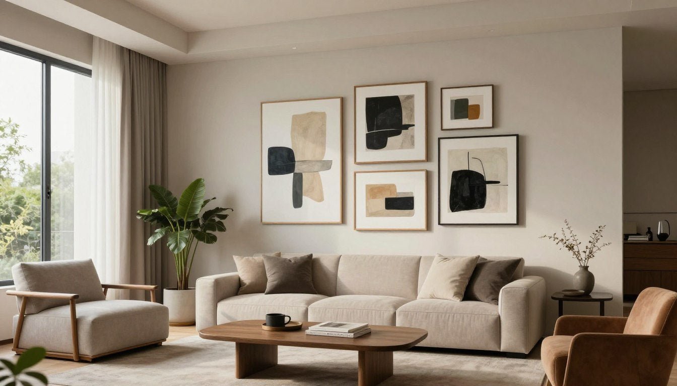
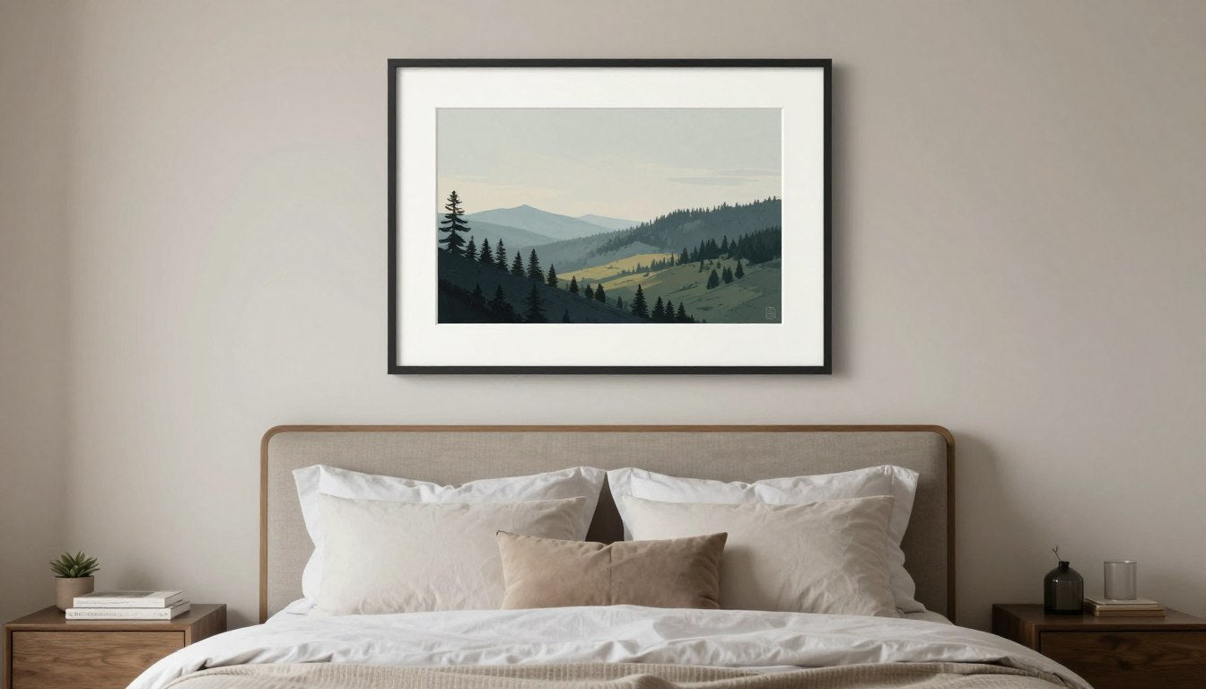
Different rooms serve different purposes, and art should support those functions. A bedroom benefits from calming compositions in soothing tones. A home office might showcase bold abstracts that energize creativity. Living rooms offer flexibility for statement pieces that reflect your personality.
Consider the mood you want to create. Abstract art tends toward contemplation and sophistication. Landscapes evoke tranquility and escape. Figurative work adds human connection. Geometric patterns bring structure and modernity. Your instinctive reaction to these styles guides your search.
Don't overthink style matching. Your collection can include diverse pieces as long as they share common threads—perhaps a color palette, emotional tone, or level of formality. Eclectic collections often feel more personal than perfectly coordinated ones.
3. Size, Placement, and Negative Space
Size miscalculations are among the most common and most avoidable art buying mistakes. A piece that looks perfect online can overwhelm a small room or disappear on a large wall.
The golden rule: art should span approximately two-thirds the width of the furniture below it. A 7-foot sofa pairs well with a 55-60 inch wide piece. A king bed works with art spanning 50-65 inches. Smaller accent pieces work above side tables, desks, or in gallery wall arrangements.
Height matters too. The center of your artwork should sit at eye level, typically 57-60 inches from the floor. Above furniture, leave 6-10 inches of space between the furniture top and the frame bottom. This creates visual connection without crowding.
Negative space—the empty wall surrounding art—is crucial. Don't fill every inch. Artwork needs breathing room to make its full impact. Resist the temptation to crowd your walls, especially in smaller spaces where restraint creates elegance.
4. Color Palette and Lighting

Color integration transforms good art into perfect art for your space. You're not looking for exact matches to your sofa or curtains. Instead, seek pieces that complement your existing palette while adding visual interest.
Identify your room's dominant colors and undertones. Warm spaces (reds, oranges, yellows, warm grays) pair beautifully with art in similar temperature ranges. Cool spaces (blues, greens, purples, cool grays) harmonize with cooler palettes. You can also create contrast deliberately—a warm painting energizes a cool room, and vice versa.
Lighting dramatically affects how art looks. Natural light shifts throughout the day, changing how colors appear. North-facing rooms receive cooler, more consistent light. South-facing rooms get warm, variable light. East and west exposures shift from warm to cool across morning and evening.
Artificial lighting matters equally. Warm-toned bulbs enhance reds and yellows but can muddy blues and greens. Cool-toned lights favor blues and greens while potentially washing out warmer colors. Many galleries now offer visualization tools or generous return policies, letting you test pieces in your actual lighting before committing.
5. Materials, Finish, and Longevity
The materials and construction methods used in creating art determine how it ages. Quality materials maintain beauty for decades. Inferior materials fade, warp, or deteriorate quickly.
For canvas prints: Look for archival-quality canvas and fade-resistant inks. Giclée printing (pronounced "zhee-clay") represents the gold standard, using museum-quality processes. The canvas should be properly stretched and stapled on the back (gallery wrap), not the front or sides. Wooden stretcher bars should be thick enough (at least 1.5 inches) to prevent warping.
For original paintings: Professional artists use lightfast pigments on properly primed surfaces. Oil paintings last centuries when properly executed. Acrylics offer similar longevity with faster drying times. Watercolors require glass protection but can last indefinitely in proper conditions. Ask about materials used, especially if you're investing significantly.
For sculptures: Material choice affects both aesthetics and durability. Bronze and stainless steel last indefinitely indoors or out. Resin offers versatility at lower cost. Wood requires climate control to prevent cracking. Ceramic and glass need protection from impacts. Consider where you'll display the piece when evaluating materials.
Finish options include gloss (reflective, vivid colors), matte (soft, reflection-free), and satin (balanced between the two). Gloss works well in dining rooms and spaces with controlled lighting. Matte suits bedrooms and offices where glare would be distracting. Most contemporary canvas prints for modern spaces offer finish options to suit your specific needs.
Canvas Prints vs Original Paintings vs Sculptures: How to Choose

Each art medium offers distinct advantages and considerations. Understanding these differences helps you choose the right option for your situation, budget, and goals.
Best for Renters and Flexible Spaces
Canvas prints excel for renters and anyone who anticipates moving or redecorating. They're lightweight, easy to transport, and affordable enough to replace if your style evolves. Quality canvas prints deliver visual impact comparable to originals at a fraction of the cost.
Modern printing technology has reached remarkable sophistication. Museum-quality giclée prints capture subtle color variations and fine details that earlier reproduction methods missed entirely. When properly executed, even trained eyes struggle to distinguish high-end prints from originals at normal viewing distances.
Canvas prints also offer incredible variety. You can access styles, artists, and compositions that would be financially out of reach in original form. Want a collection spanning abstract expressionism, impressionism, and contemporary realism? Canvas prints make that diversity affordable.
The flexibility extends to experimentation. Not sure if you're drawn to bold colors or subtle neutrals? Large-scale or intimate pieces? Gallery walls or single statements? Canvas prints let you explore these questions without major financial commitment.
Best for Statement Walls and Investment

Original paintings command attention in ways prints cannot quite match. The physical texture of paint, the subtle variations in brushwork, the knowledge that you own the unique creation—these factors create powerful presence.
For permanent homes with dedicated display spaces, originals offer advantages worth their premium cost. They become conversation pieces. They connect you directly to the artist's creative process. They potentially appreciate in value, especially if you develop an eye for promising emerging talent.
Original paintings also convey sophistication and commitment to art. There's an intangible but real difference in how a room feels when anchored by authentic artwork. This quality particularly matters in formal spaces, professional offices, or homes where entertaining is frequent.
The investment aspect shouldn't be the primary consideration for most home buyers, but it's worth acknowledging. While most art doesn't dramatically appreciate, carefully chosen pieces from mid-career or emerging artists can grow significantly in value over decades. Even without financial gain, originals maintain value far better than prints in resale markets.
Collectors exploring original paintings that command attention will find museum-quality works that transform any space into a gallery-like environment.
Best for Gifts and Multi-Dimensional Interest
Modern sculptures offer something no two-dimensional work can: they change as you move around them. Light plays across surfaces differently from various angles. They create shadows and catch highlights. This dynamic quality adds life to spaces in distinctive ways.
Sculptures work beautifully as gifts because they feel substantial and permanent. A thoughtfully chosen sculpture communicates that you've invested real consideration into the selection. They suit milestone occasions—housewarmings, anniversaries, retirements—when you want your gift to become a cherished permanent fixture.
Placement options for sculptures are more diverse than wall art. They work on mantels, shelves, side tables, pedestals, or floor stands. This versatility helps when wall space is limited or when you want to create visual interest at varying heights throughout a room.
Size scales dramatically in sculpture. Small tabletop pieces add subtle sophistication. Medium floor-standing sculptures create focal points. Large outdoor sculptures make architectural statements. This range accommodates every space from apartments to estates.
Material choices in sculpture also create different aesthetic effects. Polished metals feel contemporary and sleek. Natural wood brings warmth and organic texture. Stone conveys permanence and gravitas. Glass and acrylic offer lightness and translucency. The material becomes part of the artwork's statement.
Those seeking modern sculptures that add dimension will discover pieces that transform spaces from flat to dynamic with sophisticated three-dimensional artistry.
Size & Placement Guide for USA Homes

Getting size right is critical. Too small and your art disappears. Too large and it overwhelms. This guide provides specific measurements for common spaces in American homes.
| Wall/Room Type | Typical Wall Width | Recommended Art Width | Common Canvas Sizes (inches) | Hanging Height Tips | Notes |
| Above Sofa (Standard) | 84-96 inches | 50-65 inches | 48×36, 60×40, 54×36 | 6-10 inches above sofa back | Art should span 2/3 sofa width; single large piece or gallery wall works |
| Above Queen Bed | 60-72 inches | 40-50 inches | 48×36, 40×30, 36×24 | 5-9 inches above headboard | Keep calming tones; avoid busy patterns in bedrooms |
| Above King Bed | 76-84 inches | 50-60 inches | 60×40, 54×36, 48×36 | 5-9 inches above headboard | Horizontal orientation typically works best; can use diptych or triptych |
| Dining Room | Varies widely | Half to 2/3 table width | 40×30, 48×36, 60×40 | 60-66 inches to center (higher than living areas) | Consider how art looks when seated; avoid overwhelming table |
| Home Office/Desk | 48-72 inches | 24-40 inches | 36×24, 30×20, 24×18 | Eye level when seated (48-54 inches to center) | Choose energizing or inspiring subjects; avoid distracting busy patterns |
| Entryway/Hallway | 36-60 inches | 24-40 inches | 30×20, 36×24, 24×36 (vertical) | 57-60 inches to center (standard eye level) | Vertical pieces often work better in narrow halls; consider gallery wall |
| Bathroom | 36-48 inches | 18-30 inches | 24×18, 20×16, 18×24 (vertical) | Eye level or above toilet/vanity | Use moisture-resistant materials; avoid direct shower splash zones |
| Large Empty Wall | 120+ inches | 60-80 inches | 72×48, 60×40, or gallery wall | 57-60 inches to center | Consider multi-panel pieces (diptych/triptych) or curated gallery wall |
For detailed guidance on standard canvas dimensions and how they relate to framing options, explore this comprehensive resource on art print sizes and frame selection.
The Art Buying Checklist: Your Pre-Purchase Reference
Save yourself from common mistakes by consulting this checklist before any art purchase. These considerations apply whether you're spending $200 or $20,000.
| Goal/Room | Ideal Style Direction | Recommended Medium | Size Range (inches) | Color Notes | Finish/Frame Notes | Buy If... | Avoid If... |
| Living Room Focal Point | Bold abstract, dramatic landscape, statement contemporary | Canvas print or original painting | 48×36 to 72×48 | Complement or contrast existing palette; can introduce accent colors | Gallery wrap or floating frame; matte or satin finish | You want conversation-starting presence; room needs visual anchor | Space is small or already visually busy; prefer subtle decor |
| Bedroom Sanctuary | Calming abstracts, soft landscapes, minimalist compositions | Canvas print | 40×30 to 60×40 | Cool tones (blues, greens, soft neutrals); avoid intense reds | Matte finish preferred; simple frames; avoid reflective surfaces | You want restful, serene atmosphere; bedroom feels cold or impersonal | Subject matter is energizing or emotionally intense |
| Home Office Productivity | Geometric patterns, inspiring quotes, dynamic abstracts | Canvas print or sculpture | 24×18 to 40×30 | Energizing without being distracting; consider warm accent colors | Satin finish; minimal frame; consider small desk sculpture | Office feels uninspiring; want motivational visual cues; need creative energy | Colors are too bold or patterns too busy (may distract from work) |
| Dining Room Elegance | Classic still life, sophisticated abstracts, cultural artwork | Original painting or high-end canvas print | 40×30 to 60×40 | Rich, sophisticated tones; food-safe if depicting cuisine | Gloss or satin finish; substantial frames appropriate; consider matching set | Entertain frequently; want refined atmosphere; dining area needs focal point | Subject matter is overly casual or doesn't suit formal dining context |
| Entryway First Impression | Welcoming landscapes, bold contemporary, cultural pieces | Canvas print or sculpture | 30×20 to 36×24; or statement sculpture | Should preview home's overall palette; can be bolder than other spaces | Durable finish; secure hanging essential; consider console table sculpture | Entryway lacks personality; want guests to feel immediately welcomed | Piece is too personal or wouldn't appeal to diverse guests |
| Gallery Wall Curation | Mixed but cohesive collection (unified by color, theme, or style) | Mix of canvas prints and framed works | Variety: 12×16 to 30×40 mixed | Consistent color story across pieces; allow 1-2 accent colors | Consistent frame style or deliberate eclectic mix; matte finish easiest to coordinate | Want personal storytelling; have interesting wall space; enjoy curated look | Collection lacks unifying thread; would require more than 10-12 pieces to fill space |
| Statement Sculpture Display | Modern abstract, figurative, nature-inspired forms | Sculpture (tabletop or floor-standing) | 12-30 (tabletop) or 30-60 (floor) | Consider patina and material color against surroundings | Pedestal or surface placement; ensure stability; lighting crucial | Have interesting architectural nooks; want three-dimensional art; space allows safe display | High-traffic area with bump risk; have young children or pets; limited display surfaces |
| Gift for New Homeowner | Versatile neutrals, timeless landscapes, modern classics | Canvas print or small sculpture | 24×18 to 40×30 | Neutral palette or universally appealing colors (avoid strong personal preference) | Ready to hang; satin finish; gift receipt essential | Know recipient's general taste; want meaningful, lasting gift; comfortable with their return/exchange if needed | Piece is too specific to your taste; would be difficult to return; recipient decorating style is unknown |
How to Evaluate Quality: Materials, Clarity, Craftsmanship, Packaging

Quality separates art that remains beautiful for decades from pieces that fade, warp, or disappoint within months. These evaluation criteria help you distinguish professional work from mass-market shortcuts.
Material Quality Indicators
Canvas quality: Professional canvas prints use heavyweight cotton or cotton-poly blend canvas, typically 340-440 GSM (grams per square meter). Thinner canvas feels flimsy and may show stretcher bar shadows through the print. Quality canvas has a visible, slightly textured weave that adds depth to the image.
Printing technology: Giclée printing represents museum-quality standards. It uses archival pigment inks that resist fading for 100+ years in proper conditions. Lower-quality dye-based inks fade noticeably within 5-10 years, especially near windows. Reputable sellers specify their printing process and ink type. If this information isn't readily available, that's a red flag.
Stretcher bars: These wooden frames inside canvas prints should be at least 1.5 inches deep for standard pieces, 2 inches or more for larger works. Thicker bars prevent warping and give artwork substantial presence. Corner joints should be precise and secure, not showing gaps or using cheap staples visible from the front.
Print Clarity and Color Accuracy
Examine preview images carefully. Professional prints show sharp detail even in zoomed views. Colors should appear rich and properly saturated—neither muddy nor artificially oversaturated. Gradients (areas where colors transition smoothly) shouldn't show banding or visible lines.
Color accuracy matters most when you're familiar with the original artwork or subject matter. A sunset shouldn't look neon. Skin tones should appear natural. Greens in landscapes should show the range from deep forest to bright spring foliage, not collapse into a single flat shade.
Resolution limitations show up in several ways: overall softness, particularly in fine details; pixelation or blocky areas in close inspection; lack of subtle color variation in what should be nuanced areas. Professional galleries use extremely high-resolution source files that preserve every subtle detail from the original artwork.
Craftsmanship in Construction
Gallery wrap technique (where canvas wraps around sides) should show the image continuing around the edges, not leaving blank white canvas visible. The canvas should be evenly tensioned across the entire surface—no loose areas, wrinkles, or overly tight spots that could crack the print.
Staples or tacks securing canvas to stretcher bars should be on the back, never visible from the front or sides when you hang the piece. They should be evenly spaced and consistent in depth. Professional work shows attention to these details that you won't notice after hanging, but which indicate overall quality standards.
Hanging hardware should be securely attached and appropriately weighted for the piece's size. Larger pieces require proper D-rings or wire, not just sawtooth hangers. The hardware should be centered and level. For practical guidance on proper installation, this resource on how to hang canvas prints securely offers professional techniques.
Packaging Standards

Quality packaging signals a seller's commitment to their products arriving perfectly. Canvas prints should ship with corner protectors preventing frame damage. A protective plastic sleeve guards against moisture. Foam or heavy cardboard separates the artwork face from box walls.
Original paintings require even more protection: foam corners, face protection (never letting the painted surface contact anything), climate considerations (avoiding extreme temperatures during shipping), insurance coverage for the declared value, and tracking throughout delivery.
Sculptures need customized packaging based on material and fragility. Reputable sellers use foam-in-place packaging, heavy-duty boxes, clear "Fragile" and "This End Up" markings, and sufficient padding that the piece cannot shift during transit.
Documentation should accompany quality art: certificate of authenticity (especially for originals), care instructions specific to the piece, return policy clearly stated, and artist information when available. These details indicate professional operations that stand behind their products.
How to Create a Cohesive Gallery Wall Without Overthinking It

Gallery walls intimidate many buyers. The pressure to create perfect symmetry or magazine-worthy arrangements stops people from attempting what is actually quite forgiving and personal. Here's how to approach gallery walls with confidence.
Start With a Unifying Thread
Successful gallery walls need something tying pieces together. That unifying element could be color palette, subject matter, frame style, or artistic medium. You don't need all pieces to match perfectly. You need enough consistency that the collection feels intentional rather than random.
Color is the easiest unifying thread. Choose 2-3 main colors that appear throughout your collection, with 1-2 accent colors for variety. This approach lets you mix abstract and representational work, different artists, and various styles while maintaining visual cohesion.
Alternatively, unify by theme: all landscapes, all abstracts, all black-and-white photography, or all works featuring a particular subject. Thematic collections tell stories and create strong visual impact even with diverse frame styles and sizes.
Layout Strategy: Templates vs Organic
Two approaches work well. The grid method creates clean, organized arrangements. Pieces are aligned horizontally and vertically with consistent spacing. This works beautifully for same-size frames or pieces from a coordinated series.
The salon style allows more organic arrangements. Different sized pieces cluster with varying spacing, creating dynamic visual rhythm. This approach suits eclectic collections and feels more personal. The key is maintaining roughly equal weight distribution—don't cluster all large pieces on one side.
Before hammering nails, arrange your pieces on the floor in front of the wall. Live with that arrangement for a few days if possible. Take a photo from standing height to see how it will actually look on the wall. Adjust until it feels balanced.
Practical Spacing and Installation
Maintain 2-3 inches of consistent space between frames. Closer spacing feels cluttered; wider spacing loses cohesion. The entire gallery wall should fit within an imaginary rectangle or square. Pieces floating far from the main grouping feel disconnected.
Hang the central piece first at proper height (center at 57-60 inches). Build outward from there, maintaining your planned spacing. Use a level frequently. What looks straight to your eye while installing often isn't when you step back.
Consider the bottom edge alignment. Many successful gallery walls align all bottom edges at one height, even as top edges vary. This creates a visual anchor similar to chair rail or wainscoting.
Common Gallery Wall Mistakes to Avoid
Don't hang pieces too high. The collection's center should be at standard eye level, not floating near the ceiling. Don't make the spacing too wide—visual connection gets lost beyond 4-5 inches between frames.
Avoid including too many disparate elements. Three distinct frame styles is usually the maximum before collections start looking random rather than intentional. Similarly, limit yourself to 3-4 dominant colors across the entire grouping.
Don't feel pressured to fill every inch. Gallery walls with breathing room around them create more impact than those crammed edge-to-edge across an entire wall. The surrounding wall space frames your collection and gives the eye rest.
Common Art Buying Mistakes (and How to Avoid Them)
Even experienced collectors make these errors. Learning from others' mistakes saves money, disappointment, and wall-patching compound.
Mistake: Buying for Size Alone
The problem: You find a piece that's exactly the right dimensions for your space, so you buy it despite not loving the colors or style.
Why it fails: You'll see this artwork every day for years. Correct size doesn't compensate for art that doesn't resonate. You'll grow to resent the piece, and eventually replace it anyway.
The solution: Find artwork you genuinely love first, then verify it fits your space. If your favorite piece is slightly smaller than ideal, that's fine—mats and frames can add dimension. If it's larger, consider a different wall or room.
Mistake: Perfect Color Matching
The problem: You bring paint swatches or fabric samples to galleries, searching for artwork that perfectly matches your sofa or walls.
Why it fails: Perfect matches create boring, flat spaces. More importantly, you'll likely change that sofa or repaint those walls long before replacing quality art. You end up with expensive decoration rather than meaningful artwork.
The solution: Look for art that complements your palette without matching it exactly. Pieces that introduce new accent colors often energize spaces more effectively than perfect matches. Quality art should inspire your decor, not be enslaved to it.
Mistake: Ignoring Return Policies
The problem: You commit to an expensive piece without confirming return or exchange options, only to discover it doesn't work in your space.
Why it fails: Art looks different in your home than in galleries or online photos. Lighting, surrounding colors, and scale all affect how pieces appear. Without return options, you're stuck with expensive mistakes.
The solution: Only buy from sellers offering at least 30-day returns. Read return policies carefully—understand who pays return shipping, whether restocking fees apply, and what condition art must be in. Test pieces in your actual space before committing.
Mistake: Trend Chasing
The problem: You buy art because it's currently fashionable—geometric patterns are trending, so you buy geometric art despite preferring landscapes.
Why it fails: Trends change quickly. What's everywhere this year feels dated in three years. You end up with artwork that was never really "you," and which now also looks passé.
The solution: Buy timeless pieces that genuinely speak to you. Classic compositions, quality craftsmanship, and artwork that triggers authentic emotional response never go out of style. Let design magazines chase trends while you build a collection with lasting personal meaning.
Mistake: Overlooking Original Artists
The problem: You only consider big-name artists, ignoring talented contemporary creators whose work might resonate more deeply.
Why it fails: Famous names often come with inflated prices based on reputation rather than the specific piece's quality. Meanwhile, exceptional artists creating stunning work go unnoticed.
The solution: Explore emerging and mid-career artists. Their work often offers better value and more distinctive style than mass-marketed famous names. You support working artists, discover unique pieces, and potentially acquire work that appreciates as the artist's reputation grows.
Mistake: Poor Lighting Planning
The problem: You don't consider how lighting affects your artwork, resulting in glare, shadows, or colors that look completely different than expected.
Why it fails: Even beautiful art looks terrible in poor lighting. Glare makes pieces invisible from certain angles. Wrong-temperature light distorts colors. Dark spaces make art disappear.
The solution: Evaluate your room's natural and artificial light before buying. Consider adding picture lights for important pieces. Choose finish types (matte, satin, gloss) appropriate for your lighting conditions. Test art in your actual lighting before committing.
The Most Costly Mistake: Not Starting Your Collection
The biggest error is waiting for the "perfect time" to begin collecting. There's no perfect time—only now. Start small if budget is limited. Begin with one meaningful piece rather than several mediocre ones. Your taste will evolve, your budget may grow, but the journey begins with that first intentional purchase.
Every notable collection started with a single artwork bought by someone who had no idea if they were "doing it right." They simply chose something that moved them, brought it home, and discovered that living with art enriched their life. Your collection awaits the same beginning.
Mini Glossary: Art Buying Terms Explained
The art world uses specific terminology that can confuse newcomers. This glossary demystifies the most common terms you'll encounter.
Archival Quality
Materials designed to resist deterioration over time. Archival inks, canvas, and papers maintain their appearance for 100+ years in proper conditions.
- Look for this term when buying prints
- Indicates museum-quality materials
- Worth the premium for important pieces
- Essential for valuable art collections
Edition/Limited Edition
Prints produced in specific numbered quantities. "25/100" means this is print 25 of 100 total made. Lower numbers often command higher prices.
- Smaller editions generally mean higher value
- Artist should sign and number each print
- Open editions have unlimited quantities
- Affects resale value significantly
Giclée
French term for high-quality inkjet printing using archival pigment inks. Represents museum-quality print standards with exceptional detail and longevity.
- Pronounced "zhee-clay"
- Far superior to standard printing
- Used by museums and galleries
- Resists fading for 100+ years
Gallery Wrap
Canvas stretched around stretcher bars with the image continuing around the sides. Eliminates the need for traditional frames.
- Creates clean, modern presentation
- No blank canvas edges visible
- Common depth is 1.5-2 inches
- Saves money on framing costs
Provenance
The documented history of an artwork's ownership. Important for authenticity verification and value, especially for expensive originals.
- Critical for high-value purchases
- Includes previous owners and exhibitions
- Affects resale value significantly
- Less relevant for prints and reproductions
Signed vs Unsigned
Artist's signature adds value and authenticity. For prints, signatures in the margin below the image are standard. Originals may be signed front or back.
- Hand-signed prints more valuable than unsigned
- Signature placement varies by artist preference
- Not all legitimate art is signed
- Certificate of authenticity can substitute
Original vs Reproduction
Original means unique artwork created directly by the artist. Reproductions are copies made from originals using printing or other duplication methods.
- Originals have physical texture and brushwork
- Reproductions offer accessibility and affordability
- Quality reproductions serve most home needs
- Price differences are substantial
Medium
The materials and methods used to create artwork. Common mediums include oil paint, acrylic, watercolor, print, photography, and mixed media.
- Affects appearance, texture, and care needs
- Different mediums suit different spaces
- Impacts artwork longevity and durability
- Influences appropriate framing choices
Diptych/Triptych
Artwork created across multiple panels. Diptych uses two panels, triptych uses three. Can be hung together or with spacing between panels.
- Creates dynamic large-scale impact
- Offers installation flexibility
- Works well above large furniture
- Should be hung as unified composition
Acid-Free
Materials without acids that cause yellowing and deterioration. Essential for mats, backing boards, and any materials touching artwork.
- Prevents foxing (brown spots) on paper
- Critical for framing and storage
- Standard for professional framing
- Worth specifying when custom framing
Composition
How elements are arranged within an artwork. Good composition creates visual balance, guides the eye, and supports the piece's intended mood.
- Includes balance, focal points, and flow
- Strong composition withstands time
- Can be traditional or deliberately disruptive
- Affects how comfortable art feels in space
Palette
The range of colors used in an artwork. Can be warm (reds, oranges, yellows), cool (blues, greens, purples), or neutral (browns, grays, blacks, whites).
- Dramatically affects mood and energy
- Should complement your space's temperature
- Limited palettes often feel sophisticated
- Bold palettes create dynamic focal points
Aspect Ratio
The proportional relationship between width and height. Common ratios include 2:3 (like 24×36 inches), 3:4 (like 18×24 inches), and 1:1 (square).
- Affects which spaces art fits best
- Vertical suits narrow walls and hallways
- Horizontal works above sofas and beds
- Square creates balanced, modern feel
Stretcher Bars
Wooden frames over which canvas is stretched. Quality bars are kiln-dried, use corner bracing, and measure 1.5+ inches deep to prevent warping.
- Thickness affects artwork presence
- Quality bars prevent canvas sagging
- Corner construction indicates quality
- Usually hidden but critical to longevity
Finish
The surface coating on prints or paintings. Options include gloss (shiny, reflective), matte (flat, non-reflective), and satin (subtle sheen between the two).
- Gloss intensifies colors but creates glare
- Matte reduces glare but can look flat
- Satin balances benefits of both
- Choose based on lighting conditions
Certificate of Authenticity
Document verifying artwork's legitimacy, authorship, and details. Should include artist name, title, medium, dimensions, date, and edition information for prints.
- Essential for valuable pieces
- Keep stored safely with purchase records
- Required for insurance and resale
- Request if not automatically provided
Frequently Asked Questions About Buying Art
How much should I spend on my first piece of art?
Start with what feels comfortable for your budget, typically $200-$800 for quality canvas prints or $500-$2,000 for small original works. Your first purchase tests your taste and begins your collecting journey. It's better to buy one piece you genuinely love than several mediocre works. Many collectors report that their first intentional art purchase taught them more about their preferences than months of research.
Consider your first piece an education expense as much as a purchase. You'll learn about sizing in your space, how different styles affect room mood, and what quality looks like in person. This knowledge makes subsequent purchases more confident and successful.
Are canvas prints worth buying or should I only buy originals?
Museum-quality canvas prints absolutely merit consideration for most collectors. They offer exceptional value, providing stunning visual impact at accessible prices. Modern giclée printing captures detail and color accuracy that rivals originals at normal viewing distances. For home decoration and enjoyment, quality prints serve beautifully.
Original paintings make sense when you want one-of-a-kind ownership, physical texture and brushwork presence, or potential investment appreciation. They're ideal for permanent homes, serious collectors, and dedicated display spaces. Many sophisticated collections combine both—originals in prominent positions with quality prints filling other spaces. The "right" choice depends on your budget, goals, and how you value uniqueness versus accessibility.
How do I know if art will match my furniture and decor?
Stop trying to match perfectly. The most successful spaces use art that complements rather than matches furniture and walls. Look for pieces that share your room's temperature (warm or cool tones) while potentially introducing new accent colors. This approach creates visual interest rather than flat coordination.
Consider that you'll likely replace furniture and repaint walls multiple times over decades, while quality art remains constant. Choose artwork you genuinely love that works with your overall aesthetic. If you're uncertain, neutral pieces with subtle color variation complement most decor. Many sellers now offer virtual visualization tools or generous return policies, letting you test pieces in your actual space before committing fully.
What size artwork do I need for above my sofa?
Your artwork should span approximately two-thirds your sofa's width. For a standard 84-inch sofa, that means 50-65 inch wide art. Hang the piece 6-10 inches above the sofa back, ensuring the artwork's center sits roughly at eye level when standing (57-60 inches from the floor).
You can use a single large piece, a diptych or triptych creating that width across multiple panels, or a gallery wall arrangement within those dimensions. Multiple smaller pieces grouped together create equivalent visual weight to one large piece. Whatever arrangement you choose, maintain the two-thirds proportion for balanced, professional-looking results.
Should I buy art online or only in person?
Both approaches offer advantages. Online shopping provides enormous variety, competitive pricing, and convenience. You can explore thousands of pieces from home, filter by size and color, and read detailed specifications. Reputable online galleries offer high-resolution images, accurate color representation, and generous return policies that minimize risk.
In-person shopping lets you see actual texture, scale, and how colors appear in different lighting. You can speak with gallery staff or artists, gaining insights about pieces and proper display. The ideal approach combines both: research extensively online to understand your preferences and price ranges, then verify sizing and appearance in person when possible. Always ensure return options exist, regardless of purchase method.
How do I care for canvas prints to make them last?
Quality canvas prints require minimal maintenance but benefit from simple care practices. Avoid direct sunlight, which fades even archival inks over time. Hang art away from heat sources, humidity extremes (bathrooms without ventilation), and areas prone to splashing or smoke.
Dust frames gently with soft, dry microfiber cloths every few months. Never spray cleaning products directly on canvas or near artwork. If canvas requires cleaning, use barely-damp cloths with distilled water only, working from center outward with gentle motions. For valuable pieces, consult professional art conservators rather than attempting cleaning yourself. Proper initial placement and occasional gentle dusting will keep most canvas prints beautiful for decades.
What's the difference between giclée and regular prints?
Giclée printing uses museum-quality archival pigment inks sprayed in extremely fine droplets onto premium canvas or paper. This creates exceptional detail, color accuracy, and longevity (100+ years). Regular prints typically use standard dye-based inks on lower-quality materials, resulting in less detail, color accuracy, and durability (often fading noticeably within 5-10 years).
The difference becomes obvious over time. Giclée prints maintain their appearance for decades, making them worthwhile investments for permanent collections. Regular prints work fine for temporary decoration or spaces where longevity doesn't matter. For any artwork you plan to keep long-term or that holds meaning, giclée quality justifies its higher cost through decades of maintained beauty.
Can I return art if it doesn't look right in my space?
Reputable galleries and online sellers offer 30-day or longer return periods. This accommodation recognizes that art looks different in homes than in galleries or online photos. Lighting, surrounding colors, and actual scale all affect how pieces appear in your specific space.
Before purchasing, verify the return policy completely. Understand who pays return shipping, whether restocking fees apply, and what condition artwork must maintain for returns. Keep all packaging until you're certain about keeping the piece. Most quality sellers want satisfied customers and facilitate returns gracefully. If a seller doesn't offer reasonable returns, consider that a warning sign about their confidence in their products.
For additional perspectives on collecting art with confidence, this thoughtful guide on canvas print buying strategies and savings offers complementary advice from experienced collectors.
Next Steps: Explore Styles & Shop by Mood

You now understand the fundamentals of buying art with confidence. You know how to evaluate quality, choose appropriate sizes, and avoid common mistakes. You've learned the difference between mediums and how to create cohesive collections.
The next step is exploration. Visit galleries, browse online collections, and expose yourself to diverse styles. Notice which pieces make you pause. Pay attention to your emotional responses. Your taste will guide you toward artwork that transforms your space from a house into a reflection of who you are.
Remember that building a collection is a journey, not a destination. Your first purchase begins a process of discovery that can span decades. Each piece teaches you something about your preferences, your space, and the kind of beauty you want surrounding you daily.
Start with one meaningful piece. Choose something that genuinely moves you, that fits your space properly, and that represents quality craftsmanship. That single intentional purchase marks your entry into the rewarding world of art collecting.
Begin Your Collection Journey
At Rossetti Art, we curate museum-quality pieces for collectors at every stage. Our collections span contemporary abstracts, timeless landscapes, and modern sculptures—each selected for exceptional craftsmanship and emotional resonance. Explore art organized by style, mood, and room purpose, making your first purchase—or your fiftieth—a confident, inspired choice.
Your walls are waiting. The perfect piece exists. And now you have the knowledge to find it, evaluate it, and bring it home with complete confidence. Happy collecting.

Leave a comment
This site is protected by hCaptcha and the hCaptcha Privacy Policy and Terms of Service apply.