
The groovy aesthetics of 70s interior design are experiencing a major revival, but with a contemporary twist. Today's interpretation isn't about recreating a time capsule—it's about selectively incorporating those iconic elements that defined the era while maintaining a fresh, modern sensibility. Wall art offers the perfect opportunity to embrace this nostalgic style without committing to shag carpeting or wood-paneled walls. Let's explore how to capture that distinctive 70s vibe through carefully chosen wall art that feels both retro and relevant.
Quick Answers (TL;DR)
- The 3 elements that make a space feel 70s: Warm earthy color palette (think avocado, mustard, and burnt orange), organic curves paired with bold geometric patterns, and richly textured materials like wood, rattan, and velvet.
- Easiest way to modernize: Start with a neutral base and add just one or two retro hero pieces rather than going all-in on every 70s trend at once.
- Best wall art styles for 70s interiors: Geometric abstracts, psychedelic swirls, minimalist curves, retro botanical prints, and sunset gradients.
- The 2/3 sizing rule: Your wall art should be approximately two-thirds the width of the furniture it hangs above for proper visual balance.

What Defines 70s Interior Design? (In 90 seconds)
The 1970s marked a dramatic shift from the clean minimalism of the 60s toward more expressive, personality-filled spaces. This era embraced individuality and comfort in ways that continue to influence design today.

Warm Earthy Colors
The 70s palette celebrated nature with rich, warm tones. Avocado green, harvest gold, burnt orange, and chocolate brown dominated interiors, often paired with creamy neutrals. These colors reflected the era's environmental awareness and connection to natural elements.
Organic Curves + Bold Geometry
Furniture and decor embraced both flowing, organic shapes and striking geometric patterns. From curved modular sofas to bold geometric wallpaper, these contrasting elements created dynamic, visually interesting spaces that felt both playful and sophisticated.
Tactile Materials
Texture was paramount in 70s design. Spaces featured natural materials like wood paneling, rattan, and macramé alongside plush velvet upholstery and shag carpeting. This emphasis on tactile surfaces created environments that felt warm, lived-in, and inviting.
70s Color Palette → Modern Wall Art Pairings
The distinctive colors of the 70s can be thoughtfully incorporated into contemporary spaces through well-chosen wall art. Here's how to pair classic 70s palettes with modern art styles for a fresh interpretation:
| 70s Palette | Best Modern Update | Best Art Styles | Best Room Placement | Collection Link |
| Avocado + Cream | Pair with crisp white and black accents to prevent the avocado from feeling dated | Minimalist botanical line art, abstract leaf forms | Kitchen, dining area | Botanical & Nature Canvas |
| Mustard + Walnut | Add charcoal gray and cream for sophistication and balance | Geometric abstracts, mid-century inspired shapes | Living room, office | Abstract & Geometric Canvas |
| Burnt Orange + Charcoal | Introduce ivory and brass accents for warmth and elegance | Sunset gradients, abstract landscapes | Living room, entryway | Best Sellers Collection |
| Teal + Tobacco | Lighten with cream and add copper accents for contemporary appeal | Psychedelic swirls, abstract water-inspired forms | Bedroom, reading nook | Abstract & Geometric Canvas |
| Rust + Sand | Incorporate white space and black linear elements for modern contrast | Desert landscapes, terracotta-inspired abstracts | Hallway, dining room | Black & White Canvas |
Explore 70s-Inspired Color Palettes
Discover our curated collection of wall art featuring these timeless color combinations that perfectly complement 70s-inspired interiors while maintaining a fresh, contemporary feel.
Shop Abstract & Geometric Art
70s Motifs & Shapes Cheat Sheet
The 1970s had a distinctive visual language that can be incorporated into modern wall art. Here's your guide to the most iconic motifs and shapes that defined the era:
| Motif/Shape | Description | Modern Application |
| Sunburst | Radiating lines emanating from a central point, often in metallic finishes | Simplified, monochromatic versions work as statement pieces above consoles |
| Arches | Curved architectural forms, often repeated in sequence | Minimalist line art featuring repeating arches in neutral tones |
| Wavy Lines | Undulating, flowing curves that create movement | Abstract compositions with organic, fluid forms in limited color palettes |
| Concentric Circles | Rings within rings, often in bold contrasting colors | Simplified versions with negative space and limited color palette |
| Checkerboard | Alternating square pattern, often in high contrast colors | Subtle, tonal variations or as a small element within larger compositions |
| Terrazzo Speckle | Scattered, irregular chips of color in a neutral base | Abstract art with speckled textures in refined color combinations |
| Bold Typography | Chunky, rounded letterforms with tight spacing | Single words or short phrases as graphic elements in art |
| Floral Silhouettes | Simplified, bold flower shapes, often oversized | Graphic botanical forms in monochromatic or limited color schemes |
| Geometric Grids | Repeating patterns of squares, triangles, or hexagons | Subtle grid elements with varying opacity or as background structure |
| Psychedelic Swirls | Flowing, organic forms that create optical movement | Simplified versions with more restrained color palettes |
| Bauhaus Influence | Primary colors with basic geometric shapes | Refined compositions with more subtle color variations |
| Rattan/Wicker Texture | Woven natural material patterns | Abstract textural elements that reference natural weaving |

The Curated List: 15 "70s Wall Art Looks" (With Selection Criteria)
We've carefully selected these wall art looks based on four key criteria: authentic color era-fit, characteristic 70s shapes and motifs, modern restraint that prevents the "time capsule" effect, and versatility for contemporary homes. Each selection offers a perfect balance between nostalgic appeal and current design sensibilities.

1. Mustard Geometric Statement
A bold geometric composition in mustard yellow makes for a striking focal point in living spaces. This look works particularly well above mid-century inspired furniture or in rooms with warm wood tones. The clean lines and simplified forms prevent the piece from feeling dated while still channeling that distinctive 70s energy.
Best room placement: Living room or home office
Pairs well with: Walnut furniture, leather upholstery, brass accents
Try this: Mid-Century Modern Abstract Yellow Geometric Canvas

2. Terracotta & Charcoal Minimalist Retro
This sophisticated pairing combines warm terracotta with deep charcoal in minimalist compositions that feel both vintage and timeless. The restrained approach to color and form creates a subtle nod to the 70s without overwhelming the space.
Best room placement: Dining room or entryway
Pairs well with: Concrete surfaces, black metal accents, neutral textiles

3. Psychedelic Swirl (Single Hero Piece)
A contemporary take on 70s psychedelia, this look features flowing, organic forms in a more refined color palette than its historical counterparts. As a single statement piece, it adds just the right amount of retro flair without overwhelming the space.
Best room placement: Bedroom or reading nook
Pairs well with: Velvet upholstery, curved furniture, textural elements
Try this: Retro Spiral Vortex Abstract Canvas

4. Retro Floral Pop in Kitchen
Simplified, graphic floral forms in vintage-inspired colors bring personality to kitchen and breakfast nook areas. These pieces reference 70s botanical illustrations but with a cleaner, more contemporary approach to composition.
Best room placement: Kitchen or breakfast nook
Pairs well with: Wood cabinetry, ceramic accessories, plants
Try this: Retro Floral Bold Flower Pot Canvas

5. Bauhaus/Retro Curves & Grid
This look combines the geometric precision of Bauhaus design with the organic curves popular in the 70s. The result is a balanced composition that feels structured yet playful—perfect for adding visual interest to minimal spaces.
Best room placement: Home office or hallway
Pairs well with: Simple furniture, architectural lighting, neutral palette
Try this: Retro Bloom Abstract Line Art Canvas

Find Your Perfect 70s-Inspired Statement Piece
Browse our collection of retro-inspired canvas prints that capture the essence of 70s design while complementing your modern interior.
Explore Retro Canvas Prints6. Mid-Century Organic Forms
Celebrating the overlap between late mid-century modern and early 70s aesthetics, these pieces feature organic, biomorphic shapes in warm, earthy tones. They provide a subtle retro reference that works beautifully in contemporary spaces.
Best room placement: Living room or bedroom
Pairs well with: Wood furniture, textural fabrics, ceramic accessories

7. Warm "Sunset Gradient" Abstract
Inspired by the warm color transitions of 70s sunset photography, these gradient pieces create a sense of depth and atmosphere. The soft color blending feels both nostalgic and timeless, making it a versatile choice for various spaces.
Best room placement: Bedroom or living room
Pairs well with: Natural textures, minimal furniture, warm lighting

8. Teal & Walnut Contrast Piece
This classic 70s color combination gets a modern update through simplified compositions and plenty of negative space. The rich contrast between cool teal and warm walnut creates a sophisticated focal point.
Best room placement: Dining room or study
Pairs well with: Walnut furniture, brass accents, textural elements

9. Retro Typography Art
Featuring the chunky, rounded letterforms characteristic of 70s graphic design, these pieces make a bold statement while maintaining a contemporary feel through careful color selection and composition.
Best room placement: Home office or game room
Pairs well with: Modern furniture, solid colors, geometric accessories

10. Earthy Terrazzo-Inspired Abstract
Drawing inspiration from the speckled terrazzo surfaces popular in the 70s, these abstract pieces translate the pattern into artistic compositions with a sophisticated color palette.
Best room placement: Entryway or bathroom
Pairs well with: Concrete elements, minimal accessories, plants

11. Arched Forms Gallery Wall
A collection of prints featuring the architectural arches that were prominent in 70s design creates a cohesive gallery wall with retro flair. Varying the scale and color of the arches while maintaining a consistent style creates visual interest.
Best room placement: Hallway or stairwell
Pairs well with: Clean-lined furniture, textural accents, warm woods

12. Minimalist Curve Compositions
Celebrating the flowing, organic lines that defined 70s design, these pieces reduce the era's curves to their essential forms. The result is a clean, contemporary take on retro shapes.
Best room placement: Bedroom or meditation space
Pairs well with: Simple furniture, natural materials, neutral palette

13. Geometric Grid in Earth Tones
Structured geometric grids in warm earth tones offer a perfect balance of 70s inspiration and contemporary design. These pieces provide visual structure while maintaining the era's characteristic warmth.
Best room placement: Home office or living room
Pairs well with: Mid-century furniture, leather accents, plants

14. Botanical Line Art
Simplified botanical forms rendered in clean lines offer a refined take on the 70s houseplant obsession. These pieces feel fresh and contemporary while nodding to the era's love of bringing nature indoors.
Best room placement: Kitchen or sunroom
Pairs well with: Actual houseplants, natural materials, light woods

15. Concentric Circle Statement
Drawing on the popular 70s motif of nested circles, these bold pieces create a strong focal point while maintaining a contemporary feel through careful color selection and composition.
Best room placement: Living room or dining area
Pairs well with: Curved furniture, textural elements, solid colors

Create Your Own 70s-Inspired Gallery Wall
Mix and match complementary pieces from our canvas print sets to create a cohesive gallery wall with retro flair.
Shop Canvas Print SetsRoom-by-Room 70s Styling Recipes (Sizing + Placement)
Proper sizing and placement are crucial for wall art to feel intentional rather than haphazard. Here's how to get it right in every room when incorporating 70s-inspired pieces:
| Room | 70s Vibe | Wall Art Placement | 2/3 Rule Example | Recommended Size Range | Collection Link |
| Living Room | Bold Retro | Above sofa, centered | 80" sofa → 53" wide art (135cm) | 36-60" wide (91-152cm) | Abstract & Geometric |
| Dining Room | Earthy Boho-70s | Above sideboard or buffet | 60" buffet → 40" wide art (102cm) | 30-48" wide (76-122cm) | Botanical & Nature |
| Kitchen | Soft Retro | Open wall or breakfast nook | 48" nook → 32" wide art (81cm) | 24-36" wide (61-91cm) | Pop Culture & Retro |
| Bedroom | Disco Glam | Above headboard, centered | Queen bed (60") → 40" wide art (102cm) | 36-48" wide (91-122cm) | Best Sellers |
| Home Office | Bold Retro | Behind desk or on focal wall | 48" desk → 32" wide art (81cm) | 24-40" wide (61-102cm) | Abstract & Geometric |
| Entryway | Soft Retro | Above console table | 36" console → 24" wide art (61cm) | 20-30" wide (51-76cm) | Black & White |
Living Room Placement
The living room is the perfect place for a bold 70s statement piece. Position your art 6-8 inches (15-20cm) above your sofa, centered. For a more dynamic look, try a mix-and-match gallery wall with varying sizes of complementary 70s-inspired prints.

Kitchen & Dining Area Placement
Kitchens and dining areas benefit from 70s-inspired botanical prints or food-themed retro art. For kitchen art styling recipes, consider placing a medium-sized piece on an open wall or creating a small gallery in a breakfast nook.
Perfect Your 70s-Inspired Kitchen
Discover retro-inspired botanical and food-themed wall art that adds personality to your kitchen while maintaining a fresh, contemporary feel.
Shop Botanical & Nature PrintsSizing & Placement (So Retro Feels Designer, Not Dorm-Room)
The difference between a sophisticated 70s-inspired space and a kitschy time capsule often comes down to proper sizing and placement of wall art. Here are the key rules to follow:
2/3 Rule Above Sofa/Console (Worked Example)
For art to feel proportional to the furniture below it, aim for approximately 2/3 the width of the furniture piece. Here's how to calculate it:
- Measure your furniture width: Let's say your sofa is 84 inches (213 cm) wide
- Multiply by 2/3 (or 0.67): 84 × 0.67 = 56 inches (142 cm)
- This is your ideal art width: Look for a piece or grouping around 56 inches wide
- Height consideration: The art should be 2/3 to 3/4 the width of the piece for balanced proportions
For more detailed guidance on proper sizing in various rooms, check out our room-by-room placement rules and standard canvas sizes in cm.

Gallery Wall Spacing Rules
When creating a 70s-inspired gallery wall, proper spacing is crucial for a cohesive look:
- Between small pieces (under 11×14"): 2-3 inches (5-7.5 cm)
- Between medium pieces (11×14" to 16×20"): 3-4 inches (7.5-10 cm)
- Between large pieces (over 16×20"): 4-6 inches (10-15 cm)
For more detailed guidance on creating balanced gallery walls, see our layout guide for gallery walls.
Hanging Height Centerline Guidance
For a professional look, maintain a consistent centerline height for all wall art:
- Standard centerline height: 57-60 inches (145-152 cm) from the floor
- Above furniture: 6-8 inches (15-20 cm) above the furniture piece
- Gallery walls: Center of the entire arrangement at eye level (approximately 60 inches)
Learn more about proper art hanging in our print sizes + frames guide.
Common Mistakes + Fixes
Even with the best intentions, it's easy to miss the mark when incorporating 70s design elements. Here are the most common pitfalls and how to avoid them:
| Mistake | Why It Looks Dated | Quick Fix |
| Using too many 70s elements at once | Creates a theme park effect rather than a thoughtful design | Choose one hero piece and keep other elements more contemporary |
| Selecting art that's too small | Makes the space feel unintentional and amateur | Follow the 2/3 rule for proper scaling relative to furniture |
| Using exact vintage color combinations | Can feel like a costume rather than an interpretation | Update with contemporary neutrals and more refined versions of 70s hues |
| Hanging art too high | Creates disconnection between art and furniture | Center art at eye level or 6-8" above furniture |
| Choosing busy patterns without breathing room | Overwhelms the space and feels chaotic | Balance bold patterns with negative space and simpler elements |
| Ignoring scale relationships | Creates visual discord in the space | Ensure proper proportions between art, furniture, and room size |

FAQ
What colors are 70s interior design?
The 70s palette was dominated by warm, earthy tones including avocado green, harvest gold, burnt orange, rust, mustard yellow, and chocolate brown. These were often paired with cream or beige neutrals. For a modern interpretation, try using these colors more selectively and balancing them with contemporary neutrals like crisp white, charcoal, or greige.
How do you modernize 70s decor?
The key to modernizing 70s decor is selectivity and restraint. Choose one or two iconic 70s elements (like a statement wall art piece) rather than recreating an entire 70s room. Update the color palette with more contemporary versions of classic 70s hues, incorporate plenty of negative space, and mix in modern furniture pieces. This creates a space that references the era without feeling like a time capsule.
What wall art goes with 70s interiors?
Wall art that complements 70s-inspired interiors includes geometric abstracts, psychedelic swirls, minimalist curve compositions, botanical prints, and sunset gradients. Look for pieces that incorporate characteristic 70s shapes and colors but with a contemporary approach to composition and color palette. Abstract pieces with organic forms, terrazzo-inspired patterns, and simplified botanical motifs all work beautifully.
Is 70s design the same as mid-century modern?
No, 70s design is distinct from mid-century modern, though there is some overlap. Mid-century modern (roughly 1945-1969) emphasized clean lines, functionality, and minimalism. In contrast, 70s design (1970-1979) embraced more expressive, organic forms, bolder patterns, warmer colors, and greater emphasis on texture and comfort. The 70s aesthetic was generally more eclectic, incorporating elements of bohemian and disco influences alongside mid-century holdovers.
How big should wall art be above a sofa?
Wall art above a sofa should be approximately two-thirds (2/3) the width of the sofa for proper visual balance. For example, if your sofa is 84 inches (213 cm) wide, your art should be around 56 inches (142 cm) wide. The art should be hung 6-8 inches (15-20 cm) above the sofa. If using multiple pieces, the entire grouping should follow these same proportional guidelines.
Can 70s style work in a minimalist home?
Yes, 70s style can work beautifully in a minimalist home when incorporated thoughtfully. The key is to select just one or two 70s-inspired elements as focal points against a clean, neutral backdrop. A statement piece of geometric or organic 70s-inspired wall art can add warmth and personality to a minimalist space without overwhelming it. Focus on simplified forms and a more restrained color palette that references 70s hues without fully embracing their intensity.
What patterns are considered 70s?
Characteristic 70s patterns include bold geometrics, psychedelic swirls, oversized florals, abstract organic forms, sunbursts, concentric circles, wavy lines, and checkerboard motifs. Terrazzo-inspired speckles and patterns that reference natural materials like rattan and macramé were also popular. For a modern interpretation, these patterns are best used selectively and with updated color palettes.
Embrace 70s Style With Contemporary Flair
The 70s revival in interior design offers a wonderful opportunity to incorporate warmth, personality, and playfulness into modern spaces. By focusing on thoughtfully selected wall art that references the era's distinctive colors, shapes, and patterns, you can create a space that feels both nostalgic and fresh. Remember that the most successful 70s-inspired interiors are those that interpret rather than replicate, selecting key elements that resonate with contemporary sensibilities.
If you're ready to explore how 70s-inspired wall art can transform your space, Rossetti Art offers a curated collection of canvas prints that capture the essence of this iconic era while complementing today's interiors. From bold geometric abstracts to organic curve compositions, our pieces are designed to be the perfect bridge between retro inspiration and modern style.
Find Your Perfect 70s-Inspired Wall Art
Browse our collection of retro-modern canvas prints designed to bring the best of 70s style into contemporary interiors.
Explore Best Sellers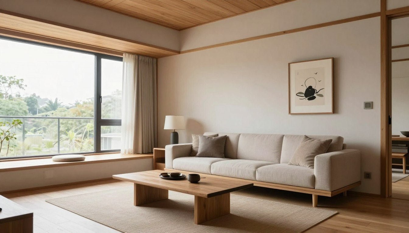

Leave a comment
This site is protected by hCaptcha and the hCaptcha Privacy Policy and Terms of Service apply.