Creating a warm-toned living room goes beyond simply choosing beige paint. It's about crafting an environment that feels simultaneously inviting and sophisticated, where earthy palettes, rich textures, and thoughtfully selected abstract art work in harmony. The most successful warm interiors balance undertones, incorporate strategic contrast, and layer textures to create spaces that feel grounded yet elevated. This comprehensive guide will walk you through creating warm living spaces that radiate intentional design rather than dated "Tuscan kitchen" vibes, with special attention to selecting abstract art that perfectly complements these earthy palettes.
Quick Answer (TL;DR)
- Warm-toned living rooms feature colors with yellow, red, or orange undertones (cream, sand, camel, terracotta, rust)
- Always identify undertones before selecting warm colors to ensure cohesion (yellow-beige vs. pink-beige)
- The most successful warm rooms pair a neutral base with 1-2 accent colors and incorporate black or navy for contrast
- Layer different textures (linen, boucle, wood, brass) to enhance warmth without relying solely on color
- Choose abstract art that either complements your palette (tonal pieces) or provides contrast (black/white with warm accents)
- Scale matters—art should occupy approximately 2/3 of the wall space above furniture
- Lighting dramatically affects warm colors; test samples in your actual space before committing
What "Warm-Toned" Really Means (Undertones Matter)
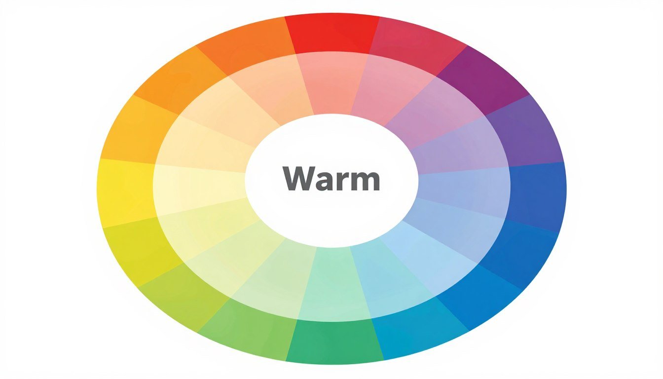
Warm-toned colors occupy the red, orange, and yellow segments of the color wheel, along with their various tints, shades, and combinations. Unlike cool colors (blues, greens, purples) that recede and create a sense of expansiveness, warm colors visually advance, making spaces feel more intimate and embracing. The distinction isn't merely theoretical—it's rooted in how we perceive and respond to these hues psychologically. Warm colors evoke associations with sunlight, fire, and earth, triggering responses that range from energizing to nurturing.

Warm colors occupy the red, orange, and yellow segments of the color wheel, creating intimate, embracing spaces
Warm beige vs warm gray (greige) vs camel vs clay
Understanding the subtle differences between warm neutrals is crucial for creating sophisticated spaces. Warm beige has yellow undertones that create a sunny, golden quality. Warm gray (often called "greige") combines gray with beige for a more sophisticated neutral that works well in contemporary settings. Camel introduces more yellow-brown undertones for a rich, leather-like quality that pairs beautifully with wood. Clay and terracotta colors have red-orange undertones that add earthiness and depth, connecting interiors to natural landscapes.

The subtle differences between warm neutrals: warm beige, greige, camel, and clay (left to right)
How to read undertones in daylight vs evening light
Perhaps the most crucial aspect of working with warm colors is understanding how lighting affects undertones. Colors can shift dramatically between daylight and artificial lighting. North-facing rooms receive cooler light that can make warm colors appear more muted, while south-facing rooms get golden light that enhances warmth. To accurately assess undertones, examine colors at different times of day and under various lighting conditions.
The secret to sophisticated warm interiors lies not in avoiding warm colors altogether, but in understanding how to select and combine them with intention and restraint.
A simple test: place your color samples against a pure white background. Yellow undertones will appear more golden, red undertones will look slightly pink or orange, and brown undertones will seem more neutral. This comparison approach is essential for creating cohesive palettes that feel intentional rather than haphazard.
The Earthy Palette Playbook (Pick One Base + Two Accents)
The most successful warm-toned living rooms follow a simple formula: one dominant neutral base color paired with two complementary accent colors. This approach creates depth and interest while maintaining cohesion. Let's explore four versatile warm palettes that work beautifully in contemporary living spaces.
Cream + oak + black (modern warm minimal)
This palette creates a light, airy foundation with cream walls and upholstery, warmed by oak furniture and architectural elements, then anchored with black accents for contrast and definition. The result is a minimal yet warm space that feels both contemporary and timeless.

Modern warm minimal palette: cream walls provide an airy foundation, oak adds natural warmth, and black accents create definition
Perfect abstract art pairings for this palette include minimalist pieces with high contrast (black and white with subtle warm accents) or tonal cream pieces with textural elements that add depth without disrupting the calm aesthetic. Look for canvas prints with simple geometric forms or subtle organic shapes.
Sand + terracotta + olive (Mediterranean warmth)
This earthy combination evokes Mediterranean landscapes with sand-colored walls and larger elements, terracotta accents that add rich warmth, and olive green touches that provide a natural counterpoint. The palette feels grounded and organic while remaining sophisticated.

Mediterranean warmth palette: sand-colored walls with terracotta accents and olive green elements create an earthy, organic feel
Abstract art that works well with this palette includes pieces with earthy terracotta and olive tones, especially those with organic forms that echo natural landscapes. Textural abstract pieces with visible brushstrokes or mixed media elements enhance the organic quality of this palette.
Camel + rust + ivory (collected vintage warmth)
This rich, layered palette combines camel (a sophisticated yellow-brown) with deeper rust tones and ivory for contrast. It creates a collected, vintage feel that's perfect for spaces that tell a story through thoughtfully curated elements.

Collected vintage warmth palette: camel leather creates a rich base, rust adds depth, and ivory provides contrast
For this palette, look for abstract art with rich, painterly qualities that incorporate rust and camel tones. Vintage-inspired abstracts with a sense of history work particularly well, as do pieces with visible texture that add to the collected, layered aesthetic.
Warm taupe + brass + charcoal (grown-up neutral)
This sophisticated palette uses warm taupe (a complex neutral with subtle pink-brown undertones) as its foundation, accented with brass for warmth and luster, and charcoal for depth and definition. The result is a refined, grown-up space that feels both contemporary and timeless.

Grown-up neutral palette: warm taupe creates a sophisticated foundation, brass adds warmth and luster, and charcoal provides depth
Abstract art that complements this palette includes sophisticated pieces with subtle color variations and rich textures. Look for works that incorporate charcoal and taupe with perhaps a hint of metallic to echo the brass elements. Pieces with architectural qualities or geometric forms often work well with this more refined palette.
Texture Layering That Makes Warm Rooms Look Expensive
Texture is the secret ingredient that elevates warm-toned living rooms from ordinary to extraordinary. By thoughtfully layering different textures, you create visual interest and tactile richness that adds depth and sophistication to your space. Let's explore the key texture categories that work beautifully in warm interiors.
Soft texture (boucle/linen)
Soft textures invite touch and create comfort in warm-toned spaces. Boucle, with its looped, nubby surface, adds visual interest and a contemporary feel to upholstery and pillows. Linen, with its natural slubs and casual elegance, brings an organic quality that complements earthy palettes perfectly. Combining these textures with warm colors creates inviting spaces that feel both comfortable and sophisticated.

Soft textures: boucle (left) adds contemporary visual interest while linen (right) brings natural, casual elegance
Natural texture (jute/wood/stone)
Natural textures ground warm palettes and connect interiors to the outdoors. Jute rugs and accessories add rough, organic texture that contrasts beautifully with smoother elements. Wood, especially in varieties with visible grain like oak or walnut, brings warmth and character. Stone elements, from marble with warm veining to rougher travertine or limestone, add natural variation and subtle pattern.

Natural textures: jute, oak, and warm-toned stone add organic elements that ground warm palettes
Reflective texture (brass/aged metal)
Reflective elements add dimension and life to warm-toned rooms by catching and playing with light. Brass, with its warm golden tone, complements earthy palettes beautifully while adding a touch of elegance. Aged or patinated metals bring character and depth, their imperfect surfaces telling a story of time and use. These reflective textures create subtle movement as light changes throughout the day.

Reflective textures: brass and aged metal add dimension and life by catching and playing with light
One "quiet" wall moment (plaster/limewash optional)
Creating one "quiet" textural moment on a wall adds subtle depth without overwhelming the space. Techniques like plaster or limewash add dimension through their slightly uneven application and the way they interact with light. These treatments create a sophisticated backdrop for art and furnishings while adding architectural interest to the room.

A "quiet" textural wall moment: subtle plaster finish adds dimension without overwhelming the space
For a truly sophisticated warm-toned living room, consider adding sculptural elements that incorporate these textural qualities. Three-dimensional pieces create interesting shadows and provide focal points that enhance the layered, collected feel of the space.
The most sophisticated warm interiors rely on texture as much as color to create depth and interest. A monochromatic room in warm tones can still be visually rich when it incorporates varied textures.
The Best Abstract Art Pairings for Warm Rooms
Abstract art can either complement or contrast with your warm-toned living room, depending on the mood you want to create. The key is understanding how different abstract styles interact with warm palettes to create cohesive, sophisticated spaces. Let's explore the most effective abstract art pairings for warm-toned rooms.
Tonal abstracts (cream/sand/camel) for calm
Tonal abstract pieces that stay within the same color family as your walls and larger furnishings create a serene, harmonious environment. These works, often featuring subtle variations in neutral tones, add visual interest without disrupting the calm atmosphere. They're perfect for spaces where relaxation is the priority.

Tonal abstract art in cream and sand creates a serene, harmonious environment in this warm neutral living room
When selecting tonal abstract art, look for pieces with subtle textural elements or variations in finish (matte vs. slight sheen) to add depth without relying on strong color contrasts. These warm-toned abstract canvas prints work beautifully in spaces where you want to maintain a cohesive, enveloping atmosphere.
High-contrast abstracts (black/ivory) for structure
High-contrast abstract art featuring black and ivory creates architectural interest and visual structure in warm-toned rooms. These pieces add definition and prevent warm spaces from feeling too soft or undefined. They're particularly effective in minimal warm interiors where they can serve as a focal point.

High-contrast black and ivory abstract art adds architectural interest and visual structure to this warm minimal living room
For high-contrast pieces, consider the balance between black and ivory—too much black can feel heavy in an otherwise warm space, while too little may not provide enough definition. The most successful high-contrast pieces for warm rooms often incorporate a small amount of a warm accent color that ties them to the overall palette.
Clay + rust accents (sienna, umber) for depth
Abstract art featuring clay and rust tones adds rich depth to warm-toned living rooms. These earthy hues—sienna, umber, terracotta, rust—create a sophisticated palette that feels grounded and natural. They're ideal for spaces where you want to enhance the warmth without introducing competing colors.

Abstract art with clay and rust tones adds rich depth and earthy sophistication to this warm living room
When selecting abstract art with clay and rust accents, look for pieces with depth and variation within these tones rather than flat, uniform color. Pieces that show the artist's hand through visible brushwork or textural elements enhance the organic, earthy quality that makes these colors so appealing.
Soft green accents (olive/sage) to cool warmth slightly
Abstract art with soft green accents provides a refreshing counterpoint to warm-toned rooms. Colors like olive and sage are particularly effective because they're muted enough to complement rather than compete with warm palettes. These natural green tones add balance and prevent warm spaces from feeling too hot or overwhelming.

Abstract art with olive and sage green accents provides a refreshing counterpoint that balances this warm-toned living room
For the most harmonious effect, choose abstract pieces where the green elements are integrated with warmer tones rather than isolated or dominant. This creates a natural transition that feels organic rather than jarring. You can browse by palette and mood to find pieces that achieve this perfect balance.
When to add blue (only as a small counterpoint)
Blue can be tricky in warm-toned rooms, but when used sparingly and thoughtfully, it can add an unexpected freshness. The key is using blue as a small counterpoint rather than a dominant element. Deep, muted blues like navy or indigo work better than bright or cool blues, as they provide contrast without disrupting the warm atmosphere.

Abstract art with small navy blue accents creates an unexpected counterpoint in this warm camel and rust living room
When considering abstract art with blue elements for a warm room, look for pieces where the blue is either very dark (navy/indigo) or very muted (slate blue with gray undertones). These variations integrate more harmoniously with warm palettes than bright or primary blues.
Scale & Placement Rules (So It Doesn't Disappear)
Even the perfect abstract art for your warm-toned living room can fall flat if it's not properly scaled or placed. Understanding a few key principles will ensure your art makes the impact it deserves while enhancing your overall design.
Above-sofa sizing (use the 2/3 guideline subtly)
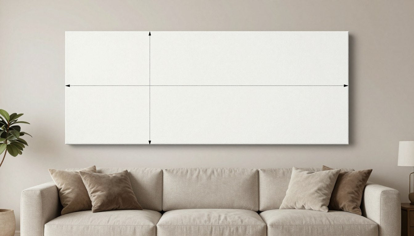
For art above a sofa, aim for a piece or grouping that occupies approximately two-thirds of the sofa's width. This proportion creates visual balance without overwhelming the space. The bottom edge of the art should hang 8-10 inches above the sofa back—close enough to feel connected but not so close that people might bump into it when seated.

Proper art sizing and placement: the artwork occupies approximately 2/3 of the sofa width and hangs 8-10 inches above the sofa back
Consider the height of your ceilings when determining the vertical scale of your art. In rooms with standard 8-foot ceilings, lower and wider pieces often work better than tall, narrow ones. For higher ceilings, you can explore larger vertical pieces or stacked arrangements. Learn more about choosing the right scale for above-sofa walls in our detailed guide.
One statement piece vs curated pair
Deciding between one large statement piece or a curated pair depends on your space and the effect you want to create. A single large piece creates a bold focal point and often has more impact in a warm-toned room, allowing the art to make a clear statement. A curated pair or small grouping can create a more collected, intentional feel and allows you to introduce more subtle variation in color and style.

A single large statement piece creates a bold focal point in this warm-toned living room

A curated pair of complementary pieces creates a more collected, intentional feel
If choosing a pair or grouping, maintain cohesion through consistent framing, complementary colors, or similar artistic styles. The pieces should relate to each other while still offering enough variation to create interest. For the most sophisticated effect, avoid perfect matching and instead look for pieces that converse with each other.
Spacing, frames, and matte finishes
The details of how you present your abstract art can significantly impact how it reads in your warm-toned living room. For spacing in grouped arrangements, maintain consistent gaps of 2-3 inches between pieces to create a cohesive collection. Frame selection should complement both the art and your room's palette—natural wood frames enhance warmth, while black frames add definition and contemporary edge.

Framing options for warm-toned rooms: natural wood enhances warmth, black adds definition, and floating frames create a contemporary feel
For most abstract art in warm-toned rooms, matte finishes are preferable to high gloss, as they reduce glare and allow the colors and textures to read more clearly. If your room receives significant natural light, consider anti-glare glass or acrylic for framed pieces to ensure the art remains visible from all angles throughout the day.
The right frame doesn't compete with the art but rather completes it, creating a finished presentation that enhances both the artwork and the room.
Common Mistakes (and quick fixes)
Even with the best intentions, creating a warm-toned living room with perfect art pairings can involve some trial and error. Here are the most common mistakes people make when styling warm interiors, along with practical solutions to fix them.
Too beige → add contrast + shape
One of the most common pitfalls in warm-toned rooms is ending up with a space that feels flat and one-dimensional—the dreaded "too beige" problem. This happens when there's insufficient contrast in both color and form, resulting in a room where everything blends together without visual interest.

Before: A flat, one-dimensional space where everything blends together

After: Added contrast and interesting shapes create dimension
The fix: Introduce elements with strong contrast and distinctive shapes. Add a piece of abstract art with bold forms or high contrast between light and dark. Incorporate black or very dark brown accessories, lamp bases, or picture frames. Consider a sculptural element with an interesting silhouette that stands out against the neutral background. These additions create visual "punctuation" that gives the eye places to rest and creates dimension in the space.
Too orange → cool with olive/charcoal/ivory
Another common issue occurs when warm-toned rooms tip too far into the orange spectrum, creating a space that feels overwhelming or dated (reminiscent of the "Tuscan kitchen" trend of the early 2000s). This happens when too many elements have yellow-orange or red-orange undertones without sufficient balancing elements.

Before: An overwhelmingly orange space that feels dated

After: Cooling elements create balance and contemporary feel
The fix: Introduce colors that visually cool and balance the orange without fighting it. Olive green works beautifully as it's still a natural, earthy tone but provides a complementary balance to orange. Charcoal gray (rather than true black) adds sophistication and grounds the space. Ivory (rather than stark white) lightens without creating harsh contrast. Look for abstract art that incorporates these cooling elements while still harmonizing with your warm base tones.
Busy textures + busy art → simplify one side
A third common mistake is creating visual chaos by combining highly textured furnishings with busy, complex art. While texture and visual interest are important, when every element in the room is competing for attention, the result can be overwhelming and unfocused.

Before: Visual chaos with too many competing elements

After: Simplified art creates harmony with the textured elements
The fix: Create balance by simplifying either the art or the textures in the room. If you love highly textured furnishings (bouclé sofa, woven pillows, chunky throws), choose more minimal, tonal art with simpler forms. Conversely, if you're drawn to complex, detailed abstract art, pare back the textures in your furnishings to create a more neutral backdrop. The goal is to create a clear hierarchy where either the art or the furnishings take the lead, with the other elements playing a supporting role.
Earthy Palette → Abstract Art Pairing Matrix
Finding the perfect abstract art for your warm-toned living room becomes simpler with this comprehensive pairing guide. Use this matrix to identify the most harmonious combinations based on your room's palette, and discover the specific elements that will create a cohesive, sophisticated space.
| Room Palette | Best Abstract Style | Ideal Color Notes in Art | Texture Pairing Tip | Frame Recommendation | Avoid This |
| Cream/Oak/Black | Minimal geometric with clean lines | Ivory, black, subtle oak or camel accents | Linen upholstery enhances the minimal warmth | Thin black frame or natural oak | Busy patterns that disrupt the minimal aesthetic |
| Sand/Terracotta/Olive | Organic forms with visible brushwork | Terracotta, olive, sand with umber accents | Rough natural fibers (jute, sisal) enhance earthiness | Natural wood with visible grain | Cool blues or purples that fight the warm palette |
| Camel/Rust/Ivory | Expressive with rich texture | Rust, camel, ivory with sienna depth | Leather and bouclé create rich textural contrast | Warm brass or antiqued gold | Flat, digital-looking prints without texture |
| Taupe/Brass/Charcoal | Sophisticated geometric or architectural | Taupe, charcoal, subtle metallic accents | Velvet adds luxurious depth to the refined palette | Thin brass or charcoal with clean lines | Rustic or overly casual elements |
| Greige/Walnut/Stone | Tonal wash with subtle depth | Greige, stone gray, walnut with ivory highlights | Smooth stone and rough linen create balanced contrast | Walnut or gray-washed wood | High-contrast elements that disrupt the subtle palette |
Warm Room Art Checklist
- Confirm undertone compatibility between your walls, furnishings, and the art
- Include at least one element of contrast (dark accent) to prevent flatness
- Ensure the art repeats at least one color from your room's palette
- Consider the texture of the art itself (canvas, textured paper, etc.)
- Choose frame finishes that complement your room's metal or wood tones
- Scale the art appropriately for the wall space (2/3 rule for above furniture)
- Test the art in different lighting conditions before final placement
- Consider how the art looks from different seating positions in the room
- Balance busy art with simpler furnishings (or vice versa)
- Add picture lighting for important pieces to enhance their presence
- Group smaller pieces with consistent spacing (2-3 inches apart)
- Ensure the art adds either harmony or intentional contrast to the space
Explore our full art collection to find pieces that perfectly complement your warm-toned living room palette.
Recommended Next Reads

Discover 6 Modern Art Styles You Need to Know
Explore the most influential modern abstract styles and learn which ones pair perfectly with warm-toned interiors.
Read Article
Ultimate Guide to Art Print Sizes
Learn how to choose the perfect size art for any wall in your home, with special attention to those tricky above-sofa spaces.
Read Article
Wabi-Sabi Principles for Warm Interiors
Discover how the Japanese concept of finding beauty in imperfection can enhance your warm-toned living space.
Read ArticleFAQ
What colors count as a warm-toned living room palette?
Warm-toned living room palettes include colors with yellow, red, or orange undertones. These range from neutral options like cream, sand, beige, camel, and warm taupe to more saturated hues like terracotta, rust, amber, and sienna. Earth tones like olive green can also work within warm palettes despite being technically cooler, as they complement and balance the warmer elements. The key is identifying the undertones—warm colors typically evoke sunlight, fire, or earth, creating spaces that feel intimate and embracing rather than cool and expansive.
What abstract art looks best with beige or cream walls?
Beige or cream walls offer a versatile backdrop for various abstract art styles. For a harmonious look, consider tonal abstract pieces in similar warm neutrals with subtle variations that add depth without contrast. For more visual interest, high-contrast abstract art with black or charcoal elements against ivory or cream creates sophisticated definition. Pieces with warm accent colors like terracotta, rust, or camel can introduce color while maintaining cohesion. The wall's specific undertone matters—yellow-beige walls pair well with golden or amber accents, while pink-beige walls harmonize better with rose or terracotta elements.
How do I keep an earthy living room from feeling too brown?
To prevent an earthy living room from feeling too brown, incorporate strategic contrast and variation. Add black or charcoal elements for definition and sophistication. Introduce texture through different materials—smooth leather, rough jute, soft linen—to create visual interest beyond color. Incorporate plants or abstract art with green accents to add freshness while maintaining an earthy feel. Use varying tones within the brown family (from light sand to rich walnut) rather than a single brown shade. Finally, ensure proper lighting with layers of ambient, task, and accent lighting to highlight textures and prevent the space from feeling flat or dark.
Should warm rooms use black frames or wood frames?
Both black and wood frames can work beautifully in warm-toned rooms, but they create different effects. Black frames add contemporary definition and create clear boundaries for the artwork, making them ideal for high-contrast or minimal abstract pieces. They're particularly effective in modern warm spaces with clean lines. Wood frames enhance the warmth and organic quality of the room, creating a more seamless integration between art and space. The wood tone should complement other wood elements in the room for cohesion. For the most versatile approach, you might use black frames for high-contrast art and wood frames for pieces with warmer, more organic qualities.
What accent colors work with terracotta and camel?
Terracotta and camel create a rich, warm foundation that pairs beautifully with several accent colors. Olive green offers a natural complement that balances the warmth while maintaining an earthy feel. Deep navy or indigo provides sophisticated contrast without the starkness of black. Charcoal gray adds definition and grounding. For a more vibrant palette, small accents of burnt orange or rust can intensify the warmth, while muted sage green provides a cooler counterpoint. Ivory or cream lightens the palette and prevents it from feeling too heavy. When selecting abstract art for terracotta and camel rooms, look for pieces that incorporate one or more of these complementary accent colors.
How big should abstract art be above a sofa in a warm living room?
Abstract art above a sofa in a warm living room should generally follow the two-thirds rule—the art (or art grouping) should occupy about two-thirds of the sofa's width for visual balance. For a standard 84-inch sofa, this means art around 56 inches wide. Height depends on your ceiling and wall space, but typically 24-36 inches works well for standard 8-foot ceilings. The bottom edge should hang 8-10 inches above the sofa back—close enough to feel connected but not so close that people might bump it. In warm-toned rooms, properly scaled art is particularly important as it helps anchor the space and prevents the warmth from feeling diffuse or undefined.
Can olive green work in a warm neutral living room?
Olive green works exceptionally well in warm neutral living rooms, offering a perfect complementary accent that balances warmth without disrupting the earthy palette. As a muted, natural green with yellow undertones, olive harmonizes with warm neutrals like cream, sand, camel, and terracotta while adding depth and visual interest. It prevents warm spaces from feeling too orange or one-dimensional. Incorporate olive through abstract art, textiles, or even plants for a connection to nature. For the most sophisticated effect, choose olive with a slightly muted quality rather than a bright, saturated green, and pair it with warm neutrals that have yellow or red undertones rather than pink undertones.
What lighting makes warm palettes look best (and not yellow)?
Lighting dramatically affects how warm palettes appear in a living room. To enhance warm tones without making them look yellow or orange, choose bulbs with a color temperature between 2700K and 3000K (warm white). This range provides warmth without the yellow cast of very warm bulbs (2400K or lower). Avoid cool white bulbs (3500K+) as they can make warm colors appear dull or muddy. Layer lighting with ambient, task, and accent sources to create depth and highlight textures. Natural light is ideal during the day—north-facing rooms receive cooler light that balances warmth, while south-facing rooms get golden light that enhances it. Always test paint colors and art placement under both natural and artificial lighting before finalizing decisions.
Ready to Transform Your Warm-Toned Living Room?
Discover our curated collection of abstract art pieces perfectly suited to complement and elevate your warm-toned living space. From tonal neutrals to pieces with earthy accents, find the perfect pairing for your palette.
Explore the Collection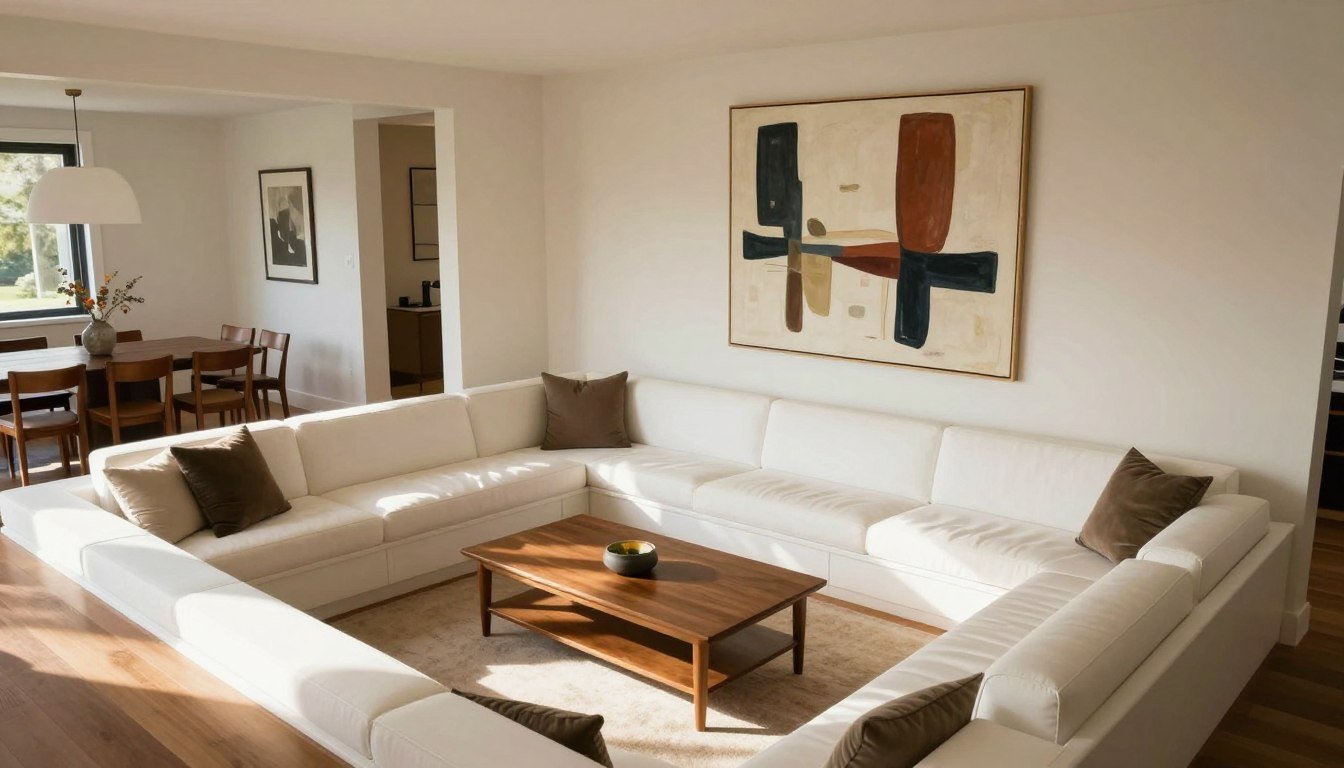

Leave a comment
This site is protected by hCaptcha and the hCaptcha Privacy Policy and Terms of Service apply.