The right wall art arrangement ideas can turn blank walls into captivating focal points that define your entire room. Whether you're planning a gallery wall or positioning a single statement piece, understanding the principles of arrangement transforms how your space feels and functions.
Most people struggle with where to start when arranging artwork. The walls feel empty, but the fear of making mistakes keeps prints stacked in closets.

Mastering Gallery Wall Layouts That Create Visual Interest
A gallery wall brings together multiple pieces of artwork to create a unified display. Start by arranging your prints on the floor before touching the walls. This approach lets you experiment with layouts without creating unnecessary holes.
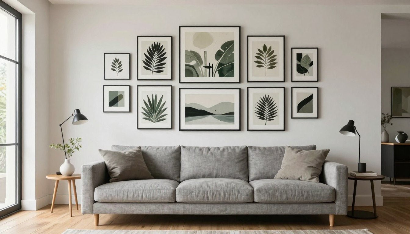
The grid layout works beautifully for spaces where you want clean, organized visual impact. Arrange frames in perfect rows and columns with equal spacing between each piece. This method suits modern interiors and looks especially striking with Black & White Canvas Prints or Line Art Canvas Prints where consistency in style matters.


The Salon Style Gallery Wall
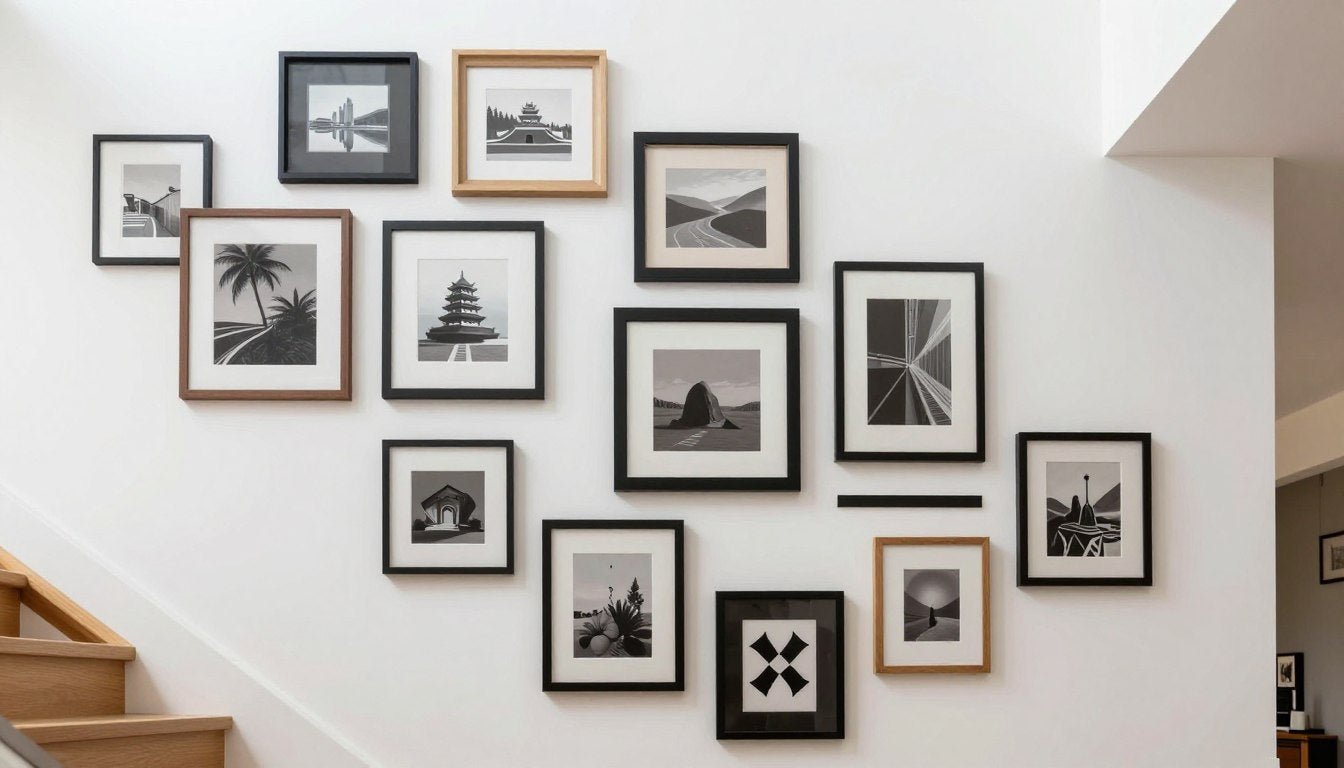
Salon style arrangements embrace organized chaos. Mix different sizes, orientations, and frame styles while maintaining consistent spacing between pieces. The key is keeping gaps uniform at two to three inches throughout your display.
Start with your largest piece first. Position it at eye level, then build outward. This becomes your anchor point that guides the rest of your arrangement. Eye level typically sits at 57 to 60 inches from the floor, matching standard gallery height.
Pro Tip: Create paper templates of each frame size and tape them to the wall first. This lets you perfect your gallery wall layout before hammering a single nail.

Horizontal Line Gallery Arrangement
The horizontal line layout creates a sophisticated look above furniture pieces. Align the bottom edges of all frames along an invisible horizontal line. This works perfectly above sofas, beds, or console tables in your living room.
Keep your arrangement width roughly two-thirds the width of your furniture below. This proportion creates visual balance without overwhelming the space. Mix pieces of varying heights while maintaining that crucial bottom alignment.


Vertical Gallery Wall Arrangements
Vertical arrangements draw the eye upward and make rooms feel taller. This approach works wonderfully in narrow wall spaces like hallways or beside doorways. Stack two to five pieces vertically with consistent spacing.
The vertical gallery emphasizes height rather than width. Use this technique to balance tall furniture or architectural features. Gallery-quality prints from Canvas Print Sets often come pre-coordinated for vertical displays.

The Frame Within a Frame Technique
This creative layout uses a large central piece surrounded by smaller artworks that create a frame effect. The outer pieces should relate to the center artwork through color, style, or theme. This arrangement naturally draws attention to your focal point.
Maintain equal spacing between all pieces to preserve the frame illusion. The outer artwork acts as a border that enhances rather than competes with the center piece. This works beautifully with Abstract Canvas Prints as central statements.

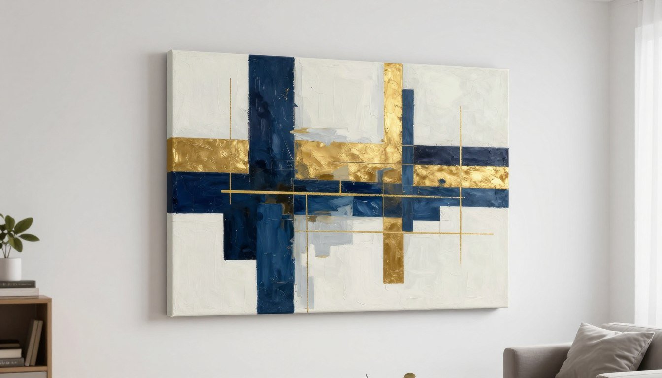
Creating Focal Points with Large Statement Pieces
A single large piece of wall art creates instant drama and serves as the room's focal point. This approach suits spaces where you want one powerful statement rather than multiple competing elements. The large piece should command attention without overwhelming the room.
Position your statement artwork centrally on the main wall you see when entering the space. This placement ensures maximum impact. The piece should be large enough to anchor the wall without leaving awkward empty spaces around it.

Sizing Your Statement Piece
The right size transforms your artwork from decoration to focal point. For walls above furniture, your art should span two-thirds to three-quarters of the furniture width. A 90-inch sofa pairs beautifully with a 60 to 68-inch wide canvas.
For standalone walls without furniture, consider the wall space itself. Leave 12 to 24 inches of empty wall on each side of large artwork. This breathing room prevents the piece from feeling cramped or the wall from feeling cluttered.


Positioning at the Perfect Height
Eye level remains the golden rule for hanging wall art. The center of your artwork should sit at 57 to 60 inches from the floor. This height works whether viewers are standing or seated, making it the universal standard galleries use.
Above furniture, adjust this rule slightly. Leave 6 to 12 inches of space between your furniture top and the artwork bottom. This creates visual connection without making the piece feel like it's sitting on the furniture.
Measurement Formula: To find the nail height, measure your artwork height, divide by two, add 57 inches, then subtract the distance from the wire to the frame top. This calculation ensures perfect eye level placement every time.

Balancing Large Art with Room Elements
Your statement piece should relate to other room elements through color, style, or mood. Look at your existing furniture, textiles, and color palette. The artwork can either complement these elements or provide intentional contrast.
A large piece with bold colors creates drama in neutral spaces. Conversely, a subtle Botanical Wall Art Print brings calm to colorful rooms. Consider the room's purpose when selecting your focal point artwork.


Lighting Your Focal Point
Proper lighting transforms good artwork into stunning focal points. Add picture lights, track lighting, or adjustable wall sconces to illuminate your statement piece. Light should hit the artwork evenly without creating glare on glass or glossy surfaces.
Natural light also affects how your art looks throughout the day. UV-resistant prints maintain their color and quality even in bright rooms. Rossetti Art's gallery-quality canvas prints feature archival inks that resist fading from sunlight exposure.

Pairing Large Art with Minimal Decor
When your focal point is a large piece of wall art, keep surrounding decor minimal. The artwork should be the star. Avoid competing elements like busy patterns or multiple decorative objects in the immediate visual field.
Choose one to three complementary accessories maximum. A simple console table below the art or a sculptural floor lamp beside it provides balance without distraction. The goal is directing eyes to your statement piece, not dividing attention.

📐 Not Sure What Size to Choose?
Use our free Wall Art Size Calculator to find the perfect dimensions for your space. Get instant recommendations based on your wall and furniture measurements.
Symmetrical Gallery Wall Arrangements for Balanced Spaces
Symmetrical gallery walls bring order and calm to spaces through balanced, mirrored arrangements. This approach works beautifully in formal rooms, above beds, or flanking architectural features like fireplaces. The symmetry creates a sense of intentional design that feels both planned and polished.
True symmetry means each side mirrors the other perfectly. Choose an odd number of total pieces with one central artwork, or an even number split equally between both sides. The arrangement radiates from a central vertical axis.

The Classic Symmetrical Grid
The symmetrical grid uses identical frames arranged in perfect rows and columns. Four or six pieces work especially well for this layout. Keep spacing equal both horizontally and vertically between all frames for true grid symmetry.
This arrangement suits spaces where you want formality and structure. Dining rooms, home offices, and master bedrooms benefit from the calm order a symmetrical grid provides. Canvas Print Sets often come pre-coordinated for grid arrangements.


Flanking a Central Focal Point
Place one large central piece with smaller matching artworks on each side. The side pieces should be identical in size and positioned at the same height. This creates a triptych effect that emphasizes your central focal point while maintaining balance.
Measure carefully to ensure equal spacing between the center piece and each flanking artwork. The gap on the left should exactly match the gap on the right. This precision separates professional-looking symmetrical arrangements from ones that feel slightly off.

Vertical Symmetrical Stacks
Create symmetry by stacking identical frames vertically on each side of a central element. This works beautifully flanking windows, doors, or tall furniture pieces. Each vertical stack should mirror its opposite in number, size, and spacing of pieces.
The vertical symmetrical approach emphasizes height and creates frame-like borders around architectural features. Keep frames within each stack closely spaced at two to three inches apart, while maintaining wider spacing between the stacks and central feature.

Symmetrical Arrangements Above Furniture
Above sofas or beds, symmetrical arrangements create hotel-like polish. The simplest approach uses two identical large pieces hung side by side with a small gap between them. Each piece should be the same height from the furniture top.
For a more elaborate symmetrical gallery, create matching clusters on each side of a central axis. If you have three pieces on the left of center, mirror them with three pieces on the right. The arrangement reads as one unified, balanced display.


Breaking Symmetry Intentionally
Near-symmetry creates visual interest while maintaining most of the balanced feeling. Keep the overall arrangement symmetrical but vary one or two elements slightly. Different artwork in identical frames, or the same art in slightly different frame styles creates this effect.
This approach feels less rigid than perfect symmetry while retaining the calm, organized quality. The eye reads the arrangement as balanced even though elements don't mirror exactly. It's symmetry with personality, perfect for spaces that blend formal and relaxed styles.

Living Room Wall Art Styling Techniques
The living room demands special attention for wall art arrangement ideas because it's where you spend the most time and entertain guests. Your art choices and arrangements set the entire room's mood. Whether your style leans modern, traditional, or eclectic, thoughtful arrangement makes the difference between decorated and designed.
Start by identifying your living room's focal wall. This is typically the wall you see first when entering, or the wall behind your main seating area. This wall deserves your largest or most impactful art arrangement.

Above the Sofa Arrangements
The wall above your sofa is prime real estate for wall art. A single large piece creates drama, while a gallery wall arrangement adds personality and visual interest. The artwork should span roughly two-thirds of the sofa's width for proper proportion.
Hang artwork so the bottom edge sits 6 to 10 inches above the sofa back. Too high makes the art float awkwardly. Too low creates a cramped feeling. This specific spacing connects the furniture and art visually while maintaining breathing room.


Corner Gallery Wall Solutions
Empty corners often get neglected in wall art arrangements, but they offer wonderful opportunities. A corner gallery wraps around the angle, treating two walls as one continuous display space. This approach works especially well in open-concept living rooms where defining zones matters.
Start with a statement piece on one wall, then extend smaller coordinating prints around the corner onto the adjacent wall. Maintain consistent spacing throughout. The arrangement should feel like it flows naturally around the corner rather than stopping abruptly at the angle.

Creating Conversation Areas with Art
Use wall art to define conversation zones within larger living rooms. Hang art directly behind or above seating clusters to anchor each area visually. The art becomes part of the furniture grouping, making the space feel intentionally zoned rather than arbitrarily divided.
Scale matters when defining zones. Larger seating areas deserve larger or more complex art arrangements. A small reading nook might need just one medium piece, while your main seating cluster could showcase a full gallery wall. The art should feel proportional to the furniture group it anchors.

Styling Around TVs and Media Centers
Incorporating wall art around televisions and media centers challenges many people. The TV itself is a visual focal point that competes with artwork. The solution is treating the TV as part of a larger gallery wall arrangement rather than fighting against it.
Frame the TV with symmetrical artwork on each side and possibly above if wall space allows. Keep frames and artwork simple so they complement rather than compete with the screen. When the TV is off, the gallery wall takes over as the focal point. Black & White Canvas Prints work especially well in media wall arrangements because they don't compete with colorful TV content.

Fireplace Wall Arrangements
Fireplaces present unique arrangement challenges because they already serve as architectural focal points. Your wall art should enhance rather than compete with the fireplace. A single statement piece centered above the mantel creates classic symmetry.
For modern spaces, consider asymmetrical arrangements that start at the mantel and extend upward and to one side. This contemporary approach acknowledges the fireplace while adding unexpected visual interest. Keep art at least 6 inches above the mantel to prevent heat damage and maintain proper proportion.


Coordinating Art with Living Room Color Schemes
Your wall art arrangement should relate to your living room's existing color palette. Pull one or two colors from your sofa, rugs, or curtains and find artwork featuring those hues. This creates cohesion without requiring exact matching.
Alternatively, use art to introduce an accent color you want more of in the space. If your living room is mostly neutral, bold Abstract Canvas Prints inject personality and color. If the room already has strong colors, consider artwork in complementary or analogous tones that enhance rather than clash.

Seasonal and Rotating Displays
Consider making your living room wall art arrangement flexible enough to rotate pieces seasonally. This keeps your space feeling fresh without major redesigns. Invest in a consistent frame style you can swap artwork into, or use a picture rail system that allows easy changes.
Rotate between different collections based on season or mood. Bright Botanical Wall Art Prints feel perfect for spring and summer, while moodier abstracts suit fall and winter. This approach maximizes your art investment while keeping your living room dynamic.

Working with Different Sizes and Frame Styles
Mixing different sizes of wall art creates dynamic, interesting arrangements that feel collected rather than bought all at once. The key is finding balance between variety and cohesion. Too much variation feels chaotic, while too much matching feels sterile.
Start with one large piece as your anchor, then add medium and small pieces around it. This size hierarchy guides the eye and prevents visual confusion. Your largest piece should be at least twice the size of your smallest for clear visual hierarchy.

The Large, Medium, Small Method
This proven formula works for any gallery wall. Choose one large piece, two to three medium pieces, and three to five small pieces. Arrange them so the large piece anchors one area, medium pieces bridge spaces, and small pieces fill gaps.
Keep spacing consistent between all pieces regardless of size. The gaps should measure the same whether between large and medium pieces or between two small pieces. Consistent spacing unifies different sizes into one cohesive arrangement.


Balancing Horizontal and Vertical Orientations
Mix landscape and portrait orientations to create visual interest. A wall filled with all horizontal or all vertical pieces lacks the dynamic quality that mixed orientations provide. Aim for roughly 60-40 split between orientations.
Use horizontal pieces to emphasize width and create calm. Vertical pieces draw eyes upward and add energy. The interplay between these orientations creates movement that keeps viewers engaged with your gallery wall longer.

Matching Frames vs. Mixed Frame Styles
Matching frames create cohesion and make disparate artwork feel connected. All black frames or all natural wood frames unify the display regardless of the art itself. This approach works beautifully when artwork styles vary widely.
Mixed frame styles work when artwork itself provides visual connection through color or theme. Combine black metal, wood, and white frames if your prints share a color palette. The mixed frames add personality while the color continuity prevents chaos.


Working with Odd Numbers
Odd numbers of pieces generally create more visually pleasing arrangements than even numbers. Three, five, or seven pieces feel more dynamic and less rigid than two, four, or six. This principle applies whether you're hanging a small cluster or a large gallery.
The exception is symmetrical arrangements where even numbers split equally on each side. For asymmetrical galleries, stick with odd numbers. They're easier to balance visually because the center piece naturally anchors the composition.

Creating Balance with Different Sizes
Visual balance doesn't mean physical symmetry. Balance different sizes by considering visual weight. A large dark piece has more visual weight than a small light piece. Position heavier pieces lower or toward the center, with lighter pieces higher or toward edges.
Distribute sizes throughout your arrangement rather than clustering all large pieces together. Scatter different sizes in a way that makes the eye move around the entire gallery. This creates rhythm and prevents dead zones where the eye never travels.

Floor to Ceiling Arrangements
Dramatic floor-to-ceiling gallery walls maximize wall spaces in rooms with high ceilings. Start at floor level and build upward. This approach makes rooms feel intentionally designed rather than leaving awkward empty space above standard art heights.
Use a step stool or ladder to reach upper pieces safely. Place larger pieces at eye level where they get the most attention, with smaller pieces filling space above and below. This creates a museum wall effect that works beautifully with Canvas Print Sets designed to work together.

Transitioning Between Rooms
Extend gallery walls from one room into the next to create flow in open-concept spaces. The arrangement transitions naturally around corners or doorways, making separate areas feel connected. Use consistent frame styles or a cohesive color story in the artwork to tie spaces together.
As the wall continues into the new room, you can gradually shift the arrangement style while maintaining elements that connect back to the first space. This creates journey through your home rather than disconnected room experiences.

Frequently Asked Questions About Wall Art Arrangement Ideas
Q: How far apart should pictures be on a gallery wall?
A: Keep spacing between frames consistent at 2 to 3 inches throughout your gallery wall. This gap is wide enough to let each piece breathe while close enough to read the arrangement as one unified display. Measure and mark spacing carefully before hanging to maintain consistency across all pieces.
Larger gaps of 4 to 6 inches work for more relaxed, casual arrangements, but anything beyond 6 inches makes the collection feel disconnected rather than intentionally grouped.
Q: What is the rule of thumb for hanging pictures on a wall?
A: The center of your artwork should sit at 57 to 60 inches from the floor, which represents average eye level. This standard height works whether you're standing or seated and matches what professional galleries use worldwide.
Above furniture, adjust this rule by leaving 6 to 10 inches between the furniture top and artwork bottom, ensuring visual connection while maintaining proper proportion.
Q: Should all frames in a gallery wall be the same color?
A: Matching frame colors create instant cohesion, especially when artwork styles vary significantly. All black frames or all natural wood frames unify diverse pieces into one collected look. This approach is the safest choice for beginners.
Mixed frame colors can work when artwork provides visual connection through shared colors or themes. The key is maintaining some consistent element—either matching frames OR matching art colors, not complete variety in both.
Q: How do I arrange pictures on a wall without making mistakes?
A: Create paper templates of each frame size and tape them to your wall first. This lets you experiment with different arrangements without putting holes in the wall. Try multiple layouts until you find one that feels balanced and intentional.
Take photos of each arrangement option and review them later. What looks good in person might photograph differently, and photos help you see your arrangement with fresh perspective before committing to nail holes.
Q: What size art should go above a sofa?
A: Artwork above a sofa should span two-thirds to three-quarters of the sofa's width. For a standard 84-inch sofa, choose art or a gallery wall arrangement that spans 56 to 63 inches wide. This proportion looks intentional without overwhelming the furniture.
Leave 6 to 10 inches between the sofa back and the artwork bottom. This spacing connects the furniture and art visually while preventing the cramped feeling that occurs when art sits too low.
Q: Can I mix portrait and landscape orientations in one gallery wall?
A: Absolutely. Mixing portrait and landscape orientations creates dynamic visual interest that engages viewers longer than single-orientation galleries. Aim for a 60-40 split between orientations for natural balance.
Horizontal pieces create calm and emphasize width, while vertical pieces add energy and draw eyes upward. This interplay between orientations creates movement that makes your gallery wall feel alive and intentionally curated.
Q: Should gallery wall art match room colors exactly?
A: Art should coordinate with room colors but doesn't need exact matching. Pull one or two accent colors from your existing textiles or furniture and find artwork featuring those hues. This creates cohesion without feeling overly matched.
Alternatively, use art to introduce new accent colors you want more of in the space. If your room is mostly neutral, colorful artwork injects personality. If the room already has strong colors, artwork in complementary tones enhances without creating visual competition.
Your walls hold incredible potential to transform ordinary rooms into spaces that reflect your style and elevate daily living. These wall art arrangement ideas provide the foundation to create displays that feel professionally designed.
Start with one wall. Choose an arrangement style that matches your space and comfort level. Remember that eye level placement, consistent spacing, and thoughtful scale create successful arrangements every time.

The right artwork makes your arrangement complete. Gallery-quality prints on hand-stretched canvas with archival inks ensure your carefully planned arrangement maintains its beauty for years. Oak floater frames and pine wood frames add the finishing touch that elevates prints to professional art pieces.
Explore our Canvas Print Sets designed to work together beautifully, or discover individual pieces from our Abstract Canvas Prints and Line Art Canvas Prints collections. Each piece is made to order with UV-resistant inks that maintain color even in bright rooms.
Transform Your Space with Gallery-Quality Canvas Prints
Each Rossetti Art print features archival inks on hand-stretched canvas with your choice of premium frames. Made to order for your space.
Leave a comment
This site is protected by hCaptcha and the hCaptcha Privacy Policy and Terms of Service apply.