Abstract wall art has a quiet power. It transforms blank walls into conversation pieces without demanding attention or declaring a single meaning. The beauty lies in its openness—what you see in bold brushstrokes, geometric shapes, or splashes of colour is entirely yours to interpret.
Whether you live in a minimalist flat or a maximalist home bursting with texture, abstract art adapts. It complements rather than competes, anchors rather than overwhelms.
[BANNER LINK HERE]
What Is Abstract Wall Art?
Abstract wall art refers to visual art that doesn't attempt to represent reality accurately. Instead, it uses colours, shapes, forms, and textures to create compositions that exist independently of the physical world. Think splashes of gold against navy blue, geometric lines intersecting in unexpected ways, or soft washes of turquoise blending into cream.
Unlike figurative or landscape art, abstract paintings don't show you a face, a tree, or a cityscape. They show you emotion, energy, movement—sometimes chaos, sometimes calm.

This style emerged in the early 20th century when artists like Wassily Kandinsky and Piet Mondrian began experimenting with non-representational forms. Today, abstract art prints remain one of the most popular choices for home décor because they're endlessly versatile.
The Appeal of Abstract Paintings
Abstract art invites interpretation. One person might see freedom in chaotic brushstrokes, while another finds calm in balanced shapes. This subjectivity makes it deeply personal—no two viewers experience the same piece identically.

For homeowners, this flexibility is invaluable. Abstract wall art works with nearly any design style—Scandi minimalism, industrial lofts, mid-century modern spaces, or eclectic bohemian rooms. It's the rare art form that truly adapts to its surroundings.
Common Styles Within Abstract Art
Abstract art isn't monolithic. It spans several distinct styles, each with its own aesthetic language:
- Geometric abstraction: Clean lines, precise shapes, and structured compositions—think circles, squares, and triangles arranged with intention.
- Expressionist abstraction: Emotional, gestural brushstrokes that convey energy and movement, often with bold, contrasting colours.
- Minimalist abstraction: Simplified forms, limited colour palettes, and generous negative space for a calm, uncluttered effect.
- Colour field abstraction: Large blocks or washes of colour that create immersive visual experiences.

Why Abstract Art Works in Any Room
One of the most compelling reasons to choose abstract wall art is its adaptability. Unlike themed art—beach scenes for coastal homes, floral prints for cottages—abstract pieces don't lock you into a single narrative or style.
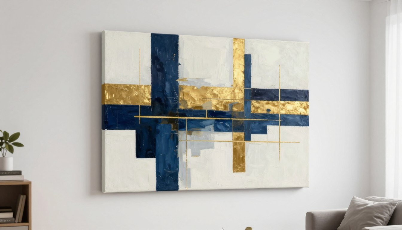
They complement existing furniture and colour schemes rather than competing with them. A navy and gold abstract canvas print, for instance, can anchor a neutral living room or add sophistication to a bolder, more colourful space.

Emotional and Visual Impact
Abstract art can shift the mood of a room. Warm colours—reds, oranges, golds—inject energy and warmth. Cool tones like turquoise, navy, and grey create calm and focus. The interplay of shapes and texture adds depth without clutter.
This emotional versatility makes abstract paintings ideal for any room in your home. A vibrant piece can energise a kitchen or dining area, while a soft, muted print brings tranquillity to a bedroom.

Flexibility Across Design Styles
Whether your home leans minimalist, industrial, traditional, or eclectic, abstract art adapts. Pair a minimalist print with Scandi furniture for cohesion, or use a bold expressionist piece to add contrast to a monochrome space.
Abstract art also ages well. Unlike trend-driven art (think motivational quotes or overly specific pop culture references), abstract designs remain visually interesting and relevant for years.
[BANNER LINK HERE]
Choosing Colours and Shapes for Your Space
Selecting abstract wall art starts with understanding your space—not just its physical dimensions, but its mood, function, and existing colour palette. The right piece enhances your room rather than clashing with it.
Colour Psychology in Abstract Art
Colours carry emotional weight. Warm tones (reds, oranges, yellows, and gold) evoke energy, optimism, and warmth. They work beautifully in social spaces like living rooms, dining areas, and kitchens where you want to encourage conversation and activity.

Cool colours (blues, greens, purples, and turquoise) promote calm, focus, and relaxation. These shades suit bedrooms, home offices, and bathrooms where you seek tranquillity or concentration.
Neutral palettes—blacks, whites, greys, and creams—offer versatility. They ground a room without dominating, making them ideal for spaces with bold furniture or patterned textiles.

Matching Art to Existing Décor
You don't need to match colours exactly—complementary contrasts often work better. If your room features warm wood tones and cream upholstery, a piece with navy, gold, and white can add depth without clashing.
Consider the 60-30-10 rule: 60% dominant colour (walls, large furniture), 30% secondary colour (smaller furniture, textiles), and 10% accent colour. Your abstract art can reinforce or provide that accent.
Shape and Composition
Geometric shapes—circles, squares, triangles—bring structure and order. They suit modern, minimalist, or Scandinavian interiors where clean lines and symmetry matter.

Organic, flowing shapes evoke nature and movement. Soft curves and fluid forms work well in eclectic, bohemian, or transitional spaces where comfort and warmth take priority.
Texture also matters. A heavily textured piece—whether through brushstrokes or the weave of the canvas—adds tactile interest, making the art feel three-dimensional even from across the room.
📐 Not sure what size to choose? Use our free Wall Art Size Calculator to find the perfect dimensions for your wall.
Room-by-Room Placement Guide for Abstract Wall Art
Where you place abstract art matters as much as what you choose. Each room serves a different function, and the right piece can enhance its purpose.
Living Room: The Statement Wall
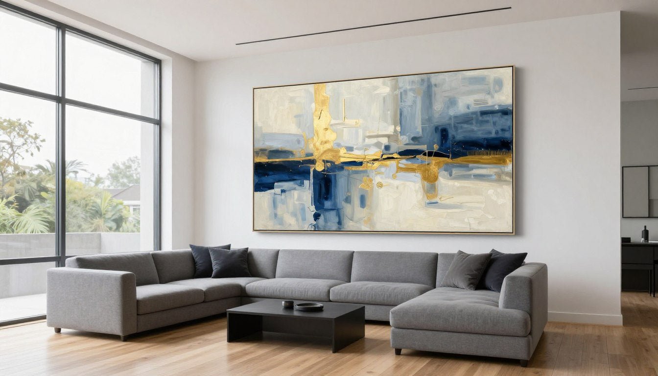
Your living room is often the heart of your home—the place where you entertain, relax, and spend most of your time. Abstract art here should command attention without overwhelming the space.

Hang a large piece above your sofa or fireplace to create a focal point. Aim for the centre of the artwork to sit at eye level (approximately 145-150 cm from the floor). If you're using a canvas set of two or three pieces, space them 5-10 cm apart for visual balance.
For smaller living rooms, avoid oversized prints. A single medium-sized canvas or a pair of smaller pieces can feel more proportionate.
Bedroom: Calm and Cohesion
Bedrooms benefit from softer, more subdued abstract paintings. Cool tones—blues, greens, purples—promote rest, while muted golds and creams add warmth without overstimulation.

Place your print above the headboard, ensuring it's proportionate to the bed's width. A good rule: the art should span roughly two-thirds to three-quarters of the bed's width.
Kitchen and Dining Room: Energy and Warmth
Kitchens and dining areas thrive on energy. Abstract art with warm colours—reds, oranges, golds—encourages appetite and conversation.

Hang art on a feature wall opposite seating areas so it's visible from the table. Keep pieces away from splashes and steam—canvas prints with UV-resistant finishes and archival inks hold up better in these environments.
Home Office: Focus and Inspiration
For a home office, choose abstract art that inspires without distracting. Geometric designs with clean lines and limited colour palettes promote focus. Position art within your line of sight—across from your desk or slightly to the side—so it provides visual breaks without pulling attention from work.

Why Canvas Quality Matters for Abstract Art
Not all abstract canvas prints are equal. The difference between a mass-produced print and a gallery-quality piece is visible—and lasting.
Archival Inks and UV Resistance
Cheap prints fade. Within months, vibrant colours dull and lose their impact. Gallery-quality canvas prints use archival inks that resist fading for decades. Look for UV-resistant finishes that protect against sunlight damage, especially if your art hangs near windows.

Rossetti Art prints are crafted with archival inks and UV-resistant coatings, ensuring your art stays as vivid on your wall as the day you hung it.
Hand-Stretched Canvas
Mass-produced prints often use thin, flimsy canvases that sag over time. Hand-stretched canvas over solid wooden frames maintains tension and shape for years. The canvas wraps around the frame edges (gallery wrap), creating a polished, frameless look that works in modern interiors.
Quality stretching also eliminates visible staples or creases, giving your print a professional finish straight out of the box.

Frame Options: Pine Wood and Oak Floater Frames
While many abstract prints work beautifully unframed, adding a pine wood frame or oak floater frame elevates the presentation. Floater frames create a "floating" effect, leaving a small gap between the canvas and frame for a contemporary, gallery-style look.
Rossetti Art offers both natural pine and oak floater frames, each made to order to match your chosen print dimensions perfectly.
Made to Order vs. Mass Production
Made to order means your print is created specifically for you—no sitting in a warehouse for months. This approach ensures freshness, quality control, and the ability to customise sizes to fit your exact wall dimensions.
[BANNER LINK HERE]
Styling Tips for Abstract Prints
Choosing the right abstract wall art is half the battle—styling it well completes the transformation.
Single Large Statement Piece
One oversized abstract canvas can anchor an entire room. Centre it above a sofa, bed, or console table. Ensure there's breathing room—leave at least 15-20 cm of space on either side and avoid crowding with too many decorative objects.

Canvas Set Arrangements
A canvas set of two or three matching prints creates visual rhythm. Hang them in a horizontal row at equal heights with consistent spacing (5-10 cm apart). Alternatively, arrange them vertically in a narrow space like a hallway or stairwell.

For diptych or triptych sets, treat them as one unified piece. Align the centre of the entire grouping at eye level, not each individual canvas.
Mixing Abstract Art with Other Styles
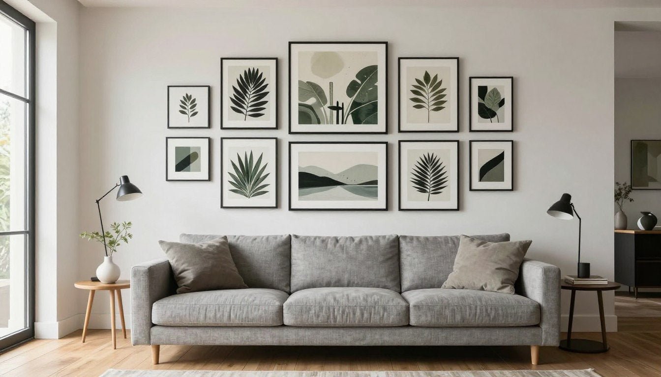
Abstract prints pair beautifully with other art styles. Combine a bold abstract piece with black and white photography, line art canvas prints, or botanical wall art for an eclectic gallery wall.

Keep frames consistent (all natural wood, all black, or all white) to maintain cohesion across different art styles.
Lighting Considerations
Lighting can make or break your art display. Natural light brings out colours during the day, but ensure UV-resistant protection to prevent fading. Add picture lights or adjustable spotlights for evening drama, angling them to avoid glare.
Scale and Proportion
Art that's too small for a wall looks lost; art that's too large overwhelms. Measure your wall space and aim for art that covers roughly 60-75% of the available width. For walls above furniture, ensure the art is narrower than the furniture piece below it.
Frequently Asked Questions
Q: What does abstract wall art mean?
A: Abstract wall art refers to non-representational art that uses colours, shapes, and textures to create visual compositions without depicting recognisable objects or scenes. It prioritises emotion, form, and aesthetic experience over realistic representation.
Q: How do I choose the right size abstract canvas for my wall?
A: Measure your wall space and choose art that covers 60-75% of the available width. For walls above furniture, the art should be narrower than the piece below. Use our Wall Art Size Calculator for precise recommendations based on your dimensions.
Q: What colours work best for abstract art in small rooms?
A: Light, cool tones—soft blues, greens, turquoise, and neutral greys—make small rooms feel more open and airy. Avoid overly bold or dark colours that can visually shrink the space. Subtle textures and minimalist compositions also work well.
Q: Can I mix abstract art with other art styles?
A: Yes. Abstract prints pair beautifully with line art, botanical prints, black and white photography, and even figurative portraits. Keep frames or colours consistent across pieces to maintain visual cohesion in gallery wall arrangements.
Q: What's the difference between cheap and gallery-quality canvas prints?
A: Gallery-quality prints use archival inks that resist fading, UV-resistant coatings, and hand-stretched canvas over solid wood frames. Cheap prints often use inferior inks that fade quickly, thin canvases that sag, and lack protective finishes. Quality prints maintain their vibrancy and structure for decades.
Q: Should I frame my abstract canvas print?
A: It depends on your style preference. Gallery-wrapped canvases (where the image wraps around the edges) look polished unframed and suit modern interiors. Adding a pine wood frame or oak floater frame elevates the presentation and works well in traditional or transitional spaces.
Final Thoughts on Abstract Wall Art
Abstract art offers something rare in home décor: timeless versatility. It adapts to your space, reflects your personality, and transforms blank walls into meaningful focal points—all without dictating a single interpretation.
Whether you're drawn to bold geometric shapes, expressive brushstrokes, or soft colour fields, there's an abstract piece that fits your home. The key is choosing quality—gallery-quality prints with archival inks, hand-stretched canvas, and UV-resistant finishes that last for years.

Ready to find your perfect piece? Explore our Abstract Canvas Prints collection—each print is made to order and crafted with care.
Leave a comment
This site is protected by hCaptcha and the hCaptcha Privacy Policy and Terms of Service apply.