
The wall art you choose today will either elevate your space for years to come or scream "that was so 2025" before the calendar even flips. The difference between trendy and timeless is not about avoiding trends altogether. It is about understanding which movements have staying power and which are fleeting decorative fads.
This guide cuts through the noise. You will discover what actually works in 2026 and why certain styles transcend the moment. No mass-produced mall art. No cookie-cutter prints that five thousand other homes already display. Just wall art that feels current without feeling disposable.
The art you hang shapes how you experience your home every single day. Choose pieces that grow with you rather than ones you will want to replace in eighteen months.
Why Most Trendy Wall Art Feels Cheap Within Months

The wall art industry has a saturation problem. When a specific style trends on social platforms, manufacturers flood the market with identical variations. Within weeks, that once-fresh aesthetic becomes visual wallpaper that no one actually sees anymore.
Mass production strips away the elements that make art feel special. The texture disappears. The color depth flattens. The composition becomes predictable. What looked interesting in a curated photo shoot feels generic when you encounter the same piece in three different homes.
The speed of trend cycles has accelerated dramatically. A style that might have felt current for three or four years now peaks and fades within twelve months. This creates an expensive cycle of replacement for anyone chasing every microtrend.
True staying power comes from pieces with inherent visual interest. Texture that catches light differently throughout the day. Composition that reveals new details over time. Colors that work within multiple design schemes. These qualities cannot be mass-produced at scale.
The Timeless Test: If you can find twenty nearly identical versions of a piece online within five minutes, it will feel dated quickly. Uniqueness is not just about aesthetics; it is about longevity.
Three Prints That Capture Timeless Modern Elegance
Understanding principles matters, but seeing them in practice makes the difference. These three pieces exemplify how current trends translate into lasting style. Each represents a different approach to modern wall art that transcends the moment.

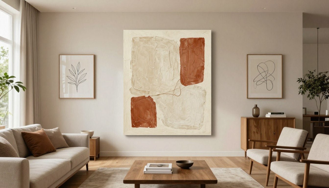
Organic Abstraction
This piece demonstrates how abstract art avoids dating itself. The organic shapes and earthy color palette work across design styles. The visible canvas texture adds physical depth that photographs cannot capture. Five years from now, this will still feel current because it never tried to be overly trendy.

Refined Line Work
Line art has trended for several years, but this elevated approach ensures longevity. The sophisticated execution and restrained composition separate it from cheaper versions. The technique draws from classical sketching traditions while feeling thoroughly modern. This bridges the gap between trend and timelessness.

Botanical Precision
Botanical prints connect to centuries of artistic tradition. This modern interpretation maintains the detail and precision of classic botanical illustration while using contemporary color palettes. Nature-based art consistently outlasts other trends because it taps into something fundamental rather than fashionable.
The Seven Trends Worth Investing In for 2026

Not all trends are created equal. Some represent genuine shifts in how we think about art and interiors. Others are superficial aesthetic changes that will fade. These seven trends have the foundation to remain relevant well beyond 2026.
Each of these movements draws from established artistic traditions while responding to contemporary sensibilities. They offer visual interest without relying on shock value or novelty. Most importantly, they adapt well to evolving personal taste and design schemes.
Textured Art That Changes with the Light

Flat digital prints dominated wall art for too long. The pendulum has swung decisively toward pieces with physical dimension. Texture transforms static artwork into something that evolves throughout the day as natural light shifts across its surface.
This trend encompasses several techniques. Heavy impasto paint creates sculptural surfaces. Mixed media incorporates actual materials like fabric or metal. Layered resin adds depth and luminosity. Even high-quality printing on textured canvas provides more visual interest than smooth finishes.
The appeal extends beyond aesthetics. Textured art engages touch as well as sight. It creates a more immersive sensory experience. This multidimensional quality is something digital screens cannot replicate, which gives physical art renewed relevance in an increasingly virtual world.
Why Texture Matters
Human brains are wired to notice and appreciate texture. Smooth digital prints trigger less neural engagement than pieces with physical dimension. Studies in environmental psychology show that textured surfaces in living spaces reduce stress and increase satisfaction with the environment.
From a practical standpoint, texture disguises imperfections better than flat surfaces. Minor variations in lighting or small wall irregularities become less noticeable. The piece itself becomes the focal point rather than the wall condition.

When selecting textured pieces, prioritize genuine texture over printed simulation. Some manufacturers print photographs of textured paintings onto flat canvas. This defeats the purpose entirely. The piece should have actual physical dimension you can see from an angle and feel if you touch it.
Consider how your room's lighting will interact with textured surfaces. Rooms with strong directional light from windows showcase texture beautifully. Spaces with only overhead lighting might require additional accent lighting to bring out dimensional qualities.
Expert Tip: Original paintings and hand-embellished prints offer the most dramatic texture. If budget is a concern, look for canvas prints with applied gel medium or varnish that adds dimension to the surface.
Minimalist Line Art with Maximum Impact

Line art has evolved from a passing trend into a legitimate artistic movement. The key distinction lies in execution quality. Sophisticated line art demonstrates genuine drawing skill and compositional understanding. Mass-market versions often rely on digital filters applied to photographs.
The best line art balances simplicity with complexity. A single continuous line can suggest an entire figure or landscape through careful placement and weight variation. This economy of means requires significant skill to execute well, which is precisely why quality pieces stand out.
Line art works exceptionally well in spaces where visual calm matters. Bedrooms, home offices, and reading nooks benefit from art that provides interest without demanding constant attention. The minimalist approach complements rather than competes with the space itself.

Identifying Quality Line Art
- Lines show intentional weight variation, not uniform thickness
- Composition demonstrates understanding of positive and negative space
- Subject matter goes beyond obvious trending images
- Drawing quality would stand up as a traditional sketch
- Artist signature or attribution indicates original creation
The line art trend connects to broader cultural movements toward minimalism and intentionality. As living spaces become smaller and lives feel more cluttered, visual simplicity offers psychological relief. Art that says more with less aligns with these values.
For those seeking to incorporate this trend, consider creating a curated line art collection rather than purchasing a single piece. Three to five coordinated line drawings create more impact than one isolated print. Vary the subjects while maintaining consistent style and framing for cohesion.
Black and white remains the classic choice, but contemporary line art increasingly explores color. Terracotta, sage, or navy lines on cream backgrounds add warmth while maintaining the minimalist aesthetic. This approach bridges the gap between stark minimalism and warmer design schemes.
Abstract Expressionism for Contemporary Spaces

Abstract art represents the ultimate timeless category because it never depicted anything specific to begin with. While representational art can feel dated when styles change, abstraction remains perpetually open to interpretation. This flexibility ensures lasting relevance.
Contemporary abstract art draws heavily from mid-century expressionism while incorporating modern color theories and materials. The result feels both familiar and fresh. Collectors appreciate the connection to established art movements while enjoying thoroughly current aesthetics.
Scale matters significantly with abstract pieces. A small abstract print can feel like an afterthought. A properly scaled canvas commands attention and anchors the room. The general rule suggests artwork should occupy roughly two-thirds to three-quarters of the furniture width below it.
Color selection in abstract art determines versatility. Pieces dominated by a single bold color make strong statements but limit decorating flexibility. Multi-color abstracts with a cohesive palette work with evolving room designs. Neutral-heavy abstracts with strategic color accents offer maximum adaptability.
Abstract Art Subcategories Trending in 2026
- Organic abstraction with flowing, nature-inspired forms
- Geometric abstraction featuring structured shapes and patterns
- Color field painting emphasizing large areas of solid color
- Mixed media abstraction incorporating varied materials
- Textured abstraction with heavy impasto techniques

When investing in abstract canvas prints, prioritize pieces that provoke an emotional response. Abstract art works through feeling rather than narrative. If a piece creates a mood or atmosphere that resonates, it will likely maintain that power over time.
Original abstract paintings command significantly higher prices than prints, but they offer unique qualities. No two original pieces are identical. The texture, color depth, and surface quality surpass any reproduction. For significant wall space or important rooms, original abstract paintings justify the investment.
Curated Gallery Walls That Tell a Story

The gallery wall trend has matured significantly. Early iterations often felt chaotic and overwhelming. Current approaches emphasize curation and cohesion. A successful gallery wall looks collected over time rather than purchased in a single afternoon.
The foundation of a strong gallery wall is a unifying element. This might be a consistent color palette, similar framing, related subject matter, or complementary artistic styles. Without this thread connecting the pieces, the wall reads as cluttered rather than curated.
Scale variation creates visual interest while avoiding monotony. Mix larger anchor pieces with smaller supporting works. The largest piece typically occupies a prominent position, with surrounding pieces arranged to balance the composition. Odd numbers of pieces generally create more dynamic arrangements than even numbers.
The Rule of Three
Start with three core pieces that anchor your gallery wall. These should be your favorites and largest works. Everything else supports these anchors. This approach prevents the wall from feeling aimless or overwhelming.
Frame Consistency
Limit yourself to two or three frame styles maximum. Mixing gold, silver, black, white, and wood frames creates visual chaos. Choose a primary frame style with one complementary option at most. This restraint lets the art shine.
Spacing Standards
Maintain consistent spacing between frames. Professional galleries typically use two to three inches. This spacing creates cohesion while allowing each piece to breathe. Varying spacing makes arrangements look unintentional.
Planning the layout before hanging prevents wall damage and disappointing results. Trace each frame on paper and arrange the templates on the wall with painter's tape. Live with the arrangement for a day or two before committing to nail holes. Adjustments are easy at this stage.
Consider room function when selecting gallery wall content. Living room wall art can be more bold and conversational. Bedroom gallery walls should emphasize calm and personal significance. Office spaces benefit from inspirational or energizing imagery.

The gallery wall trend persists because it solves a practical problem. Most people acquire art gradually over time. Gallery walls provide a framework for displaying these pieces together cohesively. As your collection grows, the gallery wall grows with it.
Bold Statement Pieces as Room Anchors

While gallery walls build impact through quantity, statement pieces achieve it through scale and presence. A single exceptional artwork can define an entire room. This approach requires confidence but delivers dramatic results when executed well.
Statement art should genuinely make you feel something. Whether that feeling is calm, energized, contemplative, or joyful matters less than the intensity of the response. Rooms need focal points, and powerful art provides this better than any furniture or architectural element can.
Scale requirements vary by room size, but the art should feel substantial rather than timid. In a standard living room with ten-foot ceilings, statement pieces typically measure at least forty inches on the shortest side. Larger rooms demand even more significant scale to maintain visual impact.
Selecting Your Statement Piece
Start by identifying which wall will host the piece. This determines orientation and size constraints. The wall should be visible from the room's main entry point. Avoid placing statement art where furniture will partially obstruct it.
Color considerations differ for statement pieces versus smaller art. Because the piece will dominate the room visually, its colors will influence all other design choices. Select something that either complements your existing palette or something bold enough to justify redesigning around.
Subject matter for statement art should have personal significance or emotional resonance. You will see this piece every day. Choosing something merely because it matches the couch guarantees eventual dissatisfaction. The connection should run deeper than coordinated colors.
Investment level deserves serious consideration. Statement art occupies premium visual real estate. This is not the place for budget compromises. Whether you choose an original painting or a high-quality large-scale print, prioritize quality over cost savings.

Lighting makes or breaks statement art. Dedicated picture lighting or strategically placed track lighting ensures the piece receives proper illumination. Many powerful artworks lose all impact when inadequately lit. Budget for lighting upgrades when planning for statement-scale art.
Installation Tip: Large-scale art requires proper mounting hardware. Standard picture hooks are insufficient. Use heavy-duty wall anchors rated for the artwork's weight plus fifty percent. Many statement pieces weigh forty pounds or more when framed.
Nature-Inspired Art Beyond Basic Botanicals

Nature has inspired art for millennia, which practically guarantees its staying power. However, 2026's approach to nature-inspired art has evolved beyond literal botanical prints and landscape photography. Contemporary pieces abstract natural forms into more sophisticated interpretations.
The trend encompasses several directions. Macro photography reveals unexpected beauty in natural details. Abstract paintings channel the colors and textures of landscapes without depicting specific scenes. Stylized botanical illustrations reimagine traditional forms through modern artistic lenses.
This evolution reflects broader cultural shifts toward environmental awareness and biophilic design. People increasingly recognize that connection to nature improves mental health and wellbeing. Art provides this connection for urban dwellers and others with limited access to natural spaces.

Contemporary Nature Art Categories
- Abstracted landscapes suggesting rather than depicting places
- Macro natural details creating unexpected compositions
- Stylized botanical forms with modern color treatments
- Nature-inspired textures and organic patterns
- Atmospheric environmental impressions
The advantage of nature-inspired art lies in its universal appeal and calming qualities. Research consistently shows that natural imagery reduces stress and improves mood. This makes it particularly appropriate for bedrooms, bathrooms, and other personal spaces where tranquility matters.
When selecting nature-inspired pieces, avoid overly literal or decorative interpretations. A sophisticated botanical canvas print should demonstrate artistic interpretation, not simply reproduce a plant photograph. The artist's perspective and style should be evident.
Color palettes in nature art have shifted from vibrant greens toward more complex earth tones. Terracotta, ochre, sage, and warm grays dominate current collections. These colors feel more sophisticated and integrate more easily into diverse design schemes than bright botanical greens.
Black and White Photography with Contemporary Edge

Black and white photography has never truly gone out of style, but its current iteration feels distinctly contemporary. Modern black and white art moves beyond classic landscape and portrait photography into more experimental territory. The medium itself remains timeless while the approach feels fresh.
Contemporary black and white work emphasizes graphic qualities, bold contrasts, and unexpected compositions. Photographers explore texture, pattern, and form without the distraction of color. This reduction to essential visual elements creates powerful, focused imagery.
The monochrome palette offers significant practical advantages. Black and white art integrates seamlessly with any color scheme. It provides visual interest without competing with room colors. This versatility means the pieces work through multiple design evolutions.
Advantages of Black and White Art
- Works with any interior color scheme
- Creates sophisticated, timeless aesthetic
- Emphasizes composition and form
- Pairs well with both modern and traditional design
- Easy to create cohesive collections
Considerations
- Can feel cold in spaces lacking warmth
- May not provide desired color accent
- Overuse creates monotonous aesthetic
- Requires strong composition to maintain interest
Subject matter in contemporary black and white photography ranges widely. Urban architectural details, intimate portraits, abstract textures, and minimalist landscapes all find audiences. The unifying factor is strong visual composition that holds up without color support.
Presentation matters significantly with black and white photography. The framing and matting choices affect how the work reads. Simple black or white frames maintain focus on the image. Natural wood frames add warmth that can balance the monochrome palette. Mat boards provide breathing room and enhance the gallery feel.

For those building black and white art collections, consistency in printing quality matters enormously. True black and white printing differs from simply desaturating color images. Proper black and white processing produces richer tonal ranges and more nuanced gray values.
Consider mixing black and white photography with other art forms rather than creating exclusively monochrome rooms. Strategic placement of black and white pieces among color works creates visual rhythm and prevents monotony. This approach maintains the sophistication of black and white while avoiding sterility.
Match These Trends to Your Space
Understanding trends matters little if you cannot translate them into your specific rooms. Each space has different requirements based on function, lighting, existing design elements, and personal needs. These curated collections help you navigate from trend knowledge to actual implementation.

Warm Organic Abstraction
Perfect for living spaces that need visual warmth without busy patterns. These pieces use earth-tone palettes and flowing organic forms. The abstractions suggest natural elements while remaining thoroughly contemporary. Ideal for rooms with neutral furnishings that need grounding energy.

Refined Minimalist Line Work
Designed for spaces requiring visual calm and sophistication. These pieces provide interest through elegant simplicity rather than complexity. The restrained palette and clean compositions work beautifully in bedrooms, home offices, and reading areas. They complement rather than compete with the space.

Bold Statement Compositions
For rooms that can handle dramatic focal points. These larger-scale pieces command attention and define the space around them. Rich colors and dynamic compositions create energy and conversation. Best suited for living rooms, dining areas, and entryways where impact matters.
Each collection represents a different approach to incorporating 2026 trends while maintaining timeless appeal. The pieces within each category share cohesive aesthetics that make creating unified room designs straightforward. Mix and match across collections carefully, ensuring connecting elements tie disparate styles together.
How to Identify Quality in Modern Wall Art

The wall art market contains vast quality variations at similar price points. Learning to identify genuine quality versus clever marketing protects your investment and ensures pieces that actually last. Quality differences become obvious once you know what to look for.
Print quality starts with resolution and color accuracy. Stand close to the artwork. You should not see individual pixels or color banding. Gradients should appear smooth, and details should remain crisp. Poor printing shows pixelation, especially in areas of color transition.
Canvas and Material Quality Indicators

Canvas quality varies dramatically. Premium canvas uses tighter weaves and better materials. Hold the canvas up to light. High-quality canvas shows consistent weave without thin spots. The material should feel substantial, not flimsy like fabric.
Stretcher bars matter more than most people realize. Cheap stretcher bars warp over time, distorting the artwork. Quality stretchers use kiln-dried wood with proper corner joints. The canvas should be stretched taut with even tension across the entire surface.
Gallery-wrapped canvases extend the image around the sides, eliminating the need for framing. This technique requires additional canvas and more complex printing. Check the corners specifically. Poor wrapping shows bunching or gaps at the corners. Professional wrapping maintains smooth, tight corners.
Quality Checklist for Canvas Prints
- Tight, even canvas weave without visible gaps
- Image wraps smoothly around edges without bunching
- Stretcher bars feel solid, not hollow or flimsy
- Canvas pulled uniformly tight across entire surface
- Colors appear rich and accurate without fading
- No visible pixelation when viewed up close
Red Flags Indicating Lower Quality
- Canvas feels thin like bedsheet material
- Stretcher bars visibly warp or bow
- Image appears dark or colors look washed out
- White borders appear along wrapped edges
- Hanging hardware feels cheap or inadequate
- Product descriptions avoid specific material details
The coating applied to canvas affects both appearance and longevity. Quality prints receive protective coatings that resist UV damage and moisture. Uncoated prints fade faster and risk damage from humidity. Ask specifically about protective treatments before purchasing.
Framing Standards That Signal Quality

Frames protect and present artwork. Quality framing uses real wood or metal, not plastic disguised to look like wood. Examine the corners closely. Well-constructed frames have tight mitered corners without gaps. The finish should appear even without drips or rough spots.
Glass or acrylic glazing protects framed prints. Standard glass works for most situations. UV-protective glass prevents fading but costs more. Acrylic weighs less than glass and resists breakage, making it preferable for large pieces or homes with children.
Matting creates space between the artwork and glass. This prevents condensation damage and adds visual breathing room. Mat board quality ranges from acidic paper that yellows and damages art to museum-grade conservation board. For pieces you want to keep long-term, conservation matting justifies the cost.
Professional Standard: Museum-quality framing uses conservation materials throughout. Acid-free mats, UV-protective glazing, and archival mounting techniques ensure artwork remains pristine for decades. This level matters most for original art and limited edition prints.
Hanging hardware reveals attention to detail. Quality pieces include appropriate hanging systems rated for the frame weight. D-rings or sawtooth hangers should be securely attached. Wire should be picture-hanging wire, not random string or household wire.
Artist Attribution and Authenticity

Legitimate art includes clear artist attribution. The artist's name should appear on the product description and ideally on the piece itself. Generic descriptions like "trendy wall art" without artist identification often indicate mass-produced, low-quality work.
For original art and limited editions, certificates of authenticity matter. These documents verify the piece's provenance and edition number if applicable. Reputable sellers provide certificates automatically. Absence of authentication for supposedly limited work raises red flags.
Reproductions of famous artworks require careful consideration. Public domain works can be reproduced legally, but quality varies enormously. Museum-quality reproductions use advanced printing techniques and premium materials. Cheap reproductions do injustice to the original artwork.
Research the artist when possible. Established artists typically have online portfolios or websites. Social media presence helps verify authenticity. If you cannot find any information about the supposed artist, question whether a real artist created the work.

Questions to Ask Before Purchasing
- Who created this artwork originally?
- Is this an original, limited edition, or open edition print?
- What printing technique was used?
- What materials comprise the canvas and frame?
- Does the piece include any authenticity documentation?
- What protective coatings or treatments were applied?
- What specific return policy applies to this purchase?
Pricing provides quality clues but not guarantees. Extremely low prices relative to size usually indicate compromised quality somewhere. However, high prices do not automatically ensure quality either. Evaluate based on specific quality markers rather than price alone.
Where Different Art Styles Work Best

Room function should influence art selection as much as personal taste. Certain styles naturally complement specific spaces while others create discord. Understanding these relationships prevents expensive mistakes and creates more harmonious environments.
The psychological effects of art vary by style and subject matter. Energizing pieces work well in social spaces. Calming art suits private retreats. Inspirational imagery benefits work areas. Matching art psychology to room purpose enhances how spaces feel and function.
Living Room Art Strategies

Living rooms accommodate the broadest range of art styles because they serve multiple functions. These spaces host guests, provide relaxation, and often connect to other areas. Art should feel substantial enough to anchor the room without overwhelming conversation and comfort.
Scale matters enormously in living rooms. Undersized art disappears in larger spaces. The primary piece should occupy significant visual real estate. For walls above sofas, the general guideline suggests art spanning two-thirds to three-quarters of the furniture width.
Color relationships between art and furnishings create either harmony or contrast. Art does not need to match your sofa exactly, but some color connection helps integration. Alternatively, bold contrasting art makes deliberate statements if that aligns with your design goals.
Living Room Art Recommendations
- Bold abstract pieces that serve as conversation starters
- Large-scale photography with dramatic subjects
- Statement pieces in styles you genuinely love
- Gallery walls showcasing collected works over time
- Original paintings when budget allows for impact
Consider sight lines when placing living room art. The primary piece should be visible from the main entry point. Additional pieces can occupy walls visible from seating areas. Art positioned behind furniture where no one sits rarely receives the attention it deserves.

Lighting can make or break living room art. Many living rooms rely primarily on overhead lighting, which often casts shadows on wall art. Adding picture lights or adjustable track lighting dramatically improves how art appears. Budget for proper lighting when investing in significant pieces.
The living room canvas art collection offers pieces specifically selected for their ability to anchor social spaces while maintaining sophisticated appeal. These works balance visual interest with approachability, creating environments that feel both elevated and comfortable.
Bedroom Art for Tranquility

Bedrooms require art that promotes relaxation rather than stimulation. This usually means softer colors, gentler compositions, and subjects that evoke peace rather than excitement. The last thing you see before sleep and first thing upon waking affects your psychological state.
Avoid jarring or unsettling imagery in bedroom art. Abstract art works well when it uses calming colors and flowing forms. Nature-inspired pieces tap into biophilic responses that reduce stress. Portraits and figures can work if they convey serenity rather than tension.
Color psychology plays a particularly important role in bedroom art. Blues and greens generally promote calm. Warm earth tones create cozy intimacy. Stark whites and blacks can feel too austere for sleep spaces unless balanced with warmer elements. Intense reds and oranges tend to energize rather than relax.
Ideal Bedroom Art
- Soft abstract compositions
- Minimalist line drawings
- Nature-inspired pieces
- Muted color palettes
- Flowing organic forms
Avoid in Bedrooms
- Busy complex patterns
- Aggressive bold colors
- Unsettling subjects
- Overstimulating imagery
- High-contrast graphics
Placement Tips
- Center above headboard
- Flanking pieces if space allows
- Opposite wall visible from bed
- Avoid ceiling installations
- Consider lighting carefully
Scale in bedrooms typically runs smaller than living rooms unless the room is particularly spacious. The art should feel proportional to the bed rather than the wall. Oversized pieces can overwhelm bedroom intimacy. Multiple smaller coordinated pieces often work better than single large statements.
Personal significance matters more in bedrooms than public spaces. This is your private retreat. Choose art that genuinely resonates with you rather than trying to impress others. The bedroom canvas print collection emphasizes pieces selected for their calming qualities and personal appeal.
Office and Workspace Inspiration

Office art should inspire and energize without distracting from work. The balance differs from both living rooms and bedrooms. You want stimulation that enhances focus rather than disrupts it. Strategic art choices can improve productivity and job satisfaction.
Abstract art works particularly well in offices. It provides visual interest during breaks without narrative content that might distract during focused work. Geometric abstractions often feel especially appropriate for professional environments, suggesting order and structure.
Inspirational imagery in offices walks a fine line. Overtly motivational pieces with text can feel clichéd. More subtle inspiration through powerful imagery or exceptional craftsmanship often resonates more authentically. Let the quality and subject speak rather than relying on printed affirmations.

Office Art Considerations
Color choices in office art can influence work mood. Blues and greens promote focus and calm. Warmer colors like orange energize and stimulate creativity. Neutral palettes with strategic color accents offer flexibility for different work modes.
Placement in offices requires thought about sight lines. Art directly behind your computer screen goes largely unseen. Better placement includes walls visible when you look up from work or areas you face during video calls. Background art in video calls creates professional impressions.
Size should remain moderate in most office spaces. Oversized pieces can dominate smaller rooms, making them feel less functional. Multiple smaller pieces allow for variety that can prevent visual boredom during long work hours.
The office canvas art collection includes pieces selected specifically for professional environments. These works balance visual interest with professional aesthetics, creating workspaces that feel both productive and personally meaningful.
For creative professionals, office art provides daily inspiration and reminds you why you do this work. For analytical professionals, it offers necessary right-brain stimulation to balance left-brain activities. Choose pieces that complement rather than contradict your work nature.
Dining Room Sophistication

Dining rooms present unique opportunities for art that might feel too formal elsewhere. These spaces typically host special occasions and gatherings. Art can enhance the sense of occasion while establishing sophisticated atmosphere.
Traditional still life paintings maintain relevance in dining spaces because they connect conceptually to the room's purpose. Contemporary interpretations of food and abundance work particularly well. However, abstract pieces or landscape art also succeed if they match the room's formality level.
Color warmth matters significantly in dining rooms. Warmer palettes make food appear more appealing and create inviting atmosphere for guests. Cooler colors can feel uninviting in spaces designed for gathering and nourishment. Consider how art colors affect the dining experience.
Dining Room Art Styles
- Contemporary still life interpretations
- Warm-toned abstract compositions
- Sophisticated botanical studies
- Elegant landscape or cityscape art
- Curated gallery walls above sideboards
Practical Considerations
- Avoid glass in areas where serving might cause breakage
- Consider how candlelight affects art appearance
- Choose pieces that spark conversation
- Scale appropriately to dining table size
- Ensure lighting highlights rather than creates glare
Lighting deserves special attention in dining rooms. Artwork should remain visible during dinner but not compete with table settings for attention. Dimmers allow you to adjust art visibility for different occasions. Wall sconces can provide dedicated art lighting separate from ambient room lighting.
The dining room wall art collection emphasizes pieces that enhance formal dining experiences while maintaining contemporary sophistication. These selections create atmosphere without overwhelming the primary function of gathering and sharing meals.
Ready to Hang Museum Quality Canvas
Bring Timeless Style to Your Walls
Every piece in our collection combines 2026's freshest trends with enduring artistic principles. You get ready-to-hang, museum-quality canvas that elevates your space immediately. Free worldwide shipping ensures your new art arrives safely, no matter where you live.
Our prints use premium materials and professional-grade printing that captures every color nuance and detail. The difference between mass-produced and truly elevated art becomes obvious the moment you unbox your piece. Gallery-wrapped edges eliminate framing needs while maintaining sophisticated presentation.

We understand that choosing art online requires trust. That is why we provide detailed images showing actual print quality, canvas texture, and color accuracy. What you see is precisely what arrives at your door. No disappointments. No surprises.
Our artist-focused approach means every piece connects to a real creator with a unique vision. You are not buying anonymous decoration. You are investing in artwork that carries intention, skill, and personal expression. This authenticity makes all the difference in how art feels in your home.
What Sets Our Prints Apart
- Museum-grade canvas with professional-tight weave
- Eco-solvent inks that resist fading for decades
- Hand-stretched on solid kiln-dried stretcher bars
- Protective coating guards against moisture and UV damage
- Gallery-wrapped edges for frameless contemporary look
- Mounted hanging hardware included with every piece
- Quality control inspection before shipping

Beyond canvas prints, we offer original paintings for those seeking one-of-a-kind pieces. Original art brings unmatched depth, texture, and presence to significant spaces. The investment in original work pays dividends in daily enjoyment and long-term value.
For those drawn to three-dimensional art, our modern sculpture collection provides textural contrast and spatial interest that flat artwork cannot achieve. Combining prints with sculptural elements creates layered, sophisticated interiors.
Common Mistakes When Choosing Wall Art

Understanding what not to do often provides as much value as knowing best practices. These common mistakes lead to disappointing results even when the individual pieces have merit. Avoiding these pitfalls saves money and creates better-looking spaces.
Buying Art to Match Existing Decor
One of the most limiting mistakes is selecting art solely to match your current sofa or curtains. This approach treats art as an accessory rather than a foundational design element. It also guarantees you will need new art every time you change other furnishings.
Strong art should influence your design scheme rather than submitting to it. Choose pieces that genuinely move you, then build your color palette around them. This creates spaces with authentic character rather than decorator-perfect rooms lacking soul.
Coordinating colors does not mean exact matching. Art can pull accent colors from your space without replicating dominant hues. In fact, introducing new colors through art often refreshes tired color schemes and adds depth to your palette.
Design Trap: Buying art at furniture stores alongside your sofa almost guarantees generic choices. Mass-market furniture retailers rarely curate interesting art. The pieces that match their sofas usually match thousands of other identical sofas.
Ignoring Scale and Proportion

Undersized art represents one of the most common and easily avoidable mistakes. A tiny print floating on a large wall looks apologetic rather than intentional. The art should occupy enough visual space to justify its presence.
Measure before purchasing. For art above furniture, the general rule suggests the piece should span 60 to 75 percent of the furniture width. For open walls, consider the entire wall size and surrounding elements. When in doubt, size up rather than down.
Hanging height matters as much as size. The center of the artwork should sit at eye level, typically 57 to 60 inches from the floor. Above furniture, leave 6 to 8 inches between the furniture top and the art bottom. These standards create proper visual relationships.
Scale Rules of Thumb
- Art above sofa: 60-75% of sofa width
- Art above bed: 50-75% of headboard width
- Gallery walls: Total collection should fill 60-75% of wall space
- Statement pieces: Minimum 30-40 inches on shortest side
- Open walls: Art should occupy 2/3 to 3/4 of intended wall section
Height Guidelines
- Standard height: 57-60 inches to art center
- Above furniture: 6-8 inches above furniture top
- Gallery walls: 57 inches to center of entire grouping
- High ceilings: Can adjust upward by 3-6 inches
- Hallways: Center at standing eye level, about 60 inches
Following Trends Without Personal Connection
Chasing trends without considering personal resonance leads to rooms that look styled but feel empty. You will live with your art daily. It needs to genuinely speak to you rather than just checking current trend boxes.
Trends provide helpful direction, but personal taste should guide final choices. If you hate abstract art, the fact that it trends in 2026 is irrelevant. Find your own intersection between current movements and authentic preference.
Ask yourself why a piece appeals to you beyond trendiness. Does it evoke emotions? Remind you of meaningful experiences? Demonstrate technique you admire? Purchases based on substantive connections outlast trend-only decisions.
"The best art for your home is art that you want to look at every day, not art that you think you should have."
Neglecting Lighting Considerations

Even exceptional art disappoints when poorly lit. Many people hang art without considering how light will hit it. The result is shadowed, dim artwork that never achieves its potential visual impact.
Natural light creates beautiful art illumination but changes throughout the day. Consider how your art looks in morning versus evening light. Window placement affects this significantly. Direct sunlight causes fading over time, requiring UV-protective glass or strategic placement.
Artificial lighting requires planning. Overhead lights often cast shadows on wall art. Picture lights mounted above frames or adjustable track lighting solve this issue. LED options provide excellent color rendering without heat damage to artwork.
Lighting Investment: Budget for proper art lighting alongside art purchases. A $500 piece with $100 in lighting looks better than a $600 piece with inadequate illumination. The lighting investment pays off in how you experience the art daily.
Buying Complete Sets Without Curation
Retailers often sell matched art sets promising instant gallery walls. While convenient, these sets rarely create interesting spaces. They look exactly like what they are: pre-packaged decoration lacking personal curation.
Building collections over time produces more authentic results. Start with one anchor piece you genuinely love. Add complementary pieces gradually as you discover them. This approach creates rooms with stories rather than rooms that look catalog-staged.
If sets appeal for budgetary reasons, plan to supplement them. Use the set as a foundation, then add unique pieces that personalize the collection. This hybrid approach balances convenience with character.
The Future of Wall Art Beyond 2026

While this guide focuses on 2026 trends with staying power, understanding emerging directions helps future-proof your choices. Several movements are gaining momentum that will likely influence wall art significantly in coming years.
Sustainability has moved from niche concern to mainstream priority. Expect increasing demand for art created with eco-friendly materials and practices. Artists using reclaimed materials, natural pigments, and sustainable production methods will gain prominence. Consumers increasingly want to know the environmental impact of their purchases.
Digital art and NFTs created headlines but struggled to find residential applications. However, digital display technology continues improving. High-quality digital frames that convincingly reproduce artwork may finally achieve the resolution and color accuracy needed for serious consideration. This could democratize access to famous works while raising questions about original art value.
Augmented Reality and Art Visualization
Augmented reality tools increasingly help people visualize art in their actual spaces before purchasing. Smartphone apps let you see how different pieces look on your specific walls at actual size. This technology reduces purchase anxiety and returns.
These tools will become more sophisticated, potentially suggesting pieces based on your room dimensions, colors, and style preferences. While helpful, the technology cannot replace genuine emotional connection to artwork. Use these tools to solve practical questions, not to make aesthetic decisions.
Personalization and Commissioned Work
Mass customization technologies enable more affordable personalized art. Custom color variations of existing designs or personalized elements within established templates provide middle ground between mass-produced and fully original commissioned work.
Truly commissioned original art will likely see renewed interest as people seek unique pieces that mass production cannot replicate. The human desire for authentic one-of-a-kind objects persists even as technology offers unlimited reproduction. This drives continued interest in original paintings and handcrafted pieces.
Integration with Smart Homes
Smart home technology may eventually integrate with art display. Lighting that automatically adjusts to optimize art viewing throughout the day. Digital catalogs of owned artwork that you can rotate on digital displays. Voice-activated information about displayed pieces.
These technological possibilities should enhance rather than replace traditional art appreciation. Technology works best when it serves art rather than becoming the focus itself. The goal is experiencing art more fully, not adding complexity for its own sake.
Continuing Value of Physical Art
Despite technological advances, physical art maintains irreplaceable qualities. Texture cannot be reproduced digitally. Original brushstrokes carry the artist's hand movement. Materiality engages senses beyond sight. These tangible qualities ensure physical art remains relevant regardless of digital capabilities.
The deliberate choice to display permanent physical art makes a statement in our digital age. It demonstrates commitment and intentionality rather than infinite scrollable options. This psychological dimension will likely increase physical art's value as digital options proliferate.
Investment Perspective: Quality physical art from talented artists tends to appreciate over time. Digital reproductions, regardless of quality, rarely gain value. For those viewing art partially as investment, physical originals maintain the strongest long-term potential.
Building Your Collection Strategically

Approaching art collecting strategically rather than impulsively creates better results and prevents expensive mistakes. A collection built with intention develops coherence while allowing for evolution and discovery.
Start by defining your collecting focus. This might be a particular style, subject matter, color palette, or group of artists. Having parameters guides decisions without being overly restrictive. You can always expand parameters as your collection and taste develop.
Budget allocation requires thought. Investing more in fewer quality pieces typically outperforms buying numerous cheap items. One exceptional work makes more impact than five mediocre ones at the same total cost. Quality over quantity applies emphatically to art collecting.
The Anchor Piece Approach
Begin with an anchor piece for your most important space. This should be something you genuinely love that will serve as the collection foundation. Spend more on this piece than you initially feel comfortable with. It sets the standard for everything else.
The anchor piece influences all subsequent additions. It establishes your quality threshold and aesthetic direction. Secondary pieces should complement rather than compete with it. This creates collections with clear hierarchy rather than competing focal points.
For most people, the living room above the sofa represents the ideal location for the anchor piece. This high-visibility position justifies investing in something truly special. The piece will influence how you design the entire room and potentially your whole home.
Anchor Piece Qualities
- Larger scale appropriate for the space
- Subject or style you will not tire of quickly
- Quality level that sets collection standard
- Emotional impact that justifies prominence
- Versatility to work through room updates
- Artist or work you genuinely admire
Building Around the Anchor
- Secondary pieces complement anchor's style
- Color palette echoes anchor's hues
- Scale variations create visual interest
- Consistent quality level throughout
- Allow collection to develop gradually
- Leave space for future discoveries
Budget Allocation Across Spaces
Allocate art budget based on space importance and visibility. Public spaces where you spend significant time and host guests deserve larger portions of your budget. Private spaces can incorporate more affordable pieces without sacrificing overall collection quality.
A practical allocation might dedicate 40 to 50 percent of your art budget to the primary living space. Bedroom and office spaces might each receive 15 to 20 percent. Remaining budget covers secondary spaces like hallways, bathrooms, and guest rooms.
This distribution ensures your most-used and most-visible spaces receive appropriate investment while not neglecting other areas entirely. Adjust percentages based on your specific space usage and priorities.
| Space | Budget Percentage | Priority Level | Recommended Investment |
| Living Room | 40-50% | Highest | Statement pieces, originals |
| Bedroom | 15-20% | High | Quality prints, meaningful pieces |
| Home Office | 15-20% | High | Inspiring works, quality prints |
| Dining Room | 10-15% | Medium | Sophisticated prints or originals |
| Hallways/Entry | 5-10% | Medium | Curated prints, gallery walls |
| Bathrooms/Guest Rooms | 5% | Low | Affordable prints, personal photos |
When to Invest in Original Art
Original art commands significantly higher prices than prints, but it offers unique value. The question is not whether to ever buy originals, but when in your collecting journey this investment makes sense.
Consider originals for anchor pieces in your most important spaces. The living room statement wall, a significant bedroom piece, or prominent office art all justify original work. These high-visibility positions benefit from the depth, texture, and presence only originals provide.
From an investment perspective, originals from emerging artists offer appreciation potential that prints never will. Research artists whose work resonates and whose careers show promise. Early purchases from artists who later gain recognition can become valuable holdings.
Emerging Artist Strategy: Follow artists on social media and through galleries. Purchase when you discover someone whose work genuinely moves you but who has not yet achieved major recognition. This combines aesthetic satisfaction with investment potential.
Our original paintings collection includes works from talented artists at various career stages. This range ensures options for different budgets while maintaining quality standards. Original art represents a different category of ownership than prints, creating deeper connection to the work.
Expert Tips for Long-Term Satisfaction

The difference between art you love for years versus pieces you want to replace after months often comes down to following certain principles. These expert insights come from observing what creates lasting satisfaction versus quick regret.
Trust Your Gut Over Trends
If you feel uncertain about a piece, that uncertainty rarely resolves into love after purchase. Your initial gut reaction usually proves accurate. When you find art that truly speaks to you, the reaction is unmistakable. Trust that feeling over any other consideration.
Conversely, if a piece makes you feel something powerful, trust that response even if it defies current trends or others' opinions. Your home should reflect your authentic taste, not consensus preferences. The pieces that break conventional wisdom often become your favorites.
Buy Better Than You Think You Can Afford
Stretching budget slightly for significantly better quality typically proves worthwhile. The difference between a $200 piece and a $350 piece may be substantial in quality and longevity. That extra $150 spread over years of daily viewing becomes negligible.
Cheap art rarely ages well. It shows wear, fading, and construction issues that expensive replacement makes it a false economy. Better to wait and save for quality than fill walls quickly with pieces you will want to replace.
Leave Room for Evolution
Do not fill every wall immediately. Leave space for discoveries, for your taste to evolve, for meaningful additions over time. Rooms that develop gradually feel collected rather than decorated. This organic growth creates more authentic spaces.
Your taste will change. Art that appeals at 30 may not resonate at 45. Building flexibility into your spaces and collections allows for this natural evolution without requiring complete overhauls.
Consider Rotation Capabilities
Some collectors maintain more art than they display simultaneously, rotating pieces seasonally or as mood strikes. This requires storage but keeps the visual environment fresh. It also allows you to keep pieces that no longer suit current spaces but remain personally meaningful.
Rotation works particularly well with canvas print sets where you might display different combinations at different times. This strategy maximizes the value of your collection while preventing visual stagnation.
Document Your Collection
Photograph your art and maintain records of purchases, including receipts, certificates of authenticity, and artist information. This documentation serves multiple purposes: insurance claims if needed, resale provenance, and simply remembering what you own and why you bought it.
Notes about why you purchased pieces, how they made you feel, or what they represent in your life add personal meaning to the documentation. Years later, these notes help you remember the story behind each acquisition.
Collection Management: Simple spreadsheets work well for tracking art collections. Include purchase date, price, artist, title, dimensions, location in your home, and personal notes. Update after each acquisition. This becomes invaluable as collections grow.
Frequently Asked Questions
What makes wall art look elevated rather than mass-produced?
Several factors distinguish elevated wall art from mass-produced decoration. Genuine texture that creates dimensional interest rather than flat printed surfaces. Original artistic vision rather than algorithm-generated designs. Quality materials including premium canvas, professional-grade inks, and solid construction. Artist attribution connecting the piece to an actual creator. Finally, uniqueness or limited availability rather than designs replicated across thousands of identical prints.
The most reliable indicator is whether you can find numerous identical or near-identical versions online. If a simple image search reveals the same piece sold by dozens of retailers, it lacks the exclusivity that feels elevated. Truly elevated art comes from specific artists or limited collections rather than mass-market reproduction.
How do I choose trendy wall art that will not look dated in two years?
Focus on trends rooted in established artistic movements rather than fleeting aesthetic fads. Abstract art, line drawing, and nature-inspired work all connect to centuries of artistic tradition, giving them inherent staying power. Avoid pieces whose appeal relies entirely on being "current" with nothing deeper supporting them.
Quality execution ensures longevity regardless of style. A skillfully executed piece in any style outlasts poorly executed work in supposedly timeless styles. Look for strong composition, sophisticated color use, and evidence of genuine artistic skill. These qualities transcend temporary trends.
Personal connection matters most. If a piece resonates with you emotionally or intellectually beyond its trendiness, that deeper connection sustains interest long after the trend fades. Choose pieces you want to look at daily, not pieces you think you should have because they are currently popular.
What size wall art should I buy for above my sofa?
The general rule suggests wall art above a sofa should span 60 to 75 percent of the sofa's width. For a standard 84-inch sofa, this means artwork should measure roughly 50 to 63 inches wide. This proportion creates visual balance without the art appearing either lost or overwhelming.
If using multiple pieces rather than a single large work, the total collection width should still follow this guideline. A gallery wall of several pieces spanning 60 inches total width works as well as a single 60-inch piece, sometimes better depending on your aesthetic preferences.
Vertical proportion matters too, though it is less rigid. For standard eight to nine-foot ceilings, art height typically ranges from 24 to 40 inches. Taller ceilings can accommodate proportionally taller pieces. The art should feel substantial enough to anchor the space without dominating the entire wall from ceiling to sofa back.
Should I buy original art or high-quality prints?
Both options have merit depending on your budget, space, and collecting goals. Original art offers unique qualities no print can replicate: actual brushstroke texture, singular existence, potential appreciation in value, and deeper connection to the artist's hand. For anchor pieces in your most important spaces, originals justify the investment if budget allows.
High-quality prints provide access to excellent art at more accessible price points. Museum-quality printing technology now reproduces color and detail with remarkable accuracy. Prints let you enjoy sophisticated artwork throughout your home rather than concentrating your entire budget on one or two originals.
A balanced approach works well for most collectors. Invest in one or two original pieces for your most significant spaces. Supplement with high-quality prints in secondary areas. This strategy maximizes both visual impact and budget efficiency while building a varied collection.
How do I create a cohesive gallery wall without it looking cluttered?
Gallery wall cohesion comes from unifying elements threading through all the pieces. This might be a consistent color palette where all pieces share similar tones even if subjects vary. Complementary framing limited to two or three frame styles maximum. Related subject matter or artistic style. Or consistent scale relationships between pieces.
Planning prevents cluttered appearance. Template your arrangement on paper first, cutting pieces to actual frame sizes. Tape these templates to your wall and live with the arrangement for several days before hanging. This reveals spacing issues and problematic compositions you can adjust before making nail holes.
Consistent spacing between frames creates order even in asymmetrical arrangements. Professional galleries typically use two to three inches between frames. Maintaining this spacing throughout your gallery wall prevents the chaotic look that varying distances create. Treat the entire collection as a single composition rather than individual pieces that happen to share a wall.
What are the most popular wall art trends for 2026?
Seven major trends dominate 2026 while showing potential for longevity beyond this year. Textured art with physical dimension that changes as light shifts throughout the day. Minimalist line art that balances sophisticated simplicity with skilled execution. Abstract expressionism drawing from established art movements while feeling contemporary. Curated gallery walls that appear collected over time rather than purchased as sets.
Bold statement pieces serving as room anchors create dramatic focal points. Nature-inspired art that moves beyond literal botanical prints into more sophisticated interpretations. Black and white photography with contemporary edge that emphasizes graphic qualities and unexpected compositions.
What sets these trends apart from passing fads is their connection to deeper artistic traditions and fundamental design principles. They work because they address timeless human responses to visual art, not because they are simply novel at this moment. This foundation suggests they will remain relevant well beyond 2026.
Final Thoughts on Timeless Trendy Wall Art

The wall art you choose shapes your daily environment more significantly than almost any other design element. You cannot avoid seeing it. Every time you enter a room, the art influences your mood and experience of that space. This impact justifies thoughtful selection over impulsive decoration.
Trends provide helpful direction, but they should inform rather than dictate your choices. Understanding what is current helps you make relevant decisions. Following trends blindly produces rooms that look styled for a magazine rather than lived in by real people with authentic preferences.
Quality matters more than any other single factor. Well-executed art in any style outlasts poorly executed work in supposedly timeless styles. Invest in the best quality your budget allows rather than filling walls quickly with cheap alternatives you will want to replace.
Personal connection determines long-term satisfaction. Art that genuinely resonates with you, that makes you feel something powerful, will remain meaningful through changing trends and evolving taste. Trust your emotional response to art over external validation or current popularity.
Build your collection gradually with intention rather than purchasing everything at once. Rooms that develop over time feel more authentic than spaces decorated in a single shopping trip. Allow yourself to discover pieces, to change your mind, to evolve your aesthetic.
The difference between trendy and timeless is not about avoiding current styles. It is about understanding which trends have substance beneath their popularity. Choose pieces with strong execution, genuine artistic merit, and personal significance. These qualities ensure your walls remain elevated rather than mass-produced, current without being disposable.
Your home deserves art that enhances your life rather than simply filling empty walls. Make choices that will satisfy you in five years, not just five minutes. The small additional effort required for thoughtful selection pays daily dividends in spaces that genuinely feel like home.
Start Your Collection Today
Explore our curated collections of canvas prints, original paintings, and modern sculptures. Each piece is selected for quality, artistic merit, and timeless appeal. Find art that will elevate your space today and remain relevant for years to come.
For ongoing inspiration and deeper dives into specific art movements and techniques, visit our art blog where we regularly publish expert insights on collecting, displaying, and appreciating contemporary art.
Leave a comment
This site is protected by hCaptcha and the hCaptcha Privacy Policy and Terms of Service apply.