Can a view of imperfection change how you make and live with art?

The wabi sabi painting technique invites a calm, hands-on way to create artwork that feels lived-in. Rooted in a Japanese philosophy from the 15th century, it values impermanence, modesty, and natural wear.
This introduction promises a friendly, practical guide that blends why the idea matters with how to work step by step. Expect simple methods for layering texture, veiling color, and choosing earth-toned palettes that echo nature.
You will learn core principles—simplicity, asymmetry, patina, and naturalness—and how each informs brushwork, composition, and material choices. The approach favors process over polish and supports any personal style.
By the end, you’ll know how to select materials and build quiet depth so your pieces celebrate beauty in small, authentic things you’ll enjoy today.
Key Takeaways
- The guide pairs philosophy and process for clear, actionable steps.
- Core principles translate directly into surface, color, and composition.
- Expect muted palettes, tactile surfaces, and a lived-in feel.
- The aesthetic is accessible to all skill levels and styles.
- This method celebrates the essence and simple beauty of things.
What Is Wabi-Sabi in Art? The Philosophy Behind the Brush
A quiet Japanese idea shapes how many artists select materials and mark their surfaces. Wabi sabi in art is both an aesthetic and a practical philosophy that finds beauty in imperfection and transience.
At its heart are seven principles: simplicity, asymmetry, subdued beauty, tranquility, naturalness, the unconventional, and mystery. Each principle guides choices about color, texture, and gesture.
Practically, this means choosing muted palettes, rough textures, and uneven forms. Asymmetry becomes a deliberate tool: off-center shapes and worn edges create a lived-in sense rather than polished perfection.
Artists use patina and time to deepen a piece’s character. Layers, gentle distressing, and natural materials let age become part of the work. This approach turns small flaws into presence.
- Focus on essence over ornament.
- Let process guide outcome, not control it.
- Accept marks of time as part of beauty.
| Principle | What it means | Choice for your art |
|---|---|---|
| Kanso (Simplicity) | Less is more | Limit palette; remove clutter |
| Fukinsei (Asymmetry) | Intentional imbalance | Place focal elements off-center |
| Shizen & Yugen | Naturalness and mystery | Use organic marks and veils of color |
| Seijaku, Shibumi, Datsuzoku | Calm, subdued beauty, and the unexpected | Choose quiet tones, rough surfaces, odd tools |
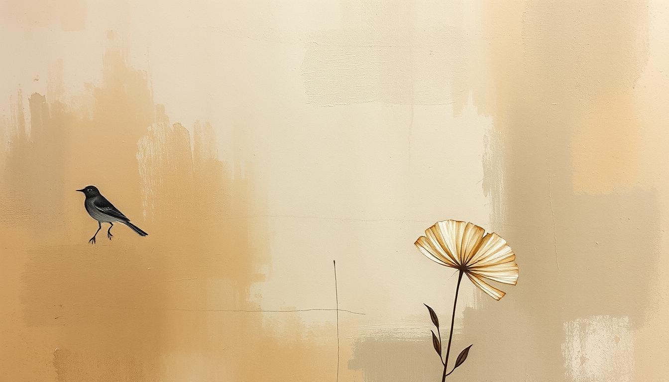
wabi sabi painting technique
Begin with a simple intention: make room for chance, texture, and time to shape the work.
Define the method: It is a process that privileges intuition and restraint. You build character with layers, subtle marks, and imperfect gestures. Let each layer respond to the one beneath it.
Materials and tools support the approach. Choose tactile grounds, earth-toned paints, sand, and modeling paste. Use humble tools—frayed brushes, a palette knife, or found implements—that leave honest traces.
- Set an intention, then create a tactile base.
- Veil color softly and let texture take shape.
- Embed small natural elements like stones or dried leaves.
Deliberately avoid perfection. Small irregularities and imperfections become expressive elements. They add quiet beauty and meaning the way patina does over time.
Practical flow: plan a limited set of elements so the piece breathes: few marks, thoughtful gestures, and open space. Work slowly and attentively so paint settles into textures without overworking.
Let tools guide decisions—a swipe of paste or a leaf impression can point the next move. This approach is accessible: start small, accept flaws, and let the work develop its modest presence. For a deeper look at the philosophy and examples, see what is wabi-sabi art.
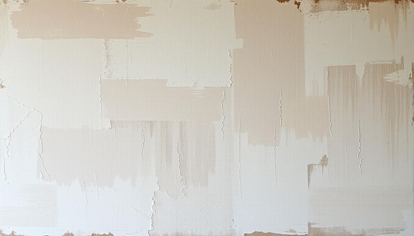
Materials and Tools: Natural Elements that Build Authentic Texture
Let the ground you pick set the mood: rough paper, grainy wood, or a textured panel invite life.
Surfaces matter. Choose canvas for flexible layering, heavy paper for torn, frayed edges, and wood panels when you want visible grain to show through.
Pre-textured substrates speed up character. They accept abrasion and hold grit well, which helps depth form naturally.
Paints, mediums, and texture
Work with earth-toned acrylics and natural pigments to keep color grounded and matte. Add sand and modeling paste to build tactile areas.
Apply paste thinly in places and thicker elsewhere. This varied approach creates texture that looks grown, not forced.
Found objects and paper additions
Integrate small stones, dried leaves, and threads so objects leave marks or become part of the surface.
Use washi, tea bag paper, or handmade paper to add fibers and worn translucency. These papers accept stains and glazes beautifully.
Tools that welcome chance
Favor old brushes with uneven bristles, palette knives for scraping, and your hand to press or blur edges. Hands often make the most honest marks.
"Treat materials with appreciation: let them speak, avoid over-fussing, and accept marks that tell the story of making."
- Keep the kit modest—few thoughtful materials outperform many heavy-handed ones.
- Test how each tool affects edges and sheen; a light scrape can add depth while removing excess.
- Consider light hand-carving on paste to catch glazes and suggest age.
For more inspiration on how materials shape the look, see wabi sabi art examples.
Step-by-Step: How to Create Wabi-Sabi Inspired Paintings
Begin with a simple promise to yourself: favor process over a finished look.
Set the intention
Write a one-line note that reminds you to explore. That small ritual shifts your mindset toward play and away from perfection.
Build a tactile base
Spread thin, varied applications of modeling paste. Use your hand, an old brush, or a palette knife to carve organic ridges and soft worn areas.
While tacky, press in tea bag paper or washi, then lift to keep edges ragged and natural.

Layer muted color
Mix sandy beige, soft gray, weathered green, and pale blue. Veil color in translucent washes and scumble across raised texture for instant depth.
Keep brushwork minimal so earlier marks remain visible and the piece breathes.
Integrate nature and let time speak
Press a dried leaf, scatter a pinch of sand, or embed a thin fiber thread. Let these materials suggest the next mark.
Pause between layers to let time reveal tiny cracks, matte shifts, and quiet patina.
Return with gentle distressing—lift pigment from high points with a soft cloth to expose earlier tones. Stop when the surface feels balanced and you genuinely felt like pursuing the work.
Key Techniques: Asymmetry, Simplicity, and the Beauty of Wear
Intentional irregularity helps a composition feel less made and more discovered.
Asymmetry and irregular forms
Use asymmetry to cluster visual weight off-center. Let shapes vary in size and spacing so the surface feels lived-in.
Allow edges to wander and horizons to tilt slightly. These small choices make forms read as organic, not forced.
Subtle restraint
Practice simplicity by limiting gestures and color shifts. Fewer, intentional moves keep the composition calm and clear.
Pause often. A short break will show what to remove rather than add, keeping the process and the result spacious.
Patina and aging
Invite patina by layering thin glazes and lifting pigment from high points. Let cracks and soft edges appear naturally over time.
Work by hand when possible—light hand-carving, hand painting thin veils, or gentle sanding keeps the surface honest and tactile.
"Accept small imperfections as part of the story; a scuff or a broken line can enrich beauty when placed thoughtfully."
- Cluster weight off-center and vary spacing for organic flow.
- Reduce marks and colors to strengthen simplicity and focus.
- Layer glazes, let edges fade, and favor hand-made marks that show time.
For practical ways to embrace imperfection in your space, see embracing imperfection.
Color and Composition: Earth Tones, Quiet Balance, and Negative Space
Let your palette echo the ground beneath your feet and the sky above.
Build a calm color plan from sandy beiges, muted browns, rusts, pale blues, weathered greens, and soft grays. Limit your main hues to two or three plus a neutral. This keeps the art unified and helps texture and layers read clearly.

Lean on natural pigments like umber and ochre to mute intensity and add depth. Use soft paper inclusions for off-white fibers that echo nature and support the aesthetic.
Compositional cues
- Use negative space as an active element so forms breathe.
- Compose with organic flow—angled clusters, gentle arcs, and irregular spacing.
- Create a focal “quiet” by reducing activity in one area to anchor the piece.
"A calm zone of quiet keeps the eye and the mind at ease."
| Element | Color | Effect |
|---|---|---|
| Ground | Sandy beige, umber | Warm base, subtle depth |
| Accent | Rust, pale blue | Soft contrast, natural echo |
| Neutral | Weathered gray, soft green | Balance and breathing room |
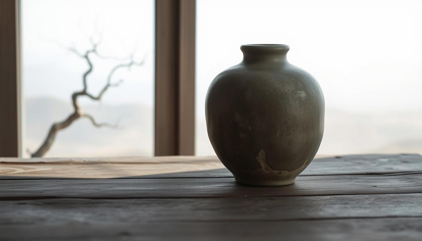
Bring Wabi-Sabi Art into Your Space
Style your finished piece so it reads as part of a lived, tactile home rather than a staged display.
Pair your work with honest surfaces: rough-hewn wood, hand-thrown ceramics, woven linen, and stone. These natural materials echo the subtle texture and muted palette of wabi sabi art and boost a sense of authenticity.
Keep furnishings simple. Choose visible grain, faded textiles, and modest frames that do not compete with the surface qualities of the piece. Display a few cherished objects—a chipped cup or a rustic bowl—to deepen the story and invite quiet appreciation.
Pairings: Wood, stone, linen, and ceramics for cohesive warmth
- Use a nature-inspired palette in the room to mirror the work’s tones.
- Let natural light play across textures with sheer curtains or minimal coverings.
- Give the artwork breathing room on the wall so it can anchor the living space.
- Layer linen throws and wool rugs in muted tones to support, not steal, attention.
"Fewer, thoughtful things create a calm world where authenticity celebrates beauty."
Conclusion
Start where you are, with a scrap of board, a bit of paste, and patient attention.
The core philosophy honors impermanence and small flaws. Accepting that nothing lasts, nothing is finished, and nothing is perfect frees your process.
Summarize the steps: set an intention, build texture with sand or paste, veil muted color, add natural elements, and let time refine the surface. Stop with restraint so the piece keeps a calm presence.
Try a modest work today. Use your hand, let materials guide you, and make tiny edits. Authenticity grows with practice and brings new appreciation for quiet beauty in life and living spaces.
For a clear overview of the ideas that shape this approach, see what is the wabi-sabi concept in.
Enhance Your Space with Unique Modern Masterpieces by Chiara Rossetti

Are you inspired by the innovative mediums and conceptual depth highlighted in our exploration of contemporary art? You’re not alone! Today’s art enthusiasts are seeking cultural relevance and emotional connections in their artwork. However, finding pieces that resonate with modern themes and fit your unique style can be a challenge. That’s where we come in!

At Rossetti Art, we specialize in canvas prints, original paintings, and modern sculptures that celebrate the spirit of now. Each piece created by Chiara Rossetti brings a personal touch that connects deeply with current social narratives—just like the modern masterpieces discussed in the article. Don’t miss out on the chance to elevate your home decor with breathtaking artwork that speaks to your values and aesthetic. Explore our collection today and find your perfect piece! Act now, and transform your space into a gallery of inspiration!
FAQ
What is the core idea behind the Wabi Sabi painting approach?
This approach celebrates imperfection, simplicity, and natural processes. Artists favor asymmetry, muted palettes, and tactile surfaces made with natural materials like wood, paper, fibers, and earth-toned pigments. The focus is on authenticity and time-worn beauty rather than polished perfection.
How does the philosophy influence the way a piece is made?
The philosophy guides choices at every stage: choosing found objects, allowing textures to form, embracing irregular marks, and using restraint in composition. Artists set an intention to let materials age, crack, and soften, so the work feels lived-in and resonant with nature and life.
Which surfaces and supports work best?
Sturdy, textured supports like heavy paper, linen-covered panels, reclaimed wood, and pre-textured substrates work well. These surfaces accept layers of paste, embedded fibers, and distressing, and they help create the depth and roughness central to the aesthetic.
What materials should I gather to start?
Begin with earth-toned acrylics or natural pigments, modeling paste or sand for texture, old brushes and palette knives, handmade paper or washi, dried leaves or fibers, and simple natural adhesives. Found materials like stone fragments or tea bag paper add authenticity.
How do I build texture without overworking the piece?
Layer deliberately: apply a tactile base with paste, press in fibers or leaves, then allow drying and rest periods. Use limited gestures—scraping, scumbling, and gentle abrasion—to reveal layers. Let time and natural wear contribute rather than forcing every effect.
What color palettes suit this style?
Muted, earthy palettes—sandy beiges, muted browns, rusts, weathered greens, soft grays, and pale blues—create the quiet balance desired. Use restrained contrasts and large areas of negative space to give the composition breathing room.
How important is asymmetry and restraint?
Very important. Asymmetry and subtle restraint create a sense of lived-in balance. Avoid perfectly centered subjects and dense ornamentation; aim for organic flow and a focal “quiet” where the eye can rest.
Can natural aging and patina be encouraged safely?
Yes. Gentle distressing—light sanding, controlled cracking mediums, or slow oxidation for certain metals—produces patina. Test methods on samples first and use archival-safe materials when longevity matters. Let some effects develop naturally over time.
How do I integrate found objects without damaging the composition?
Choose items that harmonize in texture and color, then embed them thoughtfully—partially pressed into paste, attached with archival adhesive, or inset into wood. Balance the piece by limiting the number of objects and placing them to support, not overwhelm, the visual flow.
Is formal training required to work in this style?
No. While training helps with materials and conservation, the emphasis here is on intuition, sensitivity to materials, and patient practice. Workshops, community classes, and experimentation with small studies are great ways to learn.
How do I display these works at home for best effect?
Pair pieces with natural furnishings—wood, stone, linen, and ceramics—to create cohesive warmth. Use simple frames or float panels to preserve texture. Position works where soft natural light can reveal surface depth without harsh glare.
Are there common mistakes to avoid when starting?
Overworking the surface, using high-gloss finishes, or adding too many competing elements can ruin the intended restraint. Avoid heavy symmetry, bright synthetic palettes, and ignoring the material’s natural tendencies. Pause often and let the work evolve.
Can contemporary artists blend this approach with other styles?
Absolutely. Many artists merge these principles with minimalism, abstract expression, or mixed-media practices. The key is to retain the essence—honoring imperfection, texture, and time—while adapting forms and tools that suit your voice.
Leave a comment
This site is protected by hCaptcha and the hCaptcha Privacy Policy and Terms of Service apply.