
Choosing between ivory and cream for your walls seems simple at first. Both colors look clean and neutral. Yet they create completely different moods in a room. The wrong choice can make your space feel cold or outdated.
This guide reveals the specific differences between ivory cream tones. You will learn which undertones define each color. More importantly, you will discover what wall art works best with ivory walls versus cream walls.
Understanding these color differences helps you avoid costly decorating mistakes. Your furniture, art, and accessories will harmonize perfectly. Let's explore how to match the right art to your wall color.
Understanding the Ivory Color

The ivory color sits between pure white and pale yellow on the color wheel. This shade carries a gentle warmth without looking overtly yellow. Think of natural ivory from elephant tusks or piano keys.
Interior designers favor ivory for its sophisticated appearance. The color creates a sense of elegance without the starkness of pure white. Rooms painted in ivory feel inviting yet refined.
Ivory Color Code and Technical Details
The standard ivory color code in hexadecimal is #FFFFF0. In RGB values, ivory contains Red 255, Green 255, and Blue 240. This combination produces a very light cream with cool undertones.
Different paint brands offer slight variations of ivory. Benjamin Moore's "White Dove" leans slightly cooler. Sherwin Williams' "Alabaster" shows more warmth. These subtle differences matter when selecting art.
Undertones That Define Ivory
Ivory's undertones lean toward the cooler side of the spectrum. The color contains hints of gray and sometimes blue. These cool undertones become more visible in natural light compared to warm artificial lighting.
The presence of yellow in ivory remains minimal. This restraint keeps ivory from appearing aged or dingy. The tone maintains freshness while providing more warmth than stark white.
Ivory in Natural Light
Natural daylight reveals ivory's true character. North-facing rooms emphasize cooler undertones. The color can appear slightly gray or even bluish. South-facing rooms bring out the subtle warmth.
Morning light makes ivory glow softly. Afternoon sun highlights any yellow present. Evening light adds golden tones. Consider your room's light exposure before committing to ivory.
Ivory in Artificial Light
LED bulbs with cool temperatures keep ivory crisp. Warm incandescent bulbs enhance yellow notes. The same ivory wall can look completely different under various lighting conditions.
Dimmed lighting often makes ivory appear warmer. Bright overhead lights emphasize coolness. Test your ivory choice under your actual lighting setup before painting an entire room.
Best Rooms for Ivory Walls
Bedrooms benefit from ivory's calm sophistication. The color promotes relaxation without feeling clinical. Master bedrooms particularly suit this refined neutral tone.
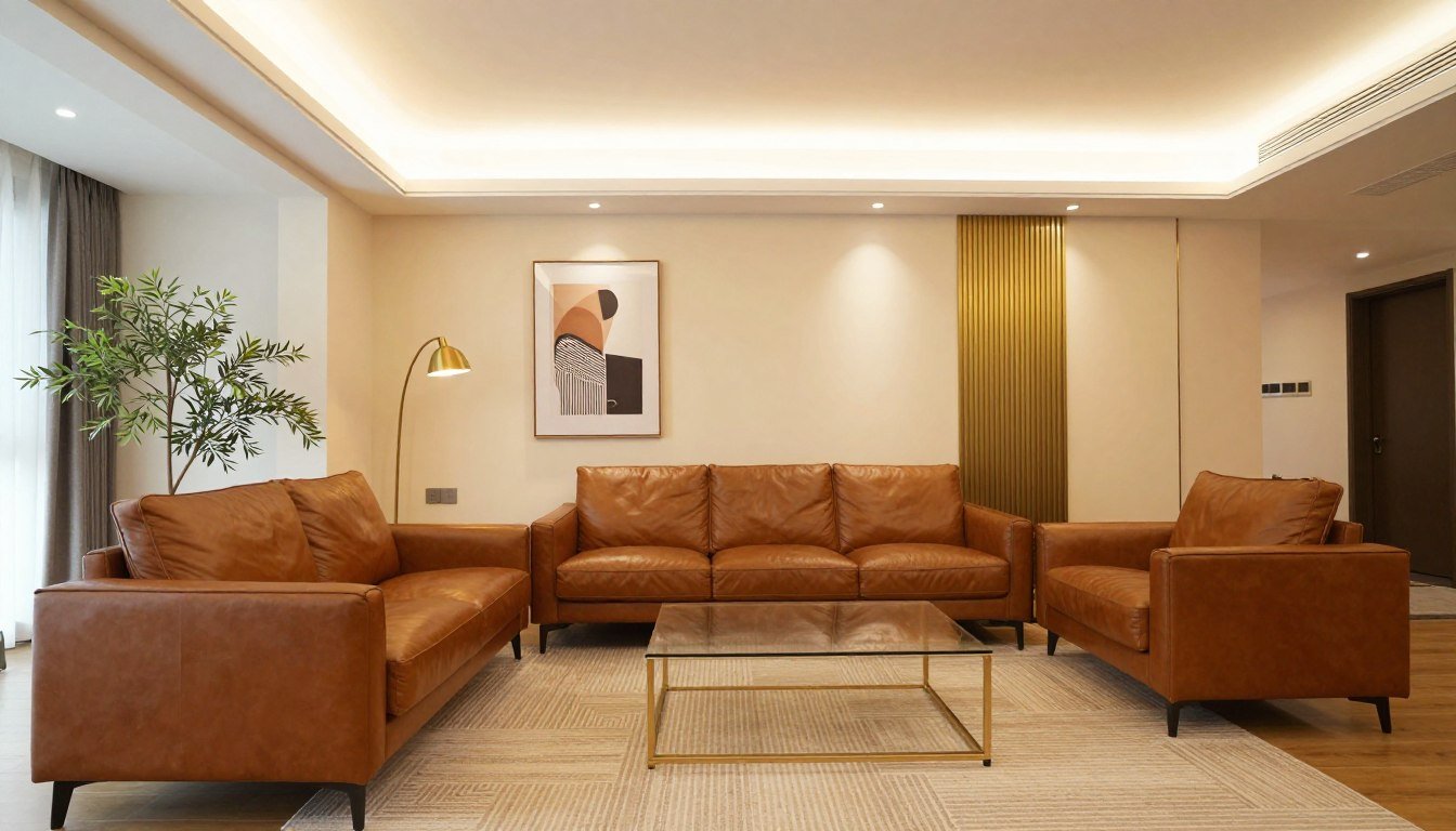
Living rooms gain elegance with ivory walls. The background allows furniture and art to stand out. Formal dining rooms achieve timeless appeal with ivory as the backdrop.
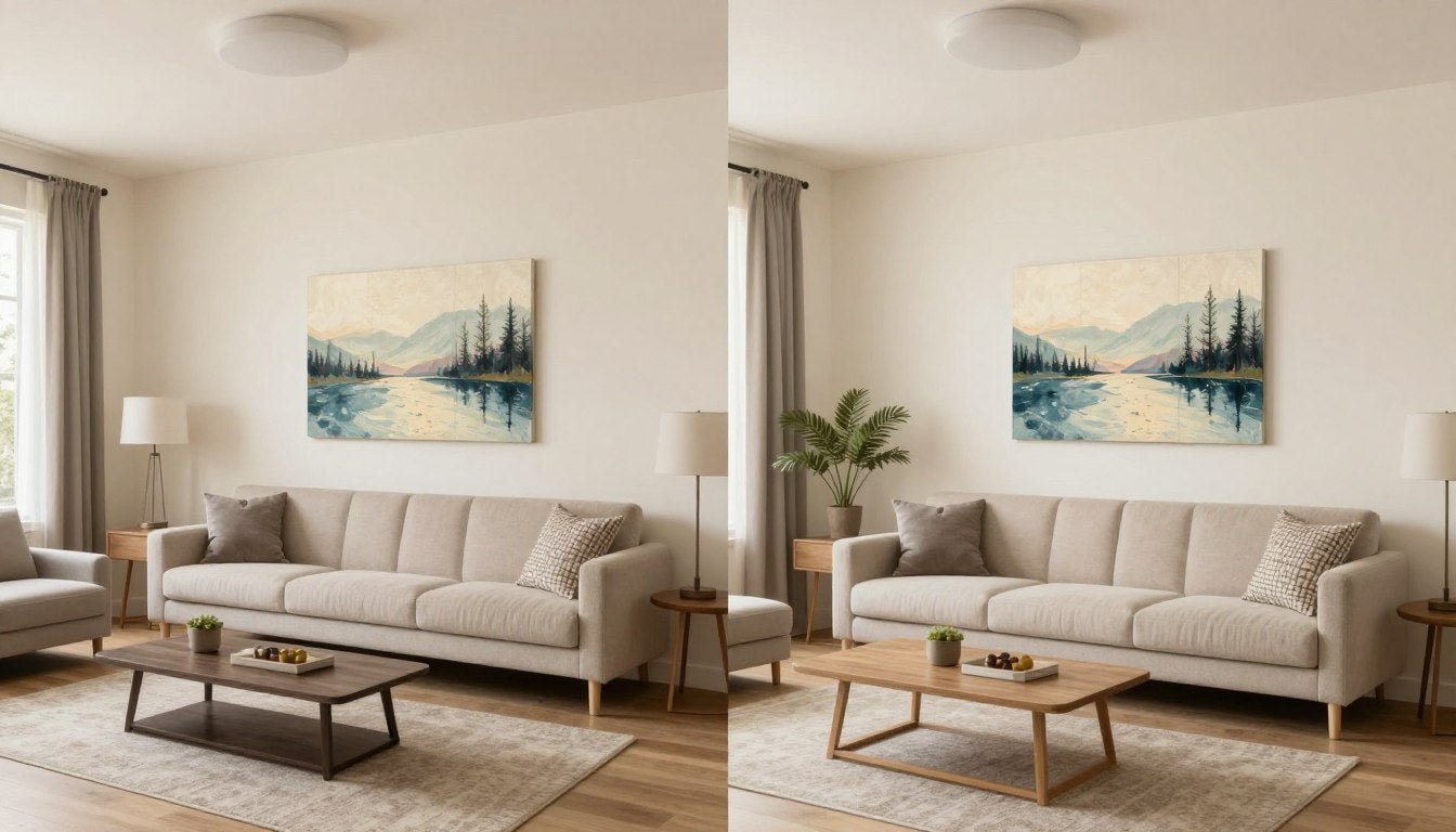
If You Love Warm, Sophisticated Spaces, Here Are 3 Prints That Bring That Mood Into a Room

Golden Hour Abstract
This flowing abstract captures the warmth of sunset. The gold and beige tones complement both ivory and cream walls beautifully. The organic shapes add movement without overwhelming your space.
Perfect for living rooms or bedrooms seeking a sophisticated, warm ambiance. The neutral palette ensures long-term versatility with your interior design choices.

Serene Horizons
Minimalist landscape art brings tranquility to any room. The soft earth tones create depth while maintaining a peaceful aesthetic. This piece works exceptionally well in spaces with abundant natural light.
Ideal for creating a focal point above a sofa or bed. The horizontal composition makes rooms feel wider and more open.

Botanical Elegance
Line art brings sophistication through simplicity. This botanical piece features warm tones that enhance ivory and cream walls. The organic subject matter connects your interior to nature.
Excellent for dining rooms, entryways, or home offices. The clean lines suit both traditional and contemporary furniture styles.
Each of these handpicked prints complements the subtle warmth of ivory and cream walls. The neutral palettes ensure your art investment remains relevant as your design preferences evolve. Explore our full canvas prints collection for more options that suit your style.
Understanding the Cream Color

Cream color contains more yellow than ivory. This shade resembles the color of dairy cream or vanilla. The warmth feels immediately noticeable when compared to cooler neutrals.
Designers choose cream when warmth takes priority over crispness. The color creates cozy atmospheres in living spaces. Rooms with cream walls feel welcoming and comfortable from the moment you enter.
Cream Color Code and Technical Specifications
The cream color code typically reads #FFFDD0 in hexadecimal notation. RGB values show Red 255, Green 253, and Blue 208. The lower blue value creates the noticeably warmer tone compared to ivory.
Paint manufacturers produce numerous cream variations. Some lean peachy while others appear more buttery. The specific yellow undertone percentage determines how warm the cream will appear on your walls.
Undertones That Define Cream
Yellow undertones dominate the cream color profile. Some creams contain hints of orange or peach. These warm undertones become more pronounced under certain lighting conditions.
The tone remains lighter than beige but darker than ivory. This middle position on the neutral spectrum offers flexibility. Cream bridges the gap between cool and warm neutrals effectively.
Cream in Natural Daylight
Sunlight intensifies cream's yellow undertones. South-facing rooms can make cream appear quite golden. North-facing spaces temper the warmth slightly but maintain the cozy feel.
Overcast days reveal cream's true character most accurately. The diffused light prevents extreme yellow enhancement. This condition helps you judge how cream will look year-round.
Cream Under Artificial Lighting
Warm LED bulbs amplify cream's yellow tones significantly. The combination can push cream toward a buttery or even peachy appearance. Cool LED lights balance the warmth but may create contrast.
Traditional incandescent bulbs pair naturally with cream. The warm glow enhances the cozy atmosphere. Consider your lighting choice as an integral part of your cream wall decision.
Ideal Spaces for Cream Walls
Kitchens gain warmth and approachability with cream walls. The color complements wood cabinets beautifully. Traditional and farmhouse-style kitchens particularly benefit from cream tones.
Family rooms feel more inviting with cream backgrounds. The warmth encourages gathering and relaxation. Cream also works well in rooms with limited natural light, adding perceived warmth.
See Color Principles in Action
Understanding how colors interact with art becomes clearer when you see examples in real spaces. This video guide demonstrates how different art styles transform rooms with neutral walls.
Notice how lighting conditions change the appearance of both wall colors and artwork. The principles shown apply directly to choosing art for your ivory or cream walls. For more inspiration on selecting art that complements neutral spaces, explore our curated canvas print collection.
Key Differences Between Ivory and Cream

The difference between ivory and cream centers on undertones and warmth. Ivory leans cooler with subtle gray or blue hints. Cream shows distinctly warmer yellow undertones. This fundamental distinction affects every design decision.
Temperature represents the most critical difference factor. Ivory reads as a cool neutral despite its warmth compared to pure white. Cream firmly establishes itself in the warm neutral category alongside beige and tan.
Comparing Color Codes
The ivory color code (#FFFFF0) shows higher blue values than cream (#FFFDD0). This twelve-point difference in blue creates noticeable temperature variation. The numbers reveal why ivory appears cooler to the eye.
Both colors maintain maximum red values at 255. Green values stay nearly identical. The blue component alone determines the temperature difference. This technical detail helps predict how colors will interact with art.
Visual Temperature Differences
Place ivory and cream samples side by side. The contrast becomes immediately obvious. Ivory appears cleaner and crisper. Cream looks softer and more golden.
Context affects perception dramatically. Ivory next to pure white looks warm. The same ivory beside cream appears quite cool. Your eye judges color relationally rather than absolutely.
| Characteristic | Ivory | Cream |
| Primary Undertone | Cool gray or blue | Warm yellow |
| Temperature Feel | Cool to neutral | Warm |
| Light Reflection | Brighter, crisper | Softer, warmer glow |
| Yellow Presence | Minimal | Pronounced |
| Best Lighting | Natural daylight | Warm artificial |
| Formality Level | More formal | More casual |
| Pairs Well With | Cool blues, grays | Warm oranges, reds |
How Light Affects Each Color
Natural light exposes undertones most honestly. Ivory maintains its cool elegance in daylight. Cream becomes noticeably more golden when sunlight streams in. This difference guides room selection for each color.
Evening artificial light transforms both shades. Warm bulbs push ivory toward cream. They make cream appear almost peachy or buttery. Plan your lighting type before committing to a wall color choice.
Psychological Impact Differences
Ivory communicates sophistication and restraint. The cooler tone feels more formal. Spaces with ivory walls suggest refinement and timeless elegance. This psychological effect suits professional or formal environments.
Cream evokes comfort and approachability. The warmth creates immediate coziness. Rooms with cream walls feel like places to relax and unwind. Family spaces benefit from this welcoming psychological effect.
Match This Cool, Elegant Vibe to Your Space
If your walls lean toward ivory's cooler undertones, explore our collection of modern art with sophisticated color palettes. These pieces enhance the refined atmosphere that ivory walls create.
What Wall Art Looks Best With Ivory Walls

Ivory walls provide a sophisticated backdrop for diverse art styles. The cool undertones pair exceptionally well with blues and grays. Art with these colors creates harmonious combinations that feel intentionally designed.
The neutral quality of ivory allows bold art choices. You can introduce strong colors without overwhelming the space. The wall color recedes visually, letting your art become the focal point.
Best Color Combinations for Ivory Walls
Navy blue creates stunning contrast against ivory. The combination feels classic and nautical. This pairing suits coastal interiors and traditional spaces equally well. The cool tones complement each other naturally.
Soft grays build monochromatic sophistication with ivory. The tonal variation adds depth without introducing competing temperatures. This combination works particularly well in minimalist and contemporary design schemes.
- Light blue art brings tranquility to ivory spaces
- Charcoal gray adds dramatic contrast while maintaining cool harmony
- Silver or metallic accents in art enhance ivory's elegance
- Pale pink offers a soft warm accent that doesn't clash
- Sage green introduces nature tones that complement ivory beautifully
- Black and white photography appears crisp against ivory backgrounds
Art Styles That Complement Ivory
Abstract expressionism thrives against ivory walls. The neutral background allows bold brushstrokes to command attention. Colors pop more vividly when surrounded by ivory's subtle coolness.
Minimalist line drawings suit ivory's refined aesthetic. The simplicity-on-simplicity creates sophisticated restraint. This pairing works perfectly in modern and Scandinavian-inspired interiors.

Avoiding Color Clashes With Ivory
Orange tones can clash with ivory's cool undertones. The temperature conflict creates visual tension. If you love orange, choose versions with blue or gray undertones to bridge the gap.
Bright yellows compete rather than complement ivory. The two similar-but-different light tones create confusion. Your eye struggles to determine which serves as the background and which provides accent.
Very warm browns may appear muddy against ivory. The contrast between cool undertones and warm browns lacks harmony. Choose cooler taupes or grays instead for better compatibility.
Frame Choices for Ivory Walls
Black frames create crisp definition against ivory. The strong contrast makes art appear more deliberate and finished. This choice suits formal rooms and gallery-style arrangements.
White or ivory frames offer subtle elegance. The low contrast lets art float gently on the wall. This approach works beautifully for creating calm, cohesive spaces without harsh visual breaks.
Natural wood frames add warmth to cool ivory walls. The organic material balances the temperature. Choose lighter woods like oak or ash rather than dark walnut for best results.
Gallery Tour: See Art Combinations in Real Spaces
Experience how professional designers combine art with neutral wall colors. This gallery tour showcases successful color combinations and styling techniques you can apply to your own space.
The examples demonstrate principles discussed throughout this guide. Notice how frame choices, art placement, and color selection work together. For unique statement pieces that create similar impacts, browse our original paintings collection.
What Wall Art Works Best With Cream Walls

Cream walls embrace warm color palettes in artwork. Oranges, reds, and warm browns create natural harmony. The yellow undertones in cream connect seamlessly with these warmer art tones.
The warmth of cream allows you to build cozy, inviting atmospheres. Art selections should enhance rather than fight this inherent characteristic. Choose pieces that celebrate warmth and comfort.
Best Color Combinations for Cream Walls
Terracotta tones feel perfectly at home with cream. The earthy warmth creates cohesive, grounded spaces. This combination suits southwestern, Mediterranean, and bohemian interior styles exceptionally well.
Warm reds add vibrant energy without temperature conflict. The shared warmth ensures visual harmony. This pairing works in dining rooms where you want to stimulate appetite and conversation.
- Golden yellows enhance cream's inherent sunshine quality
- Burnt orange creates rich, autumnal warmth with cream backgrounds
- Chocolate brown adds depth while maintaining temperature harmony
- Coral brings playful warmth that complements cream beautifully
- Warm greens like olive connect cream spaces to nature
- Copper or bronze metallic accents enhance cream's luxurious feel
Art Styles That Enhance Cream Walls
Impressionist landscapes glow against cream walls. The soft, warm color palettes in impressionist works mirror cream's gentle nature. This pairing creates romantic, timeless atmospheres.
Botanical prints in warm tones celebrate cream's connection to nature. Autumn leaves, golden flowers, and sunset-toned plants all work beautifully. The organic subjects enhance cream's approachable character.

Colors to Approach Carefully With Cream
Cool blues can appear jarring against cream walls. The temperature clash creates visual discomfort. If you love blue, choose warmer versions with hints of purple or green undertones.
Stark black creates excessive contrast with cream's softness. The harshness disrupts cream's gentle atmosphere. Soften black elements by choosing deep browns or charcoal instead.
Very cool grays fight cream's warmth ineffectively. The temperature opposition lacks resolution. Warm grays or greiges bridge the gap more successfully if you need gray tones.
Frame Selection for Cream Walls
Warm wood frames enhance cream's cozy character. Choose frames in honey, cherry, or walnut tones. The natural material adds organic warmth that complements cream perfectly.
Gold or brass frames create luxurious statements against cream. The metallic warmth elevates traditional and glam interiors. This combination works particularly well with vintage or classical art styles.
Cream or off-white frames blend seamlessly with cream walls. This tone-on-tone approach lets art float without frame distraction. The effect feels cohesive and deliberately understated.
Ivory vs Cream vs Beige: Complete Neutral Comparison

Beige enters the conversation when discussing neutral wall colors. This shade contains more brown than either ivory or cream. Beige sits firmly in warm neutral territory but with earthier undertones than cream's yellow base.
Understanding where beige fits helps clarify the entire neutral spectrum. Each shade serves different design purposes. Knowing these differences prevents decorating missteps and buyer's remorse.
Where Beige Differs From Ivory and Cream
Beige contains significant brown undertones. This earthy quality distinguishes it from cream's yellow warmth. Beige appears more grounded and less luminous than either ivory or cream.
The tone of beige reads darker than both ivory and cream. This depth can make rooms feel smaller but cozier. Beige works well in large spaces where you want to create intimate zones.
- Coolest of the three neutrals
- Subtle gray or blue undertones
- Most formal and elegant feel
- Brightest light reflection
- Works with cool color schemes
- Best for crisp, clean aesthetics
Ivory Characteristics
- Medium warmth on neutral spectrum
- Clear yellow undertones
- Cozy and approachable feel
- Soft, warm light reflection
- Pairs with warm color palettes
- Ideal for comfortable, lived-in spaces
Cream Characteristics
- Warmest of the three options
- Brown and tan undertones
- Grounded, earthy feel
- Darkest of the light neutrals
- Complements natural materials
- Perfect for casual, organic spaces
Beige Characteristics
Art Considerations Across All Three Neutrals
Each neutral demands different art approaches. Ivory allows maximum flexibility with cool-toned art. Cream benefits from warm-toned pieces. Beige pairs best with earthy, natural artwork.
The background color establishes the room's temperature foundation. Your art either reinforces or counterbalances this foundation. Understanding this relationship prevents color clashes and creates intentional design.
Consider transitioning art if you change wall colors. A blue abstract that shines on ivory may feel wrong on cream. Plan art purchases with your long-term wall color commitment in mind.
Interior Design Tips for Ivory and Cream Spaces

Successful interior design with ivory or cream extends beyond wall color alone. Every element in the room must work harmoniously. Furniture, textiles, and accessories all contribute to the overall effect.
The key lies in understanding your chosen color's temperature. Let that temperature guide every subsequent decision. Consistency in temperature creates cohesive, professionally designed spaces.
Furniture Selection Guidelines
Dark wood furniture provides striking contrast against ivory walls. The combination feels classic and timeless. This approach works particularly well in traditional and transitional design styles.
Light wood tones create softer contrast with cream walls. The warmth-on-warmth builds cohesive comfort. Scandinavian and coastal design styles benefit from this gentler approach.
Upholstery colors should respect your wall color's temperature. Cool grays and blues suit ivory backgrounds. Warm tans and terracottas harmonize with cream. This principle prevents furniture from appearing mismatched.
Accent Color Strategies
Choose accent colors that complement your wall's undertone. Ivory walls welcome navy, slate blue, or sage green accents. These cool colors enhance ivory's sophisticated character.
Cream walls pair beautifully with rust, coral, or golden yellow accents. The warm-on-warm creates energetic yet harmonious spaces. These combinations feel intentional and professionally designed.
Creating Depth With Ivory
Ivory's light value requires careful layering to prevent flat appearance. Introduce varying shades of gray and white. These tonal variations create subtle depth.
Add texture through fabrics and materials. Linen, wool, and natural fibers prevent ivory spaces from feeling sterile. The physical texture compensates for minimal color variation.
Strategic lighting creates shadows that define space. Wall sconces and table lamps add dimensional interest. The interplay of light and shadow prevents monotony in ivory rooms.

Textile and Material Choices
Natural materials enhance both ivory and cream spaces. Wood, stone, and metal add necessary contrast. These organic elements ground light neutral rooms and prevent them from floating visually.
Textiles introduce warmth and comfort. Cream walls particularly benefit from abundant soft textiles. Throw pillows, curtains, and area rugs layer comfort into the space.
Mix matte and glossy finishes for visual interest. Matte walls with glossy accents create dimension. This variation prevents neutral spaces from appearing one-dimensional or boring.
Lighting Design Considerations
Layer lighting types for flexibility and mood control. Ambient, task, and accent lighting each serve specific purposes. This layered approach allows you to adjust atmosphere throughout the day.
Choose bulb color temperature carefully with ivory and cream. Cool white bulbs suit ivory's temperature. Warm white bulbs enhance cream's cozy nature. The wrong bulb temperature can undermine your entire color scheme.
Consider dimmer switches for all lighting. This control lets you adjust how warm or cool your walls appear. Flexibility prevents you from feeling locked into one look.
Common Mistakes When Decorating With Ivory or Cream

Even experienced decorators make mistakes with neutral walls. The subtlety of ivory and cream can deceive. Small missteps compound into spaces that feel slightly wrong without obvious explanation.
Awareness of common pitfalls helps you avoid them. Most mistakes stem from ignoring undertones. Respecting temperature differences solves the majority of neutral decorating challenges.
Mixing Cool and Warm Elements Carelessly
The biggest mistake involves mixing temperature extremes. Cool blue art on cream walls creates unresolved tension. Warm orange accents on ivory walls fight rather than complement.
Temperature mixing requires intentional bridging. If you must combine temperatures, use transitional colors. Purple bridges cool blue and warm red. Olive bridges cool blue and warm yellow.
Most successful neutral rooms stay within their temperature lane. Ivory rooms maintain cool consistency. Cream spaces embrace warmth throughout. This discipline creates harmony.
Ignoring Natural Light Variables
Failing to test colors in your actual space causes regret. Paint companies offer small sample sizes for testing. Paint large swatches on multiple walls and observe them throughout the day.
Northern light cools colors significantly. Your cream may appear almost beige in north-facing rooms. Southern light warms colors intensely. Your ivory might read as cream in south-facing spaces.
Artificial lighting changes everything at night. Your daytime color assessments may prove irrelevant after dark. Test your choices under evening lighting conditions before committing.
Smart Neutral Decorating Practices
- Test paint samples for at least three days in actual lighting
- Maintain temperature consistency across all design elements
- Layer multiple textures to prevent flat appearance
- Choose art that respects wall color undertones
- Use varying shades within your temperature range for depth
- Consider room function when selecting ivory versus cream
Neutral Decorating Pitfalls to Avoid
- Selecting color based on tiny paint chips alone
- Mixing extreme cool and warm tones without transition
- Assuming all neutrals work together automatically
- Overlooking how lighting affects color temperature
- Creating all-neutral spaces without any contrast or interest
- Ignoring existing architectural elements' undertones
Overlooking Existing Elements
Your home contains fixed elements you cannot easily change. Flooring, countertops, and tile all have undertones. These existing elements must inform your wall color choice.
Honey-toned wood floors pair naturally with cream walls. The shared warmth creates cohesion. Those same floors might clash with ivory's coolness.
Gray tile or stone suggests ivory as the better choice. The cool materials harmonize with ivory's temperature. Cream might appear yellowed or dingy against cool gray stone.
Insufficient Contrast and Definition
All-neutral spaces can appear washed out without contrast. Neutral walls, furniture, and accessories blend into indistinct beige soup. Strategic contrast points prevent this problem.
Introduce darker elements deliberately. A charcoal accent chair defines space against ivory walls. A chocolate brown cabinet grounds a cream kitchen. These contrast points provide visual anchors.
Art serves as the perfect contrast vehicle. Bold colors in artwork prevent neutral spaces from disappearing. This approach allows maximum flexibility since you can change art more easily than furniture.
How to Choose Between Ivory and Cream for Your Space

The choice between ivory and cream ultimately depends on your specific circumstances. No universal right answer exists. Your room's characteristics and personal preferences determine the best selection.
A systematic evaluation process leads to confident decisions. Consider multiple factors rather than impulse choosing. This deliberate approach prevents expensive repainting projects later.
Assess Your Natural Lighting
Start by evaluating your room's natural light exposure. North-facing rooms receive cool, indirect light. These spaces benefit from cream's warmth to counterbalance coolness.
South-facing rooms flood with warm, direct sunlight. Ivory prevents these spaces from feeling too warm or yellow. The cool undertones balance abundant sunshine.
East and west-facing rooms receive changing light throughout the day. Ivory works well in west-facing rooms that get hot afternoon sun. Cream suits east-facing rooms with gentler morning light.
Consider Your Existing Decor
Inventory your existing furniture and accessories. Identify whether your pieces lean warm or cool overall. Match your wall color to your existing temperature preference.
If you own predominantly gray, navy, or cool-toned furniture, choose ivory. These pieces will sing against ivory's complementary coolness. The combination feels intentionally coordinated.
If your furniture includes warm woods, tans, or golden tones, select cream. The warm harmony creates cohesive comfort. Everything appears to belong together naturally.
Define Your Desired Atmosphere
Clarify the feeling you want your room to evoke. Formal spaces benefit from ivory's elegance. Casual, comfortable rooms thrive with cream's warmth.
Consider who uses the space and how. Professional home offices project sophistication with ivory. Family gathering spaces feel welcoming with cream.
Think about your personal temperature preference. Some people feel energized by cool tones. Others need warmth to feel comfortable. Your physical response to temperature matters in spaces where you spend significant time.
Choose Ivory If You Want:
- Crisp, clean, sophisticated atmosphere
- Formal or elegant aesthetic
- Rooms that feel spacious and airy
- Compatibility with cool color schemes
- Timeless, classic appeal
- Brighter light reflection
- Modern or traditional styling flexibility
Choose Cream If You Want:
- Warm, cozy, inviting atmosphere
- Casual or comfortable aesthetic
- Rooms that feel intimate and embracing
- Compatibility with warm color palettes
- Traditional or farmhouse appeal
- Softer, gentler ambiance
- Spaces that counter cool natural light
Test Before Committing
Purchase sample sizes of your top choices. Paint large sections on multiple walls. Live with the samples for several days minimum.
Observe the colors at different times of day. Morning light reveals different characteristics than evening light. Your reaction may change depending on when you typically use the space.
Bring your existing furniture and textiles near the sample areas. See how everything interacts in reality. Photos rarely capture subtle undertone relationships accurately.
Trust your gut reaction after thorough testing. If a color makes you uncomfortable after several days, it's wrong for you. Choose the option that consistently feels right regardless of theoretical compatibility.
Ready to Transform Your Space?
Now that you understand the subtle differences between ivory and cream, it's time to find the perfect wall art to complete your vision. Browse our curated collection of museum-quality canvas prints designed to complement neutral color schemes.
- Ready-to-hang convenience with premium hanging hardware included
- Museum-quality canvas that maintains color vibrancy for decades
- Free worldwide shipping on all orders with secure packaging
- 100% satisfaction guarantee with hassle-free returns
- Expert curation specifically for ivory and cream interiors

Looking for something truly unique? Explore our original paintings collection or add dimensional interest with modern sculptures that complement your neutral walls perfectly.
Room-by-Room Guide: Ivory vs Cream Applications

Different rooms serve different purposes and receive different light. These variables make certain colors more appropriate for specific spaces. Strategic room-by-room color selection creates a cohesive whole-home design.
Understanding how each room functions guides your ivory versus cream decision. The color choice impacts how the space feels and functions. This section provides specific recommendations for common rooms.
Living Room Considerations
Living rooms often receive abundant natural light from large windows. South-facing living rooms benefit from ivory's cooling influence. The color prevents the space from feeling overly warm despite sunshine.
North-facing living rooms need cream's warmth. The yellow undertones compensate for cool northern light. The room feels more inviting and less sterile with cream walls.
Consider your living room's formality level. Formal living rooms suit ivory's elegance. Family rooms where casual relaxation happens thrive with cream's approachability.
Bedroom Color Selection
Bedrooms serve as personal retreats focused on rest. Most people find cream's warmth more conducive to relaxation. The cozy undertones promote peaceful sleep and morning comfort.
Master bedrooms can handle ivory's sophistication beautifully. The elegant feel creates hotel-like luxury. Pair ivory bedroom walls with plush textiles to maintain comfort despite the cooler tone.
Guest bedrooms should accommodate various preferences. Cream provides universally welcoming warmth. Guests feel immediately comfortable in cream-walled bedrooms.
Kitchen and Dining Space Choices
Kitchens traditionally favor warmer neutrals. Cream creates approachable, gathering-friendly atmosphere. The warmth stimulates appetite and encourages conversation.
Modern kitchens with cool gray cabinets pair well with ivory walls. The temperature consistency creates sleek sophistication. This combination works particularly well in contemporary design.
Dining rooms can go either direction depending on formality. Formal dining rooms gain elegance with ivory walls. Casual eat-in kitchens benefit from cream's warmth and approachability.
| Room Type | Best Choice | Reason | Alternative Consideration |
| South-Facing Living Room | Ivory | Balances warm sunlight | Cream if furniture is very warm-toned |
| North-Facing Living Room | Cream | Adds needed warmth | Ivory if aiming for gallery-like feel |
| Master Bedroom | Cream | Promotes cozy relaxation | Ivory for luxury hotel aesthetic |
| Home Office | Ivory | Professional, focused atmosphere | Cream if space feels cold |
| Kitchen | Cream | Warm, gathering-friendly | Ivory with gray cabinets |
| Bathroom | Ivory | Clean, spa-like feel | Cream for traditional styling |
| Entryway | Either | Sets home's overall tone | Match to adjacent spaces |
Bathroom Applications
Bathrooms typically benefit from ivory's clean crispness. The cool tone creates spa-like serenity. Ivory makes bathrooms feel fresh and sanitary without stark white's harshness.
Powder rooms can experiment with cream for unexpected warmth. The small space handles the coziness well. Cream powder rooms feel welcoming to guests.
Master bathrooms serving as retreat spaces work beautifully in ivory. The elegant tone pairs perfectly with marble, chrome, and glass. The overall effect feels luxurious and expensive.
Home Office Recommendations
Home offices require focused, professional atmospheres. Ivory provides this without distraction. The cooler tone keeps the space feeling businesslike and productive.
Creative studios might prefer cream's warmth and comfort. The cozier atmosphere encourages free thinking. Artists and designers often respond better to warm environments.
Consider how much time you spend in your home office. Long hours may make cream's comfort more important than ivory's professionalism. Your personal work style should guide this choice.
Trending Color Combinations With Ivory and Cream in 2024

Interior design trends evolve constantly. Current color trends favor natural, earthy palettes. Both ivory and cream serve as excellent foundations for these contemporary combinations.
Understanding current trends helps your space feel modern and fresh. These combinations appeal to current aesthetic sensibilities. Your home will photograph well and impress design-conscious visitors.
Ivory With Sage Green and Terracotta
This unexpected combination bridges cool and warm beautifully. Ivory provides the neutral backdrop. Sage green adds natural coolness. Terracotta introduces earthy warmth. The three-color combination feels balanced and contemporary.
Use ivory on walls as the primary color. Introduce sage green through upholstery or large plants. Add terracotta in accessories and art. This layered approach creates sophisticated depth.
The combination works particularly well in living spaces and bedrooms. The natural palette promotes calm while preventing monotony. Each color serves a distinct purpose in the overall scheme.
Cream With Rust and Navy
This bold combination makes strong design statements. Cream's warmth anchors the palette. Rust provides vibrant energy. Navy adds unexpected sophistication and depth. The combination feels both cozy and elevated.
Apply cream to walls for maximum impact. Use navy in larger furniture pieces like sofas. Accent with rust in pillows, throws, and artwork. The proportion keeps the scheme from overwhelming the space.
This combination suits confident decorators willing to embrace color. Dining rooms and home offices particularly benefit from this energetic palette. The colors stimulate conversation and creativity.
Ivory With Charcoal and Blush Pink
Modern femininity defines this trending combination. Ivory creates an elegant foundation. Charcoal adds contemporary edge and contrast. Blush pink softens with romantic touches. The result feels current and sophisticated.
Use ivory on walls to maximize light reflection. Incorporate charcoal through furniture and window treatments. Add blush pink in artwork, florals, and textiles. The balance prevents excessive sweetness or starkness.
Bedrooms and living rooms embrace this palette beautifully. The combination photographs exceptionally well for social media. The aesthetic appeals to contemporary design sensibilities.
Natural Elements Trend

Biophilic design dominates current trends. Both ivory and cream serve as perfect backgrounds for natural materials. Wood, stone, and plants pop against these neutral foundations.
Incorporate abundant greenery in cream or ivory spaces. The contrast between living plants and neutral walls creates visual interest. Natural fiber textiles enhance the organic aesthetic.
Metallic Accents Trend

Mixed metals create current luxury appeal. Brass, copper, and black metal combine beautifully with ivory or cream. The metallic variety adds richness without color chaos.
Avoid matching all metals to one finish. Contemporary design embraces mixed metallic elements. The variety creates collected-over-time authenticity.
Bold Art Statement Trend

Oversized art creates dramatic focal points. Neutral walls like ivory and cream provide ideal canvases. One large statement piece often outperforms multiple small pieces.
Choose art that introduces your desired accent colors. Let the artwork dictate your accessory palette. This approach creates cohesive, intentional design.
Monochromatic Layering
Tonal neutrals continue trending strongly. Layer multiple shades of white, ivory, and cream together. The subtle variation creates sophisticated depth without color distraction.
This approach requires careful attention to texture. Varied materials prevent monochromatic schemes from appearing flat. Mix linen, velvet, wood, and stone for dimensional interest.
Monochromatic ivory or cream spaces photograph beautifully. The serene aesthetic appeals to minimalist sensibilities. This trend suits those seeking timeless rather than trendy appeal.
For more inspiration on incorporating these trending color combinations with carefully curated art, visit our design blog where we regularly share styling tips and color pairing advice.
Maintaining and Caring for Ivory and Cream Walls

Light neutral walls show dirt and scuffs more readily than darker colors. Proper maintenance keeps ivory and cream walls looking fresh. Understanding care techniques prevents premature repainting needs.
Both colors require similar maintenance approaches. The light value makes cleanliness visible. Regular attention prevents buildup that becomes harder to address later.
Regular Cleaning Practices
Dust walls monthly using microfiber cloths or dusters. Dust accumulation dulls neutral wall color over time. Regular dusting maintains the fresh appearance you want from light walls.
Address scuffs immediately when they occur. Fresh marks remove more easily than set-in stains. Keep a magic eraser handy for quick spot cleaning of marks and smudges.
Clean walls thoroughly twice yearly. Use warm water with mild dish soap. Work from top to bottom in small sections. Rinse with clean water and dry immediately to prevent water marks.
Touch-Up Painting Strategies
Save leftover paint for touch-ups and record the exact color name and code. Even slight color variations show against ivory and cream backgrounds. Exact matches prove essential for invisible repairs.
Touch up high-traffic areas annually. Doorways, hallways, and areas near light switches need attention most frequently. Small touch-ups prevent the need for full room repainting.
Blend touch-ups carefully using a small brush or roller. Feather edges to prevent visible patch lines. The light color generally hides touch-ups better than darker wall colors would.
Preventing Damage and Discoloration
UV light can yellow cream walls over time. Use UV-filtering window treatments in sunny rooms. This protection extends your wall color's true appearance significantly.
Smoke and cooking oils discolor light walls quickly. Ensure proper ventilation in kitchens. Consider cream instead of ivory in kitchens where yellowing matters less aesthetically.
Humidity causes mold on light walls in bathrooms. Run exhaust fans during and after showers. Address any moisture issues immediately to prevent permanent damage and discoloration.
Quick Cleaning Tips for Neutral Walls
- Test cleaning solutions in inconspicuous areas first
- Blot rather than rub when addressing fresh stains
- Use minimal water to prevent paint damage
- Avoid abrasive cleaners that remove paint sheen
- Clean from bottom up to prevent drip streaks
- Keep paint touch-up supplies easily accessible
When to Repaint
Light walls typically need repainting every five to seven years. High-traffic areas may require attention sooner. Hallways and entryways show wear first in most homes.
Repaint when touch-ups no longer match perfectly. Paint color shifts slightly over time from UV exposure. Fresh paint may not match aged paint on your walls.
Consider repainting when your design preferences shift. Neutral colors make changing easier than bold colors. The neutral base allows flexibility in redecoration without repainting.
Cost Considerations: Ivory vs Cream Decorating

Budget impacts every decorating decision. Understanding cost implications helps with planning. Both ivory and cream offer similar price points for basic application, but associated costs vary.
Smart budgeting allows quality results without overspending. Prioritizing investments in key areas maximizes impact. This section helps you allocate funds effectively for neutral room designs.
Paint Costs and Coverage
Quality paint matters significantly with light neutrals. Cheaper paints require more coats for even coverage. The labor savings of one-coat premium paint often justify higher upfront cost.
Expect to pay between forty and seventy dollars per gallon for quality interior paint. Designer brands command premium prices. One gallon typically covers three hundred fifty to four hundred square feet with one coat.
Calculate paint needs accurately to avoid shortages. Purchase extra for future touch-ups. Trying to match paint later often results in slight color variations that show on light walls.
Associated Decorating Costs
Ivory walls pair well with existing cool-toned furniture. This compatibility may reduce furniture replacement needs. Cream walls might require new accessories if your current pieces lean too cool.
Art represents a significant decorating investment. Budget between two hundred and one thousand dollars for quality canvas pieces. Multiple smaller pieces cost more combined than one large statement work.
Lighting upgrades impact neutral room success significantly. Budget for appropriate bulb color temperatures and dimmer switches. These relatively inexpensive upgrades dramatically affect how your wall color appears.
Budget Allocation Recommendations
Allocate your neutral room budget strategically for maximum impact. Paint represents the smallest percentage of total cost but provides the foundation for everything else.
| Category | Budget Percentage | Priority Level |
| Paint and Supplies | 10-15% | High |
| Wall Art | 20-30% | High |
| Lighting | 15-20% | Medium |
| Furniture Updates | 30-40% | Medium |
| Accessories | 10-15% | Low |

DIY vs Professional Application
DIY painting saves labor costs but requires time and skill. Light neutrals show application flaws more than darker colors. Uneven coverage, roller marks, and edge issues become visible.
Professional painters charge between two and six dollars per square foot. This cost includes labor, materials, and warranty. The quality difference often justifies the expense for primary living spaces.
Consider DIY for low-visibility areas like closets or home offices. Hire professionals for high-impact spaces like living rooms and master bedrooms. This mixed approach balances budget and quality effectively.
Long-Term Value Considerations
Quality neutral wall colors maintain property value effectively. Ivory and cream appeal to broad buyer demographics. These colors photograph well in listing photos, attracting more potential buyers.
Investment in quality art pays dividends in daily enjoyment. Choose pieces you genuinely love rather than trendy options. Timeless art works with multiple wall colors through future changes.
Durable, quality materials reduce replacement frequency. Cheap alternatives require more frequent updates. The lifetime cost of quality often proves lower than repeated cheap replacements.
Frequently Asked Questions About Ivory vs Cream
Is ivory warmer or cooler than cream?
Ivory is cooler than cream. Ivory contains subtle gray or blue undertones that create a cool neutral appearance. Cream has distinct yellow undertones that make it a warm neutral. This temperature difference represents the primary distinction between these two colors.
The coolness of ivory makes it appear more similar to white, while cream's warmth creates a noticeably more golden tone. When placed side by side, the temperature difference becomes immediately obvious to most observers.
Can I use ivory and cream together in the same room?
Using ivory and cream together requires careful consideration. The temperature difference can create subtle clash rather than harmony. If you want to combine them, use one as the dominant wall color and the other very sparingly in accessories.
A better approach involves choosing one color for walls and using varied shades within that same temperature family. Layer multiple warm creams together or combine ivory with other cool neutrals for cohesive results.
Which color makes rooms look bigger, ivory or cream?
Ivory generally makes rooms appear slightly larger than cream. The cooler undertones and higher light reflectance create more spacious perception. Ivory bounces light more effectively around the room, enhancing the sense of openness.
However, the difference remains subtle. Both colors work well in small spaces compared to darker alternatives. If room size concerns you significantly, prioritize ivory for maximum space-enhancing effect.
Does cream or ivory show dirt more easily?
Both colors show dirt similarly since they share similar light values. The specific undertone doesn't significantly impact visible dirt. All light neutrals require more maintenance than darker wall colors.
Cream's yellow undertones may hide certain stains slightly better than ivory's coolness. However, regular cleaning matters more than this minor difference. Budget for maintenance rather than choosing based on dirt visibility concerns.
What trim color works best with ivory walls?
Pure white trim creates crisp contrast with ivory walls. This classic combination provides definition without temperature clash. The cool white complements ivory's cool undertones naturally.
Alternatively, use ivory trim for seamless, cohesive appearance. This tone-on-tone approach makes rooms feel larger and more open. The lack of contrast creates serene, minimalist aesthetics popular in contemporary design.
What trim color works best with cream walls?
White trim pairs beautifully with cream walls. Choose warm white rather than stark white to avoid temperature clash. The warm white maintains harmony with cream's yellow undertones while providing necessary contrast.
Cream trim creates seamless flow similar to ivory-on-ivory approaches. This choice works particularly well in open floor plans where you want continuous, flowing appearance throughout connected spaces.
Can I paint one accent wall in cream and the rest in ivory?
This approach generally creates subtle confusion rather than intentional design. The temperature difference between ivory and cream doesn't provide enough contrast for effective accent wall treatment. The colors appear similar enough to seem like a mistake.
For accent walls with neutral bases, choose a distinctly different color entirely. Charcoal, navy, or sage green provide clear contrast. These choices create intentional focal points rather than subtle color variation.
How do I know if my existing paint is ivory or cream?
Compare your existing paint to pure white. If your wall color appears slightly golden or yellow compared to white, you have cream. If it appears more gray or barely different from white, you likely have ivory.
Check paint cans or receipts for exact color information if available. Paint stores can also color-match existing paint if you bring a sample. This ensures accurate identification for touch-ups or coordinating new rooms.
Do ivory and cream walls require different paint sheens?
Both colors work with any sheen, though practical considerations apply. Matte or eggshell finishes hide wall imperfections better on light colors. Satin provides easier cleaning without excessive shine.
High-traffic areas benefit from satin or semi-gloss regardless of color choice. These sheens withstand repeated cleaning better than flat finishes. The practical requirements matter more than the specific neutral color selected.
Will my ivory walls turn yellow over time?
Quality modern paints resist yellowing significantly better than older formulations. However, UV exposure, smoke, and environmental factors can cause slight yellowing over years. North-facing rooms with limited direct sunlight experience less yellowing than south-facing spaces.
Use UV-filtering window treatments to minimize color shift. Choose paint brands specifically formulated to resist yellowing. These preventive measures extend your wall color's true appearance considerably.
Making Your Final Choice Between Ivory and Cream

The difference between ivory and cream comes down to temperature and undertones. Ivory offers cool sophistication with gray or blue hints. Cream provides warm comfort with yellow undertones. Neither choice is inherently better than the other.
Your specific circumstances determine the right selection. Consider your natural lighting, existing furniture, and desired atmosphere. Test both options in your actual space before committing to gallons of paint.
Remember that wall color serves as the backdrop for your life and possessions. The art you choose brings personality and color to neutral foundations. Quality art transforms both ivory and cream spaces from bland to beautiful.
Trust your instincts after thorough evaluation. The color that makes you feel good when you enter the room is the right choice. No amount of theoretical compatibility matters if you don't love living with the result.
Take time to curate art that resonates with your personal style. The pieces you display reveal more about your taste than the neutral wall color behind them. Let your walls provide a calm canvas for the art and accessories you love.
Whether you choose ivory's elegant coolness or cream's cozy warmth, commit fully to your selection. Coordinate all elements to respect your chosen temperature. This consistency creates the polished, professional appearance you desire in your home.

Leave a comment
This site is protected by hCaptcha and the hCaptcha Privacy Policy and Terms of Service apply.