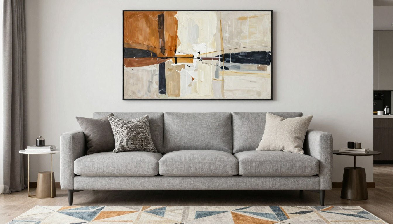

Walking into a living room where the art, sofa, and rug feel perfectly coordinated creates an immediate sense of harmony. Yet achieving this balance challenges even experienced decorators. The relationship between these three elements determines whether your space feels intentional or chaotic.
Most homeowners struggle with choosing the right rug or selecting artwork that complements their existing furniture. The colors might clash, the patterns compete for attention, or the room feels visually unbalanced. These common issues stem from not understanding three fundamental principles that professional designers use.
This guide reveals the three essential rules for matching art with your sofa and rug: understanding undertones, creating effective contrast, and balancing visual elements. You'll learn practical techniques for identifying warm and cool tones, determining proper contrast levels, and coordinating patterns without overwhelming your room. For more design inspiration and tips, explore our interior design blog.
Rule 1: Master Undertones to Create Cohesion

Undertones form the foundation of successful color coordination in any living room. These subtle hues hide beneath the surface colors of your sofa, rug, and artwork. A grey sofa might carry warm beige undertones or cool blue undertones. Understanding this distinction prevents your space from feeling disjointed.
Identifying Warm vs Cool Undertones
Every color in your room contains either warm or cool undertones. Warm tones include hints of red, orange, yellow, or gold. Cool tones lean toward blue, green, or purple. Your grey sofa might appear neutral, but natural light reveals its true undertone throughout the day.

Test your sofa's undertone by placing white fabric samples beside it. The comparison reveals whether the grey leans warm or cool. Repeat this process with your rug. When both pieces share the same undertone family, selecting complementary art becomes significantly easier.
Matching Art Undertones With Furniture
Your artwork should echo the undertones present in your sofa and rug without exact color matching. A warm grey sofa pairs beautifully with canvas prints featuring gold, rust, or warm earth tones. Cool grey furniture coordinates with artwork containing silver, navy, or sage green accents.

Warm Undertone Combinations
Spaces with warm undertones radiate comfort and intimacy. These rooms feel inviting and cozy, perfect for creating a welcoming seating area.
- Beige or tan sofa with terracotta and gold artwork
- Camel-colored rug with rust and cream art pieces
- Warm grey furniture with bronze and amber accents
- Taupe seating with earth-toned abstract paintings

Cool Undertone Combinations
Cool undertones create calm, serene environments. These spaces feel open and refreshing, ideal for modern and minimalist design styles.
- Cool grey sofa with blue and silver artwork
- Navy rug paired with teal and white art
- Charcoal furniture with purple and grey paintings
- Steel blue seating with sage green accents
The 60-30-10 Color Rule for Undertones
Professional designers use the 60-30-10 rule to distribute color throughout a room. Your dominant color (60%) typically comes from walls and large furniture pieces like your sofa. The secondary color (30%) appears in your rug and window treatments. The accent color (10%) shines in artwork and decorative accessories.

This distribution ensures your room feels balanced rather than overwhelming. Your art introduces the accent color while respecting the undertones established by your sofa and rug. The entire seating area feels intentional when these proportions align correctly.
Creating Depth Through Tonal Variation
Using multiple shades within the same undertone family adds visual interest without clashing. A warm grey sofa works with both light beige rugs and deeper chocolate brown artwork. The varying tones create depth while maintaining harmony.
Light and shadow play crucial roles in how undertones appear throughout the day. Morning light might emphasize cool tones, while afternoon warmth brings out golden hues. Choose art that looks cohesive in both lighting conditions to ensure your room feels consistent.
Discover Art That Matches Your Undertones
Explore our curated collection of canvas prints designed to complement both warm and cool interior palettes. Find the perfect piece that harmonizes with your sofa and rug.
Rule 2: Use Contrast to Add Visual Interest

Contrast prevents your living room from appearing flat and monotonous. When your sofa, rug, and art all share similar values and intensities, the space lacks energy. Strategic contrast guides the eye through the room and highlights your most important design elements.
Understanding Value Contrast in Design
Value refers to how light or dark a color appears on a grayscale spectrum. High value contrast means pairing very light elements with very dark ones. Low value contrast keeps all elements within a similar tonal range. Your room needs contrast to create focal points and visual hierarchy.

A light-colored sofa naturally creates contrast against dark artwork. Conversely, a navy sofa provides dramatic backdrop for light, airy paintings. The rug adds another layer of contrast, either bridging the gap between sofa and art or intensifying the difference.
Balancing Contrast Without Overwhelming the Room
Too much contrast creates visual chaos. Too little makes the room feel bland. The goal is balanced contrast that adds interest without overwhelming your senses. Start with one high-contrast element and keep others more moderate.
High Contrast Approaches

High contrast rooms make bold statements. They work best in spaces with abundant natural light that prevents them from feeling harsh.
- Dark sofa with light rug and bright artwork
- White furniture with dark patterned rug and bold art
- Black and white photography above colorful seating
- Navy sofa with cream rug and gold-accented paintings
Subtle Contrast Techniques

Subtle contrast creates sophisticated, calming environments. These spaces rely on texture and pattern rather than dramatic color differences.
- Medium grey sofa with light grey rug and darker artwork
- Tonal rooms using three shades of the same color
- Textured elements that create visual contrast without color
- Monochromatic schemes with varying patterns
Pattern Contrast: Mixing Scales and Styles
Pattern provides another dimension of contrast beyond color value. A patterned rug paired with a solid sofa creates textural interest. Adding patterned art risks overwhelming the room unless you carefully consider scale and style.

The key to successful pattern mixing involves varying the scale. If your rug features large, bold patterns, choose artwork with smaller, more delicate details. This prevents patterns from competing for attention. The room feels intentional rather than chaotic when patterns work at different scales.
Creating Focal Points Through Contrast
Contrast naturally draws the eye to specific areas. Your artwork becomes the room's focal point when it contrasts significantly with surrounding elements. A vibrant painting above a neutral sofa commands attention immediately upon entering the space.
The seating area should guide visitors' eyes through a deliberate visual journey. Start with the highest contrast element as your primary focal point. Use moderate contrast for secondary interest areas. Keep remaining elements relatively neutral to provide visual rest.
Texture as a Form of Contrast
Texture creates contrast even when colors remain similar. A smooth leather sofa contrasts beautifully with a nubby wool rug and textured canvas art. These tactile differences add depth and warmth to your space without introducing additional colors.

Matte finishes absorb light while glossy surfaces reflect it. This interplay creates subtle contrast that changes throughout the day as natural light shifts. A matte grey sofa paired with a glossy abstract painting introduces dimension without dramatic color contrast.
Seasonal Contrast Adjustments
Your room's contrast needs may shift with seasons. Winter's darker days benefit from higher contrast to maintain energy. Summer's bright light allows for more subtle contrast approaches. Artwork offers an easy way to adjust contrast seasonally if you rotate pieces or add temporary elements.
Find Original Paintings With Perfect Contrast
Our collection of original paintings offers diverse contrast options to complement your existing furniture. Each piece is crafted to create visual interest while maintaining harmony in your space.
Rule 3: Balance Color, Style, and Scale

Balance ensures no single element dominates your living room. When art, sofa, and rug exist in proper proportion to each other, the room feels harmonious. Imbalance creates discomfort even when individual pieces are beautiful.
Achieving Color Balance Across Elements
Color balance means distributing hues thoughtfully throughout your space. If your rug contains five colors, your artwork shouldn't introduce five more. Instead, art should pull from existing colors in the rug and sofa while adding one or two new accent tones.

The entire seating area should contain a cohesive color story. Repeat your dominant colors at least three times across different elements. A navy accent in your artwork should echo in throw pillows or rug details. This repetition creates rhythm and intentionality.
Style Coordination: Modern, Traditional, or Eclectic
Your sofa style sets expectations for coordinating pieces. A mid-century modern sofa pairs naturally with abstract or geometric art and contemporary rugs. Traditional furniture harmonizes with classic landscapes or representational paintings and Persian-style rugs.

Modern & Contemporary Spaces
Modern rooms embrace clean lines and abstract forms. Balance comes through geometric precision and intentional negative space.
- Abstract canvas prints with geometric patterns
- Solid color or simple geometric rugs
- Streamlined sofa designs in neutral tones
- Minimal color palettes with strategic pops

Traditional & Classic Styles
Traditional spaces layer pattern and texture. Balance requires careful coordination of multiple decorative elements.
- Representational art including landscapes and portraits
- Oriental or Persian rugs with intricate patterns
- Upholstered sofas with classic silhouettes
- Layered color schemes with depth

Eclectic & Transitional Looks
Eclectic spaces intentionally mix styles. Balance comes from a unifying color palette or repeated materials that tie diverse elements together.
- Mixed art styles from different periods
- Combination of traditional and modern furniture
- Layered rugs or unexpected rug choices
- Varied textures unified by color story

Bohemian & Global Styles
Bohemian rooms celebrate color and pattern. Balance prevents the space from feeling cluttered through thoughtful curation.
- Vibrant art with cultural or global influences
- Layered textiles and multiple rug textures
- Low-profile or floor-level seating
- Rich, saturated color palettes
Scale and Proportion Guidelines
Art size matters tremendously. A tiny painting above a large sofa looks lost and creates imbalance. Conversely, oversized art can overwhelm a small seating area. Following proportion rules ensures your room feels right.

Your artwork should measure approximately two-thirds to three-quarters the width of your sofa. This proportion creates visual harmony. For a standard 84-inch sofa, choose art between 56 and 63 inches wide. Multiple smaller pieces can combine to meet this width requirement.
Rug Size and Placement for Balance
The right rug anchors your seating area and defines the space. Too small, and your furniture floats awkwardly. Too large, and the room feels cramped. Proper rug size ensures all furniture pieces relate cohesively to each other.

Rug Sizing Guidelines
- All furniture front legs should rest on the rug
- Leave 18-24 inches of rug extending beyond furniture
- Maintain 10-20 inches between rug edge and wall
- Rug should define entire seating area clearly
- Common sizes: 8x10 for most living rooms, 9x12 for larger spaces
Balancing Visual Weight
Visual weight refers to how much attention an element commands. Dark colors, busy patterns, and large pieces carry more visual weight. Distribute weight evenly to prevent your room from feeling lopsided.
A heavy, dark sofa requires substantial artwork to balance its presence. Pair it with bold, colorful paintings or large-scale photography. Light, neutral furniture allows for either dramatic art that becomes the focal point or subtle pieces that maintain the airy feeling.

Your patterned rug carries significant visual weight. Balance it with either solid-colored furniture and busy artwork, or patterned art and a solid sofa. Avoid pairing a patterned rug with both patterned furniture and busy artwork unless you're experienced with maximalist design.
Creating Balance With Negative Space
Negative space provides visual breathing room. Not every wall needs art. Not every surface needs objects. Strategic emptiness balances busy elements and prevents your room from feeling overwhelming.
If your rug features complex patterns and your sofa includes decorative details, consider simpler artwork. The negative space within minimalist art provides relief from the visual activity below. This approach makes the room feel sophisticated rather than cluttered.
Symmetry vs Asymmetry in Layout
Symmetrical arrangements feel formal and traditional. Matching end tables, paired lamps, and centered art create calm, orderly spaces. Asymmetrical layouts appear more casual and contemporary, with offset furniture and varied art placement.

Choose your approach based on your sofa style and personal preference. Both can achieve perfect balance when executed correctly. Symmetry provides easier balance for beginners, while asymmetry offers more creative flexibility.
Complete Your Balanced Space With Sculptural Art
Add three-dimensional interest to your living room with modern sculptures that complement your sofa and rug. Our curated collection offers pieces in various scales to achieve perfect visual balance.
Implementing the Three Rules: Step-by-Step Process

Understanding the rules means nothing without practical application. This systematic approach helps you implement undertone matching, contrast creation, and element balancing in your own living room. Start with assessment, then move through selection to final placement.
Step 1: Assess Your Existing Pieces
Begin by analyzing what you already own. Take photos of your sofa and rug in various lighting conditions. Natural light reveals true undertones that artificial lighting may mask. Note whether each piece leans warm or cool.

Morning Assessment
Morning light tends toward cool and blue. This reveals cool undertones in your furniture most clearly.

Afternoon Observation
Afternoon light brings warmth and golden tones. Warm undertones become more prominent during these hours.
Create a color palette from your rug. Photograph it and use digital tools or physical paint chips to identify each color present. This palette guides your art selection by showing which colors already exist in your space.
Step 2: Determine Your Desired Contrast Level
Decide whether you want high drama or subtle sophistication. This choice affects every subsequent decision. Consider your room's natural light levels, size, and how the space functions daily.

High Contrast Goals
High contrast suits energetic spaces where you entertain frequently. These rooms make bold statements and photograph dramatically.
- Creates focal points immediately
- Energizes the space
- Works well with ample natural light
- Suits confident design personalities

Medium Contrast Balance
Medium contrast offers versatility and broad appeal. These spaces feel designed without being overwhelming.
- Appeals to most design preferences
- Easier to update seasonally
- Balances energy and calm
- Most forgiving for beginners

Subtle Contrast Serenity
Low contrast creates calm, sophisticated environments. These rooms feel restful and promote relaxation.
- Promotes relaxation and calm
- Sophisticated and timeless
- Relies on texture for interest
- Requires careful curation
Step 3: Select Art That Satisfies All Three Rules
With your undertones identified and contrast level chosen, search for artwork that checks all boxes. The perfect piece matches your undertones, provides your desired contrast level, and fits proportionally above your sofa.

Shopping with photos of your space prevents costly mistakes. Bring images of your sofa and rug to galleries or keep them accessible when browsing online. Compare artwork colors directly to your furniture undertones using these references.
Choosing Between Canvas Prints and Original Paintings
Both canvas prints and original paintings offer distinct advantages. Canvas prints provide affordability and reproducibility, perfect for testing color schemes. Original paintings deliver unique character and investment value that grows over time.
Canvas Print Benefits
- Affordable entry point for quality art
- Consistent colors match online previews
- Available in precise sizes for your space
- Easy to update as tastes evolve
- Durable and low-maintenance
- Wide variety of styles and subjects
Our canvas prints collection offers museum-quality reproductions in various sizes to fit your seating area perfectly. Each print is crafted to coordinate with popular furniture colors and rug styles.


Original Painting Advantages
- One-of-a-kind artwork with unique character
- Texture and dimension prints cannot replicate
- Investment that appreciates in value
- Conversation piece with provenance
- Supports artists directly
- Heirloom quality for future generations
Explore our original paintings collection for one-of-a-kind pieces that become the focal point of your living room. Each painting is created with careful attention to color harmony and contemporary style.
Incorporating Three-Dimensional Art
Sculptures add unexpected dimension to flat spaces dominated by wall art and horizontal furniture. A sculpture on a side table or console creates vertical interest while introducing new textures and materials into your room.

Choose sculptures that echo your existing color palette or introduce your accent color. A bronze sculpture adds warmth to cool grey spaces. Glass or acrylic sculptures maintain airiness in light, neutral rooms. The sculpture complements your wall art rather than competing with it.
Our modern sculptures collection includes pieces in various materials and sizes. These three-dimensional artworks complete your design by adding depth and tactile interest to your seating area.
Step 4: Test Before Committing
Before hanging expensive artwork, test your choices. Many retailers offer generous return policies. Use painter's tape to outline the art's dimensions on your wall. Live with this template for several days to ensure the scale feels right.

Create mockups by printing artwork images at roughly the correct size or use digital room visualization tools. These previews reveal how colors interact with your sofa and rug under your specific lighting conditions. Adjusting is easier before installation than after hanging.
Step 5: Proper Installation and Placement
Hang artwork 6-8 inches above your sofa back. This spacing creates connection without making the art feel like it's sitting directly on the furniture. The art's center should hang at eye level, approximately 57-60 inches from the floor.

Installation Guidelines
- Center art horizontally over sofa
- Maintain 6-8 inches from sofa top to art bottom
- Art center at 57-60 inches from floor
- Use appropriate wall anchors for weight
- Ensure level installation with proper tools
- Consider professional installation for valuable pieces
Gallery walls require additional planning but offer flexibility for smaller pieces. Create a template by tracing each frame on kraft paper. Arrange these templates on the floor in your desired configuration, then transfer the arrangement to the wall using painter's tape before installing hardware.
Common Mistakes to Avoid When Matching Art, Sofa, and Rug

Even understanding the three rules doesn't guarantee success. Certain mistakes appear repeatedly in living room design. Recognizing these pitfalls helps you avoid expensive errors that require costly corrections later.
Mistake 1: Matching Too Exactly
Perfect matching creates sterile, catalog-like rooms without personality. When your art exactly matches your throw pillows which exactly match your rug, the space feels staged rather than lived-in. Coordination differs from matching.
Coordinated Approach
- Art pulls colors from rug but adds new tones
- Textures vary while colors harmonize
- Room feels collected over time
- Personal style shines through
- Space adapts easily to updates
Over-Matched Problems
- Looks like furniture showroom display
- Lacks personality and character
- Difficult to update individual pieces
- Too predictable and boring
- Guests find it unmemorable
Aim for coordination within color families rather than exact matches. If your rug contains navy blue, choose artwork with teal or sapphire instead of matching the navy precisely. This creates harmony while maintaining visual interest.
Mistake 2: Ignoring Scale and Proportion
Scale errors rank among the most common and most damaging mistakes. Tiny art above a massive sectional sofa looks apologetic. Conversely, oversized art in a small room overwhelms the entire seating area and makes the room feel cramped.

Measure before shopping. Calculate two-thirds of your sofa's width and search for art within a few inches of that dimension. For sectionals, measure the longest straight section rather than the entire piece's length. This prevents purchasing art that's too large.
Mistake 3: Fighting Your Room's Natural Light
Rooms with limited natural light require different approaches than bright, sun-filled spaces. Dark artwork in already dim rooms makes the space feel cave-like. Light, bright art helps reflect available light and makes the room feel more open.

Limited Natural Light Solutions
Dark rooms benefit from strategic art choices that maximize available light and create brightness.
- Choose light-colored artwork with whites and creams
- Select pieces with metallic or glossy finishes
- Avoid very dark or heavy compositions
- Consider artwork with illuminated elements

Abundant Light Opportunities
Bright rooms offer flexibility for both light and dark artwork choices without overwhelming the space.
- Darker art creates sophisticated contrast
- Rich, saturated colors appear vibrant
- Both matte and glossy finishes work well
- More freedom in color and value choices
Evaluate your room throughout the day. Morning, afternoon, and evening light change how colors appear. Choose art that looks good in your room's worst lighting condition to ensure it always enhances your space.
Mistake 4: Neglecting Texture Variation
Flat, smooth surfaces throughout your room create visual boredom. When your leather sofa sits on a smooth rug beneath glass-covered art, nothing engages the eye. The room lacks depth despite potentially beautiful individual pieces.

Introduce textural variety through each element. Choose canvas prints with visible texture or original paintings with dimensional brushwork. Pair smooth leather furniture with nubby wool rugs. The texture adds interest without introducing additional colors that might clash.
Mistake 5: Following Trends Over Personal Style
Trendy colors and styles date quickly. If you choose art solely because a particular color is currently popular, you'll tire of it when trends shift. Your living room should reflect your personal taste and remain comfortable for years.
Timeless Design Principles
- Classic color combinations that endure
- Quality over quantity in art selection
- Personal meaning and connection
- Neutral base with changeable accents
- Investment in pieces you genuinely love
Trend-Dependent Choices
- Colors popular only this season
- Styles heavily promoted in current magazines
- Fast-fashion art with no personal connection
- Overly coordinated showroom looks
- Purchases based solely on what's popular
Balanced Approach
- Timeless foundation pieces (sofa, rug)
- Mix of classic and contemporary art
- Trend awareness without trend dependence
- Personal style as primary guide
- Flexibility for updates without replacement
Build your room around pieces you love rather than what's currently fashionable. Classic neutral furniture accepts both traditional and trendy art. This flexibility allows you to update your look inexpensively by changing art rather than replacing major furniture pieces.
Mistake 6: Underestimating the Power of Negative Space
More isn't always better in design. Filling every wall and surface creates visual chaos that exhausts rather than energizes. Strategic emptiness allows your eye to rest and makes your carefully chosen pieces stand out.

Leave breathing room around your artwork. If you have multiple walls in your seating area, not all need art. Consider leaving one wall empty or minimally decorated to balance a statement wall. This restraint creates sophistication and prevents your room from feeling cluttered.
Adapting the Rules for Different Living Room Scenarios

Not all living rooms present the same challenges. Small apartments require different strategies than expansive open-plan spaces. Understanding how to adapt the three rules to your specific situation ensures success regardless of your room's constraints.
Small Living Rooms and Apartments
Limited space demands careful curation. Every piece must serve both functional and aesthetic purposes. The room feels smaller when overwhelmed with too many colors or patterns competing for attention.

Small Space Strategies
- Light colors make the room feel larger
- One statement art piece instead of gallery wall
- Smaller-scale patterned rug to avoid overwhelming
- Vertical artwork draws eye up, ceiling feels higher
- Limit color palette to three main colors
- Choose furniture with exposed legs for airiness
Small rooms benefit from light undertones throughout. Cream, light grey, and soft blue create spaciousness. Add contrast through artwork rather than dark furniture. A single bold painting becomes the focal point without multiple competing elements.
Open-Plan Living Spaces
Open floor plans present the opposite challenge. Without walls defining separate zones, your seating area can feel lost in the larger space. The rug becomes crucial for establishing boundaries and creating an intimate conversation area.

Your rug defines the entire seating area in open plans. Choose a size large enough that all furniture pieces sit at least partially on it. This creates visual cohesion and separates the living zone from dining or kitchen areas. Artwork above the sofa reinforces this defined space.
Rooms With Challenging Architectural Features
Awkward windows, angled walls, or low ceilings complicate furniture arrangement. Work with these features rather than fighting them. Position your sofa to embrace the room's unique qualities, then select art and rugs that enhance rather than compete with architectural elements.

Large Windows or Views
Don't compete with stunning views. Place art on perpendicular walls where it enhances rather than blocks natural features.
- Position sofa to face view
- Place art on adjacent walls
- Choose colors that complement outdoor scenery
- Keep window walls relatively clear

Fireplace Focal Points
Fireplaces naturally draw attention. Work with this existing focal point rather than creating competition.
- Hang art above or flanking the fireplace
- Choose art that complements mantel decor
- Center rug on fireplace axis
- Arrange furniture around both fireplace and art
Low ceilings benefit from vertical artwork that draws the eye upward. Horizontal pieces emphasize the room's width, which can make low ceilings feel even lower. Choose tall, narrow art or vertical groupings to create the illusion of height.
Multi-Functional Living Spaces
Rooms serving multiple purposes require flexible design. Your living room might also function as home office, play area, or guest room. Choose art and rugs that work with various furniture arrangements as needs change.

Neutral furniture and rugs provide the most flexibility. Add personality and color through art that's easy to change. Canvas prints offer affordable variety when you want to refresh the space without replacing major pieces. Store alternate artwork to rotate seasonally or when functions change.
Rental Properties and Temporary Spaces
Renters face unique constraints including restriction on wall modifications and knowledge that the space is temporary. Focus on elements you can take when you move rather than permanent installations.
Renter-Friendly Solutions
- Use command strips or picture hanging strips
- Choose lightweight canvas prints over heavy framed art
- Invest in quality rugs that move with you
- Select portable furniture in neutral colors
- Focus budget on movable items rather than renovations
- Create gallery walls with removable adhesive
Quality canvas prints from our collection offer lightweight, damage-free hanging options perfect for rental situations. You'll enjoy beautiful art without risking your security deposit.

Seasonal Updates: Refreshing Your Look Throughout the Year

Your living room doesn't require complete redesign with every season. Strategic updates maintain interest while preserving your core design investment. Small changes in art, accessories, and textiles refresh the space without requiring new furniture or rugs.
Building a Flexible Foundation
Seasonal updates work best with a neutral foundation. When your sofa and rug use timeless colors, you can modify the room's personality through artwork and accessories. This approach provides variety without constant major purchases.

Neutral Foundation Pieces
- Grey, beige, or taupe sofas
- Natural fiber rugs in jute or sisal
- Wool rugs in neutral tones
- Classic furniture silhouettes

Changeable Accent Elements
- Artwork and wall decor
- Throw pillows and blankets
- Decorative accessories
- Seasonal textiles
Invest more in your permanent pieces and less in seasonal elements. A quality neutral sofa lasts decades while welcoming various art styles. Budget-friendly canvas prints allow you to experiment with different colors and moods as seasons change.
Spring and Summer Lightness
Warmer months call for lighter, brighter aesthetics. Swap heavy winter textiles for airy fabrics. Choose artwork with lighter values and cooler undertones. The room should feel fresh and energizing as temperatures rise.

Spring artwork might feature florals, abstracts in pastels, or coastal themes. Summer leans toward bold colors that feel energetic without feeling heavy. Light blue, coral, and sunny yellow add warmth without the weight of deeper tones. These choices make your room feel connected to the season outside.
Fall and Winter Warmth
As days shorten and temperatures drop, your living room should embrace coziness. Richer colors, deeper tones, and heavier textures create inviting warmth. Art in burgundy, forest green, or rich gold adds depth without requiring furniture changes.

Cold Weather Updates
- Artwork in deeper, richer colors
- Velvet or wool throw pillows
- Chunky knit blankets in warm tones
- Heavier curtains for insulation
- Warm metallics like bronze and copper
- Layered textures for visual warmth
Winter doesn't mean dark and dreary. Rich jewel tones bring luxury and warmth without making rooms feel cave-like. Sapphire, emerald, and ruby add color while maintaining sophistication. These hues pair beautifully with grey sofas and neutral rugs throughout the colder months.
Cost-Effective Seasonal Rotation
Building a seasonal rotation doesn't require unlimited budget. Purchase one or two pieces per season over several years. Store off-season items carefully to maintain their condition. This gradual approach creates variety without financial strain.
First Year Investment
Start with basics that provide immediate seasonal flexibility.
- Two sets of throw pillow covers
- One lightweight seasonal canvas print
- One cozy throw blanket
Second Year Addition
Expand options with complementary pieces.
- Second artwork for rotation
- Additional pillow sets
- Seasonal decorative objects
Third Year Completion
Complete your seasonal collection with variety.
- Third artwork option
- Premium seasonal textiles
- Finishing accessories
Affordable canvas prints make seasonal rotation practical. Change artwork quarterly without significant expense. Store pieces properly in protective wrapping to maintain quality. Over time, you'll build a collection that keeps your room fresh year-round.
Working With What You Already Own

Most people don't start with a blank slate. You likely already own a sofa or rug you want to keep. Working with existing pieces requires different strategies than designing from scratch. The three rules still apply, but your starting point is predetermined.
Starting With a Sofa You Love
When your sofa is your favorite piece, let it guide other selections. Identify its undertone using the white fabric comparison method. Determine whether it reads as light, medium, or dark value. These characteristics direct your rug and art choices.
Grey Sofa Starting Points
Grey is America's most popular sofa color. Its versatility works with numerous design directions.
- Cool Grey Sofa: Pair with blue, silver, or purple undertones. Choose rugs in navy, charcoal, or cool beige. Art in cool color families creates cohesion.
- Warm Grey Sofa: Coordinate with rust, gold, or warm wood tones. Select rugs with beige, caramel, or warm brown bases. Artwork in earth tones harmonizes beautifully.
- Charcoal Sofa: Creates drama and works with both warm and cool palettes. Light rugs prevent the space from feeling too dark. Bright artwork becomes a stunning focal point.
- Light Grey Sofa: Offers maximum flexibility. Almost any rug works. Let artwork determine the room's personality and color direction.

Building Around a Beloved Rug
Rugs often become starting points because they're expensive to replace. Extract a color palette from your existing rug. Use these colors to guide furniture and art selections. This ensures cohesion throughout your seating area.

Patterned rugs contain multiple colors. Choose which colors to emphasize through furniture and art. Highlight the dominant color in larger pieces and use accent colors in artwork. This creates hierarchy and prevents the room from feeling chaotic despite the patterned rug foundation.
When You Have Both Sofa and Rug
Existing furniture and rugs that weren't chosen together present the biggest challenge. Evaluate whether they share undertones. If they don't, artwork becomes the bridge that unifies them.

Mismatched Undertones Solution
Art containing both warm and cool tones bridges pieces with different undertones.
- Choose art with both color families
- Use transitional colors like teal or coral
- Add accessories that repeat both undertones
- Consider replacing the smaller piece eventually

Harmonious Foundation
When sofa and rug share undertones, art selection becomes straightforward.
- Art emphasizes shared undertone
- Wider range of art styles work
- Focus on achieving desired contrast level
- Room comes together easily
Updating Gradually vs Complete Refresh
Budget and timeline determine your approach. Gradual updates spread costs over months or years. Complete refreshes deliver immediate transformation but require larger upfront investment. Both approaches can achieve beautiful results.
- Spreads costs over time
- Allows living with choices before committing
- Permits course corrections
- Less overwhelming process
- Maintains room function throughout
Gradual Update Benefits
- Immediate cohesive result
- Everything selected to work together
- No interim awkward stage
- Single design vision throughout
- Often more cost-effective overall
Complete Refresh Advantages
Start with art when updating gradually. New artwork refreshes the entire space even with old furniture. Canvas prints offer affordable experimentation. Test how new colors work with your existing pieces before committing to furniture replacement.
Expert Tips and Professional Secrets

Professional designers develop techniques through years of experience. These insider strategies help you achieve designer-quality results without hiring professional help. Apply these methods to elevate your living room beyond basic coordination.
The Designer's Eye: Training Your Color Perception
Accurate color perception improves with practice. Train your eye by studying rooms you admire. Identify the undertones present. Notice how designers distribute colors according to the 60-30-10 rule. This observation sharpens your ability to evaluate your own space.

Color Evaluation Techniques
- View colors in natural light at different times
- Use white fabric to reveal undertones
- Compare similar colors side-by-side
- Photograph rooms to see colors objectively
- Create physical color boards before purchasing
- Trust your instinct but verify with testing
Photography reveals truths your eye might miss. Photograph your room and view images on different devices. Colors that seem matched in person might show discrepancies in photos. This technique prevents expensive mismatches.
Creating Sample Boards Before Committing
Professional designers always create sample boards. Gather fabric swatches from your sofa, rug samples, and printed images of artwork you're considering. Arrange these on poster board to see how they interact before purchasing.

View your sample board in your actual room at different times of day. Morning, afternoon, and evening light affect how colors appear together. This preview prevents disappointments when pieces arrive. The small investment in samples saves money on returns and replacements.
The Rule of Odd Numbers in Styling
Groupings of odd numbers appear more natural and interesting than even numbers. When selecting throw pillows, use three or five rather than two or four. Gallery walls work better with odd numbers of frames. This principle applies throughout design.

Three-Pillow Arrangement
Most versatile option for standard sofas. Creates balance without symmetry.

Five-Piece Gallery
Perfect for larger walls. Allows varied sizes while maintaining cohesion.

Three-Object Vignette
Standard for styling surfaces. Varies heights for visual interest.
Layering Art for Depth and Interest
Advanced designers layer art at different depths. Lean smaller pieces against the wall on a console behind your sofa. Hang larger art above. This dimensional approach adds sophistication and allows easier rotation of displayed pieces.

Varying depths catches light differently throughout the day. Framed pieces create shadows that shift as sun moves. This subtle movement adds life to static displays. The technique works especially well with original paintings that have dimensional brushwork.
Using Mirrors to Amplify Art and Light
Strategic mirror placement doubles your artwork's impact. Position mirrors to reflect art hung on opposite walls. This creates the illusion of additional pieces while bouncing light throughout your living room. The room feels larger and brighter with this simple addition.
Mirror Placement Strategy
- Hang mirrors opposite artwork to reflect it
- Position to capture natural light from windows
- Use large mirrors to expand small spaces visually
- Avoid mirrors reflecting cluttered areas
- Consider mirror frames that complement art frames
Mirrors serve dual purpose in design. They enhance your art while improving your room's light and spaciousness. This designer trick delivers significant impact without substantial cost.

The Power of Repetition
Repeat key colors and shapes at least three times throughout your room. If your artwork contains navy, echo it in throw pillows and a small accent object. This repetition creates rhythm and makes your design feel intentional rather than accidental.

Shape repetition works similarly. Circular art pairs with round throw pillows and curved furniture arms. Geometric patterns in rugs echo angular art. These subtle connections create sophisticated cohesion that elevates your entire seating area.
Budget Allocation: Where to Invest vs Save
Professional designers know where to splurge and where to save. Invest in quality foundational pieces that last decades. Save on trendy elements you'll change frequently. This strategy maximizes your budget's impact.
Investment-Worthy Purchases
- Quality sofa with hardwood frame
- Wool or natural fiber rug
- Original paintings from emerging artists
- Classic neutral pieces that endure
- Proper lighting fixtures
- Well-constructed furniture
Budget-Friendly Options
- Canvas print reproductions
- Trendy throw pillows and accessories
- Seasonal decorative objects
- Inexpensive frames for gallery walls
- Fast-fashion textiles
- Temporary design experiments
Canvas prints from quality sources like our collection bridge the gap between budget and quality. They deliver professional results at accessible prices, allowing you to achieve designer looks without designer budgets.
Real-World Coordination Examples

Theory becomes clearer through concrete examples. These real-world scenarios demonstrate how the three rules apply in different style contexts. Each example shows a complete coordination strategy from sofa selection through art placement.
Example 1: Modern Minimalist Living Room
Starting point: Light grey mid-century modern sofa with cool undertones. The clean-lined furniture sets a contemporary, uncluttered aesthetic. The goal is maintaining minimalism while adding visual interest and warmth.

Coordination Strategy:
Rug Selection
Choose a geometric patterned rug in cool greys with white accents. The pattern adds visual interest without overwhelming the minimalist aesthetic. Size: 9x12 to anchor the entire seating area with all furniture legs on the rug.
- Undertone: Cool grey matching sofa
- Pattern: Simple geometric, not overly busy
- Texture: Low pile for modern aesthetic
- Color: 3-color maximum (grey, white, cool blue)
Art Selection
Select a large-scale abstract canvas print with minimal color palette. The art features geometric shapes in cool blues, silver, and white. Approximate size: 60x40 inches for 90-inch sofa.
- Style: Abstract geometric
- Colors: Blues, silvers, white
- Undertone: Cool to match furniture
- Scale: Large single piece over gallery wall
This combination maintains the room's minimalist integrity while preventing it from feeling sterile. The geometric rug echoes the art's shapes. Cool undertones throughout create cohesion. Strategic contrast comes from value differences rather than color variety.
Example 2: Traditional Cozy Living Room
Starting point: Camel-colored tufted sofa with warm beige undertones. The classic furniture style suggests traditional elegance. The goal is creating a warm, inviting space that feels collected and timeless.

Coordination Strategy:

Rug Selection
Choose a Persian-style rug with traditional patterns in warm reds, golds, and cream. The ornate design suits the formal furniture style.
- Undertone: Warm golds and reds
- Pattern: Traditional Persian or Oriental
- Colors: Burgundy, gold, cream, rust
- Material: Wool for authentic feel
Art Selection
Select a classic landscape or still life painting with warm tones. The subject matter suits traditional aesthetics while the colors coordinate with rug and furniture.
- Style: Representational landscape or still life
- Frame: Ornate gilded frame for traditional look
- Colors: Warm earth tones, golds, rusty reds
- Undertone: Warm to match sofa and rug
- Size: Substantial but proportional to sofa width
Browse our original paintings collection for one-of-a-kind pieces perfect for traditional spaces.

This coordination creates a cohesive traditional aesthetic. Warm undertones throughout ensure harmony despite multiple patterns. The ornate rug anchors the space while the classic art provides a refined focal point. Layered textures add depth without competing elements.
Example 3: Eclectic Transitional Space
Starting point: Navy velvet sofa with cool undertones. The rich color and luxe fabric suggest sophisticated eclecticism. The goal is mixing styles and periods while maintaining cohesion through color.

Coordination Strategy:

Foundation Piece
The navy sofa provides a bold starting point. Its rich color allows coordination with both warm and cool palettes.

Bridging Rug
Choose a vintage-inspired rug mixing both warm and cool tones. Include navy to tie to sofa plus warm golds and rusts.

Contemporary Art
Select bold abstract art featuring navy, gold, and teal. The contemporary style contrasts beautifully with vintage rug.
This eclectic approach works because the navy color anchors all pieces. The rug contains both the sofa's cool navy and warm accent tones. Art bridges traditional and contemporary by featuring the navy in a modern style. The entire seating area feels curated rather than chaotic.
Example 4: Bohemian Collected Living Room
Starting point: Low-profile grey linen sofa with warm undertones. The casual furniture style invites layered, global-inspired design. The goal is creating rich visual interest through pattern and color while maintaining harmony.

Coordination Strategy:
Layered Rug Approach

Layer multiple rugs for bohemian authenticity. Start with natural jute base, add smaller patterned rugs on top.
- Base: Natural jute in large size
- Top layer: Smaller vintage-style patterned rugs
- Colors: Warm earth tones with pops of color
- Textures: Mix smooth and textured weaves
Gallery Wall Mix

Create gallery wall mixing art styles, sizes, and mediums. Unify through warm color palette.
- Mix: Paintings, prints, textiles, photographs
- Frames: Varied styles in warm wood tones
- Colors: Warm earth tones, terracotta, gold
- Arrangement: Organic, not overly structured
Bohemian style embraces abundance but still requires underlying cohesion. Warm undertones throughout unify diverse elements. The grey sofa provides neutral backdrop that lets colorful rugs and art shine. Multiple patterns work because they share a warm color story.
Bringing It All Together: Your Action Plan

Matching art with your sofa and rug transforms from overwhelming challenge to manageable process when you apply three fundamental rules. Understanding undertones creates color harmony. Strategic contrast adds visual interest. Balanced elements ensure nothing overwhelms the space. Together, these principles guide you toward a living room that feels both intentional and inviting.
Your Implementation Checklist
Follow these steps to coordinate your living room successfully. This systematic approach prevents common mistakes and ensures cohesive results.
Step 1: Assessment
- Photograph sofa and rug in natural light
- Identify warm or cool undertones
- Measure wall space for art sizing
- Note room's lighting conditions
- Determine your style preference
Step 2: Planning
- Create color palette from existing pieces
- Decide desired contrast level
- Determine budget allocation
- Calculate proper art dimensions
- Gather inspiration images
Step 3: Selection
- Shop with room photos accessible
- Test samples before committing
- Verify undertone compatibility
- Confirm proper scale proportions
- Consider both immediate and long-term goals
When to Choose Canvas Prints vs Original Art
Both options offer distinct advantages depending on your situation. Canvas prints provide accessibility and affordability for testing color schemes. Original paintings deliver unique character and investment value. Many successful rooms incorporate both.
Choose Canvas Prints When:
- Working within a modest budget
- Wanting to update seasonally
- Needing specific sizes for your space
- Testing colors before major investment
- Decorating rental properties
- Coordinating multiple rooms
Explore our canvas prints collection for high-quality reproductions in diverse styles and sizes.
Invest in Original Art When:
- Creating a permanent focal point
- Building an art collection
- Wanting unique, one-of-a-kind pieces
- Valuing texture and dimension
- Supporting artists directly
- Seeking investment-quality pieces
Browse our original paintings collection for unique pieces that become your room's centerpiece.
Don't Forget Three-Dimensional Interest
Sculptural elements complete your design by adding depth that flat art cannot provide. A carefully chosen sculpture on a console or side table introduces new textures and materials while maintaining your color story.

Choose sculptures in materials that complement your existing palette. Bronze adds warmth to cool grey spaces. White marble introduces elegance to modern rooms. Glass sculptures maintain airiness in light, neutral environments. Our modern sculptures collection offers varied options for every style.
Living With Your Choices
Even perfectly coordinated rooms require time to feel like home. Live with your choices for at least a few weeks before making additional changes. Colors and arrangements that seem unfamiliar initially often become favorites once you adjust to them.
Your living room should evolve with you. Seasonal updates keep the space fresh. Adding new art periodically prevents stagnation. The three rules remain constant, but their expression can change as your taste develops and trends shift.
Continuing Your Design Education
Design skills improve through observation and practice. Study rooms you admire in magazines and online. Identify why certain combinations work. Notice how professionals apply undertone matching, contrast, and balance principles you now understand.
Visit our design blog regularly for additional inspiration, detailed guides, and new coordination ideas. We continuously share practical tips for creating beautiful, cohesive living spaces that reflect your personal style.
Transform Your Living Room Today
Ready to coordinate your art with your sofa and rug? Browse our curated collections of canvas prints, original paintings, and modern sculptures. Find the perfect pieces that match your undertones, create ideal contrast, and balance your space beautifully.
Coordinating art with your sofa and rug no longer needs to feel overwhelming. Apply these three rules systematically. Trust the process. Your living room will transform into a cohesive, beautiful space that showcases your personal style while demonstrating professional-level design understanding.

Leave a comment
This site is protected by hCaptcha and the hCaptcha Privacy Policy and Terms of Service apply.