The decision to hang black and white art in your home carries more weight than you might imagine. A single monochrome piece can transform a room into a sophisticated gallery space or drain the warmth right out of it. The difference between premium and cold often comes down to subtle choices in composition, placement, and context that most people overlook.

Understanding these nuances separates art collectors from casual buyers. Black white artwork commands attention through its stark simplicity, but that same boldness becomes a liability when executed without consideration for space, light, and emotional resonance. This guide reveals the psychology behind monochrome art and provides practical strategies for selecting pieces that elevate rather than diminish your environment.
The Emotional Psychology Behind Black and White Art
Black and white art strips away the distraction of color to reveal pure form, texture, and contrast. This reduction creates a powerful psychological impact that color artwork cannot replicate. The human brain processes monochrome images differently, focusing on composition, lines, and emotional content without chromatic interference.

Research in visual perception shows that black white compositions activate areas of the brain associated with memory and contemplation. A well-executed monochrome piece invites viewers to linger, to study details they might otherwise gloss over. The absence of color forces deeper engagement with subject matter, creating an intellectual rather than purely visceral response.
When Black & White Feels Premium
Premium monochrome art creates sophistication through deliberate artistic choices. High-quality black white artwork demonstrates mastery of tonal range, utilizing subtle gradations between pure black and bright white. These pieces often feature rich midtones that prevent the harsh, flat appearance of cheap prints.

When It Feels Cold and Sterile
Cold monochrome art typically suffers from excessive contrast without nuance. Stark black on white with no intermediate tones creates a clinical, uninviting atmosphere reminiscent of institutional spaces. These pieces lack the warmth that comes from thoughtful tonal variation and emotional subject matter.

The subject matter plays an equally crucial role. Abstract compositions with organic forms and flowing lines tend toward premium, while rigid geometric patterns with sharp angles often read as cold. Human figures, natural landscapes, and botanical subjects inject warmth into monochrome palettes, whereas industrial or architectural themes without context can feel alienating.
For those exploring the emotional range of monochrome artwork, our blog offers deeper insights into selecting pieces that resonate on a personal level while maintaining sophisticated appeal.
Mastering Contrast: The Key to Premium Black & White Art
Contrast determines whether black white art feels dynamic and engaging or flat and lifeless. Professional artists understand that contrast encompasses more than simple black versus white opposition. It includes tonal contrast, textural contrast, and conceptual contrast that work together to create visual interest.
Tonal range refers to the spectrum of grays between absolute black and pure white. Premium monochrome art typically showcases at least seven to nine distinct tonal values, creating depth and dimension. This richness allows light to play across the artwork surface, changing appearance throughout the day as natural illumination shifts in your space.

High Contrast Drama

Bold, dramatic pieces work exceptionally well as statement art in modern spaces. High contrast draws the eye immediately and creates focal points that anchor entire room designs. These works excel in minimalist environments where they stand alone without competing visual elements.
Subtle Gradation

Gentle tonal transitions create calming, sophisticated atmospheres perfect for bedrooms and private spaces. Subtle gradation invites closer inspection and meditation, revealing new details with repeated viewing. These pieces often incorporate organic subjects like clouds, water, or fabric.
Balanced Complexity

The sweet spot combines both high and low contrast within a single composition. Balanced complexity provides visual interest without overwhelming, making these pieces versatile for various interior design styles. They work equally well in traditional and contemporary settings.
Textural contrast adds another dimension to monochrome art. Smooth gradients juxtaposed against rough, painterly strokes create tactile interest that color alone cannot achieve. Canvas prints with visible texture enhance this effect, transforming flat images into dimensional artwork that responds to changing light conditions throughout your home.
Size Matters: Choosing the Right Scale for Your Space
Scale dramatically affects whether black and white art reads as premium or overwhelming. A common mistake involves selecting pieces too small for the wall space, creating a tentative, unfinished appearance. Conversely, oversized art in compact rooms can feel oppressive, especially with high-contrast monochrome compositions.

The two-thirds rule provides a reliable starting point for wall art selection. Your artwork should occupy approximately two-thirds the width of the furniture piece below it. For black white pieces, this proportion ensures the art commands attention without dominating the entire visual field. Larger spaces with high ceilings accommodate and even require oversized pieces to maintain proper visual balance.
Explore Premium Black & White Canvas Prints
Discover museum-quality monochrome artwork in sizes ranging from intimate accent pieces to dramatic statement installations. Each print features rich tonal range and professional-grade materials designed to maintain sophistication in any space.
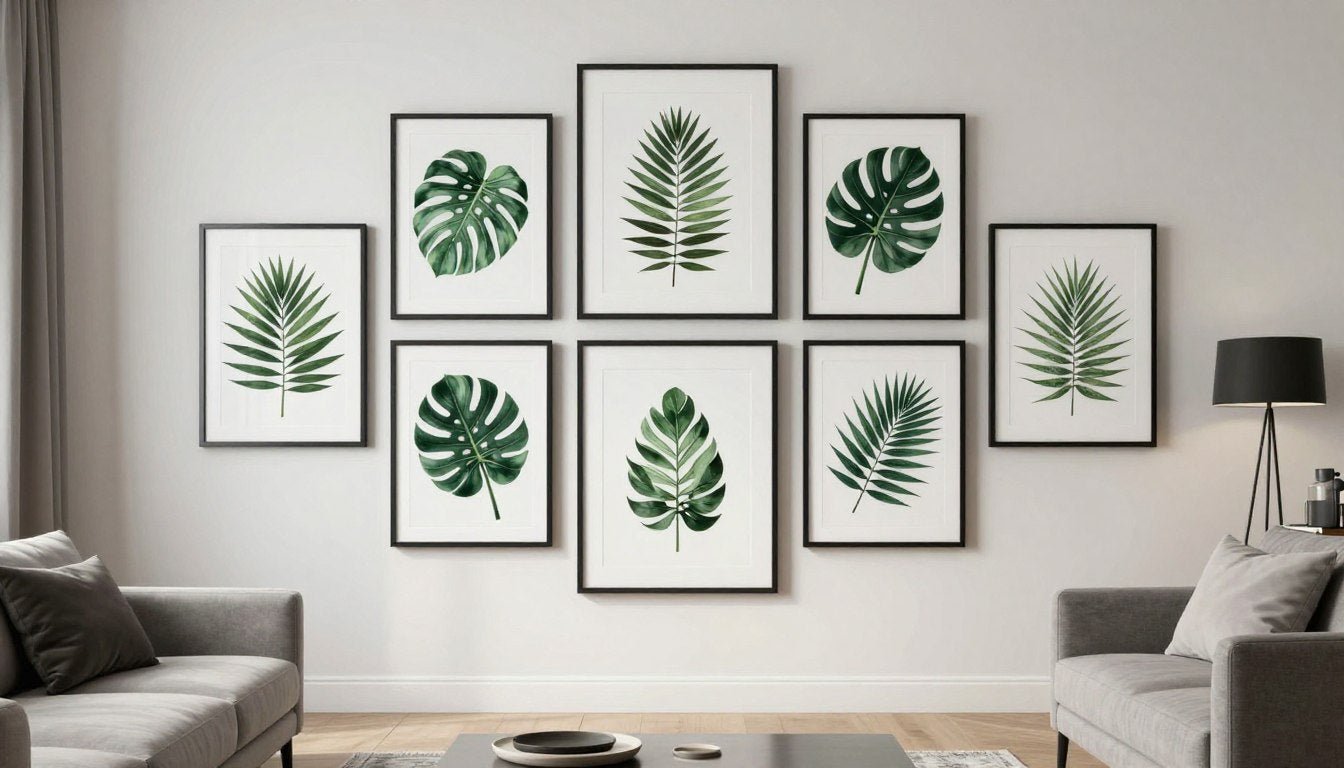
Multiple smaller pieces arranged as a gallery wall offer an alternative to single large-scale art. This approach works particularly well with black white photography or abstract compositions that share common themes or tonal characteristics. Gallery walls feel premium when properly curated with consistent framing and thoughtful spacing, typically three to six inches between frames.

Vertical versus horizontal orientation also impacts perception. Vertical black white pieces draw the eye upward, making ceilings appear higher and rooms more spacious. Horizontal orientations create stability and calm, working well above furniture where they visually anchor the space. Square formats offer versatility but require confident placement to avoid appearing indecisive.

Vertical Impact in Compact Spaces
Narrow rooms and spaces with low ceilings benefit tremendously from vertical monochrome art. The upward momentum created by tall compositions counteracts the feeling of compression. Select pieces with ascending elements like trees, buildings, or abstract forms that naturally guide the eye skyward.
Hallways and entryways particularly suit vertical black white artwork. These transitional spaces often lack natural focal points, and a commanding vertical piece provides immediate visual interest while maintaining traffic flow. The monochrome palette prevents overwhelming narrow spaces where color might feel claustrophobic.
How Lighting Transforms Black & White Art from Cold to Captivating
Lighting represents the single most influential factor separating premium from cold monochrome art presentation. Natural light reveals the full tonal range of quality black white pieces, showcasing subtle gradations that artificial lighting often flattens. South-facing walls receive consistent, balanced illumination ideal for displaying monochrome artwork without harsh shadows or glare.

Artificial lighting requires more strategic consideration. Warm-toned bulbs (2700K-3000K) add subtle warmth to monochrome art, preventing the clinical coldness associated with cool white LEDs. Picture lights or track lighting positioned at thirty-degree angles eliminate glare while enhancing texture and dimension. Avoid direct overhead lighting, which flattens artwork and creates harsh shadows.
Premium Lighting Approaches
- Dedicated picture lights with adjustable warmth settings
- Natural light from windows with UV-filtering treatments
- Layered lighting allowing artwork illumination independent of room lighting
- Dimmable fixtures enabling mood adjustment throughout the day
- Accent lighting creating subtle shadows that enhance texture
Approaches That Read as Cold
- Harsh overhead fluorescent fixtures creating flat appearance
- Cool white LEDs (5000K+) emphasizing clinical sterility
- Insufficient lighting leaving art barely visible
- Direct sunlight causing glare and potential fading
- Competing light sources creating confusing shadows
The color temperature of surrounding walls interacts with lighting to affect how viewers perceive black white art. Warm gray, cream, or beige walls complement monochrome pieces by providing visual warmth that prevents sterile appearance. Stark white walls can work but require careful lighting to avoid institutional feelings. Dark walls create drama but demand additional illumination to prevent artwork from disappearing visually.

Shadows deserve consideration as design elements rather than problems to eliminate. Strategic shadows add depth and dimensionality to monochrome art, creating dynamic installations that change throughout the day. Premium presentations embrace these variations rather than fighting them with overly bright, flat lighting.
Room-Specific Applications: Where Black & White Art Excels
Different rooms demand different approaches to black and white art selection. The function of each space influences whether monochrome artwork enhances or detracts from the environment. Understanding these nuances prevents common mistakes that turn sophisticated art into cold, unwelcoming visual elements.
Living Rooms: The Statement Space
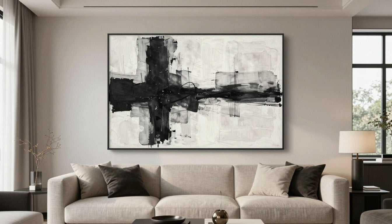
Living rooms accommodate bold, high-contrast black white art better than any other space. These social areas benefit from conversation-starting pieces that command attention without overwhelming. Large-scale abstracts or dramatic portraits work exceptionally well above sofas or fireplaces, creating focal points that anchor furniture arrangements.


Monochrome Reverie
Minimalist portraits bring human warmth to monochrome palettes. The subtle expression and tonal gradation prevent coldness while maintaining sophisticated appeal. Perfect for contemporary living rooms seeking emotional resonance.
View Similar Prints
Monochrome Symphony
Abstract compositions with varied tonal ranges create visual interest without specific subject matter. These versatile pieces adapt to evolving decor while maintaining timeless appeal. Ideal for modern and transitional interiors.
Explore Collection
Veiled Silence
Dramatic portraits with high contrast create striking focal points. The interplay of revealed and concealed elements invites contemplation. These pieces anchor rooms with confident artistic statements that reward repeated viewing.
See This PrintBedrooms: Embracing Subtlety
Bedrooms require softer approaches to monochrome art. High-contrast pieces can feel too stimulating for spaces dedicated to rest and relaxation. Instead, select black white artwork with gentle gradations, organic subjects, and calming compositions. Landscapes, botanical prints, and abstract pieces with flowing forms create serene atmospheres conducive to sleep.

Positioning matters significantly in bedrooms. Art placed opposite the bed provides something beautiful to wake up to, while pieces above the headboard should remain subtle to avoid visual overstimulation before sleep. Multiple smaller prints create gallery walls that distribute visual weight rather than concentrating it in single dramatic pieces.
Dining Rooms: Creating Conversation
Dining spaces excel with monochrome art that sparks discussion without distracting from meals and companionship. Black white photography of food, cultural scenes, or architectural subjects provides interesting visual content without the distraction of competing colors. The formality of monochrome palettes complements the social ritual of dining.

Scale remains important in dining rooms. Art should be visible from seated positions without requiring neck craning. Horizontal orientations work particularly well, echoing the horizontal line of the dining table and creating visual harmony. For those interested in exploring original artwork with similar sophistication, original paintings offer one-of-a-kind pieces that become treasured focal points.
Home Offices: Professional Sophistication
Home offices and workspaces benefit from monochrome art that projects professionalism while maintaining personality. Abstract compositions, architectural photography, and geometric designs create focused environments without the distraction of vibrant colors. Black white art in offices reads as intentional and sophisticated rather than cold when balanced with warm wood tones and natural materials.

Vertical pieces work well in offices, drawing the eye upward during moments of contemplation. Consider art that reflects your professional identity or industry—architectural firms might choose structural subjects, while creative professionals could select bold abstracts. The key is maintaining visual interest without creating distraction during focused work.
Framing Choices That Enhance or Undermine Black & White Art
Framing decisions significantly impact whether monochrome art appears premium or amateurish. The frame functions as a transitional element between artwork and surrounding space, either supporting the piece or competing with it for attention. Black white art demands particularly thoughtful framing to avoid exacerbating potential coldness.

Floating frames create sophisticated presentations for monochrome canvas prints. The gap between canvas edge and frame adds dimensionality, transforming flat prints into substantial art objects. Natural wood floating frames inject warmth that counterbalances stark black white compositions. Darker woods like walnut work well with high-contrast pieces, while lighter oak complements subtle gradations.
Premium Framing Approaches
- Floating frames creating dimensional separation
- Natural wood tones adding organic warmth
- Simple profiles avoiding visual competition
- Consistent framing across gallery walls
- Museum-quality materials preventing deterioration
- Custom sizing ensuring perfect fit
Approaches That Diminish Quality
- Ornate frames competing with artwork
- Mismatched styles creating visual chaos
- Cheap plastic frames telegraphing low quality
- Oversized matting creating distance from art
- Reflective glass causing glare and viewing difficulties
- Inconsistent framing in multi-piece installations
Black frames offer classic sophistication for monochrome art, creating clean transitions that allow the artwork to dominate visually. However, solid black frames risk appearing too matchy with black white compositions, sometimes creating a flat, one-dimensional effect. Adding thin metal accents or choosing frames with subtle texture prevents this problem.

White and light-colored frames work when contrasting with darker walls or when creating gallery walls with multiple pieces. These lighter frames prevent visual heaviness, particularly important when displaying several monochrome pieces together. The key is maintaining consistency—mixing black and white frames within the same installation typically reads as indecisive rather than eclectic.
Frameless presentations suit certain monochrome pieces, particularly modern abstracts and minimalist compositions. Gallery-wrapped canvases with painted edges eliminate the frame entirely, creating clean, contemporary presentations. This approach works best with larger pieces where the absence of framing reads as confident artistic choice rather than budget constraint.
Strategic Color Integration: Balancing Monochrome with Warmth
Pure monochrome rooms risk appearing cold and sterile regardless of art quality. Strategic color integration transforms black white art from potentially harsh to sophisticatedly restrained. The key is introducing warm tones through furnishings, textiles, and accent pieces that complement rather than compete with monochrome artwork.

Natural materials provide the most effective warmth alongside black white art. Wood furniture, woven textiles, leather upholstery, and stone accessories introduce subtle color variation and organic texture. These elements create visual and tactile richness that prevents the clinical feeling associated with excessive monochrome palettes.
Warm Neutrals
Cream, beige, and warm gray textiles soften monochrome art without introducing strong color. These neutral tones provide visual rest while maintaining sophisticated restraint. Layer various textures in similar tonal ranges for depth.
Natural Wood Tones
Medium to dark woods add organic warmth that beautifully complements black white compositions. The natural grain patterns introduce visual interest at a different scale than artwork, creating layered sophistication without color conflict.
Metallic Accents
Gold, brass, and bronze metallics inject subtle warmth and luxury. These reflective surfaces catch light differently than matte black white art, adding dimensional variation. Use sparingly to maintain elegant restraint.
Living plants represent another powerful tool for warming spaces with monochrome art. The organic green tones and natural forms provide life and movement that static artwork cannot offer. Large-leaf tropical plants create dramatic statements, while smaller succulents and ferns add subtle natural color throughout the space.

Limited color introductions through pillows, throws, and small accessories allow flexibility without overwhelming commitment. Terracotta, rust, navy, and forest green work particularly well with black white art, adding depth without bright distraction. These accent colors should appear in multiple locations throughout the room to create cohesive rather than random color placement.
Avoid introducing too many competing colors or patterns when displaying monochrome art. The restraint of black white compositions demands similar visual discipline in surrounding decor. Three colors maximum (beyond black, white, and neutrals) maintains sophisticated cohesion. More creates visual chaos that diminishes the impact of carefully chosen monochrome artwork.
Texture: The Secret Weapon Against Cold Monochrome Spaces
Texture transforms potentially cold black white art into dimensionally rich installations. While color provides one form of visual interest, texture creates another through light interaction, shadow play, and tactile appeal. Premium monochrome spaces layer multiple textures at various scales to prevent flat, sterile appearances.

Canvas texture itself contributes significantly to artwork quality. Fine-weave canvases create smooth, refined surfaces appropriate for photographic prints and detailed illustrations. Medium-weave canvases add subtle texture that enhances painted and abstract compositions. Heavily textured canvases suit bold, gestural artwork where visible weave becomes part of the artistic expression.
Textural Layering Strategy
Successful monochrome rooms combine at least five distinct textures across artwork, furniture, and accessories. Start with canvas texture in your black white art, add smooth wood furniture, introduce woven textiles through rugs or baskets, incorporate soft upholstery fabrics, and finish with hard elements like stone or ceramic. This variety creates visual richness that color would otherwise provide.
Wall texture plays a supporting role in presenting monochrome art. Smooth painted walls create clean, modern backdrops that allow artwork to stand alone. Textured walls—whether plaster, grasscloth, or subtle wallpaper—add another dimensional layer but risk competing with textured artwork. Match smooth art with textured walls or textured art with smooth walls for balanced presentations.

Sculptural elements complement two-dimensional black white art by introducing three-dimensional texture. Modern sculptures in monochrome finishes extend the black white theme while adding tangible depth. Position sculptures on shelves, console tables, or pedestals near wall art to create textural dialogue between pieces.
Fabric choices dramatically affect monochrome space warmth. Smooth silks and satins reflect light, creating cool, sophisticated atmospheres. Rough linens, chunky knits, and velvet upholstery absorb light while adding tactile warmth. Mix smooth and textured fabrics throughout the space, using rougher textures near black white art to counterbalance potential visual coldness.

Textile Selection Guidelines
Choose textiles that introduce subtle pattern through weave structure rather than printed designs. Herringbone, basket weave, cable knit, and jacquard fabrics add visual interest while maintaining monochrome sophistication. These structural patterns create shadow and light play similar to artwork itself.
Layer textiles at different scales—large-weave throws over fine-weave upholstery, chunky pillows against smooth leather. This variation prevents monotony while staying within the restrained color palette that allows black white art to dominate visually.
Common Mistakes That Make Black & White Art Feel Cold
Even quality monochrome art fails when presented improperly. Understanding common pitfalls helps you avoid transforming sophisticated artwork into cold, unwelcoming installations. These mistakes appear frequently enough that learning to recognize them prevents wasted investment in pieces that never achieve their potential.

Mistake 1: Insufficient Scale
Undersized black white art appears tentative and apologetic rather than confident. A small monochrome piece on a large wall creates negative space that reads as emptiness rather than breathing room. This problem amplifies with high-contrast art, where the dramatic subject matter demands appropriate scale to carry visual weight.
The solution involves either sizing up to fill the space properly or creating gallery walls with multiple pieces. Single pieces should occupy at minimum two-thirds the width of furniture below them. For walls without furniture, aim for artwork covering at least forty percent of the wall width to maintain presence without overwhelming.
Mistake 2: Excessive Contrast Without Nuance
Pure black and pure white with no intermediate tones create harsh, clinical compositions lacking sophistication. This extreme contrast works occasionally for dramatic effect but becomes exhausting when applied throughout a space. Eyes need rest areas of mid-tone gray to prevent visual fatigue.
Mistake 3: Cool Lighting Choices
Cool-temperature LED bulbs (5000K and above) emphasize the clinical aspects of black white art. This lighting drains any residual warmth from monochrome compositions, creating the sterile atmosphere most people instinctively avoid. The problem compounds in spaces with white walls and minimal warm-toned furnishings.
Switch to warm white bulbs (2700K-3000K) or install dimmers allowing adjustment based on time of day. Morning light can tolerate slightly cooler temperatures, while evening requires warmer tones to create inviting atmospheres. Consider smart bulbs allowing color temperature adjustment without fixture replacement.

Mistake 4: Ignoring Wall Color
Stark white walls with black white art create institutional feelings reminiscent of hospitals and offices. While this combination can work in carefully curated galleries, most homes benefit from slightly warmed wall colors. Off-white, cream, warm gray, or even deep charcoal provide more forgiving backdrops for monochrome art.
Test paint samples next to your intended artwork before committing. The same black white piece appears dramatically different against cool versus warm backgrounds. Wall color influences not just the art but the entire room atmosphere, making this choice critical for preventing cold, unwelcoming spaces.
Mistake 5: Neglecting Warm Elements
Rooms featuring only black white art, neutral furniture, and minimal accessories read as unfinished showrooms rather than lived-in homes. Humans naturally crave warmth and organic elements. Neglecting these needs in pursuit of monochrome purity creates spaces people admire but avoid spending time in.
Introduce warmth through natural materials, plants, warm metallics, and carefully chosen color accents. These elements need not compete with artwork—subtle integration maintains sophisticated restraint while preventing emotional coldness. Think of warm elements as supporting players enhancing the star rather than competing for attention.
Identifying Quality in Black & White Art Prints and Originals
Quality differences between premium and cheap black white art become apparent with educated inspection. Understanding these distinctions prevents purchasing pieces that initially appeal but ultimately disappoint. Investment in quality artwork pays dividends through years of visual pleasure and maintained property value.

Print Quality Indicators
Premium canvas prints demonstrate smooth tonal gradations without visible banding or pixelation. Examine areas transitioning from black to white—quality prints show numerous intermediate gray tones creating smooth progressions. Cheap prints display obvious steps between tones, creating poster-like rather than fine art appearance.
| Quality Factor | Premium Indicators | Budget Indicators |
| Print Resolution | Crisp details visible at close inspection, no pixelation | Visible dots or blur when viewed closely |
| Tonal Range | Smooth gradations with 7-9 distinct gray values | Harsh contrast with limited mid-tones |
| Canvas Material | Professional-grade cotton or linen blend | Thin polyester showing through ink |
| Ink Quality | Archival pigment-based, fade-resistant | Dye-based showing color shift over time |
| Edge Finishing | Gallery-wrapped with continued image or painted edges | White canvas edges or sloppy wrapping |
| Frame Construction | Solid hardwood with proper joinery | MDF or particle board with visible gaps |
Canvas texture should be appropriate to the image. Photographic prints suit fine-weave canvas allowing detail visibility. Painted and abstract compositions work well on medium-weave canvas adding subtle texture. Heavily textured canvas suits only bold, gestural artwork where weave becomes part of the artistic expression.
Original Artwork Considerations
Original black white paintings and drawings offer unique qualities prints cannot replicate. Hand-applied media creates dimensional surfaces with visible brushstrokes, pencil marks, or pen lines. This tactile quality adds significant value, transforming artwork from decorative element to collectible piece.

Examine original pieces for consistent quality throughout the composition. Professional artists maintain technical control across entire surfaces, whereas amateur work often shows strong areas alongside weak execution. Signature placement and dating indicate artist confidence in the work. Certificates of authenticity add value and ensure investment protection.
For collectors seeking one-of-a-kind pieces with investment potential, original paintings offer opportunities to own unique artwork appreciating over time. These pieces carry emotional resonance and tangible value that reproductions cannot match.
Advanced Styling Techniques for Premium Black & White Presentations
Professional interior designers employ specific techniques when styling monochrome art that separate sophisticated installations from amateur attempts. These methods account for visual weight distribution, eye movement patterns, and psychological impact of black white compositions in residential spaces.

The Rule of Three
Designers frequently group decorative elements in threes when styling around black white art. Three pillows on a sofa, three accessories on a console table, or three pieces creating a gallery wall produces visually satisfying arrangements. This odd-number grouping prevents static symmetry while maintaining balance.
Apply this principle at multiple scales. Three large furnishings anchor the room, three medium accessories style surfaces, and three small details add finishing touches. Black white art becomes one element in these triadic arrangements, integrated into the overall composition rather than floating independently.

Console Table Styling
Style console tables beneath black white art with three accessories varying in height and form. Combine sculptural objects, organic elements like plants or branches, and functional items like books or boxes. Maintain visual balance without perfect symmetry.

Sofa Arrangement
Position sofas directly below black white art with three pillows creating visual connection. Vary sizes and textures while maintaining color restraint. The pillows should echo tones from the artwork without matching exactly, creating subtle visual dialogue.

Gallery Wall Groupings
Create gallery walls using three or six pieces rather than even numbers like two or four. Odd groupings feel more dynamic and less formulaic. Vary sizes while maintaining consistent framing for cohesive yet interesting presentations.
Balancing Visual Weight
Black white art carries significant visual weight due to strong contrast. Balance this weight through strategic furniture and accessory placement. Heavy, dark furniture anchors high-contrast art, while lighter pieces risk appearing unbalanced. Alternatively, group multiple lighter furnishings to collectively balance dramatic artwork.
Distribute visual weight across the entire room rather than concentrating it in one area. If black white art dominates one wall, balance with substantial furniture pieces, large plants, or architectural features on opposite walls. This distribution creates comfortable visual flow preventing overwhelming concentration of dark elements.

Creating Layered Vignettes
Layer decorative elements at varying depths to add dimension around monochrome art. Position larger items like floor plants or sculptures directly beside or below artwork. Add medium-height items on nearby tables or shelves. Include small tabletop accessories completing the layered composition.
These vignettes should relate visually to the black white art through shape, line, or conceptual theme. Angular artwork pairs well with geometric accessories, while organic art suits natural elements like branches, stones, or botanical specimens. The layering creates visual richness preventing the flat, one-dimensional appearance of poorly styled monochrome spaces.
Discover Museum-Quality Black & White Artwork
Transform your space with professionally curated monochrome art featuring rich tonal ranges, sophisticated compositions, and premium materials. Each piece ships ready to hang with a satisfaction guarantee, ensuring your investment enhances rather than diminishes your environment.
Making Confident Choices in Black & White Art Selection
The distinction between premium and cold monochrome art ultimately depends on thoughtful selection and presentation. Quality black white artwork demonstrates rich tonal range, appropriate scale, and emotional resonance. These pieces become focal points that anchor spaces rather than afterthoughts that simply fill walls.

Success requires considering the entire environment rather than artwork in isolation. Wall color, lighting, furniture, textiles, and accessories all contribute to whether monochrome art feels sophisticated or sterile. Each element should support the others, creating cohesive spaces that reward both quick glances and prolonged contemplation.
Trust your instincts when selecting black white art. Pieces that immediately speak to you typically continue providing visual pleasure for years. Conversely, artwork purchased purely for decorative purposes without emotional connection often disappoints over time. The most successful installations combine intellectual appreciation with genuine emotional response.
Start with one significant piece rather than attempting complete room transformations. Live with that artwork for several weeks, observing how it affects the space under different lighting conditions and from various viewing angles. This measured approach prevents costly mistakes while building confidence in your developing aesthetic sensibility.
For continued inspiration and guidance on incorporating art into your home, explore our design blog featuring styling tips, artist insights, and seasonal recommendations. The journey toward creating spaces you truly love involves ongoing learning and experimentation with pieces that reflect your evolving taste.

Black and white art offers timeless appeal that transcends passing trends. When selected and presented thoughtfully, monochrome compositions create sophisticated environments combining visual interest with emotional warmth. The techniques and principles outlined here provide frameworks for confident decision-making, ensuring your investment enhances your space for years to come.

Leave a comment
This site is protected by hCaptcha and the hCaptcha Privacy Policy and Terms of Service apply.