There's something magical about walking into a room where the walls tell a story. A well-designed gallery wall turns blank space into a focal point that reflects your style and makes your house feel like home.
Whether you're drawn to bold abstract prints or quiet black and white photos, learning how to create a gallery wall opens up endless possibilities for personal expression.

What Is a Gallery Wall and Why It Matters
A gallery wall is a curated collection of art, prints, and photos arranged together on a single wall. It's a way to display multiple pieces that might feel too small on their own but create visual impact when grouped.
The beauty of gallery walls lies in their flexibility. Unlike traditional single-statement art pieces, they let you combine different styles, sizes, and frame types into one cohesive display. You can mix canvas prints with framed photos, blend color with black and white, and adjust your collection over time as your style evolves.

Gallery walls work in any room. A collection of family photos brings warmth to a hallway. Abstract art creates a focal point in your living room. Even a small bedroom wall can accommodate a tight grouping of prints that add personality without overwhelming the space.
Featured snippet answer: To create a gallery wall, start by selecting 5-15 pieces of art or photos, lay out your arrangement on the floor first, maintain 2-3 inches of spacing between frames, and hang pieces at eye level with the center point around 57-60 inches from the floor.
The key is intention. Random wall decor feels scattered. A thoughtfully planned gallery wall feels collected, personal, and purposeful—like you've been curating it for years, even if you put it together last weekend.

Planning Your Gallery Wall Layout
The difference between a gallery wall that works and one that doesn't usually comes down to planning. Taking time to map out your layout saves you from unnecessary nail holes and frustration.
Measuring Your Wall Space
Start by measuring the wall area you want to fill. Use painter's tape to mark the boundaries of your gallery wall—this gives you a visual framework and helps prevent the collection from sprawling too large or sitting too small.
A good rule of thumb: Your gallery wall should take up about two-thirds to three-quarters of your available wall space. Leave breathing room on all sides so the arrangement doesn't feel cramped against furniture or corners.

Choosing Your Layout Style
Gallery wall layouts fall into a few main categories. Each style creates a different look and feel.
Grid Layout
This structured approach uses frames of the same size arranged in perfect rows and columns. It's clean, modern, and easiest for beginners.
- Works best with matching frames
- Creates symmetrical, organized look
- Ideal for photo collections
- Requires precise measurements
Salon Style
This free-form arrangement mixes different frame sizes and orientations. It feels collected and eclectic—like you've gathered pieces over time.
- Allows mixed frame styles
- More forgiving with spacing
- Creates visual interest through variety
- Takes more planning to balance
Linear Layout
Frames align along one edge—either tops, bottoms, or center points. This style works beautifully above furniture like sofas or consoles.
- Easy to expand over time
- Creates horizontal visual flow
- Works above headboards and mantels
- Can use varied frame sizes
Clustered Layout
Tight groupings of smaller pieces arranged closely together. This style works well in compact spaces or as part of a larger wall design.
- Perfect for small walls
- Creates intimate focal points
- Easy to rearrange
- Minimal spacing between pieces

Creating Your Floor Template
Before you pick up a hammer, arrange your frames on the floor in your desired layout. This lets you play with spacing and positioning without commitment.
Take a photo of your final floor arrangement. You'll reference this constantly during installation. Some people trace each frame onto kraft paper and tape the paper template to the wall—this method lets you adjust placement before making any holes.

Pay attention to how your eye moves across the arrangement. Balance doesn't mean symmetry. A large piece on one side can be balanced by several smaller pieces on the other. What matters is that no single area feels too heavy or empty compared to the rest.

Choosing the Right Frames and Art
Your choice of frames and art pieces determines whether your gallery wall feels cohesive or chaotic. The goal is unity with enough variety to keep things interesting.
Selecting Your Art Collection
Start by gathering pieces you genuinely love. Your gallery wall should reflect your personality, not just fill space. Mix different types of art—prints, photos, canvas pieces, and even three-dimensional elements like small mirrors or sculptural objects.
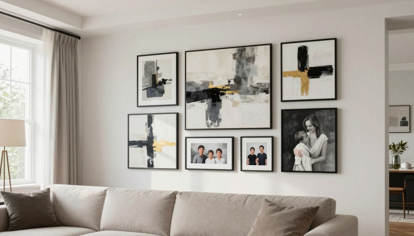
Consider these combinations: Abstract art pairs beautifully with family photos when tied together through consistent framing. Black and white photos create sophisticated contrast against colorful prints. A collection of botanical prints in similar tones feels curated and calm.

Quality matters more than quantity. Five gallery-quality canvas prints with archival inks will look more impressive than fifteen cheap poster prints. Look for pieces printed on materials that resist fading—UV-resistant coatings protect your art from sunlight damage over time.
Pro tip: When working with canvas prints, hand-stretched canvas on wood frames adds depth and dimension that flat prints can't match. The slight shadow cast by the canvas edge creates visual interest even in a simple arrangement.

Frame Selection Strategy
Frames act as the unifying element in your gallery wall. You have two main approaches: matching frames for cohesion, or varied frames connected by a common element.
Matching black frames create a modern, gallery-like aesthetic. Natural wood frames bring warmth. White frames feel fresh and coastal. The style you choose should complement your room's existing design.

If you're mixing frame styles, connect them through a common material or color family. All wood tones (even if some are oak and others are walnut) create visual harmony. Alternating black and white frames in a pattern feels intentional rather than random.
Matted vs. Matless Frames
Mats (the border between artwork and frame) add formality and breathing room around art. They're particularly effective for smaller prints that need visual weight.
Matless frames—where art goes edge-to-edge—create a more modern, gallery-like feel. They work especially well with modern wall art and contemporary photography.

Color Coordination
Your art doesn't need to match perfectly, but a cohesive color palette ties everything together. Choose a dominant color that appears in most pieces, then add accent colors for variety.
A black and white photo collection is foolproof. If you want color, pull 2-3 main colors from your room's existing palette and look for art featuring those tones. Even a neutral gallery wall with mostly beige, gray, and cream can include one or two colorful pieces as intentional accent points.

Measuring and Spacing Your Pieces
Precise measurements transform a good gallery wall idea into a great gallery wall reality. Small spacing errors multiply across multiple frames, so accuracy matters from the start.
The 57-Inch Rule
Professional galleries hang art with the center point at 57 to 60 inches from the floor—average eye level for most people. This rule applies to gallery walls too, though you'll apply it to the entire arrangement rather than individual pieces.
Calculate the center point of your entire gallery wall layout, not just the middle frame. If your arrangement spans 48 inches vertically, the center should sit around 57-60 inches from the floor, placing the bottom edge around 33 inches up and the top around 81 inches.

Spacing Between Frames
Consistent spacing creates visual harmony. The standard spacing between frames is 2 to 3 inches—close enough to feel connected, far enough to let each piece breathe.
Use the same spacing horizontally and vertically throughout your entire gallery wall. Inconsistent gaps make even beautiful art feel haphazard. A simple spacer cut from cardboard helps you maintain uniform distance as you hang each piece.

Common spacing mistake: Don't space pieces farther apart to fill a larger wall. If your collection feels too small for the space, add more pieces rather than increasing gaps. Spacing over 4 inches makes your gallery wall feel disconnected.
Working With Odd Numbers
Gallery walls with odd numbers of pieces (5, 7, 9, 11) tend to look more balanced than even numbers. The odd count allows for a natural center point and makes asymmetrical arrangements feel intentional.
Start with your largest or most important piece and build around it. This anchor piece often goes slightly off-center rather than dead-center—this creates movement and keeps the arrangement from feeling too static.

Adjusting for Furniture
When your gallery wall sits above furniture—a sofa, console table, or bed—the furniture's top edge becomes your new baseline. Leave 6 to 8 inches of space between the furniture and your lowest frame.
Your gallery wall should be roughly two-thirds the width of the furniture below it. A 72-inch sofa pairs well with a gallery wall spanning 48 to 60 inches wide. This proportion feels anchored and intentional.

Hanging Techniques That Actually Work
The hanging process makes or breaks your gallery wall. Even a perfectly planned layout falls flat with sloppy installation. These techniques ensure your frames stay level and secure.
Essential Tools You'll Need
Gather your supplies before you start. You'll need a hammer, picture hanging hooks or nails, a level (laser levels work beautifully for this), measuring tape, pencil, and painter's tape for marking positions.
For heavier pieces—canvas prints on wood frames or large framed art—use proper wall anchors or picture hooks rated for the weight. Standard nails work for lightweight frames under 5 pounds, but anything heavier risks falling.

The Paper Template Method
This foolproof technique eliminates guesswork and unnecessary holes. Trace each frame onto kraft paper or newspaper, cut out the shapes, and tape them to your wall in your planned arrangement.
Step back and live with the paper template for a day. You'll quickly spot any pieces that need adjusting. Mark your nail holes through the paper, then peel away the templates and hang your frames exactly where marked.

Starting From the Center
Begin with your center or anchor piece. Get this one perfectly positioned and level—everything else builds from this foundation point.
Work outward from your anchor piece using consistent spacing. Check your level constantly. Even a one-degree tilt becomes obvious when you step back to view the whole arrangement. A laser level speeds this process dramatically.

Hanging Without Damage
Command strips work for lightweight prints in rental spaces where nail holes aren't allowed. Follow weight limits carefully—these adhesive strips fail spectacularly when overloaded.
For picture rails or gallery hanging systems, all your frames hang from nearly-invisible cables or hooks along a rail. You can adjust heights and positions without new holes. This system works beautifully if you like refreshing your gallery wall seasonally.

Working Solo vs. With Help
Gallery walls are easier with a second person. One person holds frames in position while the other steps back to check placement and level. If you're working alone, use painter's tape to temporarily hold lightweight frames while you check positioning.
Take breaks to step back. You'll spot crooked frames and spacing issues more easily from 8 feet away than when you're standing at the wall with a hammer in hand.

Styling Tips for Cohesive Gallery Walls
A cohesive gallery wall feels collected and intentional. These styling strategies help disparate pieces work together as a unified whole.
Creating Visual Balance
Balance doesn't require symmetry. A large piece on one side balances with a cluster of smaller pieces on the other. Dark frames balance with lighter artwork. The key is distributing visual weight so no area dominates.
Test the balance by squinting at your arrangement. When you blur the details, you see only shapes and values. The composition should feel stable, not lopsided or bottom-heavy.

Mixing Horizontal and Vertical Orientations
Vary your frame orientations for visual interest. All horizontal frames create a stable, grounded feeling. All vertical frames draw the eye upward. A mix of both creates dynamic movement across your wall.
Square frames anchor corners and fill gaps between rectangular pieces. They're particularly useful in salon-style arrangements where you need flexibility to fit pieces together like a puzzle.

Incorporating Different Art Styles
You can mix abstract art with photography, vintage prints with modern graphics, family photos with purchased art. The unifying element is usually the framing or color palette.
Personal photos add warmth to a collection of abstract prints. Travel photography pairs beautifully with maps or vintage postcards from those locations. The story you're telling matters more than strict style consistency.

Design tip: If your collection includes abstract canvas prints alongside framed photos, use the abstract pieces as your anchor points. Their bold shapes and colors provide structure, while photos fill in around them with personal touches.
Adding Dimensional Elements
Gallery walls don't have to be flat. Small shelves, sculptural pieces, or even mounted plants add depth and personality. A floating shelf in the middle of your arrangement holds small objects that connect to your theme.
Three-dimensional elements break up the rhythm of flat frames and give your eye resting points. Just keep them proportional—a large sculptural piece needs space around it, while small objects work tucked between frames.

Seasonal Refreshes
One advantage of gallery walls is their flexibility. Swap out a few pieces seasonally to keep your space feeling fresh. Replace bright summer photos with moody autumn landscapes. Switch colorful art for black and white in winter.
This approach works best if you plan for it from the start. Use the same frame sizes for pieces you intend to swap, so you're changing artwork without re-measuring and re-hanging frames.

Common Gallery Wall Mistakes to Avoid
Even experienced decorators make these gallery wall mistakes. Learning to recognize and avoid them saves time, money, and frustration.
Hanging Too High
The most common error is hanging your entire gallery wall too high on the wall. Remember the 57-60 inch center point rule. Gallery walls that sit close to the ceiling feel disconnected from your living space.
Fix this mistake: If your arrangement is already hung too high, don't be afraid to take it down and rehang it lower. Those extra nail holes will disappear with spackle and paint. The improved look is worth the effort.

Inconsistent Spacing
Random gaps between frames make your arrangement feel unplanned. Whether you choose 2 inches or 3 inches between pieces, keep that measurement consistent throughout your entire gallery wall.
Use a cardboard spacer or painter's tape to maintain uniform gaps. This small detail dramatically improves how professional your finished wall looks.
Ignoring Room Context
A gallery wall should complement your room's style, not fight it. Ornate gold frames in a minimalist space feel out of place. Ultra-modern abstract prints clash with traditional Victorian decor.
Your frames and art should echo colors, materials, and style elements already present in your room. Pull colors from your throw pillows, pick up wood tones from your furniture, or reflect the mood your space already has.

Using Poor Quality Prints
Low-resolution digital prints or cheap poster paper undermine even the most thoughtful arrangement. Quality matters. Blurry images, pixelated details, and flimsy paper cheapen your entire wall.
Invest in gallery-quality prints on archival paper or canvas. UV-resistant inks prevent fading from sunlight. These quality details make your gallery wall look intentional and lasting rather than temporary.
Quality matters most in large prints where imperfections become obvious. When working with large canvas prints, professional printing on hand-stretched canvas maintains crisp details even at substantial sizes.
Choosing Frames That Don't Fit Your Art
Forcing artwork into the wrong size frame leads to awkward matting or cropped images. Measure your art before buying frames, or choose made-to-order options that fit your pieces perfectly.
Custom framing costs more upfront but eliminates the frustration of ill-fitting standard frames. Your art deserves to be displayed at its full dimensions without compromise.

Gallery Wall Ideas by Room
Different rooms call for different gallery wall approaches. The pieces you choose and how you arrange them should match each space's purpose and atmosphere.
Living Room Gallery Walls
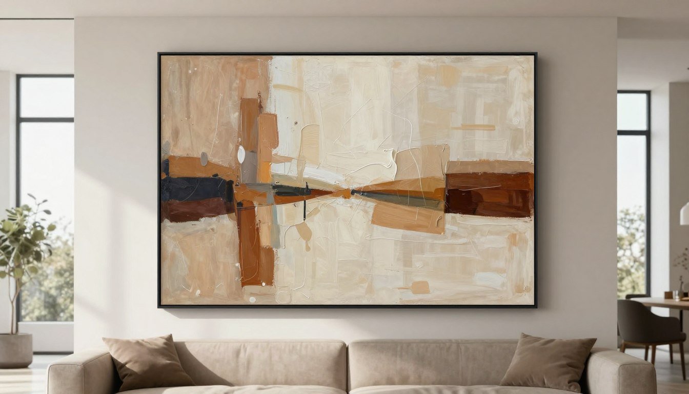
Your living room gallery wall becomes the focal point of the space. This is where you can go bold with large-scale pieces and statement art.
Choose art that reflects the room's mood. Abstract prints in calming colors create a relaxed atmosphere. Bold geometric patterns energize the space. Family photos mixed with art add personal warmth. Position your gallery wall above the sofa or on the longest uninterrupted wall for maximum impact.

Living room walls have the space for larger collections—9 to 15 pieces work well. Mix sizes dramatically: pair a 30x40 inch canvas with clusters of 8x10 inch prints. This size variation creates visual interest and keeps your eye moving across the arrangement.
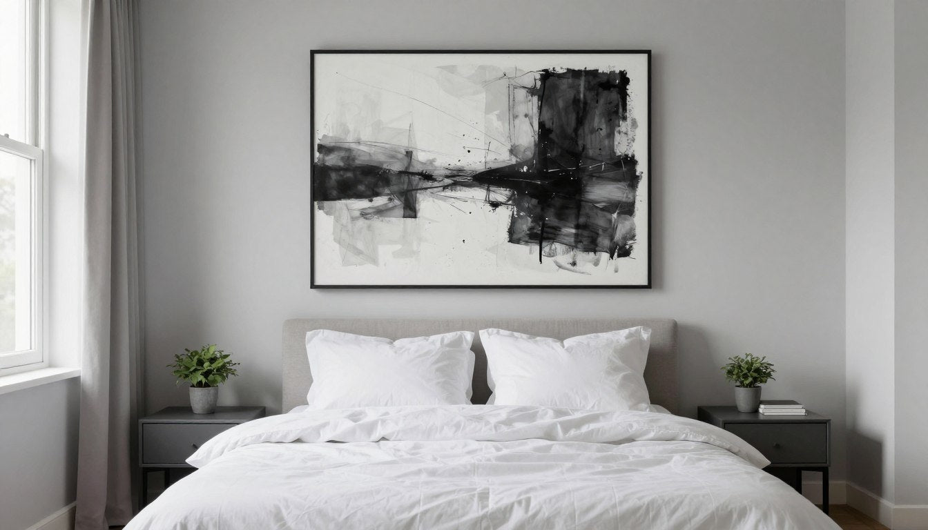
Bedroom Gallery Walls
Bedrooms call for more intimate, calming gallery walls. This is your personal retreat, so choose art that makes you feel peaceful or inspired when you see it first thing in the morning.
Softer colors, nature photographs, abstract art in muted tones, and meaningful personal photos work beautifully in bedroom spaces. Keep your collection smaller and more focused—5 to 7 pieces often feels more restful than a large, busy arrangement.

Position bedroom gallery walls above your headboard or on the wall facing your bed. Avoid placing heavy pieces directly above where you sleep—use lightweight canvas or framed prints securely anchored.
Hallway Gallery Walls
Hallways are perfect for linear gallery wall arrangements. The narrow space works beautifully with frames aligned along one edge, creating a path that guides you through the space.
Hallway walls handle more eclectic collections. Mix family photos from different eras, travel photographs from various trips, or a collection of art you've gathered over time. The transitional nature of hallways welcomes these collected, story-telling arrangements.

Use consistent spacing (2-3 inches) and frame style throughout hallway galleries. The repetition creates rhythm as you move through the space. Hallways also offer opportunities for very long arrangements—15 to 20 pieces isn't too many if you have the wall length.
Dining Room Gallery Walls
Dining rooms benefit from more formal gallery wall arrangements. Grid layouts with matching frames create sophistication appropriate for a room where you entertain guests.
Consider art that sparks conversation—food photography, vintage wine posters, botanical prints, or colorful abstract pieces. Your gallery wall becomes part of your tablescape, contributing to the dining experience.

Home Office Gallery Walls
Office gallery walls should inspire and motivate without distracting from work. Choose pieces that reflect your professional goals or personal aspirations.
Inspirational quotes framed alongside abstract art, black and white photography, or graphic prints work well in office spaces. Keep colors energizing but not overstimulating—think navy, gray, and pops of color rather than full rainbow brightness.

Staircase Gallery Walls
Stairway walls present unique challenges and opportunities. The angled ceiling line creates interesting possibilities for ascending or descending arrangements that follow the stairs' slope.
Align frame bottoms with the stair rail angle for a flowing look. Or create a more formal arrangement that maintains level alignment despite the stairs. Both approaches work—choose based on your home's style.

Maintaining Your Gallery Wall Over Time
A well-maintained gallery wall looks fresh for years. These simple care practices protect your investment and keep your wall looking intentional.
Protecting Art From Fading
Sunlight is your gallery wall's biggest enemy. UV rays fade prints, especially photographs and watercolors. If your wall receives direct sunlight, use UV-protective glass in frames or choose canvas prints treated with UV-resistant coatings.
Rotate pieces seasonally if you have artwork in direct sun. Move the most exposed pieces to shadier spots and bring previously stored pieces out. This rotation prevents uneven fading across your collection.

Cleaning Your Frames and Art
Dust frames monthly with a soft microfiber cloth. For glass-covered art, use streak-free glass cleaner on a cloth—never spray directly on the frame. Moisture seeping behind glass causes damage.
Canvas prints need gentler care. Dust them with a soft brush or clean microfiber cloth using light strokes. Never use water or cleaning products on canvas—these can damage the print and canvas texture.
Checking for Straightness
Frames naturally shift over time from vibrations, bumps, or settling walls. Check your gallery wall every few months and straighten any pieces that have tilted.
Keep your small level handy. A quick check and minor adjustment takes seconds but maintains that professional, curated look you worked hard to create.

Refreshing Your Collection
Gallery walls can evolve as your style and life change. Swap out pieces that no longer resonate with you. Add new art as you discover it. This is one of the joys of gallery walls—they're never truly finished.
Keep your layout framework but change what fills it. Replace summer beach photos with cozy winter scenes. Update family photos as your children grow. Rotate art from other parts of your house into your gallery wall and vice versa.

Securing Frames in High-Traffic Areas
In spaces where frames might get bumped—hallways, stairs, or kids' rooms—add security measures beyond standard picture hooks. Earthquake putty on frame backs prevents shifting. Multiple hanging points distribute weight and add stability.
For homes with children or pets, make sure heavier pieces are absolutely secure. A falling frame is a safety hazard. Test your installations by gently pulling the bottom of each frame—it shouldn't budge or tilt forward.
Safety tip: Use proper wall anchors in drywall for any piece over 10 pounds. Find studs for the heaviest pieces when possible. Quality installation hardware prevents accidents and protects your art investment.
Frequently Asked Questions
Q: How many pictures should be in a gallery wall?
A: Most effective gallery walls contain between 5 and 15 pieces. Odd numbers (5, 7, 9, 11) tend to look more balanced than even numbers because they allow for a natural center point. The exact number depends on your wall size and frame dimensions. Small walls work well with 5-7 pieces, while large living room walls can accommodate 12-15 pieces without feeling crowded. Quality matters more than quantity—a thoughtful arrangement of seven pieces looks better than a scattered collection of twenty.
Q: What is the best spacing between frames in a gallery wall?
A: The ideal spacing between frames is 2 to 3 inches, both horizontally and vertically. This distance keeps pieces connected as a unified collection while giving each frame enough breathing room. Maintain this spacing consistently throughout your entire arrangement for a cohesive, professional look. Spacing less than 2 inches makes your gallery wall feel cramped, while gaps over 4 inches make individual pieces feel disconnected from the group. Use a cardboard spacer to maintain uniform gaps as you hang each piece.
Q: Should all frames in a gallery wall match?
A: Frames don't need to match exactly, but they should share a unifying element. All black frames create a modern, cohesive look. All natural wood frames (even in different wood tones) feel collected and warm. You can also mix frame styles successfully if they share a common color family or material. The key is intention—varied frames should look deliberately chosen, not randomly assembled. For beginners, matching frames in one color (black, white, or natural wood) is the safest approach that guarantees a cohesive result.
Q: How do you arrange a gallery wall without making holes?
A: The paper template method eliminates unnecessary holes. Trace each frame onto kraft paper, cut out the shapes, and tape them to your wall. Live with this paper arrangement for a day or two, making adjustments until it feels right. Mark your hanging points through the paper, then remove the templates and hang frames exactly where marked. This technique ensures you get placement right the first time. For lightweight pieces in rentals, Command strips rated for appropriate weight allow hanging without any holes, though they have strict weight limits you must follow.
Q: Where should a gallery wall be placed in a room?
A: Gallery walls work best on large, uninterrupted wall spaces that naturally draw the eye. In living rooms, position your gallery wall above the sofa or on the longest clear wall opposite the entrance. In bedrooms, hang gallery walls above the headboard or on the wall facing the bed. Hallways are perfect for linear gallery wall arrangements. Avoid placing gallery walls where furniture doors, light switches, or heating vents interrupt the space. The wall should be visible from main seating areas and feel like a natural focal point rather than an afterthought tucked in a corner.
Q: Can you mix photos and art in a gallery wall?
A: Absolutely—mixing family photos with purchased art creates warmth and personality. The key to successfully combining photos and art is using a unifying element like consistent frame style or a cohesive color palette. Black and white family photos pair beautifully with colorful abstract prints when all pieces share matching black frames. Personal photos add intimate touches to collections of botanical prints or landscape art. This mix tells your story while maintaining visual cohesion. Balance is important—don't let one type dominate unless that's your intention. A good ratio is roughly 40% photos to 60% art, or vice versa.
Creating a gallery wall transforms blank spaces into personal statements. Whether you fill your wall with family memories, curated art, or a mix of both, the process is about telling your story through pieces you love.
Start small if you feel overwhelmed. Five frames arranged thoughtfully beat fifty pieces hung without purpose. As you live with your gallery wall, you'll discover what works in your space and what changes you want to make.
The best gallery walls evolve over time, growing with your style and reflecting your journey. Ready to begin yours? Explore our canvas prints collection to find pieces that speak to you.

Leave a comment
This site is protected by hCaptcha and the hCaptcha Privacy Policy and Terms of Service apply.