
Which style truly changes the mood of a room — calm landscapes or bold, nonrepresentational pieces?
The right wall decor can lift a small living area or anchor a large dining space. This short guide helps readers weigh visual feel, scale, and practical hang heights without pressure.
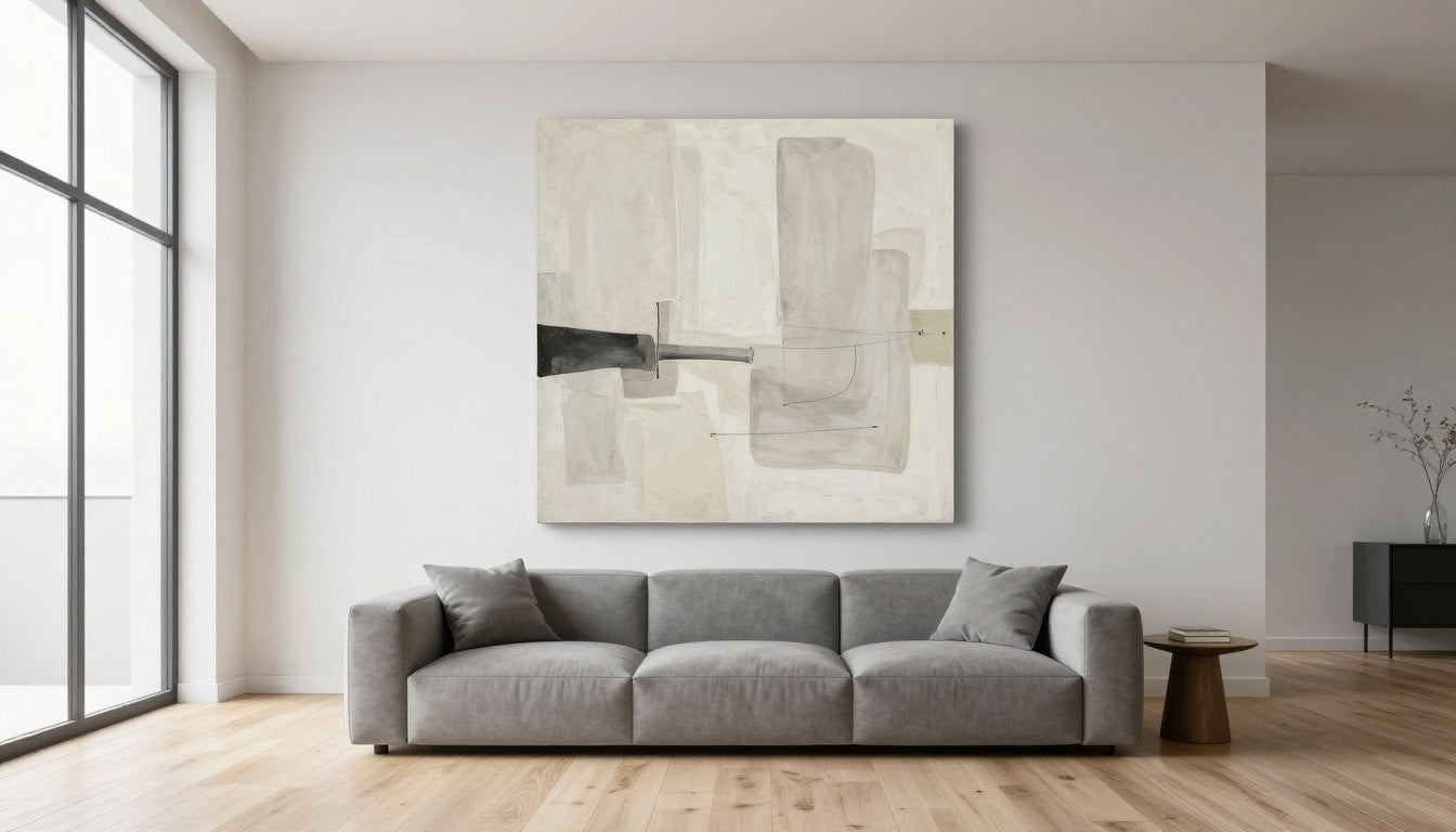
Practical tips include size rules—aim for art that spans roughly half to three quarters of furniture width—and common eye level placement at about 57–60 inches to the center in empty wall zones.
Mixing formats like gallery grids, stacked canvases, or mirrors creates a lived-in look. Mirrors also bounce light, which suits bright Australian rooms and helps spaces feel bigger when natural sun is limited.
Readers will find easy color strategies, lighting basics, and budget-friendly ideas such as DIY canvas pieces and framed textiles. Rossetti Art’s curated canvas collection is a handy place for quick choices and chat support for tailored picks.

Key Takeaways
- Measure art relative to furniture: 50–75% width works best.
- Center artwork about 57–60 inches from the floor in open walls.
- Mix sizes and mirrors for a collected, airy look in bright homes.
- Pick finishes and colors that match daily life and room light.
- Build a layered collection over time with statement canvases and smaller prints.
Why Wall Art Matters in Your Home’s Design
Good wall pieces bring texture and mood that furniture alone rarely provides.
Wall art acts like jewelry for a house: it adds color, texture, and visible personality. A single hero canvas or a small gallery can pull a room's palette together and give the space an immediate point of focus.
They don't need to be costly. Affordable prints, vintage finds, and simple DIY pieces all lift the look without breaking a budget.
"A few great pieces often feel more curated than many small, competing items."
Mixing formats — a framed print, a mirror, a stacked group or a sculptural piece — creates rhythm across different walls. Leaving breathing space around each item prevents clutter and lets each piece read clearly.
- Art completes a room by adding depth that plain walls can't deliver.
- A curated selection signals personal taste and cohesive style.
- Choose pieces that bring daily joy; they don’t need a heavy pedigree.
Explore nature and abstract options at Rossetti Art or chat for help picking the right canvas: https://rossettiart.com/collections/canvas-print. Need help? 💬 Chat: https://m.me/104795508292657.
Nature vs. Abstract: What Defines Each Style and How They Shape a Room’s Vibe
Artwork often decides whether a space feels calm or energised the moment you walk in.
Organic motifs and calming tones
Nature pieces use landscapes, botanicals and ocean scenes. They bring soft blues, creams and greens that suit coastal or Hamptons themes.
These choices create a grounded, serene vibe in the room. Woven or layered surfaces add texture and gentle movement.
Shapes, movement and bold statements
Abstract pieces speak in shape, gesture and contrast. They can energise a room with bright palettes or moody tones.
Black-and-white abstracts give crisp graphic weight that helps anchor furniture groupings and architectural lines.
- Nature: organic motifs, calming tones, soft vibe for coastal rooms.
- Abstract: gesture and movement that creates a bold focal point.
- Texture: layered paint or woven materials make both styles feel richer.
- Practical tip: stack two framed pieces when one large canvas is hard to source.
Discover Rossetti Art’s nature and abstract prints: https://rossettiart.com/collections/canvas-print
How to Choose Between Nature Art and Abstract Art for Your Walls
Art selection often starts with the emotion someone wants from a space.
Start with the feeling: serene retreat vs. energized focal point
If the aim is a calm retreat, look for soft tones, organic shapes, and gentle movement. These pieces settle a room and invite rest.
For a lively focal point, pick bold gestures, high contrast, or energetic marks. A single statement can lift a neutral space instantly.
Match (or intentionally contrast) existing decor
Map the room’s current theme—coastal, Scandi, modern—and decide whether the piece should support that style or offer a controlled contrast.
- Support: echo a colour or material already in the space for cohesion.
- Contrast: introduce one unexpected hue or shape to add interest without clutter.
- Test: view options digitally, then step back from different angles before committing.
Give permission to pick pieces they love. Affordable routes—DIY canvases, framed textiles, or mixing small prints with one hero work—build confidence and reflect taste and personality.
Compare options at Rossetti Art and chat for tailored suggestions: https://rossettiart.com/collections/canvas-print · https://m.me/104795508292657.
Room, Scale, and Placement: Getting Size Right So Art Doesn’t Feel “Too Small”
Size and placement decide whether a piece feels intentional or lost on a wall.
Golden proportions over furniture — aim for 50–75% of the furniture width. Over a 60-inch sofa, that equals roughly 30–45 inches wide. This simple rule keeps the wall art in proportion with the seating and anchors the group.
Hanging height and spacing — in open areas centre the piece about 57–60 inches from the floor for easy viewing. For grouped pieces keep 2–3 inches between frames so the gallery reads as one composed unit.
When to pick each format
- Oversized hero: best in large rooms or tall walls that need a strong focal point.
- Gallery wall: perfect for storytelling and variety across a hallway or above a console.
- Grid: ideal when crisp, symmetrical order helps an area feel calm.
Common mistake: art that’s too small makes a big wall feel empty. As an example, aim for pieces that cover two-thirds to three-quarters of the wall width on large expanses. Check sightlines from seating and paths so the point reads centred in the room.
Explore sizes and formats at Rossetti Art’s canvas collection for practical examples and quick ordering.
Color Strategy: From Calming Greens to Bold Blacks and Whites
A carefully chosen palette makes art feel like it belongs in a room.
Start with colour psychology. Blues and greens calm bedrooms. Reds and oranges energise living zones. Neutrals keep options flexible and work well with Australian light.
Use accent hues already in the room
Pull a shade from a rug, cushion, or curtain so wall art clicks with the rest of the decor. Small repeats across textiles and prints give a cohesive theme without effort.
When high-contrast makes a statement
In mostly pale spaces, a strong black white piece reads from across the room. It creates instant focus and a modern look without extra clutter.
Analogous and complementary palettes
Analogous schemes offer soft transitions. Complementary pairs give a lively pop. Test with paint swatches or simple digital mockups under natural and artificial light.
| Effect | Colours | Best Room |
|---|---|---|
| Calm | Blues, Greens | Bedroom |
| Energetic | Reds, Oranges | Living |
| Graphic | Black & White | Entry / Gallery |
Practical tip: Balance intensity so the wall doesn’t overpower furniture or architecture. See color-forward nature and abstract prints at Rossetti Art: https://rossettiart.com/collections/canvas-print.
Lighting Your Art: Make Colors Pop and Textures Glow
Well-placed fixtures make colours richer and textures more visible from every seat.
Accent lighting is the go-to for showing true colour and detail in wall art. It sits between ambient and task lighting and draws the eye to an artwork without overwhelming the room.
Picture lights, track, and recessed options
Picture lights give focused, classic beams for a single piece. Track lights suit multi-piece arrangements and let someone adjust coverage. Recessed fixtures provide a clean ceiling line and wide, subtle wash when placed correctly.
Practical rules: angle, dimmers, temperature
Angle lights at roughly 30 degrees to avoid glare and ensure even coverage. Dimmers let users lower brightness for evening meals or raise it for display mode.
Warm lamps flatter reds and yellows. Cooler lamps keep blues and greens true. Avoid direct sunlight; it fades pigments and paper over time.
| Type | Best Use | Notes |
|---|---|---|
| Picture light | Single canvas | Targeted beam, elegant finish |
| Track light | Gallery or multiple pieces | Flexible angles, easy repositioning |
| Recessed | Minimal ceilings | Subtle wash, needs placement care |
If unsure about lighting choices, 💬 Chat: https://m.me/104795508292657.
Framed vs. Canvas: Which Finish Fits Your Space and Style
The right surface and edge can turn a canvas into relaxed scale or a frame into a formal statement.
Canvas prints for modern, relaxed rooms and large-scale impact
Canvas brings a contemporary, casual feel. It is lightweight and often more affordable for big statements above sofas or beds.
Stretch options keep texture and colour strong while keeping installation simple. Large canvas prints read well in open-plan Australian living spaces.
Framed pieces for definition, protection, and formal spaces
A clean frame adds crisp edges and protects the surface. Framed prints suit dining rooms, studies, or hallways that need a polished look.
Match frame tone to timber floors or pick black, white, or metallics to avoid wood-clash.
Mixing both for balanced visual weight
Use a framed anchor piece with companion canvas works to balance scale and ease. The framed work gives definition; canvas adds relaxed movement.
Think about overall style and colour threads so the wall art feels cohesive across the space.
Mixing Nature and Abstract Without Clutter
A curated mix of organic scenes and bold gestures feels fresh when held together by a single visual thread.
Unify with colour or a subtle theme. Pull one or two hues through every piece so styles read as a set rather than a random collection.
Keep frames and tones steady
Consistent frame tones or a matched edge finish help varied subjects look curated. This simple rule makes gallery groupings calmer and more deliberate.
Balance visual weight and rhythm
Anchor the display with a larger hero piece and give smaller works generous breathing space so the wall feels composed, not crowded.
"Fewer strong pieces often read more confident than many small, competing items."
- Test layouts on the floor or use paper templates on the wall.
- Edit ruthlessly—remove one item if the space feels busy.
- Limit the palette so mixed subjects keep a cohesive look.
Need help editing a mix? 💬 Chat: https://m.me/104795508292657.
Gallery Walls, Grids, and Stacks: Layouts That Always Look Considered
A well-planned arrangement turns scattered frames into a single, confident feature on the wall.
Plan with paper templates. Trace each print, stick the templates to the wall and step back. This makes spacing obvious and avoids surprises.
Template planning and spacing that reads polished
Keep 2–3 inches between frames and treat the whole grouping as one unit. That simple rule makes a gallery wall feel deliberate rather than random.
Combining portraits, landscapes, and 3D elements
Stack two pieces vertically to fill a narrow space. Build a tight grid for symmetry, or mix portrait, landscape and small sculptural items for depth.
"Balance larger or darker works lower or central to spread visual weight evenly."
Mirrors add height and bounce light in entries and near windows. Asymmetry can feel lively when balanced by a single anchor piece.

| Layout | Best use | Spacing |
|---|---|---|
| Grid | Precise symmetry in a dining room | 2–3 inches |
| Stack | Narrow hallways or beside mirrors | 2–3 inches |
| Mixed gallery | Living room focal wall with varied pieces | 2–3 inches |
Tip: Shop ready-to-hang canvas prints for grids and stacks at Rossetti Art: https://rossettiart.com/collections/canvas-print.
Room-by-Room Ideas: Living, Dining, Bedroom, and Entry
Each room benefits from a clear focal idea that guides scale, colour, and placement.
Living area choices
In the living room a single oversized focal canvas anchors the seating zone. Alternatively, a layered gallery wall that spans about two-thirds of the sofa width creates a collected look.
Tip: keep spacing consistent so the display feels intentional from couches and doorways.
Dining selections
For dining spaces choose calm, cohesive grids hung at eye level (about 57–60 inches). Serene botanicals or soft prints make conversation easy and the table the centre of attention.
Bedroom picks
Bedrooms benefit from gentle botanicals or soothing abstracts in muted tones. When placing pieces over a headboard, hang slightly lower so the art reads from the bed.
Entry and hallway ideas
Use mirrors to bounce light in narrow entryways. Small prints and vertical stacks fill tall walls without clutter. Keep intervals tight for narrow spaces so the run feels balanced.
- Anchor pieces to furniture proportions.
- Preview placement from common sightlines before hanging.
- Maintain even spacing so arrangements read polished across rooms.
Explore living and dining picks from Rossetti Art: https://rossettiart.com/collections/canvas-print · Chat for styling help: https://m.me/104795508292657.
Texture, Materials, and Frames: Elevating the Look
Texture and framing often decide whether a work reads casual or curated in a living space.
Matting gives smaller pieces breathing space. A neat mat lifts prints and makes textiles feel tailored, so a framed textile looks intentional rather than improvised.
Matting, timber tones, and metallics that complement furniture
Match frames with nearby furniture and floors. Avoid pairing blond oak with dark mahogany; if unsure, black, white, or a slim metallic is safe and modern.
Consistent frame tones across a grouping help mixed subjects read as one composed feature on the wall.
How texture in abstracts and botanicals adds depth
Layered paint, woven fibers, and raised inks catch light differently. These surfaces bring motion and richness without changing scale.
Pair textural pieces with tactile cushions, jute rugs, or linen throws so the room feels cohesive and layered.
- Tip: slim metal frames suit modern style; natural timber fits coastal or Scandi schemes.
- Tip: matting elevates small works and makes textiles appear custom.
See framed looks and canvas textures in Rossetti Art’s collection: https://rossettiart.com/collections/canvas-print.
Budget-Savvy Ways to Build a Collection You Love
Start with accessible canvas prints from Rossetti Art: https://rossettiart.com/collections/canvas-print. 💬 Chat for bundle ideas: https://m.me/104795508292657.

Smart sourcing and small edits help anyone grow a meaningful art collection without overspending. Begin with one strong canvas as an anchor, then layer affordable prints and a few personal pieces over time.
DIY hacks work well. Paint a simple abstract, frame a travel textile or tidy tea towel, or reframe a vintage find. These steps add character and keep the budget low.
Groups of small prints hung close together read as one large artwork. Likewise, two stacked mid-size frames can fill a tall niche as an inexpensive alternative to a single oversized canvas.
- Buy one statement canvas, then add smaller prints and mementos.
- Use DIY framed textiles for low-cost, high-meaning pieces.
- Hang grids tightly so multiple prints behave as a single feature.
Mix a few higher-impact items with thrifty finds so the wall never feels unfinished. Edit often and keep only what they love in the space.
Australian Homes, Light, and Lifestyle: Choosing Art for Local Conditions
Bright Australian light changes how prints read; planners can use that to their advantage.
Sunlit rooms suit coastal palettes—soft whites, creams and ocean blues and greens bring a calm theme indoors.
Protect pieces from direct sun. UV exposure fades pigments and paper. Place prized wall art out of the midday path or use UV-filtering glass for framed works.
Mirrors work well in deeper areas. They bounce daylight into a room and let wall art stay visible without harsh exposure.
- Match frames with lighter timber floors common in coastal homes, or pick black, white or metallic for versatility.
- Pick subjects that echo local landscapes—botanicals, ocean scenes, breezy abstracts—to make the home feel linked to place.
- Hang with everyday light in mind: test pieces at morning and late-afternoon times.
"Bright light reveals texture and colour, so placement matters as much as the piece."
| Condition | Placement Tip | Best Choice |
|---|---|---|
| Strong midday sun | Move away from direct panes | Framed prints with UV glass |
| Deep rooms | Use mirrors to reflect daylight | Soft coastal palettes |
| Light timber interiors | Match frame tones | Natural frames or crisp black/white |
Browse coastal-ready pieces at Rossetti Art: https://rossettiart.com/collections/canvas-print.
Shop Rossetti Art: Curated Nature and Abstract Canvas Prints for Every Room
Customers find that the right mix of framed prints and lightweight canvases brings both balance and character to any space.
Explore a curated collection of wall art designed for living rooms, dining zones, bedrooms, entries and hallways. The range includes framed prints and stretched canvas pieces that scale from grids to oversized hero works.
Lightweight canvas makes large formats easy to hang and re-arrange. Mixing framed pieces with canvas helps spread visual weight and keeps a gallery display balanced.
- Quick fit tips: aim for 50–75% width above furniture and 2–3 inch spacing between frames.
- Choose canvas for big impact; use prints for layered, editable walls.
- Chat for personalised size, palette and layout advice.
"Simple, scalable pieces help people build confident collections that feel curated."
| Use | Best Picks | Why it works |
|---|---|---|
| Hero over sofa | Large canvas | Lightweight, bold focal point |
| Gallery grid | Matched prints | Consistent spacing, tidy rhythm |
| Narrow hall | Stacked pieces | Vertical fill without clutter |
Explore more → https://rossettiart.com/collections/canvas-print
Shop link: https://rossettiart.com/ · 💬 Chat with us → https://m.me/104795508292657
Follow for real-room examples: Instagram · Facebook
Conclusion
A considered approach makes any wall feel finished in a few simple steps. They should start with feeling and theme so the piece fits the home and the way people use each space.
Quick metrics help. Aim for 50–75% of furniture width and centre art at about 57–60 inches for easy viewing in most rooms.
Light the work at roughly 30 degrees, add dimmers, and pick a colour temperature that flatters the piece. Mix framed pieces with canvas to balance visual weight and the overall look.
Take time, try paper templates, and edit until the point feels right. When ready, explore Rossetti Art: https://rossettiart.com/ and sample nature and abstract canvases at https://rossettiart.com/collections/canvas-print.
Need help? 💬 Chat: https://m.me/104795508292657 · 📸 Instagram: https://www.instagram.com/chiara_rossetti_art · 🔵 Facebook: https://fb.com/104795508292657.
FAQ
Which style suits a calm living room best — nature or abstract?
For a calm living room, nature-inspired pieces often work well. They use organic shapes, soft palettes, and botanicals that foster relaxation. Abstract pieces can also calm a space if they use muted tones and gentle movement rather than high-contrast or chaotic marks.
How big should a piece be above a sofa?
Aim for artwork that spans roughly 50–75% of the sofa width. This golden proportion keeps the piece in scale with furniture and prevents the art from looking too small or overwhelmed by the sofa.
What lighting works best to make canvas prints look great?
Use directional lighting like picture lights, track heads, or adjustable recessed fixtures placed at about a 30-degree angle. Warm LED bulbs with dimming control preserve color and bring out texture without glare.
Should art hang at eye level or centered over furniture?
Hang art so its center sits near average eye level, about 57–60 inches from the floor. If placing above furniture, leave 6–12 inches between the top of the furniture and the bottom of the frame for balanced spacing.
Can framed pieces and canvas prints be mixed in one gallery wall?
Yes. Mix frame finishes and canvases by unifying a color thread or mat tone. Keep consistent spacing and a visual anchor piece to maintain rhythm and avoid clutter.
What color strategies help unify room decor?
Pull one or two accent hues from existing textiles or cushions into the artwork. Use analogous palettes for subtle cohesion or a complementary pop for a bold focal wall in black-and-white or high-contrast pieces.
How to protect art in sunny rooms or Australian coastal homes?
Avoid direct sunlight; use UV-filtering glass or low-UV acrylic for framed works. Rotate pieces periodically and place art away from windows when possible. Consider fading-resistant inks and protected canvas finishes for bright, coastal light.
What’s the easiest way to build a curated collection on a budget?
Mix a large statement canvas with smaller prints and personal photos. Buy open-edition prints, frame thrift finds, or try DIY abstracts. Grouping several small works as one composition creates big impact affordably.
When should someone pick a large hero piece versus a gallery wall?
Choose a hero piece when a single focal point is needed—above a sofa or on a long wall. Opt for a gallery wall when layering, storytelling, or filling a tall entry or stairwell with varied scales and textures.
How can texture in artworks influence room vibe?
Texture adds depth and tactile interest. Thick paint, impasto abstracts, and natural-fiber canvases feel warm and inviting. Smooth photographic or flat-print pieces read modern and crisp, pairing well with sleek furniture.
Is black-and-white art a safe choice for mixed decor styles?
Yes. Black-and-white pieces provide graphic contrast and work as neutral anchors across modern, traditional, or eclectic rooms. They pair well with wood tones, metallic frames, and colorful accents.
What spacing is best between pieces in a gallery layout?
Keep spacing consistent, typically 2–4 inches for tight groupings and 4–6 inches for more airy arrangements. Use templates on the wall or kraft paper cutouts to preview spacing before hanging.

Leave a comment
This site is protected by hCaptcha and the hCaptcha Privacy Policy and Terms of Service apply.