Your walls hold more potential than any other surface in your home. They frame your daily life, set the emotional temperature of each room, and reveal—often without words—what matters to you. Yet most of us leave them bare or fill them hesitantly, unsure where to begin.
Finding the right home wall decor ideas isn't about following rigid design rules. It's about discovering pieces that resonate, arranging them with intention, and creating spaces that feel authentically yours.
This guide walks you through practical wall decor strategies for every room. You'll learn how to choose art that fits your space, where to hang it for maximum impact, and how to build cohesive arrangements that elevate your entire home.
Why Your Walls Matter More Than You Think
Walls are the largest uninterrupted visual planes in any room. When left bare, they create a sense of incompleteness—like a sentence without punctuation. When decorated thoughtfully, they become focal points that anchor furniture arrangements and define your home's character.
Wall decor transforms spaces by establishing visual hierarchy. Your eye naturally seeks somewhere to land when entering a room. Art provides that destination, creating intentional focal points that organize the entire space around them.

The psychological effect of wall art extends beyond aesthetics. Studies show that personalized spaces reduce stress and increase satisfaction with your living environment. When your walls reflect your tastes and experiences, your entire home feels more welcoming.
Different rooms serve different functions, and your wall decor should acknowledge that. Living room walls can handle bold statements that spark conversation. Bedroom walls benefit from calming pieces that promote relaxation. Kitchen walls work best with art that energizes without overwhelming.

The Role of Wall Decor in Interior Design
Interior designers use wall art as a tool to manipulate perception of space. Large-scale pieces make rooms feel more expansive by creating depth. Vertical arrangements draw the eye upward, emphasizing ceiling height. Horizontal groupings extend walls visually, making narrow rooms feel wider.
Color in wall decor also plays a functional role. Cool tones recede visually, making walls appear farther away. Warm colors advance, bringing walls forward and creating intimacy. Neutral pieces provide visual rest areas between bolder design elements elsewhere in the room.

Texture adds another dimension. Canvas prints offer subtle texture that softens hard surfaces like metal and glass. The interplay between smooth walls and hand-stretched canvas creates tactile interest even from across the room.
Common Mistakes to Avoid
The most frequent wall decor mistake is hanging art too high. The center of your artwork should sit at eye level—typically 57 to 60 inches from the floor. This creates comfortable viewing angles and proper visual weight in the room.
Another common error is choosing pieces that are too small for the wall space. Art should fill roughly two-thirds to three-quarters of the furniture width beneath it. A tiny picture above a large sofa looks lost and disconnected from the rest of the arrangement.

Ignoring lighting is equally problematic. Even beautiful art disappears in poorly lit spaces. Consider how natural and artificial light interact with your walls throughout the day. Rooms with strong direct sunlight benefit from UV-resistant prints that maintain color vibrancy over time.
Creating a Gallery Wall That Tells Your Story
A gallery wall offers more creative freedom than any other wall decor approach. You can combine different sizes, subjects, and frame styles into one cohesive arrangement that evolves with your tastes and experiences.
Start by selecting a unifying element—a consistent color palette, subject matter, or frame finish. This common thread holds disparate pieces together visually. You might choose all black and white canvas prints for graphic impact, or mix subjects while keeping frames identical.

Planning Your Gallery Layout
The grid approach works well for symmetrical spaces and formal rooms. Frames of identical or very similar sizes hang in straight rows and columns. This creates order and calm—ideal for living room walls where you want visual stability.
The salon style offers more personality. Frames of varying sizes cluster together with minimal space between them, often extending from floor to ceiling. This maximalist approach suits eclectic homes and creates an art-collector aesthetic.

Before hammering nails, create templates. Trace each frame onto kraft paper, cut out the shapes, and tape them to your wall with painter's tape. This lets you experiment with arrangements risk-free. Move pieces around until the composition feels balanced.
Visual weight matters more than perfect symmetry. Larger, darker pieces carry more weight. Balance them with lighter or smaller works on the opposite side. Your eye should travel smoothly across the entire arrangement without getting stuck in one spot.
Grid Gallery Layout
- Identical or similar frame sizes
- Uniform spacing between pieces
- Straight horizontal and vertical lines
- Creates formal, orderly appearance
- Best for symmetrical spaces
- Easier to plan and execute
Salon Gallery Layout
- Mixed frame sizes and orientations
- Tight spacing, often 2-3 inches
- Organic, asymmetrical arrangement
- Creates collected, eclectic feel
- Suits personality-driven spaces
- Requires more planning
Selecting Art That Works Together
Cohesion doesn't require matching. Look for pieces that share a mood or aesthetic sensibility even if subjects differ. Abstract canvas prints pair beautifully with botanical wall art prints when color temperatures align.
Consider the story you're telling. A gallery wall can document travels, celebrate family, or simply showcase art you love. Let that narrative guide your selections. Personal meaning creates authenticity that visitors sense even if they can't articulate why the arrangement works.

Leave room for growth. Gallery walls shouldn't feel finished or permanent. Plan your layout so you can add new pieces over time. This keeps the arrangement dynamic and prevents your walls from becoming static backdrops you stop noticing.
Spacing and Hanging Techniques
Maintain consistent spacing between frames for professional results. Most designers use 2 to 3 inches between pieces in salon-style arrangements, and 4 to 6 inches for grid layouts. Wider spacing suits minimalist aesthetics, while tighter spacing creates drama.
Use the level religiously. Even slight tilts disrupt the entire composition. For arrangements with multiple pieces, establish a level baseline and work from there. The bottom edges of your lowest row should align horizontally even if frame sizes vary.

Hardware matters for gallery walls with multiple heavy pieces. Use proper wall anchors rated for your wall type. For canvas prints on stretcher bars, D-rings or sawtooth hangers provide secure mounting. Gallery-quality prints deserve equally reliable hanging systems.
Choosing Art by Room Function and Mood
Each room in your home serves a different purpose and requires wall decor that supports that function. What energizes your morning routine in the kitchen might disrupt sleep in the bedroom. Matching art to room function creates harmony between space and use.
Living Room Wall Decor Ideas
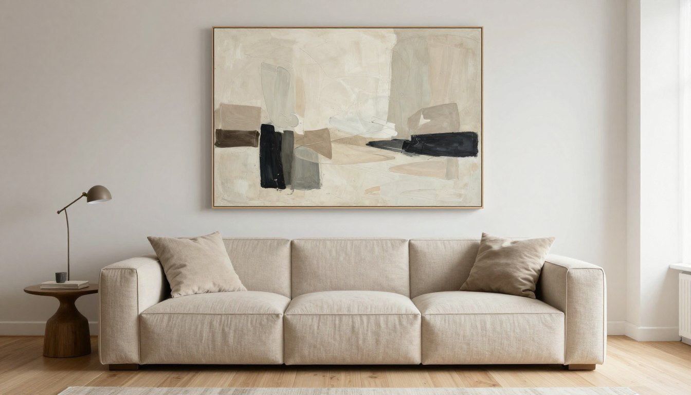
Your living room deserves statement pieces that anchor the space and spark conversation. This is where you can embrace larger canvases and bolder subjects. The wall above your sofa offers prime real estate—typically the room's main focal point.

Scale matters significantly here. A piece that spans 50 to 75 percent of your sofa's width creates proper visual balance. Too small and it looks tentative; too large and it overwhelms. For standard sofas, this typically means artwork between 40 and 60 inches wide.
Living room walls also work well for canvas print sets—two or three panels that create one cohesive image. Triptychs add architectural interest and let you customize sizing by adjusting space between panels.

Consider your living room's light quality when selecting colors. North-facing rooms with cooler light benefit from warm-toned art that adds visual warmth. South-facing spaces can handle cooler palettes without feeling cold.
Bedroom Wall Decor for Restful Spaces
Bedroom walls should promote relaxation and rest. Choose subjects and colors that calm rather than stimulate. Soft landscapes, gentle abstracts, and muted botanical prints create peaceful atmospheres conducive to sleep.
The wall above your headboard is the natural focal point. Art here should feel grounding rather than energizing. Horizontal compositions emphasize the bed's width and create visual stability. Aim for pieces that span 60 to 75 percent of your headboard width.

Avoid overly bright colors or busy patterns that might interfere with winding down. Blue and green tones support relaxation. Earthy neutrals create cocooning comfort. If you love vibrant colors, incorporate them in smaller accent pieces rather than dominating the wall behind your bed.
Bedroom wall decor also includes walls you face from bed. A piece on the opposite wall becomes part of your morning routine and evening wind-down. Choose something you genuinely enjoy looking at—this is art for you alone, not visitors.

Kitchen Wall Art That Energizes
Kitchen walls handle moisture, temperature changes, and splashes. Choose UV-resistant and moisture-tolerant pieces. Canvas with archival inks holds up better than paper prints in these conditions.
Kitchen wall decor can be playful and energizing. Bright colors, food-related subjects, or bold graphics suit this active space. Since kitchens often lack large uninterrupted wall space, consider smaller pieces or vertical arrangements that work around cabinets and windows.

The area above cabinets offers often-overlooked opportunities. A series of smaller coordinating pieces fills this space without competing with working areas. Or use one longer horizontal piece that spans the available wall length.
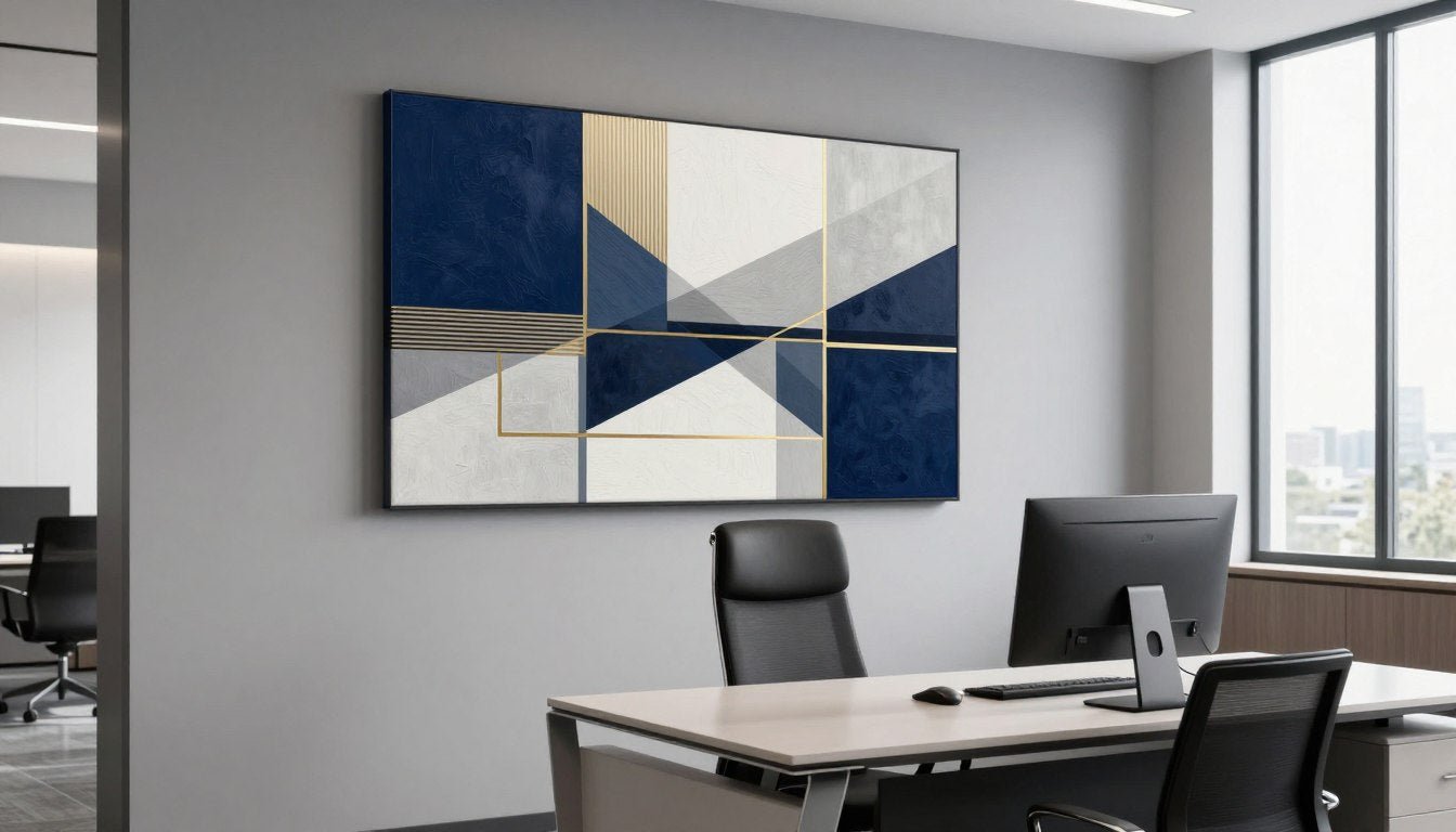
Home Office Wall Design Ideas
Office walls should inspire focus without creating distraction. Choose pieces that energize and motivate but don't demand constant attention. Abstract art with purposeful movement, cityscape scenes that suggest ambition, or nature images that provide mental breaks all work well.
Place art within your sightline when seated at your desk. A piece you glimpse when looking up from work provides necessary mental pauses. Avoid hanging important art directly behind your computer monitor where you'll rarely see it properly.

For video calls, consider your wall as a backdrop. Neutral or sophisticated art reads well on camera and creates a professional impression. Busy patterns or very bright pieces can be distracting to viewers on the other end.
Bathroom and Hallway Considerations
Bathrooms need moisture-resistant solutions. Canvas handles humidity better than paper, but ensure proper ventilation. Subjects that evoke spa-like calm—botanicals, water scenes, or minimalist abstracts—enhance the bathing experience.

Hallways are transitional spaces that connect rooms. Use them to display collections or create progression. A series of related pieces that leads from one end to the other guides movement and makes these often-bland spaces feel intentional.
Narrow hallways benefit from line art canvas prints that don't overwhelm limited space. Simple compositions with lots of negative space keep narrow areas from feeling claustrophobic.

Sizing and Placement Rules That Actually Work
Proper sizing transforms good art into great room design. The relationship between artwork dimensions and surrounding furniture creates visual harmony or discord. Getting these proportions right is more important than the art itself.
The Two-Thirds Rule
Your artwork should span approximately two-thirds of the furniture width beneath it. For a 90-inch sofa, look for pieces between 50 and 70 inches wide. This creates visual connection between furniture and wall without overwhelming the arrangement.

Single large pieces often work better than multiple small ones for establishing focal points. Three 16x20 inch prints spread across a long sofa look disconnected. One substantial canvas or a tightly grouped set of three reads as a single intentional statement.
For gallery walls above furniture, treat the entire arrangement as one unit. The outer dimensions of your complete grouping should follow the two-thirds guideline, not individual frames within it.
Eye-Level Placement Standards
The 57-inch rule comes from museum standards. Hanging art so its center hits 57 inches from the floor creates comfortable viewing for average-height adults. This works for most rooms except dining areas, where seated viewers need slightly lower placement.

In rooms where you're typically seated—dining rooms, bedrooms—lower art by 4 to 6 inches. This accounts for viewing angle when furniture brings your eye level down. Art that looks perfect standing feels too high when you're seated at the table.
Stairway walls present unique challenges. Follow the staircase angle rather than hanging all pieces at one height. The center of each frame should align with the stair diagonal, creating rhythm that moves with you as you climb.
Dealing with Difficult Spaces
High ceilings tempt you to hang art too high. Resist. Keep the 57-inch center guideline even with 12-foot ceilings. If walls feel empty above, add architectural elements like picture rails or consider larger pieces rather than hanging higher.

Corners often go unused but offer interesting opportunities. Corner arrangements with pieces on adjacent walls create dialogue between them. Or place furniture diagonally and hang art on the corner walls behind it for unexpected visual interest.
Small walls between windows or doors can handle smaller pieces that might disappear on larger walls. These spots work well for creating vignettes with art, sconces, and small shelves layered together.
Scale for Different Room Sizes
Small rooms need carefully scaled art. Oversized pieces can make cramped spaces feel even smaller. Stick with medium-sized works or several coordinating small pieces. Light-colored art with minimal busy-ness helps small rooms feel more open.
Large rooms demand substantial art to avoid the "postage stamp" effect. A 16x20 inch print looks lost on a 12-foot wall. Either scale up to larger pieces or create groupings that achieve larger overall dimensions.

Open-concept spaces benefit from repeated visual elements. Use similar frame styles or coordinating color palettes in different zones to create cohesion. This helps define areas within the larger space without walls to separate them.
Color Coordination Without Overthinking
Color coordination doesn't mean perfectly matching art to throw pillows. Effective color strategies create connection without being literal. Your wall decor should relate to the room's palette while offering enough contrast to stand out.
The 60-30-10 Color Rule
Interior designers use the 60-30-10 proportion for balanced color schemes. Your dominant color covers 60 percent (usually walls and large furniture), secondary color takes 30 percent (accent furniture, curtains), and accent color adds 10 percent of punch (accessories, art).

Your art can serve as either the 30-percent or 10-percent element. Large statement pieces often become the secondary color. Smaller works or grouped pieces typically function as accent color, adding visual excitement without dominating.
This formula prevents color chaos. When everything competes for attention, nothing wins. The structured proportion creates hierarchy that guides the eye and makes spaces feel intentional rather than accidentally collected.
Complementary vs. Analogous Approaches
Complementary colors sit opposite each other on the color wheel—blue and orange, red and green, purple and yellow. These combinations create vibrant, energetic spaces. Use them when you want living room walls that feel dynamic and contemporary.
Analogous colors neighbor each other on the wheel—blue, blue-green, and green. These create harmonious, restful combinations. They work beautifully in bedrooms and spaces where calm matters more than energy.

For fail-safe coordination, pull colors directly from your art. Find one or two hues in your canvas and repeat them in textiles or accessories. This creates obvious connection without requiring color theory expertise.
Neutral Art in Colorful Rooms
Neutral art provides visual rest in colorful spaces. When walls, furniture, and textiles already deliver plenty of color, black and white or sepia-toned pieces prevent overload. They give the eye somewhere to pause.
Black and white canvas prints work in virtually any color scheme. They add sophistication and graphic impact without introducing new hues to balance. This makes them ideal for rooms where you regularly change accent colors seasonally.

Neutral doesn't mean boring. Black and white pieces with strong contrast, interesting subjects, or bold composition contribute significant visual interest. The lack of color becomes a design choice rather than a safe default.
Bold Color in Neutral Spaces
Neutral rooms need art to inject personality. This is where you can embrace vibrant color without risk. When walls, floors, and furniture stay quiet, art becomes the room's voice.
A single large piece in a saturated color transforms a neutral space. Against white or gray walls, even moderately bright hues read as dramatic. This approach lets you change the room's entire mood by swapping one piece.

Multiple colorful pieces in neutral spaces require careful curation. Ensure colors relate to each other somehow—similar saturation levels, shared undertones, or deliberate complementary contrast. Random bright colors together can feel chaotic rather than collected.
Mixing Frames, Styles, and Mediums
Uniformity creates calm; variety creates interest. Finding the right balance between consistency and diversity makes wall arrangements feel curated rather than matchy-matchy or accidentally assembled.
When to Match Frames, When to Mix
Identical frames unify disparate art subjects. If your gallery wall includes photos, abstract prints, and botanical images, matching frames provide visual thread that holds everything together. This works especially well for grid arrangements.

Mixed frames suit eclectic styles and salon walls. Combine black and natural wood, or mix ornate and simple profiles. Keep one element consistent—all wood tones, or all slim profiles—to maintain some unity amid variety.
The oak floater frame offers versatility for mixing. Its clean lines work with both traditional and modern art. Floater frames create the illusion that canvas floats within the frame, adding depth and sophistication to gallery-quality prints.

Frame width matters when mixing. Vary widths thoughtfully—slim black metal with chunkier wood works because the profiles contrast intentionally. Random width variations look accidental unless very carefully balanced.
Combining Different Art Styles
Mixing abstract and representational art requires a unifying factor. Shared color palette is easiest. Or keep all pieces within similar tonal ranges—all high-contrast or all soft and muted.
Style period mixing works when eras share aesthetic qualities. Mid-century modern pieces combine naturally with contemporary minimalism—both emphasize clean lines and uncluttered composition. Victorian-era botanicals pair well with traditional realistic paintings.

Avoid combining too many distinct styles in one small space. Three to four different aesthetic approaches is typically the limit before arrangements feel scattered. In large open spaces, you can handle more variety by creating distinct zones.
Canvas Prints vs. Framed Prints vs. Original Art
Canvas prints offer texture and dimensionality that flat prints can't match. The woven surface catches light differently throughout the day. Hand-stretched canvas on wooden frames needs no additional framing—it's ready to hang directly from the box.
Framed prints work well for smaller pieces or paper-based artwork. They add finished polish and protect delicate works. Mix canvas and framed prints by keeping frame colors compatible with canvas edge colors.

Original paintings bring unique energy but command higher investment. Mix them with high-quality prints by ensuring similar subject matter sophistication and color compatibility. Well-produced made-to-order prints from reputable sources hold their own alongside originals.
Adding Three-Dimensional Elements
Wall decor extends beyond two-dimensional art. Floating shelves break up large expanses while creating space to layer smaller pieces. Display a canvas with objects in front for dimensional interest that purely flat art can't provide.
Sculptural elements add literal depth. Metal wall sculptures, ceramic pieces, or woven textiles create shadows and texture. Combine them with canvas prints by ensuring styles complement rather than compete.

Mirrors function as both functional items and wall art. Large mirrors amplify light and expand space visually. Position them opposite windows to maximize effect. Or lean oversized mirrors against walls for casual, collected looks.
Storage solutions become decorative elements when styled properly. Open shelving units housing books, objects, and small art pieces create gallery-like displays. Ensure storage serves actual needs rather than existing only for aesthetic purposes.
Wall Decor Ideas for Small Spaces
Small rooms require thoughtful wall decor strategies. The right approach makes compact spaces feel larger and more sophisticated. Poor choices emphasize cramped quarters and create visual clutter.
Maximizing Visual Space
Light colors make small rooms feel more expansive. Art with pale backgrounds or lots of white space opens up walls rather than closing them in. Reserve dark, heavy pieces for larger spaces where they won't overwhelm.

Vertical pieces emphasize ceiling height, making low rooms feel taller. A portrait-oriented canvas draws the eye upward, creating the illusion of greater volume. This works especially well in rooms with 8-foot ceilings.
One substantial piece beats multiple small ones in tight quarters. A single 30x40 inch canvas commands a wall without creating visual fragmentation. Several small pieces make walls busy and space feel even smaller.
Corner and Awkward Space Solutions
Corners in small rooms often go unused, wasting valuable wall space. Hang art that spans the corner, with the frame center aligned with the corner itself. This unexpected placement adds interest while maximizing available surfaces.

Spaces above doors and between windows work for smaller pieces that would disappear on large walls. These spots suit kids room canvas prints or other playful subjects that don't need to be formal focal points.
Narrow wall sections beside doorways can handle vertical arrangements of small pieces. Three to five coordinating works stacked vertically turn awkward leftover space into intentional design features.
Multi-Functional Wall Decor
Small spaces benefit from wall decor that works harder. Pegboard painted to match walls provides hanging art space plus functional hooks for keys or accessories. The visual consistency prevents it from reading as purely utilitarian.
Picture ledges let you change displays easily without new nail holes. Lean multiple pieces on a shallow ledge, overlapping edges for gallery-like effect. Swap pieces seasonally or whenever your mood shifts—commitment-free decorating for renters or indecisive decorators.

Magnetic boards painted with chalkboard or whiteboard paint combine function with decoration. Frame the board itself, creating the effect of large-scale art that also serves as message center or kids' drawing space.
Rental-Friendly Options
Renters need wall decor that doesn't damage walls or forfeit security deposits. Command strips handle surprisingly heavy weights when properly installed. Follow package instructions exactly—surface prep determines success.
Picture rails mounted just below the ceiling let you hang art with cords rather than nails in walls. The rail itself requires installation, but thereafter you can rearrange endlessly without additional holes. This Victorian-era solution solves modern rental restrictions.

Leaning art against walls sidesteps hanging entirely. Large canvases lean on mantels, atop dressers, or on the floor itself. Layer smaller pieces in front for dimensional arrangements. Ensure pieces are stable and won't topple—use museum putty if needed.
Frequently Asked Questions
Q: What are some easy home wall decor ideas for beginners?
A: Start with a single statement piece above your sofa—choose something you genuinely love in colors that complement your existing room palette. Hang it so the center sits 57 inches from the floor, spanning roughly two-thirds of your furniture width beneath it.
Next, add a smaller piece or two in secondary spaces like hallways or above consoles. Keep frames similar in style or color to create cohesion without requiring advanced curation skills. As confidence builds, expand to gallery walls or more complex arrangements.
Q: How do I choose the right size wall art for my living room?
A: Measure your sofa or the furniture beneath where art will hang. Your artwork should span 50 to 75 percent of that width for proper visual balance. For a 90-inch sofa, look for pieces between 45 and 70 inches wide.
If using multiple pieces as a grouping, measure the overall outer dimensions of the complete arrangement rather than individual frames. Height matters too—leave 6 to 12 inches between furniture top and artwork bottom to create breathing room without disconnection.
Q: What wall decor works best for small rooms?
A: Choose light-colored art with plenty of white space or pale backgrounds to make small rooms feel more open. One medium-to-large piece works better than multiple small ones, which fragment walls and emphasize limited space.
Vertical orientations emphasize ceiling height in rooms with low ceilings. Mirrors amplify light and create depth. Avoid dark, heavy pieces or very busy patterns that close in walls. Instead, opt for pieces that feel airy and let the eye move through them easily.
Q: How high should I hang wall art?
A: The center of your artwork should sit at 57 inches from the floor—this is the museum standard that creates comfortable viewing for average-height adults. In dining rooms or bedrooms where you're usually seated, lower this by 4 to 6 inches to account for viewing angle.
For art above furniture, maintain 6 to 12 inches between the furniture top and art bottom. This connects the pieces visually without crowding. If hanging a gallery wall, determine your desired center point first, then arrange frames to achieve that overall centering.
Q: Can I mix different frame styles and colors on the same wall?
A: Yes, mixing frames creates personality and collected charm—but it requires one unifying element. Keep all frames within the same color family (all woods, or all neutrals), or maintain similar profiles (all slim, or all substantial).
For eclectic gallery walls, variety actually strengthens the composition. Combine black with natural wood, or mix modern with vintage profiles. The key is intentional variety rather than random accumulation. If you're uncertain, start with identical frames—you can always diversify later.
Q: What's the best wall decor for renters who can't make holes?
A: Command strips handle substantial weight when installed correctly—read package instructions and prep surfaces properly. Picture rails mounted near the ceiling let you hang art with cords without individual nail holes in walls.
Leaning art against walls works beautifully for larger pieces. Rest canvases on mantels, console tables, or the floor itself. Use museum putty to prevent sliding. Picture ledges screwed into walls create changeable displays—you make a few holes for the ledge but can swap art endlessly afterward.
Q: How do I create a cohesive look with different art styles?
A: Find a common thread—shared color palette is easiest. Art in vastly different styles feels unified when colors relate. Alternatively, keep all pieces within similar tonal ranges (all high-contrast or all soft and muted).
Identical or very similar frames also unify disparate art. When frame style stays consistent, subject variety becomes charming rather than chaotic. Limit yourself to three or four distinct style approaches in one space to avoid scattered appearances.
Q: Should bedroom wall decor be different from living room art?
A: Yes—function dictates different approaches. Bedrooms need calming subjects and softer colors that promote rest. Choose gentle landscapes, soothing abstracts, or muted botanicals over energizing or intense pieces.
Living rooms can handle bolder subjects and more saturated colors since they're social spaces meant to energize. Reserve your most conversation-starting pieces for living room walls. Bedrooms work best with art that feels personally meaningful and quietly beautiful rather than attention-grabbing.
Your home wall decor reflects who you are and how you want to feel in your space. The right pieces transform empty walls into personal galleries that ground your rooms and express your sensibility.
Start with the spaces you use most. Choose art that genuinely resonates rather than what you think should work. Pay attention to scale, placement, and how pieces relate to your existing furnishings. Your walls will tell your story more authentically than any design rule ever could.
Explore our Abstract Canvas Prints to find pieces that transform your walls into personal galleries.
Leave a comment
This site is protected by hCaptcha and the hCaptcha Privacy Policy and Terms of Service apply.