
Modern abstract wall art has the remarkable ability to transform any space from ordinary to extraordinary with a single piece. Its fluid forms, bold colors, and expressive nature create visual intrigue while reflecting your personal style. This comprehensive guide will walk you through expert decorating ideas for every room, practical frameworks for selecting the perfect abstract piece, and curated recommendations that elevate your home's aesthetic.
Quick Answers: Modern Abstract Wall Art Essentials
- Best Placements: Living room (above sofa, over console), bedroom (above bed), dining room (sideboard), entryway (vertical orientation), home office (focus wall)
- Color Strategies: Match (pull colors from existing decor), complement (adjacent colors on wheel), contrast (opposite colors for drama)
- When to Go Oversized: For high ceilings, open-plan spaces, and when creating a single dramatic focal point
- When to Use Sets: For horizontal spaces like above sofas, to create visual rhythm in hallways, or to fill large walls without overwhelming
- Best for Minimalist Interiors: Monochromatic, geometric, or line-based abstracts with negative space
- Small Space Trick: Create paper templates of potential art to tape on walls before purchasing; use removable hooks for flexibility
- Lighting Tip: Install warm, directional lighting that highlights texture without creating glare on the canvas
Why Abstract Art Works Brilliantly in Modern Interiors

Abstract art creates a dynamic focal point while establishing the room's color palette
Abstract art has become a cornerstone of modern interior design for several compelling reasons. Unlike representational art, abstract pieces work with your space in unique ways:
Movement and Energy
The flowing lines, dynamic shapes, and gestural elements in abstract art create visual movement that energizes static spaces. This sense of motion adds vitality to rooms that might otherwise feel flat or lifeless.
Mood Establishment
Abstract art communicates emotion through color, form, and composition rather than literal imagery. This makes it exceptionally effective at establishing or enhancing a room's mood—whether you're seeking calm serenity with soft neutrals or vibrant energy with bold colors.
Negative Space Utilization
The thoughtful use of negative space in abstract compositions creates visual breathing room, preventing walls from feeling cluttered even with larger pieces. This makes abstract art particularly valuable in smaller spaces where balance is crucial.
Color Echo Opportunities
Abstract pieces often contain multiple colors that can be echoed throughout your space in textiles, accessories, and accent pieces. This creates cohesion and intentionality in your design without appearing overly matched or contrived.
How to Choose the Perfect Abstract Art: A Simple Framework
Consider your existing color palette when selecting abstract art for cohesive design
Selecting the right abstract piece doesn't need to be overwhelming. This straightforward framework breaks the process into three key strategies:
Color Strategy
Match
Select art that contains colors already present in your space for a harmonious, cohesive look. This approach works well in already colorful rooms where you want the art to feel integrated rather than competing.
Complement
Choose pieces with colors adjacent to your existing palette on the color wheel. This creates subtle visual interest while maintaining harmony. Blues work beautifully with greens; reds pair elegantly with oranges.
Contrast
For dramatic impact, select art with colors opposite your dominant palette on the color wheel. A bold blue abstract makes a striking statement in a predominantly orange space.
Scale Strategy
Statement Piece
A single oversized canvas creates a powerful focal point and works best when you want the art to be the room's centerpiece. For maximum impact, choose a piece that's at least two-thirds the width of the furniture it hangs above.

Gallery Approach
Multiple smaller pieces create visual rhythm and allow for more creative expression. This approach works well for filling larger walls or creating interest in transitional spaces like hallways and staircases.

Mood Strategy
Calm Neutrals
Abstract pieces in soft neutrals, whites, beiges, and grays create a sense of tranquility and work well in bedrooms, reading nooks, and spaces dedicated to relaxation.

Featured Abstract Pick: Eclipse Flow
This minimalist black abstract creates a sense of calm movement while maintaining sophisticated simplicity—perfect for minimalist interiors or a focused office environment where concentration is key.
View Eclipse FlowEnergetic Color
Vibrant, colorful abstracts inject energy and personality into spaces. These work wonderfully in living areas, dining rooms, and creative spaces where stimulation and conversation are desired.

Featured Abstract Pick: Solar Flow
This vibrant abstract combines warm oranges, yellows and cool blues in a dynamic composition that instantly energizes a space—ideal as a focal point in living rooms or dining areas where you want to stimulate conversation.
View Solar FlowModern Abstract Wall Art Decor Matrix
Use this comprehensive matrix to guide your abstract art selection based on your specific decor goals and room characteristics:
| Decor Goal | Best Palette | Best Abstract Style | Best Rooms & Placements | Size Approach | Styling Notes | Collection |
| Calm | Neutrals, soft blues, muted tones | Minimal line, soft gestural | Bedroom (above bed), reading nooks, meditation spaces | Medium to large single piece | Natural textiles, warm lighting, minimal accessories | Wabi-Sabi Art |
| Energetic | Bold primary, vibrant contrasts | Gestural, color field, expressive | Living room (focal wall), creative studios, dining room | Oversized statement | Complementary accent pillows, sculptural elements | Abstract & Geometric |
| Luxe | Monochrome with metallic accents | Textured, metallic-infused | Dining room (above sideboard), master bedroom, entryway | Large single or elegant triptych | Velvet textiles, directed lighting, minimal frames | Gold & Metallic |
| Minimalist | Black & white, single-tone | Geometric, minimal line | Office (focus wall), modern kitchen, clean-lined living spaces | Medium to large with ample negative space | Architectural lighting, textural contrast in furnishings | Black & White |
| Artistic | Warm earth tones, soft pastels | Mixed media, textured | Creative spaces, conversation areas, personal retreats | Gallery grouping, varied sizes | Layered textiles, plants, handcrafted objects | Line Art |
Living Room: Abstract Art as Your Design Anchor

Let the artwork set the palette—then echo it in textiles and accessories
The living room offers prime real estate for abstract wall art that can define your entire home's aesthetic. Here are the most effective placements and approaches:
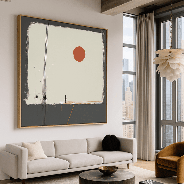
Above the Sofa
This classic placement demands proper sizing—aim for a piece (or set) that spans at least two-thirds of your sofa's width. For maximum impact, center the art at eye level when seated (typically 60-65 inches from the floor to the center of the artwork).

Featured Abstract Pick: Celestial Mosaic
This geometric abstract combines sophisticated structure with an ethereal quality that makes it perfect for above-sofa placement. Its balanced composition creates a sense of harmony while the subtle color variations add depth without overwhelming the space.
View Celestial MosaicOver Console Tables
Console tables paired with abstract art create elegant vignettes, especially in entryways or behind sofas. For this placement, consider vertical compositions that create height and visual interest. The bottom edge of the frame should sit 8-10 inches above the console surface.
Fireplace Mantel
Abstract art above a fireplace creates a natural focal point. For this prominent position, choose a piece with presence that can hold its own against the architectural feature below it. Consider the viewing distance—bolder, simpler compositions often work better than intricate details that get lost from across the room.

Featured Abstract Pick: Black Gravity
The dramatic vortex composition of this monochromatic abstract creates a powerful focal point perfect for above a fireplace. Its swirling movement draws the eye while the black and white palette ensures it works with any color scheme.
View Black GravityBedroom: Creating Calm with Abstract Expressions

Abstract art in calming tones creates a serene bedroom retreat
Bedrooms call for abstract art that promotes relaxation while expressing personality. The right piece can transform your sleep space into a personal sanctuary.
Above the Bed
This prime bedroom placement demands thoughtful selection. Choose pieces that evoke the mood you want to experience in this intimate space. For most, this means calming compositions with gentle movement rather than high-energy pieces with jarring contrasts.

Featured Abstract Pick: Electric Blue Flow
The fluid white gestures against a deep blue background create a sense of gentle movement that's perfect for bedroom spaces. This piece adds depth and interest while maintaining the calm atmosphere essential for restful sleep.
View Electric Blue FlowCalming Palettes
For bedrooms, consider abstract pieces in blues, soft greens, lavenders, or neutral tones that promote tranquility. These colors have been shown to lower blood pressure and heart rate, creating an environment conducive to rest.

Featured Abstract Pick: Whispers of Balance
This soft pastel abstract creates a gentle, dreamy atmosphere with its balanced composition and soothing color palette. Perfect for bedrooms where tranquility is the priority, it adds visual interest without disrupting the peaceful ambiance.
View Whispers of BalancePaired Abstracts
Symmetrical pairs of abstract prints flanking the bed create balance and harmony—ideal qualities for restful spaces. Choose complementary pieces that share a color palette or stylistic approach for a cohesive look.
Dining Room: Conversation-Starting Abstract Art

Vibrant abstract art energizes dining spaces and stimulates conversation
Dining rooms benefit from abstract art that stimulates conversation and creates atmosphere. Since these spaces are often used for entertaining, consider pieces that reflect the energy you want to create during gatherings.
Sideboard Focal Point
The wall above a dining room sideboard or buffet offers an ideal canvas for statement abstract art. This placement allows the piece to be viewed and appreciated throughout meals without competing with the table setting.

Featured Abstract Pick: Radiant Bloom
This vibrant abstract combines pink, yellow, and blue in a composition that energizes dining spaces and creates an atmosphere of celebration. Its dynamic forms make it an excellent conversation starter for entertaining areas.
View Radiant BloomFor dining rooms where you host frequent dinner parties, consider more vibrant, energetic abstracts that stimulate conversation. For intimate family dining spaces, you might prefer pieces with warmer tones that create a sense of comfort and connection.
Room-by-Room Modern Abstract Wall Art Ideas
This quick-reference guide provides specific placement recommendations for each room in your home:
| Room | Best Placement | Orientation | Styling Tip | Example Artwork |
| Living Room | Above sofa, over console, mantel | Horizontal for sofas, vertical for narrow walls | Echo 1-2 colors from the artwork in throw pillows or accessories | Celestial Mosaic |
| Bedroom | Above bed, dresser wall | Horizontal above bed, pairs on nightstands | Choose calming colors and fluid forms for restful energy | Whispers of Balance |
| Dining Room | Above sideboard, empty wall | Large horizontal or triptych set | Add directional lighting to highlight texture and create ambiance | Radiant Bloom |
| Entryway | Above console, empty wall | Vertical for narrow spaces | Choose a piece that sets the tone for your entire home | Facing Souls |
| Home Office | Focus wall, behind desk | Horizontal or vertical based on wall space | Select colors that promote your desired work energy | Cobalt Motion |
| Staircase | Ascending wall, landing | Gallery set following stair line | Create rhythm with consistent spacing between pieces | Canvas Print Sets |
Entryway & Hallway: First Impressions with Abstract Impact

Vertical abstract pieces create height and drama in transitional spaces
Entryways and hallways offer unique opportunities for abstract art that creates strong first impressions and guides movement through your home.
Vertical Statements
Narrow entryways and hallways benefit from vertical abstract compositions that draw the eye upward, creating a sense of height and spaciousness. These transitional spaces are perfect for more dramatic pieces that might overwhelm living areas.

Featured Abstract Pick: Facing Souls
This striking line art abstract on a black background creates dramatic contrast perfect for entryways. Its vertical orientation and minimalist aesthetic make a sophisticated first impression while working with virtually any design style.
View Facing SoulsFirst Impression Strategy
The abstract art in your entryway sets expectations for the rest of your home. Consider it a visual introduction to your aesthetic. For cohesive design, choose pieces that reflect the color palette and style found throughout your interior spaces.
Hallway Rhythm
Long hallways benefit from a series of related abstract pieces that create visual rhythm and movement. Consider a collection of 3-5 pieces in the same style or color family, spaced evenly to guide the eye down the corridor.
Home Office: Focus & Creativity with Abstract Art

Abstract art behind a desk creates an inspiring backdrop for focused work
Home offices benefit from abstract art that supports your work style—whether you need energizing stimulation or calming focus.
Focus Wall
The wall behind your desk offers prime real estate for abstract art that inspires without distracting. This is where you'll spend hours looking up from your work, so choose a piece that resonates with your professional goals and work style.

Featured Abstract Pick: Cobalt Motion
The dynamic blue composition of this abstract creates energy while maintaining focus—ideal for creative professionals who need stimulation without distraction. Its cool tones promote clear thinking and productivity.
View Cobalt MotionCreativity Cues
For creative professionals, abstract art can serve as a visual catalyst for innovative thinking. Consider pieces with unexpected color combinations, interesting textures, or compositions that challenge conventional perspectives.

Featured Abstract Pick: Geometry in Revolt
This dynamic abstract challenges conventional geometry with its chaotic yet structured composition—perfect for creative spaces where innovative thinking is valued. Its energetic forms stimulate the mind and inspire outside-the-box solutions.
View Geometry in RevoltStaircase & Landing: Rhythmic Abstract Arrangements

Abstract series creates visual rhythm that guides movement up and down stairs
Staircases and landings offer unique opportunities for abstract art that creates movement and visual interest in transitional spaces.
Rhythmic Series
Staircases are ideal for a series of related abstract pieces that ascend with the stairs, creating visual rhythm that guides movement. For this approach, select 3-7 pieces that share a color palette or style but offer slight variations in composition.
Grid Gallery
Staircase landings provide wall space for more structured abstract gallery arrangements. Consider a grid of 4-6 pieces in matching frames for a clean, organized look that brings cohesion to an otherwise transitional space.
For maximum impact on staircases, consider a coordinated set of abstract prints that creates a cohesive visual journey as you move between floors.
Layout Options: From Statement Pieces to Gallery Walls

Different layout approaches create distinct visual impacts in your space
How you arrange your abstract art is just as important as the pieces themselves. Consider these layout approaches for different spaces and effects:
Single Oversized Statement
A large, dramatic abstract piece creates immediate impact and works well as a room's focal point. For proper scale, the artwork should be approximately two-thirds the width of the furniture it hangs above, with the center at eye level (typically 60-65 inches from the floor).
Diptych & Triptych Arrangements
Sets of two or three related abstract pieces create a cohesive yet dynamic visual experience. For proper spacing, maintain 2-3 inches between canvases and treat the entire arrangement as one unit when centering on a wall.

Featured Abstract Pick: Canvas Print Sets
Triptych and diptych arrangements create sophisticated visual impact while filling horizontal spaces beautifully. These coordinated sets offer the drama of large-scale art with added visual interest from multiple compositions.
Explore Canvas Print SetsGallery Wall Approaches
Grid Gallery
A structured arrangement with consistent spacing creates a clean, organized look. For this approach, use frames of identical size and maintain 2-3 inches between each piece. This works well in more formal or minimalist spaces.
Organic Gallery
A more relaxed arrangement with varied spacing creates casual, collected energy. This approach allows for mixing different sizes and orientations while maintaining visual balance through color or theme. Perfect for eclectic or bohemian spaces.
For gallery walls, create paper templates of each piece and tape them to the wall first. This allows you to experiment with arrangements before committing to nail holes.
Special Spaces: Solutions for Challenging Areas
Small Spaces & Rental-Friendly Ideas

Light-colored abstracts with depth create visual space in compact rooms
Small spaces and rentals present unique challenges for decorating with abstract art. These approaches help maximize impact while respecting limitations:
- Paper Mockups: Create paper templates of potential art pieces and tape them to walls to visualize scale before purchasing.
- Removable Hooks: Use damage-free hanging solutions that won't affect security deposits.
- Vertical Orientation: Choose taller, vertical pieces that draw the eye upward, creating the illusion of higher ceilings.
- Lighter Palettes: Abstract art with lighter backgrounds creates a sense of openness and expands visual space.

Featured Abstract Pick: Celestial Drift
This minimalist dot abstraction creates visual depth while maintaining an airy, open feel—perfect for small spaces and rentals. Its subtle pattern adds interest without overwhelming limited wall space.
View Celestial DriftHigh Ceilings & Open-Plan Spaces

Oversized abstract art creates proportion and anchors expansive spaces
Large, open spaces require art with presence to maintain proper scale and create defined areas. Consider these approaches:
- Oversized Statements: Large-scale abstract pieces create proper proportion in rooms with high ceilings.
- Triptychs: Multi-panel arrangements expand horizontal reach for wide, open walls.
- Anchoring "Blank" Walls: Use bold abstract art to define and anchor functional zones within open-plan layouts.
- Vertical Power: Tall, narrow abstracts draw the eye upward, celebrating height while creating visual connection.

Featured Abstract Pick: Chromatic Flow
This colorful geometric abstract creates a powerful presence that stands up to large spaces and high ceilings. Its dynamic composition and vibrant palette make it an effective anchor for open-plan areas.
View Chromatic FlowStyling Add-Ons: Creating Cohesion with Abstract Art

Echo colors from your abstract art in textiles for a cohesive, designed look
The right styling elements enhance your abstract art and create a cohesive, intentional look throughout your space:
Rugs & Textiles: The Color Echo Effect
Create visual harmony by selecting textiles that echo colors from your abstract art. This doesn't mean exact matching—instead, pull secondary or accent colors from the artwork into pillows, throws, or rugs. This subtle connection creates cohesion without appearing contrived.
Lighting: Highlighting Texture & Dimension
Proper lighting dramatically enhances abstract art's impact. Consider these approaches:
- Directional Lighting: Picture lights or adjustable fixtures that focus on the artwork highlight texture and dimension.
- Warm Temperature: Bulbs in the 2700-3000K range enhance most color palettes without distortion.
- Glare Prevention: Position lights at a 30° angle to minimize reflections, especially on glossy canvases.
Frame & Floater Frame Guidance
The right framing enhances your abstract art without competing with it:
- Gallery-Wrapped Canvas: Modern abstracts often look best with clean, frameless edges that maintain their contemporary feel.
- Floater Frames: These create a subtle border while maintaining the edge-to-edge integrity of the canvas.
- Traditional Frames: For abstract pieces in more classical settings, choose simple frames that don't compete with the artwork's complexity.
Common Mistakes When Decorating with Abstract Wall Art

Proper scale and placement dramatically improve abstract art's impact
Avoid these common pitfalls when decorating with abstract wall art:
Mistake: Art Too Small for the Wall
Fix: Choose pieces that are at least two-thirds the width of the furniture below, or use a set of coordinated pieces to fill the space appropriately. When in doubt, go larger—undersized art looks like an afterthought.
Mistake: Hanging Too High
Fix: Center artwork at eye level (typically 60-65 inches from floor to center) and in relation to nearby furniture. For pieces above sofas or consoles, hang 8-10 inches above the furniture.
Mistake: Ignoring Undertones
Fix: Pay attention to whether your room's existing colors have warm (yellow, orange, red) or cool (blue, green, purple) undertones, and choose abstract art with complementary temperature for harmony.
Mistake: Too Many Focal Points Competing
Fix: Designate one wall for your statement abstract piece and keep surrounding walls more subdued. Multiple bold pieces in the same sightline create visual competition and chaos.
Mistake: Gallery Wall Without Consistent Spacing
Fix: Maintain consistent spacing (2-3 inches) between pieces in a gallery arrangement. Use paper templates and a level to plan placement before hanging.
Mistake: Matchy-Matchy Without Intention
Fix: Instead of exact color matching, which can feel contrived, pull secondary or accent colors from your abstract art into a few carefully chosen accessories for subtle cohesion.
Mistake: Harsh Lighting Creating Glare
Fix: Position lights at an angle to minimize reflections on canvas. Choose warm-temperature bulbs (2700-3000K) that enhance colors without washing them out.
Mistake: Buying Before Measuring
Fix: Create paper templates of potential art pieces and tape them to your walls to visualize scale and impact before purchasing. This simple step prevents costly mistakes.
Frequently Asked Questions About Decorating with Abstract Wall Art
How do I choose abstract wall art colors for my room?
Consider three approaches: match (select colors already present in your space for harmony), complement (choose colors adjacent on the color wheel for subtle interest), or contrast (select colors opposite on the color wheel for dramatic impact). Also consider the mood you want to create—blues and greens tend to be calming, while reds and oranges energize a space.
What size abstract wall art should I get for above a sofa?
For above a sofa, select abstract art that spans at least two-thirds of the sofa's width for proper proportion. For example, a 72-inch sofa would need artwork (or a grouping) at least 48 inches wide. The bottom edge should hang 8-10 inches above the sofa back. When in doubt, go larger rather than smaller for maximum impact.
Is abstract art good for small rooms?
Yes, abstract art can be excellent for small rooms when chosen thoughtfully. Select pieces with lighter backgrounds and depth to create the illusion of space. Vertical compositions draw the eye upward, making ceilings feel higher. Abstract art with simplified compositions and breathing room (negative space) prevents visual clutter in compact areas.
How do I style a modern gallery wall with abstract art?
For a cohesive modern gallery wall, select abstract pieces with a connecting element—similar color palette, style, or theme. Create paper templates to experiment with arrangement before hanging. For a contemporary look, maintain consistent spacing (2-3 inches) between pieces and use identical frames. Mix sizes and orientations for visual interest while maintaining overall balance.
Should abstract art match my rug or cushions?
Rather than exact matching, which can feel contrived, aim for cohesion through color echoing. Select abstract art that contains some colors from your existing textiles, then pull secondary or accent colors from the artwork into a few new cushions or accessories. This creates a sophisticated, intentional connection without being overly coordinated.
What's better: one large piece or a triptych?
Both approaches have distinct advantages. A single large abstract creates dramatic impact and simplicity, ideal for clean, minimalist spaces. A triptych (three-panel artwork) creates visual rhythm and works well for filling wider walls while maintaining a cohesive look. Consider your wall dimensions and desired effect—triptychs often work better for spaces requiring horizontal reach.
How high should I hang abstract wall art?
The center of your abstract art should be at eye level, typically 60-65 inches from the floor in living spaces. When hanging above furniture, position the bottom edge 8-10 inches above the furniture surface. For dining areas, hang slightly lower (eye level when seated). Always consider the viewing position—art in stairwells should be visible while ascending or descending.
What abstract styles look best in minimalist interiors?
Minimalist interiors pair beautifully with abstract art that embraces similar principles of simplicity and intentionality. Look for geometric abstracts with clean lines, monochromatic or limited color palettes, and compositions with ample negative space. Black and white abstracts, minimal line art, and subtle textural pieces complement minimalist spaces without disrupting their serene aesthetic.
Creating Your Personal Gallery: Final Thoughts
Modern abstract wall art offers endless possibilities for transforming your home with color, movement, and expression. The most successful spaces use abstract art as a three-part design tool: establishing mood, creating cohesion through thoughtful color relationships, and providing focal points that anchor rooms with personality.
Remember that there are no rigid rules in abstract art—the most important factor is your personal connection to the pieces you select. Choose works that resonate with you emotionally, that you'll enjoy seeing daily, and that express something about your unique perspective.
Explore Curated Abstract Collections
Discover Rossetti Art's premium abstract canvas prints, thoughtfully created to elevate modern interiors with artistic expression and visual impact.
Explore Abstract & Geometric Explore Wabi-Sabi Neutrals
Leave a comment
This site is protected by hCaptcha and the hCaptcha Privacy Policy and Terms of Service apply.