
Walk into any home decor store and you'll see rows of canvas prints. Some look stunning. Others scream discount bin. The difference isn't always obvious at first glance.
Many homeowners worry their canvas wall art might look cheap. This concern stops them from buying pieces they love. The truth is simpler than you think.
Quality canvas prints rival framed prints in sophistication. The secret lies in seven specific factors. Master these elements and your wall art transforms any room into a gallery-worthy space.

Museum-Quality Materials
Premium cotton canvas with archival inks that last generations

Professional Presentation
Gallery-wrap technique with hidden edges for seamless display

Perfect Sizing
Proper scale selection that matches your room dimensions
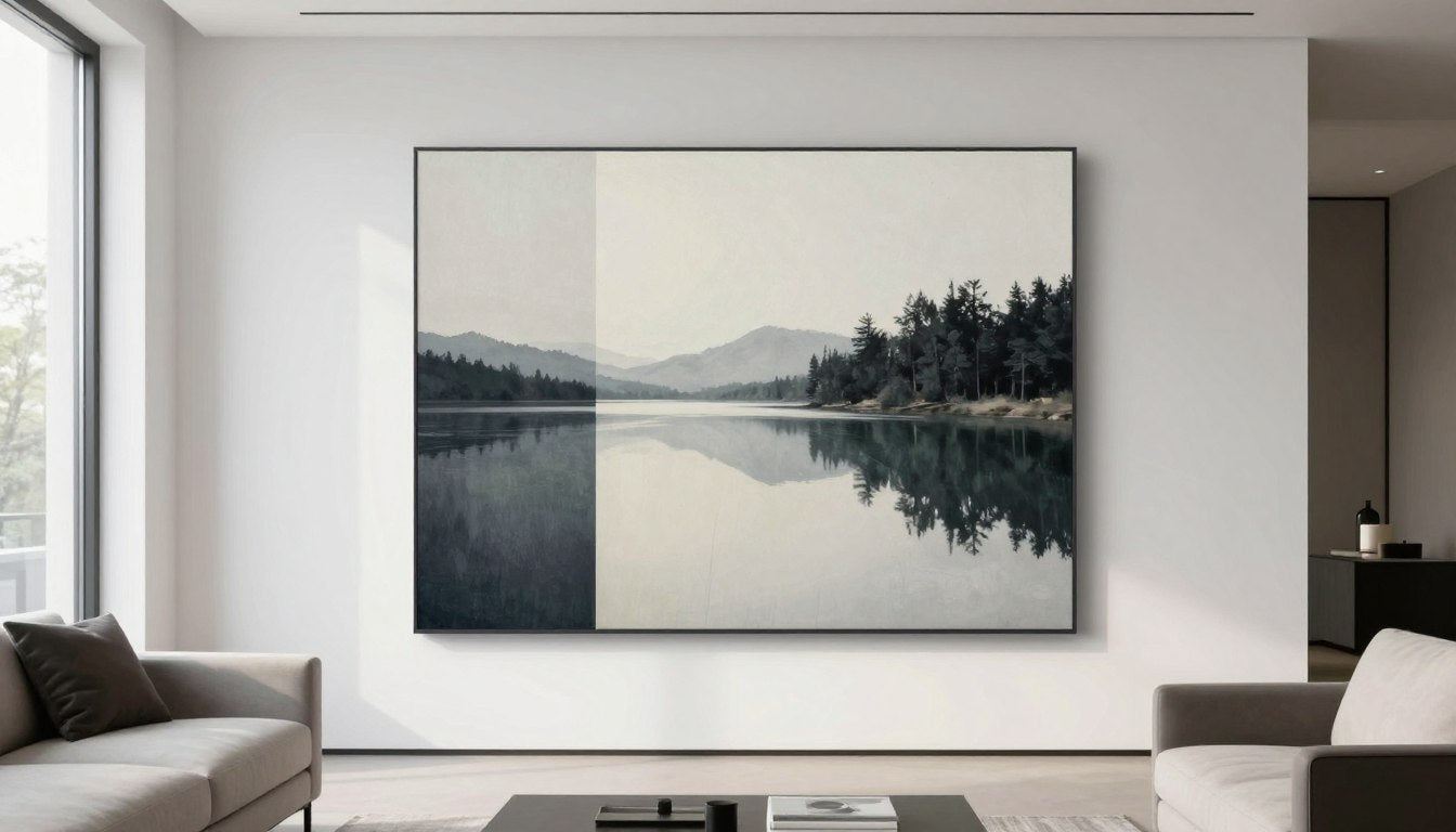
Love Gallery-Quality Canvas Art? Here Are 3 Prints That Bring That Mood Into a Room
These curated canvas wall art pieces showcase the museum-quality materials and professional printing we discuss throughout this guide. Each print demonstrates what separates gallery-grade artwork from budget alternatives.
Canvas Material Quality Separates Cheap From Premium
The canvas fabric itself determines whether your art looks cheap. Premium canvas prints use heavyweight cotton. Cheap options rely on thin polyester blends.
Cotton canvas offers superior texture and durability. The material weight matters significantly. Quality canvas weighs between 340-400 GSM (grams per square meter).

Polyester canvas appears shiny and artificial. Cotton maintains a natural matte finish. This subtle difference transforms the entire piece.
The weave pattern also matters. Fine art canvas features a tight, consistent weave. Lower quality options show irregular patterns. These inconsistencies become visible from certain angles.
Premium Cotton Canvas
Professional artists and galleries prefer cotton for its archival properties. The material resists yellowing over time.
- Natural matte appearance
- Superior color absorption
- Long-lasting durability
- Consistent texture throughout
Budget Polyester Options
Polyester canvas costs less but shows its economy status. The synthetic sheen gives away its budget origins.
- Artificial glossy finish
- Colors appear less vibrant
- Prone to sagging over time
- Inconsistent print quality
Blend Canvas Materials
Cotton-polyester blends offer middle-ground options. Quality varies significantly between manufacturers.
- Mixed finish characteristics
- Moderate price point
- Variable long-term performance
- Texture depends on ratio
Specialty Art Canvas
Museums and serious collectors use archival-grade canvas. These materials meet strict preservation standards.
- Acid-free composition
- Decades of color stability
- Premium pricing justified
- Professional certification
Your canvas choice impacts dust accumulation too. Quality cotton naturally resists dust particles. Cheaper materials attract and hold dust more readily.
Consider room conditions when selecting canvas material. High-humidity spaces like bathrooms need moisture-resistant options. Living room and office settings work well with standard cotton.
Printing Technology Makes Colors Pop or Fade
Giclée printing defines gallery-grade canvas art. This technology produces museum-quality reproductions. Budget prints use standard inkjet methods.
The difference appears in color depth and detail. Giclée printers use 8-12 ink colors. Regular printers use only 4 colors. More colors mean richer, more accurate artwork.
Resolution matters enormously in print quality. Professional canvas prints require 300 DPI minimum. Lower resolution creates visible pixelation from normal viewing distance.
Ink quality determines how long your prints maintain their vibrancy. Archival pigment inks last 100+ years. Dye-based inks fade within 5-10 years. This longevity difference justifies higher prices.

Color accuracy separates professional from amateur work. Quality printers calibrate regularly. They match original artwork precisely. Cheap printing shows color shifts and inconsistencies.
The printing process affects canvas texture too. Professional printers preserve the canvas weave. Budget options can flatten or obscure the natural texture. This flattening makes prints look cheap and artificial.
Print customers should request test prints before full production. Quality providers offer this service. It ensures colors match your preferences and room decor.
Stretcher Bars and Frame Construction Matter
Hidden frame quality determines whether canvas prints sag over time. Premium stretcher bars use solid wood construction. Cheap options use thin composite materials.
Bar thickness impacts the finished look. Gallery-standard bars measure 1.5 to 2 inches deep. This depth creates impressive shadow effects on walls. Thin bars look flat and cheap.

Corner joints reveal construction quality. Mortise and tenon joints provide superior strength. Stapled corners loosen and separate over time. This separation ruins the entire piece.
The stretching process requires skill and proper tension. Professional galleries use specific techniques. Canvas should be tight without warping the frame. Poor stretching creates waves and ripples.
- Solid pine or fir wood provides best stability
- Kiln-dried wood prevents warping from humidity
- Cross-bracing supports larger canvas sizes
- Proper corner reinforcement ensures longevity
- Professional-grade staples hold canvas securely
Large canvas prints need additional support. Cross-bracing prevents sagging in pieces over 24 inches. Budget manufacturers skip this step to cut costs.
Frame depth also affects hanging options. Deeper frames need appropriate wall anchors. Consider your wall type when choosing frame thickness. Drywall requires different hardware than plaster or concrete.
Quality stretcher bars come with pre-installed hanging hardware. This hardware sits flush against the wall. Cheap options require additional installation work.
Match This Gallery-Grade Vibe to Your Space
Now that you understand material quality, printing technology, and frame construction, explore collections designed with these premium standards. Each piece demonstrates the quality factors that prevent canvas prints from looking cheap.
Ink Quality Determines Color Vibrancy and Longevity
Archival pigment inks separate museum-quality from discount prints. These specialized inks resist fading for decades. Cheap dye-based inks lose color within years.
Pigment inks penetrate canvas fibers deeply. This penetration creates permanent color bonds. Dye inks sit on the surface. Surface application means faster deterioration.

UV resistance determines how prints handle sunlight exposure. Quality inks include UV inhibitors. These chemicals protect against sun damage. Budget inks offer no protection.
Testing methods reveal ink quality. Professional printers provide fade resistance ratings. Look for Wilhelm Imaging Research certifications. These independent tests verify longevity claims.
Color gamut describes the range of reproducible colors. Wide-gamut inks capture subtle variations. Limited gamut creates flat, lifeless colors. This difference becomes obvious in landscapes and portraits.
Ink layering creates depth in quality prints. Multiple ink passes build dimension. Single-pass printing looks flat and cheap. The layering process takes more time but delivers superior results.
Environmental factors affect ink performance. Humidity and temperature fluctuations challenge stability. Quality inks resist these changes. Budget options show visible deterioration in challenging conditions.
Whether you're decorating a home office or living room, ink quality impacts daily enjoyment. Vibrant colors enhance room atmosphere. Faded prints diminish the entire space.
Finishing Options Create Professional Polish
Surface finish transforms canvas from amateur to professional. Three main options exist: matte, satin, and glossy. Each serves different artistic purposes.
Matte finishes eliminate glare and reflections. This option suits most fine art reproductions. Galleries prefer matte for its sophisticated appearance. The finish lets viewers focus on the artwork itself.

Satin finishes offer subtle sheen without excessive reflection. This middle option works well in various lighting conditions. The slight shine adds depth without looking cheap.
Glossy finishes enhance color vibrancy but create reflections. This option works best for photographic prints. Art reproductions typically avoid glossy finishes. The shine can appear cheap if overused.
Protective coatings extend canvas life significantly. UV-resistant varnishes prevent fading and yellowing. These treatments also make cleaning easier. Dust wipes away without damaging the print.
- Matte finish reduces glare in bright rooms
- Satin provides versatile middle-ground option
- Glossy finish intensifies photographic colors
- UV coating adds decades to print life
- Water-resistant treatments protect against humidity
Application method affects finish quality. Spray-applied coatings create even coverage. Hand-applied finishes can show brush marks. Professional application ensures consistent results.
Room lighting influences finish selection. Bright spaces with windows benefit from matte finishes. Dimly lit areas can handle satin or glossy options. Consider natural light patterns throughout the day.
Maintenance requirements vary by finish type. Matte finishes hide dust better than glossy. Satin strikes a balance between appearance and practicality. Your lifestyle preferences should guide this choice.
Edge Wrapping Style Shows Attention to Detail
Gallery wrap technique defines professional canvas presentation. The print extends around frame edges. This continuation eliminates the need for additional framing options.
Three edge styles dominate the market. Gallery wrap continues the image around edges. Mirror wrap reflects edge pixels. Solid color wrap uses black or white borders.

Gallery wrap creates the most professional appearance. Viewers see art from any angle. The continuous image makes frames unnecessary. This style dominates modern art presentations.
Mirror wrap works well for images with defined edges. The reflection technique avoids cutting off important elements. This option suits photographs and graphics particularly well.
Solid color wrapping offers clean, minimalist edges. Black creates bold contrast. White provides airy sophistication. This style works in any decor scheme.
Edge quality reveals manufacturing standards. Premium wrapping shows no staples on sides. Cheap prints expose staples and raw canvas edges. These details immediately signal quality level.
Gallery Wrap Benefits
- No additional framing needed
- Modern, clean aesthetic
- Art visible from all angles
- Seamless room integration
- Professional gallery appearance
Considerations
- Image edges must accommodate wrapping
- Critical details shouldn't appear at edges
- Requires proper image sizing
- May not suit traditional decor
Edge depth affects visual impact. Thicker edges create stronger shadows and presence. Standard 1.5-inch depth works for most spaces. Two-inch depth makes bold statements.
Framed prints offer an alternative if edge wrapping doesn't appeal. Traditional frames provide formal presentation. Many customers prefer this classic look for certain rooms or decor styles. Compare original paintings with canvas prints to understand different presentation options.
Proper Sizing Makes Art Look Intentional Not Cheap
Canvas size dramatically impacts perceived quality. Too small looks cheap and insignificant. Too large overwhelms the space. Proper sizing creates intentional, professional presentation.
Room dimensions determine appropriate art sizes. Measure wall space before purchasing. Leave breathing room around the piece. Crowded placement diminishes even quality art.

The furniture-to-art relationship follows specific guidelines. Canvas width should span 60-75% of furniture width below. This proportion creates visual balance. Smaller pieces look cheap and disconnected.
Wall color influences size perception. Dark walls make art appear smaller. Light walls create the opposite effect. Consider your wall color when selecting sizes.
- Large walls need substantial pieces or groupings
- Small spaces work better with medium sizes
- Multiple smaller pieces can equal one large impact
- Vertical pieces suit narrow wall spaces
- Horizontal orientations complement furniture lines
Gallery walls combine multiple canvas pieces. This arrangement requires careful planning. Sizes should complement rather than compete. Professional designers space pieces 2-3 inches apart.
Room function affects appropriate sizing. Office spaces often prefer smaller, focused pieces. Living rooms accommodate larger statement art. Dining areas suit medium sizes that don't overwhelm meals.
Viewing distance matters significantly. Large rooms allow larger prints. Close viewing distances need moderate sizes. This relationship prevents overwhelming visual experiences.
Consider architectural features when sizing art. Windows, doors, and built-ins create natural boundaries. Work within these limitations. Fighting architecture makes even quality pieces look cheap.
Single large canvas makes bold statements. Multiple coordinated pieces offer flexibility. Your personal style preferences should guide this decision. Both approaches work when executed properly. Explore different art mediums like sculptures alongside canvas to create varied visual interest.
Ready-to-Hang, Museum-Quality Canvas. Free Worldwide Shipping.
Every canvas print in our collection features the seven quality factors discussed in this guide. Premium cotton canvas, archival inks, solid wood stretcher bars, professional finishing, and perfect gallery wrapping combine to create art that elevates any space. No cheap shortcuts. Just gallery-grade quality delivered to your door.
Quality Canvas Prints Rival Any Wall Art
Canvas prints don't look cheap when manufacturers prioritize quality. Seven factors separate gallery-grade from discount bin: material quality, printing technology, frame construction, ink quality, finishing options, edge wrapping, and proper sizing.
Each element contributes to the overall impression. Skimp on any single factor and the entire piece suffers. Invest in all seven and your canvas wall art matches any framed print in sophistication.

Your home deserves art that enhances rather than cheapens your space. Understanding these quality indicators empowers confident purchasing decisions. Whether decorating an office or transforming a living room, these guidelines ensure your canvas art looks intentional and professional.
Quality canvas prints offer flexibility that traditional framed art cannot match. Easy installation, lightweight construction, and diverse style options make them practical choices. When executed properly, they create the same sophisticated impact as any fine art piece.
The investment in quality pays dividends over time. Cheap prints fade and sag. Gallery-grade canvas maintains its appearance for decades. This longevity makes the initial cost difference negligible.
Take time selecting your canvas art. Consider room conditions, lighting, existing decor, and personal preferences. With attention to the seven quality factors discussed here, your canvas prints will look anything but cheap. For more insights on selecting and displaying art, visit our art blog for additional tips and inspiration.


Leave a comment
This site is protected by hCaptcha and the hCaptcha Privacy Policy and Terms of Service apply.