

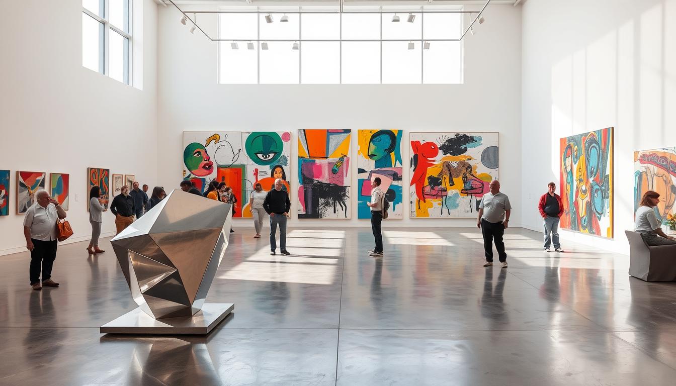
What if a single artwork could change how you feel at home?
I write from a creator's point of view—inviting you to bring museum-quality vision into everyday living. I frame post-war to present movements as a practical toolbox. Think Warhol’s repetitive Pop icons, Pollock’s motion, Rothko’s color fields, Kusama’s mirrors, and Bourgeois’ silhouette.
The promise: clear, stylish cues that make rooms feel larger, calmer, and more intentional. Match scale to architecture. Pair bold pieces with quiet furnishings. Layer sculpture, text, and abstraction for a collected look.
I show how artworks can lift mood and stand the test of time. Expect approachable tips that honor craftsmanship and lasting beauty—so your home feels like a thoughtful gallery, not a showroom.
Key Takeaways
- Use scale, color, and form to align art with architecture.
- Mix genres—Abstract, Pop, Minimal, Text, Sculpture—for depth.
- Choose pieces that bring daily joy and evolve with your style.
- Learn from masters—apply Warhol, Pollock, Rothko, Kusama, Bourgeois to living spaces.
- Balance statement works with minimalist surroundings for refined calm.
Curated contemporary art ideas for stylish homes
I believe one piece can reorder a room’s proportions and lift daily living. Start by reading the architecture—ceiling height, light, and wall width—then choose paintings or sculptures that breathe in the space.
"what you see is what you see"
How to match color, form, and scale to your space
Build a palette by echoing one hue from the work into cushions or rugs. Use complementary colors for quiet tension and depth.
Think of forms—geometric pieces sharpen modern lines; gestural canvases soften hard edges. Match scale to sightlines: centerlines should align with furniture, or place a focal piece at the end of a corridor.
Balancing statement pieces with minimalist rooms
Anchor minimalist rooms with one large piece and reserve negative space around it to keep the calm. Layer textures—matte paint next to polished stone, linen near glazing—so surface qualities sing.
- Mix originals with editions and prints for accessible luxury.
- Rotate works seasonally to refresh mood and protect sensitive media.
- Let silhouette and material be as decisive as color and composition.
Abstract and Abstract Expressionism: energy, color, and gesture
A mid-century New York movement still teaches us how mark and field can shape a room. Action painting and color field work offer two complementary paths—dynamic movement or meditative hue.
Jackson Pollock’s movement-driven drip paintings as inspiration
Pollock’s gestural technique—seen in Autumn Rhythm (1950)—shows how energetic compositions enliven studios or dining rooms. Use a lively painting to anchor creative nooks and spark conversation.
Mark Rothko’s color fields for serene, large-scale impact
Rothko’s Orange, Red, Yellow (1961) demonstrates the power of broad color to calm a space. Large fields create a contemplative focal point—best viewed from a respectful distance.
Mixing gestural works with calm furnishings
Balance is key. Pair expressive works with clean-lined sofas, soft rugs, and pale walls to let brushwork breathe.
- Scale: hang large paintings 6–10 inches above sofas and leave generous margins.
- Color strategy: pick one dominant hue from the work and echo it in pillows or drapery.
- Finish: matte walls cut glare so saturated fields and layered marks read true.
"what you see is what you see"
Pop Art power: iconic images, vibrant colors, and culture
Iconic imagery—when placed with restraint—becomes the pulse of a living space. Pop art offers bold graphics, playful scale, and instant personality. Use one or two major pieces and let them lead a room.
Andy Warhol’s Campbell’s Soup Cans and Marilyns as wall focal points
Andy Warhol taught us that repetition and celebrity turn everyday objects into commentary. A grid of Campbell’s reproductions transforms a dining wall into a graphic field. His Marilyn portraits read like cultural mirrors—striking at entryways or above mantels.
Keith Haring’s dynamic figures to energize hallways and playrooms
Haring’s rhythmic figures and hearts bring motion to corridors and family spaces. These playful works feel spontaneous—perfect for circulation zones where the eye travels.
Roy Lichtenstein’s comic style to animate media rooms
Lichtenstein’s speech bubbles and Ben‑Day dots nod to screen culture. Media rooms welcome his punchy images—add crisp lighting and a neutral palette so the pieces sing.
New York legacy: bridging high art and everyday life
Pop rose from New York’s energy—where commerce met critique. Collect editions and prints to celebrate that city legacy. Keep furnishings minimal and use track lights to keep vibrant colors true.
- Make a statement: Warhol grids for bold focal walls.
- Energize circulation: Haring figures for motion.
- Animate screens: Lichtenstein for media rooms.
Immersive installations and mirror play
Mirrors and light can turn a tiny niche into a boundless moment of wonder. I look to Yayoi Kusama’s Infinity Mirror Room for practical cues—repetition, reflected planes, and concealed LEDs that make a small space feel infinite.
Yayoi Kusama’s Infinity Mirror Room uses mirrors, lights, and pattern to create an overwhelming sense of depth. You can echo that effect at home without a gallery budget.
Yayoi Kusama’s Infinity Mirror Room influence for reflective nooks
Mirror strategy: opposing mirrors and soft LEDs create depth—ideal for entry niches or compact reading corners.
Creating a sense of infinity with lights, repetition, and pattern
Install with intention: layer smoked glass, mirrored plinths, and polished metal frames. Scale carefully—small mirrored sculptures and light-based pieces add magic without crowds.
- Pattern language: polka dots or gentle repeats nod to Kusama while staying livable.
- Light quality: warm, dimmable LEDs keep the mood ethereal—hide sources to avoid hotspots.
- Safety & materials: use tempered glass, secure hardware, and mix lacquer or chrome with velvet for tactile luxury.
Photographable moments: design a single vignette that reads well online and more importantly, feels sophisticated day to day.
Geometric clarity: lines, shapes, and precise forms
When points, lines, and planes lead the eye, interiors read as thoughtful compositions.
I favor geometry for its ability to echo architecture—clean canvases that answer steel stairs, millwork, and rectilinear plans. This approach uses straightedges and compass-drawn rationale to foreground structure over whimsy.
Practical cues: pair two-tone color blocking—cream, charcoal, and one saturated accent—to keep harmony. Choose metals, lacquer, and fine woods to support hard-edged paintings and sculptures. Maintain negative space so each piece breathes.
"Precision is not cold — it is the framework that lets form sing."
- Align frames to window mullions and millwork for grid discipline.
- Mix scales: one bold painting plus two studies keeps balance.
- Limit competing textile patterns so geometry guides the eye.
| Feature | Recommended Use | Materials |
|---|---|---|
| Architectural Synergy | Large canvases above cabinetry or stair landings | Oil, lacquer, steel |
| Color Blocking | Entry walls and dining rooms | Matte paint, acrylic panels |
| Sculptural Cadence | Console tables and niches | Bronze, wood, polished metal |
Lighting matters: use wall washers for even glow and avoid scalloping so crisp edges read true. This geometry-forward style brings order to the room—and a quiet, modern confidence to your world.
Figurative statements: faces, figures, and life
Faces and figures have a rare ability to make a room feel inhabited—raw, intimate, and immediate. I favor portraits that start conversations and carry emotional weight.
Basquiat’s enigmatic portraits as bold conversational walls
Jean‑Michel Basquiat’s Untitled (1981) reads like a charged emblem—half skull, half cipher. Such works demand a central wall in a dining or lounge area.
Use them as conversation starters: hang at eye level, allow generous margins, and pair with sleek furniture to temper raw energy.
Jenny Saville’s unapologetic self-portraits and body-positive themes
Jenny Saville’s Propped (1992) brings painterly warmth and scale. Her work reframes beauty—perfect for bedrooms or intimate libraries.
Embrace humanity: combine a Saville‑like painting with smaller studies nearby to build narrative layers.
- Palette: earth and bone tones, plus one jewel accent.
- Framing: float mounts; museum glass to reduce reflections.
- Care: control humidity and UV to preserve surface and pigment.
| Use | Recommended Placement | Visual Strategy |
|---|---|---|
| Basquiat‑style portraits | Dining wall, entry | Bold scale, ample negative space |
| Saville‑like self‑portraits | Bedroom, personal library | Warm lighting, intimate grouping |
| Complementary studies | Adjacent walls or shelves | Smaller frames, narrative depth |
"Portraits are a way to talk about presence—the room listens."
Minimalism in black, white, and quiet color
Black, white, and muted tones create a quiet stage where form speaks first.
I favor a minimal approach that foregrounds surface, proportion, and rhythm. This is practical minimalism for living spaces—calm, museum-quality, and uncluttered.
Frank Stella’s “what you see is what you see” ethos at home
Stella reminds us to let the work be itself. Reduce to essentials—shape, edge, and spacing carry the message.
Quiet luxury: monochrome works in black, white, and muted tones calm busy rooms and sharpen lines.
- Material focus — linen canvases, raw paper edges, and subtle textures let light perform across surfaces.
- Scale & rhythm — diptychs and generous margins create gallery-level negative space.
- Styling — pair with pale walls, natural oak, and stone; conceal clutter to honor clarity.
- Lighting — soft wall wash over specular spots; matte fields read truer.
- Edit mercilessly — add one work, remove one accessory; let rooms breathe.
"What you see is what you see"
Surreal touches: dream logic and alternate realities

Surrealism invites the home to become a stage for the subconscious—small details can feel haunted and familiar at once. I use this approach to fold mystery into everyday rooms so the world pauses and curiosity grows.
Rooted in 1920s psychoanalysis, the movement set a template many contemporary art makers return to today. Dorothea Tanning’s Door 84 (1984) shows how surreal works loosen into abstraction while keeping uncanny tension.
Bring the uncanny home: place dreamlike images in foyers or studies to invite wonder. Pair antique mirrors and clouded glass for motif mixing—unexpected pairings heighten psychological drama.
- Palette: dusky blues, sepia, and shadowed neutrals for a cinematic mood.
- Spatial play: echo portals with arches or curved furniture.
- Narrative grouping: cluster three small pieces so viewers complete the scene.
- Media tip: add a short film loop on a discreet screen for a quiet, mesmerizing ambiance.
"Light like a stage"—accent with narrow beams to model shadows and sculpt dreamlike depth. Keep textiles calm so imagery remains the center of attention.
Text and neon: language as artwork
Neon and typography make language an active fixture—speaking to the room long after you leave. I look to Bruce Nauman and Lawrence Weiner for how language can be both idea and object. Their late‑20th‑century New York practice taught that words can probe, charm, or unsettle.
Conceptual roots and living messages
Start with meaning: choose a phrase that reflects your values or mood. Nauman’s neon often mixes humor and unease; Weiner treats text as sculpture. Let concept lead the visual.
Materials, placement, and media pairings
Say it with light: neon over a bar or in a media room adds attitude and glow. Use acrylic, powder‑coated metal, or polished frames for an urban, museum‑quality finish.
- Dimming matters—install smart dimmers for night‑soft glow.
- Pair with abstract works to keep hierarchy clear and avoid clutter.
- Consider short video loops or ambient sound for a Nauman‑inspired corner.
"Language can be structural—text becomes the object."
Hyperreal polish: photo-sharp paintings and sculptures
Photo-precise paintings and polished sculptures bring a startling stillness to interiors. Hyperrealism creates works that read like high-quality photographs, yet carry painterly intent and narrative depth.
I often recommend a single hyperreal piece over a mantel or credenza—its precision becomes the room’s focus. Choose subjects that echo your life: cocktails, botanicals, street reflections, or portrait studies.
Material presence matters. Polished resin or bronze sculptures can mimic skin, glass, or chrome and reward close viewing. Oversized portrait studies make fashion-forward statements and shift a room’s energy.
Lighting and restraint keep details legible—use high-CRI, even illumination and avoid hotspots. Pair hyperreal works with neutral palettes so micro-details remain the center of attention.
Frame with narrow profiles and museum glass for edge-to-edge clarity. Maintain pieces by dusting lightly and keeping them out of direct sun to preserve pigments and finishes.
Cubist echoes: fractured views and modern structure
Cubism deconstructed subjects into geometric planes and layered perspectives. Those moves—simultaneity of viewpoints and a hinted fourth dimension—still shape how I layer rooms today.
Picasso’s legacy in contemporary interiors
Picasso’s Les Demoiselles d’Avignon rewrote form in 1907. Its fracture of the figure taught artists and makers to value structure first—an approach that pairs well with modern furniture lines.
- Structure first — choose works with faceted planes to echo angular lighting and millwork.
- Palette — muted neutrals with terracotta, slate, or ochre accents feel timeless and architectural.
- Spatial rhythm — hang consistently; align edges with shelves or panel seams for tidy order.
Figurative facets—pick pieces that abstract figures. They spark conversation without dominating the room. Oak, leather, and patinated metals form a calm material dialogue. Place these near reading nooks—daylight rewards close looking and slow discovery.
Sculptures for living spaces: from playful to monumental

A well-placed three-dimensional work reshapes movement, light, and conversation in a living room.
Think of sculpture as a living anchor—it guides sightlines and creates pockets of attention. I look to Louise Bourgeois’ Maman for motif translation: spider figures inspire slender, architectural floor sculptures that feel dramatic yet airy.
Louise Bourgeois’ spider motif and scaled presence
Maman honours memory and maternal strength; its silhouette works as a reference for tall, spidery pieces that punctuate foyers or stair landings.
Reflective accents à la Jeff Koons
Koons’ Balloon Dog suggests reflective joy—small chrome or resin forms make playful accents on consoles or shelves without overwhelming a room.
Silhouettes inspired by Antony Gormley
Gormley’s Angel of the North teaches silhouette strength. Rusted steel or matte black figures ground bright interiors and read well against pale walls or windows.
Materials and placement strategy
- Material mix: steel for structure, resin for shine, ceramic for artisanal warmth.
- Scale strategy: one commanding floor piece or a trio of smaller sculptures for rhythm.
- Sightlines & safety: place near windows or pale walls; use felt pads and anchored plinths to protect flow.
- Lighting: low grazing light for texture; pin‑spots for reflective works.
"A single figure can change how a room moves."
Political and social themes: concept with impact
Some works enter a room like testimony; they ask you to stop and read, to feel a history.
Ai Weiwei’s Remembering turned 9,000 backpacks into a sentence of mourning. The material itself carried the message—everyday objects becoming witness.
Sophie Calle’s Prenez soin de vous asked 107 women to reply to a breakup email. The result is layered—text, photos, and performative responses that make private rupture public and moving.
Ai Weiwei’s memory through material
Use found objects or textiles as meaningful anchors—backpacks, clothing, or household items can read like testimony on a wall.
Scale with care—large groupings belong in entries, libraries, or stair landings where viewers can pause and reflect.
Sophie Calle’s narrative curation for intimate spaces
Create small story clusters—text panels, photos, and artifacts arranged like a narrative case. Hallways and studies work well.
Labeling helps: brief captions or museum-style notes orient the viewer without overwhelming the mood.
"Meaning lives where design meets conviction."
| Work Strategy | Materials | Best Placement |
|---|---|---|
| Memorial installations | Found objects, textiles, everyday items | Entry halls, libraries, stair landings |
| Narrative clusters | Photos, text panels, small artifacts | Hallways, home offices, reading nooks |
| Mixed-media displays | Video, prints, labels | Dedicated wall or alcove with controlled lighting |
Practical tips: pair serious themes with calm palettes and soft lighting to honor focus. Use even, anti-glare illumination so images and text remain legible.
For further reading on politically engaged works and their display, explore this selection of political pieces. Rotate these works thoughtfully—dialogue over time keeps their resonance alive.
Color stories today: from vibrant to muted
Color is the room’s first mood—choose it like you choose a lens for memory.
I work with two clear paths: the Pop palette—bright, saturated, and immediate—or an earthy lane that favors warmth and longevity. Both read luxe when curated with restraint.
Pop palettes nod to advertising and mass culture—vivid hues that energize social rooms. Use one leading hue and one supporting accent. Two brights max keeps a space elegant, not busy.
Earthy schemes use camel, stone, and chalk to anchor textured canvases and ceramics. These tones age well and suit quieter, daily living.
Practical rules for choosing a color language
- Pick a lane: vibrant colors for energy; muted tones for calm.
- Accent control: one lead color, one support—test swatches in daylight.
- Materials matter: match undertones across wood, metal, and textiles.
- Art-first approach: pull wall and fabric shades from a favorite piece to unite the room.
Artist spotlights to know right now
Today’s notable creators teach us how to balance spectacle, intimacy, and conservation in the home.
Damien Hirst remains provocative—his shark and mixed-media works provoke strong reactions. For domestic display I recommend editions or high-quality prints rather than fragile installations.
Conservation matters: control humidity, avoid direct sun, and consult a framer experienced with unusual materials.
David Hockney — pools and California light
Hockney’s swimming-pool paintings celebrate bright, open rooms. Use a Hockney-inspired painting in sunlit living areas to amplify warmth and optimism.
Pick float frames or soft wood to keep the scene feeling airy. Give the work 8–12 inches of clearance from furniture.
Takashi Murakami — Superflat blooms
Murakami’s Flower Ball and Superflat approach bring joyful, graphic color. Hang a single bloom as a bold focal point or form a small grid for playful rhythm.
Framing cue: sleek, modern frames suit his glossy prints and preserve color accuracy.
Cecily Brown — lush textures
Brown’s paintings read as tactile, layered gestures—perfect for dining or lounge areas where conversation lingers.
Choose soft wood or float mounts to warm the surface. Keep lighting diffuse so the brushwork reads without glare.
"Collect with confidence—editions offer accessible luxury while honoring an artist’s legacy."
| Artist | Best Rooms | Display Notes |
|---|---|---|
| Damien Hirst | Entry, gallery wall | Choose editions; climate control; consult conservator |
| David Hockney | Sunlit living rooms | Soft wood frames; place away from direct afternoon sun |
| Takashi Murakami | Playful walls, media rooms | Sleek frames; use small grids or lone statements |
| Cecily Brown | Dining, lounge | Float frames; diffuse lighting to reveal texture |
- Scale: allow 8–12 inches of breathing room to furniture.
- Protection: use UV glazing and avoid direct sunlight for sensitive pigments.
- Collecting tip: editions and prints give access to major artists while respecting legacy and budget.
How to source contemporary art: galleries, editions, and media
Sourcing meaningful pieces means combining research, visits, and plain questions. Start with a goal—what feeling, scale, or room do you want to change.
I visit galleries, request viewing rooms, and ask for provenance and condition reports. Major institutions still steward legacies—Warhol and Picasso remain reference points—while New York galleries set market tone.
Working with galleries and exploring editions
Start with galleries: request condition reports, compare prices, and view works in person. Editions and prints offer museum-quality access—authenticated, budget-friendly, and ideal for building a collection over time.
Choosing mediums and practical questions
- Medium choices: painting for atmosphere; sculptures for presence; installations for experience; mixed media for edge.
- Ask about: materials, light sensitivity, framing, and care to future-proof your purchase.
- Expand reach: browse online catalogs and virtual shows—they extend the world beyond New York and reveal varied styles and price points.
- Support and commission: back emerging artists, commission with clear briefs, and insure and hire professional installers.
"Buy informed, buy well."
Conclusion
Good collecting begins with questions: what mood do you want to live inside? I use movements from Rothko to Kusama as tools—turning post‑war legacy into usable cues for contemporary art in the home.
Curate with scale, color, and clarity. Let a statement painting sit with quiet furniture. Add a small sculpture to give depth. Study artists you love and let their works guide placement over time.
Collect with purpose: editions, prints, and originals all have value. Protect pieces with proper lighting, framing, and rotation. Your home becomes a living gallery—each artwork a chapter in a personal, time‑tested story of the world you make.
Enhance Your Space with Unique Modern Masterpieces by Chiara Rossetti

Are you inspired by the innovative mediums and conceptual depth highlighted in our exploration of contemporary art? You’re not alone! Today’s art enthusiasts are seeking cultural relevance and emotional connections in their artwork. However, finding pieces that resonate with modern themes and fit your unique style can be a challenge. That’s where we come in!

At Rossetti Art, we specialize in canvas prints, original paintings, and modern sculptures that celebrate the spirit of now. Each piece created by Chiara Rossetti brings a personal touch that connects deeply with current social narratives—just like the modern masterpieces discussed in the article. Don’t miss out on the chance to elevate your home decor with breathtaking artwork that speaks to your values and aesthetic. Explore our collection today and find your perfect piece! Act now, and transform your space into a gallery of inspiration!

FAQ
How do I choose museum-quality pieces that suit my home?
Start by considering scale and mood—large canvases anchor high-ceiling rooms; smaller works suit nooks. Pick a color story that complements existing textiles and finishes. Prioritize craftsmanship—handmade prints, gallery-stretched canvases, and archival framing—so pieces feel like accessible luxury. Work with reputable galleries or limited editions for provenance and longevity.
How can I match color, form, and scale to a living room or bedroom?
Assess dominant tones and the room’s focal point. Use one bold work to introduce a vibrant accent—think Warhol-inspired pops—or choose a serene color field for calm. Keep scale proportional: art should occupy about two-thirds to three-quarters of the wall above a sofa. Consider vertical pieces for narrow walls and wide formats for long sofas.
What’s the best way to balance a statement piece with minimalist interiors?
Let the artwork breathe—use negative space, simple frames, and restrained lighting. One museum-quality statement work can transform a minimalist room without clutter. Pair it with tactile materials (wool, linen, matte ceramics) to maintain warmth while preserving the room’s quiet elegance.
How do I mix gestural, energetic works with calm furnishings?
Anchor expressive paintings with grounding elements—neutral upholstery, clean-lined furniture, and muted rugs. Use accent colors from the artwork in small accessories to create cohesion. Position gestural pieces where they become a focal counterpoint to serene textures and minimalist silhouettes.
How can I incorporate Pop Art influences without it feeling kitschy?
Choose curated references—iconic prints or limited editions by artists such as Andy Warhol, Roy Lichtenstein, or Takashi Murakami—and display them with refined framing. Balance bright imagery with sophisticated materials: a marble console, brass accents, or matte black frames to elevate playful motifs into luxurious statements.
What are simple ways to bring immersive or reflective elements into a home?
Use mirrors and layered lighting to create depth. Small-scale mirror installations, sculptural reflective pieces, or LED accents echo Kusama’s infinity concepts without overwhelming a room. Repeat patterns and strategic placement create a sense of continuation and intrigue.
How do I introduce geometric or minimalist works into a color-forward scheme?
Use geometry as a calm counterbalance—linear canvases, precise shapes, or monochrome panels can ground vivid palettes. Place geometric pieces near bold rugs or colorful furniture to create contrast while preserving visual harmony.
How can figurative works like Basquiat or Jenny Saville-inspired pieces enhance a space?
Figurative statements add personality and narrative. Choose works with emotional resonance—strong portraits or expressive figures—to spark conversation. Position them in social zones (dining or entry) where their presence can be appreciated and discussed.
What tips help me use text, neon, or typographic art in a home?
Keep the message concise and the lighting soft. Neon signage or typographic canvases work well above a bar, in a home office, or in a hallway. Pair text pieces with matte surfaces and sculptural accents so language feels intentional—not decorative.
Where should I place sculptures to work with everyday living?
Consider sightlines and scale—pedestals for small to medium pieces, floor sculptures for open areas. Materials like bronze, resin, and ceramic suit different moods: polished surfaces add shine; matte finishes offer quiet sophistication. Place playful forms in family zones and monumental silhouettes in entranceways or gardens.
How do political or narrative works fit into a domestic setting?
Choose pieces that reflect your values and trigger thoughtful engagement. Use intimate display strategies—groupings with captions or curated lighting—to invite reflection. Such works can provide meaningful context without dominating a room’s aesthetic.
What’s the best way to source works—galleries, editions, or online platforms?
Combine approaches. Visit established galleries for original pieces and provenance. Explore limited editions and artist prints for affordability. Trusted online platforms and vetted art fairs offer discovery. Always request condition reports, certificates of authenticity, and return policies.
How do I select mediums—painting, sculpture, installation, or mixed media—for different rooms?
Match medium to function: paintings and prints for walls; sculptures for tables and floors; installations for large, flexible spaces. Consider durability—outdoor-friendly materials for patios, lightfast works for sunlit rooms—and choose pieces that enhance the room’s purpose and flow.

Leave a comment
This site is protected by hCaptcha and the hCaptcha Privacy Policy and Terms of Service apply.