
The dining room is more than just a place to eat—it's where conversations flow, memories form, and connections deepen. The artwork you choose for this space sets the tone for every gathering, creating an atmosphere that can inspire, comfort, or energize your guests. Whether you're designing a formal dining room or styling a cozy breakfast nook, the right art transforms ordinary walls into a backdrop for life's meaningful moments.
Finding the perfect dining room artwork requires balancing aesthetics with practicality. You'll need pieces that complement your table, withstand the scrutiny of seated guests, and hold up to varying lighting conditions. This guide will walk you through everything from proper sizing and placement to style pairings that elevate your dining experience.
Quick Answers: Dining Room Artwork Essentials
- Size your main wall art to 2/3 the width of your dining table for balanced proportions
- Hang artwork at 57-60 inches from the floor to center (eye level for standing adults)
- Consider both seated and standing viewing angles when selecting and placing art
- Choose art that complements, not competes with, your dining table's finish and style
- For sideboard walls, select art that's 75% of the furniture width below it
- Avoid high-gloss finishes directly across from windows or under pendant lights
- Leave 8-10 inches of breathing room between art and furniture edges
The 5 Rules for Dining Room Art That Looks Intentional

Scale: Anchor to Table Width
The most common dining room art mistake is choosing pieces that are too small for the space. For the main dining wall, select artwork that spans approximately two-thirds the width of your table. This creates a visual anchor that feels purposeful rather than floating. For a standard 72-inch dining table, aim for artwork (or a grouping) around 48 inches wide.
When placing art above a sideboard or buffet, the same principle applies—your artwork should be about 75% of the furniture width below it. This creates a cohesive relationship between the pieces while maintaining proper visual weight.
Height: Balance Seated and Standing Views
Dining rooms present a unique challenge: your artwork needs to look good from both standing and seated positions. The standard rule of hanging art at eye level (57-60 inches from floor to center) works well for standing viewers, but consider how the piece looks when seated too.
For larger pieces, you might hang them slightly lower than in other rooms. This ensures your guests can comfortably view the artwork while seated without craning their necks. Always step back and view your placement from both positions before finalizing.
Lighting: Consider Pendants, Glare, and Reflections
Dining rooms typically feature pendant lighting or chandeliers, which creates unique lighting considerations for artwork. Avoid placing glossy or glass-framed art directly under pendant lights, as this creates distracting glare spots that change with the viewing angle.
Instead, opt for canvas prints or matte-finished pieces that absorb rather than reflect light. If you love the look of framed art under glass, consider adding dedicated picture lighting or adjusting your pendant height to minimize reflection issues.
Color: Echo Tones, Don't Fight the Table
Your dining table is likely the most substantial piece in the room, so your artwork should complement rather than compete with it. Choose pieces that echo 1-2 tones from your dining set, whether that's the warm wood tones of your table or the metal finish of your chair legs.
For rooms with neutral furniture, artwork can introduce color that ties to other elements like chair upholstery, table linens, or nearby curtains. This creates a cohesive look that feels intentionally designed rather than randomly assembled.
Story: Choose Art That Invites Conversation
The best dining room art does more than fill wall space—it sparks conversation. Select pieces that reflect your interests, travels, or values. Abstract pieces can prompt discussions about interpretation, while landscapes might remind guests of places they've visited.
Consider the mood you want to create during meals. Serene, minimal pieces foster calm, intimate gatherings, while bold, colorful works energize the space for lively dinner parties. Your art should tell a story that enhances, not distracts from, the dining experience.
Dining Room Art Placement & Scale Guide
| Placement Zone | Width Rule | Best Formats | Suggested Sizes | Lighting Note | Style Cue |
| Main Dining Wall | 2/3 of table width | Single oversized, triptych | 36×48″, 40×60″, 48×71″ | Avoid glossy finishes under pendants | Statement, focal point |
| Above Sideboard | 75% of furniture width | Single, diptych, small gallery | 30×40″, 24×36″ (each for sets) | Add picture light if dark corner | Complementary to main wall |
| Dining Nook | Equal to table diameter | Single vertical, stacked set | 24×36″, 30×40″ | Consider natural light changes | Intimate, cozy |
| Entry-to-Dining Wall | 50-60% of wall width | Gallery wall, grid of 4-6 | 16×20″ or 20×24″ (each) | Add sconces for evening drama | Curated collection |
| Open-Plan Divider | 40-50% of visual boundary | Diptych, horizontal piece | 30×40″ (each), 36×48″ | Viewable from multiple angles | Transitional, unifying |
Before You Choose Artwork for the Dining Room
Essential Pre-Purchase Checklist
- Measure table width + wall width (maintain proper proportions)
- Decide focal wall (where people naturally look when entering)
- Choose format (single statement piece vs. set vs. gallery wall)
- Pick a palette that complements table/lighting metal finishes
- Consider viewing distance (seated vs. standing perspectives)
- Avoid glare (evaluate finish + angle + lighting interaction)
- Keep hanging height comfortable (57-60" center for standing view)
- Leave breathing room from furniture edges (8-10" minimum)
- Decide if you want calm ambiance or bold conversation piece

21 Dining Room Artwork Ideas for Every Style
Statement Pieces for Main Walls
1. Oversized Abstract Canvas
Placement: Main dining wall behind table
Format: Single large canvas (40×60″ or larger)
Mood & Palette: Bold, energetic with 2-3 dominant colors
A large-scale abstract piece creates an instant focal point that anchors your dining space. Look for pieces with movement and depth that draw the eye from across the room. Abstract canvas prints with geometric elements work particularly well in modern dining rooms with clean lines and minimal décor.

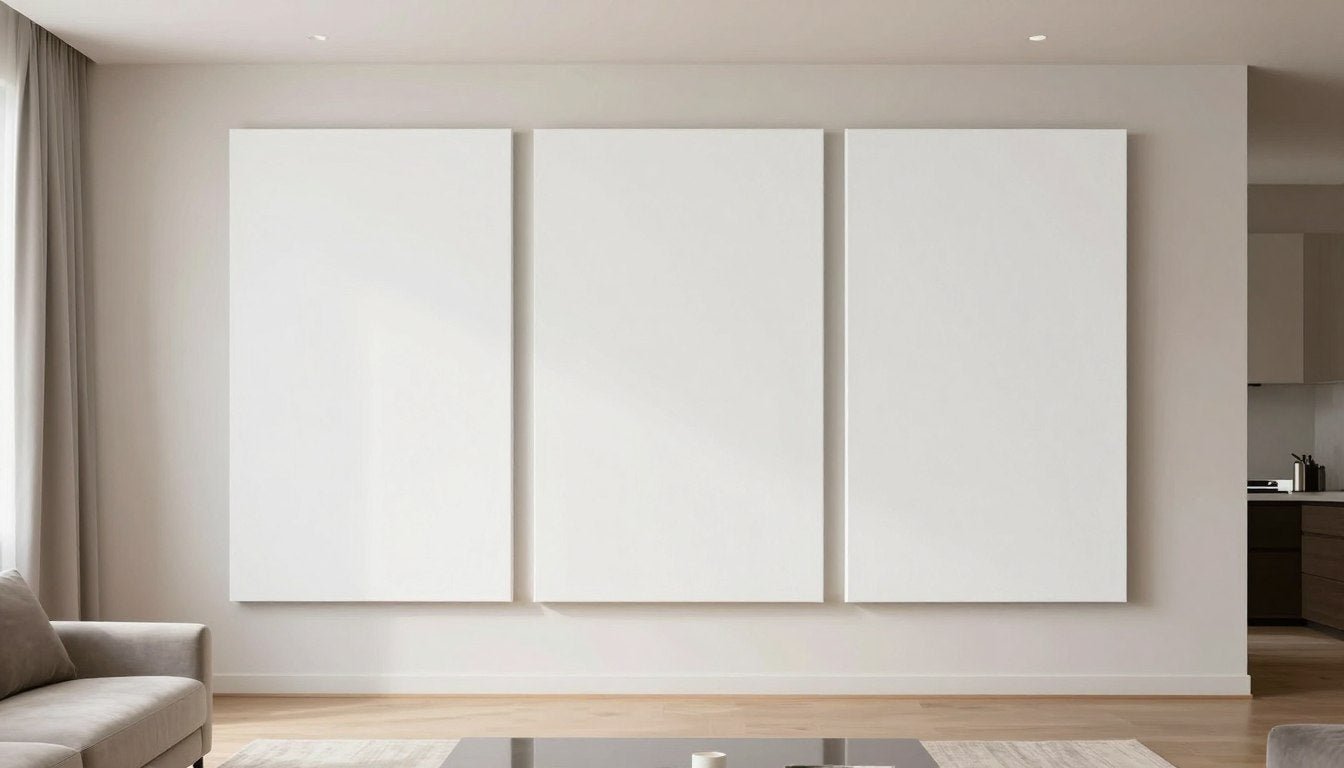
2. Dramatic Landscape Triptych
Placement: Main wall spanning table length
Format: Three-panel set (triptych)
Mood & Palette: Serene, expansive with horizon elements
A landscape triptych creates a panoramic effect that works beautifully behind longer dining tables. The horizontal orientation mirrors the table shape while creating a window-like view that expands the space. Consider canvas print sets that feature continuous scenes across multiple panels for maximum impact.
3. Oversized Black and White Photography
Placement: Main wall or above sideboard
Format: Single large print (36×48″ or larger)
Mood & Palette: Sophisticated monochrome with high contrast
Black and white photography brings timeless elegance to dining spaces. The absence of color creates a quiet luxury feel that works with any interior palette. Architectural subjects, landscapes, or abstract details all work beautifully in this format. Choose pieces from curated collections of timeless prints that won't quickly go out of style.

Gallery Walls and Collections
4. Curated Gallery Wall
Placement: Entry-to-dining transition wall
Format: 5-9 coordinated frames with consistent spacing
Mood & Palette: Eclectic yet cohesive, unified by frame style or color theme
A thoughtfully arranged gallery wall creates visual interest while showcasing multiple pieces. Maintain cohesion by using identical frames or a consistent color palette across all pieces. For dining spaces, consider a mix of canvas prints in complementary styles that tell a visual story when viewed together.
5. Grid of Botanical Prints
Placement: Above sideboard or buffet
Format: Symmetrical grid of 4 or 6 identical-sized frames
Mood & Palette: Natural, organized, typically green and neutral tones
A grid arrangement of botanical prints brings order and natural elements to your dining space. The symmetry creates a sense of calm while the subject matter subtly connects to the culinary purpose of the room. This works especially well in traditional or transitional dining rooms with wood furniture.

6. Asymmetrical Collection with Hero Piece
Placement: Main wall or large side wall
Format: One large anchor piece with 2-3 smaller supporting works
Mood & Palette: Dynamic, visually interesting with intentional color connections
This arrangement creates visual hierarchy while maintaining balance. The hero piece anchors the grouping while smaller works add depth and interest. Choose pieces that share color elements or thematic connections for a cohesive look that still offers variety.
Color and Mood Statements
7. Bold Color Accent Piece
Placement: Main wall or visible from adjacent rooms
Format: Single statement canvas (30×40″ or larger)
Mood & Palette: Vibrant, energetic with one dominant color that ties to room accents
A single artwork in a bold, saturated color creates energy and becomes a conversation piece. Choose a color that appears in smaller doses elsewhere in your dining space—perhaps echoing chair upholstery, table linens, or a nearby rug. This creates a color story that feels intentional rather than random.

8. Monochrome "Quiet Luxury" Collection
Placement: Main wall or throughout room in coordinated placement
Format: Single large piece or coordinated set in same palette
Mood & Palette: Sophisticated, subtle with tonal variations of one color family
Monochromatic artwork creates a sense of refined elegance perfect for formal dining spaces. Look for pieces with textural interest and subtle variations within a single color family. This approach works beautifully in dining rooms with architectural details you want to highlight rather than compete with.
9. Warm Neutral Abstract for Calm Ambiance
Placement: Any wall, especially effective in small dining spaces
Format: Single piece or diptych
Mood & Palette: Serene, grounding with earth tones and organic shapes
Neutral doesn't mean boring. Abstract pieces in warm beiges, taupes, and soft terracottas create a calming backdrop for intimate meals. The subtle palette allows conversation to flow without visual distraction. Abstract pieces with organic shapes and textures add interest without overwhelming the space.
Format Variations for Different Spaces
10. Vertical Diptych for Narrow Walls
Placement: Narrow end walls or between windows
Format: Two stacked vertical canvases
Mood & Palette: Cohesive between pieces, can be bold or subtle
Vertical spaces need vertical solutions. A stacked diptych draws the eye upward, creating height in the room while making use of narrow wall sections that might otherwise be overlooked. This works particularly well in dining rooms with high ceilings or limited wall space.

11. Horizontal Set to Visually Extend a Wall
Placement: Main wall or above sideboard
Format: 2-3 horizontal canvases arranged in a row
Mood & Palette: Continuous or complementary across pieces
A horizontal arrangement of multiple pieces creates a sense of expansion, making walls appear wider. This is ideal for square dining rooms you want to visually elongate. Canvas print sets designed to be displayed together ensure a cohesive look with perfect spacing.
12. Small-Scale Vertical for Dining Nooks
Placement: Wall adjacent to breakfast nook or small dining area
Format: Single vertical piece (24×36″ or similar)
Mood & Palette: Intimate, detailed, viewable from close distance
Smaller dining areas benefit from appropriately scaled artwork. A vertical piece adds height to a cozy nook while providing visual interest at close range. Choose pieces with details that reward closer viewing, as guests will be seated nearby.
Style-Specific Selections
13. Geometric Abstracts for Modern Dining Rooms
Placement: Any wall, particularly effective on main wall
Format: Single large piece or coordinated set
Mood & Palette: Clean, precise with defined shapes and limited color palette
Geometric abstract art complements the clean lines of modern dining furniture. Look for pieces with strong compositional structure and a restrained color palette. Geometric canvas prints with bold shapes create a sophisticated contemporary statement.

14. Vintage-Inspired Food Illustrations
Placement: Near sideboard or bar area
Format: Set of 3-4 in identical frames
Mood & Palette: Nostalgic, thematic with food-related imagery
Food-themed artwork creates a playful, thematic connection to your dining space. Vintage-inspired illustrations of produce, herbs, or culinary scenes add character while maintaining sophistication. Group several together in identical frames for a collected, curated look.
15. Black and White Architectural Photography
Placement: Main wall or above sideboard
Format: Single large piece or triptych
Mood & Palette: Structured, dramatic with strong contrast
Architectural photography brings structure and visual interest to dining spaces. The monochromatic palette creates a sophisticated backdrop that works with any color scheme. Look for images with strong lines and interesting perspectives that create depth.
Conversation Starters
16. Iconic Pop Culture Reference
Placement: Side wall visible during meals
Format: Single statement piece
Mood & Palette: Playful, nostalgic, often bold colors
Art that references film, music, or cultural icons creates instant conversation starters during meals. Choose pieces that reflect your personal interests while maintaining an elevated aesthetic. Artistic interpretations of music and cinema legends add personality without feeling like posters.

17. Abstract Expressionist for Emotional Depth
Placement: Main wall as focal point
Format: Single large canvas
Mood & Palette: Emotive, dynamic with gestural marks and depth
Abstract expressionist works bring emotional resonance to dining spaces. The gestural, spontaneous quality of these pieces creates visual energy and depth. Choose pieces with movement and layers that reveal different aspects depending on lighting and viewing angle.
18. Oversized Still Life with Modern Edge
Placement: Main wall or above sideboard
Format: Single large canvas
Mood & Palette: Traditional subject with contemporary execution
A modern take on traditional still life brings a fresh perspective to dining room art. Look for pieces that reference classical compositions but with contemporary color palettes or techniques. This creates a bridge between traditional dining furniture and modern sensibilities.
Specialized Placements
19. Open-Plan Transition Piece
Placement: Wall visible from both dining and adjacent living space
Format: Single large piece or diptych
Mood & Palette: Unifying colors that connect both spaces
In open-concept homes, artwork can help define the dining area while creating visual flow between spaces. Choose pieces that incorporate colors from both the dining and adjacent areas to create a cohesive transition. Versatile pieces with broad appeal work well in these connector positions.

20. Buffet or Sideboard Gallery
Placement: Wall above sideboard or buffet
Format: Row of 3-5 small to medium pieces
Mood & Palette: Complementary to main wall art but distinct
The wall above a sideboard offers prime real estate for a secondary art moment. Create a mini gallery with smaller pieces that complement but don't compete with your main dining wall. This creates layered interest throughout the room while maintaining visual hierarchy.
21. Corner Vignette with Stacked Art
Placement: Corner adjacent to dining area
Format: 2-3 pieces of varying sizes, slightly overlapping or stacked
Mood & Palette: Casual, collected with personal significance
Create an artful corner moment by arranging 2-3 pieces in a casual, slightly overlapping composition. This creates a more relaxed, collected feel compared to formal centered arrangements. This approach works well for introducing smaller pieces that might get lost on a large wall.
Style Pairing Guide: Match Art to Your Dining Room Mood

Modern + Crisp
For dining rooms with clean lines, minimal ornamentation, and contemporary furniture, choose art with strong geometric elements, limited color palettes, and precise compositions. Abstract pieces with defined shapes and high contrast create a sophisticated modern statement.
Best formats: Single oversized canvas, diptych with strong horizontal line, or grid arrangement of identical sizes
Warm + Intimate
Create a cozy, welcoming dining atmosphere with art featuring soft edges, warm neutral palettes, and natural elements. Abstract landscapes, botanical studies, or textural pieces in earth tones foster connection and conversation during meals.
Best formats: Medium-scale single piece, small grouping of complementary works, or textural canvas with depth
Bold + Social
Energize your dining space with statement pieces featuring vibrant colors, dynamic compositions, and eye-catching elements. These conversation-starting works set the stage for lively gatherings and memorable dinner parties.
Best formats: Large statement canvas, colorful triptych, or unexpected subject matter in oversized format
Curated + Eclectic
For a collected, personal dining space, mix various art styles unified by a common element—frame style, color palette, or thematic connection. This approach showcases your unique taste while maintaining visual harmony.
Best formats: Gallery wall with varied sizes, collection of different mediums in same subject, or salon-style hanging with intentional arrangement
Lighting & Glare: How to Make Art Look Good at Night

Dining rooms present unique lighting challenges for artwork. Many meals happen in the evening under artificial light, and most dining spaces feature pendant lights or chandeliers that can create problematic glare on art surfaces.
Pendant Placement Considerations
When positioning pendant lights, consider their relationship to your artwork. Ideally, pendants should hang centered over your table, not aligned directly with wall art. This prevents harsh light from creating hotspots or washing out colors in your artwork.
If you're designing from scratch, place pendants first, then position artwork where it won't receive direct light beams. For existing pendants, adjust your art placement to avoid the direct light path.
Finish and Material Choices
The finish of your artwork significantly impacts how it handles light. Canvas prints with a matte finish are ideal for dining rooms, as they diffuse light rather than reflecting it. Quality canvas prints maintain color vibrancy without creating distracting glare spots.
If you prefer framed art under glass, choose museum or anti-glare glass options. These specialized materials minimize reflections while protecting the artwork. Position these pieces on walls perpendicular to windows rather than directly across from them.
Optional Picture Lighting
For special pieces or dining rooms used primarily in the evening, consider adding dedicated picture lights. These fixtures mount above artwork to provide controlled, even illumination without glare. Modern LED picture lights are slim and unobtrusive while highlighting the colors and details of your art.
Picture lights work particularly well above sideboards or buffets, creating a secondary lighting zone that adds depth to your dining space while properly showcasing artwork.
Common Mistakes (and Quick Fixes)
Common Mistakes
- Too small for the wall: Artwork that looks tiny and disconnected from furniture below
- Hanging too high: Pieces placed well above eye level, creating neck strain
- Inconsistent spacing: Gallery walls with random, uneven gaps between frames
- Competing with the table: Art that fights with your dining table for attention
- Ignoring glare: Glossy pieces placed directly across from windows or under lights
- Improper scale: Artwork disproportionate to the furniture it hangs above
Quick Fixes
- Size up: Choose larger pieces or group smaller works together for impact
- Lower placement: Center artwork at 57-60" from floor (standard eye level)
- Use templates: Create paper mockups to plan gallery wall spacing before hanging
- Coordinate colors: Select art that complements rather than competes with furniture
- Switch finishes: Replace glossy pieces with matte canvas in high-glare areas
- Follow the 2/3 rule: Art should span about 2/3 the width of furniture below it

Frequently Asked Questions About Dining Room Artwork
What size artwork should I hang in a dining room?
For the main dining wall, choose artwork that spans approximately two-thirds the width of your dining table. For a standard 72-inch table, aim for artwork around 48 inches wide. Above a sideboard, artwork should be about 75% of the furniture width. Single pieces should be substantial enough to anchor the space—generally 30×40 inches or larger for average dining rooms.
Should dining room art match the kitchen in an open-plan space?
While dining room art doesn't need to match kitchen décor exactly, it should create visual harmony in open-plan spaces. Choose pieces that incorporate at least one color element from your kitchen palette to create flow between the areas. The art should feel connected to the kitchen without being identical in style—think complementary rather than matching.
How high should art be hung above a sideboard?
Art above a sideboard or buffet should be hung 8-10 inches above the furniture top. This creates enough breathing room while maintaining a visual connection between the pieces. The center of the artwork should generally be at eye level (57-60 inches from the floor) when standing, but this can be adjusted slightly lower to accommodate seated viewing in dining spaces.
Is a triptych better than one large canvas for a dining room?
Neither option is inherently better—both can work beautifully depending on your space and style preferences. Triptychs work especially well above long rectangular tables, creating a panoramic effect that mirrors the table shape. They also add visual interest through the spacing between panels. Single large canvases create a bold, unified statement and can be simpler to hang. Consider your table shape, wall size, and whether you prefer a continuous or segmented visual effect.
How do I avoid glare from dining room lighting on my artwork?
To minimize glare, choose canvas prints with matte finishes rather than glossy surfaces or glass-covered frames. Position artwork on walls that don't directly face windows, and ensure pendant lights aren't creating direct reflections on art surfaces. If using framed pieces under glass, opt for museum glass or anti-glare options. For existing pieces with glare issues, adjusting your pendant height or adding a dimmer switch can help manage reflection problems.
Can I do a gallery wall in a formal dining room?
Absolutely! Gallery walls can work beautifully in formal dining rooms when executed with intention. For a more formal approach, use matching frames in a classic finish like gold or black, maintain precise, even spacing between pieces, and select artwork with a cohesive color palette or theme. A symmetrical arrangement often feels more formal than an organic, scattered approach. Consider curating pieces with similar subject matter or artistic style for a collected yet sophisticated look.
What type of dining room artwork creates the best atmosphere for entertaining?
For entertaining spaces, choose artwork that sparks conversation without dominating it. Abstract pieces with intriguing color combinations, landscape scenes that evoke travel memories, or artistic interpretations of familiar subjects all create talking points without requiring focused attention. Consider the mood you want to create—vibrant, energetic pieces enhance lively dinner parties, while serene, harmonious works foster intimate conversations. Avoid overly controversial or potentially divisive imagery that might distract from the social experience.
Where to Find Dining Room-Worthy Wall Art

The perfect dining room artwork transforms ordinary meals into memorable experiences, creating a backdrop for life's important moments. As you select pieces for your space, remember that the best dining room art balances aesthetic appeal with practical considerations like scale, placement, and lighting interaction.
Whether you prefer bold statement pieces or subtle, sophisticated works, the key is choosing art that resonates with you while enhancing your dining experience. The right pieces will spark conversation, complement your interior design, and create an atmosphere that feels both personal and intentional.
For curated collections of dining room-worthy artwork in various styles and formats, explore Rossetti Art's thoughtfully selected canvas prints. From statement pieces for main walls to coordinated sets for gallery displays, you'll find options that transform your dining space into the private gallery you've envisioned.
Leave a comment
This site is protected by hCaptcha and the hCaptcha Privacy Policy and Terms of Service apply.