Brown is having a major moment in interior design. This rich, versatile color anchors spaces with warmth and sophistication. Yet many homeowners struggle with one crucial question: what colors go with brown?
The answer transforms ordinary rooms into magazine-worthy spaces. Brown pairs beautifully with unexpected hues that elevate your home's entire aesthetic. Whether you're working with chocolate leather sofas, warm wood tones, or dark brown walls, the right color combinations unlock limitless design potential.

This guide reveals nine designer-approved color palettes that complement brown perfectly. Each combination includes practical styling tips and curated art selections to complete your vision. You'll discover how to balance warm and cool tones, layer textures effectively, and choose artwork that ties everything together.
Why Brown Is the Ultimate Foundation Color for Your Home
Brown functions as nature's neutral in interior design. This earthy color creates immediate warmth while offering remarkable versatility. Unlike stark whites or cool grays, brown tones bring organic richness to every space.

The psychology behind brown colors explains their enduring appeal. This hue evokes feelings of stability, comfort, and connection to nature. When you incorporate brown wood furniture or brown leather sofas into your living room, you're creating a foundation that feels both grounded and inviting.
Brown's true strength lies in its spectrum. Light tan and beige offer subtle warmth. Medium brown tones provide rich depth. Dark brown creates dramatic sophistication. Each shade responds differently to complementary colors, giving you endless design flexibility.
Warm Brown Undertones
These brown shades contain red, orange, or yellow notes. They pair naturally with terracotta, gold, and olive green. Warm browns create cozy, intimate atmospheres perfect for bedrooms and living spaces.
Cool Brown Undertones
These tones lean toward gray or taupe. They complement blues, purples, and crisp whites beautifully. Cool browns work exceptionally well in modern living room designs and minimalist spaces.
Understanding your brown's undertone is essential. This knowledge guides every subsequent color choice. Hold fabric swatches or paint samples next to your existing brown furniture. Does it look richer beside warm golds or cooler blues? That contrast reveals which color palette will make your room feel cohesive and intentional.
3 Prints That Bring Brown Palettes to Life
Artwork transforms color theory into lived reality. The right pieces unify your brown color palette while adding personality and depth. These three curated selections demonstrate how art completes brown-based room designs.

Warm Earth Tones Abstract
This expressionist piece features flowing browns, terracotta, and cream. The organic movement mirrors natural wood grain while introducing complementary warm accents. Perfect for spaces with brown wood furniture and earthy decor.

Sophisticated Portrait Series
Deep brown backgrounds meet cool blue undertones in this striking portrait. The combination demonstrates how complementary colors create visual interest without overwhelming brown furniture. Ideal for modern living rooms with dark brown elements.

Natural Landscape Minimal
Subtle brown earth meets soft sage green in this calming composition. The minimal approach lets your existing brown color palette shine while introducing nature-inspired accents. Excellent for bedrooms and spaces seeking tranquil atmosphere.
Each piece demonstrates core principles for selecting art that enhances brown spaces. Look for artwork containing at least one brown shade from your existing palette. Then choose pieces that introduce your desired complementary color. This approach creates visual cohesion while adding dimensional interest to walls and overall room feel.
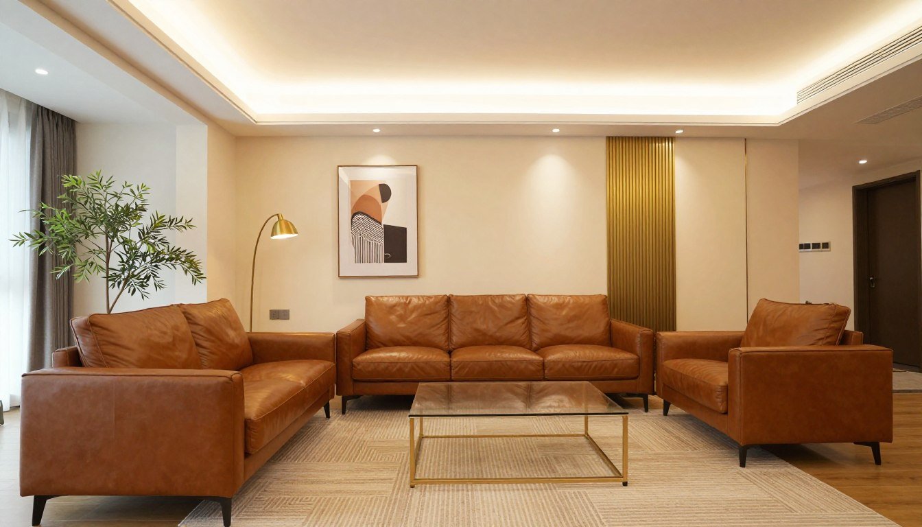
Classic Elegance: Brown and Cream
This timeless combination creates sophisticated spaces that never feel dated. Chocolate brown paired with creamy neutrals delivers warmth without overwhelming a room. The contrast between deep and light tones adds depth while maintaining an airy atmosphere.

In your living room, anchor the space with a brown leather sofa. Layer cream throw pillows and a textured cream rug beneath a dark wood coffee table. The key lies in varying textures rather than relying solely on color contrast. Smooth leather against nubby linen creates tactile interest that pure color cannot achieve alone.

Styling Tips for Brown and Cream
- Use 60% cream, 30% brown, 10% accent for balanced proportions
- Mix warm cream (ivory) with warm brown or cool cream (linen) with cool brown
- Add gold accents to bridge the two tones harmoniously
- Layer multiple cream shades to prevent flatness
The brown complementary color principle applies here through value contrast. Dark brown furniture against cream walls creates natural focal points. Your eye travels from light to dark automatically, establishing visual hierarchy. This makes small room feel more spacious while maintaining cozy warmth.

For artwork in cream and brown spaces, select pieces with both tones present. Abstract art featuring flowing browns and creams creates seamless integration. Alternatively, choose photography with warm undertones. Black and white images often feel too stark against this softer palette.
Earthy Bohemian: Warm Brown and Terracotta
Terracotta breathes life into brown spaces with its vibrant, earthy energy. This combination channels desert landscapes and Mediterranean villas. The warm undertones in both colors create natural harmony that feels collected rather than coordinated.

This palette works beautifully when layered with natural materials. Combine brown wood tones with terracotta ceramics, woven baskets, and abundant greenery. The result feels organic and collected over time. Your living room becomes a curated space reflecting personal style rather than showroom perfection.

The science behind this combination involves color temperature. Both brown and terracotta register as warm colors on the spectrum. They share orange and red undertones, creating immediate visual compatibility. When you introduce these colors together, they amplify each other's warmth without competing for attention.
Key Elements
Brown leather or rattan furniture establishes the foundation. Terracotta appears in textiles, ceramics, and wall accents. Natural fiber rugs bridge the tones.
Best Rooms
This palette excels in living rooms, dining areas, and covered patios. The warmth suits spaces for gathering and relaxation. Avoid in rooms needing cool, crisp energy.
Design Mood
Expect casual, welcoming atmosphere with global influences. This combination never feels formal or stuffy. Perfect for homes embracing relaxed, artistic sensibility.
To prevent overwhelming warmth, introduce cream or off-white in larger doses. Paint walls a soft cream, allowing brown furniture and terracotta accents to punctuate the space. This approach maintains the palette's character while ensuring visual breathing room.

Natural Retreat: Brown and Olive Green
Olive green brings sophisticated freshness to brown spaces. This earthy combination mirrors forest floors where brown bark meets green foliage. The result feels grounded yet vital, perfect for creating restorative home environments.

The colors complement brown through their shared natural origins. Olive green contains brown undertones itself, creating seamless transition between hues. When you place an olive green throw pillow on a brown leather sofa, the colors don't merely coexist—they enhance one another's richness.
In a modern living room, this palette creates organic sophistication. Start with brown wood furniture as your base. Introduce olive green through upholstered pieces, curtains, or a statement rug. The green provides visual relief from brown's earthiness without jarring the eye.
Achieving Balance
Neither color should dominate completely. Use brown for larger furniture pieces and wood tones throughout the room. Reserve olive green for medium-sized accents like chairs or curtains.
Add cream or tan as a third neutral. This lighter shade prevents the combination from feeling too heavy or dark, especially in rooms with limited natural light.

This combination works year-round but truly shines in autumn and winter. The olive green reads as sophisticated rather than bright, making it suitable for formal spaces. Your home office or bedroom benefits from this palette's calming yet focused energy.

For art selection, seek pieces featuring both brown earth tones and green foliage. Abstract landscapes work beautifully, as do botanical prints. The artwork should feel like it emerged from the same natural environment, reinforcing the palette's organic cohesion.
Match This Vibe to Your Space
Explore curated art collections designed to complement your brown color palette. From earthy abstracts to sophisticated portraits, find pieces that complete your vision and tie together your room's aesthetic with museum-quality craftsmanship.
Luxe Glam: Dark Brown and Gold
Gold transforms dark brown from rustic to refined. This opulent combination evokes luxury hotels and high-end boutiques. The metallic sheen against deep brown creates dramatic contrast that reads as intentionally glamorous.

Dark brown provides the perfect backdrop for gold's brilliance. The deep tone prevents gold from appearing gaudy or excessive. Instead, metallic elements punctuate the space with deliberate luxury. Your room feel instantly more expensive without requiring massive investment.

The complementary to brown nature of gold involves light reflection. Gold's warm metallic finish bounces light throughout a room, preventing dark brown from feeling cave-like. This interplay between light-absorbing and light-reflecting surfaces creates dimensional depth that pure matte colors cannot achieve.
Application Strategy
- Paint walls deep brown or use brown wood paneling
- Select gold lighting fixtures as statement pieces
- Add gold-framed mirrors to multiply light reflection
- Incorporate gold-threaded textiles sparingly
- Choose furniture with gold-toned hardware details
Balance Considerations
- Use gold as 10-15% of total room design
- Distribute gold accents throughout the space evenly
- Mix gold finishes (brushed, polished, antique) for depth
- Add cream or ivory to prevent excessive darkness
- Ensure adequate lighting to showcase the palette
This palette demands confidence in execution. Too little gold reads as accidental. Too much appears ostentatious. The sweet spot involves deliberate placement in lighting, hardware, and select decor items. Each gold element should feel purposeful rather than scattered.

For bedroom application, pair a dark brown upholstered headboard with gold bedside lamps. Use brown and gold bedding in luxe fabrics like velvet or silk. The intimate scale of a bedroom allows this dramatic palette to envelop you without overwhelming the space.
Coastal Calm: Brown and Blue
Blue offers refreshing contrast to brown's warmth. This unexpected pairing channels seaside cottages where weathered wood meets ocean views. The combination feels both relaxed and intentional, perfect for spaces seeking balanced energy.

The science behind brown and blue involves complementary color relationships. On the color wheel, orange sits opposite blue. Since brown contains orange undertones, it creates subtle complementary harmony with blue shades. This explains why the combination feels simultaneously surprising and right.

In your living room, a brown leather sofa gains new life against blue walls. The leather's warmth prevents blue from feeling cold, while blue stops brown from becoming too heavy. Consider navy blue for sophisticated spaces or soft powder blue for casual, airy rooms.
Navy and Brown
This traditional pairing reads as preppy and polished. Use it in home offices or libraries for intellectual sophistication. The deep tones create cocooning atmosphere perfect for focus.
Powder Blue and Brown
Lighter blues create casual, approachable spaces. This variation works beautifully in bedrooms and breakfast nooks. The soft blue introduces airiness without sacrificing brown's grounding effect.
Teal and Brown
For adventurous designers, teal brings jewel-tone richness. The blue-green hybrid contains enough warmth to harmonize with brown naturally. Use in small doses for maximum impact.
White or cream serves as essential third color here. Use it liberally on walls or larger surfaces. This neutral prevents blue and brown from competing, giving each color room to breathe. The three-color formula ensures visual balance in any room feel.

Select art featuring seascapes, abstract blue paintings, or photography with brown and blue tones. The artwork reinforces the coastal narrative while providing a focal point that showcases both colors working in harmony.
Scandinavian Modern: Brown Wood Tones and White
This minimalist combination celebrates natural materials without excess. Light brown wood against crisp white creates the foundation of Scandinavian design. The palette feels clean, contemporary, and effortlessly sophisticated.

The best colors brown can pair with include pure white for maximum contrast. But Scandinavian design rarely uses stark white. Instead, opt for warm whites with slight cream or gray undertones. These softer whites complement brown wood tones without harsh coldness.

Essential Elements
- Light-toned brown wood (oak, ash, birch)
- White or off-white wall paint
- Minimal furniture with clean lines
- Natural fiber textiles in neutral tones
Brown wood furniture should showcase visible grain and natural character. Avoid heavy, dark stains. The wood's organic beauty becomes the room's texture and visual interest. This eliminates need for excessive decoration or color.

In this palette, restraint creates impact. A single brown wood table becomes a statement. White walls amplify its presence rather than competing. Your modern living room achieves sophistication through subtraction, not addition.
Add warmth through textiles rather than color. Cream linen curtains, ivory wool throws, and natural jute rugs introduce subtle variation. These neutral layers prevent the white-and-brown combination from feeling sterile while maintaining the palette's minimalist integrity.

For art in Scandinavian spaces, choose minimal abstracts or simple line drawings. Black and white photography works beautifully here. The artwork should enhance rather than dominate, supporting the palette's quiet sophistication.
Soft Romance: Brown and Blush Pink
Blush pink brings unexpected softness to brown spaces. This contemporary combination feels romantic without being overly feminine. The warm undertones in both colors create gentle harmony that works in adult spaces and nurseries alike.

This palette challenges traditional color rules beautifully. Brown provides grounding weight that prevents blush from appearing juvenile. Conversely, pink softens brown's potentially heavy presence. The balance creates spaces that feel nurturing and stylish simultaneously.

Color Proportions
Use brown as the dominant neutral in furniture and wood tones. Apply blush pink more sparingly in textiles and decor. This prevents the palette from skewing too sweet while maintaining its romantic character.
Material Choices
Pair rustic brown wood with luxe pink velvet for textural contrast. Rough and smooth surfaces create dynamic interplay. The juxtaposition makes each material's qualities more pronounced.
In bedrooms, this combination excels at creating serene retreats. Brown wood bed frames anchor the space while blush bedding introduces softness. Layer multiple pink tones from pale ballet pink to deeper rose for dimensional interest. This approach prevents the color from reading flat.

Introduce metallic accents in rose gold or copper. These warm metallics bridge brown and pink while adding glamorous touch. The metals catch light beautifully, enhancing the palette's overall warmth and atmosphere.
Urban Edge: Dark Brown and Charcoal
Charcoal gray alongside dark brown creates sophisticated, masculine energy. This moody combination suits contemporary lofts and bachelor pads. The near-monochromatic scheme feels intentionally restrained and undeniably cool.

The best colors brown pairs with for modern aesthetics include deep grays. Both register as near-neutrals, allowing the subtle difference in undertone to provide visual interest. Brown brings warmth to prevent gray's potential coldness. Gray adds contemporary edge to prevent brown from feeling too traditional.

Wall Treatment
Paint walls charcoal gray to create dramatic backdrop for brown furniture. Alternatively, use brown wood paneling against gray walls for architectural interest.
Furniture Mix
Combine brown leather seating with gray upholstered pieces. The mix of materials and tones creates layered sophistication that single colors cannot achieve.
Accent Strategy
Introduce matte black elements sparingly. Black deepens the palette's moody quality while providing crisp definition between brown and gray zones.
This palette demands excellent lighting. The dark tones absorb light, so incorporate multiple light sources at various heights. Metallic finishes in aged brass or black metal complement the sophisticated color story while reflecting light throughout the space.

For art selection, consider monochromatic photography or abstract pieces in the same tonal range. The artwork should enhance the palette's cohesive, sophisticated atmosphere rather than introducing bright color that would disrupt the carefully curated mood.
Botanical Serenity: Brown and Sage Green
Sage green offers a softer alternative to olive while maintaining earthy sophistication. This muted green contains gray undertones that create subtle elegance. Paired with brown, it evokes botanical gardens and peaceful conservatories.

Sage green works beautifully as a wall color throughout your home. The muted tone provides color without overwhelming. Brown wood furniture and accents gain prominence against this subtle backdrop. Your living room feel grows more cohesive as the green unifies disparate brown pieces.

This combination naturally invites living plants into the space. Real greenery reinforces the color story while adding organic texture. Potted plants in brown ceramic or woven baskets create seamless integration. The result feels like nature itself inspired your design choices.
Implementing Sage and Brown
- Paint walls sage green, use brown for furniture and trim
- Layer various green shades from sage to deeper forest
- Incorporate cream or tan as lighter neutral balance
- Add plants in matching sage-toned ceramic planters
- Choose art featuring botanical themes or green abstracts

The complementary to brown quality of sage appears in its calming effect. While not technically opposite on the color wheel, the gray-green tone provides visual relief from brown's warmth. This makes the combination ideal for bedrooms and spaces prioritizing relaxation.

For art integration, botanical prints feel obvious yet effective. Consider abstract pieces featuring green and brown organic forms. Original paintings with textured brushwork add dimensional interest that complements the palette's natural, layered aesthetic.
Expert Design Tips for Brown-Based Color Schemes
Success with brown color palettes requires understanding balance, proportion, and light. These professional strategies ensure your chosen combination achieves the intended atmosphere while maintaining visual harmony.

Understanding Brown Undertones
Every brown shade leans warm or cool. Warm browns contain red, orange, or yellow notes. Cool browns incorporate gray or purple undertones. Match your complementary colors to your brown's temperature. Warm browns pair best with terracotta, gold, and warm greens. Cool browns harmonize with blues, purples, and cool grays.
Testing Your Brown
Hold color samples beside your existing brown elements in natural daylight. Which makes the brown look richer and more appealing? That reveals compatible undertones.
- Photograph brown furniture in different lighting conditions
- Compare against both warm and cool color samples
- Notice which combinations make the room feel cohesive
- Trust your eye over color theory rules
Light Considerations
Natural light dramatically affects how brown colors appear throughout the day. Rooms with southern exposure make browns appear warmer and more vibrant.
- North-facing rooms benefit from warm brown tones to counter coolness
- Dark brown in low-light spaces requires additional artificial lighting
- Reflective surfaces help distribute light in brown-heavy rooms
- Multiple light sources at different heights prevent shadowy corners
Proportion and Balance
The 60-30-10 rule provides foolproof formula for color distribution. Use brown for 60% of the room, typically in walls or large furniture pieces. Your complementary color occupies 30% through medium elements like rugs or curtains. Accent colors fill the remaining 10% in decor items.

Texture Creates Depth
Brown rooms risk appearing flat without textural variation. Combine smooth brown leather with nubby linen. Pair glossy brown wood with matte painted walls. Rough jute rugs contrast beautifully with sleek brown furniture. These tactile differences create visual interest that color alone cannot provide.
- Mix multiple brown shades for dimensional depth
- Add cream or tan to prevent heavy, dark atmosphere
- Use metallic accents to reflect light in brown spaces
- Layer textures extensively for visual interest
- Incorporate living plants to add freshness
- Choose art containing your brown tones for cohesion
Do These
- Using only one brown shade throughout the entire room
- Pairing brown with colors that have conflicting undertones
- Neglecting adequate lighting in dark brown spaces
- Combining too many competing patterns in brown palettes
- Forgetting to add lighter tones for visual balance
- Ignoring the room's natural light when selecting brown shades
Avoid These
Make Small Room Feel Larger
Dark brown can overwhelm compact spaces. Use lighter brown tones on walls while reserving darker browns for smaller furniture pieces. Add substantial mirrors to reflect light and create depth illusion. Keep patterns minimal and colors limited to prevent visual clutter.

For additional guidance on color psychology and design principles, explore more insights on our design blog. Understanding how colors interact helps you make confident decisions for every room in your home.
Selecting Art That Complements Brown Color Palettes
Artwork serves as the final layer that unifies your brown color scheme. The right pieces tie together disparate elements while adding personality. Follow these principles to choose art that enhances rather than conflicts with your carefully curated palette.

Color Coordination Strategies
Look for artwork containing at least one brown shade present in your room. This creates instant visual connection between art and space. Then ensure the piece includes your chosen complementary color. For example, if you're working with brown and blue, select art featuring both tones.
Abstract Art Benefits
Abstract pieces offer flexibility in brown spaces. The non-representational forms allow viewers to focus on color and texture relationships. Abstract art in earth tones creates cohesive backdrops while colorful abstracts provide dynamic focal points.
Consider modern canvas prints that feature organic shapes and your brown color palette. These museum-quality pieces arrive ready to hang, eliminating installation uncertainty.
Representational Art
Photography and realistic paintings work beautifully when their colors harmonize with your palette. Landscape photography featuring brown earth and your complementary color creates natural connection to your design scheme.
For spaces with dark brown elements, explore original paintings with rich, saturated colors that hold their presence against deeper tones.

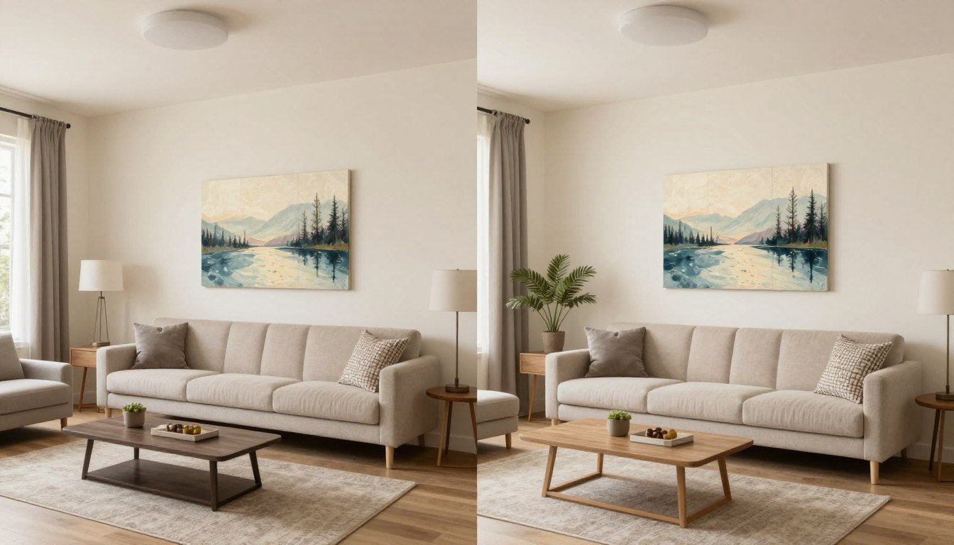
Scale and Proportion
Artwork should relate proportionally to furniture beneath it. A piece above your sofa should span two-thirds to three-quarters of the furniture's width. Too small appears tentative. Oversized creates drama but requires confident execution.
Small Spaces
One large statement piece often works better than multiple small works. The single focal point provides visual anchor without fragmenting the room's perceived space.
Large Walls
Gallery walls allow you to combine multiple pieces sharing your color palette. Mix sizes and orientations while maintaining consistent spacing for professional appearance.
Odd Numbers
Groups of three or five pieces create more dynamic compositions than pairs. The asymmetry feels more organic and intentional than perfectly balanced arrangements.
Three-Dimensional Art
Don't limit yourself to flat wall art. Modern sculptures add dimensional interest to brown spaces. Bronze and wood sculptures naturally harmonize with brown palettes while providing textural contrast against painted walls.

Place sculptures on brown wood furniture to create layered vignettes. The three-dimensional form catches light differently throughout the day, providing evolving visual interest that flat art cannot match. This approach works especially well in modern living room designs seeking sophisticated, collected aesthetic.
Frame Selection Matters
Frame choices significantly impact how art relates to brown interiors. Brown wood frames create seamless integration with brown furniture, though they risk blending too completely. Gold or brass frames add luxe touch while creating definition between art and walls. Simple black frames provide crisp contrast that makes both art and brown elements more pronounced.

Ready-to-Hang, Museum-Quality Canvas
Transform your brown color palette with art that completes your vision. Every piece arrives gallery-wrapped and ready to hang, with free worldwide shipping. Museum-quality materials ensure your investment looks stunning for years. No installation stress, no hidden costs—just beautiful art delivered to your door.
Room-by-Room Application of Brown Color Schemes
Different rooms serve distinct functions requiring tailored approaches to brown palettes. These specific applications help you implement colors that go with brown effectively throughout your entire home.

Living Room Strategies
Your living room typically contains the most brown wood furniture and largest seating pieces. This space can handle bolder complementary colors since it's designed for activity and gathering. A brown leather sofa becomes stunning focal point against sage green walls or beside navy blue accent chairs.

Living Room Essentials
- Use brown as foundation in large furniture pieces
- Add complementary colors through easily changeable elements
- Layer multiple textures to prevent visual flatness
- Ensure adequate lighting for darker brown schemes
- Create conversation areas using brown wood coffee tables as anchors
Bedroom Color Psychology
Bedrooms benefit from brown's naturally calming properties. Warm brown wood furniture promotes restful atmosphere. Pair with soft complementary colors like sage green, blush pink, or powder blue. Avoid overly stimulating combinations like bright terracotta or vibrant gold in sleeping spaces.

Brown bedding creates cozy envelope perfect for cold weather months. Layer various brown shades from chocolate to tan for dimensional interest. Add your complementary color through accent pillows, throws, or a statement headboard. This approach allows seasonal color changes without replacing major furniture pieces.
Dining Spaces
Brown wood dining tables serve as natural gathering points. The warm tone stimulates appetite while creating intimate atmosphere. Pair brown wood tones with upholstered dining chairs in complementary colors. Consider olive green velvet, blue linen, or terracotta leather for sophisticated look.

Home Office Productivity
Brown creates grounding atmosphere conducive to focused work. Brown wood desks and shelving provide practical surfaces while establishing professional aesthetic. Pair with colors that enhance concentration: navy blue for intellectual pursuits, sage green for creativity, or charcoal for sophisticated edge.
Office Design Tips
- Invest in quality brown wood desk as foundation piece
- Use complementary wall color to reduce eye strain
- Add task lighting to counter brown's light absorption
- Incorporate plants for air quality and color relief

Kitchen and Bathroom Considerations
These functional spaces handle brown differently. In kitchens, brown appears primarily in wood tones of cabinets or flooring. Keep walls and counters lighter to maintain clean, hygienic appearance. Introduce complementary colors through backsplash tiles, small appliances, or window treatments.

Bathrooms with brown stone or wood vanities gain spa-like quality when paired with sage green, cream, or soft blue. These colors enhance brown's natural, organic feel while maintaining the fresh, clean atmosphere bathrooms require. Add white fixtures and chrome hardware to prevent the space from feeling too dark.
Adapting Brown Palettes Through Seasons
Brown's versatility allows seasonal refreshes without major overhauls. Simple adjustments to accents and textiles shift your brown color palette's mood throughout the year. This approach maximizes investment in brown furniture while keeping spaces feeling current.

Spring and Summer Lightness
Warm weather calls for lighter complementary colors that make brown spaces feel airy. Swap heavy textiles for linen and cotton in cream, powder blue, or soft sage. Remove layered throw blankets and replace with single lightweight options. The brown foundation remains while atmosphere lightens considerably.
Spring/Summer Swaps
- Replace velvet pillows with linen or cotton versions
- Switch darker rugs for natural jute or lighter shades
- Add fresh flowers in complementary colors weekly
- Hang lightweight curtains in cream or white
- Display lighter-toned art or photography

Fall and Winter Richness
Cooler months embrace brown's inherent warmth. Layer deeper versions of your complementary colors. Sage green becomes forest green. Powder blue shifts to navy. Blush pink deepens to burgundy. These saturated tones create cocooning atmosphere perfect for long winter evenings.

Add textural warmth through chunky knit throws, faux fur pillows, and wool rugs. These tactile elements amplify brown's cozy qualities. Increase ambient lighting with table lamps and candles. The combination of rich colors, varied textures, and warm light transforms your space into autumn and winter sanctuary.
Textiles
Swap to heavier fabrics like velvet, wool, and faux fur. Layer multiple blankets and pillows for visual and physical warmth.
Colors
Deepen complementary shades to richer versions. Add metallics like gold or copper for festive warmth and light reflection.
Lighting
Increase warm-toned light sources. Add candles, string lights, or amber-bulbed lamps to enhance brown's cozy glow.
Holiday Adaptations
Brown serves as excellent neutral backdrop for holiday decor. The earth tone doesn't compete with seasonal colors. Thanksgiving embraces brown naturally with orange and gold accents. Christmas pairs brown with red, green, or white beautifully. Your brown furniture becomes part of the festive story rather than obstacle to work around.
Common Mistakes When Decorating With Brown
Even versatile brown presents challenges when mishandled. Avoid these frequent errors to ensure your brown color palette achieves its intended sophisticated effect rather than falling flat.

Using Only One Brown Shade
Single-tone brown spaces feel monotonous and flat. Layer light, medium, and dark brown shades for dimensional depth. Your brown leather sofa works best alongside lighter brown wood coffee table and darker brown accent pillows. The variation creates visual interest while maintaining cohesive brown foundation.
Effective Brown Layering
- Mix furniture in various brown tones
- Combine different wood species for grain variation
- Layer brown textiles in graduated shades
- Add brown artwork or accessories in contrasting values
- Use natural materials that introduce organic brown variation
What Creates Flatness
- Matching all brown furniture pieces exactly
- Using single brown paint shade throughout
- Avoiding textural contrast in brown elements
- Forgetting to vary finish types (matte, glossy, distressed)
- Neglecting lighter or darker brown accents
Insufficient Lighting
Dark brown absorbs light voraciously. Rooms with inadequate illumination feel cave-like rather than cozy. Install multiple light sources at different heights. Combine overhead lighting with table lamps, floor lamps, and accent lights. Aim for warm-toned bulbs that enhance brown's natural warmth rather than fighting against it.

Ignoring Undertones
Mixing warm and cool browns creates discord. Your warm brown leather sofa clashes with cool gray-brown walls. Test undertones carefully. Hold samples together in your room's natural light. If the combination looks muddy or uncomfortable, the undertones conflict. Choose complementary colors that match your brown's temperature for harmonious results.
Forgetting Breathing Room
Too much brown overwhelms. Even in brown-focused palettes, introduce lighter neutrals for visual relief. Cream walls, white trim, or tan accents provide necessary contrast. These lighter elements prevent brown from feeling heavy while allowing your chosen complementary color to shine.

Achieving Balance
Follow the 60-30-10 guideline religiously. Brown occupies 60% maximum. Your complementary color takes 30%. Lighter neutrals fill remaining space, providing crucial breathing room.
Don't forget ceiling treatment. White or cream ceilings prevent brown rooms from feeling enclosed. This simple choice dramatically impacts perceived room height and openness.
Neglecting Texture
Smooth brown surfaces throughout create boring uniformity. Mix leather, wood, linen, and metal. Combine rough jute with sleek brown leather. Pair distressed brown wood with polished brown stone. These textural contrasts create visual complexity that keeps eyes engaged and spaces interesting.
Creating Your Perfect Brown Color Story
Brown's enduring appeal lies in its remarkable versatility. This foundational color adapts to countless design styles while providing warmth and sophistication. The nine combinations explored here demonstrate brown's potential when paired thoughtfully with complementary colors.

Success with colors that go with brown requires understanding your specific brown's undertones, selecting compatible complementary colors, and maintaining proper proportions. Layer multiple brown shades for depth. Introduce adequate lighting to prevent darkness. Balance brown's weight with lighter neutrals. Add texture extensively for visual interest.
Most importantly, let artwork complete your vision. Whether abstract canvas prints, striking original paintings, or dimensional modern sculptures, art ties together your brown color palette while expressing personality. The right pieces transform good design into exceptional spaces.

Your brown furniture and wood tones provide timeless foundation. Build upon this base with colors that resonate with your aesthetic vision. Whether you choose classic cream, vibrant terracotta, sophisticated olive green, or any combination explored here, brown adapts beautifully. The result is a home that feels both grounded and inspired, comfortable yet sophisticated—a space uniquely yours.

Leave a comment
This site is protected by hCaptcha and the hCaptcha Privacy Policy and Terms of Service apply.