
Earth tone colors work when you balance warmth with light. The rule: pair deep earthy tones with neutral bases and natural light to create space that feels cozy without overwhelming your room.
This guide shows you exactly how to use earth tone colors in your home. You'll learn which shades work together, how to layer textures, and which pieces anchor a room without adding visual weight.
We'll cover practical color palettes, material combinations, and lighting strategies. You'll see why some earth tone rooms feel inviting while others feel heavy. Plus, we'll show you how Rossettiart canvas prints complete an earth tone aesthetic with the right balance of color and negative space.
Let's start with the core earth tone palette and build from there.
Earth Tone Canvas Prints for Your Space
If you love earthy tones, here are 3 prints that bring that mood into a room.

Abstract Earth Flow Canvas
Terracotta and sage blend in organic shapes that add warmth without dominating your walls.
View Print
Desert Horizon Canvas
Layered browns and olive green create depth while keeping the composition light and open.
View Print
Botanical Study Canvas
Natural forms in beige and brown tones connect your space to nature without heavy contrast.
View PrintUnderstanding Earth Tone Colors
Earth tone colors come from nature. Think soil, stone, wood, and clay. These include browns, tans, terracotta, sage, olive green, and warm grays.
The palette feels grounded because these colors literally exist in the earth. When you use them in your home, you create a connection to the natural world.
But here's the challenge: too many dark earthy tones make a room feel closed in. The solution is mixing deep colors with lighter shades and plenty of breathing room.

Base Earth Tones
Your base colors create the foundation. These are the tones you'll use most across walls, large furniture, and major textiles.
Warm beige works as a versatile base. It reflects light while maintaining warmth. Soft taupe offers slightly more depth without going dark.
Cream and off-white anchor earth tone spaces. They provide contrast against deeper shades like terracotta or olive.
Sand and stone gray serve as neutral bridges. They connect warm and cool earthy tones in the same room.
Accent Earth Tones
Accent colors add personality. Use them in smaller doses through pillows, art, and decorative pieces.
Terracotta brings warmth and energy. A terracotta accent wall or throw pillows create focal points without overwhelming the space.
Sage green adds freshness. It balances warmer browns and prevents the palette from feeling too heavy.
Olive green introduces depth. Use it in textiles like curtains or area rugs to ground the room.
Rust and burnt orange provide bold contrast. Small doses work best, like in artwork or a single accent chair.

Visual Palettes for Earth Tone Rooms
These palettes show you exactly how to combine earth tone colors. Each one includes base colors, accents, materials, and lighting tips.
Warm Desert Palette
- Base: Sand beige walls, cream ceilings, light taupe flooring
- Accent: Terracotta, rust orange, warm brown in textiles and art
- Materials: Natural linen, woven rattan, unfinished wood, clay pottery
- Lighting tip: Use warm LED bulbs (2700K-3000K) and maximize natural light during the day
Common mistake to avoid: Using terracotta on all walls creates a cave-like atmosphere. Keep it to one accent wall or decorative pieces.

Forest Green Retreat
- Base: Soft sage walls, cream trim, natural wood or light stone floors
- Accent: Olive green, deep forest green, warm brown, touches of terracotta
- Materials: Linen fabrics, cork, bamboo, natural fiber rugs, live plants
- Lighting tip: Layer lighting with table lamps and wall sconces to prevent dark corners in rooms with green walls
Common mistake to avoid: Too much dark green without enough cream or beige makes the space feel murky. Balance is essential.
Modern Neutral Earth
- Base: Warm gray walls, beige or taupe furniture, light wood or concrete floors
- Accent: Soft brown, muted terracotta, sage green in minimal doses
- Materials: Smooth linen, leather, polished concrete, minimal wood grain
- Lighting tip: Use bright daylight bulbs (4000K) to keep neutrals from looking flat or dull
Common mistake to avoid: All-gray earth tones feel cold. Add warmth through wood tones and warm-based beiges.

Cozy Cabin Palette
- Base: Warm tan walls, natural wood paneling or beams, medium-tone wood floors
- Accent: Deep brown, rust, olive green, cream for contrast
- Materials: Heavy linen, wool, exposed wood, stone, leather
- Lighting tip: Add multiple warm light sources at different heights to create depth without darkness
Common mistake to avoid: Too much wood and brown without lighter tones creates a heavy, dated cabin feel instead of cozy warmth.
For more earth tone inspiration and art that complements these palettes, explore our collection of original paintings designed to enhance natural color schemes.
Mediterranean Clay Palette
- Base: Warm white or cream walls, terracotta tile or light wood floors, natural plaster texture
- Accent: Terracotta, burnt sienna, sage green, soft gold tones
- Materials: Raw linen, terracotta pottery, wrought iron, natural stone, unfinished wood
- Lighting tip: Emphasize natural light with sheer curtains and use warm ambient lighting in the evening to enhance the clay tones
Common mistake to avoid: Using glossy finishes on terracotta-colored surfaces can look artificial. Stick to matte or textured finishes for authenticity.

Match This Vibe to Your Space
Find Your Earth Tone Style
Explore our curated collections designed to complement earth tone interiors.
Art Collections
- Modern Sculptures - Natural forms in earth tone finishes
- Canvas Wall Art - Abstract and natural designs in earthy palettes
- Original Artwork - Unique pieces with organic color schemes
Design Resources
- Interior Design Blog - Tips for styling earth tone spaces
- Color coordination guides for art selection
- Room-specific earth tone strategies
Earth Tones by Room
Different rooms benefit from different earth tone approaches. Here's how to adapt the palette to each space in your home.
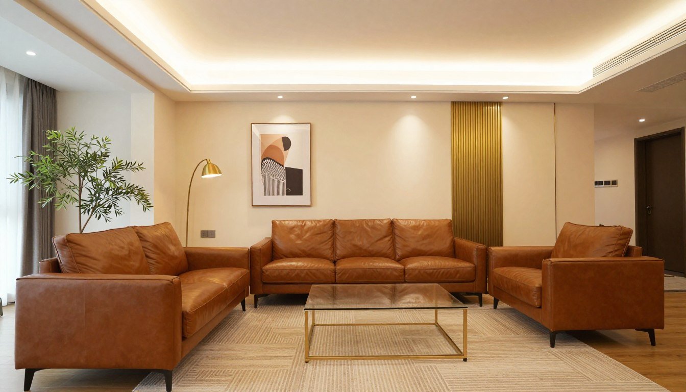
Living Room Earth Tones
Living rooms handle deeper earth tone colors better than other spaces. These areas typically have more natural light and larger windows.
Start with a neutral base on walls. Beige, warm gray, or soft taupe work well. These create space for deeper accent colors in furniture and decor.
Your sofa can be a deeper tone like olive green or warm brown. Balance it with lighter chairs or accent seating.
Use terracotta or rust in throw pillows and blankets. These add warmth without commitment. You can change them seasonally if the palette feels too heavy.
Layer textures through a natural fiber rug, linen curtains, and wood furniture. Texture prevents earth tone rooms from looking flat.

Bedroom Earth Tones
Bedrooms need softer earth tone palettes. This is where you sleep, so avoid colors that feel heavy or energizing.
Sage green walls create a calming base. Pair them with cream bedding and natural wood furniture.
If you prefer neutral walls, use beige or warm gray. Add earth tone color through your bedding, starting with a base layer in cream or soft taupe.
Terracotta works well in a bedroom when used sparingly. Try it in a throw blanket at the foot of the bed or in accent pillows.
Keep window treatments light. Sheer linen curtains in cream or soft beige let in natural light during the day while maintaining warmth.
Add depth through materials like a chunky knit throw, a woven basket for storage, or a natural fiber rug beside the bed.

Kitchen Earth Tones
Kitchens benefit from lighter earth tone palettes. Cooking areas need to feel clean and bright.
White or cream cabinets provide a fresh base. Add warmth through natural wood open shelving or a wood island.
Use earth tone colors in your backsplash. Terracotta tiles or sage green subway tiles add color without overwhelming the space.
Natural stone countertops in warm beige or light brown tones connect the palette. Avoid dark granite or marble that adds visual weight.
Introduce olive green or sage through small appliances, dish towels, or plants on the counter.
Keep larger surfaces light. Dark earth tone cabinets make a kitchen feel smaller and closed in.
Bathroom Earth Tones
Bathrooms offer a perfect space for earth tone experimentation. These rooms are typically smaller, so color has immediate impact.
Warm beige or sand-colored walls create a spa-like atmosphere. Pair them with white fixtures to maintain brightness.
Natural stone tiles in earth tone shades work well for floors or shower surrounds. Look for light to medium tones rather than dark slate.
Add sage green through towels, a bath mat, or a shower curtain. Green brings freshness to a bathroom without feeling clinical.
Wood vanities in natural finishes anchor the space. Choose lighter woods like oak or maple over dark walnut.
Terracotta accessories like soap dispensers or planters add warmth without permanent commitment.

Home Office Earth Tones
Home offices need earth tone palettes that feel grounded but not sleepy. You want focus without distraction.
Warm gray or soft taupe walls create a neutral backdrop. These colors don't compete with your computer screen or reading materials.
Use olive green or sage as an accent wall behind your desk. Green promotes concentration and reduces eye strain.
Natural wood desk and shelving add warmth. Choose medium to light wood tones to keep the space from feeling heavy.
Add texture through a wool area rug in warm beige or brown. This softens the space acoustically and visually.
Keep decor minimal but meaningful. A single piece of earth tone art provides visual interest without clutter.
Materials and Textures for Earth Tone Spaces
Materials matter as much as color in earth tone design. The right textures prevent your space from looking flat or monotonous.
Natural Fabrics
Linen tops the list for earth tone spaces. It has a natural texture that catches light differently throughout the day.
Use linen for curtains, throw pillows, and upholstery. Choose natural, undyed linen or linen in soft beige and warm gray.
Cotton in heavier weights adds softness. Look for canvas or duck cloth in earth tone colors for durability and texture.
Wool brings warmth and depth. A chunky knit throw in cream or soft brown adds dimension to a sofa or bed.
Avoid synthetic fabrics that look shiny. Polyester and nylon disrupt the natural feel of an earth tone palette.

Wood Elements
Wood anchors earth tone rooms. It provides warmth and connects the space to nature.
Light to medium woods work best. Oak, ash, maple, and light walnut maintain brightness while adding color.
Avoid high-gloss finishes. Natural oil or matte finishes let the wood grain show through naturally.
Mix wood tones carefully. Stick to woods with similar undertones, either all warm or all neutral, not a mix of both.
Exposed beams, wood furniture, and wood accents like picture frames all contribute to the earth tone aesthetic.
Stone and Clay
Stone adds permanence and texture. Natural stone in beige, tan, or light gray works in flooring, countertops, and accent walls.
Terracotta pottery introduces handmade texture. Use it for planters, vases, or decorative bowls.
Concrete works in modern earth tone spaces. Its gray-beige color bridges warm and cool tones.
Avoid polished marble or granite that looks too formal. The earth tone aesthetic favors natural, unpolished finishes.
Natural Fibers
Jute, sisal, and seagrass add texture underfoot. These materials work perfectly for area rugs in earth tone rooms.
Rattan and wicker bring organic shapes. Use them for baskets, light fixtures, or accent furniture.
Avoid plastic imitations. Real natural fibers have irregularities that add authenticity to the space.

Lighting Strategies for Earth Tone Rooms
Lighting makes or breaks earth tone spaces. The wrong light temperature turns cozy into cave-like.
Natural Light Maximization
Natural light is your most important tool. Earth tone colors absorb light, so you need as much as possible during the day.
Keep window treatments minimal. Use sheer curtains in cream or beige that filter light without blocking it.
Clean windows regularly. Dirty glass reduces natural light by up to 30 percent.
Place mirrors opposite windows. This reflects light deeper into the room.
Avoid heavy drapes in earth tone colors. Dark curtains absorb light and make the space feel smaller.
Artificial Light Color Temperature
Warm white bulbs (2700K-3000K) enhance earth tone colors. They emphasize the warmth in beiges, browns, and terracottas.
Avoid cool white or daylight bulbs in earth tone spaces. They make warm colors look muddy and unappealing.
Use dimmable lights. Earth tone rooms benefit from adjustable lighting throughout the day.
LED bulbs in warm temperatures save energy while maintaining the right color balance.

Layered Lighting Approach
Layer three types of light: ambient, task, and accent.
Ambient lighting comes from overhead fixtures or recessed lights. This provides general illumination.
Task lighting focuses on specific areas. Table lamps for reading or under-cabinet lights in kitchens fall into this category.
Accent lighting highlights art or architectural features. Use picture lights or adjustable track lighting to showcase earth tone artwork.
Avoid relying on a single overhead light. This creates harsh shadows and makes earth tone colors look flat.
Light Fixture Materials
Light fixtures themselves contribute to earth tone design. Choose materials that complement the palette.
Natural materials like wood, rattan, or linen shades work well. They filter light softly and add texture.
Avoid chrome or shiny metal fixtures. These reflect light harshly and look out of place.
Brass or bronze in matte finishes complement earth tones. These warm metals enhance the overall palette.
Rossettiart Picks for Earth Tone Colors
These pieces bring earth tone aesthetics to your walls. Each one balances warmth with the breathing room that prevents heaviness.

Organic Abstract Earth Collection
This piece combines terracotta warmth with sage coolness in abstract forms that add depth without visual weight.
Shop Canvas Prints
Layered Landscape Series
Stacked earth tone bands create the illusion of depth while maintaining a light, open composition perfect for smaller spaces.
View Collection
Botanical Study Collection
Natural plant forms in subtle earth tones connect your interior to nature without introducing heavy contrast or bold pattern.
View Originals
Textured Neutral Series
Heavy texture in neutral earth tones adds physical dimension that creates interest without adding color intensity.
Explore Paintings
Geometric Earth Collection
Clean geometric shapes in earth tone colors bring modern structure to the organic palette without losing warmth.
Shop Now
Natural Form Sculptures
Three-dimensional earth tone pieces add depth through physical presence, complementing wall art without competing for attention.
View SculpturesCommon Earth Tone Mistakes and Fixes
Even experienced designers make these mistakes with earth tone colors. Here's how to avoid or fix them.
Mistake: All Dark, No Light
Using too many deep earth tone colors makes a room feel cave-like. Browns, deep greens, and dark terracottas absorb light.
Fix: Follow the 60-30-10 rule. Use 60 percent light neutrals (cream, beige, soft gray), 30 percent medium earth tones (sage, taupe), and 10 percent deep accents (terracotta, olive).
Add cream or white to every room. Paint the ceiling white. Use light-colored large furniture even if you want dark accent pieces.
Mistake: No Texture Variation
Earth tone rooms look flat without texture. A beige room with all smooth surfaces feels boring and hotel-like.
Fix: Layer at least three different textures in each room. Combine smooth (painted walls), woven (linen curtains), and rough (natural fiber rug).
Add visual texture through materials like exposed brick, wood grain, or stone. Even in a rental, you can introduce texture through textiles and decor.

Mistake: Ignoring Undertones
Mixing earth tone colors with different undertones creates visual confusion. A cool gray beige next to a warm peachy beige looks wrong.
Fix: Identify whether your earth tones lean warm or cool, then stick to one temperature.
Test colors next to each other before committing. Paint large swatches on the wall and observe them at different times of day.
Warm earth tones have yellow, orange, or red undertones. Cool earth tones have gray, blue, or green undertones.
Mistake: Forgetting About Natural Light
Earth tone colors look different in north-facing versus south-facing rooms. Ignoring light direction leads to unexpected results.
Fix: Test colors in your actual space before painting. Paint a large poster board and move it around the room throughout the day.
Compensate for low light with lighter earth tone shades. A north-facing room needs lighter beiges and creams than a sunny south-facing space.
Add artificial lighting that mimics natural light. Use warm white bulbs and place lights at multiple heights.
Mistake: Too Matchy-Matchy
Using the same earth tone shade for everything creates a monotonous look. An all-beige room lacks visual interest.
Fix: Vary your earth tone shades by at least two steps. If walls are light beige, use medium tan for large furniture and deeper brown for accents.
Introduce one unexpected earth tone. A mostly beige and brown room benefits from sage green or dusty blue accents.
Mistake: Neglecting Contrast
Earth tone rooms need contrast to define spaces and create visual hierarchy. Without it, everything blends together.
Fix: Use white or cream as a contrast color. White trim, white furniture legs, or white accents make earth tone colors pop.
Add black in very small doses. Black picture frames, black hardware, or a black accent in artwork provides grounding contrast.
Create contrast through value (light versus dark) rather than color. Pair light beige with deep brown rather than adding a totally different color.

Earth Tones in Small Spaces
Small rooms benefit from earth tone colors when you apply specific strategies. The goal is warmth without making the space feel smaller.
Light Base Strategy
Start with the lightest earth tone colors on walls. Cream, off-white, or pale beige reflect light and make small rooms feel larger.
Keep the ceiling white or lighter than the walls. This draws the eye upward and creates the illusion of height.
Use deeper earth tone colors only on one accent wall. This creates depth without surrounding you with dark color.
Vertical Interest
Draw the eye upward with vertical elements in earth tone colors. Tall, narrow art pieces or vertical wood paneling create height.
Floor-to-ceiling curtains in light beige or cream make walls look taller. Hang them as close to the ceiling as possible.
Avoid horizontal stripes or patterns. These cut the wall visually and make the space feel shorter.
Minimal Furniture in Earth Tones
Choose furniture in light to medium earth tone colors. Heavy, dark furniture overwhelms small spaces.
Select pieces with visible legs. Furniture that sits on the floor makes a room feel more crowded than furniture with exposed legs.
Keep furniture to a minimum. Every piece should serve a clear purpose.

Strategic Color Placement
Place the darkest earth tone colors at the bottom of the room. A dark natural fiber rug anchors the space without making walls feel close.
Use medium earth tones at furniture level. Your sofa or bed can be sage or warm taupe without overwhelming the room.
Keep upper walls and areas near the ceiling in the lightest tones. This prevents the ceiling from feeling low.
Mirror and Reflective Surfaces
Mirrors reflect both light and color, making small earth tone spaces feel larger.
Place a large mirror on the wall opposite a window. This doubles the natural light in the room.
Use glass or acrylic furniture pieces. These transparent elements don't add visual weight.
Avoid covering windows with heavy treatments. Keep natural light flowing in.
Earth Tone Color Psychology
Earth tone colors affect mood and perception. Understanding this helps you choose the right shades for each space.
Beige and Taupe Psychology
Beige creates a sense of calm and neutrality. It doesn't demand attention, making it ideal for spaces where you want to relax.
Taupe adds sophistication to beige. It feels more intentional and designed than plain beige.
These neutral earth tones work well in bedrooms and living rooms where stress reduction matters.
Brown Psychology
Brown conveys stability and reliability. It's grounding and makes people feel secure.
Too much brown can feel heavy or depressing. Use it as an accent rather than a dominant color.
Warm browns with red undertones feel cozier than cool browns with gray undertones.
Green Earth Tone Psychology
Sage and olive green reduce stress and promote concentration. These colors work well in home offices and bedrooms.
Green connects us to nature, which has proven calming effects on mood and stress levels.
Avoid bright or lime greens in earth tone palettes. Stick to muted, grayed greens for authenticity.
Terracotta Psychology
Terracotta and rust colors feel warm and energizing. They're social colors that encourage conversation and connection.
These work well in dining rooms and living spaces where people gather.
Use terracotta sparingly in bedrooms or home offices. It's too stimulating for spaces where you need calm.
Creating Emotional Balance
Mix earth tone colors to create the mood you want. Combine calming beige with energizing terracotta for a balanced living room.
Match color choices to room function. Calming colors for bedrooms, energizing colors for social spaces, focusing colors for work areas.
Consider who uses the space most. Children may need more energizing earth tones while adults benefit from calmer shades.
Seasonal Earth Tone Adjustments
Earth tone spaces adapt well to seasonal changes. Small adjustments keep the palette fresh year-round.
Spring and Summer Earth Tones
Lighten your earth tone palette for warmer months. Switch to lighter linens in cream and soft beige.
Add more sage green through plants and textiles. Green feels fresher and cooler in warm weather.
Remove heavy textiles like wool throws and chunky knits. Replace them with lightweight cotton or linen.
Open curtains fully to maximize natural light. The longer days enhance lighter earth tone colors.
Fall and Winter Earth Tones
Deepen your earth tone palette for cooler months. Add rust, deep brown, and terracotta accents.
Layer textiles for warmth and visual coziness. Wool throws, extra pillows, and heavier curtains add comfort.
Introduce warm metallics like bronze or brass. These enhance the warmth of earth tone colors in lower winter light.
Add more artificial lighting. Shorter days mean earth tone colors need help staying warm and inviting.

Transition Pieces
Some earth tone elements work year-round. Natural wood furniture, neutral walls, and jute rugs don't need seasonal changes.
Focus seasonal adjustments on textiles and accents. These change easily without major investment.
Keep a storage system for off-season earth tone decor. Rotating pieces keeps the look fresh without buying new items.
Watch: Mastering Earth Tone Colors in Interior Design
This video breaks down earth tone color theory and shows real room transformations using the principles covered in this guide.
Earth Tone Colors with Other Styles
Earth tone colors adapt to multiple design styles. Here's how to blend them with popular aesthetics.
Modern Earth Tones
Modern design pairs earth tone colors with clean lines and minimal decoration.
Use neutral earth tones like warm gray, taupe, and beige as your base. These feel contemporary and uncluttered.
Add depth through texture rather than pattern. Smooth concrete, natural linen, and matte wood finishes create interest.
Keep accent colors minimal. One or two earth tone accent shades like sage or rust work better than many colors.
Choose furniture with simple silhouettes. Avoid ornate details that conflict with the modern aesthetic.
Bohemian Earth Tones
Bohemian style embraces layered earth tone colors and textures.
Mix multiple earth tone shades freely. Terracotta, sage, olive, brown, and beige can all coexist in a boho space.
Layer patterns in earth tone colors. Geometric prints, natural motifs, and ethnic patterns add visual interest.
Include global textiles like Moroccan rugs, Indian block prints, or South American weavings in earth tone palettes.
Add plants generously. Living greenery enhances the natural, organic feel of earth tone bohemian spaces.

Scandinavian Earth Tones
Scandinavian design uses earth tone colors sparingly within a light, airy framework.
Keep walls white or the palest beige. The Scandinavian aesthetic prioritizes light and space.
Add earth tone colors through natural materials. Light wood floors and furniture bring warmth without color intensity.
Use muted earth tone textiles for subtle warmth. A soft beige throw or taupe pillows add coziness without weight.
Maintain the less-is-more principle. One well-chosen earth tone accent piece outperforms multiple decorative items.
Traditional Earth Tones
Traditional design embraces richer earth tone palettes with classic furniture styles.
Use deeper earth tones more liberally. Warm browns, deep greens, and rich terracotta work in traditional spaces.
Choose classic furniture silhouettes in wood finishes. Traditional earth tone rooms feature substantial wooden pieces.
Layer textiles formally. Matching curtains and upholstery in earth tone colors create a cohesive traditional look.
Add traditional patterns like damask, toile, or plaids in earth tone colorways.
Industrial Earth Tones
Industrial style combines earth tone colors with raw materials and exposed elements.
Use concrete gray and warm browns as your primary earth tones. These complement exposed brick and metal.
Keep earth tone textiles simple and utilitarian. Canvas, leather, and heavy cotton suit the industrial aesthetic.
Let architectural elements provide earth tone color. Exposed brick, concrete floors, and wood beams are natural earth tones.
Add warmth through lighting. Industrial spaces need warm light to prevent earth tones from looking cold.
Ready to Transform Your Space
Museum-Quality Earth Tone Art for Your Home
Ready-to-hang, museum-quality canvas. Free worldwide shipping.

Each Rossettiart piece arrives ready to hang with all mounting hardware included. Our museum-quality canvas prints use fade-resistant inks that maintain their earth tone warmth for decades.
We ship worldwide at no cost to you. Your earth tone transformation starts the moment you choose your piece.
FAQ: Earth Tone Colors
What colors are considered earth tones?
Earth tone colors include all shades found in nature like browns, tans, beiges, terracottas, olive greens, sage greens, warm grays, and rust colors. These tones come directly from soil, clay, stone, wood, and natural landscapes.
The palette ranges from light cream and sand to deep chocolate brown and forest green. The key is that each color has a natural, muted quality rather than bright or artificial vibrancy.
How do you use earth tone colors without making a room feel heavy?
Balance is essential when working with earthy tones. Use the 60-30-10 rule: 60 percent light neutrals like cream or beige, 30 percent medium earth tones like sage or taupe, and 10 percent deeper accent colors like terracotta or olive.
Maximize natural light with sheer curtains and keep ceilings white or very light. Layer different textures rather than adding more color to create visual interest without overwhelming the space.
What is the best earth tone color palette for a bedroom?
Bedrooms benefit from softer earth tone palettes that promote relaxation and sleep. Start with sage green or warm beige walls, then layer cream bedding as your base.
Add warmth through terracotta or soft brown accents in throw blankets and pillows. Natural wood furniture and light linen curtains complete the calming atmosphere without creating heaviness that disrupts sleep.
Can you mix earth tone colors with other color schemes?
Earth tone colors work well with many other palettes when you maintain balance. They pair beautifully with white and cream for a fresh, modern look. You can add black accents for contrast and definition.
Dusty blues and soft pinks complement earth tones without clashing. The key is keeping additional colors muted rather than bright, which maintains the natural, grounded feeling of the earth tone aesthetic.
What materials work best with earth tone colors?
Natural materials enhance earth tone palettes most effectively. Linen, cotton canvas, and wool add texture in fabrics. Wood in light to medium finishes provides warmth without darkness.
Natural fiber rugs like jute or sisal ground the space. Terracotta pottery, stone elements, and rattan or wicker pieces complete the natural aesthetic. Avoid synthetic materials and high-gloss finishes that disrupt the organic feel.
How do you style earthy tones in a modern home?
Modern homes with earthy tones focus on neutral earth tone colors like warm gray, taupe, and beige with clean lines and minimal decoration. Use texture rather than pattern to create visual interest.
Keep furniture simple with modern silhouettes. Add one or two earth tone accent colors like sage or rust sparingly. The combination of natural colors with contemporary design creates sophisticated, uncluttered spaces.
What lighting works best for earth tone rooms?
Warm white LED bulbs between 2700K and 3000K enhance earth tone colors by emphasizing their natural warmth. Layer three types of lighting: ambient overhead lights, task lamps for specific areas, and accent lighting for artwork.
Maximize natural light during the day with sheer curtains in light earth tone colors. Avoid cool white bulbs that make warm earth tones look muddy. For more design inspiration, visit our interior design blog.
How do earth tone colors create a cozy atmosphere?
Earthy tones create coziness by connecting your space to nature, which humans find inherently comforting. Warm colors like terracotta and brown have psychological associations with safety, stability, and warmth.
When layered properly with multiple textures and balanced with light tones, earth tone colors absorb sound and create intimate spaces. This combination of visual warmth, natural connection, and acoustic softness produces the cozy feeling people seek in their homes.
What are common mistakes when decorating with earth tones?
The most common mistake is using too many dark earth tone colors without enough light balance, which creates a cave-like feel instead of cozy warmth. Another error is ignoring texture variation, which makes rooms look flat and boring.
Mixing earth tones with different undertones (warm with cool) creates visual confusion. People also often forget to test colors in their actual space throughout the day, leading to unexpected results once fully committed.
Can small rooms use earth tone color palettes effectively?
Small spaces work beautifully with earth tone colors when you prioritize light shades like cream, pale beige, and soft taupe on walls and ceilings. Use deeper earth tone colors only for accent walls or at floor level through rugs.
Choose furniture with visible legs in light to medium earth tones. Maximize natural light and use mirrors strategically to reflect both light and color. The result is a warm, inviting small space that doesn't feel cramped or heavy.
Final Thoughts on Earth Tone Colors
Earth tone colors bring natural warmth to your home when you balance depth with light. The difference between cozy and heavy comes down to proportion.
Use light earth tone colors as your foundation. Build depth through medium tones in furniture and textiles. Add personality with deeper accent colors in small doses.
Remember that texture matters as much as color. Layer natural materials like linen, wood, and stone to prevent flat, monotonous spaces.
Light makes everything work. Maximize natural light during the day and use warm artificial lighting in the evening. This keeps your earth tone palette feeling open and inviting.
Start with one room. Test your earth tone color combinations before committing to your entire home. Most people find that once they understand the balance, earth tone colors become their preferred palette for creating comfort.

Your earth tone transformation doesn't require perfection. It requires attention to balance, light, and the natural materials that make these colors feel authentic.
The result is a home that feels grounded, warm, and connected to nature while maintaining the breathing room that prevents heaviness.

Leave a comment
This site is protected by hCaptcha and the hCaptcha Privacy Policy and Terms of Service apply.