Walking into a living room should feel like coming home. Yet sometimes, a single piece of abstract wall art for living room spaces transforms your sanctuary into visual chaos. The artwork you purchased with excitement suddenly dominates the space. It fights with your furniture instead of complementing it.
This frustration affects countless homeowners. You invested in what looked perfect in the gallery or online. But once mounted on your wall, the abstract art feels aggressive, busy, or simply wrong. The problem is not your taste. The issue stems from fundamental design principles that many overlook when selecting abstract wall decor.

Understanding why certain abstract artwork overwhelms a room empowers you to make confident choices. This guide reveals the specific factors that create visual discord. More importantly, you will discover how to select abstract wall art that enhances your living room without overpowering it.
The Scale and Proportion Problem with Abstract Wall Art
Scale determines whether your abstract art feels harmonious or jarring. A piece that is too large for your wall creates immediate visual stress. Conversely, artwork that is too small gets lost in the space. The human eye naturally seeks balance in interior design.
The most common mistake involves purchasing abstract wall art for living room spaces without measuring first. Many homeowners rely on visual estimates. This leads to purchasing pieces that are several inches larger or smaller than the ideal size. The difference between a 60-inch and 72-inch canvas dramatically changes room dynamics.

Professional designers follow the two-thirds rule for abstract artwork above furniture. Your wall art should span approximately two-thirds the width of the furniture piece below it. This creates visual anchoring. A 90-inch sofa pairs beautifully with a 60-inch piece of abstract wall art. This proportion feels intentional rather than accidental.
Measuring Your Space Correctly
Accurate measurements prevent scale disasters. Start by measuring your wall width and height. Document these numbers before shopping for abstract art. Consider the furniture arrangement below where you plan to hang artwork.
Account for visual breathing room around your abstract wall decor. Leave at least 6 to 8 inches of empty wall space on each side of large abstract artwork. This negative space prevents the cramped, overwhelming feeling that occurs when art stretches too close to corners or adjacent walls.

Ceiling height influences how large your abstract art should be. Rooms with 8-foot ceilings accommodate different dimensions than spaces with 10 or 12-foot ceilings. Taller walls can handle larger, more imposing abstract pieces. Standard ceiling heights require more restrained selections to avoid overwhelming the room.

Color Intensity Creates Visual Weight and Overwhelm
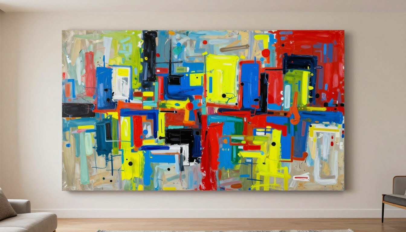
Colour serves as the most powerful element in abstract wall art. Highly saturated, contrasting colours demand attention. When those intense hues cover large canvas areas, they generate visual weight that can dominate your entire living room. The phenomenon intensifies when multiple bold colours compete within a single piece of abstract artwork.
Warm colours like red, orange, and bright yellow advance toward viewers. These hues create energy and excitement. However, large expanses of warm colours in abstract art can overstimulate the senses. Your living room becomes difficult to relax in. The space feels active rather than restful.

Discover Balanced Color Palettes in Abstract Art
Rossetti Art curates abstract wall art for living room spaces with harmonious colour schemes that enhance rather than overwhelm. Our collection features pieces designed with intentional colour balance for US homes.
Cool colours including blue, green, and violet recede visually. These tones create calm, spacious feelings in interior design. Abstract wall decor dominated by cool colours rarely overwhelms a space. Instead, these pieces can make rooms feel larger and more serene.
The relationship between your wall colour and your abstract art matters tremendously. High contrast combinations create drama but risk visual fatigue. A vibrant, multicoloured abstract piece on a pure white wall demands constant attention. Your eye cannot rest. Reducing contrast by selecting artwork with some colours that echo your wall tone creates harmony.
High Saturation Risks

Fully saturated colours grab attention forcefully. These intense hues work well as accent pieces in small doses. However, large abstract wall art with consistently high saturation creates visual exhaustion in living rooms where you spend hours daily.
Balanced Color Approach

The most successful abstract artwork for living rooms combines saturated accents with neutral areas. This variation gives the eye places to rest. Colour becomes an intentional design element rather than an overwhelming force.
Tonal Harmony Strategy

Limiting your abstract art to a specific colour palette creates sophistication. Tonal pieces explore variations within related colours. These artworks add visual interest while maintaining calm. They never compete with your living room's existing design.

Temperature balance within abstract wall art affects perceived intensity. Artwork mixing warm and cool colours creates visual vibration at their boundaries. This effect appears intentionally in some abstract art styles. However, in living room applications, excessive colour temperature contrast can feel unsettling rather than energizing.
Compositional Complexity and Pattern Overload
Composition refers to how elements arrange within your abstract wall art. Simple compositions feature clear focal points with organized shapes or colour blocks. Complex compositions layer multiple elements, patterns, and textures simultaneously. The human brain processes simple compositions with minimal effort. Complicated arrangements require continuous visual processing.
Abstract artwork with excessive pattern repetition exhausts viewers. Your eye searches for the pattern's logic. When no clear system emerges, frustration builds. Living rooms decorated with overly complex abstract wall decor never achieve the restful atmosphere most homeowners desire.

The number of distinct elements in abstract art determines its complexity. Count the different shapes, texture types, and colour families in a piece you are considering. Abstract wall art for living room spaces works best with three to five major elements. Beyond this number, compositions start feeling crowded.

Focal Point Importance
Every successful piece of abstract wall art establishes hierarchy. One area demands attention first. Secondary elements support the focal point. This organization guides the viewer's eye through the composition naturally. Artwork lacking clear focal points forces your eye to jump erratically across the canvas.
Negative space serves as a critical compositional tool. The empty or minimally decorated areas in abstract artwork give busy elements room to breathe. Negative space prevents the cramped feeling that makes some abstract wall decor overwhelming. The best pieces use empty space as intentionally as painted areas.
Texture layering adds depth to abstract art but increases complexity. Light surface texture enhances visual interest without overwhelming. Heavy impasto techniques with thick paint application create dramatic shadows and highlights. These textural variations magnify the artwork's visual impact. Large pieces with extreme texture can dominate a living room through physical presence beyond the painted image.

Geometric abstract art creates different challenges than organic compositions. Hard-edged geometric patterns with precise lines and shapes read as more structured. These pieces suit modern, minimalist living rooms. Organic, flowing abstract artwork with soft edges and natural forms complements traditional or transitional spaces. Mismatching the composition style to your room's aesthetic amplifies the overwhelming effect.

Understanding Visual Density in Abstract Wall Art
Visual density describes how much information fills the canvas. High-density abstract artwork covers every inch with colour, pattern, or texture. Low-density pieces incorporate significant empty space. Medium-density art balances active and quiet areas. Living rooms benefit most from low to medium visual density in wall art.
The viewing distance for your abstract wall art influences appropriate density levels. Art viewed from across a living room can handle more density than pieces examined up close. Gallery walls displaying multiple abstract art prints need individual pieces with lower density. Otherwise, the collective visual information becomes overwhelming.


Low Density Abstract Art
Perfect for small living rooms or spaces with busy furnishings. These pieces provide visual relief. The generous negative space allows your eye to rest. Low-density abstract wall decor works beautifully above sofas or beds where you want calm energy.

Medium Density Abstract Artwork
The versatile choice for most living room applications. These pieces balance visual interest with restraint. Medium-density abstract art provides enough complexity to remain engaging without demanding constant attention. Ideal for main focal wall art.

High Density Statement Pieces
Reserved for specific applications where bold energy suits the space. Large living rooms with minimal decor can accommodate high-density abstract wall art. These pieces become the room's centerpiece. Everything else must remain simple to avoid sensory overload.
Density also relates to the number of colours present. Abstract artwork featuring two to four colours maintains lower visual density than pieces incorporating eight or more hues. Each additional colour adds processing load for viewers. Living rooms displaying multi-colour abstract wall decor alongside patterned furniture and decorative accessories quickly become overwhelming spaces.

How Your Living Room Context Affects Art Impact
Abstract wall art never exists in isolation. The piece interacts with your furniture, flooring, window treatments, and existing decor. A painting that appears balanced in a gallery transforms when placed in your specific living room environment. Context determines whether artwork enhances or overwhelms your space.
Furniture style creates expectations for abstract art selection. Modern, minimalist living rooms with clean lines accommodate bold, graphic abstract wall art. Traditional spaces with ornate furniture require more refined abstract artwork. Mixing opposing styles creates visual discord that makes even beautiful abstract art feel wrong for the room.

Existing Color Schemes
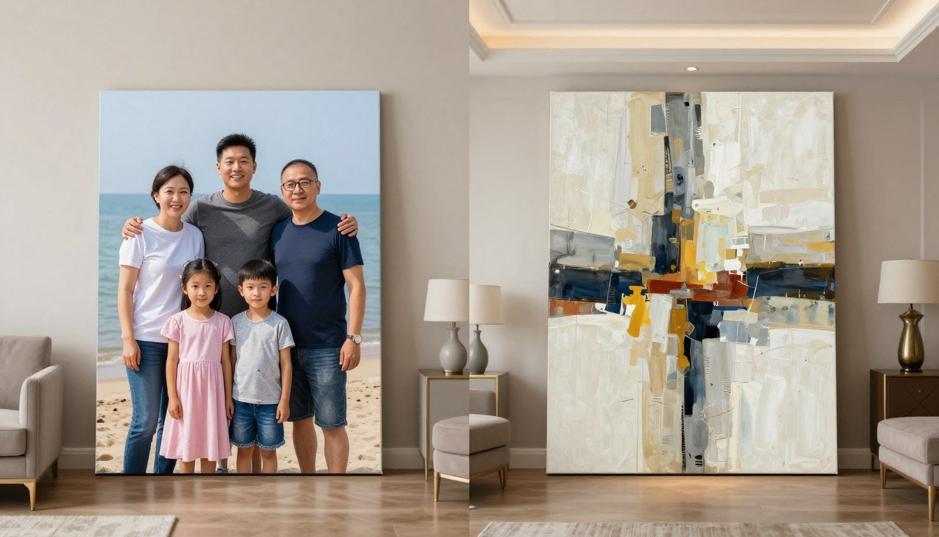
Your living room already has a colour palette. Wall paint, upholstery, rugs, and curtains establish this foundation. Abstract wall art for living room applications should either complement or intentionally contrast these existing colours. Random colour combinations create chaos.
The safest approach involves selecting abstract artwork that pulls two to three colours from your current scheme. Add one new accent colour through the art. This strategy feels cohesive while introducing fresh visual interest. Artwork introducing multiple new colours often overwhelms because it fights rather than coordinates with the space.

Lighting conditions dramatically alter how abstract wall art appears. Natural daylight reveals true colours. Warm incandescent lighting shifts colours toward yellow and orange. Cool LED lights emphasize blues and greens. The abstract wall decor you loved in the gallery under professional lighting may look completely different under your living room's specific illumination.

Wall size relative to room size affects artwork impact. A 60-inch abstract canvas dominates a small 12x14 living room. The same piece fits comfortably in a 20x24 great room. Understanding your room's proportions helps determine maximum artwork dimensions before the piece becomes overwhelming rather than impressive.
Furniture placement creates viewing angles for your abstract wall art. Art hung above a sofa gets viewed from seated positions across the room. Pieces on perpendicular walls get observed from side angles. Abstract artwork with strong directional elements may look unbalanced when viewed from certain positions. Consider all typical viewing angles when evaluating potential abstract wall decor.

Abstract Art Styles and Their Emotional Impact
Different abstract art movements create distinct psychological effects. Abstract expressionism features gestural, energetic brushwork. These pieces radiate movement and emotion. They work beautifully in active living spaces but can feel too stimulating for rooms intended for relaxation. Understanding style characteristics helps match abstract wall art to your living room's purpose.
Geometric abstraction employs precise shapes and clean lines. This structured approach feels orderly and calm. Hard-edge abstract art suits contemporary living rooms with similar architectural precision. The style rarely overwhelms because its organization provides clear visual logic for the brain to process.

Color Field Abstraction

Large areas of flat or subtly modulated colour define this style. Color field abstract wall art creates atmospheric effects. These pieces feel expansive rather than busy. Perfect for living rooms where you want spacious, contemplative energy. The style virtually never overwhelms.
Lyrical Abstraction

Combining expressive brushwork with harmonious colour, lyrical abstraction balances energy and beauty. These pieces add visual interest without aggression. They work across various living room styles from traditional to contemporary. The approach offers complexity without overwhelm.
Minimalist Abstract

Reduced to essential elements, minimalist abstract art embraces restraint. Simple forms, limited colour palettes, and generous negative space characterize the style. Ideal for small living rooms or spaces with complex furniture. These pieces provide visual relief in busy homes.
Texture-heavy abstract artwork including impasto techniques creates three-dimensional presence. The physical depth adds another layer of visual interest. However, highly textured pieces cast shadows that change throughout the day. This movement can feel dynamic or distracting depending on the living room's purpose and your personality.

Mixed media abstract art combines paint with collage elements, found objects, or alternative materials. These pieces offer maximum visual complexity. The varied surfaces, materials, and techniques demand examination. Large mixed media abstract wall art can easily overwhelm living rooms unless the rest of the space maintains extreme simplicity.
Practical Sizing Guidelines for Different Living Room Layouts
Standard living room configurations require different abstract wall art approaches. The space above your sofa represents the most common location for large artwork. This prime real estate demands careful sizing. Too large and the art dominates uncomfortably. Too small and the arrangement looks unfinished and awkward.
For typical three-seat sofas measuring 84 to 96 inches wide, aim for abstract wall art spanning 56 to 64 inches in width. This follows the two-thirds proportion guideline. Height depends on wall space, but 30 to 40 inches works for most applications. Hang the piece so its center sits at eye level, approximately 57 to 60 inches from the floor.


Sectional Sofa Considerations
L-shaped and U-shaped sectionals create unique challenges for abstract wall art placement. Measure the longest straight section where you plan to hang artwork. Apply the two-thirds rule to that specific measurement rather than the sectional's total length. This prevents selecting pieces that are too large.
Alternatively, consider a gallery wall approach for sectionals. Multiple smaller pieces of abstract art prints or abstract wall art create visual interest without requiring a single massive canvas. This approach offers flexibility and reduces the risk of overwhelming the space.
Rooms with fireplaces present the mantel-to-art relationship. Abstract wall art hung above a fireplace should not extend beyond the mantel's width. Leave several inches on each side for balance. The vertical spacing between the mantel top and art bottom should measure 4 to 8 inches depending on the mantel's visual weight.

Blank walls without furniture below offer more flexibility but still require restraint. A common mistake involves filling the entire wall with abstract artwork. Leave border space around large pieces. Twelve to eighteen inches of empty wall on each side prevents the cramped appearance that triggers the overwhelming feeling.
Get Expert Sizing Recommendations for Your Living Room
Not sure which size abstract wall art for living room will work best in your specific space? Rossetti Art offers personalized consultations to help you select perfectly proportioned pieces for your home.
High ceilings above 10 feet accommodate vertically oriented abstract artwork. Tall pieces draw the eye upward, emphasizing the impressive ceiling height. However, these vertical compositions need adequate width to avoid looking like narrow banners. Maintain width-to-height ratios that feel balanced, typically no more than 1:2 for vertical pieces.

Applying Color Psychology to Abstract Wall Art Selection
Colours trigger emotional and physiological responses. Understanding colour psychology helps you select abstract wall art that creates your desired living room atmosphere. The wrong colour choices generate the overwhelmed, unsettled feeling that makes artwork unsuccessful in residential spaces.
Blue abstract wall art promotes calm and reduces stress. Light blues feel airy and spacious. Deep navy creates sophistication and stability. Blue-dominant abstract artwork rarely overwhelms living rooms because the colour naturally recedes. It works beautifully in spaces where relaxation is the priority.

Red abstract art energizes and stimulates. Small doses of red add excitement and passion. Large expanses of red increase heart rate and can feel aggressive. Red-dominated abstract wall art for living room spaces works best when balanced with cooler tones or neutrals. Pure red pieces often overwhelm unless your living room is exceptionally large and minimal.
Green for Balance

Green occupies the color spectrum's center, creating natural balance. Green abstract artwork feels neither too warm nor too cool. The colour connects to nature, bringing organic calm to living rooms. Green-based pieces work across nearly all design styles and rarely create overwhelm.
Yellow for Optimism

Yellow stimulates mental activity and generates happiness. However, pure bright yellow can cause anxiety in large doses. Successful yellow abstract wall art incorporates softer buttery or golden yellows. Balance warm yellows with cool grays or neutrals to prevent the overwhelming effect of excessive brightness.
Purple for Luxury

Purple combines red's energy with blue's calm. The colour suggests creativity and luxury. Deep purples create drama without aggression. Lavender and soft purples bring restful elegance. Purple abstract artwork adds sophistication to living rooms without the overwhelming intensity of pure red or orange.
Neutral abstract art in blacks, whites, grays, and beiges offers maximum versatility. These pieces adapt to changing decor and never clash with furnishings. Neutral abstract wall decor provides texture and visual interest without colour-based overwhelm. The style particularly suits minimalist and Scandinavian-inspired living rooms.

Analogous colour schemes use colours adjacent on the colour wheel. Blue-green-teal or orange-red-pink combinations create harmony. Abstract artwork using analogous colours feels cohesive and rarely overwhelms. The related hues flow naturally together, reducing visual stress compared to complementary or contrasting colour schemes.

How Framing and Presentation Affect Visual Impact
Framing choices significantly influence whether abstract wall art feels overwhelming or refined. Heavy, ornate frames add visual weight that magnifies the artwork's presence. Clean, simple frames or frameless gallery-wrapped canvases create modern lightness. The frame becomes part of the total visual package you are placing in your living room.
Dark frames create strong contrast against light walls. This bold outline makes artwork appear larger and more commanding. If your abstract art already features intense colours or complex composition, a dark frame can push the piece into overwhelming territory. Light frames or no frame soften the presentation for busy abstract artwork.

Mat Board Considerations
White or cream mat boards surrounding abstract art prints create visual breathing room. The mat separates the artwork from the frame, reducing intensity. Wide mats work beautifully with smaller abstract art pieces, making them suitable for larger walls. The negative space prevents even bold abstract artwork from overwhelming the viewing experience.
However, mats add cost and require professional framing. Gallery-wrapped canvas eliminates this expense while creating contemporary presentation. The painted edges of wrapped canvas continue the artwork around the stretcher bars. This seamless approach suits modern and transitional living rooms.

Floating frames create the illusion that canvas hovers within the frame. The gap between artwork edge and frame adds another layer of negative space. This presentation style works beautifully with abstract wall art that might otherwise feel too heavy. The floating effect lightens visual weight while adding contemporary sophistication.

Frame colour should either match or intentionally contrast with colours in the abstract artwork. Matching frames create unity and make the piece feel complete. Contrasting frames establish separation between art and wall. Random frame colour choices that relate to neither the artwork nor the room create visual discord that contributes to the overwhelming effect.
Multiple pieces require frame consistency. Gallery walls displaying abstract art prints look intentional when frames match or follow a clear pattern. Mixing frame styles, colours, and widths creates chaos. Unless you are an experienced designer, stick with identical frames for multi-piece abstract wall art installations.

Matching Abstract Art to Living Room Function and Lifestyle
Your living room's primary purpose should guide abstract wall art selection. Formal living rooms used for entertaining accommodate bolder, more dramatic artwork. Family rooms where you relax daily require more restful pieces. Matching art to function prevents the disconnect that makes some abstract wall decor feel wrong despite being objectively beautiful.
Active households with children benefit from durable, less precious abstract wall art. Large canvas prints or abstract art prints offer affordability and replaceability. Original paintings represent significant investments that may cause stress in high-traffic family spaces. The anxiety of potential damage can make even perfect artwork feel overwhelming in the wrong context.


Formal Entertaining Spaces
Formal living rooms allow more dramatic abstract wall art for living room presentations. Statement pieces with bold colours or large scale create conversation. These rooms get less daily exposure, so stimulating artwork feels exciting rather than exhausting. Invest in quality pieces that reflect your taste.

Daily Living and Relaxation
Spaces used daily for relaxation need calming abstract wall decor. Choose medium to low visual density pieces. Favour cool colours or neutrals that promote rest. These living rooms benefit from artwork that becomes a pleasant backdrop rather than demanding constant attention. Comfort trumps drama.

Multi-Purpose Living Areas
Rooms serving multiple functions require versatile abstract artwork. Medium-density compositions with balanced colour work across activities. Avoid pieces that are too stimulating for work or too subdued for entertaining. Flexible abstract wall art adapts to your changing needs throughout the day.
Television placement affects abstract wall art decisions. Hanging artwork directly above large televisions creates visual competition. Your eye cannot decide whether to focus on the screen or the art. This conflict feels exhausting. Place abstract wall art on perpendicular walls or opposite the television for better visual flow in media-focused living rooms.

Natural light exposure impacts artwork longevity and appearance. Direct sunlight fades pigments in abstract art prints and even some paintings. Southern exposure windows flood rooms with intense light. If your living room features significant natural light, choose fade-resistant materials or place abstract wall decor on walls that receive indirect light.
Coastal and Serene Abstract Art Styles for Living Rooms
Coastal abstract wall art brings ocean-inspired calm to living rooms. These pieces feature blues, teals, sandy neutrals, and soft whites. The colour palettes evoke beaches and seascapes without literal representation. Coastal abstract artwork creates the serene, vacation-like atmosphere many homeowners desire in living spaces.
Wave-inspired abstract art uses flowing horizontal lines and organic shapes. These compositions suggest water movement without depicting actual waves. The gentle rhythm creates meditative viewing experiences. Coastal wall art in this style suits both beach houses and landlocked homes where residents seek coastal energy.


Texture in Coastal Abstract Art
Textured coastal abstract wall art adds dimensional interest that enhances the oceanic theme. Thick paint application suggests sand, sea foam, or rocky shores. The tactile quality invites closer inspection while maintaining the calm colour palette that prevents overwhelm. These pieces work beautifully in casual, coastal-inspired living rooms.
Gold or metallic accents in coastal abstract artwork represent sunlight on water. Small amounts of shimmer add sophistication without compromising the serene atmosphere. Avoid excessive metallics that shift the piece from coastal calm to flashy statement. Balance is essential in all successful abstract wall decor.
Minimalist coastal abstract art reduces the beach theme to essential elements. A simple horizon line dividing blues and neutrals evokes ocean views. These understated pieces bring coastal feeling without obvious beach imagery. The subtlety suits sophisticated living rooms where you want relaxed elegance.

Discover Coastal Abstract Wall Art Collections
Rossetti Art's coastal wall art collection features serene abstract pieces that bring ocean-inspired tranquility to living rooms across America. Each piece is carefully curated to create calm, never chaos.
Abstract art inspired by natural elements beyond coastal themes also creates serene living room environments. Earth-tone palettes featuring browns, greens, and warm neutrals connect to forest and mountain landscapes. These pieces ground spaces with organic energy that feels calming and timeless.

Balancing Budget and Quality in Abstract Wall Art
Price ranges for abstract wall art span from affordable prints to investment-grade original paintings. Understanding what drives cost helps you allocate budget effectively. Original abstract artwork commands premium prices due to uniqueness and artist reputation. Abstract art prints offer accessibility while maintaining visual impact in living room settings.
Giclee prints represent high-quality reproduction technology. These prints capture original artwork detail with archival inks on premium canvas or paper. Quality giclee abstract art prints can look nearly identical to originals from typical viewing distances. They offer an excellent middle ground between posters and original paintings for budget-conscious buyers.

Investment Considerations
Original abstract wall art for living room spaces represents both aesthetic and potential financial investment. Emerging artist works offer affordability with appreciation potential. Established artists command higher prices but provide recognized value. Consider your budget, space permanence, and whether you view art purely decoratively or as collectible.
Limited edition abstract art prints offer middle-ground investment value. Numbered editions signed by artists have collectible status while costing less than originals. Edition size affects value - smaller editions command higher prices per print. Certificate of authenticity proves legitimacy for future resale.

Canvas quality affects longevity and appearance. Museum-grade canvas with archival primers lasts generations. Budget canvas may yellow or deteriorate within years. For abstract wall art you plan to keep long-term, invest in quality materials. Temporary or frequently changed decor can use more affordable options without concern.
Frame quality similarly impacts both appearance and durability. Solid wood frames with proper joinery last indefinitely. Composite frames may warp or separate. If you invest in quality abstract artwork, protect that investment with appropriate framing. Budget frames undermine even expensive art's presentation.

Budget-Friendly Options

Affordable abstract art prints in simple frames create beautiful living room impact without financial stress. Focus budget on image quality rather than elaborate framing. Many online galleries offer museum-quality prints at accessible price points. Smart shopping yields excellent results for modest investments.
Mid-Range Investment

The mid-range category delivers significant quality improvements over budget options. Limited edition prints, gallery-wrapped canvases, or emerging artist originals fall here. These pieces offer excellent value, combining artistic merit with reasonable pricing. Perfect for buyers wanting quality without luxury price tags.
Premium Art Investment

Premium abstract wall art includes established artist originals, unique commissions, or blue-chip collectible works. These pieces become family heirlooms and potential financial assets. The investment makes sense for art enthusiasts, collectors, or those creating permanent legacy living spaces where quality matters more than budget.
Sales, gallery events, and artist direct purchases offer opportunities to acquire quality abstract artwork at better prices. Follow galleries and artists you admire on social media. Many offer periodic promotions or first-access sales to followers. Building relationships with galleries and artists can yield both better pricing and personalized service.
Testing Abstract Art Before Final Commitment
Committing to large abstract wall art for living room installation represents a significant decision. Smart buyers test options before finalizing purchases. Several strategies reduce the risk of selecting pieces that ultimately feel overwhelming or wrong for your space.
Many galleries and online retailers offer return policies or approval periods. Purchase artwork with the option to return if it does not work in your actual space. Gallery appearance differs dramatically from home installation. Lighting, wall colour, and furniture context all influence how abstract wall decor performs in situ.

Digital Visualization Tools
Room visualization apps allow you to virtually place abstract art in smartphone photos of your space. These tools help assess scale and colour relationships before purchasing. While not perfect, digital previews eliminate obviously wrong choices. Upload your living room photo and test multiple abstract artwork options quickly.
Professional design apps offer augmented reality features that overlay artwork onto real-time phone camera views. This technology provides surprisingly accurate previews. Many galleries and artists now offer this service, helping buyers visualize pieces in their actual homes before committing to purchase.

Creating mockups with paper or cardboard cut to artwork dimensions helps assess scale physically. Tape the mockup to your wall where you plan to hang the actual piece. Live with this placeholder for several days. Observe it from different seating positions and lighting conditions. This low-tech strategy provides valuable insights before you invest in abstract wall art.

Borrowing art from libraries or rental services offers another testing approach. Many cities operate art lending libraries where members can borrow original artwork for limited periods. Try different abstract pieces in your living room before committing to purchase. This hands-on experience builds confidence in your final selection.
Consulting with interior designers provides professional perspective. Designers understand how abstract wall art interacts with living room elements. They can identify pieces that will overwhelm your space before you waste money. Even a single consultation session offers valuable guidance for significant art investments.

Expert Guidance for Your Abstract Art Selection
Rossetti Art offers complimentary design consultations to help you select abstract wall art that perfectly complements your living room. Our experts understand the nuances that prevent overwhelming spaces.
Proper Installation Techniques for Abstract Wall Art
Even perfectly selected abstract wall art fails if installed incorrectly. Hanging height, leveling, and hardware quality all affect the final presentation. Professional installation techniques ensure your abstract wall decor looks intentional and polished rather than haphazard.
The 57-inch rule provides a starting point for hanging height. Measure 57 inches from the floor to the artwork's center point. This height aligns with average human eye level in standing position. However, adjust based on your ceiling height and furniture below. Artwork above sofas should relate to the furniture, not just the floor.

Hardware and Wall Anchors
Large abstract wall art for living room spaces requires substantial mounting hardware. Never rely on simple nails for pieces heavier than a few pounds. Use wall anchors rated for your artwork's weight. Drywall anchors, toggle bolts, or direct mounting into wall studs provide security. Improper mounting risks damage to both walls and artwork.
Professional picture hanging wire and D-rings distribute weight better than sawtooth hangers. Wire allows minor adjustments after hanging. Position D-rings one-third down from the artwork's top edge for proper hanging angle. This placement prevents the piece from tilting away from the wall.

Leveling matters more than most people realize. Unlevel abstract artwork draws attention to the mistake rather than the art itself. Use a quality level during installation. Many smartphone apps include digital levels that work surprisingly well. Check level from both close proximity and across the room for accuracy.

Grouping multiple pieces requires extra planning. Gallery walls displaying several abstract art prints need consistent spacing. Use paper templates to plan layouts before putting holes in walls. Maintain 2 to 3 inches between frames for cohesive appearance. Inconsistent spacing looks amateurish and creates visual chaos.
Consider professional installation for valuable or very large abstract artwork. Professional installers have experience, proper tools, and insurance. They ensure secure mounting and perfect placement. For investment pieces, the installation cost is worthwhile insurance against damage or incorrect hanging.

Maintaining Abstract Wall Art for Lasting Beauty
Proper maintenance preserves your abstract wall art investment. Dust accumulation dulls colours and builds texture on surfaces. Regular gentle cleaning keeps artwork looking fresh. However, improper cleaning damages delicate surfaces. Understanding correct care techniques protects your abstract wall decor for decades.
Dusting abstract artwork requires soft, clean tools. Microfiber cloths or soft natural bristle brushes work well for canvas and framed pieces. Dust gently, never scrubbing or applying pressure. For abstract art prints under glass, clean the glass with standard glass cleaner sprayed onto the cloth, never directly onto the frame.


Protecting from Environmental Damage
Sunlight fades pigments in abstract artwork over time. Direct sun exposure accelerates deterioration. Hang valuable pieces away from windows receiving direct sunlight. Alternatively, use UV-protective glass or acrylic for framed abstract art prints. Museum-quality glazing blocks harmful ultraviolet rays while maintaining clarity.
Humidity fluctuations damage canvas and paper. Avoid hanging abstract wall art in bathrooms or above fireplaces where temperature and moisture vary dramatically. Climate-controlled living rooms provide ideal environments. Stable conditions prevent warping, cracking, or mold growth that destroys artwork value.
Smoke and cooking residues deposit onto artwork surfaces. Living rooms open to kitchens accumulate grease particles that yellow and dull abstract art. Proper ventilation reduces this exposure. Consider air purifiers in open-plan homes where cooking odors reach living areas regularly.
Inspect mounting hardware annually. Vibrations from foot traffic, doors closing, or nearby activities can loosen screws and hooks. Tighten hardware as needed. Rehang pieces that shift or tilt. This simple maintenance prevents accidents that damage both walls and precious abstract wall art.

Professional cleaning and restoration services exist for valuable abstract artwork. Conservators specialize in cleaning, repairing, and preserving art. If your abstract wall art experiences damage, consult professionals before attempting DIY fixes. Improper repair attempts often cause more damage than the original problem.
Knowing When to Change Your Abstract Wall Art
Not all abstract artwork remains appropriate for your living room indefinitely. Life changes, design preferences evolve, and spaces transform over time. Recognizing when abstract wall decor no longer serves your space allows positive changes rather than enduring pieces that no longer resonate.
Seasonal rotations refresh living room energy without major redecorating. Some homeowners swap abstract art between warm and cool colour palettes seasonally. Summer might feature light blues and greens. Winter could showcase warmer oranges and reds. This practice keeps spaces feeling current and intentional.

Refresh Your Space with New Abstract Art
Transform your living room's energy with new abstract wall art from Rossetti Art. Our diverse collections offer options for every season, style evolution, and design refresh. Discover pieces that grow with your changing tastes.
Major life transitions often inspire art changes. Marriage, children, empty nesting, or retirement bring different aesthetic preferences. Abstract wall art for living room spaces should reflect your current life stage. The edgy, bold pieces of your thirties may feel wrong in your fifties. Embrace these shifts rather than clinging to outdated choices.
Renovation or redecorating makes perfect timing for art evaluation. New furniture, paint colours, or flooring may clash with existing abstract artwork. Rather than forcing incompatible elements together, select new pieces that harmonize with updated design. Fresh art completes the transformation.

When abstract wall art consistently irritates or disappoints you, change it. Life is too short to live with artwork you dislike. The piece that seemed perfect initially may not suit you long-term. Trust your instincts. Replace abstract wall decor that no longer brings joy or feels overwhelming in your evolved space.
Making Confident Abstract Wall Art Selections
Understanding why some abstract wall art feels overwhelming empowers better purchasing decisions. Scale, colour intensity, compositional complexity, and visual density all influence whether artwork enhances or overwhelms your living room. Context matters as much as the artwork itself. Your specific space, lighting, and lifestyle determine success.
The perfect piece of abstract wall art for living room applications balances visual interest with restraint. It complements your space rather than competing with it. Size relates proportionally to walls and furniture. Colours coordinate with your existing palette while potentially introducing fresh accents. Composition provides clear focal points without excessive complexity.

Trust the guidelines presented while honouring your personal taste. Rules provide frameworks, not mandates. Your living room should reflect your personality and preferences. Use professional principles to avoid common mistakes while selecting abstract wall decor that genuinely resonates with you.
Shopping from reputable sources ensures quality and fair pricing. Rossetti Art offers curated abstract artwork collections designed specifically for American homes. Every piece considers scale, colour balance, and compositional harmony that prevents the overwhelming effect plaguing poorly selected abstract wall art.
Take time with your decision. Rushing art selection leads to regrets. Visit galleries, browse online collections, use visualization tools, and consult experts when appropriate. The investment in thoughtful selection pays dividends through years of enjoyment in your beautifully appointed living room.

Abstract wall art transforms living rooms when selected with intention and understanding. Your space deserves artwork that brings joy, complements design, and creates the atmosphere you desire. Armed with knowledge about scale, colour, composition, and context, you can confidently select pieces that enhance rather than overwhelm your most important living space.
Transform Your Living Room with Perfect Abstract Art
Rossetti Art helps American homeowners discover abstract wall art that enhances spaces without overwhelming them. Explore our expertly curated collections designed with balance, proportion, and beauty in mind. Find pieces that feel exactly right for your living room.
Frequently Asked Questions About Abstract Wall Art
What size abstract wall art should I choose for above my sofa?
Select abstract wall art that spans approximately two-thirds the width of your sofa. For a standard 90-inch sofa, choose artwork between 56 and 64 inches wide. This proportion creates visual balance without overwhelming the space. Hang the piece 6 to 8 inches above the sofa back with the center at approximately 57 to 60 inches from the floor.
How do I know if abstract art colors will work with my living room?
Choose abstract artwork that pulls two to three colours from your existing living room palette and introduces no more than one new accent colour. This approach creates cohesion while adding fresh visual interest. Test colour relationships using room visualization apps or by viewing artwork samples in your actual space under your specific lighting conditions before purchasing.
What makes some abstract wall art feel overwhelming in a room?
Abstract art feels overwhelming when it features excessive scale for the space, high colour saturation across large areas, complex composition with too many competing elements, or high visual density that fills every inch of canvas. Additionally, poor context fit - such as mismatched style with your furniture or incorrect placement - contributes to the overwhelming sensation even with objectively beautiful artwork.
Should I choose original abstract art or prints for my living room?
The choice depends on your budget, collecting goals, and space permanence. Original abstract artwork offers uniqueness and potential investment value but commands premium prices. High-quality giclee prints provide excellent visual impact at accessible price points, perfect for most living room applications. Limited edition prints offer middle-ground collectibility. Choose based on your financial comfort and whether you view art decoratively or as investment.
How can I test if abstract art will work before I buy it?
Use augmented reality apps to visualize artwork in your space, create cardboard mockups at actual artwork dimensions to assess scale, purchase from retailers offering return policies, or consult with interior designers. Many galleries also offer approval periods allowing you to test pieces in your home. These strategies reduce the risk of selecting abstract wall art that ultimately feels wrong in your living room.
What abstract art style works best for relaxation in living rooms?
Colour field abstraction, minimalist abstract art, and coastal abstract styles work best for relaxation. These approaches feature calm colour palettes dominated by blues, greens, or neutrals, low to medium visual density, and simple compositions with clear focal points. Avoid abstract expressionism with aggressive brushwork or high-density pieces with excessive pattern for spaces where you want to unwind daily.

Leave a comment
This site is protected by hCaptcha and the hCaptcha Privacy Policy and Terms of Service apply.