Curious how bold color and scale can change a room overnight? Contemporary art now moves from backdrop to centerpiece, with oversized wall art and vivid canvases shaping mood across U.S. homes and commercial space.
2025 art trends favor bright palettes, confident composition, and affordable formats that make updates simple. Digital and AR-enhanced pieces add immersive layers, while recycled materials and low-toxin pigments answer a growing demand for sustainable choices.
Minimal living areas gain instant personality from colorful abstracts, and hotels, offices, and retail use large works to set brand tone. Prints and canvas options keep museum-quality looks within reach, so rotating a piece feels easy and stylish.

Key Takeaways
- Bold scale rules: Oversized art anchors a space and creates instant focus.
- Color drives mood: Vivid abstracts lift neutral rooms with curated flair.
- Tech adds depth: Interactive and digital works invite engagement today.
- Eco matters: Recycled substrates and non-toxic pigments match modern values.
- Accessible updates: Prints and canvases make seasonal swaps affordable.
Abstract Art in 2025: Bold, personal, and tech-forward
Oversized canvases and vivid palettes are reshaping how Americans live with art. Designers pair neutral foundations with large, joyful color blocks so a single piece can change a room without a remodel.
Key signals:
- Scale first: larger-than-life pieces that dominate a room and set the look.
- Personalization: commissions and custom sizes to fit ceilings and floor plans.
- Tech-enabled: AR previews and AI-assisted compositions that speed creative choices.
For U.S. homes, one statement work can anchor a living area and reflect personal style. Commercial spaces use vivid wall art to energize lobbies and reinforce brand design. Polished gallery walls with cohesive color schemes help multiple pieces read as a single visual story.
Patterns and lines balance bold forms with negative space so interiors feel breathable. Think beyond canvas: multimedia pieces that add motion, sound, or interactivity are an easy way to keep a space fresh.
Explore more ideas and examples in this collection of top pieces.
The evolution setting the stage: From early pioneers to today’s mixed media and digital
From geometric experiments to software-driven canvases, a long arc of innovation set up today's mixed-media wall art.
Kandinsky and Mondrian taught artists to treat color and form as language. Their work framed non-representational practice and still guides modern design choices.
Postwar experimentation widened the palette. Painters and makers mixed found materials, textiles, and paint to create textured, layered pieces that read well at scale.
Then analog met digital: generative systems, projection mapping, and design software gave creators new ways to compose. That tech expanded where art can live and how a work responds to a space.
- Durability and scale: archival papers, sturdy canvas, and printable metals made larger pieces practical for homes and hospitality.
- Cross-discipline collaboration: artists now work with architects and designers to match palette, light, and size.
- Enduring appeal: abstract approaches invite personal reading, so wall art adapts across regions and style preferences.
Taken together, these shifts explain why contemporary art blends tactile craft, sustainable materials, and digital tools. The story keeps unfolding as artists push materials and software to new extremes.
What is the abstract trend in 2025?
Define it simply: big, vibrant, and personal—art that pairs oversized scale with saturated color, tactile surfaces, and greener materials. This approach favors one strong piece to set mood and circulation across a home or public space.
Defining traits
Scale & color energy: saturated brights add momentum; softened neutrals soothe. Both read as bold wall art against clean backgrounds.
Texture: layered media and dimensional surfaces cast shifting light without cluttering a room.
Sustainability & interactivity: recycled substrates, low-toxin pigments, and AR previews or motion-reactive installations bring values and play to galleries and lobbies.
How traits show up across spaces
- Living rooms: one oversized canvas anchors seating and draws the eye at entry.
- Bedrooms: calming abstracts above the bed keep visual interest while aiding rest.
- Lobbies: large-format pieces guide flow and boost brand tone quickly.
"Presence and personality define today's wall art—art becomes the room's main voice."
| Trait | Living Room | Bedroom | Lobby |
|---|---|---|---|
| Scale | Oversized canvas anchors seating | Medium scale above bed | Large-format for wayfinding |
| Color | Bright accents for energy | Muted tones for calm | Brand-driven palettes |
| Material | Canvas or archival prints | Textured mixed media | Durable recycled substrates |
Bottom line: the 2025 art scene favors presence and personality. Prints and canvas formats make it easy to adopt this look affordably across American homes and commercial spaces.
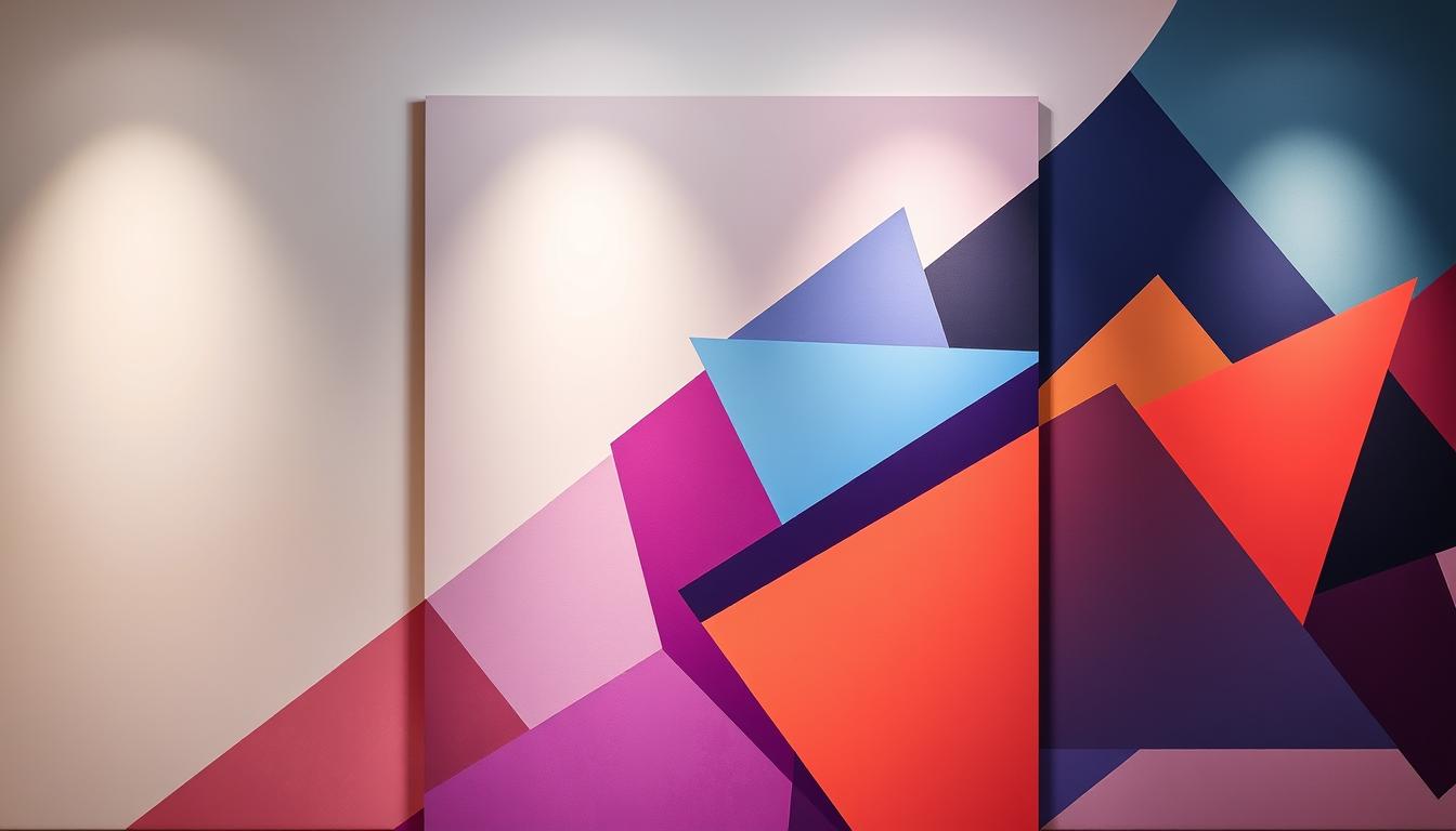
Oversized abstract artwork as the focal point of the room
A single oversized canvas can make a whole room feel intentional and gallery-ready. Large wall art sets hierarchy, so furniture arrangements read as deliberate rather than accidental.
Sizing guidance: aim for artwork that spans about two-thirds to three-quarters of a sofa’s width or sits with a 6–12" gap above a credenza. This prevents the piece from appearing too small or overpowering the space.
Scale affects aesthetics: bigger canvases permit broader color fields, bolder gestures, and clearer visual rhythm. They command attention and create a memorable first impression at entry.
Place the piece centered on the main wall, leave breathing room at edges, and keep sightlines consistent across seating and circulation paths. One large art piece often replaces a cluster of smaller works, simplifying styling in busy rooms.
- Lighting: proper fixtures turn a canvas into an architectural element, not just decoration.
- Palette: start with versatile tones that match textiles and finishes for easy seasonal swaps.
- Install: use professionals for heavy or extra-large frames to ensure safety and perfect alignment.
"Choose a confidently scaled focal piece to modernize a room quickly without a full redesign."
For more scale-driven examples and placement ideas, see this collection of top pieces.
Color-forward abstracts: Vibrancy that transforms minimal interiors
A single vivid canvas can flip a spare room from quiet to spirited without swapping furniture. Color-forward wall art lets a minimal interior keep its calm while gaining instant personality.
Choosing palettes: Joyful brights vs. calming neutrals
Joyful brights inject energy and create focal points. They pair well with soft furnishings and warm wood for a lively, modern look.
Calming neutrals support rest and subtlety. Use muted abstracts above a bed to keep a room serene while still adding texture and interest.
Contrast strategy: Pops of color against neutral backdrops
Keep walls and large furniture soft, then add one saturated canvas to anchor the scheme. Echo a dominant hue in pillows or a throw for cohesion.
Room-by-room impact: Living rooms, dining spaces, and bedrooms
In the living room, pick one dominant hue and repeat it in textiles for balance. Dining spaces welcome saturated pieces that spark conversation and pair with metal or wood finishes.
For bedrooms, choose softer lines and subdued tones for rest, or jewel tones for intimate drama. Test a palette by photographing the space in daylight and at night to confirm color balance.
"Color-forward abstracts are the easiest way to refresh interiors while keeping a clean, contemporary style."
Affordable access: Abstract art prints and high-quality reproductions
High-quality prints let homeowners carry a gallery look without a gallery budget. Museum-quality wall art prints mirror originals with striking color and scale, so a single piece can lift a living room or entry without heavy cost.
Materials and formats:
Paper, canvas, and metal
Paper prints deliver crisp detail and are ideal for framed work that reads sharp on walls. Canvas adds subtle texture and depth that mimics original brushwork.
Metal prints offer a modern sheen and durable surface that reflects light differently across a room. Each format supports bold scale and lasting quality at lower price points than originals.
Rotating collections without breaking the bank
Rotating pieces seasonally keeps a home feeling fresh and aligned with personal taste. Start with a cohesive set for one room, then expand into adjacent spaces as the collection grows.
- Budget tips: mix one statement piece with smaller supporting works to add depth affordably.
- Renter-friendly: prints are lightweight and easy to move when relocating.
- Care & storage: store swapped prints flat and dry to preserve condition for future rehangs.
"High-quality reproductions let you explore style and scale before committing to a commission."
| Format | Look | Best use |
|---|---|---|
| Paper | Crisp detail, framed finish | Small to medium works for walls and grouped layouts |
| Canvas | Textured, gallery feel | Large formats for living room focal pieces |
| Metal | Sleek, reflective surface | Durable lobby pieces and modern dining spaces |
Tips to elevate prints: use simple frames or float-mount canvas to increase perceived value. Proper hanging and lighting make reproductions read like originals while keeping costs low.
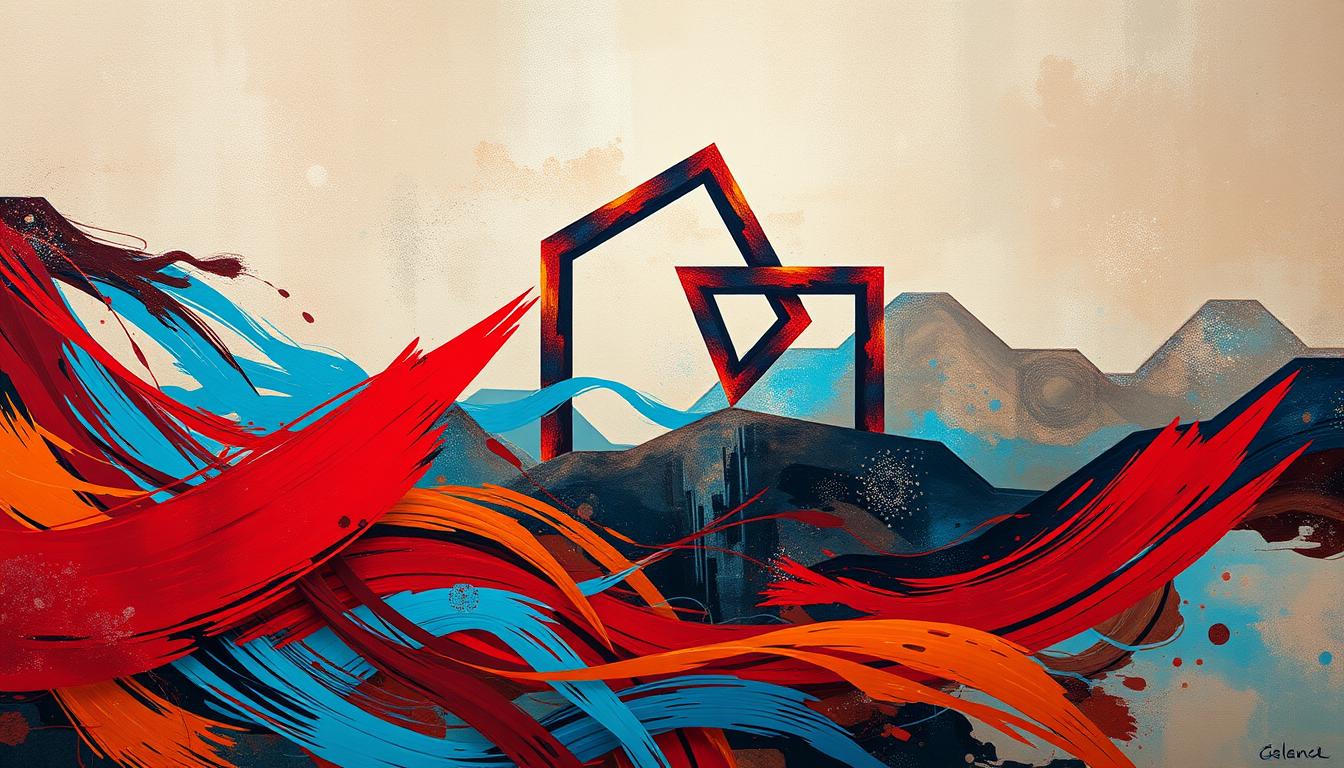
Texture and mixed media: Layers, depth, and tactile intrigue
Layered, tactile pieces make wall art feel architectural. Texture adds presence so a single work can read like built-in design rather than decoration.
Materials matter: textiles warm a room, metals add sheen, and found objects supply narrative and depth. Artists pair mesh, rope, resin, and reclaimed wood to create modern, tactile stories that reward close inspection.
Light and shadow change how textured pieces read across a day. Place a relief piece opposite natural light or under adjustable track lighting to highlight contours and shifting shadows.
Sustainability counts. Upcycled substrates and recycled components add unique surface effects while cutting environmental impact. Mixed media often doubles as a conversation starter and a value signal for mindful design.
- Keep one textured focal and balance it with smoother companion works to maintain visual rhythm.
- Test viewing distances—two feet versus ten feet can reveal very different compositions.
- Care: dust gently with a soft brush and avoid high-humidity zones to preserve relief and adhesives.
"Textured wall art invites touch, tells a story, and anchors interiors with dimensional presence."
For more surface-driven inspiration and practical placement tips, see curated wall art ideas that showcase mixed-media approaches.
Abstract canvas artworks in modern interiors
Canvas works bring a tactile calm that reads well across open-plan homes and shared living zones. Canvas remains a go-to because it’s durable, lightweight, and adds subtle texture that lifts abstract compositions.
In a large living area, one canvas can visually anchor multiple zones. Custom sizes let a piece fit a tricky wall or sit perfectly above a sofa.
Pro tip: size canvases so they span about two-thirds of a sofa or fill a wall with a 6–12" margin for a high-end look.
Multimedia techniques—impasto, glazing, or collage—add layers and texture without leaving the canvas format. These approaches give depth that reads at both close range and across a room.
- Long runs: vertical or panoramic canvases suit hallways and stairwells.
- Tailored fit: stretched canvas and custom frames match odd dimensions precisely.
- Groupings: pairs or triptychs work when one piece feels too small for the room’s volume.
Keep maintenance simple: dust with a microfiber cloth and avoid prolonged, harsh sunlight to preserve pigments. Mix canvas pieces with metal or paper prints elsewhere to add contrast while keeping a cohesive style.
"Canvas-based abstracts pair seamlessly with concrete, warm oak, and matte black finishes to create modern, layered interiors."
Digital and interactive abstracts: AR, data-driven visuals, and participation
Digital tools are expanding how people meet and shape wall art. Interactive pieces invite viewers to become active participants rather than passive observers. This section shows ways technology amplifies color, motion, and meaning while keeping bold, personal design at the center.
How viewers become co-creators
Interactivity defined: sensors, touchscreens, and body tracking let movement change color fields and patterns in real time.
That feedback loop turns a visit into a creative exchange and lets people influence a work’s energy.
Where to experience it
See these works in immersive gallery installations, public plazas, and on smartphones with AR previews. Mobile tools let buyers test scale and palette before hanging a piece at home.
Blending with sound and motion
Motion graphics paired with soundscapes deepen emotional response. Artists sync visuals to environmental or social data so a display evolves across hours or with crowd input.
- Integration tip: pair a dynamic digital focal with muted physical works to balance visual noise.
- Maintenance: ensure stable power, network access, and regular display calibration for consistent quality.
- Outlook: expect more artists to mix code, sensors, and sound as collaborations between studios and tech teams expand.
"Participation shifts meaning: modern digital work invites audiences to help write the next scene."
Sustainable and eco-friendly abstracts: Materials, methods, and meaning
Eco-conscious materials now shape how wall art speaks to a room's values and mood. A greener approach blends recycled substrates, plant-based or low-VOC pigments, and mindful production. That mix keeps bold color and strong scale while cutting environmental impact.
Recycled substrates and non-toxic pigments
Choose recycled or upcycled supports: reclaimed wood, recycled board, and post-consumer paper reduce embodied carbon.
Prefer plant-based or low-VOC paints: these lower indoor emissions and protect indoor air quality for family and pets.
When buying or commissioning, ask for material lists and look for certifications such as FSC, GreenGuard, or OEKO-TEX where applicable.
Designing greener homes with responsible wall art
Sustainable pieces can carry environmental narratives, adding deeper meaning to a living space.
- Vet suppliers: request sourcing, print processes, and shipping details.
- Protect sensitive works: avoid prolonged sun exposure and high humidity to extend life.
- Frame thoughtfully: linen, jute, or reclaimed frames reinforce a nature-forward style.
- Support local artists to cut shipping miles and strengthen community markets.
"One responsible piece can shift how a home collects art—beauty and care can coexist."
| Feature | Benefit | Action for homeowners |
|---|---|---|
| Recycled substrates | Lower carbon footprint | Ask for % recycled content and sourcing |
| Low-VOC pigments | Better indoor air quality | Request SDS or VOC data from seller |
| Local sourcing | Less transport, community support | Buy small from regional artists or galleries |
| Natural frames/textiles | Biophilic, textured aesthetic | Use linen, jute, or reclaimed wood |
Tip: eco-friendly choices can stay vivid and bold while reflecting living values. Start with one responsible wall art piece and let that inform future purchases across your spaces.
Abstracts in commercial and public spaces: Branding and placemaking
Commercial and civic settings now use bold nonfigurative pieces to shape mood, guide visitors, and signal values. Large works communicate brand tone quickly through color, scale, and composition. This makes a lobby or plaza feel intentional the moment someone enters.
Hotels, offices, retail: atmosphere, productivity, and wayfinding
Wall art can serve as fast brand language. A large canvas or printed panel sets expectations and captures attention at arrival.
- Hotels use oversized pieces for memorable lobby moments and wayfinding cues.
- Offices pick considered palettes to lift creativity without distracting teams.
- Retail spaces match art to finishes and signage to unify design and style.
Murals and installations as community touchstones
Murals and atrium installations become local landmarks that invite photos and repeat visits. Commissioning regional artists ties works to neighborhood character and builds civic pride.
| Feature | Benefit | Action |
|---|---|---|
| Durable finishes | Resists scuffs in high-traffic spaces | Choose washable coatings and protective laminates |
| Modular or temporary pieces | Keeps visitors returning | Rotate shows to support artists and freshen aesthetics |
| Local commissions | Strengthens community ties | Work with regional artists and public programs |
Bottom line: well-placed art across multiple spaces builds a clear, recognizable identity. That cohesion boosts customer perception, dwell time, and long-term ROI.
Personalization and commissions: Bespoke abstracts with a story
Commissioned art turns a wall into a narrative. A bespoke piece can reflect memories, travel, music, or career milestones. That personal thread makes large-scale work feel like it belongs.
Matching scale, palette, and narrative to your space
Start by sharing room photos, exact dimensions, and visual references with artists. Collaboration begins with clear notes on light, finish preferences, and how the piece should sit among existing wall art.
Use mockups to confirm proportion and balance before fabrication. Digital previews and taped outlines on site prevent surprises and ensure the final work reads well from common sightlines.

"A bespoke canvas that carries a story changes how a space feels—and how people remember it."
- Process: send photos, agree on scale, refine palette with the artist, and approve mockups.
- Finish: choose matte or gloss to match lighting and surrounding materials for cohesion.
- Logistics: set timelines, materials, and maintenance expectations up front to protect quality.
- Value: commissioned work can harmonize with collections or act as a single, powerful focal piece.
- Documentation: collect sketches and studies to display alongside the final work and enrich the story.
| Step | Why it matters | Action |
|---|---|---|
| Brief & photos | Ensures correct scale and context | Share room shots, measurements, and inspirations |
| Mockups | Prevents proportion errors | Approve digital previews or taped outlines |
| Finish choice | Affects glare and mood | Pick matte for soft light; gloss for vivid saturation |
| Budget & milestones | Builds trust and clarity | Agree on price, deposit, and delivery schedule |
| Documentation | Deepens narrative value | Keep sketches, studies, and provenance details |
Pro tip: corporate or gift commissions gain extra resonance when color and gesture reference a brand or personal memory. Clear briefs and staged mockups turn a concept into a lasting, life-shaped work.
Styling your living room: From single showpieces to curated gallery walls
Start with one striking canvas and build rhythm with smaller works to make a living space feel intentional and fresh. That single choice dictates scale, palette, and how additional pieces will relate.
Placement principles above sofas, mantels, and sectionals
Hang wall art so the center sits about 57–60" from the floor or align the middle with eye level near seating.
For above a sofa, aim for artwork width around two-thirds of the sofa. Above a mantel, keep a 6–12" gap between frame bottom and mantel edge.
Polished gallery walls: Themes, cohesion, and framing
Choose a single unifying thread—palette, subject, or frame finish—to make many pieces read as one design. Start with a dominant art piece, then layer smaller canvases and prints to create rhythm without clutter.
Use consistent margins (2–3" between frames) and align at least one horizontal or vertical line to anchor the layout.
- Test first: lay works on the floor or use painter’s tape to preview placement.
- Frames: match frame color for cohesion or mix finishes sparingly for a curated feel.
- Balance: keep negative space so the living room feels open, not overcrowded.
| Placement | Rule | Why it works |
|---|---|---|
| Above sofa | Width ≈ 2/3 sofa | Creates clear anchor |
| Above mantel | 6–12" gap | Makes sightlines clean |
| Gallery spacing | 2–3" between frames | Keeps rhythm & cohesion |
Think about glare and light angles before nailing holes. Echo key hues in pillows or rugs to tie walls to textiles and finish a polished, livable look.
"One dominant piece sets tone; a thoughtful gallery grows with new ideas while keeping harmony."
Bedroom abstracts: Serenity, drama, and scale above the bed
Above the bed, a single calm canvas can anchor sleep and style with a quiet, confident presence.
Choose soothing palettes—soft neutrals, misty blues, and desaturated greens—for a restorative bedroom mood. These tones help the room breathe and support rest.
Introduce drama sparingly. A single, moody piece can add intimacy without overstimulating the senses. Keep shapes simple and color fields broad so the eye can settle.
For sizing, aim for artwork that spans about two-thirds of the headboard width. Leave 6–12" of negative space on each side to keep proportions calm and balanced.
- Single vs multi: one statement canvas feels modern; symmetric pairs or a three-piece set offer formal balance.
- Texture: choose subtle relief that reads up close but won’t trap dust near linens.
- Finish & fixtures: match frame finishes to bedroom hardware and add dimmable sconces or picture lights for mood shifts.
- Renters: use lightweight hanging systems that protect walls and secure larger pieces safely.
- Avoid overly busy patterns directly above the bed to keep sleep-friendly energy.
"Bedroom wall art should feel personal, calm, and perfectly scaled—an inviting pause in your home that reflects your style."
Match art to your interior style: Minimalist, industrial, boho, farmhouse, mid-century
Let an artwork echo a room’s dominant material—wood, concrete, or woven textiles—to unify the look. This quick guide pairs confident choices with common U.S. home styles so styling feels simple and intentional.
Clean lines and neutrals for minimalist calm
Minimalism: pick wall art with clean lines, restrained palettes, and generous negative space. Keep compositions simple so lines and scale reinforce calm interior architecture.
Metallics and geometry for mid-century and industrial vibes
Industrial: choose monochrome or metal-accented pieces that echo concrete and steel. Use bold geometry and warm wood accents for mid-century design to highlight patterns and era-appropriate color blocking.
Texture-rich layers for boho warmth; rustic tones for farmhouse
Boho: favor texture-rich canvases, hand-made finishes, and earthy palettes—these ideas pair well with layered textiles and plants.
Farmhouse: lean on rustic tones and nature-inspired gestures that soften a room and read cozy with reclaimed frames.
- Blend eras: vintage frames around contemporary art keep rooms personal and fresh.
- Scale tip: one larger piece reduces visual clutter and fits open-plan living layouts.
- Mix styles: pair mid-century furniture with minimalist art for a tailored, balanced result.
Choose art that amplifies existing design rather than competing with it.
Color strategy and sizing: Make the most of scale, light, and palettes
Measure a canvas against furniture first; size mistakes are the fastest way to undercut confident design. Start by checking wall width, ceiling height, and sofa or bed measurements before shopping. Simple ratios remove guesswork and help a bold piece feel intentional.

Sizing rules of thumb for walls and furniture
Above sofas: choose artwork about two-thirds of sofa width. This keeps balance without crowding.
Above beds: aim for artwork that spans roughly two-thirds of the headboard width and leaves 6–12" margin each side.
Console tables & mantels: select a piece slightly narrower than the furniture with 6–8" clearance to avoid a cramped look.
Balancing contrast, harmony, and natural light
Pick one dominant color from existing textiles and let the artwork echo or contrast it. A cohesive hue ties the living room together; a bold contrast creates energy.
Use AR previews or taped mockups to test looks in daytime and under lamps. Surface sheen and frame finish change perceived saturation; matte reduces glare, gloss boosts color pop.
"One confident canvas anchors a space; add supporting works only if the balance calls for them."
| Rule | Why it matters | Quick action |
|---|---|---|
| Width ≈ 2/3 sofa | Creates visual anchor | Measure sofa, multiply by 0.66 |
| Headboard span ≈ 2/3 | Keeps bedside symmetry | Leave 6–12" each side |
| Ceiling height | Taller rooms suit vertical formats | Choose taller canvases for 9'+ ceilings |
| Lighting type | Spotlights show texture; diffuse light softens contrast | Test at night and day with mockups |
Quick checklist: confirm clear circulation paths, avoid blocking TV sightlines, test mockups under both daylight and lamp light, and keep consistent spacing for multi-piece groups. Follow these simple rules and your wall art will read like deliberate design, not an afterthought.
Explore more design-forward palettes and practical tips at design-forward palettes.
Conclusion
A confident canvas can rewrite a room’s feel and supply instant style without costly renovations.
In 2025, art goes big, vibrant, and personal—wall art that pairs bold scale with sustainable materials and smart tech. Choose one strong piece or a cohesive cluster to set mood and guide a living room, bedroom, or lobby.
Keep quality and budget balanced by testing prints or canvases first. Pay attention to size and light so a piece reads intentional at day and night.
Support artists who mix digital and tactile methods, pick a palette that tells your story, and favor greener materials when you can.
Practical step: shortlist two or three pieces, preview them on your walls, then pick the work that lifts your home and life for years to come.
FAQ
What defines the abstract movement shaping interiors this year?
Bold scale, energized color, tactile layers, and tech-infused formats define current abstract work. Large canvases and mixed-media pieces create focal points while AR and data-driven visuals invite viewer interaction. Sustainability and bespoke commissions also play a growing role.
How do oversized canvases change a living room or lobby?
Large-format pieces anchor a room visually, set mood, and reduce the need for extra decorative elements. In public spaces they establish identity and guide circulation. Proper scale and placement above sofas or reception desks create balance and a strong first impression.
What color strategies work with minimalist interiors?
Use a single vibrant piece to punctuate neutral palettes or choose a series of coordinated hues for subtle rhythm. Contrast bright accents with calm backgrounds to add energy without cluttering the space. Natural light and surface finishes will affect how colors read.
Are high-quality prints a good alternative to original paintings?
Yes. Museum-grade giclée prints on canvas or fine art paper deliver strong color fidelity at lower cost. Metal and photographic substrates offer modern, crisp finishes. Rotating prints lets homeowners refresh looks affordably while maintaining visual impact.
How does texture and mixed media influence perception of depth?
Layered materials like fabric, metal, and found objects create shadows and tactile interest that read differently as light shifts. Texture adds dimension that flat color cannot, making pieces feel more sculptural and engaging from multiple vantage points.
Where can I experience interactive abstract art?
Galleries, museums, and public installations increasingly feature AR-enabled works. Museums like the Whitney and tech-forward galleries host data-driven exhibits. Many artists publish companion apps or smartphone experiences that let viewers alter visuals in real time.
What sustainable practices are available for wall art buyers?
Seek works made with recycled canvases, reclaimed frames, and low-VOC or natural pigments. Studios and printers now offer eco-minded options and transparent sourcing. Choosing durable materials also reduces waste by extending a piece’s lifespan.
How can businesses use abstracts for branding and placemaking?
Custom murals and large installations communicate brand values, influence mood, and aid wayfinding. Hotels and offices use color and scale to shape guest experience and productivity. Commissioned work ties local identity into a space and supports community artists.
What should I consider when commissioning a bespoke piece?
Clarify scale, palette, and narrative up front. Share photos and measurements of the installation site, discuss framing and maintenance, and set timelines and budgets. A good commission balances the artist’s voice with the functional needs of your space.
How do I style a gallery wall with abstract works?
Start with a focal piece, then add smaller related works that echo color or theme. Maintain consistent spacing and consider matching frames or mats for cohesion. Lay pieces out on the floor first to test arrangements and scale before hanging.
What sizing rules help match art to furniture and walls?
A common guideline: artwork above a sofa should span about two-thirds to three-quarters of the furniture width. For mantel or console placement, choose pieces that keep negative space balanced. Measure and mock up the layout to ensure harmonious proportions.
How do abstracts perform across different interior styles?
Abstracts adapt well: clean, restrained pieces suit minimalist schemes; geometric and metallic accents fit mid-century and industrial interiors; layered textiles and organic hues complement boho and farmhouse looks. Select finishes and scale to reinforce the room’s character.
Can I combine digital and physical works in one space?
Absolutely. Pair a static canvas with a framed screen or projection for contrast. Use synced color palettes or thematic links so the digital element enhances rather than competes. Multi-sensory installations that blend sound and motion deepen engagement.
How do I keep a vibrant abstract piece from overwhelming a small room?
Choose pieces with restrained compositions or softer palettes, or place the artwork on a single accent wall to avoid visual clutter. Use mirrors and light to open the room, and keep surrounding decor minimal to let the work breathe.

Leave a comment
This site is protected by hCaptcha and the hCaptcha Privacy Policy and Terms of Service apply.