Can a single canvas change how we feel at home or work? This question points to a big shift: art moves beyond decoration and becomes personal storytelling across Canadian living rooms, offices, and public spaces.

Sustainability, personalization, and tech shape fresh design directions. Nature-led palettes and tactile methods meet retro-futurist colors and AI-made pieces. These mixes create styles that feel modern yet warm.
Gallery walls and oversized statement pieces sit side by side. Practical choices—scale above couches, print sizes for small rooms, and frame finishes—help homeowners pick what fits each space.
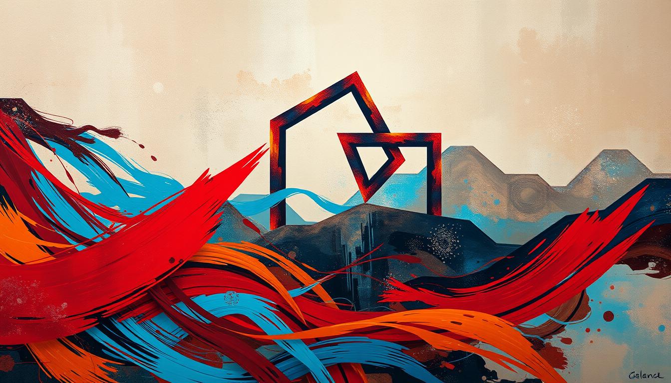
Abstract work sits at the center of this visual language, linking wellness, material choices, and local makers. Expect eco-friendly prints and canvases, biophilic touches, and algorithmic effects that add meaningful impact to walls.
Key Takeaways
- Art now tells stories, not just fills space.
- Nature palettes and tactile techniques lead many design choices.
- Curated gallery walls coexist with bold single canvases.
- Canadian buyers favor recycled materials and local art.
- Scale, placement, and frame choice shape final impact.
Why 2025 Matters for Abstract Art: Context, Culture, and Design Impact
Vibrant, textural pieces are becoming central to how people craft restful, expressive interiors. Wellness-focused design pushes this shift: biophilic palettes, layered textures, and tactile prints reduce stress and add warmth to living and work spaces.
Gallery walls offer narrative depth by grouping works that tell a story. A single oversized canvas creates instant wow and anchors a room with clear personality.
- Eco choices matter: Canadians prefer recycled materials, local sourcing, and low-VOC finishes for canvases and prints to lower environmental impact.
- Personalization wins: Commissions and customizable prints let homeowners match colour, scale, and light conditions to furniture and decor.
- Tech helps sell: AR try-on and AI-assisted visuals let buyers preview art on walls and explore new styles before buying.
"Contemporary art now blends craft and code—metallic accents, 3D textures, and algorithmic effects expand how works live in a room."
Practical impact: more intentional purchases, better integration of art into daily life, and interiors that feel both restorative and expressive. These shifts shape how a new world of art and interior design meets real homes across Canada.
What is the abstract trend in 2025?
Handcrafted texture meets AI patterning, forming works that act like personal emblems in Canadian spaces. This synthesis ties biophilic color, cozy minimalism, mindful maximalism, and retro-futurist echoes into one cohesive movement.
The big picture: synthesis of nature, minimalism, maximalism, and AI
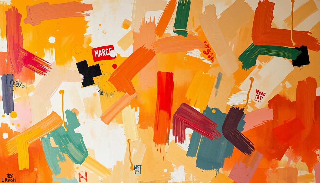
Artists blend organic palettes with algorithmic motifs, so prints and canvas pieces read as both familiar and surprising. Texture—impasto, collage, sgraffito—adds depth and invites imagined touch.
Key shifts: from decoration to identity, from flat to tactile, from solo to collaborative
Art moves from background to statement. Collectors choose works that signal culture, ethics, and wellness. Sustainability and recycled media matter more to Canadian buyers.
- Human-machine collaboration expands visual language via guided AI.
- Studios, tech teams, and designers co-produce immersive installations.
- Practical checklist: pick pieces that match room scale, palette, and function.
"Abstraction now acts as identity—small prints or large canvases both carry narrative weight and real impact."
Biophilic Abstraction: Nature’s Patterns Reimagined for Wellness
Soft, layered greens and warm earthen tones reshape rooms into calm, nature-led havens. Biophilic works distill organic forms into non-representational pieces that promote calm and focus.
Earthy palettes and organic lines
Palette strategies favor mossy greens, warm terracotta, ocean blues, and rich browns. These colors help ground living and bedroom spaces and replace stark contrasts with gentle harmony.
Lines and edges mimic riverbeds, leaves, and dunes. Soft curves create a steady visual rhythm that soothes the eye.
Texture cues on canvas and paper
Texture cues include stone-like stippling, wood-grain strokes, and ripple effects on canvas or paper. These surfaces invite touch and make prints read as sensory objects.
Styling for restorative spaces
Pair prints or a single canvas with light wood furniture, linen textiles, and clay accents for cohesive decor. Choose warm, layered lighting that grazes texture and deepens shadow for evening calm.
Place works opposite windows to catch natural light and group multiple prints in a unified color story to wrap the room in nature’s mood.
"Nature-led palettes and tactile surfaces turn walls into meaningful sanctuaries."
The New Minimalism: Cozy Serenity and Intentional Calm
A softer minimalism focuses on warmth, generous negative space, and tactile materials to quiet a room. Cozy minimalism is a warm evolution of minimalism that values intent, comfort, and clean lines. It keeps decor simple while inviting touch and presence.
Japandi influence: soft neutrals, negative space, light wood
Japandi-inspired interiors use beige, cream, and gentle grays with light wood accents to let a work breathe. Generous space around a piece reinforces calm and shows respect for materials.
Minimalist abstract as focal point: one piece, maximum impact
Use one minimalist abstract as a clear focal point. Aim for two-thirds the width of the furniture below to keep balance and scale right for a living or bedroom.
- Choose textures like matte varnish, soft brushwork, or linen-textured prints to avoid clinical looks.
- Pick thin natural wood or white float frames for subtle definition without crowding negative space.
- Keep surfaces tidy, layer textiles, and align the art’s lines with architectural features to amplify calm.
Wellness benefit: Quiet compositions reduce visual noise and improve focus. Personalize neutrals with slight tonal shifts so the canvas or print harmonizes with flooring and window light.
For more guidance on balancing single statements and gallery walls, see this minimalist art guide.
Maximalist Expressions: Curated Abundance with Abstract Focal Points
Rooms that celebrate color and pattern now wear art like statement jewelry.
Mindful maximalism means curated abundance: more is more, but with purpose. A single bold canvas becomes the narrative anchor and sets the mood for fabrics, wallpapers, and furnishings.
Bold color stories and pattern layering
Choose saturated jewel tones—sapphire, emerald, magenta—or high-contrast duos for drama. Build layered prints by repeating a dominant color or motif from the focal piece to keep harmony.
Oversized canvases as narrative anchors
Pick a large canvas that reads as the room’s focal point. Give it breathing room and match frame finishes across pieces to reduce clutter and boost visual impact.
- Define mindful maximalism: curated abundance where one statement piece leads a room.
- Mix geometric, floral, and animal patterns while repeating one color for cohesion.
- Anchor a salon-style gallery wall around one commanding work and orbit smaller complementary pieces.
- Collect across eras—vintage finds and contemporary works add depth and personal history.
| Element | Strategy | Example | Placement Tip |
|---|---|---|---|
| Oversized canvas | Use as anchor | Single jewel-toned painting | Center above sofa with 8–12" clearance |
| Pattern mix | Repeat a color | Geometric rug + floral pillows | Limit palette to 3 hues for cohesion |
| Gallery wall | Orbit smaller works | Salon layout with one bold center | Match frames to reduce chaos |
"Mindful maximalism lets one confident work unify an eclectic space."
Tactile Dimensions: Texture-Forward Abstract Works
Layered surfaces and sculptural brushwork turn a wall into a place to pause. These pieces ask viewers to slow down and notice detail.
Impasto, collage, sgraffito: materials that invite touch
Impasto builds sculptural layers. Thick paint and palette knife ridges catch side light and animate a canvas as the day changes.
Collage and mixed media embed wood, textiles, sand, metal, and paper to add physical depth and symbolic meaning. Such works read as small landscapes of memory and material.
Sgraffito scratches back top layers to reveal hidden colors. The result is fine linear complexity that rewards close viewing and creates a lively surface.
Mixed media: wood, textiles, sand, and metal for depth
Use tactile pieces where people slow down: meditation corners, entryways, and living areas. These spaces let viewers savor texture and narrative.
- Avoid humid spots for layered works; humidity can loosen adhesives and delicate fibers.
- Choose gentle, angled lighting to cast soft shadows and highlight relief.
- Float-mounts or shadow gaps give edges breathing room and show dimensionality.
| Material | Care | Placement tip |
|---|---|---|
| Wood elements | Keep away from direct sunlight and damp | Entryway or living wall with stable temp |
| Textiles & paper | Dust gently, avoid high humidity | Frame behind glass or in shadow gap |
| Sand & metal | Secure mounting; check for corrosion | Use in accent walls with complementary surfaces |
"Texture proves a hand was there—each ridge and embedded shard signals craft and authenticity."
Styling tip: Pair tactile pieces with smooth finishes like glass or polished stone to heighten contrast and elevate sensory range. Canadian collectors often prize this hand-made proof; texture becomes a signature of value and impact.
For placement ideas and sizing guidance for canvas and mixed media pieces, see this tactile art guide.
Retro-Futurism and Newstalgia: Past Futures, Present Rooms
Retro-futurist palettes revive past optimism and fold it into polished, playful interiors. This style pulls earthy 70s tones and neon 80s accents into one lively language for homes and offices across Canada.
Geometric energy and playful glitches
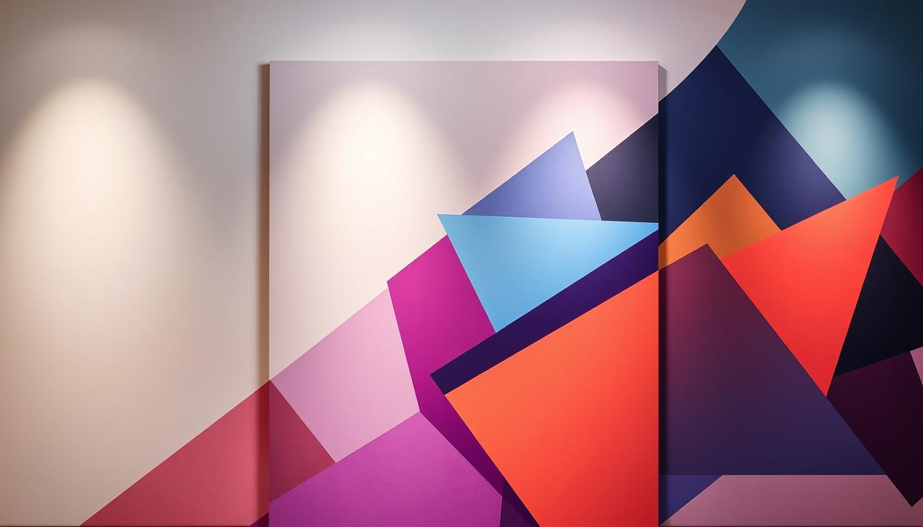
Geometric abstraction uses op-art echoes, rhythmic grids, and bold shapes to add clear movement and bright focus to a room.
Glitch motifs and pixelation nod to early digital culture and act as fresh patterns for modern prints and canvas works.
Color stories, pairings, and placement
- Color picks: avocado, mustard, orange for warmth; neon and pastels for punch; chrome-like sheens for futurism.
- Apply: a feature wall with a statement print or a small cluster of retro-toned works softens modern decor.
- Pair: mid-century furniture, chrome accents, and streamlined lighting balance playful art with sophistication.
- Office use: rhythmic lines energize collaborative space while keeping visual order.
| Element | Use | Placement tip |
|---|---|---|
| Geometric print | Focal energy | Align lines with architectural planes |
| Glitch/pixel work | Accent pattern | Cluster near tech or media zones |
| Chrome-accent canvas | Futurist sheen | Pair with streamlined lighting |
"Borrowing past optimism brightens present rooms and invites playful confidence into everyday spaces."
Algorithmic Aesthetics: AI, Data, and the New Abstract
Algorithms now help artists stretch imagination into complex, dreamlike patterns that merge data and feeling.
Human-machine collaboration pairs prompts with curation so creators can shape motifs, repeatable patterns, and surreal complexity beyond manual limits.
Refik Anadol’s data sculptures show how datasets become immersive visuals. Ian Cheng’s living simulations push the idea that a piece can keep evolving.
Ownership and collecting
NFTs act as blockchain-backed certificates that verify digital artwork ownership and provenance for collectors. Value often follows the artist’s concept and curation, not just a generated file.
Hybrid display ideas
- Rotate high-res screens as curated media walls for ambient modes.
- Use projection mapping for events and pop-ups.
- Anchor a room with museum-grade prints for lasting wall presence.
| Display | Best use | Care tip |
|---|---|---|
| Screen wall | Dynamic living areas | Calibrate brightness; schedule sleep mode |
| Projection | Events and immersive nights | Control ambient light for contrast |
| Museum print | Permanent collection | Use archival inks and papers; avoid humidity |
"Data gives canvas to new imaginations—code becomes color, and motion becomes mood."
Tip for Canadian collectors: Visit local gallery shows that feature AI-led works and balance digital pieces with tactile prints for a rounded collection. For guidance on digital artwork provenance see digital artwork provenance.
Purpose-Driven Abstraction: Art with a Conscience
Collecting with conscience means walls now hold stories about place, people, and planet. Purpose-driven works encode environmental and identity narratives without literal depiction.

Visual strategies range from fragmented forms that hint at social fracture to agitated color fields that channel climate anxiety. Other pieces offer harmonic palettes that imagine communal futures.
Sustainable materials matter: recycled media, low-impact substrates, and upcycled canvases make design choices that align with ethical values. Choosing such pieces reduces footprint and supports makers using conscious materials.
- Acquiring these works amplifies artists who address social justice and ecological issues.
- Display tips: include artist statements near artwork to spark conversation and deepen engagement.
- Pair pieces with natural finishes and energy-efficient lighting to reinforce the ethical message.
Community matters. Attend local exhibitions, talks, and artist-led workshops to build context for each piece and to support the wider world of practice.
| Purpose | Visual cue | Design tip |
|---|---|---|
| Environmental narrative | Layered, weathered textures | Use recycled frames; soft, warm lighting |
| Identity and memory | Fragmentation, symbolic color fields | Place near seating for conversation |
| Utopian visions | Calm harmonies and expansive space | Give breathing room; neutral surrounds |
"Purpose-driven pieces bring long-term resonance, aligning a home’s aesthetic with its owner’s values."
Material Alchemists: From Urban Debris to Natural Dyes
Artists now mine city detritus and plant dyes to make works that feel like reclaimed memories.
Urban pigments, reclaimed wood, and hand-made paper carry layered histories. Firelei Báez’s indigo and henna layers function as counter-archives. Tanya Goel grinds rubble into pigments that shimmer like decaying city grids.
Urban pigments, reclaimed wood, and paper artistry
Pigments and substrates embed place and politics. Coastal sand, soot, and plant dyes make each piece a map of extraction and care.
Texture and meaning: how materials tell the story
Paper-cut installations such as Phoenix Garden show paper’s sculptural power. Intricate cuts and layered negatives turn humble sheets into transcendent narratives.
- Pair material-rich works with reclaimed wood frames or raw edges to honor origin stories.
- Place delicate paper artwork away from direct sun and high humidity for conservation.
- Ask artists about sourcing—local salvage, ethical dyes, and recycled substrates strengthen eco goals.
"Materials become both subject and medium, giving pieces tactile depth and lasting impact."
Group related works in hallways or studies to create material narratives. This approach deepens meaning and makes each room feel like a small world of care and craft.
How to Style Abstract Works in Canadian Interiors
Start by choosing a clear focal piece that sets mood and scale for each room. This approach simplifies choices and makes it easier to layer other prints and objects around a central idea.
Room-by-room: living rooms, bedrooms, and office spaces
Living rooms: place a statement print or canvas above the sofa. Aim for 60–75% of the furniture width for balanced scale.
Bedrooms: use pairs or triptychs over the bed to create symmetry and calm. Keep colors soft to suit low light.
Offices: choose calming biophilic pieces to boost focus. Low-contrast palettes reduce screen glare and help productivity.
Gallery walls vs. single statements: scale, placement, and lines
Gallery walls tell layered stories and work well in halls or tall walls. Use a cohesive theme—repeat a color or line direction to unify eclectic pieces.
Single statements deliver immediate clarity. Pick one large canvas for smaller rooms to avoid visual clutter.
Framed vs. unframed canvases: when each choice shines
Framed prints read as formal and refined; choose them for traditional decor and public-facing spaces.
Gallery-wrapped, unframed canvases feel modern and relaxed. Use them for casual living spaces or minimalist interiors.
Fine art paper offers crisp detail and softer glare; canvas brings texture and painterly depth.
| Room | Best choice | Scale tip |
|---|---|---|
| Living room | Large canvas or single print | 60–75% of sofa width; center 57–60" high |
| Bedroom | Pairs or triptychs | Align with headboard; keep 6–10" gap |
| Office | Biophilic prints on paper or canvas | Choose calming palettes; avoid high contrast |
"Use AR previews and mockups to validate size and placement before buying; this saves time and ensures impact."
Color, Scale, and Materials: A Practical Trend Checklist for 2025
Start with a simple rule: pull two hues from your sofa or rug, then add one neutral from the wall to craft a balanced palette. This method keeps prints and other works tied to existing decor and avoids visual conflict.

Choosing colors that harmonize with sofas, rugs, and walls
Color checklist: pick two dominant tones from textiles, one neutral from paint or trim, and one small complementary accent for pop.
Tip: repeat a texture—linen or matte—across frames and pillows to stabilize mixed styles.
Sizing guidance for couches, beds, and dining spaces
For sofas and headboards, aim for about two-thirds the furniture width. That formula keeps scale readable and pleasing.
Dining walls do best with centered pieces at seated eye level. Use AR previews to confirm size before buying.
Canvas, paper, and wood: textures that elevate contemporary art
Medium guide: choose canvas for textured warmth, paper for crisp detail, and wood accents to echo floors or furniture.
Layering works starts with one anchor artwork, then add supporting prints to grow a color story without clutter.
- Maintenance: UV glazing for paper, gentle dusting for canvas, and avoid high humidity for wood frames.
- Trend checks: add biophilic hues for calm rooms, retro palettes for playful zones, and AI prints for innovation corners.
- Shopping checklist: measure wall, confirm palette, pick medium, test with AR, and finalize framing to match decor.
"Measure first, match color, and choose materials that echo the room—small moves make big impact."
Conclusion
This year’s art scene blends hands-on craft with code to reshape how rooms feel.
2025 balances grounding naturalism and digital possibility. Nature-led palettes, cozy minimalism, curated maximalism, tactile surfaces, retro-futurist play, and algorithmic innovation form a clear synthesis.
Collectors now choose pieces as identity markers. Pick works that mirror values, wellness goals, and room purpose to make spaces feel personal and calm.
Balance tactile and digital pieces for lively, rooted collections. Define palette and scale, choose medium, and prioritise sustainable materials and meaningful stories.
Start with one piece that truly resonates and build over the year. These ideas help re-energize homes and offices while keeping collections durable and relevant to a changing world.
FAQ
How does nature influence current abstract art choices?
Designers and artists draw on organic patterns and earthy palettes — mossy greens, terracotta, ocean blues — to create calming, restorative pieces that work well in living rooms and bedrooms. Textures that mimic stone, wood grain, and water add a tactile, sensory layer that promotes wellness.
Which minimalist directions are shaping interiors this year?
A cozy, Japandi-influenced approach leads. Soft neutrals, generous negative space, and light wood finishes let a single, strong piece become the room’s focal point. Minimalist canvases act as intentional anchors rather than mere decoration.
What defines maximalist abstract works for modern homes?
Curated abundance, bold palettes, and layered patterns define the look. Oversized canvases and statement pieces serve as narrative anchors, balancing busy rooms with controlled composition and rich color stories.
How important is texture in new abstract pieces?
Extremely. Techniques like impasto, collage, and sgraffito and materials such as reclaimed wood, textiles, sand, and metal increase depth and invite viewers to engage with surface and form, moving works from flat images to tactile experiences.
What role does technology play in contemporary abstract production?
Human-machine collaboration expands creative possibilities. AI-driven patterns and algorithmic compositions generate complex forms that artists refine. Hybrid displays — prints, projections, and screen installations — blur boundaries between physical and digital art.
Are sustainable methods influencing material choices?
Yes. Recycled media, natural dyes, and reclaimed materials are common. Artists and makers use urban pigments and salvaged wood to add narrative and reduce environmental impact, making sustainability part of a piece’s meaning.
How should collectors approach scale and placement?
Match size to function and sightlines. Large sofas and dining areas suit oversized canvases; small nooks benefit from grouped works. Consider height and negative space so pieces read as focal points rather than clutter.
When is framing preferable to leaving a canvas unframed?
Framing adds polish and can protect delicate media, ideal for gallery walls or formal rooms. Unframed canvases feel more intimate and contemporary, fitting casual living spaces or minimalist schemes where texture and edge matter.
How can abstract art reflect identity and purpose?
Artists encode environmental concerns, cultural identity, and social themes through color, form, and material choice. Purpose-driven pieces communicate values visually and connect with collectors seeking meaningful work.
What color strategies work with existing furnishings?
Choose harmonizing tones that echo sofas, rugs, or accent pieces. Use one dominant hue with supporting accents to create cohesion. Earthy palettes pair well with warm woods, while saturated accents add contrast in neutral rooms.
Are prints a viable alternative to original works for trend-conscious spaces?
High-quality prints offer accessibility and versatility. They let homeowners follow trends affordably, experiment with scale, and rotate imagery seasonally while maintaining strong visual impact.
How do Canadian interiors shape these trends?
Sustainability and personalization lead Canadian tastes. Designers favor regionally sourced materials, biophilic palettes, and pieces that balance cozy comfort with contemporary clarity, fitting diverse climates and lifestyles.
What should buyers consider when collecting works that involve AI?
Ask about authorship, rights, and process. Verify how prompts or algorithms contributed and ensure provenance documentation. Collectors often value pieces where human and machine contributions are transparent.
How can small spaces benefit from tactile abstract pieces?
Texture-forward, mid-sized works can create depth without overwhelming. Layering materials like fabric, wood, or thin relief brings richness while maintaining scale appropriate for apartments and compact rooms.
Which materials best translate retro-futurist aesthetics?
Glossy surfaces, metal accents, and printed glitch motifs capture a past-future vibe. Combine geometric forms with vintage palettes and playful color blocking to achieve sophistication suitable for both homes and workspaces.


Leave a comment
This site is protected by hCaptcha and the hCaptcha Privacy Policy and Terms of Service apply.