Curious how a scene that looks unbalanced can still feel complete? Many people expect mirror-like symmetry, but artists often choose a different path to guide the eye and create emotion.
Asymmetrical balance uses unequal visual weight across a composition and still achieves harmony. Creators arrange positive and negative space, tweak color, and play with texture and light to move the viewer through the image.
Modern makers favor this approach for variety, motion, and storytelling. Works such as Van Gogh’s The Starry Night and Hokusai’s Great Wave show how shifting elements creates drama without losing balance. You can learn practical ideas for layout and design and spot key techniques in classic and current examples.
For a clear primer on the core idea, see this short guide to asymmetrical balance in art. By the end of this article, you will know how to plan and compose a piece that feels intentional and alive to the viewer.

Key Takeaways
- Balance doesn’t require mirroring: unequal parts can still feel stable.
- Visual weight comes from color, texture, light, and placement.
- Asymmetry adds movement, depth, and narrative to a composition.
- Classic and modern works offer useful examples to study.
- Skills for this approach apply to art, photography, and design.
Why asymmetrical balance captivates viewers today
Today, artists and designers turn to unbalanced layouts to spark curiosity and motion. Symmetry once felt natural, but heavy use now reads as predictable. Modern makers choose asymmetrical balance to add variety and momentum to a scene.
Off-center placement, contrasting color, and smart use of negative space guide the eye through a work. That guidance rewards a viewer with new discoveries and links between elements. The result keeps attention longer than a centered, mirror-like layout.
Asymmetry supports storytelling. Placing a bold shape to one side and countering it with smaller, lighter parts suggests movement or tension. Designers apply this in painting, photography, and web design to make compositions feel both fresh and organized.
| Feature | How it acts | Benefit for viewer |
|---|---|---|
| Off-center focal point | Shifts eye path across the image | Increases dwell time and curiosity |
| Contrasting colors | Creates visible weight differences | Highlights relationships between elements |
| Negative space | Balances heavy forms without symmetry | Keeps composition clear and readable |
- Asymmetrical balance breaks predictability while keeping a work cohesive.
- It adapts easily to different formats and feels timely in our visual culture.
What is an asymmetrical painting?
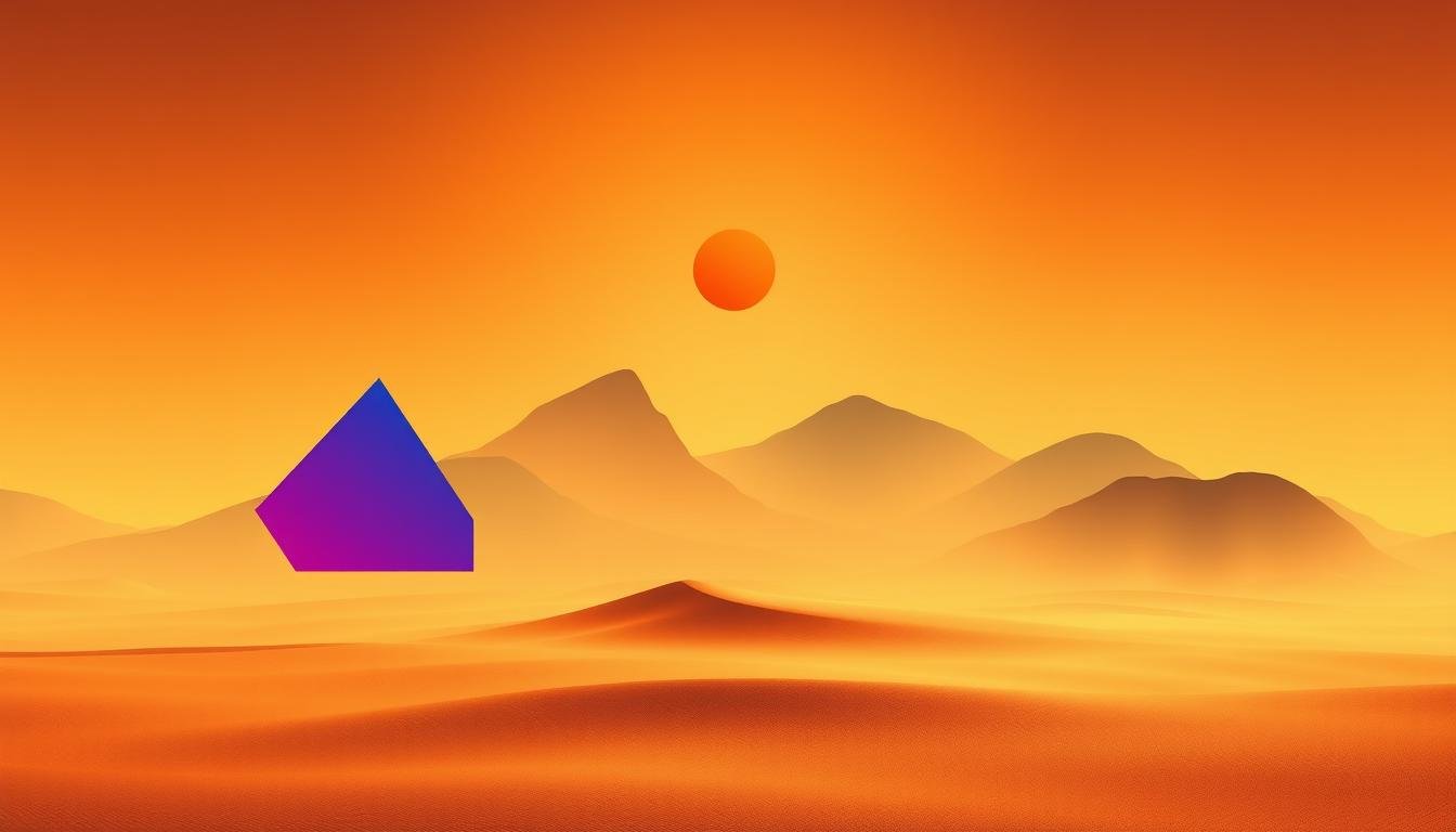
A thoughtful mix of heavy and light forms can make a canvas feel steady without mirroring. This approach arranges unequal parts so the whole reads as intentional and cohesive.
Clear definition
Asymmetrical balance places different visual elements with unequal weight on each side to create balance. Artists shift size, tone, color, texture, and placement of positive and negative space to guide the eye.
Why it matters
The result adds movement, variety, and intrigue. One side may hold a dominant shape while the other counters with several lighter marks. That contrast makes the viewer scan the image and discover relationships across the frame.
- Visual weight comes from size, tone, texture, color, and placement.
- Strategic empty space can "weigh" a composition and help it breathe.
- Use different elements deliberately to achieve balance, not by chance.
"Balance does not require symmetry; it asks for thoughtful distribution so a work feels whole."
Asymmetrical balance vs. symmetrical balance in art and design
Deciding on symmetry or a more dynamic layout changes how a viewer reads the whole image. Symmetrical balance arranges elements with equal weight on either side of a center line. It gives a clear sense of order and ceremony that suits architecture, logos, and formal portraits.
Asymmetrical balance finds equilibrium without mirroring. Artists vary size, color, and placement so the composition feels lively and modern. This approach asks for more choices but rewards the viewer with movement and narrative tension.
- Use symmetry when you want calm, iconic clarity and instant legibility for the viewer.
- Choose asymmetry for energy, contrast, and a contemporary way to guide attention across the frame.
- Test both types balance with thumbnails: mirror your layout, then offset elements to compare impact.
- Consider medium and context—web design and posters often rely on asymmetry to steer the eye; emblems favor symmetry for authority.
"Both approaches can achieve balance; the choice shapes how a composition feels—predictable or intriguing."
Core principles that drive balance: visual weight, color, shape, and space
Smart handling of weight, hue, and empty space turns contrast into harmony on the canvas.
Visual weight depends on size, tone, texture, and placement. Larger, darker, or high-contrast forms usually feel heavier. Place a heavy form near the edge and counter it with open space or several small accents on the other side.
Colors carry uneven weight too. Warm hues like red or orange draw more attention than cool blues. A single saturated spot can balance a cluster of muted items across the frame.
Shapes, lines, and negative space
Use shapes with intent—angular forms point and direct while curves invite a gentler path. A strong diagonal line can act like an arrow and bridge a heavy mass on the opposite side.
Negative space isn't empty; it is active structure. Expanding openness on one side can offset a dense area on the other and shape the viewer’s path.
"Test balance by squinting or viewing in grayscale to see true value relationships."
- Think of visual weight as what pulls the eye—bolder, larger, and higher-contrast elements typically feel heavier.
- Calibrate color weight: a saturated color can outweigh several neutral tones.
- Combine different shapes and lines to create a rhythm that guides attention across the side.
| Principle | How it shifts weight | Quick tip |
|---|---|---|
| Size & placement | Larger or edge-placed items feel heavier | Counter with multiple small elements or open space |
| Color & value | Saturated/warm hues advance and draw focus | Use one bold color to balance many muted tones |
| Shape & line | Angular shapes point; curves guide gently | Add diagonals to pull the eye back into the composition |
| Texture & detail | Rough, detailed areas register as heavy | Balance texture with smooth, calm zones |
Composition tools that help achieve balance without symmetry
Practical grids, focal planning, and contrast control make intentional imbalance read as harmony.
Rule of thirds: placing key elements off-center
Use the rule thirds grid to place subjects near intersections. This reduces the urge to center and adds movement.
Designers and artists often position a strong object at one intersection and counter it with smaller marks across the frame. That creates natural tension and balance.
Focal point: leading the viewer through the image
Establish a clear focal point, then add supporting items that guide the eye. Curves, diagonals, and repeated shapes form a path.
Keep the main subject off-center. Use size, proximity, and spacing so the eye moves between different elements instead of stopping early.
Contrast and harmony: managing tension across the frame
Leverage contrasting colors or values where you want attention and calm adjacent zones. A single high-contrast block can balance a dense side.
- Use foreground depth to offset distant masses.
- Remember edge placement increases weight—add negative space or pull objects inward.
- Iterate with small thumbnails and flip the canvas to spot issues fast.
"Place a strong point, then let lines and color bring the eye back—balance follows intent."
| Tool | How it helps | Quick tip |
|---|---|---|
| Rule thirds | Creates off-center emphasis | Position subjects at intersections |
| Focal planning | Guides the eye across the composition | Use leading lines and repeats |
| Contrast | Defines tension and rest | Balance bold color with calm areas |
How to create an asymmetrical painting: a friendly step-by-step guide
Pick a mood or idea first; it will steer every placement and color choice. Artists and designers benefit when intent leads decisions. This keeps balance purposeful and tied to story, not accident.
Map visual weight by sketching large shapes and noting which side pulls more. Larger, darker, or textured forms read heavy. Lighter tones or several small marks can counter that pull.

Place elements
Use lines, curves, and the rule of thirds to place your focal area off-center. Let one side hold dominance while the other supports with spacing and accents.
Choose colors and space
Balance a heavy hue with lighter tones or a cluster of quiet colors. Treat negative space as active structure that can neutralize a crowded region.
Refine the composition
Run simple tests: squint to read values, flip the canvas to find bias, and iterate with thumbnails. Adjust edge tension by pulling a heavy form inward or adding a guiding line from the opposite side.
- Start with intent and rough thumbnails.
- Assign visual weight and counter heavy zones.
- Place off-center elements using lines and space.
- Pick a color plan to balance value and hue.
- Test, flip, and tweak until you achieve balance.
"Plan weight first; the rest follows so the image reads alive and purposeful."
| Step | Quick check | Why it matters |
|---|---|---|
| Define intent | Clear mood or message | Keeps balance choices cohesive |
| Map visual weight | Sketch heavy vs. light | Shows where to counter with elements |
| Place & test | Rule of thirds, squint, flip | Reveals value gaps and center bias |
| Color & space | Balance hue clusters and negative space | Achieves harmony without mirroring |
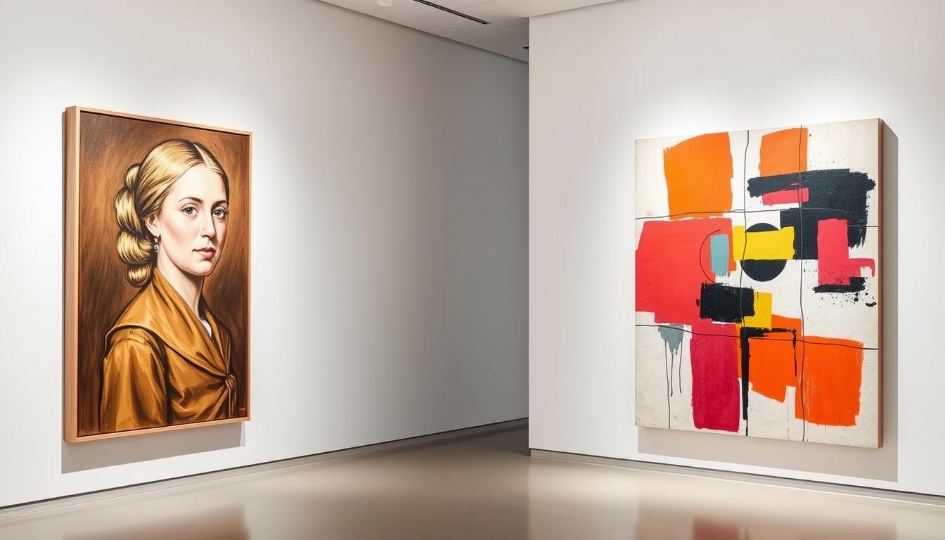
Asymmetrical balance in action: classic and modern examples
Familiar masterpieces reveal practical moves artists use to balance very different parts.
Van Gogh’s The Starry Night uses a tall, dark cypress on one side and smaller village shapes on the other. Scale and bold color shifts distribute visual weight across the whole sky.
Hokusai’s The Great Wave off Kanagawa sets a towering wave against distant Mount Fuji and open background sky. Contrast in size, colors, and sharp shapes balances drama with quiet stability.
Michelangelo’s Creation of Adam relies on strategic placement to lead the eye between God and Adam. The narrative flows across unequal halves rather than mirroring elements.
- Calder’s mobiles show balance through moving, unequal forms that settle into equilibrium.
- Velázquez places the Infanta slightly off-center, offset by figures and light in the background.
- Escher uses negative space to organize complex, non-centered architecture so the composition reads clearly.
"Observe where each artist adds stillness versus motion, letting shapes and background work together so no one side overwhelms the other."
| Work | Artist | Key move | Effect |
|---|---|---|---|
| The Starry Night | Van Gogh | Large cypress vs. small village forms | Scale and color spread visual weight |
| The Great Wave | Hokusai | Massive wave vs. tiny Mount Fuji | Contrast balances spectacle with calm |
| Creation of Adam | Michelangelo | Off-center figures with directional lines | Narrative flow without mirroring |
| Relativity / Las Meninas / Mobiles | Escher, Velázquez, Calder | Negative space, light patterns, suspended shapes | Readability, focal counterbalance, kinetic equilibrium |
Common mistakes to avoid and pro tips for artists and designers
Haphazard placement, not bold ideas, usually makes an image feel off-kilter. Unbalanced results most often come from ignoring how visual elements share weight across the frame.

Pitfalls to watch: cluttered sides that carry too much detail will swamp the composition. Don’t let arbitrary placement dictate your layout; map visual elements and their weight first.
Center-weighted bias flattens energy. Shift forms off-center and connect areas so the viewer’s attention travels naturally. Too many high-contrast accents will fragment focus and harm balance art.
Pocket pro tips
- Use grids like rule of thirds to avoid default symmetry and to iterate quickly.
- Convert your work to grayscale to check value and weight; fix heavy zones with lighter tones or more space.
- Leverage the background: soft gradients or calm shapes can stabilize a dense foreground.
- Counter a dominant object with several smaller elements or by expanding negative space.
- Make one change at a time and test by flipping the canvas to spot bias.
"Plan visual weight, then refine — asymmetry reads as balance when elements are placed with intent."
| Problem | Quick fix | Why it helps |
|---|---|---|
| Clustered detail | Spread accents or add calm zones | Balances weight and preserves viewer focus |
| Edge-hugging subjects | Move inward or add guiding lines | Reduces edge tension and restores flow |
| Random placement | Map elements by weight, then test | Makes the design deliberate and readable |
Conclusion
,Good balance grows from decisions, not luck—map weight, refine lines, then simplify.
Asymmetrical balance lets a work feel complete without mirroring. Use off-center points, negative space, and contrast to guide the eye. Practice rule-of-thirds placement, grayscale checks, and flipping the canvas to refine composition.
In both art and design, these principles help you control weight and space so each element earns its role. Symmetry still serves calm, formal layouts, while asymmetry fuels movement and variety.
Test your ideas over time. Squint, step back, and adjust colors, shapes, and background marks until the whole image reads clearly for the viewer. Master the steps and your compositions will feel dynamic, legible, and memorable.
Enhance Your Space with Unique Modern Masterpieces

Are you inspired by the innovative mediums and conceptual depth highlighted in our exploration of contemporary art? You’re not alone! Today’s art enthusiasts are seeking cultural relevance and emotional connections in their artwork. However, finding pieces that resonate with modern themes and fit your unique style can be a challenge. That’s where we come in!

At Rossetti Art, we specialize in canvas prints, original paintings, and modern sculptures that celebrate the spirit of now. Each piece created by Chiara Rossetti brings a personal touch that connects deeply with current social narratives—just like the modern masterpieces discussed in the article. Don’t miss out on the chance to elevate your home decor with breathtaking artwork that speaks to your values and aesthetic. Explore our collection today and find your perfect piece! Act now, and transform your space into a gallery of inspiration!
FAQ
What makes an asymmetrical painting different from a symmetrical one?
Asymmetrical work uses unequal visual weight across the canvas so the composition feels balanced without mirroring. Designers rely on size, color, texture, and placement to guide the eye and create movement, while symmetrical pieces align elements evenly for formal stability.
How does visual weight affect balance in a composition?
Visual weight comes from factors like scale, contrast, saturation, and detail. A small dark shape can balance a larger pale area if placed strategically. Artists combine these elements to distribute attention and avoid a lopsided look.
Which tools help achieve balance without symmetry?
Use the rule of thirds to position focal points off-center, establish a clear focal point, and mix contrast with harmony. Grids, thumbnails, and flipping the canvas help test balance before finalizing a piece.
Can contrasting colors create equilibrium?
Yes. A bold hue on one side can be offset by several muted tones, a bright accent elsewhere, or a textured area. Contrast and value differences let artists balance intensity without matching shapes.
How does negative space contribute to a balanced layout?
Empty areas carry visual weight by giving breathing room and directing attention. Thoughtful negative space can neutralize busy sections, emphasize a focal point, and make asymmetrical arrangements feel intentional.
Are there common mistakes when working with asymmetry?
Typical pitfalls include cluttering one side, placing elements arbitrarily, or unintentionally centering the composition. Skipping tests like squinting, viewing from different angles, or using grayscale can hide balance problems.
Which classic works show effective use of asymmetrical balance?
Vincent van Gogh’s The Starry Night uses scale and color to distribute weight; Hokusai’s The Great Wave off Kanagawa balances a massive wave with Mount Fuji; Michelangelo’s Creation of Adam relies on figure placement to lead the eye.
How should a beginner map visual weight before painting?
Start with a clear intent—mood or story—then sketch major forms on each side. Use value thumbnails, block in tones, and move small studies around until the layout reads balanced at a glance.
What are quick techniques to refine balance during the process?
Try the squint test to blur detail and focus on overall values, flip the canvas horizontally to spot weak areas, convert the image to grayscale to check value balance, and adjust spacing or add small supporting elements.
When should a designer choose symmetry over asymmetry?
Choose symmetry for formal, calm, or classical communications where order and stability matter. Opt for asymmetry when you want energy, movement, surprise, or a modern feel that engages the viewer more dynamically.
How can shapes and lines direct attention in off-center compositions?
Diagonal lines, leading edges, and repeated motifs guide the eye toward a focal point. Contrasting shapes—organic versus geometric—create tension that helps the viewer move through the image intentionally.
Can small elements balance a dominant focal point?
Absolutely. Multiple small details, a textured background, or a bright accent placed away from the main subject can counterbalance a large, heavy element without mirroring it.
What role does texture play in creating balance?
Texture adds perceived weight and visual interest. A rough, detailed patch can hold as much attention as a smooth, larger area. Use texture to counterbalance empty spaces or bold shapes.
Are there digital tools that help test asymmetrical balance?
Most image editors offer grids, rule-of-thirds overlays, flip canvas, and desaturate or levels adjustments for value checks. Apps like Adobe Photoshop, Procreate, and Affinity Photo all support these handy tests.
How do you maintain balance while keeping variety and movement?
Combine predictable elements with surprises: repeat a color or shape to create unity, then offset it with contrast or an unexpected placement. Rhythm and variation keep the composition lively without losing equilibrium.
Leave a comment
This site is protected by hCaptcha and the hCaptcha Privacy Policy and Terms of Service apply.