
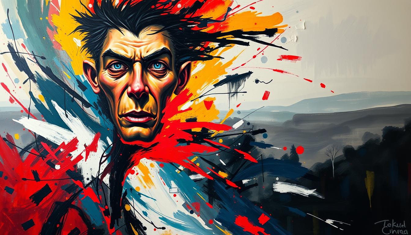
Which famous art represents depression? This guide names seven well-known works, explains what they show, and gives simple ways to read each image. You’ll learn what to look for first—posture, palette, light, and space—so you can understand mood without guessing.

We’ll look at Van Gogh’s folded figure, Picasso’s Blue Period, Munch’s shoreline isolation, Hopper’s public solitude, Kahlo’s wounded self-portrait, and more. For each artwork you’ll see what the image is doing—body language, color temperature, emptiness—and why viewers often read it as low mood.
This isn’t medical advice. It’s a visual guide: how artists communicate heaviness, distance, and quiet grief through paint.
More art stories and guides
If you like this kind of breakdown, browse our blog for artist guides, record-sale stories, and practical art buying tips.
Read the BlogKey takeaways
- Art can reflect depression through color, posture, light, and space.
- Read gesture first, then palette, then the emptiness around the figure.
- Repeated symbols (chairs, windows, closed rooms) can make loneliness legible.
- Different artists show different kinds of sadness: grief, numbness, fatigue, isolation.
- If you’re sensitive to heavy themes, choose calming art for your space instead of darker imagery.
What art can show about depression (answer fast)
Depression is a complex experience, and a painting can’t diagnose it. But art can show the feelings people associate with it: withdrawal, exhaustion, numbness, loneliness, and loss. Artists often communicate those moods through a small set of visual cues.
- Posture: bent bodies, dropped shoulders, hidden faces.
- Palette: cool blues/greens, muted tones, or drained contrast.
- Space: large emptiness around a small figure; distance between people.
- Light: dim interiors, harsh spotlighting, or flat “no warmth” light.
- Symbols: empty chairs, windows, closed doors, repeated objects of absence.
Want a calmer mood on your wall?
If this topic feels heavy, choose art that grounds the room instead—warm tones, balanced composition, and a steady focal point. Explore our modern canvas prints.
Explore Modern Canvas Prints7 famous artworks often linked to depression (quick guide)
These works are often read as showing isolation, low mood, grief, or numbness. Read each one the same way: gesture first, then palette, then the space around the figure.
- Vincent van Gogh — At Eternity’s Gate (1890): a bowed figure with face hidden; inward posture reads as burden and fatigue.
- Pablo Picasso — The Old Guitarist (1903–1904): blue palette and a frail body; color restriction makes loss feel unavoidable.
- Edvard Munch — Melancholy (1892): a figure turned away by the shore; distance and placement suggest rumination.
- Edward Hopper — Automat (1927) / New York Movie (1939): solitude in public; empty seats, reflections, and room edges amplify loneliness.
- Andrew Wyeth — Christina’s World (1948): a small figure in a wide field; scale and reach can read as longing and limitation.
- Frida Kahlo — The Wounded Deer (1946): symbolic injury with calm expression; endurance made visible.
- Edgar Degas — L’Absinthe (c.1876): people together but emotionally apart; sickly light and turned gazes suggest numbness.
Visual signs to notice (color, posture, space, symbols)
If you want a quick “reading method,” use this sequence. It’s simple and it works across styles.
- 1) Gesture: Is the body open or folded? Is the face present or hidden?
- 2) Palette: Cool, muted, drained color often reads as low energy or numbness.
- 3) Space: Big emptiness, long distance, or hard room edges can make isolation feel physical.
- 4) Light: Flat light can feel emotionless; harsh spotlighting can feel exposed.
- 5) Repetition: A repeated object (chair, window, bottle) can work like a quiet symbol.
A short visual explanation
If you prefer a visual walkthrough, here’s a quick video from our YouTube channel.
Why these images hit so hard (psychology, not fluff)
These paintings work because they don’t just show sadness—they build it into the structure of the image. The viewer feels it through balance, distance, and color temperature.
- We mirror posture: a folded body makes the viewer feel weight.
- We read color as weather: cool palettes can feel like emotional cold.
- We feel emptiness: negative space can make loneliness look measurable.
- We sense time: stillness can feel like “nothing is moving forward.”
Prefer one-of-one art with quiet presence?
Originals can feel calmer and more personal than famous “sad” images. If you want something unique for your space, explore our original paintings.
Explore Original PaintingsIf you want art that feels calming, not heavy
If you’re choosing art for your home and you want calm instead of weight, make these swaps: warm tones, softer light, simpler shapes, and a stable focal point.
- Warmer palette: soft ochres, terracotta, warm neutrals.
- Diffuse light: gentle, even light instead of harsh contrast.
- Balanced composition: fewer sharp diagonals, more stable shapes.
- Grounding focal point: one clear form that steadies the eye.
- Simple symbolism: subtle, not aggressive or graphic.
A different kind of calm: sculpture
If wall art feels too intense, sculpture can ground a room in a quieter way—presence without narrative. Explore modern sculptures.
Explore Modern SculpturesConclusion
Works like At Eternity’s Gate, The Old Guitarist, Melancholy, Hopper’s solitary scenes, Christina’s World, Kahlo’s symbolic portraits, and L’Absinthe are often read as expressing isolation or low mood. They show how posture, palette, and space can make emotion visible.
If you’re choosing art for your home, you don’t need heavy imagery to get depth. Calm, warm, well-finished work can still feel meaningful— just easier to live with every day.
FAQ
Can art represent depression?
It can reflect experiences people associate with depression—withdrawal, fatigue, loneliness—through visual cues like posture, palette, and space. It’s not a diagnosis, but it can make feeling visible.
What visual signs do artists use?
Common signs include cool or muted palettes, bent or withdrawn posture, large negative space, and repeated objects that suggest absence (empty chairs, windows, closed doors).
What kind of art feels calming instead?
Calming art often uses warm tones, diffuse light, balanced composition, and a grounding focal point. Sculpture can also bring quiet presence without an intense narrative.

Leave a comment
This site is protected by hCaptcha and the hCaptcha Privacy Policy and Terms of Service apply.