
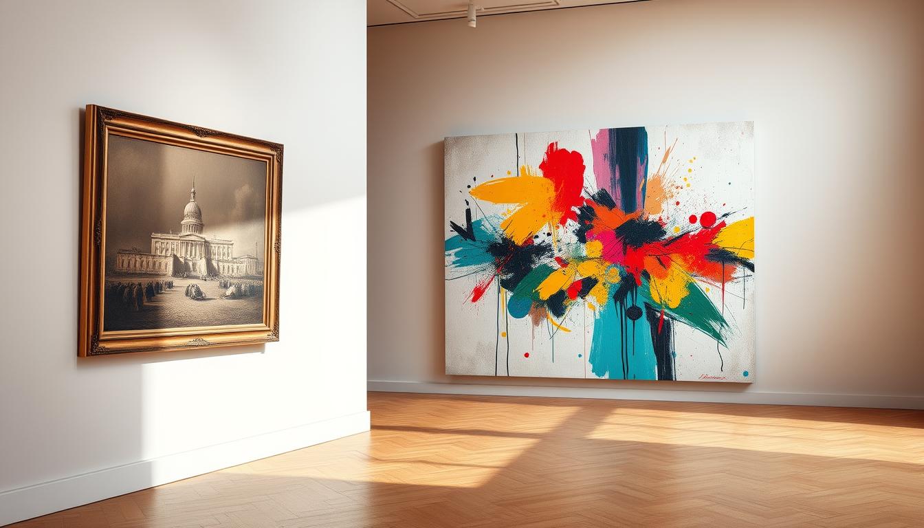
Can seven simple building blocks unlock how a painting moves you?
This guide breaks down the key elements artists use to shape feeling and meaning.
Artists mix line, shape, color, value, texture, form, and space to craft a memorable work. Each element gives a tool for mood, motion, or focus.
We link theory to real examples, from Van Gogh's swirling strokes to Caravaggio's bold light-dark drama. That makes it easier for any viewer to read a canvas and for a creator to plan a piece.

Expect a friendly, practical walk-through that helps you spot how these elements artfully join to tell a story. By the end, you will see how simple choices shape museum-quality impact.
Key Takeaways
- Seven core elements form the visual language artists use.
- Each element serves a clear role: mood, motion, or structure.
- Famous paintings offer one strong example per element to learn from.
- Knowing these tools helps viewers read and critique work with confidence.
- Practical tips will improve both studio decisions and museum visits.
What are the 7 elements of fine art? The quick answer
Seven visual tools let artists shape mood, focus, and spatial drama in any composition.
Shape, line, value, texture, form, color, and space act as the core vocabulary for any piece of art. Each item affects how you read an image.
Shape gives flat areas with height and width. Line acts like a moving point that can point, divide, or link parts of a scene.
Value sets light and dark, which builds depth and contrast. Texture suggests surface feel and can speed up or calm movement.
Form turns shapes into volume so objects feel three‑dimensional. Color mixes hue, value, and saturation to push areas forward or pull them back.
Space balances filled and empty areas to create believable distance. Together, these elements guide the viewer eye, set emphasis, and craft convincing depth in any work.
Line: how lines create direction, movement, and focus in painting
Lines act like silent guides that push focus, create rhythm, and suggest movement across a painting.
Definition and common types
Line is a point in motion. It may be directional, implied, 2D, or read as 3D along a form.
Directional edges and dotted alignments show how lines create paths for the eye. Curved lines soften motion; angular marks add tension.
Van Gogh’s Starry Night as an example
In Starry Night, visible brush strokes become luminous lines that mimic light and rhythm. Swirls and arcs make continuous movement across sky and hills.
Using weight and contrast to guide viewing
Thick strokes and high contrast pull focus; thin, low‑contrast marks let areas recede. Strategic bright lines against dark passages clarify silhouettes and lead the viewer eye.
| Line Type | Effect | Best Use |
|---|---|---|
| Directional | Guides focus along a path | Lead to focal points |
| Implied | Subtle connections, gentle flow | Unify distant elements |
| Curved lines | Suggest organic motion | Soften transitions |
| 3D/contour | Model form and depth | Turn shapes into volume |
Shape: height and width that frame stories and focal points
Blocking in bold flat shapes sets where the eye stops and where it moves next.
Shape is a pure, two-dimensional area defined by height and width. It lets you map forms and objects quickly before you add detail or texture.
Geometric shapes — circles, squares, triangles — feel ordered and stable. Organic shapes carry irregular edges and feel natural and lively. Use that contrast to set mood and structure in a work.
In Van Gogh’s Starry Night, the tall cypress silhouette directs attention upward and anchors the motion in the sky. A clear silhouette often gives a subject instant presence.
Geometric vs. organic shapes and their effects on composition
- Shape is the flat foundation that helps you block in subjects fast.
- Geometric shapes signal order; organic shapes suggest life and movement.
- Bold, readable shapes establish focal points faster than subtle color shifts.
- Grouping related shapes forms larger masses that guide viewing priority.
| Type | Visual Quality | Best Use |
|---|---|---|
| Geometric | Stable, constructed | Architectural scenes, logos, calm compositions |
| Organic | Fluid, natural | Figures, landscapes, energetic layouts |
| Silhouette-focused | High impact, clear read | Focal subjects, character design |
| Interlocking shapes | Guides movement, frames subject | Narrative scenes, layered compositions |
For practical study, try blocking a scene using only height and width to set mass and rhythm. Then refine edges so secondary shapes stay supportive. For more composition tips, see this composition guide.
Value: light and dark that build form, depth, and emphasis
Value maps the range from deepest shadow to brightest highlight so forms read clearly.
Value defines how light or dark areas shape volume and space in any art piece. It organizes light and dark into a readable pattern that makes forms turn and spaces separate.
Chiaroscuro uses sharp lightness darkness to create dramatic contrast and focus. Caravaggio’s The Denial of St. Peter shows this clearly: bright highlights pull attention to faces while deep shadow hides less important areas.
A solid value plan often carries a painting before color is added. If a grayscale read works, the final work usually follows. Use clear value groups — light, mid, dark — to simplify choices and speed composition decisions.
- Keep focal areas high contrast so viewers snap to your center of interest.
- Let background shapes trend lighter and softer for atmospheric depth.
- Use reflective light and halftones sparingly to enrich form without noise.

Texture: from smooth to rough—how surfaces affect feeling and movement
Surface marks can whisper calm or shout energy, and texture is the voice they use.
Texture describes how a surface might feel, from glassy smooth to jagged rough. It shapes mood instantly and helps viewers sense material without touching it.
Implied texture uses visual cues—repeated patterns, varied edges, and small strokes—to suggest feel. Actual texture builds physically with thick paint, scraping, or mixed media that catch light and cast tiny shadows.
Implied versus actual texture and how the eye reads brushwork
Implied texture reads as detail at a distance. Actual texture reads tactile up close. Both can work together to make subjects feel alive.
Turner’s Rain, Steam, and Speed: marks that signal motion and nature
In Turner’s 1844 painting, curved strokes suggest rainfall while vigorous scraping shows steam and speed. This example uses brushwork to make weather and forward surge legible.
- Texture guides mood: smooth areas calm; rough marks inject energy.
- Use soft versus bold textures to keep a work balanced and clear.
- Directional strokes and varied lines can echo compositional flow and hint at movement.
- Match surface cues to objects—skin, metal, foliage—to sell reality.
Form: turning shapes into 3D objects with width, height, and volume
Turning flat silhouettes into solid volumes is how paintings gain believable weight and presence.
Form extends a simple shape into three dimensions by adding height, width, and depth.
Perspective places those forms inside a scene. Vanishing points and scale shifts anchor each object so distance reads true.
Shading and small value shifts map how light crosses planes. Core shadow, reflected light, and highlights work together to model a single form.
Perspective, shading, and value shifts that create believable objects
Keep proportions steady: calibrate height and width so rotations or receding objects stay convincing.
- Overlap and occlusion tell which forms sit in front.
- Cast shadows give weight and stop objects from floating.
- Softer transitions read as curved surfaces; sharp edges hint at hard material.
"Combine structural drawing with tonal modeling for forms that feel both architecturally sound and visually lifelike."
Render your main object with the most nuanced modeling and simplify secondary forms to protect focus.
For a deeper take on how form functions in classical practice, see this short guide to form in art.
Color: hue, value, and saturation—color wheel basics artists use
Color comes from light bouncing into the eye, and artists harness that process to set mood and focus.
Isaac Newton’s color wheel bent the spectrum into a circle so you can see how hues relate. Use the wheel to predict mixes: primaries, secondaries, and tertiaries make practical studio decisions easier.
Hue, value, chroma: hue names a tint, value measures lightness, and chroma (saturation) names intensity. Value is not chroma—one can be pale yet vivid or dark yet muted.
Mixing systems and schemes
Common primary sets include RYB for painters and CMY for print and digital work. Choose a system that fits your materials and goals.
- Use saturated accents sparingly to protect harmony and draw the eye.
- Complementary pairings increase contrast and energy; analogous choices calm and unify.
- Test palette mixes on a grayscale value strip to ensure balance when lightness dominates.
Van Gogh’s yellows against deep blues show how temperature and complementary contrast can energize a composition without chaos. Let color serve the story: adjust hue, value, and saturation to guide attention and clarify form in any art work.
Space: positive, negative, depth, and how objects occupy the picture plane
A picture's breathing room can make a subject sing or disappear.
Space manages where subjects live on the picture plane and how the viewer eye moves between them. Positive areas hold shapes or forms; negative space gives those areas room to read and breathe.
Negative space and the role of scale, overlap, and atmospheric perspective
Negative space is not empty. Its contours shape silhouettes and clarify relationships between objects. Scale shifts and simple overlap instantly order front and back.
Atmospheric perspective adds subtle depth: distant forms soften, lose contrast, and desaturate so near elements stay dominant.
Guiding the viewer through depth: foreshortening, clarity, and saturation shifts
Foreshortening compresses limbs or objects toward the viewer, creating projection into the scene. Use sharper edges and richer color up front, then ease clarity and chroma with distance.
Tip: Arrange gaps and alignments to make a clear visual path. Small, intentional openings guide the eye without extra detail.

- Balance positive and negative space so shapes don't tangle.
- Keep background simpler so midground and foreground carry the story.
- Calibrate proportions to maintain a readable hierarchy across the work.
Elements vs. Principles of Art: how balance, emphasis, rhythm, and unity build on the seven elements
Think of elements as building blocks and principles as the plan that arranges those blocks into a clear image. Elements supply marks, color, and space. Principles art then shape those parts so a composition reads easily.
Balance distributes weight across a work. It can be symmetrical, asymmetrical, or radial. Each type changes how stable or dynamic a piece feels to a viewer.
Balance types: symmetrical, asymmetrical, radial
Symmetrical balance mirrors objects or color around a centerline for calm, formal feel.
Asymmetrical balance uses different visual weights—size, color, texture—to reach equilibrium without copying sides.
Radial balance arranges elements around a point so focus spins outward or pulls inward.
Emphasis, movement, pattern, rhythm, proportion, variety, unity—how they use the elements
Emphasis isolates a focal area through contrast in value, hue, or scale so the viewer knows where to look first.
Movement creates a planned path using lines, repeated shapes, or directional edges to carry the eye.
Pattern and repetition energize surfaces; rhythm spaces repeats for a pleasing visual tempo.
Proportion sets relative size so scenes read believable or intentionally dramatic. Variety keeps interest; unity ties parts together with consistent color families or repeated motifs.
| Principle | What it controls | How it uses elements | Studio tip |
|---|---|---|---|
| Balance | Visual weight | Size, color, texture, space | Block values first to test balance |
| Emphasis | Focal priority | Contrast in value, hue, or placement | Use a single high-contrast accent |
| Rhythm & Pattern | Tempo and surface energy | Repeated lines, shapes, or color | Vary spacing for lively rhythm |
| Unity & Variety | Coherence and interest | Recurring motifs plus varied details | Anchor with three repeating elements |
"Elements give you the pieces; principles let you compose a work that speaks clearly."
Famous examples: how artists combine the seven elements in nature and work
A quick look at famous works shows how artists layer visual tools to translate nature into vivid scenes.
Study these masterworks to see clear, usable pairings of shapes, lines, color, value, texture, form, and space.
From Starry Night to Sunflowers: practical, modern takeaways for artists
Van Gogh’s Starry Night mixes swirling lines, bold value shifts, lively texture, and strong color to suggest motion across large shapes.
Caravaggio uses chiaroscuro value contrast to spotlight figures and control the viewer’s focus.
Turner turns texture into atmosphere; his marks make weather feel urgent and physical.
- Caillebotte: use perspective lines and careful shading to model convincing form.
- Van Gogh’s Sunflowers: similar hues build unity without heavy contrast.
- Sloan: overlap, scale shifts, and foreshortening create seamless space.
| Painting | Key elements used | Practical takeaway |
|---|---|---|
| Starry Night | Lines, value, texture, color | Use directional marks plus contrast to animate large shapes |
| The Denial of St. Peter | Value, form | Place light to steer attention and heighten drama |
| Rain, Steam, and Speed | Texture, lines | Let brushwork suggest motion and weather |
| Parquet Scene | Form, space, lines | Use perspective and shading to ground figures |
| South Beach Bathers | Space, scale, clarity | Shift saturation and overlap to imply depth |
"Borrow a method that fits your goal: texture for motion, value for focus, or color for energy."
Conclusion
A careful mix of marks, color, and space turns a sketch into a scene that feels alive.
, Use the seven core components—shape, line, value, texture, form, color, and space—as your checklist. Plan clear shapes and lines early, verify values in gray, then add color and texture with intent. Keep contrast and hierarchy focused so the viewer eye lands where you want it.
Practice studies that target one element at a time. Ask simple questions: are shapes readable? do lines create flow? is depth believable? Small, repeated experiments using limited palettes and controlled texture speed skill learning. With steady practice you will make paintings that guide attention, hold depth, and feel complete.
Enhance Your Space with Unique Modern Masterpieces

Are you inspired by the innovative mediums and conceptual depth highlighted in our exploration of contemporary art? You’re not alone! Today’s art enthusiasts are seeking cultural relevance and emotional connections in their artwork. However, finding pieces that resonate with modern themes and fit your unique style can be a challenge. That’s where we come in!

At Rossetti Art, we specialize in canvas prints, original paintings, and modern sculptures that celebrate the spirit of now. Each piece created by Chiara Rossetti brings a personal touch that connects deeply with current social narratives—just like the modern masterpieces discussed in the article. Don’t miss out on the chance to elevate your home decor with breathtaking artwork that speaks to your values and aesthetic. Explore our collection today and find your perfect piece! Act now, and transform your space into a gallery of inspiration!
FAQ
What are the seven elements artists use to build a composition?
Shape, line, value, texture, form, color, and space serve as the core visual tools artists use to guide the viewer, create depth, and shape focal points in a work.
How does line direct movement and focus in a painting?
Lines—whether directional, implied, curved, thin, or bold—lead the eye, suggest motion, and establish rhythm. Artists vary line weight and contrast to prioritize elements and create visual pathways.
What’s the difference between geometric and organic shapes?
Geometric shapes use clear edges and predictable proportions, lending structure and stability. Organic shapes feel natural and irregular, adding softness, life, or expressive storytelling to a composition.
How do value and contrast create depth?
Value refers to lightness and darkness. Strong chiaroscuro and well-planned value shifts model form, push planes back or forward, and increase drama and emphasis in an image.
What role does texture play in visual storytelling?
Texture—actual or implied—signals material, temperature, and motion. Brushwork, surface treatment, and pattern tell the eye how to feel an object and can suggest movement or stillness.
How does form differ from shape?
Shape defines flat height and width. Form adds depth and volume with perspective, shading, and value transitions, turning a silhouette into a believable three-dimensional object.
Why is color theory important for artists?
Color choices—hue, value, and saturation—affect mood, hierarchy, and spatial relationships. Understanding primary, secondary, and tertiary mixes, plus complementary and analogous schemes, helps artists control harmony and contrast.
What is negative space and why does it matter?
Negative space is the area around and between subjects. It balances composition, defines shapes, and can create surprising focal points when used deliberately.
How do artists create the illusion of depth in a flat picture plane?
Depth comes from scale, overlap, atmospheric perspective, clarity shifts, and value or saturation changes. Foreshortening and diminishing detail also reinforce spatial relationships.
How do the elements relate to the principles of design?
Elements are the building blocks; principles—like balance, emphasis, rhythm, pattern, proportion, variety, and unity—organize those blocks to form effective compositions.
Can you give examples of artists who combined these elements effectively?
Vincent van Gogh and J.M.W. Turner are strong examples: Van Gogh used bold color contrasts and expressive line, while Turner relied on texture and atmospheric value to convey motion and light.
How can a beginner practice using these visual tools?
Start small: study simple still lifes to explore value and form, experiment with limited palettes to learn color relationships, and sketch gesture lines to understand movement and composition.
Leave a comment
This site is protected by hCaptcha and the hCaptcha Privacy Policy and Terms of Service apply.