
Your living room walls hold more potential than you might imagine. The right wall art ideas for living room spaces can shift an entire atmosphere, turning blank surfaces into conversation starters and reflecting your unique personality.
Whether you're drawn to bold abstract paintings or serene botanical prints, the art you choose becomes the heartbeat of your home. This guide walks you through practical styling strategies that work in real living rooms, not just design magazines.
From understanding scale and proportion to mastering color coordination, you'll discover how to curate wall decor that feels intentional and authentic. Let's explore the transformative power of thoughtfully chosen artwork.
Choosing the Right Wall Art Style for Your Living Room
The best wall art for living room spaces starts with understanding your existing design aesthetic. Your furniture, color palette, and overall room style should guide your artwork choices rather than fight against them.
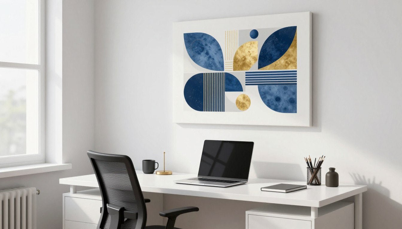
Modern living rooms with clean lines and neutral tones pair beautifully with abstract canvas prints or minimalist line art. These pieces add visual interest without overwhelming the space, creating a sophisticated focal point that complements contemporary design.

Traditional spaces benefit from classic portrait canvas prints or landscape paintings. These timeless pieces honor the room's heritage while adding depth and character to your walls.
Matching Art to Your Room's Personality
Think about how your living room functions in daily life. Family-focused spaces often shine with warm, inviting pieces like botanical wall art prints that bring nature indoors.

Entertainment-oriented living rooms make bold statements with eye-catching pop art canvas prints or dramatic cityscape pieces. These conversation starters energize the space and reflect a dynamic lifestyle.
Contemporary Spaces
Modern rooms thrive with geometric patterns and abstract forms that echo architectural elements.
- Abstract geometric prints in monochrome palettes
- Line art that emphasizes negative space
- Large-scale pieces with minimal color variations
- Metal wall sculptures for dimensional interest
Traditional Interiors
Classic rooms welcome art with historical references and refined compositions.
- Portrait paintings in ornate frames
- Landscape scenes with rich color depth
- Still life compositions with careful detail
- Vintage-inspired prints and reproductions
Eclectic Designs
Mixed-style spaces allow for creative combinations and unexpected pairings.
- Layered gallery walls with varied frame styles
- Mixing photography with painted pieces
- Combining different art movements in one space
- Vintage finds paired with contemporary prints
Minimalist Rooms
Pared-down spaces benefit from carefully selected singular statements.
- One large-scale piece as the sole focus
- Black and white photography for clarity
- Simple line drawings with emotional impact
- Monochromatic paintings in subtle tones
Understanding Art Movements and Their Impact
Different art styles create distinct emotional responses in your living room. Abstract pieces invite interpretation and personal connection, allowing each viewer to find their own meaning in the forms and colors.

Figurative art brings recognizable subjects into your space, creating immediate connections. Portrait and animal prints add personality and warmth, especially in rooms that might otherwise feel too sterile.
The style you choose shapes how visitors experience your living room wall. Bold, colorful pieces energize conversations, while softer, nature-inspired works create calm, contemplative atmospheres.

Gallery Wall Arrangements That Create Visual Impact
A well-planned gallery wall transforms your living room wall into a curated exhibition. This approach works particularly well when you want to display multiple pieces that tell a cohesive story.
Start by selecting a theme or color palette that unifies your collection. Canvas print sets designed to work together take the guesswork out of coordination while maintaining visual harmony.

Layout Techniques for Gallery Walls
The grid method offers clean, organized presentation perfect for modern spaces. Arrange your pieces in evenly spaced rows and columns, maintaining consistent gaps between frames for a gallery-quality look.
Salon-style arrangements embrace asymmetry and creative placement. This traditional approach layers different sizes and shapes organically, creating a collected-over-time aesthetic that adds character to any room.
Planning Your Gallery Layout
Before hammering a single nail, lay your pieces on the floor to test arrangements. This simple step prevents wall damage and helps you visualize the final composition.
Take photos of different layouts from various angles. What looks balanced from directly in front might feel lopsided from your seating area.
Consider the anchor piece first. This largest or most eye-catching work should sit at eye level (typically 57-60 inches from the floor), with other pieces arranged around it.

Frame Coordination Strategies
Matching frames create cohesion in diverse art collections. Using identical pine wood frames or oak floater frames throughout your gallery wall unifies different artwork styles and subjects.

Mixed frame styles work when you maintain another unifying element. Keep the color palette consistent across artworks, or stick to all black and white pieces while varying the frame materials and finishes.
Spacing and Balance Principles
Maintain 2-3 inches between frames for visual breathing room. Too much space makes the arrangement feel disconnected, while too little creates visual clutter.
Balance doesn't mean symmetry. A large piece on one side can be balanced by several smaller works on the other, creating dynamic tension that keeps the eye moving.

The overall shape of your gallery wall matters too. Rectangular arrangements suit walls above sofas, while organic shapes work well in awkward spaces or around architectural features like windows.
[YOUTUBE VIDEO — https://youtu.be/EtnpEMViJdo?t=1]Large Statement Pieces as Living Room Focal Points
A single oversized artwork commands attention and anchors your entire living room design. This bold approach simplifies decorating decisions while making maximum visual impact.
Large-scale pieces work especially well in rooms with high ceilings or expansive wall space. They fill the vertical area without requiring multiple smaller pieces or complex arrangements.

Choosing the Right Size
Measure your wall space before falling in love with a piece. The artwork should span roughly two-thirds to three-quarters of your furniture's width for proper proportion.
For a standard 8-foot sofa, look for pieces between 48-72 inches wide. This creates visual connection between furniture and wall art without overwhelming the space.
Pro Designer Tip: Stand back and assess from your primary seating area. The piece should feel substantial without dominating the entire room. If you can barely see your furniture, the art might be too large for the space.
Subject Matter for Statement Pieces
Abstract compositions offer versatility as focal point art. Their non-representational nature allows them to complement various decor styles while adding sophisticated color and texture to your living room wall.

Landscape and nature scenes bring the outdoors in, creating a window effect on your wall. Oversized botanical prints or scenic vistas add depth and tranquility to urban living spaces.
Consider abstract geometric canvas prints for modern interiors where clean lines and sophisticated color relationships matter more than recognizable subjects.
Placement and Height Guidelines
The center of your artwork should sit at eye level when you're standing. This typically means the center point falls between 57-60 inches from the floor.
For pieces above furniture, leave 6-12 inches of space between the furniture top and the bottom edge of your frame. This creates visual connection while preventing the cramped look of art sitting directly on furniture.

Creating Drama with Oversized Art
Lighting transforms good art into spectacular art. Install picture lights or track lighting to highlight your statement piece, especially in rooms with limited natural light.
Let the artwork breathe. Resist the urge to crowd the wall with additional decor items. A powerful piece needs space around it to make its full impact.

The frame matters tremendously with large pieces. Oak floater frames add a gallery-quality finish that elevates even affordable prints to museum-worthy status. The floating effect creates subtle shadows that enhance the artwork's dimensionality.
Color Coordination Techniques for Wall Art
Color creates emotional resonance in your living room. The hues you choose for wall art either harmonize with your existing palette or provide intentional contrast that energizes the space.
Pull colors from your largest furniture pieces or area rug. Repeating these tones in your artwork creates cohesion that ties the entire room together visually.

Working with Neutral Palettes
Neutral living rooms offer maximum flexibility for wall art choices. These spaces benefit from pieces that introduce subtle color variations within the same tonal family.
Black and white canvas prints add graphic impact to neutral rooms without introducing competing colors. The strong contrast creates visual interest while maintaining the serene atmosphere.

Warm neutrals like taupe, cream, and soft brown pair beautifully with botanical prints in muted greens. This combination brings organic warmth without overwhelming subtle color schemes.
Adding Color to Monochrome Spaces
Use artwork as your primary color injection in predominantly white or gray rooms. A single vibrant piece becomes the room's focal point and color anchor.
The 60-30-10 rule applies to art color choices too. Your dominant room color should appear in 60% of the artwork, secondary colors in 30%, and accent colors in just 10%.
Complementary Color Strategies
Opposite colors on the color wheel create vibrant tension. Blue and orange, purple and yellow, or red and green combinations energize living spaces.

Analogous Color Harmony
Adjacent colors on the wheel create soothing, harmonious combinations. Blues flowing into greens, or oranges transitioning through yellows feel naturally cohesive.

Seasonal Color Adjustments
Rotating art pieces with the seasons keeps your living room wall feeling fresh. Warm oranges and reds for fall, cool blues for summer, vibrant greens for spring.
If you love this approach but want permanence, choose artwork with versatile color palettes that work year-round. Multi-colored abstract pieces adapt to seasonal accent changes through pillows and throws.

Testing Colors Before Committing
Many artists and retailers offer color samples or digital previews. Request these tools to see how artwork colors appear in your actual lighting conditions.
Your room's natural light changes throughout the day. Morning light shows cooler tones more accurately, while afternoon light warms everything. Test color samples at different times before making final decisions.
📐 Not sure what size to choose? Use our free Wall Art Size Calculator → https://rossettiart.com/blogs/news/wall-art-size-calculatorMixing Textures and Materials in Wall Decor
Texture adds dimension that flat walls desperately need. Combining different materials creates tactile interest that engages multiple senses beyond just visual appeal.
Hand-stretched canvas brings inherent texture through the woven fabric surface. The slight irregularities and dimensional quality of canvas create depth that paper prints simply cannot match.

Layering Different Art Forms
Mix framed canvas prints with three-dimensional wall sculptures. Metal wall art adds reflective surfaces and contemporary edge, contrasting beautifully with soft, matte canvas textures.
Incorporate woven pieces like tapestries or macramé alongside traditional paintings. These fiber arts introduce organic texture that softens modern spaces and adds bohemian warmth.

Working with Frame Textures
Wood frames add warmth and natural texture. Pine wood frames offer light, subtle grain patterns that complement rather than compete with artwork, while darker stained woods create dramatic contrast.
Floater frames create the illusion that art hovers away from the wall. This gap produces subtle shadow play that changes with room lighting, adding another layer of visual interest.

Combining Matte and Glossy Finishes
Matte canvas prints absorb light for a sophisticated, gallery-quality appearance. These finishes prevent glare and look professional in any lighting condition.
Add mirrors strategically near matte artwork to introduce reflective surfaces without competing with the art itself. The mirror multiplies light and adds spatial depth while the matte art remains the focal point.

Texture Balance Tips
Avoid overwhelming your space with too many competing textures. Choose 3-4 distinct materials maximum for cohesive design.
Balance rough with smooth. If your art has heavy texture, keep surrounding decor items sleek and simple.
Consider wall texture itself. Smooth painted walls showcase textured art beautifully, while textured walls need simpler, flatter pieces.
Natural Material Integration
Bring organic elements into your wall decor through materials rather than just imagery. Wooden shelves displaying small plants can float near botanical canvas prints, reinforcing the nature theme through texture.
Rattan or wicker pieces add warmth and casual texture. These natural materials complement botanical wall art perfectly, creating cohesive nature-inspired vignettes.

Quality Matters in Canvas Texture
Premium materials show their value in texture and longevity. Gallery-quality prints use superior canvas that resists sagging and maintains crisp detail over time.
UV-resistant and archival inks preserve color vibrancy for decades. These quality features mean your textural investment continues looking fresh rather than fading into the background.
Sizing and Placement Guidelines for Maximum Impact
Getting proportions right separates amateur decorating from professional-looking results. The relationship between wall space, furniture, and artwork determines whether your room feels balanced or awkward.
Start by measuring your available wall space, including the width of furniture below. These numbers guide every subsequent decision about artwork size and placement.

The Two-Thirds Rule
Your artwork should cover approximately two-thirds of the furniture width below it. For a 90-inch sofa, aim for pieces or arrangements spanning 60 inches wide.
This proportion creates visual anchoring. Art that's too small looks like an afterthought floating on your wall, while oversized pieces overwhelm the furniture below.
Quick Calculation: Measure your sofa width in inches, multiply by 0.66, and you have your target artwork width. Round up or down to standard frame sizes for practical shopping.
Height Placement Standards
The magic number for art center height is 57-60 inches from the floor. This measurement represents average eye level and works in most residential spaces.
For rooms with high ceilings or above furniture, adjust upward slightly. The piece should relate to both the furniture and the wall space proportionally, not rigidly follow a single rule.

Arrangements for Different Wall Sizes
Narrow walls between windows or doors call for vertical pieces. Portrait-oriented art draws the eye upward and makes the most of limited horizontal space.
Expansive blank walls offer flexibility. Go large with a single statement piece, or create an extended gallery wall that spans the entire space for collected, layered looks.
Small Wall Solutions
- Single medium-sized piece as the sole focus
- Vertical diptych or triptych arrangements
- Small gallery wall with 3-4 coordinated pieces
- One bold, colorful piece that punches above its size

Large Wall Strategies
- Oversized single artwork (60+ inches wide)
- Expansive gallery wall covering most of the wall
- Triptych of large panels for continuous impact
- Art with furniture vignette creating layers

Multiple Piece Spacing
When hanging multiple pieces horizontally, maintain 2-4 inches between frames. Closer spacing creates a unified composition, while wider gaps emphasize each piece individually.
For diptychs and triptychs meant to be viewed as one image, keep spacing minimal—just 1-2 inches. This maintains visual continuity across panels.

Furniture Relationship Guidelines
Art and furniture should share a visual relationship. If your sofa sits at 36 inches high, leave 6-12 inches between its back and your artwork's bottom edge.
This gap prevents the cramped look of art sitting directly on furniture while maintaining clear visual connection. The space lets both elements breathe without floating away from each other.
Room-Specific Considerations
Open-concept living rooms need carefully scaled art that relates to multiple sightlines. Consider how pieces look from dining areas or kitchens, not just the main seating zone.
Small living rooms benefit from one impactful piece rather than many small ones. A single well-chosen work creates focus without cluttering limited wall space.

Budget-Friendly Wall Art Styling Ideas
Transforming your living room wall doesn't require unlimited funds. Strategic choices and creative approaches deliver high-impact results without high-end price tags.
Made to order prints offer gallery-quality results at accessible prices. This approach eliminates the markup of pre-framed pieces while ensuring you get exactly the size and style you need.

Mixing High and Low
Invest in one statement piece of quality art as your focal point. Surround it with more affordable prints or personal photographs that complement but don't compete.
This strategy puts your money where it shows most—in that central piece that anchors the entire room. Supporting items can be budget-friendly because they play secondary roles.
Investment Piece Selection
Choose your splurge piece carefully. It should feature colors, style, and subject matter that you'll love for years, not just what's trending now.
Original artwork or limited-edition prints hold value better than mass-produced items. Even if budget-constrained now, one quality piece beats five mediocre ones.
Look for artists offering affordable options in their collections. Many established creators provide prints at accessible price points alongside their original works.

DIY Framing Solutions
Canvas prints often don't require framing at all. Gallery-wrapped edges look finished and professional as-is, saving hundreds on custom framing costs.
If you prefer frames, simple styles cost far less than ornate ones. Clean black or natural wood frames look timeless and focus attention on the artwork rather than the frame.

Strategic Collection Building
Build your wall art collection gradually rather than rushing to fill every space immediately. Purchase one piece at a time, living with it before adding the next.
This measured approach lets you discover what truly works in your space. You'll make better choices than if you bought everything in one rushed shopping trip.
Consider canvas print sets designed to work together. These pre-coordinated collections eliminate guesswork about what pieces complement each other.
Rotating Displays for Fresh Looks
Own fewer pieces but rotate them seasonally. This keeps your living room wall feeling updated without constant purchasing.
Store off-season pieces carefully—wrap in acid-free paper and keep in climate-controlled spaces. This protects your investment while pieces wait for their turn on display.

Maximizing Impact on Minimum Budget
Color creates the biggest visual impact per dollar spent. Choose vibrant, saturated hues that energize your space rather than pale prints that disappear on walls.
Scale matters more than quantity. One large, bold piece reads as intentional design, while multiple small items can look cluttered and indecisive regardless of total cost.
Budget Priority List: Spend on canvas quality and printing first, framing second, and quantity last. Better to have fewer excellent pieces than many mediocre ones. UV-resistant inks and proper printing ensure your investment lasts decades.
Seasonal and Rotating Wall Art Displays
Your living room wall can evolve with the seasons, reflecting changes in light, mood, and the natural world outside your window. This dynamic approach keeps your space feeling current and intentional.
Seasonal rotation doesn't require a massive collection. Just 8-10 pieces that you swap throughout the year can create four distinctly different looks.

Spring and Summer Displays
Warmer months call for lighter, brighter artwork. Botanical prints in fresh greens, coastal scenes in blues and whites, or abstract pieces with sunny yellows lift spirits during these energetic seasons.
Summer art can embrace bolder colors as natural light floods your living room. Pieces that might feel too vibrant in winter's dim light shine beautifully under June sunshine.

Fall and Winter Transitions
As days shorten, transition to deeper, richer colors. Warm oranges, burgundies, and forest greens echo autumn's palette while creating cozy atmosphere.
Winter calls for drama and depth. Abstract paintings in moody colors, black and white photography, or landscape scenes in muted tones complement the introspective season.


Holiday-Specific Displays
Consider subtle nods to holidays without obvious themed decor. Abstract art in red and green for December feels festive without screaming 'Christmas,' allowing it to work throughout winter.
Personal photographs of celebrations or meaningful moments make wonderful seasonal displays. Family gatherings, vacation snapshots, or milestone events bring warmth to any time of year.
Storage Solutions for Off-Season Art
Protect stored pieces from humidity, temperature extremes, and direct light. A closet or under-bed storage with consistent conditions preserves artwork between rotations.
Wrap canvas prints in acid-free tissue paper before storing. Never use plastic bags, which can trap moisture and damage both canvas and prints over time.

Creating a Rotation Schedule
Mark your calendar for seasonal swaps—spring equinox, summer solstice, fall equinox, and winter solstice make natural transition points.
These changes take just an hour or two but completely refresh your living room's look. The effort pays off in keeping your space feeling intentional and current.
Rotation Tip: Photograph your wall each season before changing it. This creates a visual reference for reinstalling pieces next year and helps you remember what arrangements worked best.
Balancing Permanence and Change
Not every piece needs to rotate. Keep 1-2 permanent artworks that you love year-round, then swap surrounding pieces for seasonal variety.
This anchored approach prevents the space from feeling too different with each change. Your favorite pieces remain constant while supporting elements introduce freshness.

Frequently Asked Questions
Q: What type of wall art is best for living rooms?
A: The best wall art depends on your living room's style and your personal preferences. Abstract canvas prints work beautifully in modern spaces, while botanical prints add organic warmth to traditional or transitional rooms. Large statement pieces create bold focal points, whereas gallery walls offer curated, collected looks. Consider your existing color palette, furniture style, and the mood you want to create. Abstract geometric canvas prints offer versatility that adapts to various design aesthetics.
Q: How do I choose the right size art for above my sofa?
A: Your artwork should span approximately two-thirds to three-quarters of your sofa's width for proper proportion. For a standard 90-inch sofa, look for pieces between 60-68 inches wide. Leave 6-12 inches of space between the sofa back and the artwork's bottom edge. If using multiple pieces, their combined width should follow this same guideline. The artwork's center should sit at eye level (57-60 inches from the floor) or adjust slightly higher if the sofa is tall-backed.
Q: Should living room wall art match furniture or provide contrast?
A: Both approaches work depending on your design goals. Matching creates harmonious, cohesive spaces—pull colors from your furniture or rug into your artwork for unified looks. Contrast adds energy and creates focal points—a bold piece against neutral furniture commands attention and becomes the room's star. Many successful living rooms use both strategies: matching for secondary pieces and contrast for the main focal point. The key is intentionality rather than strict rules.
Q: How many pieces of wall art should I have in my living room?
A: There's no magic number—it depends on your wall space and style preferences. Minimalist rooms shine with one large statement piece, while eclectic spaces might feature gallery walls with 7-12 pieces. A good starting point is one focal point piece plus 2-4 supporting items. Avoid overcrowding; your walls need breathing room. If you can't step back and clearly identify the focal point, you likely have too many competing pieces. Quality and intentional placement matter more than quantity.
Q: What are the best colors for living room wall art?
A: The best colors depend on your existing palette and desired atmosphere. Neutral living rooms benefit from artwork that introduces subtle color—soft blues, warm earth tones, or muted greens add interest without overwhelming. Bold, colorful rooms can handle equally vibrant art or benefit from neutral black and white pieces for visual rest. Use the 60-30-10 color rule: your dominant room color should appear in 60% of the artwork, secondary colors in 30%, and accent colors in 10%. This creates harmony while allowing for personality.
Q: Can I mix different art styles in one living room?
A: Absolutely, mixing styles creates collected, personalized spaces full of character. The key is finding a unifying element—consistent color palette, matching frames, or similar scale. You might combine abstract paintings with botanical prints if they share a color story, or mix photography with illustrations in identical frames. Avoid too many competing focal points; even eclectic rooms need one dominant piece that anchors the arrangement. Start with your favorite piece, then add complementary items that support rather than fight for attention.
Q: How do I light wall art in my living room?
A: Proper lighting transforms good art into spectacular displays. Install adjustable picture lights directly above artwork for focused illumination, or use track lighting that can be aimed at multiple pieces. For subtle ambiance, try LED strip lights behind frames to create a glowing halo effect. Avoid direct sunlight, which fades colors over time, even with UV-resistant prints. In naturally dim rooms, lighting becomes essential—the investment in proper fixtures pays off in how dramatically your art presents. Warm white bulbs (2700-3000K) work best for most artwork.
Bringing Your Living Room Walls to Life
Your living room walls tell your story through the art you choose to display. Every piece reflects your taste, experiences, and the atmosphere you want to create in the space where you spend your most meaningful time.
From understanding proper proportions to coordinating colors and mixing textures, these guidelines give you the foundation to curate walls that feel intentional and authentic. Remember that rules exist to guide, not restrict—trust your instincts about what resonates with you.

Start with one piece that speaks to you, then build your collection thoughtfully over time. The walls that evolve gradually often feel more authentic than those decorated in a single weekend.
Whether you're drawn to bold abstracts, serene botanicals, or dramatic black and white compositions, the perfect art for your living room walls is waiting. The transformation begins with that first intentional choice.
Explore our Abstract Canvas Prints or browse our Botanical Wall Art to discover gallery-quality pieces designed to bring your living room vision to life.

Leave a comment
This site is protected by hCaptcha and the hCaptcha Privacy Policy and Terms of Service apply.