There's something quietly powerful about a wall that doesn't try too hard. Wabi sabi wall art decor brings this philosophy into your home through pieces that celebrate natural imperfection rather than hide it. These aren't the paintings that demand attention with bold statements or perfect symmetry.
They whisper instead of shout. They honor the beauty of weathered textures, organic forms, and the gentle passage of time.

Understanding the Wabi Sabi Aesthetic in Wall Art
Wabi sabi art embraces the Japanese philosophy that finds beauty in imperfection, impermanence, and incompleteness. This ancient concept translates into wall decor through abstract paintings, organic forms, and pieces that celebrate natural materials rather than conceal them.
The aesthetic rejects perfection as artificial. Instead, it honors the authenticity found in weathered surfaces, subtle asymmetry, and the marks left by human hands or natural processes.

When you look at wabi sabi wall art decor, you'll notice certain recurring elements. Muted color palettes dominate—think warm beiges, soft grays, gentle taupes, and earthy browns. These tones mirror nature itself, creating spaces that feel grounded and calm.
Core Principles of Wabi Sabi Art
Understanding these principles helps you recognize authentic wabi sabi pieces and avoid mass-produced imitations that merely mimic the aesthetic without embodying its spirit.
- Acceptance of natural imperfection and irregularity
- Appreciation for materials showing age and weathering
- Preference for simplicity over ornate decoration
- Connection to natural forms and organic shapes
- Celebration of handmade quality and visible craftsmanship

The beauty of this philosophy lies in its quiet confidence. A wabi sabi painting doesn't compete with your furniture or demand to be the focal point. It simply exists in harmony with your space, inviting contemplation rather than commanding attention.

Many people discover that once they introduce one piece of wabi sabi art into their home, they begin noticing beauty in imperfection everywhere. A crack in a ceramic vase becomes interesting rather than flawed. A worn wooden table tells a story instead of needing replacement.
Choosing Wabi Sabi Art for Different Spaces
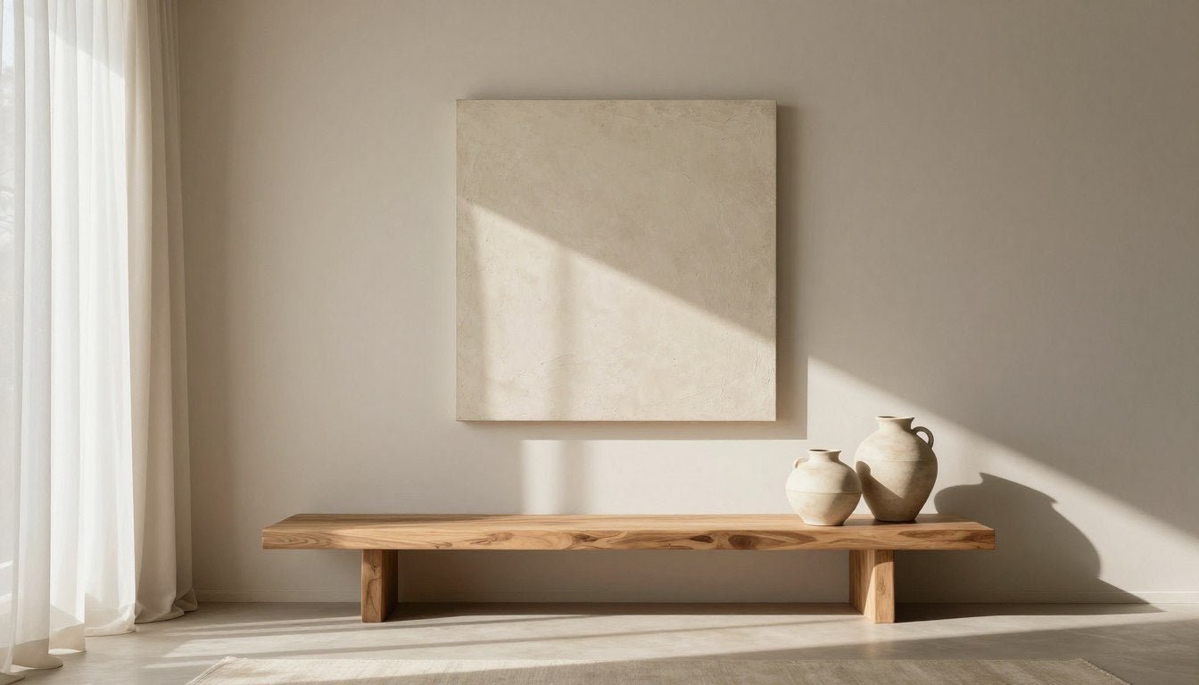
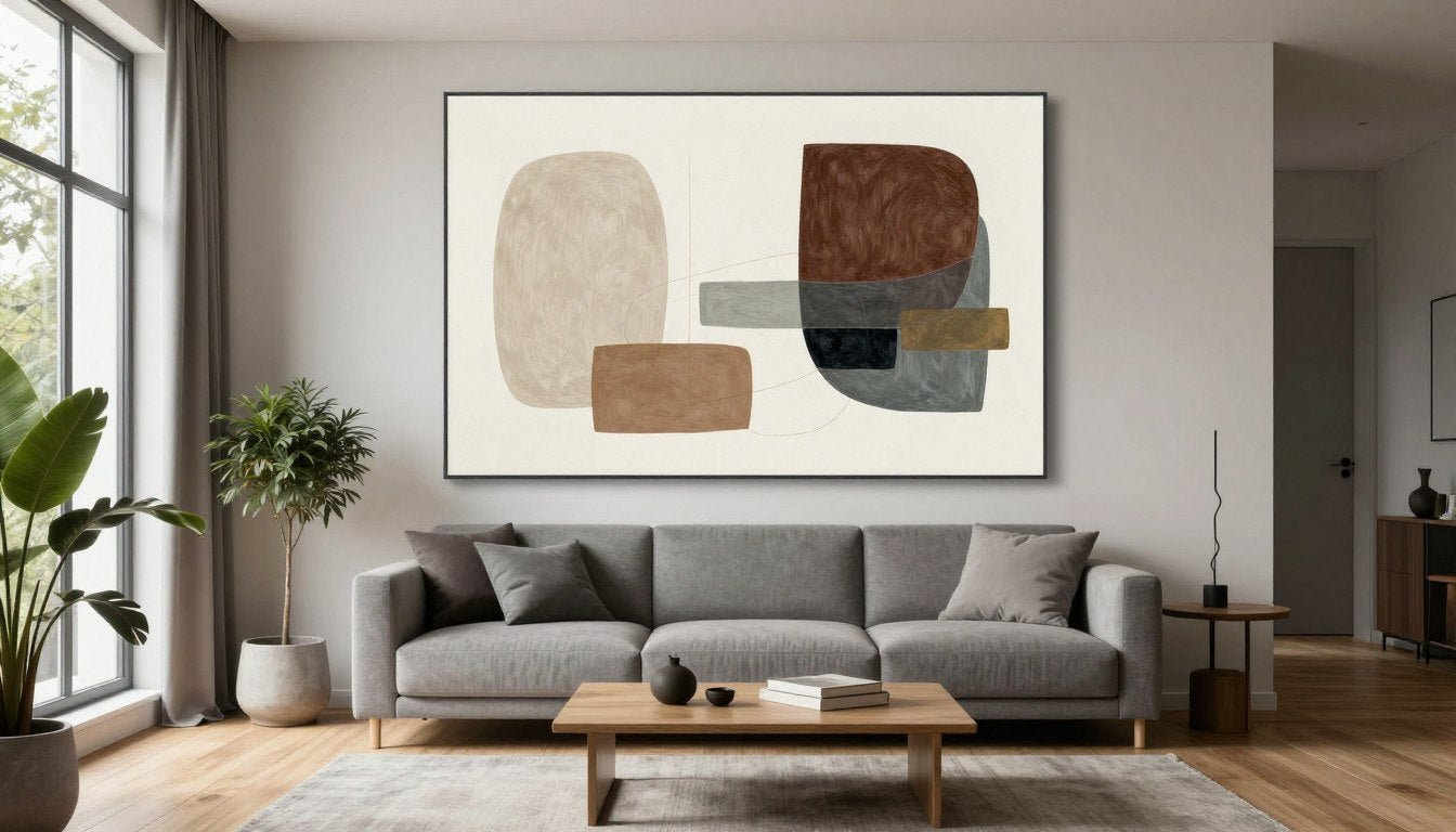
Your living room benefits from larger wabi sabi pieces that establish a calm foundation for the entire space. Abstract canvas prints with organic shapes and neutral tones work beautifully above sofas or console tables.

The scale matters here. A piece that's too small gets lost on a large wall, while properly sized art anchors your seating area and creates visual balance. Consider works that span 40 to 60 inches in width for standard living room walls.
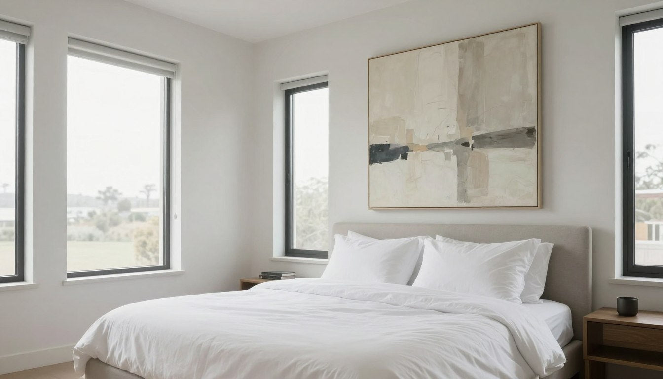
Bedroom wall art in the wabi sabi style should promote tranquility above all else. Choose pieces with softer edges and lighter tones that won't overstimulate as you wind down for sleep or wake in the morning.

Think about the mood you want to create. Bedroom canvas prints with gentle watercolor effects or subtle gradients in sand and stone tones work exceptionally well. These pieces feel like visual deep breaths.

Home Office
Select pieces that maintain focus without distraction. Vertical compositions in muted tones support concentration while adding warmth to work areas.

Dining Room
Larger horizontal pieces complement the gathering nature of dining spaces. Choose work with enough visual interest to inspire conversation but not overwhelm meals.

Entryway
Make first impressions count with a statement piece that sets the tone for your entire home. Vertical or square formats work well in these typically narrow spaces.
Hallways and transitional spaces often get overlooked, but they're perfect for wabi sabi wall decor. A series of smaller pieces in cohesive tones creates a gallery effect without feeling cluttered or overwhelming.

Color Palettes and Textures That Define Wabi Sabi
The colors in authentic wabi sabi art pull directly from nature's palette. You'll find the soft beige of sun-bleached linen, the warm taupe of smooth river stones, and the gentle gray of weathered driftwood.

These aren't colors that shout for attention. They create backgrounds for life to unfold against, supporting rather than competing with your daily experience of your home.
📐 Not sure what size to choose? Use our free Wall Art Size Calculator to find the perfect dimensions for your space.

Texture Creates Visual Interest
Texture plays a crucial role in wabi sabi wall art. Visible brushstrokes, layered paint, and intentional imperfections add depth that flat prints simply cannot match.
When you stand before a piece with genuine texture, light plays across the surface differently throughout the day. Morning sun reveals shadows in the paint's valleys, while evening light smooths and softens the overall effect.
This changing quality keeps the art alive. It prevents the visual boredom that comes from perfectly flat, unchanging surfaces.

Consider how different rooms receive light when selecting colors. North-facing rooms with cooler light benefit from warmer beiges and taupes. South-facing spaces with abundant warm light can handle cooler grays without feeling cold.
- Cream and ivory foundations
- Sandy beige midtones
- Warm taupe accents
- Soft terracotta touches
- Best for cooler light conditions
Warm Neutral Palette
- Soft gray foundations
- Stone and concrete tones
- Cool beige midtones
- Subtle blue-gray accents
- Best for warmer light conditions
Cool Neutral Palette
The goal isn't to match your existing decor precisely. Instead, choose art that complements your space while introducing subtle variation. This creates visual interest without disrupting the calm that defines wabi sabi aesthetic.

Styling and Placement Tips for Wabi Sabi Wall Art
Proper placement makes the difference between art that enhances your space and art that simply occupies wall area. Start by considering eye level—the center of your artwork should typically hang 57 to 60 inches from the floor.

This standard works for most spaces, but adjust based on ceiling height and furniture scale. In rooms with high ceilings, you might hang pieces slightly higher to maintain visual proportion.
Above Furniture
When hanging art above a sofa, console, or bed, leave 6 to 8 inches of space between the furniture top and the artwork's bottom edge.
- Artwork should span two-thirds to three-quarters of furniture width
- Group smaller pieces to achieve proper scale
- Center the arrangement over the furniture piece
- Maintain consistent spacing in groupings
On Open Walls
Standalone wall art needs careful consideration of surrounding space and visual balance within the room's overall composition.
- Ensure adequate blank space around the piece
- Align with architectural features when possible
- Consider sightlines from room entrances
- Balance with furniture placement across the room
Gallery Wall Approach
Multiple wabi sabi pieces can create a cohesive collection that feels intentional rather than cluttered.
- Maintain consistent frame styles for unity
- Vary sizes while keeping similar proportions
- Plan layout on floor before hanging
- Keep spacing consistent at 2 to 3 inches
Lighting Considerations
Natural and artificial light dramatically affect how your wabi sabi art appears throughout the day and evening.
- Avoid direct sunlight on unprotected pieces
- Consider UV-resistant glass or coatings
- Use picture lights for evening ambiance
- Position to avoid glare from windows

Remember that wabi sabi philosophy embraces simplicity. Resist the urge to fill every wall. Empty space serves as visual rest, allowing each piece to breathe and your eyes to find calm.
In fact, one perfectly chosen and placed wabi sabi painting often creates more impact than multiple pieces crowded together. The aesthetic celebrates restraint as much as beauty.

When styling around your wabi sabi wall art, choose complementary elements that honor the same principles. Natural materials like wood, stone, ceramic, and linen create harmony. Avoid overly glossy or synthetic items that clash with the organic aesthetic.

Natural Materials
Wood shelves, stone objects, and ceramic pieces echo the organic quality of wabi sabi art. These elements feel collected rather than coordinated.

Textile Layers
Linen curtains, wool throws, and natural fiber rugs add tactile warmth that complements the visual texture in wabi sabi paintings.

Living Elements
Nature itself belongs in wabi sabi spaces. Plants, branches, and natural found objects bring life to the aesthetic without competing with your art.
Quality Materials That Honor Wabi Sabi Philosophy
The materials used to create and present your wabi sabi art matter as much as the imagery itself. Authentic pieces deserve quality presentation that respects the philosophy's emphasis on natural, lasting materials.

Hand-stretched canvas provides the foundation for prints that maintain integrity over time. Unlike pre-stretched or machine-stretched alternatives, hand-stretching ensures even tension across the entire surface, preventing warping and sagging.
This traditional technique takes more time and skill, but the results prove worth the investment. Your art remains taut and smooth for decades rather than developing loose spots or ripples.
Archival Quality Matters
Archival inks resist fading from light exposure and environmental factors that degrade standard prints over years. This longevity aligns perfectly with wabi sabi's appreciation for objects that age gracefully rather than deteriorate.
The difference becomes apparent over time. While regular prints lose vibrancy and shift colors, archival-quality pieces maintain their intended appearance. The soft beiges stay soft. The warm taupes remain warm.
UV-resistant coatings add another layer of protection, especially crucial for art placed in naturally lit spaces. These coatings prevent the yellowing and fading that sunlight inevitably causes to unprotected pieces.


Frame selection should honor the understated elegance of wabi sabi aesthetic. A pine wood frame brings warm, natural tones that complement earth-toned artwork without adding visual weight. The subtle grain patterns add organic interest.
For pieces requiring more presence, an oak floater frame creates the illusion that your canvas floats within the frame's border. This contemporary presentation style works beautifully with abstract wabi sabi paintings, adding dimension while maintaining simplicity.
Pine Wood Frame Benefits
- Warm, honey-toned natural appearance
- Lightweight and easy to hang
- Affordable while maintaining quality
- Subtle grain adds organic texture
- Complements neutral color palettes
Oak Floater Frame Benefits
- Contemporary floating presentation
- Adds visual depth and dimension
- Durable hardwood construction
- Works with canvas edges as design element
- Premium appearance for statement pieces

Gallery-quality presentation elevates wabi sabi art from simple decoration to meaningful investment. This level of craftsmanship shows in details most people don't consciously notice but subconsciously appreciate.
The corners meet precisely. The canvas wraps smoothly without puckering. The frame sits flush against the wall. These seemingly small factors combine to create an overall impression of care and quality.
Made to order production allows for this attention to detail. Rather than mass-producing pieces that sit in warehouses, quality art makers create each work specifically for its buyer. This ensures freshness and allows for customization in size and framing.

This approach also aligns with wabi sabi values of mindful production and appreciation for the maker's hand. Your piece exists because you chose it, not because a factory produced thousands hoping someone might buy.
At Rossetti Art, every canvas print receives this careful treatment. From the initial print using archival inks to the final inspection before shipping, skilled hands ensure your art meets the standards that wabi sabi philosophy demands.
Frequently Asked Questions
Q: What exactly is wabi sabi in wall art?
A: Wabi sabi in wall art embraces the Japanese aesthetic philosophy that finds beauty in imperfection, impermanence, and the natural aging process. This translates to artwork featuring organic forms, muted earth tones, visible textures, and intentional irregularities. Rather than pursuing flawless symmetry or vibrant colors, wabi sabi art celebrates the authentic character found in weathered surfaces, subtle variations, and handcrafted elements. The style creates calm, contemplative spaces that feel connected to nature and honest in their material expression.
Q: What colors work best for wabi sabi wall decor?
A: The quintessential wabi sabi color palette draws from nature's neutral tones. Warm beige, soft taupe, gentle gray, cream, sand, and earthy brown dominate authentic pieces. These colors create serene backgrounds that support rather than compete with daily life. Occasionally, subtle terracotta or sage green appears as accent tones, but always in muted, weathered forms rather than bright, saturated versions. The goal is visual rest—colors that calm rather than stimulate, allowing your space to feel grounded and peaceful.
Q: How do I style a room with wabi sabi art?
A: Styling with wabi sabi art requires restraint and attention to natural materials. Start with your art as the anchor, then add complementary elements in wood, stone, ceramic, linen, and other organic materials. Avoid overcrowding walls—embrace negative space as part of the design. Layer neutral textiles for warmth without pattern overload. Incorporate living plants or natural branches to strengthen the connection to nature. Keep surfaces relatively clear, choosing a few meaningful objects over many decorative items. The overall effect should feel curated but not staged, comfortable but not cluttered, simple but not stark.
Q: Can wabi sabi art work in modern homes?
A: Wabi sabi art works beautifully in modern and contemporary spaces, often providing the warmth and organic texture that stark minimalism lacks. The philosophy's emphasis on simplicity and clean lines complements modern design principles, while the natural materials and earthy tones soften potentially cold contemporary interiors. Many designers intentionally mix modern furniture with wabi sabi art to balance sleek surfaces with organic warmth. The key is maintaining the overall restraint that both styles share—choose one or two statement pieces rather than filling every wall, allowing the art and architecture to complement rather than compete with each other.
Q: What size wabi sabi wall art should I choose?
A: Size selection depends on your wall dimensions and furniture scale. For art above a sofa, choose pieces spanning two-thirds to three-quarters of the furniture width. On open walls, larger pieces (40-60 inches) create impact without overwhelming. In bedrooms, the art above your bed should be roughly the width of a queen or king mattress. Vertical pieces work well in narrow spaces like hallways or beside tall bookcases. When grouping multiple smaller pieces, treat the entire arrangement as one large element and apply the same proportional guidelines. The free Wall Art Size Calculator at Rossetti Art helps determine ideal dimensions for your specific space.
Q: How is wabi sabi different from minimalism?
A: While both wabi sabi and minimalism value simplicity, they differ in their approach to imperfection and warmth. Minimalism often pursues perfection through clean lines, flawless surfaces, and stark simplicity. Wabi sabi embraces visible wear, organic irregularity, and the beauty of natural aging. Minimalist spaces can feel cold or austere, while wabi sabi spaces aim for warmth and comfort despite their simplicity. In wall art, minimalism might feature geometric perfection and bold statements, while wabi sabi prefers organic forms, subtle variations, and muted tones. Both reduce visual clutter, but wabi sabi does so while celebrating rather than concealing the human hand and natural processes.
Q: What makes wabi sabi art high quality?
A: High-quality wabi sabi art combines authentic aesthetic principles with superior materials and craftsmanship. Look for pieces printed with archival inks that resist fading, mounted on hand-stretched canvas that maintains tension over time, and protected with UV-resistant coatings for longevity. Gallery-quality presentation includes proper canvas wrapping, precise frame corners, and attention to finishing details. The artwork itself should demonstrate genuine understanding of wabi sabi philosophy—organic compositions, natural color palettes, and visible texture that adds depth. Avoid mass-produced prints that merely mimic the aesthetic without embodying its values. Made to order production often indicates higher quality and attention to individual pieces.
Bringing Wabi Sabi Into Your Home
Creating a space that honors wabi sabi principles doesn't require perfection. In fact, it explicitly rejects it. Start with one piece that speaks to you, place it thoughtfully, and let it anchor your room.

Notice how the art changes throughout the day as light shifts. Observe how it creates calm when you enter the room. Pay attention to the way it makes your space feel more intentional without trying too hard.
This is the gift of wabi sabi wall art decor—it transforms your environment quietly, authentically, and lastingly. It doesn't demand attention or require constant updating. It simply exists in harmony with your life, growing more meaningful as you spend time with it.
The philosophy teaches us that beauty lives in acceptance rather than resistance, in authenticity rather than pretense. Your walls deserve art that reflects these values—pieces that feel true rather than trendy, lasting rather than disposable.
Explore our Abstract Canvas Prints and Modern Wall Art collections to discover gallery-quality pieces that honor wabi sabi principles through thoughtful design and premium materials.
Leave a comment
This site is protected by hCaptcha and the hCaptcha Privacy Policy and Terms of Service apply.