Most guides to buying art for your home start with color theory and end with a checkout button. This one starts somewhere more useful: what actually goes wrong when people buy paintings for home decor, and how to avoid it.

Start with the room, not the painting
The most common mistake is falling for a painting online and only then wondering where it goes. Work backward instead. Stand in the room and identify the wall that already gets attention — above a sofa, over a console table, at the end of a hallway. That's your painting's job: to hold a spot the room already wants filled, not to compete for one it doesn't have.
Scale matters more than most people expect. A painting that looked substantial on a screen can read as an afterthought on a real wall. As a rough guide, aim for artwork that spans roughly two-thirds the width of the furniture below it — a sofa, a headboard, a sideboard — so the piece anchors rather than floats.
Match the painting to how the room actually feels
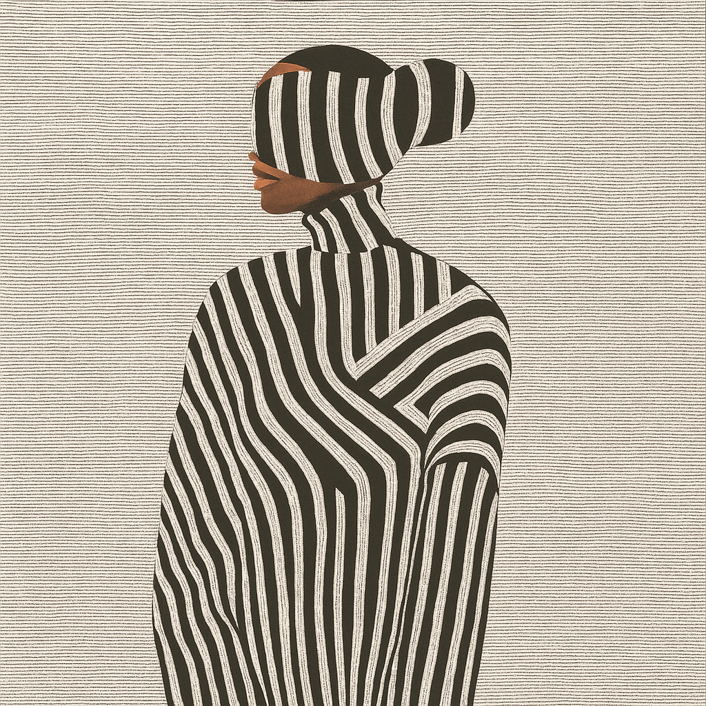
Paintings for home decor work best when they extend a room's existing mood rather than fighting it. A calm, textured piece — muted palette, visible brushwork, asymmetry — settles into a room built around natural materials and quiet color. A bold abstract with high contrast and movement does the opposite job: it becomes the room's focal point and pulls everything else into orbit around it.
Neither is more "correct." The mistake is picking a striking, high-contrast piece for a room that already has a lot going on, or a quiet, subtle piece for a stark room that needed a strong anchor. Look at what the room is missing, not just what you personally respond to in isolation.

Original painting vs. canvas print — and why it's not really about budget
The instinct is to treat "original painting" and "print" as a budget decision. It's more useful to treat it as a texture decision. An original painting carries real surface — visible brushwork, layered paint, sometimes texture you can see change under different light through the day. A canvas print gives you a flat, consistent image at a lower price point and in more size options.
If the room already leans toward texture — linen, raw wood, unglazed ceramics — an original painting reinforces that physical quality in a way a print can't quite match. If you need a specific large size for a specific wall and the image matters more than the surface, a print is the practical choice. Both are legitimate; they're just answering different questions.
A quick way to avoid buyer's remorse
Before buying, take a photo of the actual wall in the actual light the painting will hang in — morning light and evening light can shift how a palette reads dramatically. Hold your phone at the height the painting will hang (not eye level standing across the room) and look at the photo, not just the wall. Colors that felt neutral in a product photo taken in a studio can suddenly read warm or cool once they're in your own light.
If a piece is part of a themed collection — wabi-sabi, minimalist, geometric abstract — it's worth reading a little about the tradition it's drawing from. A painting chosen because you understood *why* it looks the way it does tends to hold up better over years than one chosen purely on first impression.

Frequently Asked Questions
What size painting should I buy for my living room?
As a starting point, aim for roughly two-thirds the width of the furniture the painting hangs above. A 7-foot sofa suggests a piece in the 4.5-5 foot range. Oversized rooms and double-height walls can support even larger, more dominant pieces.
Should the painting match my furniture color?
Match the mood, not the exact color. Pulling one or two accent tones from the painting into cushions, throws, or a rug creates cohesion without making the room feel like a matched set.
Is an original painting worth it over a print for home decor?
If the room's material palette already leans toward texture and natural materials, yes — the physical surface of an original does something a flat print can't. If your priority is a specific large size at a lower price, a print is the more practical choice.
Find the Painting Your Room Is Missing

Rossetti Art's original paintings collection is built around exactly this idea — pieces with real surface and real intention, curated by style and by room, from bold abstract works to quiet, textured wabi-sabi pieces. Each one is an original by Chiara Rossetti, made to anchor a room rather than just decorate it.

About the Author
Chiara Rossetti
Chiara Rossetti is the founder of Rossetti Art, a canvas print and original art brand. She writes about interior design, wall art styling, and the art of making a home feel alive.

Leave a comment
This site is protected by hCaptcha and the hCaptcha Privacy Policy and Terms of Service apply.