The right piece of statement wall art for living room design doesn't just fill empty space. It anchors the entire room, sets the mood, and becomes the visual centerpiece that draws every eye. Yet choosing that perfect piece feels overwhelming when you're staring at thousands of options online, wondering which size will work, which colors will clash, and whether you're about to make an expensive mistake.
I've spent years helping people discover art that genuinely transforms their spaces. The process isn't about following rigid rules or matching everything perfectly. It's about understanding a few key principles that make the difference between wall art that disappears and art that commands attention.

Throughout this guide, you'll discover the exact criteria that separate statement pieces from ordinary wall decor. You'll learn sizing formulas that designers use, color coordination techniques that work in real homes, and practical hanging methods that ensure your art looks gallery-quality from day one.
Discover Gallery-Quality Canvas Prints
Browse our curated collection of statement pieces, each printed with archival inks on hand-stretched canvas for lasting beauty.
What Makes Wall Art Statement-Worthy
Statement wall art creates immediate visual impact through size, bold design elements, or striking color contrast. It serves as the focal point that anchors your living room's aesthetic and draws the eye naturally when someone enters the space. Unlike decorative artwork that blends into the background, a statement piece commands attention without overwhelming the room.

The most effective statement pieces share several characteristics. They feature confident color palettes that either complement or intentionally contrast with your existing decor. They typically occupy substantial wall space—often 60 to 75 percent of your sofa width or console width. They express a clear artistic point of view, whether abstract, figurative, or photographic.
Scale and Proportion Principles
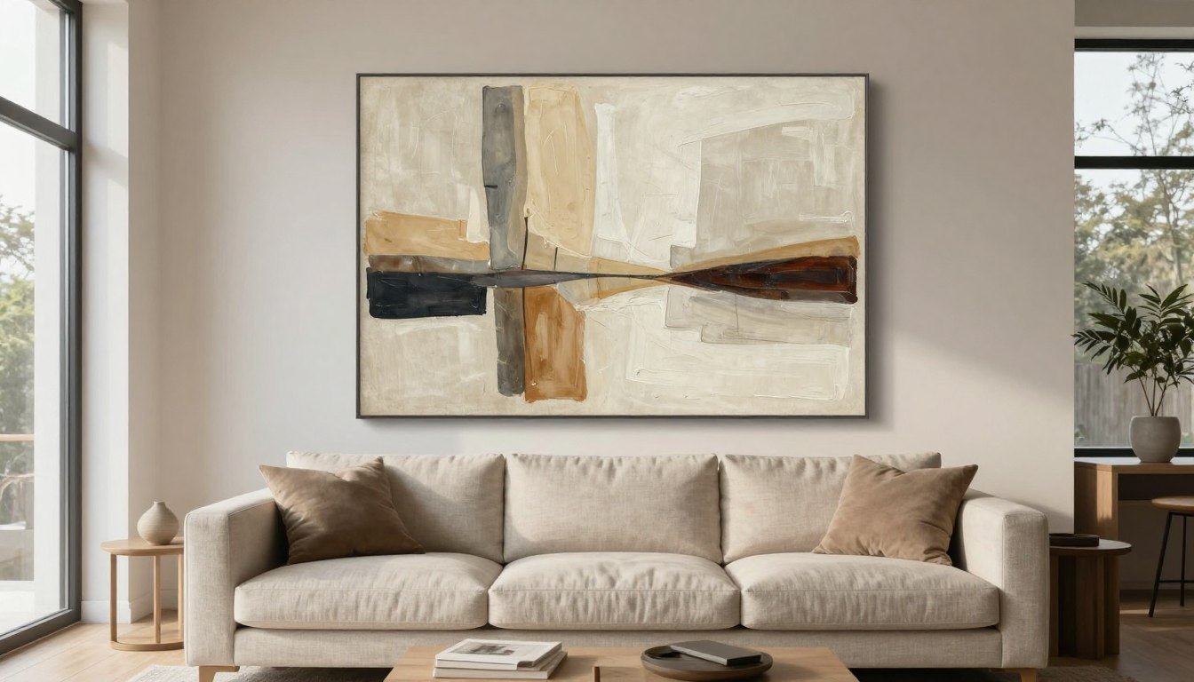
Scale matters more than any other factor. A piece that's too small creates an apologetic feeling, as if the art is trying to disappear. Oversized art makes a bold declaration. For walls above furniture, your artwork should span roughly two-thirds to three-quarters of the furniture width below it.

This living room demonstrates ideal proportion. The canvas print measures about 70 percent of the sofa width, creating balance without overwhelming the space. The artwork's horizontal orientation echoes the furniture line below.

Above narrow furniture like consoles, statement pieces can be slightly smaller. This piece covers roughly 65 percent of the console width, maintaining visual weight while leaving breathing room on either side.
Color Impact and Contrast
Bold color creates instant drama. Statement pieces often feature saturated hues that stand apart from neutral walls and furniture. You're not looking for perfect matches—you're seeking colors that create intentional contrast or unexpected harmony.

Consider your room's dominant colors. If your space leans heavily neutral—grays, whites, beiges—a canvas print with rich jewel tones or saturated primary colors will pop beautifully. If your room already contains color through furniture or textiles, choose art that either amplifies those existing tones or introduces complementary shades.
Artistic Style and Subject Matter
Your art should reflect your personal aesthetic while fitting your home's overall design language. Abstract pieces work universally well because they allow interpretation. Geometric designs bring structure and modernity. Figurative art and portrait pieces add human interest and narrative depth.

Abstract
Versatile and open to interpretation, abstract art fits contemporary, transitional, and even traditional spaces when colors align.

Geometric
Clean lines and structured patterns bring order and sophistication, particularly effective in mid-century modern and contemporary interiors.

Figurative
Portraits and figure studies add personality and become conversation pieces, working beautifully in eclectic and traditional settings.
The subject matter you choose communicates volumes about your personality. Landscapes and nature scenes create calm. Bold abstracts signal creativity and confidence. Black and white photography adds sophistication and timelessness. Choose what genuinely resonates rather than what feels safe.
Quality Indicators That Matter
Statement pieces deserve gallery-quality production. Look for hand-stretched canvas rather than paper prints. Verify that colors are printed with archival inks that resist fading. Quality canvas prints should be UV-resistant to maintain vibrancy over time, especially in rooms with natural light.

Frame quality significantly impacts the final impression. A pine wood frame offers affordable elegance for contemporary pieces. An oak floater frame creates a museum-quality presentation where the canvas appears to float within the frame. For statement art, invest in proper framing—it's the difference between "nice" and "stunning."
At Rossetti Art, every piece is made to order using these exact quality standards. This ensures your wall art arrives ready to make the statement you're envisioning.
Choosing the Right Size for Maximum Impact
Size determines whether your art whispers or commands. Most people instinctively choose pieces that are too small, creating a tentative, unfinished look. Statement art requires confidence in scale. The right dimensions transform a room from decorated to designed.

The Two-Thirds Rule for Wall Art
Professional designers rely on a simple formula. Your wall art should measure between 60 and 75 percent of the width of the furniture piece below it. This creates visual balance without overwhelming the space or appearing timid.
Quick Sizing Formula: Measure your sofa or console width. Multiply by 0.65 to 0.75. That range gives you the ideal art width. For a 90-inch sofa, look for art measuring 58 to 68 inches wide. For a 60-inch console, choose art between 39 and 45 inches wide.
This guideline works for most living room configurations. Adjust slightly based on your ceiling height and wall proportions. Rooms with tall ceilings can accommodate slightly larger pieces. Cozy spaces with lower ceilings often look better with art on the smaller end of the range.
Large Wall Art Options
Expansive walls demand large wall art to avoid a scattered, incomplete appearance. Single oversized pieces create more impact than groupings on big walls. Consider canvas prints measuring 48 by 36 inches or larger for walls exceeding eight feet in width.

Single Oversized Piece
One dramatic canvas spanning 60 to 72 inches creates immediate focal point impact. This approach works exceptionally well for large canvas prints in minimalist or contemporary spaces.

Gallery Wall Grouping
Multiple pieces arranged together can cover substantial space while adding visual interest through varied sizes. Plan the layout carefully so the grouping functions as one cohesive statement.
When selecting large pieces, consider the room's scale holistically. A 60-inch wide canvas might dominate a small apartment living room but appear modest in a spacious open-concept area. Walk the space before committing to dimensions.
Height and Vertical Placement
Proper hanging height makes or breaks the visual effect. The center of your artwork should sit at eye level, typically 57 to 60 inches from the floor. This standard works for most people and most spaces.

Above furniture, adjust this rule. Leave six to eight inches of space between your furniture's top edge and the bottom of your frame. This creates visual connection without the art sitting directly on the furniture. For art above a sofa, the bottom edge typically sits about eight to ten inches above the sofa back.
In rooms with tall ceilings—ten feet or higher—you can hang art slightly higher to fill vertical space. Never hang statement pieces so high they require tilting your head back to view comfortably. Art should integrate into your natural sight line.
Orientation Matters
Horizontal pieces make walls appear wider and rooms feel more expansive. They work beautifully above sofas and console tables. Vertical pieces draw the eye upward, adding height perception to rooms with lower ceilings. They shine in narrow wall spaces between windows or beside doorways.
Horizontal Orientation
- Makes rooms feel wider and more spacious
- Ideal for placement above sofas and long furniture
- Creates calm, restful visual flow
- Works well in open-concept living areas
Vertical Orientation
- Adds perceived height to rooms with lower ceilings
- Perfect for narrow wall sections
- Creates dynamic, upward energy
- Effective for statement art in entryways
Square formats offer versatility and modern appeal. They work in nearly any space and pair beautifully in groupings. A large square canvas—48 by 48 inches or 36 by 36 inches—creates bold, balanced impact without favoring width or height.
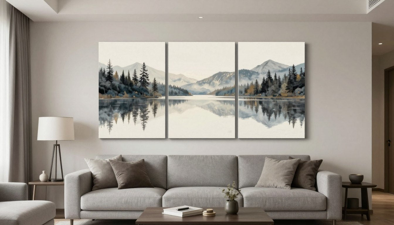
Multi-Panel and Triptych Options
Split-panel art offers an alternative to single large pieces. Triptychs (three-panel art) and diptychs (two-panel art) create visual interest through separation while functioning as a unified statement. They work particularly well on very wide walls where a single piece might appear stretched.

When hanging multi-panel pieces, maintain two to three inches of space between panels. The panels should read as connected sections of a single artwork, not separate pieces. Total width of all panels combined should still follow the two-thirds rule relative to your furniture.
Explore various sizing options in our modern wall art collection to find proportions that match your specific wall dimensions and furniture scale.
Find Your Perfect Statement Piece
Every Rossetti Art canvas print is created with UV-resistant archival inks and hand-stretched for gallery-quality presentation in your home.
Style Coordination and Color Harmony
The most impactful statement wall art feels both surprising and inevitable—unexpected in its boldness yet perfectly suited to the space. This balance comes from understanding how to coordinate style elements while maintaining visual interest through strategic contrast.

Matching Art to Your Interior Design Style
Your living room already speaks a design language. Statement art should amplify that voice, not contradict it. Contemporary spaces thrive with bold abstracts and geometric patterns. Traditional rooms gain interest from figurative work and landscape scenes. Mid-century modern interiors pair beautifully with abstract expressionist pieces and graphic designs.
Contemporary and Modern Spaces
Clean lines dominate modern interiors. Choose art with strong geometric elements, minimalist compositions, or bold color blocking. Abstract canvas prints work exceptionally well because they complement rather than compete with architectural features.

Traditional and Transitional Rooms
Classic spaces benefit from art with depth and narrative. Consider figurative portraits, botanical prints, or landscape scenes. These subjects add sophistication without disrupting the established elegance. Frame choice matters here—ornate frames enhance traditional aesthetics.

Eclectic and Bohemian Aesthetics
These relaxed styles embrace creativity and personal expression. Statement pieces can be bold, colorful, and unconventional. Mix abstract with figurative elements. Layer textures through your art selection. The only rule is that the piece should feel authentically you.

Mid-Century Modern Style
Retro-inspired spaces call for art that echoes the 1950s-70s aesthetic. Look for pieces with organic shapes, warm color palettes, and artistic confidence. Abstract expressionism and graphic prints align beautifully with mid-century modern furniture lines.

Color Psychology and Palette Selection
Colors create emotional responses. Warm tones—reds, oranges, yellows—energize spaces and encourage conversation. Cool colors—blues, greens, purples—calm and soothe. Neutrals provide sophistication and timelessness. Your art's dominant color should align with the mood you want to cultivate in your living room.

Consider your existing palette. If your room features neutral walls and furniture, you have freedom to introduce any color through art. If your space already contains significant color, choose art that either complements or intentionally contrasts. Complementary colors—opposites on the color wheel—create vibrant tension. Analogous colors—neighbors on the wheel—offer harmonious flow.
Working with Existing Decor Elements
Your statement piece doesn't need to match everything in the room, but it should relate to something. Pull one or two colors from your art and echo them in throw pillows, blankets, or decorative objects. This creates intentional connection without over-coordination.
The Three-Color Rule
Identify three colors in your chosen art print. Use the dominant color as your primary connection point—it should appear somewhere in your room's existing palette. The secondary color can inspire new accent pieces like pillows or vases. The tertiary color adds unexpected pops through smaller decorative items.

Avoid the common mistake of exact matching. If your sofa is navy blue, don't choose art that's precisely that same navy. Instead, select a piece with navy as one element among others. The slight variation creates sophistication.
Black and White Art Versatility
Black and white canvas prints offer unmatched versatility. They work in any color scheme, any design style, any room. Monochromatic art brings drama through contrast and composition rather than color. It acts as a neutral that still makes a powerful statement.

In colorful spaces, black and white art provides visual rest. It anchors the eye without competing with existing color saturation. The absence of color becomes the statement.

In neutral rooms, monochromatic art adds depth through tonal variation and graphic impact. It maintains the sophisticated restraint while preventing blandness.
Black and white pieces work particularly well when you plan to change your room's color scheme seasonally or over time. Your art remains relevant regardless of your decor evolution. Explore options in our black and white canvas prints collection.
Texture and Material Considerations
Visual texture in your artwork adds dimension that flat decor cannot provide. Abstract pieces with visible brushstrokes or heavy impasto technique create tactile interest. Textured art catches light differently throughout the day, making the piece feel alive and changing.

Canvas prints maintain some textural quality through the canvas weave. For maximum texture impact, consider original paintings where actual paint layers create three-dimensional surface variation. These pieces interact with room lighting to create depth that reproductions cannot match.
If your living room features smooth, sleek surfaces—leather furniture, glass tables, polished wood—textured art provides essential contrast. If your space already contains substantial texture through woven fabrics or natural materials, smoother art prints can balance the overall composition.
📐 Not sure what size to choose? Use our free Wall Art Size Calculator → https://rossettiart.com/blogs/news/wall-art-size-calculator
Placement and Hanging Techniques
Even the most stunning statement piece loses impact when hung incorrectly. Proper placement considers sight lines, lighting conditions, and room flow. These technical details separate amateur installations from professional-looking results.

Above Sofa Placement Rules
The sofa wall is prime real estate for statement art. This location naturally draws attention as people enter the room and sit facing the space. Your artwork should hang centered above the sofa, with six to eight inches of space between the sofa back and the bottom of the frame.
If your sofa sits against the wall, verify that your art doesn't extend beyond the sofa's endpoints. The piece should feel visually contained within the furniture's width. For sectional sofas, center the art above the longest section rather than trying to span the entire L-shape.
Standard Sofa Configuration

- Center art horizontally above sofa
- Maintain 6-8 inches from sofa top to frame bottom
- Art width: 60-75% of sofa width
- Bottom of frame: roughly 56-60 inches from floor
Sectional Sofa Setup

- Position art above the longest section
- Don't attempt to span the entire sectional
- Consider the sitting view angle
- Maintain same spacing rules as standard sofa
Console and Entry Table Arrangements
Console tables and entry pieces create opportunities for vertical statement moments. Art above these narrow furniture pieces can be proportionally smaller than sofa art while maintaining impact through verticality or dramatic subject matter.

Leave eight to ten inches between the console surface and your frame's bottom edge. This creates room for layered decor—a table lamp, small sculptures, or framed photos—without crowding. The art should anchor the vignette visually without overwhelming the layered styling below.
Console art can take bolder risks than sofa art. Consider vertical orientations that draw the eye upward. A tall, narrow piece creates dramatic impact in entryways and behind console tables in a way that horizontal pieces cannot.
Gallery Wall Design
A gallery wall functions as a collected statement rather than a single piece. The grouping should feel curated and intentional, not random. Plan your layout on the floor before hammering any nails. Use painter's tape on the wall to mark frame positions and ensure proper spacing.
Gallery Wall Layout Tips
- Maintain consistent spacing—2 to 3 inches between all frames
- Start with your largest piece and build around it
- Keep the overall grouping shape rectangular or square
- Mix frame sizes but keep frame styles consistent
- The center point of the entire grouping should sit at eye level

For gallery walls, you can mix framed art prints with canvas prints, photographs, and even small sculptural elements. The key is maintaining visual cohesion through color palette or subject matter. All pieces don't need to match, but they should relate.
Lighting for Maximum Impact
Natural light enhances art during daylight hours but can cause fading over years. Position statement pieces on walls that receive indirect light rather than direct sun exposure. UV-resistant finishes help, but prevention remains the best strategy.

Add dedicated picture lights or adjustable track lighting to spotlight your art after dark. Position lights to eliminate glare on the canvas or glass surface. Aim for even illumination across the entire piece rather than a hot spot in the center.
LED picture lights offer the best solution for art lighting. They produce minimal heat, preventing damage to canvases and prints. They're energy-efficient for extended use. Warm white LEDs (2700-3000K) create an inviting gallery-like glow.
Hardware and Installation Methods
Use appropriate hardware for your wall type and art weight. Standard drywall requires anchors for pieces over ten pounds. Picture hanging wire with D-rings offers flexibility for leveling. For heavy original paintings or large framed pieces, consider professional installation.
Lightweight Pieces (Under 20 lbs)
- Standard picture hangers with nails
- Drywall anchors for added security
- Sawtooth hangers for small frames
- Command strips for temporary or rental situations
Heavyweight Art (Over 20 lbs)
- Wall anchors rated for piece weight
- Screws into wall studs when possible
- French cleats for large canvases
- Professional installation for valuable pieces
Level your art carefully. An off-kilter piece immediately signals amateur installation. Use a standard bubble level or a laser level for precise alignment. For multi-piece arrangements, verify level on each individual piece and across the grouping as a whole.

Framing and Quality Considerations
The frame is not an afterthought—it's an integral part of your statement piece's presentation. Quality framing elevates art from poster to gallery-worthy. It protects your investment and signals that you value both the art and your home's aesthetic.

Canvas vs. Framed Print Options
Unframed canvas prints offer contemporary, gallery-style presentation. The canvas wraps around the stretcher bars, creating a finished look without a frame. This approach works beautifully in modern and minimalist spaces where you want the art to feel immediate and unfussy.
Framed canvas prints add structure and formality. The frame protects canvas edges and provides a transitional element between art and wall. Frames work particularly well in traditional or transitional interiors where they reinforce established architectural details.

Gallery-Wrapped Canvas
Clean, modern presentation with no frame. The image extends around canvas edges. Ideal for contemporary spaces and when you want the art itself to be the entire focus without any visual barrier.

Floater Frame Presentation
Canvas appears to float within the frame with a subtle gap. Combines modern aesthetic with traditional framing protection. An oak floater frame adds warmth and museum-quality finish.
Frame Material and Finish Selection
Wood frames dominate quality framing. Natural wood brings warmth and complements most art styles. Pine wood frames offer affordable elegance with subtle grain. Oak, walnut, and maple provide richer tones and more pronounced character.

Frame finish should relate to your existing wood tones. If your living room features warm honey or medium brown wood furniture, choose frames in similar warmth. Cool gray-toned interiors pair beautifully with white, black, or gray-washed frames.
Metal frames bring industrial or ultra-modern aesthetics. Thin metal frames nearly disappear, keeping focus entirely on the art. Chunky metal frames make their own statement. Consider metal framing for geometric or graphic pieces where sleek minimalism enhances the artistic intent.
Print Quality and Longevity
Statement pieces warrant investment in quality production. Gallery-quality printing uses professional-grade printers and premium materials. The difference is immediately visible in color saturation, detail sharpness, and overall vibrancy.
Quality Indicators to Verify
- Archival inks: Pigment-based inks resist fading for 100+ years
- Canvas weight: Minimum 350gsm for proper structure and durability
- UV resistance: Coating protects against sun damage
- Color accuracy: Professional color calibration ensures true-to-design colors
- Hand-stretched: Proper gallery stretching over wooden bars

Avoid discount prints from unknown sources. Poor quality printing shows immediately through muddy colors, visible pixelation, and thin canvas that warps. These pieces devalue your space rather than enhancing it. Quality statement art is an investment that pays returns every time you walk into your living room.
Protecting Your Investment
Proper care extends your art's life indefinitely. Dust canvas prints gently with a soft, dry cloth or feather duster monthly. Never use cleaning products or water directly on canvas. For stubborn marks, consult a professional art restorer rather than attempting DIY cleaning.
Humidity affects canvas and paper prints. Maintain consistent indoor humidity levels between 40 and 60 percent. Extreme dryness causes canvas to shrink and crack. Excessive moisture promotes mold growth. Standard home climate control typically maintains appropriate levels.

Avoid hanging valuable art in bathrooms, kitchens, or areas with fireplaces where temperature and moisture fluctuate significantly. These conditions accelerate deterioration. Living rooms typically provide stable conditions ideal for art preservation.
Choosing Between Prints and Original Art
Canvas prints offer accessibility to stunning designs at reasonable prices. They allow you to own museum-quality imagery reproduced with precision. Prints are practical for high-traffic homes, rental properties, or spaces where you might want to change art frequently.
Original paintings carry unique value as one-of-a-kind pieces. No reproduction captures the texture, dimension, and presence of hand-applied paint. Original art becomes a personal collection piece and typically appreciates in value over time. If your budget allows, original work adds unmatched character to your living room.
Canvas Print Advantages
- Access to any design or artwork
- Consistent quality through controlled production
- More affordable for large sizes
- Easy to replace or update
- Wide selection of subjects and styles
Original Art Benefits
- One-of-a-kind ownership
- Visible texture and dimension
- Investment potential
- Direct support of artists
- Unmatchable presence and authenticity
Many collectors combine both approaches. Use canvas prints in bedrooms, home offices, and secondary spaces. Reserve original art for primary display locations like the living room. This strategy maximizes both budget and impact throughout your entire home.
Browse our original paintings collection to discover one-of-a-kind pieces, or explore our extensive canvas print options for museum-quality reproductions.
Transform Your Space Today
Discover statement pieces made to order with hand-stretched canvas, archival inks, and your choice of pine wood or oak floater frames.
Frequently Asked Questions
Q: What size wall art should I choose for above my sofa?
A: Your wall art should measure between 60 and 75 percent of your sofa's width. For a standard 90-inch sofa, look for art measuring 54 to 68 inches wide. The bottom of the frame should sit 6 to 8 inches above the sofa back. This proportion creates visual balance without overwhelming the space or appearing too small.
Q: How do I choose art colors that work with my existing decor?
A: Select art that contains at least one or two colors already present in your living room, then allow the piece to introduce new accent colors. You don't want exact matches—slight variations create sophistication. If your room is predominantly neutral, you have freedom to introduce any color palette. Use throw pillows and small accessories to echo colors from your chosen art, creating intentional connection without over-coordination.
Q: Should I choose horizontal or vertical wall art for my living room?
A: Horizontal pieces work best above sofas and long furniture, making rooms feel wider and more spacious. Vertical pieces add height perception and work well in narrow wall spaces or rooms with lower ceilings. Consider your specific wall dimensions and furniture placement. For sofa walls, horizontal orientation typically provides better visual balance. For walls beside windows or in entryways, vertical pieces often create more dramatic impact.
Q: What's the difference between canvas prints and original paintings?
A: Canvas prints reproduce artwork or designs onto canvas using high-quality printing, offering access to any image at affordable prices with consistent quality. Original paintings are one-of-a-kind hand-painted pieces with visible brushstrokes and textured layers that prints cannot replicate. Originals typically cost more but offer unique ownership and potential investment value. Many homeowners use canvas prints in multiple rooms and reserve original art for primary display spaces like the living room.
Q: How high should I hang wall art above furniture?
A: Leave 6 to 8 inches of space between the top of your furniture and the bottom of the art frame. For art not positioned above furniture, hang pieces so the center sits at eye level—typically 57 to 60 inches from the floor. This standard works for most people and most spaces, creating comfortable viewing angles that don't require looking up or down.
Q: Do I need to frame canvas prints?
A: Canvas prints with gallery-wrapped edges (where the image extends around the sides) don't require framing and offer a clean, modern presentation. However, adding a floater frame provides additional protection and creates a more formal, museum-quality appearance. Frame choice depends on your design style—contemporary spaces often skip frames, while traditional interiors benefit from the structure and elegance that framing provides.
Q: How do I protect wall art from fading?
A: Choose art printed with UV-resistant archival inks, which significantly slow fading. Position pieces away from direct sunlight—indirect natural light is fine. Install UV-filtering window film if your living room receives strong sun exposure. Maintain consistent indoor humidity between 40 and 60 percent. Quality canvas prints with proper materials and care can maintain their original vibrancy for 100+ years.
Creating Your Statement
The right statement wall art transforms your living room from simply furnished to genuinely designed. It's the piece that makes guests pause, that catches your own eye every time you enter the space, that turns a house into a home with personality and intention.
You now understand the principles that separate impactful art from ordinary wall decor. You know how to calculate proper sizing, coordinate colors without over-matching, and hang pieces for professional results. Most importantly, you understand that statement art reflects your personal aesthetic rather than following rigid rules.

The selection process should feel exciting rather than overwhelming. Start with what genuinely resonates with you. Consider your space's practical requirements—size, colors, style—but let your emotional response guide the final decision. The best statement pieces are those you'll love seeing every single day.
Whether you choose bold abstracts, serene landscapes, striking photography, or textured original paintings, quality matters. Invest in pieces printed with archival inks on properly stretched canvas. Select frames that enhance rather than distract. Hang your art at proper heights with secure hardware.
Your living room is waiting for that transformative piece that pulls everything together. The art that makes the space feel complete. The statement that says something true about who you are and how you want to live.
Explore our living room canvas prints to discover statement pieces designed to transform your space with gallery-quality craftsmanship.
Leave a comment
This site is protected by hCaptcha and the hCaptcha Privacy Policy and Terms of Service apply.