Walking into a room that takes your breath away often comes down to one transformative element. A single piece of art commanding attention can shift the entire atmosphere of your home. That's the power of statement wall art—it's not just decoration hanging on your walls, it's the focal point that defines how your space feels the moment someone steps inside.
The right piece becomes more than wall decor. It reflects your personality, anchors your design choices, and creates instant visual impact. Whether you're drawn to bold abstract compositions, serene botanical prints, or striking black and white photography, your statement piece sets the tone for everything else in the room.

What Is Statement Wall Art and Why It Matters
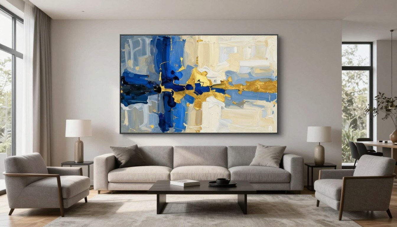
Statement wall art is a bold, large-scale piece that serves as the visual anchor and focal point of a room. Unlike smaller decorative prints that blend into your decor, a statement piece demands attention and sets the mood for your entire space. It's typically oversized, visually striking, and positioned prominently where it can be appreciated the moment you enter.
Think of it as the jewelry of interior design. Just as a stunning necklace elevates a simple outfit, the right artwork transforms plain walls into something memorable. The piece you choose speaks volumes about your style and creates an immediate atmosphere—whether that's calm and contemplative or energetic and dynamic.

The Defining Characteristics of Statement Pieces
Not every piece of wall art qualifies as a statement piece. True statement art shares several key characteristics that set it apart from standard home decor.

Size and Scale
The most obvious characteristic is size. Statement pieces typically measure at least 30 x 40 inches, with many ranging up to 60 inches or larger. This substantial scale allows the artwork to hold visual weight in a room and compete with furniture and architectural elements.
Large wall art creates impact through sheer presence. When properly sized for your space, it doesn't disappear into the background—it commands attention and becomes an integral part of your room's design narrative.
Visual Impact and Bold Design
Beyond size, statement art delivers visual punch through bold colors, strong contrasts, or dramatic subject matter. Whether it's an abstract composition with sweeping brushstrokes or a oversized botanical print with intricate details, these pieces have presence.
The artwork might feature vibrant, saturated colors that energize a space, or it could use stark black and white tones for sophisticated drama. Some statement pieces captivate through subject matter alone—think life-size portrait art or dramatic landscape photography that transports viewers.
How Statement Art Transforms Your Home
The right piece of wall art does more than fill empty space on your walls. It fundamentally changes how a room feels and functions, creating atmosphere and defining the character of your home.

Creating an Immediate Focal Point
Every well-designed room needs a focal point—something that draws the eye and anchors the space. Statement wall art serves this purpose beautifully, giving viewers a clear place to focus when they enter.
Without a defined focal point, rooms can feel scattered or incomplete. Your eyes don't know where to land, creating visual confusion. A strong statement piece solves this problem instantly, organizing the room around itself and making design decisions easier.
This focal point becomes particularly important in open-concept homes where spaces flow together. A bold piece of art helps define zones and creates visual separation without physical walls.
Expressing Personal Style and Atmosphere
Your choice of statement art reveals your personality and interests more clearly than almost any other design element. The artwork you display tells your story—whether you gravitate toward abstract expressionism, classic portraiture, or nature-inspired botanical designs.
Beyond personal expression, art sets emotional tone. Calm, muted pieces with soft colors create serene, relaxing atmospheres perfect for bedrooms or meditation spaces. Bold, energetic compositions with strong contrasts inject life and excitement into social areas like living rooms and dining spaces.

Elevating Perceived Value and Design Quality
Investing in quality wall art—especially gallery-quality prints with archival inks and professional framing—elevates your entire space. It signals attention to detail and commitment to creating a thoughtfully designed home.
Rooms with carefully chosen statement pieces photograph better, feel more complete, and make stronger impressions on guests. This isn't about showing off—it's about creating an environment that feels intentional and finished rather than thrown together.
Even rental spaces or homes with builder-grade finishes can feel custom and sophisticated when anchored by the right artwork. It's one of the most effective ways to add perceived value without major renovations.

Choosing the Perfect Statement Piece for Your Home
Selecting statement wall art isn't about following trends or choosing what's popular. It's about finding pieces that resonate with you while working harmoniously with your space. The perfect statement piece balances personal preference with practical design considerations.
Understanding your options and knowing what to look for helps you make confident choices. From subject matter and style to color palettes and artistic techniques, each element contributes to whether a piece will truly transform your space or simply occupy wall space.

Understanding Art Styles and Subjects
The world of wall art encompasses countless styles and subjects, each bringing different energy and aesthetic to your home. Familiarizing yourself with major categories helps narrow your search and identify what speaks to your design vision.
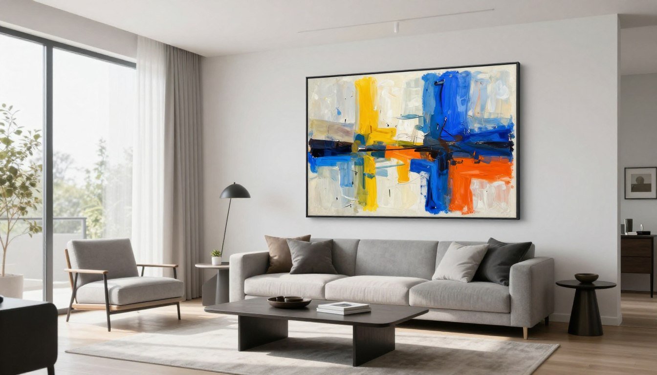
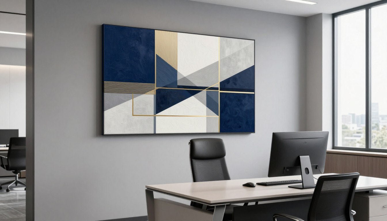
Abstract and Geometric Art
Abstract pieces offer versatility and sophistication. Without literal subject matter, they work with various decor styles and allow for personal interpretation. Bold brushstrokes, color blocking, and geometric shapes create modern, contemporary atmospheres perfect for living spaces.
These works play with color, form, and texture rather than depicting recognizable objects. This makes them incredibly adaptable—the same abstract print can feel completely different depending on surrounding colors and furniture. For those seeking flexibility and timeless appeal, abstract canvas prints provide endless possibilities.

Botanical and Nature-Inspired Prints
Bringing the outdoors inside never goes out of style. Botanical wall art—from oversized tropical leaves to delicate wildflower compositions—adds organic beauty and creates calming, biophilic atmospheres that improve wellbeing.
Nature prints work particularly well in spaces where you want to promote relaxation or connection to the natural world. Bedrooms, bathrooms, and home offices benefit from these soothing designs. Large-scale flower photography or illustrated botanical studies make especially striking focal points.
The colors in nature artwork tend to be more subdued than abstract pieces, making them easier to coordinate with existing palettes while still providing visual interest. Botanical wall art prints bridge the gap between bold statement pieces and subtle decoration.

Portrait and Figurative Art
Human figures and faces create immediate connection and narrative. Portrait art ranges from classical realism to modern line drawings, each bringing different energy. These pieces work beautifully in spaces where you want to make guests feel welcome and create conversation.
Contemporary line art portraits offer particular appeal for statement pieces. Clean, minimalist lines create sophisticated focal points without overwhelming spaces. The simplicity allows them to work across decor styles while maintaining strong visual presence.
Figurative artwork also includes full-body poses, dance movements, and stylized human forms. These dynamic compositions add life and movement to static spaces, particularly effective in entryways, dining rooms, and social areas.

Landscape and Cityscape Art
Dramatic landscapes transport viewers to other places, creating escape and atmosphere. Whether showcasing mountains, seascapes, or desert vistas, large landscape prints add depth and expansiveness to rooms, particularly those with limited natural views.
Urban cityscapes bring energy and sophistication. Skyline silhouettes, architectural photography, and street scenes work exceptionally well in contemporary and industrial-style spaces. These pieces celebrate human achievement and design while providing strong graphic impact.
Both landscape and cityscape art work best when they either complement or provide contrast to your actual environment. A beach house might feature desert landscapes for unexpected interest, while a downtown apartment could showcase mountain scenes for peaceful counterbalance.

Pop Art and Retro Designs
For those who love color, personality, and a touch of nostalgia, pop art brings playful energy to any space. These bold, graphic designs often feature iconic imagery, vibrant color palettes, and cultural references that spark joy and conversation.
Retro-inspired prints tap into nostalgia while feeling fresh and contemporary. Vintage travel posters, mid-century modern designs, and pop culture icons make excellent statement pieces for entertainment areas, game rooms, and creative spaces.
These pieces work particularly well when you want your home to feel fun and approachable rather than serious or formal. They inject personality and can serve as great conversation starters when entertaining guests.

Matching Art to Your Design Style
Your statement piece should enhance your existing aesthetic rather than fighting against it. Understanding how different art styles complement various interior design approaches helps ensure cohesive, intentional-looking spaces.
Modern and Contemporary Spaces
Clean lines, neutral palettes, and minimalist furniture pair beautifully with abstract art, geometric designs, and bold color-blocking. These spaces can handle dramatic contrasts and large scale without feeling cluttered.
- Large-scale abstract compositions with bold colors
- Minimalist line art and geometric patterns
- Black and white photography with strong contrast
- Oversized single-subject botanical prints
Traditional and Classic Interiors
Traditional homes benefit from statement art that honors classical aesthetics while providing contemporary edge. Look for pieces that bridge timeless and current without feeling out of place.
- Sophisticated botanical illustrations and studies
- Classical portrait art with modern framing
- Landscape paintings in traditional color palettes
- Vintage-inspired prints with ornate framing
Bohemian and Eclectic Rooms
Boho style embraces layered, collected looks with rich textures and global influences. Statement art in these spaces can be bold, colorful, and unconventional without overwhelming the eclectic vibe.
- Colorful abstract expressionism with painterly quality
- Global-inspired patterns and motifs
- Nature-based art with rich, saturated colors
- Mixed media pieces with textural interest
Industrial and Urban Lofts
Exposed brick, metal accents, and raw materials create perfect backdrops for edgy, graphic artwork. These spaces can handle bold statements that might overwhelm softer design styles.
- Urban photography and cityscape prints
- Large-scale black and white compositions
- Abstract art with industrial color palettes
- Graphic design-inspired pop art pieces

Considering Color Palettes and Coordination
Color might be the most critical factor in choosing statement wall art. Your piece doesn't need to match your decor exactly—in fact, it shouldn't—but it should coordinate thoughtfully with your existing palette to create harmony rather than discord.
Working With Existing Room Colors
Start by identifying the dominant colors in your space. Look at your largest pieces—sofas, rugs, curtains—and note the primary hues. Your statement art can incorporate these colors or provide intentional contrast, but it should acknowledge their presence.
The 60-30-10 rule applies here. If your room uses the 60-30-10 color distribution (60% dominant color, 30% secondary color, 10% accent), your art can pull from any of these tiers. A piece featuring your 10% accent color prominently creates cohesion while maintaining visual interest.
Alternatively, choose art with a completely different palette that still harmonizes with your space. This works when your existing colors are neutral—cream, gray, beige, white. Bold art then provides the color punch your room needs without clashing.

Using Art to Introduce New Colors
Statement pieces offer an opportunity to refresh your palette without major purchases. If you love a color but aren't ready to commit to a new sofa or paint job, introduce it through artwork first. This allows you to test whether you love living with that hue.
Once your art establishes a new color direction, you can gradually incorporate matching accent pieces. Throw pillows, small decorative objects, and fresh flowers in coordinating tones tie the room together and make the art feel intentional rather than random.
This approach works particularly well if you're transitioning between design phases. Maybe your home currently leans heavily on cool blues and grays, but you're drawn to warmer earth tones. A statement piece incorporating rust, terracotta, or gold begins that transition gently.
Monochromatic and Neutral Approaches
Black and white artwork offers timeless sophistication and works with virtually any color scheme. These pieces provide graphic impact without introducing color conflicts, making them ideal if you frequently change your decor or prefer flexibility.
Monochromatic art—pieces using variations of a single color—creates cohesive, calming effects. A navy blue abstract piece in a room with varying shades of blue provides visual interest through tonal depth rather than contrasting hues.
Neutral artwork in creams, beiges, and taupes serves as a sophisticated backdrop while allowing other design elements to shine. This approach works beautifully in spaces where texture and materials take precedence over color.

Evaluating Quality and Materials
Not all wall art is created equal. The quality of materials, printing techniques, and construction dramatically affects how your piece looks and how long it lasts. Understanding these factors helps you invest wisely.
Canvas Prints vs. Paper Prints
Gallery-quality canvas prints offer durability and texture that paper simply can't match. The woven fabric surface adds depth and dimension, particularly visible when viewing abstract or painterly artwork. Canvas also doesn't require glass, eliminating glare issues.
Hand-stretched canvas on proper frames maintains tension and prevents sagging over time. Quality matters here—cheap canvas prints often use thin, flimsy material that warps or loosens. Premium options use thick, archival-grade canvas that maintains its appearance for decades.
Paper prints work beautifully for certain applications, particularly photography and fine art reproductions. When properly framed behind UV-protective glass, they preserve detail and color accuracy. However, they require more protection from humidity and environmental damage than canvas.

Frame Selection and Presentation
Frames do more than protect artwork—they define how pieces integrate with your space. The right frame enhances without distracting, creating a finished, professional look that elevates the entire room.
Oak floater frames offer modern sophistication, appearing to suspend the canvas within the frame's perimeter. This contemporary style works exceptionally well with abstract and modern art, creating breathing room around the image. The natural wood adds warmth while maintaining clean lines.
Simple pine wood frames provide classic versatility at accessible price points. These frames work across style categories and can be painted or stained to match your specific needs. For traditional or transitional spaces, they offer timeless appeal without overwhelming the artwork itself.
Gallery wrapping—where the canvas extends around frame edges—creates a frameless look perfect for contemporary spaces. This technique allows the artwork to flow continuously, creating a three-dimensional presence on your wall. It works particularly well with abstract compositions and bold designs.

Print Technology and Archival Quality
The longevity of your investment depends on printing technology. Archival inks resist fading from sunlight and environmental exposure, maintaining color vibrancy for generations. Cheap prints using standard inks can noticeably fade within just a few years.
UV-resistant finishes protect against sun damage, particularly important for pieces displayed in rooms with significant natural light. This coating allows you to hang art near windows without worrying about rapid deterioration.
High-resolution printing captures fine details and creates smooth color transitions. Poor quality prints show visible pixelation or banding, especially in large formats. Gallery-quality reproduction ensures your statement piece looks crisp and professional at any viewing distance.
When you're ready to transform your space with artwork that lasts, quality matters. Rossetti Art creates every piece using archival inks on hand-stretched canvas, ensuring your investment maintains its beauty for years to come. Each print receives the same attention to detail as fine art originals.

Size and Placement Guidelines That Actually Work
Even the most beautiful statement art fails to make impact when hung at the wrong height or sized incorrectly for the space. Proper placement transforms good artwork into great design, while poor positioning makes expensive pieces look like afterthoughts.
Understanding the relationship between wall dimensions, furniture scale, and artwork size takes the guesswork out of hanging. These proven guidelines help you achieve gallery-worthy results in your own home, regardless of your space's size or layout.

Determining the Right Size for Your Space
Size relationships matter more than absolute dimensions. A 40-inch print might dominate a cozy bedroom but disappear on a expansive living room wall. Learning to evaluate your specific space ensures your statement piece achieves proper visual weight.
The Two-Thirds Rule for Furniture
When hanging art above furniture—sofas, beds, consoles, or dining sideboards—aim for the artwork to span approximately two-thirds the width of the furniture below it. This creates pleasing proportions without the piece appearing lost or overwhelming.
For an 8-foot (96-inch) sofa, you'd want art measuring roughly 64 inches wide. You can achieve this with a single large piece or a multi-panel arrangement. The key is the overall visual mass, not necessarily one continuous canvas.
Going slightly larger or smaller than two-thirds still works, but avoid extremes. Art spanning less than half the furniture width looks disconnected and small. Pieces extending significantly beyond furniture edges create top-heavy imbalance.

Wall Coverage and Negative Space
Statement pieces need breathing room. Filling every inch of wall space dilutes impact and creates visual clutter. Your artwork should command attention precisely because it has empty space around it to stand out.
For full wall coverage, plan for your art to occupy 50-75% of the available wall space. This applies to the focal wall—the one immediately drawing attention when entering the room. The remaining 25-50% of negative space frames the artwork and prevents the room from feeling cramped.
In open floor plans or rooms with very tall ceilings, you might go larger. The goal remains the same: create presence without overwhelming. Step back frequently during the selection process and evaluate whether the piece feels balanced or dominating.
Ceiling Height Considerations
Standard 8-foot ceilings accommodate art up to 48 inches tall comfortably. Going larger risks the piece feeling squeezed or touching furniture below. With 9-10 foot ceilings, you can confidently display pieces up to 60 inches tall or larger.
High ceilings in lofts or contemporary homes allow for dramatic, oversized artwork that would overwhelm traditional spaces. A 72-inch tall piece makes perfect sense in a room with 12-foot ceilings but would look absurdly large in a standard bedroom.
Consider vertical versus horizontal orientation based on ceiling height. Tall, narrow pieces draw the eye upward and emphasize ceiling height. Wide, horizontal pieces make rooms feel broader and work well with lower ceilings.

Multi-Piece Arrangements and Canvas Print Sets
Sometimes the best statement comes from multiple coordinated pieces rather than one large canvas. Diptychs (two-panel sets), triptychs (three-panel sets), or larger gallery arrangements create dynamic visual interest while offering sizing flexibility.
When planning multi-piece arrangements, treat the entire grouping as one unified piece for sizing purposes. Measure the total width including spacing between panels, then apply the same proportional rules. A three-panel set totaling 72 inches wide works beautifully above that 8-foot sofa.
Space between panels typically ranges from 2-4 inches. Closer spacing creates cohesion and reads as one piece from a distance. Wider spacing emphasizes each panel's individuality while maintaining relationship between them.
Multi-panel arrangements work exceptionally well in modern and contemporary spaces where symmetry and clean lines matter. They also solve the challenge of very wide walls where a single piece would need to be impractically large.

Optimal Placement and Hanging Height
You've found the perfect size—now where exactly does it go on the wall? Proper height and positioning ensure your statement piece integrates seamlessly with your space rather than floating awkwardly or cramming against furniture.
The 57-Inch Rule and Eye-Level Positioning
The standard gallery rule places artwork at 57 inches on center—meaning the center point of the artwork sits 57 inches from the floor. This measurement reflects average human eye level and creates comfortable viewing in most spaces.
For practical application, measure your artwork height, divide by two, then measure up from the 57-inch mark. If your piece is 40 inches tall, its center sits at 20 inches. Measure 57 inches up the wall, then continue 20 inches higher—the top of your artwork should reach 77 inches from the floor.
This rule works beautifully in hallways, entryways, and on walls without furniture. However, adjust for specific furniture relationships and room function. What matters most is visual coherence within your particular space.

Adjusting for Furniture Height
When hanging art above furniture, forget the 57-inch rule and focus on the relationship between the furniture's top edge and the artwork's bottom edge. Ideal spacing falls between 6-12 inches—close enough to create connection, far enough to prevent collision.
Standard sofas sit approximately 30-36 inches tall. Adding 8 inches of space means artwork begins at 38-44 inches from the floor. For a 40-inch tall piece, the top would reach 78-84 inches—reasonably close to the 57-inch center rule anyway.
Lower furniture like media consoles (around 24 inches tall) requires adjustment. Starting artwork 6-8 inches above puts the bottom edge at 30-32 inches from the floor. This keeps the piece's center lower than 57 inches but maintains proper furniture relationship.
Dining room art above sideboards or credenzas follows the same principle. Leave approximately 6 inches between the furniture top and art bottom, ensuring visual connection while allowing space for objects on the furniture surface.

Creating Focal Points in Different Room Layouts
The focal point wall—the one featuring your statement piece—should be immediately visible when entering the room. This is typically the wall facing the main entrance or the wall your seating arrangement faces in living areas.
In living rooms, the sofa wall often serves as the natural backdrop for statement art, directly in the sight line of anyone seated in the space. This creates a relaxing view and anchors the seating area design. If your sofa faces a different direction, consider the wall it faces as your statement wall instead.
Bedroom focal points typically center on the wall behind the bed. This creates visual drama when entering and provides a calming view from the doorway. Large-scale art here functions almost like an architectural headboard, defining the sleeping zone.
Open-concept spaces benefit from statement art that helps define zones. Position a bold piece behind your dining table to visually separate the dining area from adjacent living space, or use artwork to anchor a reading nook within a larger room.

Special Placement Scenarios
Not every wall situation is straightforward. Challenging spaces require adapted approaches to achieve beautiful results without breaking fundamental design principles.
Hanging Art on Tall or Double-Height Walls
Dramatically tall walls in lofts or homes with vaulted ceilings tempt us to hang art too high, trying to fill vertical space. Resist this urge. Your art still needs to relate to the room's occupants and furniture, not float near the ceiling.
Instead, treat the lower portion of the wall—up to about 10 feet—as your canvas. Position statement art in this zone where it maintains connection to furniture and eye level. The upper wall can remain empty or feature architectural details like molding or contrasting paint.
For genuinely massive walls, consider a vertical multi-piece arrangement. Three or four pieces stacked vertically with consistent spacing between them creates upward movement while maintaining connection to the room below. Each piece remains at viewable heights.

Narrow Wall Spaces and Hallways
Narrow walls between windows, doorways, or architectural features require careful sizing. The art must fit the width while maintaining enough negative space to breathe. As a rule, leave at least 4-6 inches between artwork edges and wall boundaries like windows or corners.
Hallways benefit from multiple pieces creating a gallery effect rather than one large statement piece. However, if you choose a single bold piece for a hallway, ensure it doesn't overwhelm the narrow space. Vertical orientations often work better than horizontal in tight passages.
The 57-inch center rule becomes especially important in hallways where no furniture dictates height. Consistency in hanging height creates professional polish as viewers move through the space.
Above-Bed Placement Specifics
Artwork above beds requires special consideration for both aesthetics and safety. The piece should span roughly the width of the bed (not including nightstands) or be slightly narrower. Going wider than the bed creates visual imbalance and risks overhang above nightstands.
Hang bedroom art approximately 6-8 inches above the headboard or, if you have no headboard, 6-8 inches above the mattress top. This creates connection while ensuring the piece won't be bumped by pillows or people sitting up in bed.
For safety and peace of mind, ensure bedroom art is securely anchored. Use appropriate hanging hardware rated for the artwork's weight. The last thing anyone wants is concern about art falling during sleep.

Dealing with Challenging Architecture
Sloped ceilings, awkward corners, and unusual wall angles require creative approaches. In rooms with angled ceilings, hang art on the taller wall sections where it can be properly viewed. Follow the angle of the ceiling with the top edge of the artwork to create intentional cohesion.
Corners can feature artwork when treating them as focal points, but ensure the piece doesn't extend into high-traffic areas where it might be bumped. Corners work particularly well for creating cozy, defined zones within larger open rooms.
Windows interrupt wall space but don't eliminate statement art possibilities. Center artwork between windows or above a window grouping, maintaining consistent spacing relationships. Alternatively, treat windows and art as a unified composition, centering the entire arrangement on the wall.

Testing Before You Commit
Even with measurements and guidelines, seeing artwork in position before making holes in your wall saves regret and extra repair work. Use simple techniques to visualize final placement.
Paper Template Method
Cut paper or newspaper to your artwork's exact dimensions, then tape it on the wall at your planned height. Step back and evaluate from multiple angles and distances. Does it feel balanced? Too high or low? Move the template until it looks right, then measure and mark the position.
This simple technique takes five minutes and prevents costly mistakes. It's particularly valuable when working with large-scale pieces where small placement errors create obvious visual problems.
Painter's Tape Outline
Use painter's tape to outline your artwork's dimensions directly on the wall. This method works well for multi-piece arrangements where you need to visualize spacing between panels. You can easily adjust tape positions until the composition feels right.
Live with the tape outline for a day, checking how it looks in different lighting conditions and from various spots in the room. Once you're confident, mark the positions and hang with certainty.

Styling Statement Art: Colors, Frames, and Finishing Touches
Hanging your statement piece is only the beginning. How you style around it—the supporting elements, color coordination, and finishing details—determines whether it truly transforms your space or simply decorates it.
The art of styling involves creating relationships between your focal piece and everything surrounding it. Done well, this integration makes rooms feel thoughtfully designed rather than randomly assembled. Every element should either support your statement art or intentionally contrast with it for specific effect.

Building a Cohesive Color Story
Your statement art introduces or reinforces your room's color palette. The way you echo, complement, or intentionally contrast those colors throughout the space makes the difference between amateur and professional-looking design.
The Echo Technique
Pull colors directly from your artwork and repeat them in smaller doses throughout the room. If your statement piece features rich emerald green and warm gold accents, echo these colors in throw pillows, area rugs, curtains, or decorative objects.
This technique creates instant visual cohesion. The eye travels from the artwork to these coordinating elements and back again, creating a sense of intentional design. You don't need exact color matches—tones within the same family work beautifully and actually look more sophisticated than perfect matches.
Aim for 3-5 "echo points" around the room. Too few and the connection feels weak; too many and the space becomes overly coordinated and predictable. Balance is key—enough repetition to create unity without losing interest.

Complementary Color Strategies
Sometimes the most striking rooms use complementary colors—hues opposite each other on the color wheel—to create vibrant contrast. If your artwork features cool blues, styling with warm oranges or coral tones creates energy and visual excitement.
This approach works particularly well in contemporary and eclectic spaces where you want to make bold statements. The art and its surrounding elements play off each other, each making the other appear more vivid through contrast.
Balance complementary schemes carefully. Use the 60-30-10 rule: 60% neutral or background color, 30% your dominant complementary color (perhaps from the artwork), and 10% the contrasting complementary accent. This prevents the space from feeling overwhelming or chaotic.
Monochromatic Sophistication
Monochromatic schemes—using various shades and tints of a single color—create serene, sophisticated atmospheres. If your statement art features deep navy blue, surround it with varying shades from pale sky blue to midnight navy in fabrics, walls, and accessories.
This approach lets your artwork shine without competing elements. The consistent color family creates calm while tonal variations prevent monotony. It's particularly effective in bedrooms, home offices, and spaces where you want to promote focus and tranquility.
Add texture and pattern within your monochromatic scheme to maintain interest. Different materials—smooth velvet, nubby linen, glossy ceramics—all in similar tones create depth without disrupting the cohesive color story.

Accessorizing Around Statement Art
The objects you place near your statement piece either enhance or detract from its impact. Strategic accessorizing draws attention to your art while creating layered, lived-in appeal.
Console and Furniture Styling
Furniture below statement art provides opportunities for complementary styling. Keep arrangements simple and balanced, avoiding clutter that competes with the artwork above. The console or credenza should feel connected to the art while maintaining its own presence.
Use the triangular composition principle: arrange objects in varying heights creating an imaginary triangle. For example, a tall vase on one side, medium-height books or boxes in the center, and a shorter decorative object on the opposite side. This creates visual movement without overwhelming.
Limit console accessories to 3-5 objects maximum. More creates clutter that distracts from your statement piece. Each object should earn its place—choose items you love rather than filling space just to fill it.

Layering with Smaller Artwork and Objects
In some design styles—particularly bohemian, eclectic, or maximalist—layering smaller art pieces or decorative objects around a statement piece creates curated, collected appeal. This approach requires careful balance to avoid crossing into cluttered territory.
If layering, ensure your statement piece remains clearly dominant. Smaller surrounding elements should be noticeably different in scale—at least one-third smaller. They can lean against walls on consoles or shelves adjacent to your main piece, creating depth and personality.
This technique works particularly well with black and white photography galleries or botanical print collections. A large central piece surrounded by coordinating smaller prints creates salon-style sophistication when done with consistent framing and spacing.
Textile Coordination
Textiles—throw pillows, blankets, curtains, and rugs—offer flexibility for seasonal updates and color coordination. These elements can pull accent colors from your artwork, creating cohesion without permanent commitment.
Pillow arrangements on sofas beneath statement art should reference the artwork's colors or complement them. Mix patterns and solids, but keep the color story consistent. If your art features organic, flowing shapes, echo this with curved patterns in your textiles.
Area rugs anchor furniture groupings and can subtly incorporate colors from your wall art. The rug doesn't need to match—it should coordinate while grounding the space. Think of the rug as the foundation and your artwork as the crowning glory, with furnishings bridging the two.

Lighting Your Statement Piece
Proper lighting transforms good artwork into gallery-worthy focal points. The right illumination enhances colors, creates drama, and ensures your statement piece commands attention at all hours, not just during daylight.
Natural Light Considerations
While natural light beautifully illuminates artwork during the day, direct sunlight accelerates fading and damage. Position statement pieces on walls that receive indirect or filtered natural light when possible. North-facing walls in the northern hemisphere receive the most consistent, gentle light throughout the day.
For south-facing walls with strong direct sunlight, ensure your artwork features UV-resistant finishes and archival inks. Quality canvas prints with proper protection maintain their vibrancy even in bright conditions, though no artwork should face prolonged direct sun exposure without protection.
Window treatments offer flexibility. Sheer curtains or solar shades filter harsh direct light while still allowing brightness. This protects your art while maintaining the airy feeling natural light provides.
Artificial Lighting Techniques
Picture lights—those small fixtures mounted directly to the wall or frame—create museum-quality illumination. LED versions generate minimal heat, protecting your artwork while providing focused, adjustable light. They work beautifully in traditional and transitional spaces.
Track lighting offers flexibility, allowing you to highlight multiple focal points or create dramatic washes of light across your statement piece. Adjustable heads let you modify the focus as you change artwork or rearrange furniture over time.
Recessed ceiling spots with adjustable trims direct light specifically onto your artwork. Position these 12-18 inches out from the wall to minimize shadows and hot spots. This approach works exceptionally well in contemporary spaces with modern architecture.

Avoiding Common Lighting Mistakes
Glare is the enemy of good art presentation. Avoid placing lighting directly opposite your artwork, which creates reflective hot spots, particularly on glass-covered pieces. Light should come from above or the sides at roughly 30-degree angles.
Overlighting washes out colors and creates harsh, unflattering presentation. Your art should be illuminated slightly brighter than the surrounding space—enough to draw attention without creating spotlight effects that make everything else disappear into shadow.
Color temperature matters. Warm white bulbs (2700-3000K) create cozy, traditional atmospheres but can shift cool colors in your artwork toward warmer tones. Neutral white (3500-4100K) provides more accurate color rendering for art viewing.
Maintaining Your Statement Piece
Protecting your investment ensures your statement art maintains its beauty for years. Simple care routines prevent damage and deterioration without requiring excessive time or effort.
Regular Cleaning and Dusting
Dust accumulates on canvas surfaces over time, dulling colors and collecting in texture. Gently dust gallery-quality canvas prints every few months using a soft, clean microfiber cloth or a soft brush attachment on your vacuum at low suction.
Never use water, cleaning solutions, or chemical sprays directly on canvas prints. These can damage the inks and canvas surface. For stubborn spots, consult professional art cleaners rather than attempting DIY solutions that might cause permanent damage.
Framed art behind glass requires different care. Clean glass surfaces with standard glass cleaner, but spray the cleaner onto your cloth rather than directly onto the glass. This prevents liquid from seeping behind the glass and damaging the print.
Environmental Protection
Humidity extremes damage canvas and paper over time. Keep your artwork in climate-controlled environments when possible. Avoid hanging art in bathrooms, directly above fireplaces, or near heating/cooling vents that create temperature and humidity fluctuations.
Made-to-order pieces from quality sources like Rossetti Art use materials selected for longevity. Archival inks resist fading from environmental factors, while hand-stretched canvas on proper frames maintains tension and appearance without sagging or warping.
Check your artwork periodically for any signs of damage—loosening canvas, frame issues, or fading. Address problems early before they become serious. Quality pieces should look as beautiful years after purchase as they did on installation day.

Room-by-Room Guide to Statement Wall Decor
Each room in your home serves different functions and creates distinct atmospheres. Statement art should respect these purposes while transforming the space. What works brilliantly in your living room might feel completely wrong in your bedroom.
Understanding how to approach wall art selection for specific rooms helps you make choices that enhance rather than conflict with each space's purpose. From energizing social areas to calming private retreats, let's explore how statement pieces adapt to serve each room effectively.

Living Room Statement Art
Your living room often serves as the heart of your home—where you entertain guests, relax with family, and spend significant time. Statement art here makes the strongest impact on the most viewers, making selection particularly important.
Setting the Tone for Your Home
Living room art establishes your home's personality from the moment guests arrive. Bold, colorful abstracts create energetic, welcoming atmospheres perfect for entertaining. More subdued, sophisticated pieces project calm elegance and refined taste.
Consider your lifestyle and how you use this space. Active families might choose durable canvas prints featuring playful designs or vibrant colors that energize the room. Those who prefer quiet conversation and intimate gatherings might select more contemplative artwork with subtle colors and refined compositions.
The living room focal wall typically sits behind or facing the main seating arrangement. This placement ensures the artwork remains in sight lines whether you're entertaining or relaxing. Large-scale pieces work beautifully here because the room scale accommodates them.

Conversation Starters and Personal Expression
Living room art naturally becomes a conversation topic. Choose pieces that reflect your interests, travels, or values—artwork that carries meaning beyond pure decoration. These personal connections make your space authentically yours and give guests insight into who you are.
Abstract pieces allow for interpretation and discussion. Guests bring their own experiences and perspectives, creating natural dialogue. Representational art—landscapes, cityscapes, or recognizable subjects—can spark conversations about shared experiences or travel memories.
For art lovers seeking sophistication, explore abstract canvas prints that offer timeless appeal and conversation-starting visual interest. These pieces work across decor styles while maintaining strong presence in your most social space.
Balancing Art with Technology
Modern living rooms often include televisions, creating a design challenge. Avoid positioning statement art directly adjacent to TVs where they compete for attention. Instead, place them on perpendicular walls, creating separate focal points for different activities.
If your TV must occupy the main focal wall, consider a multi-panel arrangement flanking the screen. This frames the TV as an intentional design element rather than an afterthought while still providing artistic interest.
Some homeowners successfully place large artwork directly above a TV console. This works when the TV is relatively small compared to the wall and the artwork is positioned high enough to avoid visual competition. The key is ensuring one element clearly dominates while the other plays a supporting role.

Bedroom Artwork Selection
Bedrooms serve as personal sanctuaries focused on rest, relaxation, and rejuvenation. Statement art here should promote calm and reflect your most authentic self, free from concerns about others' opinions.
Creating Calm and Promoting Rest
Choose artwork with soothing qualities—soft colors, gentle compositions, and subjects that promote relaxation. Blues, greens, and earth tones create naturally calming effects. Avoid intensely bright reds, oranges, or highly contrasting black and white that can feel stimulating rather than restful.
Botanical prints bring nature indoors, creating peaceful, organic environments. Studies show nature-inspired imagery reduces stress and promotes better sleep quality—perfect for bedroom spaces where restoration matters most.
Abstract pieces with flowing, organic shapes work beautifully in bedrooms. Harsh geometric patterns or aggressive compositions might energize living spaces but can feel jarring in rest-focused rooms. Select art that makes you feel calm when viewing it.

Personal Meaning Over Trends
Bedrooms offer freedom to choose deeply personal art without considering others' tastes. This might be the perfect spot for that quirky piece you love but weren't sure where to display, or artwork with personal meaning that others might not understand.
Family photos, travel memories, or artwork by loved ones all work beautifully in private bedroom spaces. These personal connections create comfort and belonging—essential feelings for restful sleep and personal sanctuary.
Don't feel obligated to follow design trends in your most private space. If you find landscape photography calming but modern abstract is trending, choose the landscapes. Your bedroom should serve your needs, not impress hypothetical guests.
Scale Considerations for Intimate Spaces
Bedrooms are typically smaller than living areas, requiring adjusted scale expectations. A piece that would be modest in a spacious living room might be perfectly substantial above a queen or king bed.
Consider viewing distance. You view living room art from across the room, but bedroom art is often viewed from much closer—lying in bed, walking past, or sitting nearby. This intimate viewing distance allows you to appreciate detail and texture that might be lost in larger spaces.
Multi-panel sets work particularly well above beds, creating visual interest without overwhelming smaller spaces. Three coordinated panels can provide the same visual impact as one large piece while feeling more proportional to the room size.

Dining Room Drama
Dining rooms present unique opportunities for bold artistic statements. These spaces host gatherings and celebrations, allowing for more adventurous choices than bedroom sanctuaries. Drama and personality shine here.
Encouraging Conversation and Connection
Dining room art creates conversation topics during meals. Choose pieces with visual interest and depth that reward extended viewing—guests will spend considerable time at your table with this artwork in view.
Still life paintings or food-related art create thematic cohesion with the room's purpose. However, any subject that sparks interest works beautifully. Abstract compositions, cultural art, or striking photography all make excellent dining room selections.
Consider the wall opposite your primary seating position. If you consistently sit at the table head, place your statement piece where you'll view it during meals. This ensures you derive maximum enjoyment from your selection.

Formal vs. Casual Dining Spaces
Formal dining rooms accommodate more traditional or sophisticated artwork. Classical still life, elegant landscapes, or refined abstract compositions complement formal entertaining. These pieces project polish and intentionality.
Casual dining spaces in kitchens or breakfast nooks welcome more playful approaches. Pop art, whimsical designs, or colorful compositions create fun, relaxed atmospheres perfect for family meals and casual entertaining.
Match your art's formality to how you actually use the space, not just its designated name. If your "formal" dining room mostly hosts casual family dinners, choose art that reflects that reality rather than a theoretical entertaining style you rarely employ.
Working with Sideboards and Buffets
Most dining rooms include a sideboard or buffet, creating a natural focal wall for statement art. The furniture-to-art relationship matters even more here because guests seated at the table view this arrangement for extended periods.
Follow the two-thirds rule carefully—art should span approximately two-thirds of the sideboard width. This creates pleasing proportions when viewed from seated positions around the table.
Style the sideboard surface minimally. During meals, this surface often holds serving dishes and drinks. Choose a few permanent decorative objects that complement your artwork without creating clutter or interfering with the sideboard's functional purpose.

Home Office and Creative Spaces
Home office artwork should inspire productivity, creativity, and focus while reflecting your professional identity. These spaces benefit from thoughtful art selection that supports your work rather than distracts from it.
Boosting Productivity and Inspiration
The artwork you view during work hours affects your mood and productivity. Choose pieces that energize without overwhelming—art that makes you feel capable and creative when you look up from your screen.
Cityscapes and architectural photography create sophisticated professional atmospheres, particularly relevant if you work in business or urban planning fields. Landscape art provides mental escape during intense work sessions, offering brief visual vacation moments.
Abstract compositions in your favorite colors create personalized inspiration without dictating specific emotional responses. These pieces remain professionally appropriate for video calls while still expressing your personality.

Considering Video Call Backgrounds
With remote work normalizing, your home office background appears in countless video calls. Statement art in the background creates a professional, put-together impression while expressing personality.
Position your desk so statement art appears behind you during calls, but ensure it doesn't distract viewers from your face. The art should be visible enough to create visual interest without drawing attention away from you.
Avoid pieces with text, distracting patterns, or controversial subjects that might undermine professional credibility. Abstract designs, nature photography, and sophisticated compositions work universally well.
Balancing Professionalism and Personality
Home offices allow more personality than traditional corporate environments while still requiring professional appropriateness. This balance creates opportunities for interesting art choices that reflect your unique interests.
If you work in creative fields, showcase that creativity through bold, unconventional art choices. Traditional professions might call for more conservative selections that still express your taste within expected parameters.
Consider whether clients or colleagues see your space. Home offices used solely for personal work can embrace any aesthetic you love. Spaces regularly visible to others require more consideration about professional impressions.

Entryways and Hallways
First impressions matter. Entryway art sets expectations for your entire home, while hallway pieces turn transitional spaces into interesting galleries. These often-overlooked areas benefit tremendously from thoughtful statement pieces.
Creating Welcoming First Impressions
Entryway art should feel welcoming while clearly establishing your home's style. This is your chance to make a strong initial statement that prepares visitors for what they'll experience throughout your home.
Consider scale carefully in entryways—these spaces are typically smaller than living areas but highly visible. A piece that feels right for the wall size while not overwhelming the small space requires balance.
Bold, confident artwork signals a thoughtfully designed home. Even if your entryway is just a small section of hallway, treating it as worthy of statement art elevates the entire home.

Gallery Walls in Hallways
Hallways offer perfect opportunities for gallery wall arrangements. Rather than one large statement piece, create visual interest through carefully arranged multiple pieces that tell a story or explore a theme.
Maintain consistency through framing, color palette, or subject matter. All black frames with varying sized prints create cohesion. Alternatively, mixed frames with coordinated color palettes or all botanical subjects unify diverse pieces.
For gallery walls, maintain the 57-inch center rule. The collective center of the entire arrangement should sit at this height, creating professional polish as viewers walk the hallway.
Lighting Considerations in Transitional Spaces
Hallways and entryways often lack natural light, making artificial illumination critical for appreciating artwork. Consider installing picture lights or adjustable track lighting to properly illuminate your pieces.
Good lighting transforms dark hallways from forgotten spaces into interesting galleries. It signals that every area of your home receives attention and care, not just main living spaces.
Properly lit artwork also provides functional illumination for these transitional spaces, adding beauty while serving practical purpose. This dual function makes statement art particularly valuable in entryways and halls.

Kitchen and Dining Area Art
Kitchen wall decor faces unique challenges—humidity, temperature fluctuations, and grease exposure require durable materials. However, these social gathering spaces absolutely deserve statement art that creates warmth and personality.
Material Considerations for Kitchen Environments
Canvas prints typically handle kitchen environments better than paper prints. The durable canvas surface resists moisture better, and the lack of glass means no condensation issues. Ensure your prints feature UV-resistant and archival inks for longevity.
Position artwork away from direct cooking areas where grease splatter might occur. Above dining tables or on walls opposite cooking zones provide safer placement. This protects your investment while still creating impact.
Glass-covered prints work in kitchen dining areas but require more frequent cleaning. The glass protects the print from kitchen moisture but shows fingerprints and requires regular maintenance.

Food and Beverage Themes
Kitchen art can embrace food themes without becoming kitschy. Sophisticated botanical prints of herbs, vegetables, or fruit offer thematic connection to the space. Vintage food advertising or wine imagery creates personality.
Abstract art in appetizing colors—warm reds, fresh greens, rich browns—creates inviting atmospheres in eating spaces without literal food depictions. These pieces work across design styles while still feeling appropriate to the room's purpose.
Coffee-themed art has surged in popularity for kitchen spaces, particularly elegant line drawings of coffee cups or vintage café posters. These pieces celebrate daily rituals and create cozy, welcoming feelings.
Creating Cohesion in Open-Concept Spaces
When your kitchen opens directly into living or dining areas, ensure artwork creates visual flow between spaces. You don't need matching pieces, but coordinated color palettes or complementary styles maintain cohesion.
Think of your art as creating a visual journey through connected spaces. Statement pieces in each zone should feel related—like chapters in the same book rather than completely different stories.
Use the boldest statement piece in your most prominent space (usually the living area), then select complementary but slightly less dominant pieces for adjacent zones. This creates hierarchy while maintaining the connected feeling open concepts require.

Bathroom Statement Art
Bathrooms are often overlooked for statement art, but these personal spaces benefit tremendously from thoughtful artwork. Properly selected pieces transform purely functional rooms into spa-like retreats.
Humidity-Resistant Solutions
Bathroom moisture poses real challenges for artwork. Choose canvas prints with archival inks and UV-resistant finishes, and avoid paper prints unless your bathroom has excellent ventilation. Canvas handles humidity fluctuations better than delicate paper.
Position art away from direct shower spray. Above the toilet, on walls opposite the shower, or in separate water closet areas provide safer placement. Even moisture-resistant art shouldn't face constant direct water exposure.
Ensure bathrooms have proper ventilation—exhaust fans that run during and after showers significantly reduce moisture damage to all surfaces, including artwork. Good airflow protects your investment.

Creating Spa-Like Atmospheres
Bathroom art should promote relaxation and create the tranquil atmospheres found in luxury spas. Soft colors, nature subjects, and peaceful compositions transform daily routines into self-care rituals.
Botanical prints feel particularly appropriate in bathrooms—they connect to the water and nature themes while promoting calm. Seascapes and water-themed photography also create thematic cohesion with the room's purpose.
Abstract art in soothing blues, greens, and neutrals provides visual interest without specific imagery. These pieces create contemplative atmospheres perfect for the private, personal time spent in bathrooms.
Size Appropriate for Smaller Spaces
Most bathrooms are compact, requiring adjusted scale expectations. A 24x30 inch piece might be perfectly substantial in a bathroom while reading as modest in larger rooms.
Consider placement options beyond the typical over-toilet location. A striking piece opposite the sink creates visual interest while you go through daily routines. Just ensure placement allows comfortable room function without crowding.
Vertical orientations often work better than horizontal in bathroom spaces where wall width is limited. Tall, narrow pieces draw the eye upward, making small bathrooms feel more spacious.

Frequently Asked Questions
Q: What size should statement wall art be?
A: Statement art should typically be at least 30x40 inches to create significant visual impact. The ideal size depends on your wall dimensions and furniture scale. When hanging above furniture, the art should span approximately two-thirds of the furniture width. For example, a 96-inch sofa works well with 60-72 inches of artwork.
In rooms with standard 8-foot ceilings, pieces up to 48 inches tall work comfortably. Higher ceilings accommodate larger pieces—9-10 foot ceilings can display art up to 60 inches tall or larger. The goal is creating presence without overwhelming your space.
Remember that multiple panels arranged together can create the same impact as one large piece. A three-panel set totaling 72 inches wide provides statement impact with more flexible sizing options than a single large canvas.
Q: How high should I hang statement wall art?
A: The standard gallery rule places artwork at 57 inches on center—meaning the center point of the piece sits 57 inches from the floor. This reflects average human eye level and works well in hallways or on walls without furniture.
When hanging above furniture, adjust this rule to create proper relationships. Position the artwork 6-12 inches above the furniture's top edge. For a standard sofa sitting 30-36 inches tall, this means artwork begins at 36-48 inches from the floor, putting the center slightly higher or lower than 57 inches depending on the art's height.
The most important factor is visual balance within your specific space. Step back and evaluate whether the piece feels connected to furniture below it and comfortable in the room's overall proportions.
Q: What type of art makes the best statement piece?
A: The best statement art reflects your personal style while creating strong visual impact through size, color, or subject matter. Abstract and geometric designs work across various decor styles and offer versatile sophistication. Large-scale botanical prints bring organic beauty and create calming atmospheres.
Bold, colorful compositions energize social spaces like living rooms, while more subdued pieces promote relaxation in bedrooms. The key is choosing artwork that resonates with you personally while having enough visual presence to anchor your space.
Consider the room's purpose when selecting art. Living and dining rooms accommodate more adventurous choices since they're designed for entertaining. Bedrooms and private spaces benefit from personally meaningful pieces that promote rest and reflection. The "best" statement art serves both aesthetic and functional purposes in your specific space.
Q: Should statement wall art match my furniture?
A: Statement art should coordinate with your furniture without matching exactly. Perfect matching often feels overly coordinated and lacks visual interest. Instead, pull one or two accent colors from your artwork and echo them in smaller doses through throw pillows, accessories, or decorative objects.
Your furniture and art should share a compatible style language. Contemporary furniture pairs naturally with modern abstract prints or geometric designs. Traditional furniture works beautifully with classical landscapes or sophisticated botanical studies.
Use the 60-30-10 color rule: 60% neutral or dominant color, 30% secondary color, and 10% accent. Your statement art can feature your 30% or 10% colors prominently while your furniture provides the neutral foundation. This creates cohesion without the sterile feeling of everything matching perfectly.
Q: How do I choose statement art for a small room?
A: Small rooms absolutely can and should feature statement art—you just need to adjust scale expectations. A 30x40 inch piece that would be modest in a spacious living room creates perfect impact in a compact bedroom or home office.
Choose colors and subjects that enhance the feeling you want. Light colors and open compositions make small rooms feel more spacious. Avoid very dark or busy pieces that might make tight spaces feel more confined.
Vertical orientations often work better than horizontal in small spaces with limited wall width. Tall pieces draw the eye upward, creating the illusion of higher ceilings and more expansive rooms. The same logic applies to narrow hallways and compact entryways.
Q: Can I hang statement art in a bathroom?
A: Yes, bathrooms benefit tremendously from thoughtful statement art. Choose pieces specifically designed for moisture-prone environments—gallery-quality canvas prints with archival inks and UV-resistant finishes handle bathroom humidity better than paper prints.
Position artwork away from direct shower spray. Above the toilet, on walls opposite the shower, or in separate areas provide safer placement. Even moisture-resistant art shouldn't face constant water exposure.
Ensure your bathroom has proper ventilation with exhaust fans that run during and after showers. Good airflow significantly reduces moisture damage to all surfaces, including artwork. Botanical prints, seascapes, or abstract pieces in soothing colors create spa-like atmospheres perfect for bathroom spaces.
Q: What's the difference between a statement piece and regular wall decor?
A: Statement art serves as the visual anchor and focal point of a room, demanding attention through significant size, bold colors, or striking subject matter. Regular wall decor typically plays a supporting role—filling space, adding color, or creating visual interest without commanding primary attention.
Statement pieces usually measure at least 30x40 inches and are positioned prominently where they're immediately visible upon entering. They define the room's aesthetic and create atmosphere. Regular decor might include smaller prints, decorative mirrors, or accent pieces that complement but don't dominate.
Think of statement art as the jewelry of interior design—the bold necklace that elevates an entire outfit. Regular decor is more like classic accessories that complete the look without stealing the show. Most rooms benefit from one clear statement piece supported by complementary, smaller elements.
Q: How do I light statement wall art properly?
A: Proper lighting transforms good artwork into gallery-worthy focal points. Picture lights mounted to the wall or frame create museum-quality illumination perfect for traditional and transitional spaces. Choose LED versions that generate minimal heat to protect your artwork.
Track lighting offers flexibility, allowing you to highlight multiple focal points or create dramatic light washes. Recessed ceiling spots with adjustable trims can direct light specifically onto your artwork—position these 12-18 inches out from the wall at roughly 30-degree angles to minimize shadows.
Avoid placing lights directly opposite artwork, which creates reflective glare. Your art should be illuminated slightly brighter than surrounding areas—enough to draw attention without creating harsh spotlight effects. Use neutral white bulbs (3500-4100K) for most accurate color rendering.
Transform Your Space With the Right Statement Piece
The perfect statement art does more than fill empty wall space. It anchors your design, expresses your personality, and creates the atmosphere you want to experience every day in your home.
From understanding proper sizing and placement to coordinating colors and styling around your focal piece, you now have the knowledge to choose confidently. Whether you're drawn to bold abstracts, serene botanicals, or sophisticated line art, the right piece is waiting to transform your space.
Remember that quality matters. Gallery-quality prints with archival inks, hand-stretched canvas, and thoughtful framing maintain their beauty for years, making them true investments in your home rather than temporary decorations.
Ready to find your perfect statement piece? Explore our canvas print collections featuring carefully curated designs, premium materials, and the craftsmanship your home deserves.
Leave a comment
This site is protected by hCaptcha and the hCaptcha Privacy Policy and Terms of Service apply.