Selecting the perfect neutral wall art for your living room is an art form in itself. The right piece can transform a space from ordinary to extraordinary, creating a sense of calm sophistication without overwhelming the room. Whether you're drawn to minimalist abstracts, textured canvases, or earth-toned prints, this guide will walk you through the nuanced decisions that make neutral wall art sing in your space. From understanding undertones to mastering scale and placement, we'll explore how to create a living room that feels both timeless and intentionally curated.

What "neutral wall art" really means (and why some neutrals feel wrong)
Undertones 101: warm (cream/oat), cool (gray/stone), earthy (sand/clay)
Neutral doesn't simply mean "beige." The world of neutrals encompasses a rich spectrum of tones, each with distinct undertones that dramatically affect how they interact with your space. Warm neutrals like cream, oat, and ivory carry yellow or red undertones that create a cozy, inviting atmosphere. Cool neutrals such as stone, dove, and silver have blue or green undertones that feel more serene and contemporary. Earthy neutrals including sand, clay, and taupe blend warm and cool properties for a grounded, organic feel.

Match the room's dominant neutral, then add one contrasting neutral (charcoal/ink) for depth
The secret to successful neutral wall art lies in harmony with your room's existing palette. Identify your space's dominant neutral—is it the warm beige of your sofa, the cool gray of your walls, or the earthy tone of your hardwood floors? Select art that echoes this dominant tone as its base, then look for pieces that incorporate at least one contrasting neutral. A touch of charcoal, ink, or deep umber creates necessary depth and prevents the composition from appearing flat or washed out.

Trend note: warmer, layered neutrals are rising vs flat cool gray
While cool grays dominated neutral palettes for years, design trends have shifted toward warmer, more layered neutrals. Today's most sought-after neutral wall art incorporates oatmeal, ivory, sand, and clay tones that feel more organic and inviting. These warmer neutrals create spaces that feel lived-in rather than stark. When selecting neutral wall art, consider pieces that layer multiple warm tones rather than flat, one-dimensional cool grays for a more current, sophisticated look.

Step-by-step: choose the right piece for your living room
Start with your anchor (sofa/rug) and pull 2–3 tones from it
Your living room's largest pieces—typically the sofa or area rug—serve as anchors that define your color palette. Examine these elements closely to identify 2-3 distinct neutral tones within them. Even seemingly solid-colored items often contain subtle variations. A "beige" sofa might reveal hints of warm sand, cool taupe, and rich caramel upon closer inspection. Select wall art that incorporates at least two of these tones to create a cohesive visual connection between your art and furnishings.

Decide the mood: airy minimal vs organic modern vs quiet luxury
Neutral wall art can support distinctly different design directions. Airy minimal styles feature clean lines, ample negative space, and a restrained palette—think simple line drawings or abstract shapes with plenty of breathing room. Organic modern pieces incorporate natural textures, irregular forms, and earthy elements that feel handcrafted and tactile. Quiet luxury embraces subtle richness through layered neutrals, sophisticated compositions, and refined materials like linen and handmade paper. Determine which aesthetic resonates with your space before selecting your art.

Add texture to avoid "beige-on-beige boredom" (linen feel, brushwork, plaster-like surfaces)
The key to compelling neutral wall art lies in textural variation. Without it, neutral-on-neutral can quickly become visually flat. Look for pieces that incorporate tactile elements: canvas with visible linen texture, impasto brushwork that creates dimensional surfaces, plaster-like finishes that catch light and shadow, or mixed media that combines different materials. These textural elements create visual interest even within a limited color palette, ensuring your neutral wall art feels dynamic rather than dull.

Scale and placement (the part most people get wrong)
Above the sofa: keep the bottom edge ~6–12 inches (15–30 cm) above the sofa back
The space between your sofa and wall art is crucial for visual balance. Position your art so the bottom edge sits approximately 6-12 inches (15-30 cm) above the sofa back. This creates enough breathing room to prevent the piece from feeling crowded while maintaining a visual connection between the furniture and art. For larger sofas or higher ceilings, lean toward the upper end of this range. For smaller spaces or lower ceilings, stay closer to the 6-inch mark.

Gallery rule: artwork center around ~57 inches (145 cm) from the floor (then adjust for seating)
Professional galleries typically center artwork at 57 inches (145 cm) from the floor—approximately average eye level. This principle works well for neutral wall art in areas where people stand, like hallways or entryways. In living rooms, however, people are usually seated, so adjust accordingly. For art above seating, use the sofa-back measurement method. For other living room walls, you might center the piece slightly lower than 57 inches to accommodate seated viewing positions.

Proportion guidance: one large piece vs diptych/triptych vs gallery wall (when each works)
The scale of your wall art should respond to your wall dimensions and furniture proportions. For above a sofa, the ideal width is about two-thirds to three-quarters of the sofa's width. A single large piece creates dramatic impact and works well in minimalist spaces. Diptychs or triptychs (sets of two or three coordinated pieces) offer more visual interest and can span wider areas effectively. Gallery walls of multiple neutral pieces work beautifully when you want to fill a larger area or create a more collected, layered look.

Contrast and composition (how to make neutrals feel intentional)
Use contrast in value (light/medium/dark), not just color
Even within a neutral palette, value contrast—the difference between light, medium, and dark elements—creates visual interest and depth. The most compelling neutral wall art incorporates at least three distinct values. Look for pieces that balance areas of light (ivory, pale sand), medium (taupe, warm gray), and dark (charcoal, umber) tones. This value variation ensures your neutral art has dimension and doesn't read as a flat, monotonous block on your wall.

Choose one "quiet focal point" shape (circle, arch, line grid) and repeat it subtly elsewhere
Strong composition often relies on a central organizing principle. In neutral wall art, this might be a subtle geometric element—a perfect circle, a gentle arch, or a grid of thin lines. Select a piece with one clear "quiet focal point" shape, then echo this form subtly elsewhere in your room. If your art features an arch motif, consider a mirror or lamp with similar curved elements. This repetition creates cohesion without being obvious, making your design choices feel intentional and sophisticated.

Negative space: let the wall breathe (especially in modern rooms)
The most sophisticated neutral wall art embraces negative space—the empty areas that allow the composition to breathe. This is particularly important in modern interiors, where visual clutter can disrupt the clean aesthetic. Look for pieces that balance their compositional elements with generous negative space. The color of your wall becomes part of the artwork, framing and highlighting the piece. Don't feel compelled to fill every inch of your wall; that restraint is what gives neutral wall art its elegant, considered quality.

Frames and finishes (subtle choices that change everything)
Wood, matte black, soft gold: what suits warm vs cool rooms
Frame selection can dramatically influence how neutral wall art integrates with your space. For rooms with warm undertones (beige, cream, terracotta), natural wood frames in oak, walnut, or maple enhance the organic, inviting quality. In spaces with cooler undertones (gray, blue-white, sage), matte black frames create crisp definition and contemporary contrast. Soft gold or champagne frames work as versatile bridges between warm and cool palettes, adding a touch of refinement without overwhelming the art's subtle qualities.

Matte vs satin: glare considerations (especially near windows)
The finish of your neutral wall art significantly impacts its visibility, particularly in rooms with abundant natural light. Matte finishes reduce glare and allow the subtle details of neutral pieces to remain visible even when positioned near windows. This non-reflective quality makes matte ideal for textured art where surface dimension is important. Satin finishes offer a subtle sheen that can enhance depth in neutral paintings but may create glare in bright settings. Consider your room's light sources when selecting between these finishes.

Lighting tips so neutrals don't look dull
Bulbs: CRI 90+ (better color accuracy)
The Color Rendering Index (CRI) of your lighting dramatically affects how neutral wall art appears. Bulbs with a CRI of 90 or higher faithfully reproduce the subtle variations in neutral tones that lower-quality lighting might flatten or distort. These high-CRI bulbs reveal the true richness of cream, taupe, and sand tones, allowing you to appreciate the nuanced undertones and textural details. For art lighting, invest in quality LED picture lights or track lighting with high CRI ratings to ensure your neutral wall art appears as intended.

Kelvin: 2700K–4000K works well in homes; neutral whites can be ~3500K–5000K depending on the piece
The color temperature of your lighting, measured in Kelvin, significantly influences the mood of neutral wall art. For most living rooms, bulbs in the 2700K-3000K range create a warm, inviting atmosphere that enhances cream and beige tones. For more contemporary spaces featuring cooler neutrals like gray and stone, lighting in the 3500K-4000K range can better reveal their subtle blue undertones. True white or gallery-style lighting (4000K-5000K) can make neutral whites pop dramatically but may feel clinical in residential settings unless used specifically as accent lighting on the artwork.

Glare control: aim lights about ~30° and avoid direct reflection
Proper lighting angle prevents distracting glare that can obscure the subtle details of neutral wall art. Position track lights or picture lights at approximately a 30-degree angle to the artwork's surface. This angle illuminates the piece evenly while directing any reflection away from typical viewing positions. For framed pieces with glass, proper lighting angle becomes even more critical. Experiment with adjustable fixtures to find the perfect position that highlights texture and depth without creating hot spots or reflective glare.

Curated product recommendations

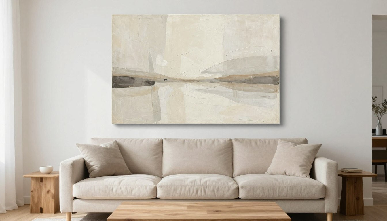
Neutral Abstract Canvas Print
This modern minimalist piece works beautifully in contemporary living rooms through its sophisticated balance of warm beige tones and subtle textural elements. The varying neutral shades create depth without overwhelming your space, while the abstract composition offers visual interest that remains serene.
Best placement: Above a sofa in a minimalist or contemporary living room, where its horizontal format creates a sense of expansiveness.
Lighting note: Illuminate with warm-white (3000K) lighting at a 30° angle to enhance the textural elements without creating glare on the canvas surface.
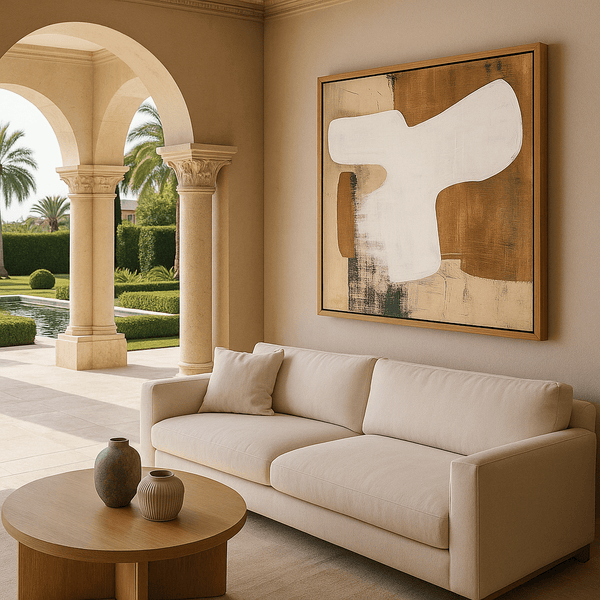
Neutral Essence Minimalist Abstract
This earth-toned abstract brings organic warmth to any living space through its harmonious blend of sand, clay, and taupe tones. The piece excels in spaces with natural materials like wood and linen, where its earthy palette enhances the organic modern aesthetic without competing for attention.
Best placement: Perfect for a reading corner or conversation area where its grounding energy creates an intimate atmosphere.
Lighting note: Pair with warm lighting (2700K-3000K) to enhance the earthy undertones and create a cozy, inviting ambiance around the piece.

Circle of Tones Geometric Minimalist
This geometric piece creates a meditative focal point through its perfect circular composition and subtle gradient of neutral tones. The concentric shapes provide a quiet yet compelling visual anchor that draws the eye without overwhelming the space, making it ideal for minimal interiors seeking a touch of intentional design.
Best placement: Centered on a wall opposite the main seating area, where its balanced composition can be fully appreciated as a focal point.
Lighting note: Use neutral lighting (3500K) positioned to eliminate shadows, allowing the subtle tonal variations to remain visible from all viewing angles.
Original Neutral Textured Painting
This original textured piece elevates any living room through its dimensional surface and elegant arched composition. The handcrafted texture creates an ever-changing interplay of light and shadow throughout the day, bringing the neutral palette to life with subtle movement and depth that flat prints cannot achieve.
Best placement: Above a fireplace or console, where changing light throughout the day will highlight its textural dimension.
Lighting note: Position lighting at a dramatic angle (45°) to maximize shadow play across the textured surface, creating visual interest even in the evening hours.

Whispered Lines Textured Original
This subtly textured original painting brings quiet sophistication to living spaces through its delicate line work and nuanced beige palette. The piece embodies restrained luxury with its handcrafted quality and thoughtful composition, creating a sense of calm that enhances rather than disrupts your living environment.
Best placement: In a transitional space like a hallway or entryway to the living room, where its subtle details invite closer inspection.
Lighting note: Use high-CRI (95+) lighting to reveal the full spectrum of beige tones and textural nuances that might be lost under standard illumination.

Minimalist Abstract Line Canvas
This timeless piece brings elegant simplicity to living spaces through its refined line work and perfectly balanced negative space. The minimalist composition creates visual interest without demanding attention, allowing it to integrate seamlessly with various interior styles from modern to transitional while maintaining its quiet presence.
Best placement: Above a long sofa or console table, where its horizontal format complements the furniture proportions.
Lighting note: Illuminate evenly with diffused lighting to maintain the delicate balance of the composition without creating harsh shadows that might disrupt the linear elements.
Frequently Asked Questions
What size wall art should I choose for above a sofa?
For wall art above a sofa, aim for a width that's approximately 2/3 to 3/4 the length of your sofa. This proportion creates visual balance without overwhelming or underwhelming the space. For a standard 84-inch sofa, look for artwork (or a grouping) around 50-60 inches wide. Height should be proportional to width, but typically 24-36 inches works well for most living rooms. Remember that the bottom edge should hang 6-12 inches above the sofa back for proper spacing.
How high should I hang wall art in a living room?
In general living room areas where people stand, follow the gallery standard of centering artwork at 57-60 inches (145-152 cm) from the floor to the center of the piece. For art above seating, position the bottom edge 6-12 inches (15-30 cm) above the furniture. This creates proper visual connection while maintaining enough separation. Always step back and assess from typical viewing positions—art should feel connected to the furniture below it without appearing to float disconnected on the wall.
How do I keep neutral wall art from looking boring?
Prevent neutral wall art from appearing flat by focusing on three key elements: texture (look for pieces with dimensional surfaces, visible brushwork, or mixed media), value contrast (ensure the piece includes light, medium, and dark neutral tones), and composition (seek dynamic arrangements with interesting focal points or movement). Additionally, proper lighting dramatically affects how neutral art appears—high-quality, well-positioned lighting can reveal subtle variations and textures that might otherwise go unnoticed.
What frame color is best for neutral interiors?
The ideal frame color depends on your specific neutral palette and design style. For warm neutral interiors (beige, cream, terracotta), natural wood frames in oak, walnut, or maple enhance the organic quality. For cool neutral spaces (gray, blue-white), matte black frames create contemporary contrast and definition. Soft gold or champagne frames work as versatile bridges between warm and cool palettes. Consider your room's metal finishes (hardware, lighting) and choose frames that complement these existing elements for cohesion.
What lighting is best for artwork (CRI/Kelvin)?
For optimal neutral wall art illumination, select lighting with a Color Rendering Index (CRI) of 90+ to accurately reveal subtle tonal variations. For color temperature, warm lighting (2700K-3000K) enhances warm neutral tones and creates an inviting atmosphere, while neutral lighting (3500K-4000K) provides more accurate color representation for cooler neutral palettes. Position lights at approximately a 30-degree angle to the artwork to minimize glare while maximizing visibility of textural details. Adjustable fixtures allow you to fine-tune the lighting angle for your specific piece and room conditions.
Can I mix different neutral wall art styles in the same room?
Yes, mixing neutral wall art styles creates visual interest when done thoughtfully. The key is maintaining a common element that ties the pieces together—similar color palette, complementary undertones, related subject matter, or consistent framing. For example, pair a minimalist line drawing with a textured abstract if both share a warm beige palette. Create hierarchy by varying sizes and allowing one piece to serve as the anchor. This curated approach feels collected rather than matched, adding sophistication to your neutral living room.
Creating Your Neutral Gallery
Selecting neutral wall art for your living room is a nuanced process of balancing undertones, scale, texture, and placement. When thoughtfully chosen, these seemingly simple pieces become the quiet heroes of your space—creating atmosphere without demanding attention, adding sophistication without overwhelming the senses. The beauty of neutral wall art lies in its versatility and longevity; as trends come and go, these timeless pieces continue to ground your space with their serene presence.
As you curate your own collection, remember that the most compelling neutral spaces are those that embrace subtle variation rather than flat uniformity. Whether you're drawn to the textural dimension of original paintings or the clean precision of minimalist prints, Rossetti Art offers neutral pieces that balance artistic expression with livable, everyday elegance. Take time to consider how light moves through your space, how your existing furnishings inform your palette, and how the right piece of neutral wall art might transform your living room from simply decorated to thoughtfully designed.

Leave a comment
This site is protected by hCaptcha and the hCaptcha Privacy Policy and Terms of Service apply.