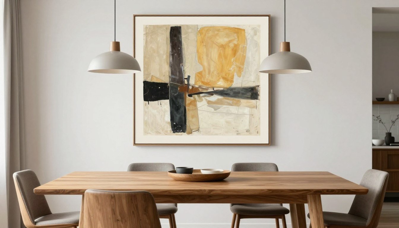
The dining room holds a special place in your home. It's where meals become memories and conversations linger long after dessert. The right modern wall art for dining room spaces transforms these moments, creating an atmosphere that feels both intentional and inviting.
Unlike other rooms where art plays a supporting role, your dining room wall demands pieces that command attention without overwhelming the space. The art you choose sets the tone for every gathering.
This guide walks you through every decision, from selecting styles that complement your aesthetic to mastering the technical details of size and placement. You'll discover how to create a dining environment that feels curated, confident, and unmistakably yours.

Discover Your Perfect Dining Room Art
Explore our curated collection of modern wall art designed to elevate dining spaces with gallery-quality craftsmanship.
Why Dining Room Art Matters More Than You Think
Your dining room serves a purpose beyond function. It's a stage for connection, celebration, and daily rituals that anchor family life. Wall art in this space does more than fill empty walls—it shapes how people feel when they gather around your table.

Modern dining rooms face a unique design challenge. They need to balance formality with comfort, style with practicality. The right artwork bridges these demands, adding personality without cluttering the visual space where food and people remain the stars.
The Psychology of Art in Dining Spaces
Studies in environmental psychology reveal that art influences appetite, conversation quality, and how long guests linger at the table. Warm colors and organic shapes encourage relaxation and extended meals. Geometric patterns and cooler hues create energy and focused conversation.

Your choice of wall decor communicates values and taste to everyone who enters. A carefully selected piece signals that you invest in your home, care about aesthetics, and value the experience of dining together.
Creating a Focal Point That Works
Every successful dining room needs a visual anchor. Without it, the space feels incomplete, as if waiting for something to tie the elements together. Wall art provides this anchor naturally, drawing the eye upward and creating vertical interest in a room dominated by horizontal furniture lines.

The piece you select becomes the reference point for every other design decision in the room. It informs your choice of table linens, color palette for accessories, and even the style of your dining chairs. This makes the initial selection both important and empowering—get it right, and everything else falls into place.
Investment in Daily Experience
Unlike art in hallways or guest rooms, dining room pieces earn their keep daily. You see them morning, noon, and night. They become part of your routine, influencing your mood with every meal.
Quality matters here more than anywhere else in your home. A piece crafted with archival inks and UV-resistant materials maintains its impact year after year, never fading under natural light or losing the vibrancy that first caught your eye.

The return on this investment shows up in countless small moments: the smile when you notice a new detail in a familiar print, the compliment from a dinner guest, the sense of pride when you walk into your own dining space.
Choosing the Right Style of Modern Wall Art
Modern wall art encompasses a vast landscape of styles, from minimal line drawings to explosive abstract expressions. Understanding the major categories helps you identify what speaks to your aesthetic and fits your dining room environment.

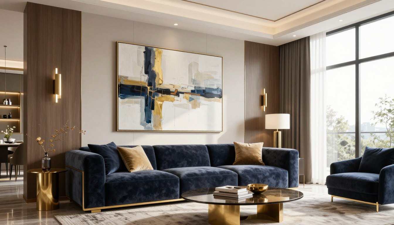
Abstract and Geometric Compositions
Abstract art offers unmatched versatility for dining spaces. Without literal imagery to interpret, these pieces allow viewers to project their own meaning, making conversation starters that never grow stale.
Bold geometric patterns bring structure and sophistication. Sharp lines and defined shapes complement contemporary furniture while adding visual complexity that prevents the room from feeling too stark or minimalist.

Soft, organic abstracts create a different energy entirely. Flowing forms and blended hues introduce movement and warmth, particularly effective in dining areas where you want guests to relax and settle in. Our abstract canvas prints showcase this range beautifully, offering options from structured geometrics to fluid color fields.
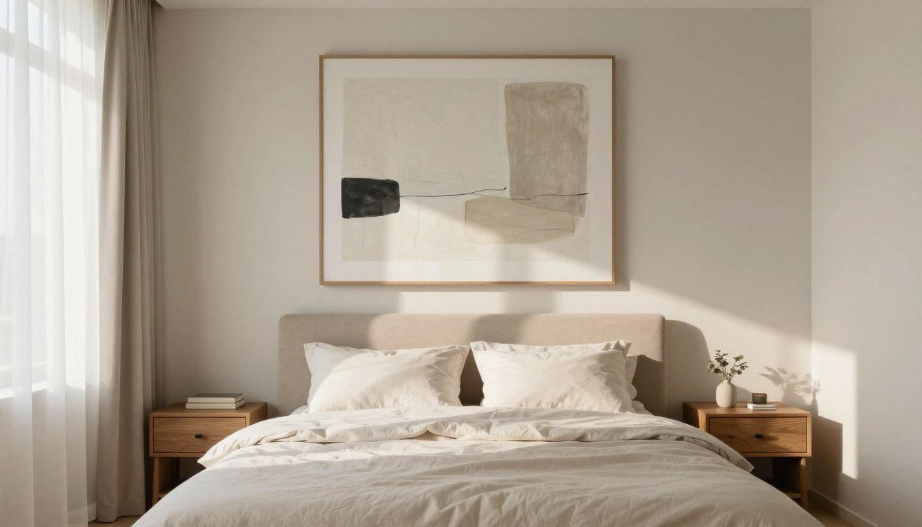
Minimalist and Line Art
Minimalism proves that less truly can be more. A single bold line, a simple shape, or a restrained color palette creates impact through intentional restraint rather than visual density.

This approach works exceptionally well in smaller dining spaces or rooms with already complex architectural features. The art provides a resting place for the eye without competing with other elements.
Line art offers particular charm—sophisticated enough for formal dining yet approachable enough for everyday meals. Single-line drawings of faces, botanicals, or abstract forms feel current without being trendy, ensuring longevity in your design scheme.
Nature-Inspired Modern Interpretations
Modern botanical and landscape art reimagines natural forms through a contemporary lens. Think oversized leaves rendered in unexpected color palettes, or landscapes abstracted to their essential shapes and hues.

These pieces bring the outside in, connecting your dining experience to the natural world. They work particularly well in homes with garden views or abundant natural light, creating visual continuity between interior and exterior spaces.
The key difference from traditional nature art lies in the execution. Modern interpretations emphasize design over realism, using nature as a starting point rather than the end goal.
Figurative and Portrait Work
Contemporary figurative art brings human presence into your dining room without literal representation. Abstracted faces, simplified forms, or suggested human shapes add intimacy and warmth to the space.

This category requires thoughtful selection. The figures should feel contemplative rather than confrontational, enhancing the dining atmosphere without dominating it. Our figurative portrait collection demonstrates this balance, offering pieces that add character without overwhelming.
Color Field and Textural Pieces
Sometimes color itself becomes the subject. Large fields of saturated hues, gradients that shift subtly across the canvas, or textures that catch light differently throughout the day—these pieces transform your wall into a dynamic element of the room.

Textural art adds a tactile dimension even from across the room. Visible brushstrokes, layered media, or embossed surfaces create shadows and highlights that change as light moves through your space during different time of day.
The right textural piece brings depth and richness that flat prints cannot match. When created with hand-stretched canvas and gallery-quality production methods, these works develop a presence that elevates the entire room.

Transform Your Dining Space Today
Browse our complete collection of canvas prints, each crafted with archival inks and hand-stretched for gallery-quality results.
Size and Scale: Getting Proportions Perfect
Choosing the right size makes the difference between art that enhances your space and art that feels like an afterthought. Scale affects perception, atmosphere, and how successfully your piece anchors the room.

The Two-Thirds Rule
Professional designers rely on a simple guideline: your wall art should span roughly two-thirds the width of the furniture beneath it. For a sixty-inch dining table, aim for artwork measuring approximately forty inches wide.
This proportion creates visual balance without overwhelming the furniture or leaving the wall feeling bare. It establishes a relationship between elements that feels natural and intentional.

Ceiling Height Considerations
Rooms with eight-foot ceilings require different strategies than spaces with soaring ten or twelve-foot heights. In standard-height rooms, large vertical pieces can make the space feel taller by drawing the eye upward.
High-ceiling dining rooms offer freedom to go bold. Oversized horizontal pieces or multiple coordinated works stacked vertically fill the generous wall space without creating visual clutter.

The space between your art and ceiling matters too. Leave at least six to twelve inches of breathing room above the frame. This prevents the piece from appearing cramped or touching the ceiling line, which creates visual tension.
Single Statement Pieces vs. Gallery Walls
One large piece delivers maximum impact with minimum complexity. It simplifies the room, creates a clear focal point, and makes a confident statement about your style.

Gallery walls offer different advantages. Multiple smaller pieces create visual interest and allow you to showcase a collection or tell a story through curated works. This approach works particularly well in eclectic or maximalist dining spaces.
However, gallery walls require more careful planning. Each piece needs to relate to the others through color, style, or theme. The overall arrangement should feel cohesive rather than chaotic.

Working with Buffets and Sideboards
When hanging art above a buffet or sideboard, the proportions shift slightly. The piece should span half to two-thirds the furniture width, creating a layered look that doesn't compete with the surface below.
Leave approximately six to eight inches between the furniture top and the bottom of your frame. This creates visual separation while maintaining a clear relationship between elements.

Common Sizing Mistakes to Avoid
The most frequent error? Going too small. A tiny piece on a large wall looks tentative and unfinished, as if you ran out of budget or courage midway through the project.
Conversely, cramming an oversized piece into a small space creates claustrophobia. The art needs breathing room—negative space around it that allows the piece to exist comfortably within the room.

Ignoring furniture scale causes problems too. A delicate piece above a heavy farmhouse table feels mismatched. A bold, chunky frame above an elegant glass table creates stylistic discord.
📐 Not sure what size to choose? Use our free Wall Art Size Calculator → https://rossettiart.com/blogs/news/wall-art-size-calculator
Color Palette Strategies for Dining Spaces
Color shapes emotion and appetite in ways both subtle and profound. The hues in your dining room wall art influence everything from how long guests linger to how the food on your table appears.

Complementing Your Existing Palette
Start by identifying the dominant colors already present in your space. Note your wall color, furniture finishes, flooring, and any fixed elements like built-ins or window treatments.
Your artwork can either harmonize with these existing hues or provide contrast. Harmonious choices create serene, cohesive environments. Contrasting selections inject energy and visual excitement.

Neither approach is inherently better. The decision depends on your desired atmosphere. Formal dining rooms often benefit from harmony. Casual, family-oriented spaces can handle more playful contrast.
The Power of Neutrals
Neutral art—blacks, whites, grays, and earth tones—offers flexibility and longevity. These pieces adapt to changing decor trends and seasonal table settings without requiring replacement.
Don't mistake neutral for boring. Texture, composition, and subtle tonal variations create depth and interest within a restrained palette. Our black and white collection demonstrates this principle beautifully.

Neutral art also allows other elements to shine. If you invest in seasonal table linens or frequently update your centerpiece, neutral wall decor provides a stable backdrop for these changing elements.
Strategic Color Pops
Bold color injections through art transform a dining room from pleasant to memorable. A vibrant abstract in jewel tones or saturated primaries becomes the room's personality, setting an energetic, confident tone.

This strategy works best when the rest of your space remains relatively neutral. The art becomes the hero, with furniture and accessories playing supporting roles. Our colorful canvas prints offer vibrant options that command attention without overwhelming.
Consider the psychology of specific hues. Warm colors like red, orange, and yellow stimulate appetite and conversation. Cool blues and greens calm and refresh, creating a more contemplative dining experience.
Seasonal Flexibility
Some homeowners prefer to rotate art seasonally, swapping pieces to reflect changing moods throughout the year. This approach requires planning but keeps your space feeling fresh and responsive to the seasons.

If you embrace this strategy, invest in versatile hanging systems that allow easy swapping without wall damage. Choose pieces that share similar sizes and frame styles for visual continuity even as colors change.
Creating Cohesion Through Accent Colors
Professional designers use a simple trick: pull one or two accent colors from your art and repeat them throughout the room in small doses. This creates visual threads that tie the space together.
If your artwork features touches of deep blue, introduce blue in your table runner, napkins, or a ceramic piece on the sideboard. This repetition feels intentional and sophisticated.

Limit yourself to two or three accent colors maximum. More than that creates visual confusion rather than cohesion. The goal is subtle connection, not matchy-matchy redundancy.
Placement and Composition Techniques
Even perfect art falls flat when poorly positioned. The height, angle, and relationship to other elements determine whether your piece enhances the room or fades into the background.

The Eye-Level Rule
Standard gallery practice places art so its center sits at eye level—approximately fifty-seven to sixty inches from the floor. This works well in spaces where people stand to view art.
Dining rooms complicate this rule. Since people spend most of their time seated here, the optimal viewing height drops slightly. Aim for the art center at fifty-two to fifty-five inches from the floor when hanging above a table.

Above a buffet or sideboard, return to standard gallery height since viewers approach standing. The shift in hanging position based on viewing context shows thoughtful design rather than rigid rule-following.
Creating Visual Weight Distribution
Every room has visual weight—the sense that some areas feel heavier or lighter than others. Dark colors, large objects, and busy patterns carry more weight. Light colors, empty space, and minimal design feel lighter.
Your art should balance the room's visual weight. If your dining table and chairs are substantial and dark, a bold, colorful piece provides counterbalance. A glass table with delicate chairs needs less assertive art to maintain equilibrium.

Symmetry vs. Asymmetry
Symmetrical arrangements feel formal and traditional. Centering a single piece above the table or placing matching works on either side of a buffet creates classical balance.
Asymmetrical composition brings modern energy. Off-center placement, varied sizes, or intentionally unbalanced groupings create dynamic tension that feels current and intentional.

Your choice depends on your overall style. Traditional dining rooms typically favor symmetry. Modern, eclectic, or transitional spaces embrace asymmetry more readily.
Working with Architectural Features
Windows, doorways, chair rails, and wainscoting all influence art placement. Rather than fighting these features, use them as guides.
Center art within the wall space created by architectural elements. If a window occupies part of your dining room wall, hang art in the remaining space rather than trying to span both window and wall.

Crown molding creates a natural upper boundary. Leave adequate space between your art's top edge and the molding to avoid a cramped appearance.
Lighting Considerations
Light makes or breaks art presentation. Natural light brings colors to life but can cause fading over time without proper protection. This is where UV-resistant materials prove their worth, preserving your investment against sun damage.

Artificial light offers control. Position track lighting or picture lights to eliminate glare while highlighting the art's texture and color. Warm bulbs enhance warm-toned art; cooler bulbs suit monochromatic or blue-toned pieces.
Avoid placing art directly opposite bright windows, which creates backlighting that washes out colors and makes viewing difficult.
Multiple-Piece Arrangements
When hanging multiple works, treat the collection as a single unit. The spacing between pieces should remain consistent—typically two to four inches depending on frame size.

Layout options include grid arrangements (structured, formal), salon-style (eclectic, varied sizes), or horizontal/vertical rows (clean, contemporary). Before hammering nails, create templates from paper and tape them to the wall to test arrangements.
The bottom edge of the lowest piece should sit eight to ten inches above the furniture below, creating visual connection without crowding.
Find Art That Fits Your Vision
Discover large-scale pieces designed to make a statement in dining spaces, crafted with gallery-quality materials and ready to hang.
Framing Options and Quality Considerations
The frame you choose affects not just aesthetics but longevity and perceived value. Understanding options helps you make decisions that protect your investment while enhancing your design.

Frame Styles and Materials
Traditional frames with profiles and mat boards suit formal dining rooms. They create separation between art and wall, adding dimension and formality.
Floater frames present canvas with a small gap between art edge and frame, creating a floating appearance. This modern approach works beautifully with contemporary prints and adds subtle dimension. An oak floater frame brings warmth and natural texture that complements both modern and transitional spaces.

Simple pine wood frames offer clean lines and lighter tones that suit Scandinavian or minimalist aesthetics. The light wood doesn't compete with the artwork, allowing the image to remain the focus.
Gallery-wrapped canvas without frames creates seamless, contemporary presentation. The image wraps around the edges, eliminating the need for framing altogether. This approach demands high quality canvas and tight stretching to maintain professional appearance.

Quality Indicators Worth Knowing
Gallery-quality prints differ from standard prints in several key areas. Archival inks resist fading for decades, maintaining color vibrancy through years of display. Standard inks begin degrading within months when exposed to light.
Hand-stretched canvas means artisans physically pull and secure canvas to frames, ensuring even tension and eliminating ripples or sagging. Machine stretching often leaves inconsistencies visible once hung.

Substrate matters too. Canvas weight and weave affect how print detail renders and how the finished piece hangs. Premium cotton-polyester blends offer durability without the weight and cost of pure cotton canvas.
Ready to Hang Convenience
Ready hang systems save time and frustration. Wire hanging, D-rings, or sawtooth hangers come pre-installed, allowing immediate display without additional hardware purchases or installation expertise.
The hanging method should match the art's weight. Lightweight pieces under five pounds work fine with sawtooth hangers. Heavier works require wire or double D-rings for security and level hanging.

Protecting Your Investment
UV-resistant coatings or glazing protect against the primary enemy of art: ultraviolet light. Even indirect sunlight gradually degrades colors and breaks down materials without this protection.
For dining rooms with significant natural light, UV-resistant materials are non-negotiable. The slight added cost pays for itself many times over in extended piece life.

Climate control also matters. Extreme temperature swings and humidity fluctuations damage canvas and cause warping. Dining rooms generally maintain stable conditions, but avoid hanging art directly above radiators or HVAC vents.
Made to Order vs. Mass Production
Made to order pieces offer advantages beyond exclusivity. Production begins after you order, ensuring fresh materials and current quality standards. Colors remain more vibrant, and materials haven't sat in warehouses collecting dust.
This approach also reduces waste. Pieces are created specifically for buyers who want them, eliminating unsold inventory that eventually ends up discounted or discarded.

Lead times typically range from one to three weeks for made to order works, longer than instant shop purchases but worth the wait for superior quality and assurance that your piece was created specifically for your home.
Advanced Styling Tips for Maximum Impact
Once you've selected and hung your art, thoughtful styling techniques amplify its impact and integrate it seamlessly into your dining room narrative.

Layering Textures and Materials
Your wall art introduces one texture into the room. Enhance its impact by creating texture conversations with other elements. A smooth, modern print gains depth when surrounded by rough wood furniture or woven textiles.
Conversely, highly textured art pairs beautifully with sleek glass, polished metal, or smooth ceramic surfaces. The contrast highlights both the art's dimensionality and the furniture's refinement.

Coordinating with Table Settings
Your everyday table setting need not match your art exactly, but pulling one or two colors creates subtle harmony. If your artwork features sage green accents, introduce green in your napkins or a simple table runner.
For special occasions, take coordination further. Let your art inspire your tablescape, using its color palette and mood as a jumping-off point for centerpieces, linens, and even menu selections.

Seasonal Styling Updates
Rather than changing your art seasonally, shift the elements around it. Spring might call for fresh flowers echoing your artwork's colors. Autumn could introduce candlelight that creates new shadows and highlights in textured pieces.
This approach keeps your space feeling current without the expense and effort of rotating art. The piece becomes a constant around which seasonal elements dance.

Creating Vignettes
A vignette groups related objects to create a curated moment. On a buffet below your art, arrange three to five items of varying heights—perhaps a sculptural object, a plant, and a stack of beautiful books.
The vignette should relate to your art without directly matching it. If your piece is highly geometric, introduce organic shapes below. If your art feels soft and flowing, add structured elements for balance.

Considering the Full Room Experience
Your art doesn't exist in isolation. Consider sight lines from other rooms. What do guests see when they approach? How does the piece appear from the living room or kitchen?
Optimize for these viewing angles too. Sometimes a piece that works less well straight-on creates stunning impact when glimpsed from an adjacent space, drawing people into the dining room.

Balancing Negative Space
White space—the empty areas around your art—isn't wasted space. It provides visual rest and allows the eye to appreciate the piece without distraction.
Resist the urge to fill every inch of wall. A single striking piece with generous negative space communicates confidence and sophistication. Crowded walls feel anxious and uncertain.

Lighting as a Styling Tool
Strategic lighting transforms art from static object to dynamic presence. A dimmer switch on your dining room chandelier lets you adjust ambient light to suit different occasions.
For intimate dinners, lower ambient light and add picture lighting to make your art glow. For casual family meals, brighter overall light creates energy and visibility.

Candles on the dining table create flickering light that plays across textured art, adding movement and atmosphere. This ancient light source brings warmth that electric light can't replicate.
Incorporating Art into Daily Rituals
The best art becomes part of your daily life, not just decor you notice during dinner parties. Take moments to really see your piece—notice how morning light reveals different details than evening light.
Share what you love about the piece with family. Let it become part of your home's story. Art isn't precious when it's truly lived with; it's a companion that enriches everyday moments.

Frequently Asked Questions
Q: What size wall art is best for a dining room?
A: The ideal size depends on your table width and wall dimensions. As a general rule, choose artwork that spans approximately two-thirds the width of your dining table. For a sixty-inch table, aim for art measuring forty to forty-eight inches wide. In rooms with high ceilings, you can go larger to fill vertical space appropriately. Always use our Wall Art Size Calculator to determine the perfect proportions for your specific space.
Q: Should dining room art match the rest of my home decor?
A: Your dining room art should coordinate with but not necessarily match your overall home decor. Creating visual threads through color, style, or theme helps the space feel cohesive, but exact matching can feel contrived and unimaginative. Instead, pull one or two accent colors from your art and echo them in adjacent rooms through textiles or accessories. This creates subtle connection while allowing each space to maintain its own character. The dining room can express a slightly different mood than your living room while still feeling part of the same home.
Q: How high should I hang artwork above a dining table?
A: Position artwork so its center sits fifty-two to fifty-five inches from the floor when hanging above a dining table. This is slightly lower than standard gallery height because viewers are seated most of the time. If hanging above a buffet or sideboard, increase to standard gallery height with the center at fifty-seven to sixty inches, since people approach these pieces while standing. Leave eight to ten inches between the furniture top and the bottom of your frame to create visual connection without crowding.
Q: What colors work best for dining room wall art?
A: The best colors depend on your desired atmosphere and existing palette. Warm hues like red, orange, terracotta, and golden yellow stimulate appetite and encourage lingering conversation. Cool blues and greens create calm, contemplative environments. Neutral palettes in blacks, whites, grays, and earth tones offer timeless versatility that adapts to changing decor trends. For maximum flexibility, choose art with a neutral base and strategic color accents that you can echo in changeable elements like table linens and centerpieces.
Q: Is it better to have one large piece or multiple smaller pieces?
A: Both approaches work beautifully when executed well. A single large statement piece creates maximum impact with minimum complexity, ideal for modern or minimalist dining rooms. It simplifies the space and makes a confident design statement. Multiple smaller pieces arranged as a gallery wall offer versatility and visual interest, working well in eclectic or traditional spaces. The decision depends on your style, available wall space, and comfort level with composition. If uncertain, start with one large piece—you can always add coordinating works later.
Q: How do I protect dining room art from fading?
A: Protect your investment by choosing prints created with archival inks and UV-resistant materials, which resist fading for decades even in bright conditions. Position art away from direct sunlight when possible—never directly opposite large windows where harsh afternoon sun hits. Use window treatments to filter intense light during peak hours. For framed works, select UV-resistant glazing or acrylic. Maintain stable temperature and humidity in your dining room, avoiding placement near radiators, HVAC vents, or fireplaces. Gallery-quality canvas prints with proper materials easily last twenty-plus years without noticeable degradation when given basic protection.
Q: What style of art works best in formal vs. casual dining rooms?
A: Formal dining rooms typically suit symmetrical arrangements, traditional frames, and sophisticated subject matter like refined abstracts or classical-inspired works. Colors lean toward rich jewel tones or elegant neutrals. Casual, family-oriented dining spaces embrace playful asymmetry, vibrant colors, and eclectic mixes. The art can be more experimental and personal. However, these are guidelines, not rules. A stunning modern abstract can elevate a traditional formal space, while a carefully chosen classical piece adds gravitas to a casual room. Trust your instincts and choose art that makes you happy every time you sit down to eat.

Choosing modern wall art for dining room spaces transforms more than walls—it reshapes how you experience daily meals and special gatherings. The right piece anchors your design, reflects your personality, and creates an environment where both food and conversation flourish.
Start with understanding your space: its proportions, existing color palette, and the atmosphere you want to create. Consider the technical details—size, placement, quality—but don't let them overwhelm the emotional response. The best art speaks to you on a level beyond rules and measurements.

Invest in quality materials that protect your investment: archival inks, UV-resistant coatings, hand-stretched canvas, and thoughtful framing options like a pine wood frame or oak floater frame. These details ensure your piece maintains its beauty for years to come.
Remember that your dining room art is never truly finished. It evolves with seasonal styling, changing light, and the life that unfolds around your table. Each meal, each gathering, each quiet morning coffee adds new meaning to the art you've chosen.

Your dining space deserves art that matches the care you put into every other aspect of creating a home. Choose pieces that make you pause, that spark joy, that become part of your family's story.
Explore our Canvas Prints to discover gallery-quality pieces crafted with archival inks, UV-resistant materials, and ready hang systems designed specifically for modern dining spaces.
About the Author
Chiara Rossetti is the founder of Rossetti Art, a canvas print and original art brand. She writes about interior design, wall art styling, and the art of making a home feel alive.
Leave a comment
This site is protected by hCaptcha and the hCaptcha Privacy Policy and Terms of Service apply.