Your living room tells your story before you say a word. It welcomes guests, cradles quiet evenings, and serves as the backdrop for everyday life. Yet choosing the right design direction—and the wall art that completes the look—can feel overwhelming when you're staring at blank walls and endless inspiration photos.
This living room interior design photo gallery cuts through the noise. You'll find curated looks across five distinct styles, each paired with specific wall art guidance that actually works in real American homes. No guesswork, no expensive mistakes, just clear direction from room constraints to final styling touches.
Whether you're decorating a small apartment or an open concept living space, this guide gives you the visual vocabulary and practical formulas to create a room that feels intentionally designed. For even more wall art guidance tailored to your space, explore our living room wall art guides.

Quick Takeaways (TL;DR)
- Start with your room's physical constraints—ceiling height, sofa length, window placement, and natural light determine which styles will work best in your space
- Choose one dominant aesthetic and one accent influence to create a curated look that feels intentional rather than random or collected over time
- Wall art should occupy two-thirds to three-quarters of your sofa's width when hung above it; this proportion creates visual balance in nearly every living room layout
- Gallery walls need consistent spacing between frames (typically two to three inches) and should align with your sofa's centerline, not the wall's centerline
- The five most versatile living room styles in American homes right now are Modern Minimal, Warm Modern, Contemporary Luxe, Industrial, and Coastal—each pairs with specific art directions
- Common mistakes include hanging art too high, choosing pieces that are too small for the wall space, and ignoring how lighting affects both paint color and artwork visibility
- Every style benefits from the same wall art formula: consider scale first, then color relationships, then texture and mood—in that specific order
How to Use This Living Room Photo Gallery
This gallery works differently than scrolling through endless inspiration boards. Each section breaks down a specific style with the practical details you need to recreate the look in your own space. You'll see not just what works, but why it works and how to adapt it.
The photos show real design principles in action. Notice the furniture scale, the lighting layering, the color relationships, and especially the wall art choices that complete each aesthetic. These aren't aspirational concepts—they're replicable formulas.

Start With Your Room Constraints (Size, Light, Ceiling Height, Sofa Length)
Before you fall in love with a style, measure your reality. Grab a tape measure and note your room dimensions, sofa length, ceiling height, and window size. These numbers aren't limitations—they're your design guardrails.
Natural light changes everything. A north-facing room with limited windows needs a different color strategy than a south-facing space flooded with afternoon sun. Light affects how paint reads on walls and how artwork appears throughout the day.
Ceiling height determines your vertical proportions. Standard eight-foot ceilings call for different art scaling than nine or ten-foot ceilings. Your sofa length directly dictates the width of art that will look proportionally correct above it.
Sketch your floor plan, even roughly. Note where people walk through the space, where sight lines land when you enter the room, and which walls are focal points versus transitional spaces. These traffic patterns influence where to place your strongest design moments.

Pick 1 Dominant Style + 1 Accent Influence (So It Looks Curated, Not Random)
Successful living room design isn't about perfectly matching a single aesthetic. It's about choosing one dominant style direction and allowing one complementary influence to add depth. This approach prevents the space from feeling like a showroom or a design catalog page.
Your dominant style sets the rules: the color palette, the furniture silhouettes, the material choices, and the overall mood. Think of it as the language your room speaks. Your accent influence is the dialect—it adds personality without contradicting the core aesthetic.
For example, a Modern Minimal room might incorporate Coastal accent influences through natural fiber textures and bleached wood tones. An Industrial space might layer in Contemporary Luxe touches through one statement velvet chair or a sculptural light fixture. The dominant style stays recognizable while the accent prevents predictability.
This one-plus-one formula also guides your wall art decisions. If your dominant style is Warm Modern, your art might lean contemporary abstract. Your Coastal accent influence could appear in the color palette—soft blues and sandy neutrals rather than pure black and white.

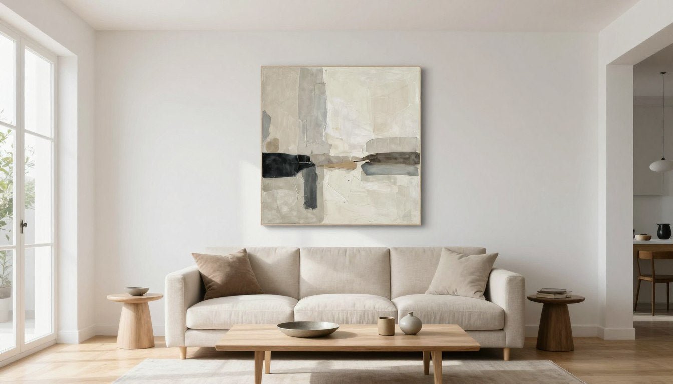
Photo Gallery — Modern Minimal Living Rooms
Modern Minimal living rooms strip away excess to reveal essential beauty. This aesthetic relies on clean lines, neutral palettes, and carefully chosen pieces that each earn their place in the space. Nothing is accidental; everything serves both function and visual purpose.
The style reads as calm and uncluttered, but it's not cold or sterile when executed well. Texture becomes crucial—a linen sofa, a wool rug, matte paint finishes—because color variation is limited. The eye travels easily across the space without visual interruption.


Palette + Materials
The Modern Minimal palette centers on white, gray, black, and beige with occasional warm brown accents. These aren't stark institutional tones—they layer various temperatures and undertones to create subtle depth. Think warm grays paired with cool whites, or black metal accents against natural oak.
Materials trend natural and honest. Wood appears in its recognizable grain, not painted or heavily stained. Metal stays matte or brushed rather than polished. Stone surfaces show their actual texture. Fabrics lean toward linen, cotton, wool—materials that age gracefully and feel authentic to the touch.
Floors are often light wood, polished concrete, or neutral tile. Walls stay white or very pale gray to maximize light reflection. Trim can match walls for a seamless look, or contrast in pure white for architectural definition. The coffered ceiling detail remains simple if present—clean lines without ornate molding.
Window treatments are minimal by design. Sheer panels, simple roller shades, or no treatments at all when privacy allows. The goal is to preserve natural light and maintain clean sight lines rather than adding decorative fabric layers.

Best Wall Art Direction (Scale, Color, Texture)
Wall art in Modern Minimal living rooms typically follows a "less is more" philosophy—one or two large-scale pieces rather than multiple small frames. The art itself should feel intentional and substantial, not decorative or busy. Scale matters enormously because the spare aesthetic means your art commands significant visual attention.
Color in the artwork usually stays within the room's neutral palette or introduces one controlled accent color. Think charcoal and cream abstracts, soft beige and white geometric compositions, or occasional black line drawings on white backgrounds. Colorful art can work, but it becomes the room's focal point by default.
Texture in the art adds the depth that might otherwise come from pattern or decorative objects. Canvas texture, visible brushstrokes, or even textured paper prints bring tactile interest to otherwise smooth walls. For this aesthetic, explore modern canvas prints for living rooms in monochromatic palettes—abstract geometrics or subtle tonal compositions create visual interest without overwhelming the clean aesthetic.
Frame choices lean simple and contemporary. Black metal frames, natural wood frames in light oak or walnut, or frameless canvas floater frames all work. White frames can read too matchy with white walls unless the art itself provides strong contrast. The frame should recede, allowing the artwork itself to speak.


"Steal This Look" Mini-Checklist
- Choose one neutral base color for large furniture pieces (sofa, chairs) and stick to it throughout the space for cohesion
- Limit your material palette to three or four options maximum—for example, light wood, matte black metal, natural linen, and white painted surfaces
- Select one large-scale artwork (minimum 40 inches wide for a standard sofa) in a two- or three-color palette that echoes your room's neutrals
- Use floating shelves or built-in bookshelves in the same finish as your trim for storage without adding visual weight through freestanding furniture
- Keep your coffee table simple and low-profile; glass or light wood tables maintain the open, airy feeling
- Layer lighting with simple fixtures—one statement pendant or floor lamp plus recessed lighting provides flexibility without clutter
- Contain small items in closed storage; every visible object should be intentionally displayed rather than casually placed

Photo Gallery — Warm Modern / Cozy Contemporary
Warm Modern living rooms take contemporary design principles and soften them with texture, layered lighting, and inviting color temperatures. This style feels approachable and livable while maintaining clean lines and current sensibilities. It's where modern design meets actual comfort.
The space reads as put-together but not precious. You can imagine sinking into the sofa with a book, not just perching on the edge for photos. Furniture tends toward comfortable scale and soft upholstery rather than sculptural minimalism.


Lighting + Textures
Lighting makes or breaks the Warm Modern aesthetic. Layered light sources at different heights create the warmth this style requires. Think table lamps with fabric shades, floor lamps with warm LED bulbs, and perhaps a statement pendant light with visible warm bulbs rather than hidden recessed lighting alone.
Light fixtures themselves become decorative elements while remaining contemporary in form. Brass, warm bronze, or natural wood finishes on lighting fixtures add warmth without looking dated. The light quality matters as much as the fixture design—choose bulbs in the 2700K to 3000K range for that inviting glow.
Texture layers throughout the room. A chunky knit throw draped over the sofa arm, linen curtains that puddle slightly at the floor, a jute or wool rug underfoot, velvet or textured throw pillows, and perhaps a boucle accent chair. Each texture catches light differently and adds visual richness without introducing pattern.
Natural materials bring inherent warmth. Wood tones can be richer here than in stark modern spaces—think walnut or oak with visible grain. A stone fireplace, if present, might be limestone or sandstone rather than sleek marble. Even paint finishes can add texture; consider matte or eggshell rather than high-gloss sheens.

Art Choices That Add Softness and Depth
Wall art in Warm Modern spaces should echo the room's inviting quality. Abstract works with soft color transitions, organic shapes, or gentle mark-making fit better than hard-edged geometric compositions. The art can introduce slightly more color than in a minimal space—think terracotta, rust, warm gold, sage green, or dusty blue.
Artwork with visible texture or brushwork reinforces the layered, tactile feeling of the room. Canvas prints showing painterly abstracts, mixed media pieces with collage elements, or even woven wall hangings can work in this aesthetic. The key is avoiding anything too slick, too digital, or too graphically precise.
Consider art that brings in natural elements—abstract landscapes, botanical forms, or organic patterns. These don't need to be literal representations, but they should evoke a connection to the natural world. Earthy colors and flowing forms reinforce the warm, grounded feeling. To add this warmth and softness, explore gallery-style canvas wall art with organic abstracts in warm tones—these add visual depth without disrupting the cozy atmosphere.
Frame selections in warm wood tones (natural oak, walnut, or light maple) or warm metal finishes (brass, bronze, rose gold) tie the art to the room's material palette. Black frames can still work but might read slightly cool unless balanced by warm mats or warm tones within the artwork itself.


"Steal This Look" Mini-Checklist
- Start with warm neutral wall colors—soft beige, greige, warm light gray, or even a pale terracotta—rather than stark white to create an enveloping feel
- Layer at least three different textures in your soft furnishings: smooth (leather or linen), chunky (knit throws or boucle), and soft pile (velvet or faux fur)
- Include a minimum of three light sources in the space: ambient (overhead or recessed), task (table or floor lamp), and accent (picture light or decorative fixture)
- Choose artwork with warm undertones—even if the dominant colors are neutral, look for pieces with terracotta, rust, warm brown, or golden accents
- Add plants in natural fiber or ceramic planters; living greenery reinforces the organic, warm feeling and adds another layer of texture
- Select a coffee table or side tables in natural wood with visible grain rather than painted, lacquered, or glass options
- Use window treatments in natural fabrics like linen or cotton that soften the light rather than block it entirely

Photo Gallery — Contemporary Luxe
Contemporary Luxe elevates modern design with high-end materials, dramatic moments, and sophisticated color or texture contrasts. This aesthetic says "investment" through quality rather than quantity. Every piece in the room feels considered and substantial.
The style balances restraint with impact. Furniture silhouettes stay clean and current, but upholstery might be velvet or leather rather than cotton. Finishes lean toward polished marble, rich wood, or lacquered surfaces. Lighting fixtures become sculptural moments. The overall effect is refined without feeling formal or unapproachable.


Contrast + Statement Pieces
Contemporary Luxe thrives on intentional contrast. Light against dark, smooth against textured, warm against cool—these juxtapositions create visual tension that reads as sophisticated. A room might pair white marble with black metal, or soft velvet upholstery with sleek lacquered wood.
Color contrast adds drama. Deep jewel tones (emerald, sapphire, ruby) against neutrals, or black and white compositions with one metallic accent color. The palette isn't necessarily bold, but it's decisive. Even an all-neutral luxe room will layer different tones—warm caramel against cool gray, or cream against charcoal.
Statement pieces earn their place through quality and presence. This might be a single extraordinary sofa in a bold color, a sculptural coffee table that doubles as art, a dramatic fireplace surround in book-matched marble, or an oversized light fixture that commands attention. These pieces set the room's tone and justify the "luxe" designation.
Materials themselves create contrast. Reflective surfaces (polished metal, glass, lacquer, marble) bounce light and create glamour. These balance with matte or textured elements (velvet, leather, wood, stone) to prevent the space from feeling cold or too shiny. The interplay between reflective and absorptive surfaces creates depth.

One Large Artwork vs. Multi-Piece Gallery Wall
In Contemporary Luxe spaces, the wall art decision carries significant weight. The choice between one large statement piece and a gallery wall depends on the other drama in the room. Generally, this aesthetic trends toward singular, substantial artworks rather than collections of smaller pieces.
One large artwork anchors the space with authority. It can be bold in color, dramatic in scale, or striking in subject matter—the point is immediate impact. This approach works especially well when the art introduces a key color or provides the room's primary visual moment. For a luxe focal point, a single original painting as a focal point can anchor the entire room and justify investment in other high-end finishes.
If you choose a gallery wall in a Contemporary Luxe room, it needs impeccable curation. All frames should match (typically in a luxe finish like brass, polished black, or natural walnut), spacing must be precise, and the overall composition should read as a single deliberate arrangement rather than a collection. Think museum-quality presentation.
The art itself in luxe spaces often includes metallics (gold leaf, silver, bronze), dramatic abstracts with strong mark-making, sophisticated photography in gallery-quality prints, or even three-dimensional works that cast shadows and create physical depth. Whatever the medium, it should feel like an investment piece, not a placeholder.
Frame quality matters significantly in this aesthetic. Budget frames undermine expensive furniture and finishes. Look for substantial moulding, quality materials, museum glass when appropriate, and professional framing standards. The frame is part of the art's presentation, not an afterthought.


Photo Gallery — Industrial / Urban Modern
Industrial living rooms celebrate raw materials and honest structure. Exposed brick, visible ductwork, concrete surfaces, and steel elements define this aesthetic. Yet it's not harsh—the industrial style balances hard edges with warm woods and soft textiles to create inviting urban spaces.
This style often emerges naturally in loft or warehouse conversions, but it can be created in any space through material choices and design decisions. The key is embracing imperfection and allowing architectural elements to show rather than concealing them behind smooth finishes.


Raw Materials + Clean Silhouettes
The Industrial aesthetic showcases materials in their natural or lightly finished states. Brick stays exposed and unpainted. Concrete remains sealed but visible. Metal appears in its functional forms—black steel, raw iron, or weathered brass rather than polished chrome. Wood is reclaimed, rough-hewn, or simply finished to show age and character.
Despite raw materials, furniture silhouettes stay clean and modern. Industrial style doesn't mean cluttered or rustic. A leather sofa has simple lines. A wood coffee table features straightforward construction. Storage solutions might use metal shelving systems, but they're organized and intentional, not haphazard.
The color palette typically centers on neutrals with strong contrast: black and white, gray and brown, charcoal and warm wood tones. Occasional warm metal accents (copper pipes, brass fixtures, bronze hardware) add depth without introducing true color. When color does appear, it's usually in small doses through textiles or accessories.
Architectural elements become design features. High ceilings with exposed ductwork, large factory-style windows with black metal frames, steel support columns, original brick walls, concrete floors—these aren't hidden or minimized. They're celebrated as part of the space's character and history.

Art That Balances Hard Edges
Wall art in Industrial spaces needs to acknowledge the room's raw character while preventing it from feeling too cold or masculine. The art can echo the urban aesthetic through subject matter—cityscapes, architectural photography, industrial abstracts, or graphic black and white compositions—or it can intentionally soften the space.
One effective approach uses organic, flowing forms in the artwork to contrast with the room's angular architecture and hard materials. Abstract paintings with gestural marks, botanical prints, or even textile wall hangings introduce curves and softness that the architecture lacks. This creates necessary visual tension.
Black and white photography suits the Industrial aesthetic naturally. Urban landscapes, architectural details, street photography, or high-contrast portraits in gallery-quality prints match the style's aesthetic without adding color that might feel out of place. Large-scale black and white prints make strong statements above sofas or between windows.
When incorporating color through art, consider earth tones, rust, warm browns, or muted greens—colors that feel organic and aged rather than bright and synthetic. These warm accents prevent the space from reading as too stark. Balance hard edges with modern sculptures for shelves and consoles that add organic texture without softening the urban edge.
Frame choices typically use black metal, raw steel, or simple wood frames stained dark. The framing should feel utilitarian rather than decorative. Float-mounted prints, canvas prints with simple black floater frames, or even unframed prints mounted to wood panels all work within the aesthetic.


Photo Gallery — Coastal / Airy Neutrals
Coastal living rooms evoke the ease and light of seaside living without relying on literal nautical themes. This aesthetic prioritizes natural light, pale palettes, organic textures, and a sense of relaxed comfort. The mood is breezy and uncomplicated, with an emphasis on livability over formality.
Modern coastal style has evolved beyond blue-and-white stripes and anchor motifs. Today's version uses tonal neutrals, natural materials, and subtle nods to the beach environment through texture and color temperature rather than obvious seaside references. The result feels effortlessly elegant and genuinely calming.


Tone-on-Tone Styling
Coastal style succeeds through careful tone-on-tone layering rather than stark contrasts. The palette stays within a narrow range—whites, creams, beiges, soft grays, pale blues, and sandy taupes—but uses multiple shades within each color family to create subtle depth. This prevents the all-neutral scheme from reading as flat or boring.
Natural materials define the texture story. Rattan, jute, sisal, linen, cotton, driftwood, bleached oak, and whitewashed pine all appear in various forms. These materials share a common thread: they're organic, they show natural variation, and they feel touchable and casual. Nothing is precious or untouchable.
White serves as the foundation, but not necessarily stark bright white. Look for softer whites with warm undertones—cream, ivory, linen white, or off-white. These warmer whites prevent the space from feeling cold or clinical, especially in rooms without constant natural light. Trim can be slightly lighter than walls for subtle definition.
Coastal spaces embrace imperfection through materials that weather gracefully. Slipcovers can wrinkle. Linen curtains can crease. Wood surfaces show natural grain and maybe a few knots. The style isn't about perfection—it's about authentic, easy living that looks better with a little wear.

Art That Keeps It Light, Not Bland
Wall art in Coastal spaces must balance the neutral palette with enough visual interest to prevent blandness. The art should introduce subtle color, texture, or form while maintaining the overall light and airy feeling. This is a delicate balance—too much color or contrast disrupts the serene mood, but too little leaves the space feeling unfinished.
Effective coastal art often features organic, flowing forms rather than geometric precision. Think watercolor-style abstracts in soft blues and greens, impressionistic landscapes suggesting beach or sky, or simple line drawings of coastal botanicals. The art suggests rather than states, maintaining the aesthetic's understated quality.
Color in coastal artwork typically stays muted and atmospheric—soft aqua, weathered denim blue, sage green, sandy beige, warm gray, or pale coral. These colors feel sun-bleached and organic rather than bright or synthetic. Even when introducing blues, choose tones with gray or green undertones rather than pure primary blue.
Texture in the art itself adds dimension without adding visual weight. Consider canvas prints that show subtle texture, watercolor paintings where the paper grain is visible, or even woven textile art in natural fibers. Three-dimensional elements like driftwood assemblages or sculptural wall hangings can work if kept minimal and organic in form. To keep your coastal space light and serene without blandness, explore gallery-style canvas wall art in soft aqua, sage, and sandy tones—abstract seascapes and organic forms add interest while preserving the airy aesthetic.
Frame selections should enhance the light feel. White-washed wood, natural light oak, simple white-painted frames, or even no frames at all for canvas pieces. Avoid dark frames or heavy ornate moulding, which creates unwanted contrast and formality in the otherwise casual space.


The Wall Art Formula (Works With Every Style)
Regardless of your chosen aesthetic, certain wall art principles apply universally. These formulas take the guesswork out of sizing, placement, and selection. Master these rules, and your art will look professionally styled in any living room design.
The following guidelines work for Modern Minimal, Warm Modern, Contemporary Luxe, Industrial, Coastal, and every style in between. They're based on proportion, visual weight, and how the human eye processes spatial relationships. Once you understand these fundamentals, you can confidently adapt them to your specific space.

Before diving into specific formulas, understand that these are guidelines, not rigid rules. A room with exceptionally high ceilings might adjust vertical proportions. A narrow wall between windows might require different math. But these formulas provide your starting point—the baseline from which intentional adjustments can be made.
For comprehensive details on standard art dimensions, explore our art print sizes guide, which breaks down every dimension, aspect ratio, and frame pairing option for your specific wall measurements.
Above-Sofa Sizing Rules
The most common wall art placement question centers on the sofa wall. The formula is straightforward: your artwork should occupy two-thirds to three-quarters of your sofa's width. Measure your sofa from arm to arm, multiply by 0.67 to 0.75, and that's your target art width (or total width if using multiple pieces).
For a standard 84-inch sofa, this means artwork between 56 and 63 inches wide. For a sectional or longer sofa, you might need a multi-piece solution or an oversized single piece. The point is visual proportion—art that's too small looks like a postage stamp, while art that extends beyond the sofa edges creates awkward visual imbalance.
Vertical sizing depends on your wall height and other elements. A general rule: leave 6 to 12 inches of space between the top of your sofa back and the bottom of the art. This creates visual separation without floating the art too high on the wall. The art height itself typically ranges from 24 to 40 inches for standard residential ceilings.
If your room has high ceilings (over 10 feet), you may need taller artwork or a vertical arrangement to fill the proportional wall space. Standard-height ceilings (8 to 9 feet) work well with horizontal or square compositions. Consider your ceiling height before finalizing your art dimensions.

For those working with challenging walls or unconventional hanging surfaces, our guide on how to hang a canvas without nails offers modern solutions for renters and anyone wanting damage-free installation options.
Gallery Wall Spacing + Alignment Rules
Gallery walls require more precision than single artworks. The spacing between frames matters as much as the arrangement itself. A standard spacing of 2 to 3 inches between all frames creates visual cohesion and allows each piece to be seen individually while reading as a unified collection.
Before hammering a single nail, create paper templates of each frame and tape them to the wall. Live with the arrangement for a day or two, adjusting as needed. This simple step prevents costly mistakes and unnecessary wall holes. Move the templates until the composition feels balanced and intentional.
Alignment options include grid layouts (all frames aligned to an invisible grid), center-aligned layouts (all frames share a central horizontal line), or edge-aligned layouts (one edge of the collection aligns while the opposite edge varies). The grid approach looks most formal, while edge-aligned feels more organic and collected.
When aligning a gallery wall to furniture, use the sofa's centerline as your anchor point, not the wall's centerline. The gallery should relate to the furniture arrangement, creating a cohesive visual unit. If your sofa isn't centered on the wall (common in open concept living rooms), the gallery shouldn't be centered on the wall either.
Balance light and dark frames, large and small pieces, and subject matter throughout the gallery. Step back and squint—your eye should travel across the arrangement without getting stuck in one area due to unbalanced visual weight. Adjust placement until the composition feels evenly distributed.

Choosing Art by Mood (Calm, Energetic, Dramatic)
Beyond size and placement, consider the emotional impact you want your art to create. The same room can feel entirely different based on whether the artwork is calm and meditative, energetic and bold, or dramatic and moody. This choice should align with how you want to feel in the space and what activities happen there.
Calm art features soft colors, gentle transitions, organic forms, and minimal contrast. Think watercolor-style abstracts, monochromatic compositions, subtle gradients, or serene landscapes. This mood suits living rooms used primarily for relaxation, reading, or quiet conversation. The art recedes into the background, creating a soothing environment rather than commanding attention.
Energetic art uses bold colors, strong contrasts, dynamic compositions, or graphic elements. This might include bright abstracts, colorful geometric patterns, or vibrant photography. Energetic art works well in living rooms that serve as social hubs or in homes with minimal other color where the art introduces the space's personality and vibrancy.
Dramatic art creates a statement through scale, color intensity, unusual subject matter, or striking compositions. Large-scale abstracts in deep colors, high-contrast black and white photography, or bold figurative works all qualify. Dramatic art suits living rooms where you want a strong focal point and aren't afraid of making a decorating commitment.
Consider your living room's primary function when choosing mood. A space used for entertaining might handle energetic or dramatic art well, while a living room that doubles as a home office might benefit from calmer choices that don't distract. There's no wrong answer—only alignment between your art choice and how you actually use the space.

If you're exploring canvas art for the first time, understanding the medium helps with selection—read our guide on what is canvas art to learn about canvas prints, stretched canvas, and gallery-wrap finishes before making your purchase.
Living Room Style → Wall Art Pairing Matrix
| Style | Best Art Type | Ideal Color Palette for Art | Best Placement | Frame / Finish Notes | Avoid This |
| Modern Minimal | 1 large statement piece (40-60 inches) or single oversized canvas | Neutrals, monochrome (black/white/gray), occasional single accent color | Above sofa, centered, or on focal wall opposite entry | Black metal, light wood, or frameless canvas float; keep moulding simple and thin | Multiple small prints that clutter the clean aesthetic; ornate gilded frames |
| Warm Modern / Cozy Contemporary | 1 large piece or diptych (two panels) in warm abstracts or organic forms | Warm neutrals with earth tone accents (terracotta, rust, sage, warm gray) | Above sofa, console, or fireplace in main seating area | Natural wood (oak, walnut), warm brass, or textured canvas without frame | Cool-toned blues and grays that fight the warm palette; high-gloss frames |
| Contemporary Luxe | 1 dramatic statement piece (48+ inches) or original artwork with visible texture | Bold jewel tones with metallics, or high-contrast black/white/gold | Above fireplace or as room focal point opposite main entry | Polished brass, gold leaf, thick black lacquer; substantial moulding with quality finish | Budget prints or cheap frames that undermine expensive furniture; posters |
| Industrial / Urban Modern | Large black/white photography or abstract with raw edge; may include sculptural wall pieces | Black and white, or muted earth tones (rust, warm brown, charcoal) | Above sofa or between large windows; on exposed brick if present | Black metal, raw steel, dark stained wood; utilitarian simple frames or no frame | Pastel colors or soft watercolors that don't match the raw aesthetic; ornate frames |
| Coastal / Airy Neutrals | 1-3 pieces in soft abstracts or organic forms; can use gallery wall if frames match | Soft blues, sandy beiges, sage greens, warm whites—all muted and atmospheric | Above sofa, console, or distributed across multiple walls for balanced feel | White-washed wood, natural light oak, white painted frames, or frameless canvas | Bright saturated colors or heavy dark frames that create harsh contrast |
| Eclectic / Layered | Gallery wall with varied sizes and subjects; can mix frames and art types | Varied—cohesive through repeated accent color or tonal consistency | Gallery wall above sofa or covering large empty wall as collected display | Can mix frame styles if united by color (all brass, all black) or consistent mats | Random sizing without visual balance; too many competing focal points |
Ready to explore artwork matched to your style? Browse our curated collections of gallery-style canvas wall art organized by aesthetic and color palette—each piece selected to complement the living room design styles outlined in this matrix.

Common Mistakes (and Fixes)
Even with the best intentions, certain wall art mistakes appear repeatedly in living room design. These errors undermine otherwise well-designed spaces, making rooms feel unfinished, disproportionate, or awkward. The good news: every mistake has a straightforward fix.
Understanding what doesn't work—and why—helps you avoid these pitfalls in your own space. Most art placement errors stem from ignoring proportion, rushing the process, or following bad advice from outdated design rules. Let's address the most common issues and their solutions.

Too Small Art
The most pervasive mistake in living room design is artwork that's undersized for the wall space and furniture it accompanies. A 16x20 inch print above a standard sofa looks like a postage stamp, yet this scenario appears in countless homes. The problem is usually budget-driven or stems from uncertainty about going "too big."
The fix: Follow the two-thirds to three-quarters rule for sofa width. Yes, larger art costs more, but properly sized artwork transforms the room while undersized art looks like an afterthought. If budget is a concern, prioritize one correctly sized piece over multiple small ones. A single substantial artwork commands more presence than three or four small pieces scattered across the wall.
If you can't afford a large single piece, consider a diptych or triptych (two or three panels) that collectively achieve the correct width. This approach sometimes costs less than one large piece while still providing proper scale. Just ensure the panels are hung close together (2-4 inches apart) to read as a unified composition.

Wrong Height
The second most common error is hanging artwork too high. The outdated rule of "center the art at 57 inches" (museum standard) doesn't account for furniture relationships. Art should relate to the furniture it accompanies, not float independently high on the wall like it's trying to escape.
The fix: Leave 6 to 12 inches between the top of your sofa back and the bottom of the artwork. This creates visual connection between furniture and art. For art on walls without furniture below, the 57-60 inch center height works fine. But above sofas, consoles, or other furniture, the art needs to acknowledge the furniture's presence.
If you've already hung art too high and don't want new holes, consider adding a console table or low bookshelf beneath it to bridge the gap. This creates a deliberate vertical composition rather than awkward floating art. Alternatively, bite the bullet and rehang it correctly—your room will look instantly more polished.

Cluttered Wall
Gallery walls done poorly create visual chaos rather than curated collections. The clutter usually stems from inconsistent spacing, too many different frame styles, random sizing without planned composition, or simply too many pieces competing for attention. The eye doesn't know where to land or how to read the arrangement.
The fix: Use consistent spacing (2-3 inches) between all frames. If you're mixing frame styles, unite them through color (all black, all brass, all natural wood). Plan your layout completely before hanging anything—use paper templates taped to the wall and live with the arrangement for a few days. Remove pieces that don't contribute to the overall composition; less is often more.
For a cleaner alternative, consider arranging multiple pieces in a strict grid format rather than an organic salon-style gallery. Grid galleries look intentional and curated even with varied artwork. Every frame aligns to invisible horizontal and vertical lines, creating order from variety.

Mismatched Frames
Mixing frame styles can work in eclectic interiors, but it requires a unifying strategy. Random frame mixing—gold here, black there, natural wood somewhere else, all in different widths and profiles—creates visual noise rather than interest. Each frame fights for attention instead of supporting the artwork.
The fix: If you want frame variety, unite them through one consistent element. All frames could be the same color in different styles, all could share the same width moulding in different finishes, or all could have identical white mats regardless of frame variation. This common thread creates cohesion while allowing diversity.
The simplest solution: stick with identical frames throughout a gallery wall or throughout the entire room. This approach always works and allows the artwork itself to provide variety. Black frames work in nearly any style, as do simple natural wood frames. These neutral frame choices let you change artwork over time without needing to reframe everything.

Ignoring Lighting
Even perfectly sized and placed artwork falls flat without proper lighting. Natural light changes throughout the day, and artificial light can distort colors or cast shadows that obscure the art. Many living rooms have adequate ambient lighting but no direct art illumination, leaving the wall art underlit and difficult to appreciate after sunset.
The fix: Add dedicated picture lighting or adjust your existing lighting to illuminate the artwork. Options include picture lights mounted to the frame or wall, track lighting aimed at the art, wall sconces positioned on either side of the piece, or even adjustable floor lamps that cast light upward. The goal is even illumination without glare.
Consider the color temperature of your bulbs. Warm white (2700-3000K) flatters most artwork and living spaces, while cool white or daylight bulbs can make art colors appear washed out or distorted. LED strips or picture lights designed specifically for art often offer adjustable color temperature, letting you fine-tune the lighting to match your specific pieces.
Don't forget natural light considerations. Direct sunlight fades artwork over time, especially works on paper or photographs. If your art will receive direct sun exposure, use UV-filtering glass in the frame, rotate pieces periodically, or use window treatments to control the light during peak sun hours.

Related Rossetti Art Guides (Internal Reading Path)
These comprehensive guides expand on the fundamentals covered in this gallery. Each resource dives deeper into specific aspects of wall art selection, sizing, hanging, and styling for your living room and throughout your home.
Ultimate Guide to Art Print Sizes
Master every standard art print dimension, aspect ratio, and frame pairing. Learn which sizes work best for different wall spaces and furniture arrangements, from small accent pieces to oversized statement prints.
How to Hang Canvas Without Nails
Discover modern hanging solutions perfect for renters or anyone wanting damage-free walls. From adhesive strips to rail systems to tension rods, explore every option for displaying canvas art without putting holes in your walls.
What Is Canvas Art?
Understand the differences between canvas prints, stretched canvas, gallery-wrap finishes, and traditional framed prints. Learn about canvas quality, texture, durability, and which canvas formats work best in different living room styles.

Frequently Asked Questions
What size wall art looks best above a sofa?
Wall art above a sofa should measure two-thirds to three-quarters of the sofa's width. For a standard 84-inch sofa, aim for artwork between 56 and 63 inches wide. This proportion creates visual balance without the art looking too small or extending beyond the sofa edges.
If you're using multiple pieces, calculate the total combined width including the space between frames. A diptych or triptych can achieve the correct total width while sometimes costing less than one large piece. The key is treating the grouped pieces as a single visual unit that follows the width proportion rule.
Vertical sizing typically ranges from 24 to 40 inches tall for standard 8-9 foot ceilings. Leave 6 to 12 inches of space between the top of your sofa back and the bottom edge of the artwork to create visual connection between furniture and art.
How high should I hang artwork in the living room?
Artwork hung above furniture should sit 6 to 12 inches above the furniture's top edge. This creates visual connection between the furniture and art rather than having the art float independently high on the wall. The old museum rule of centering art at 57 inches doesn't apply when furniture is involved.
For walls without furniture below, center the artwork at 57 to 60 inches from the floor. This height places the art at average eye level when standing. In rooms where people primarily sit, you can lower this slightly to 54-56 inches for better viewing from seated positions.
When hanging a gallery wall, use the centermost piece as your anchor at the appropriate height, then arrange other pieces around it maintaining consistent spacing. The overall gallery composition should follow the same height guidelines as a single large piece.
How do I create a gallery wall that looks curated (not messy)?
Start by using paper templates cut to each frame's exact size and tape them to the wall. Live with this arrangement for several days, adjusting until the composition feels balanced. This prevents unnecessary wall holes and lets you perfect the layout before committing.
Maintain consistent spacing between all frames—2 to 3 inches works for most gallery walls. This uniform spacing creates cohesion and allows each piece to be appreciated individually while reading as a unified collection. Inconsistent spacing is the primary culprit in messy-looking galleries.
Unite your frames through one consistent element: same color (all black, all brass, all natural wood), same mat color (all white mats regardless of frame finish), or same frame width and profile. This unifying thread lets you vary artwork subjects and sizes while maintaining visual order. Limit your gallery to one or two frame colors maximum.
What living room colors are trending in the USA right now?
Warm neutrals dominate current living room color trends—think greige (gray-beige), warm taupe, soft terracotta, and creamy whites with warm undertones. These colors create inviting spaces that photograph well for social media while remaining timeless enough to avoid looking dated in a few years.
Accent colors lean toward earthy, muted tones rather than bright primary colors. Rust, sage green, dusty blue, warm ochre, and soft clay shades appear frequently in textiles, wall art, and decorative accessories. These nature-inspired colors pair beautifully with the warm neutral base palettes.
Dark accent walls in deep charcoal, navy, or forest green are trending in contemporary living rooms, especially on fireplace walls or as a backdrop for gallery walls. These darker tones create drama and intimacy without committing to dark walls throughout the entire space. They work particularly well in rooms with abundant natural light.
Should I choose one large canvas or a set of smaller pieces?
One large canvas typically creates more impact and feels more intentional, especially in Modern Minimal, Contemporary Luxe, or Industrial living rooms. A substantial single piece commands the wall with authority and simplifies the design decision—you need less precision than multi-piece arrangements require.
Multiple smaller pieces work better when you want to create a collected, layered look (Eclectic or Coastal styles) or when you're working with a very wide wall where one piece would need to be impractically large. Gallery walls also allow you to incorporate personal photos, varied artwork, and dimensional objects for more personality.
Consider your budget and flexibility. One large piece is a bigger upfront investment but typically looks more sophisticated. Multiple smaller pieces can be collected over time and rearranged as your taste evolves, offering more flexibility. If you change your mind about a gallery wall, you can relocate individual pieces to other rooms; a large single canvas has less versatility.
How do I decorate a small living room without making it feel crowded?
Choose furniture with exposed legs rather than skirted sofas or chairs sitting directly on the floor. Visible floor space beneath furniture creates an airy feeling and makes the room appear larger. Light wood legs or metal frames work particularly well in small spaces.
Stick to a limited color palette with mostly light neutrals. Too many colors fragment the space visually and make it feel smaller. Carry one or two accent colors throughout the room in small doses rather than introducing new colors in every corner. This visual continuity expands the perceived space.
Use one or two larger pieces of art rather than many small items on the walls. A single substantial artwork creates a focal point without cluttering the walls. Multiple small frames can make a small room feel busy and cramped. The same principle applies to furniture—fewer, better-scaled pieces beat many small ones.
Incorporate mirrors strategically to reflect light and create depth. A large mirror opposite a window effectively doubles the natural light. Avoid heavy window treatments that block light; opt for sheer panels or simple roller shades instead.
What's the best wall decor for an open-concept living room?
In open concept living rooms, your wall art should relate to the adjacent spaces (kitchen, dining space) through color palette or style rather than trying to create rigid separation. Choose artwork that complements the overall color scheme flowing through the open plan rather than introducing entirely new colors in the living area.
Scale becomes even more important in open concept spaces because the walls are often longer and the viewing distances are greater. What looks substantial in a closed room might read as small in an open plan living room. Add 10-15% to your typical sizing calculations when determining artwork dimensions for open concepts.
Use wall art to subtly define zones within the open space. A gallery wall behind the sofa designates the living area, while a different piece or arrangement can anchor the dining space. The art doesn't create hard boundaries, but it helps the eye understand the different functional zones within the larger room.
Consider art visible from multiple angles and rooms. In open concept spaces, you often see the living room wall art from the kitchen or dining area, so choose pieces that work from various viewpoints. Avoid highly detailed works that only make sense from one specific position.
How do I mix sculptures and wall art in the same space?
Balance wall art with sculptures by distributing visual weight throughout the room rather than concentrating everything in one area. If you have a substantial gallery wall above the sofa, place smaller sculptural pieces on the console table, bookshelves, or coffee table rather than adding large sculptures that compete for attention.
Use sculptures to complement your wall art's aesthetic. Modern abstract wall art pairs well with contemporary sculptural accents for living rooms in similar materials or tones. Industrial wall pieces work with metal or wood sculptures showing raw materials. Maintain style consistency between two-dimensional and three-dimensional art.
Vary the heights and scales. If your wall art occupies the upper third of the wall, sculptures on tables and shelves activate the middle and lower zones, creating a layered, three-dimensional composition. Don't cluster all sculpture on one surface; distribute pieces throughout the room at various elevations.
Consider negative space as carefully as filled space. Both wall art and sculptures need breathing room to be appreciated. A minimally styled console table with one perfect sculpture can balance a busy gallery wall across the room. Too many sculptural objects compete with wall art and create visual chaos.

Bringing Your Living Room Vision to Life
Your living room holds more potential than any other space in your home. It's where design decisions are most visible, where guests form first impressions, and where you spend the largest portion of your home time. Getting the design right—and choosing wall art that completes the look—makes a measurable difference in how the space feels and functions.
This gallery showed you five distinct aesthetic directions, each with clear guidance on palette, materials, furniture, and crucially, the wall art that makes each style work. You've seen the formulas for sizing, the principles for placement, and the common mistakes to avoid. These aren't abstract concepts—they're practical tools you can apply to your specific living room right now.
Start with your room's constraints, choose your dominant style, and let the wall art selection follow the guidelines you've learned here. Whether you're drawn to Modern Minimal's serene simplicity, Warm Modern's inviting textures, Contemporary Luxe's sophisticated drama, Industrial's raw authenticity, or Coastal's breezy ease, you now have the visual vocabulary and practical formulas to execute your vision successfully.
Remember that professional-looking design isn't about perfection or unlimited budgets. It's about understanding proportion, honoring your space's unique characteristics, and making deliberate choices rather than random ones. Your living room can look intentionally designed with the wall art principles and style guidance from this resource.


Leave a comment
This site is protected by hCaptcha and the hCaptcha Privacy Policy and Terms of Service apply.