The right piece of wall art transforms a living room from a simple gathering space into a reflection of your personality and style. Yet standing before an empty wall, many homeowners feel paralyzed by choice.
This guide walks you through every decision point. You'll learn to match art with your existing furniture, determine the perfect size for your walls, and create visual harmony that makes your space feel intentional.
Understanding Your Living Room Space and Style
Your living room already tells a story through its furniture, layout, and natural light. The best wall art complements this existing narrative rather than competing with it.
Start by identifying your current design style. Modern spaces with clean lines and minimal furniture pair beautifully with abstract artwork or geometric designs. Traditional rooms featuring wood furniture and classic textiles call for more figurative pieces or landscape photography.

The room itself provides valuable clues. Measure your wall space carefully, noting the width and height available. Consider architectural features like windows, doorways, and built-in shelving that influence where artwork can hang.
Pay attention to your ceiling height. Standard eight-foot ceilings accommodate different artwork than dramatic ten or twelve-foot spaces. The scale of your room determines the scale of art that looks proportional.
Assessing Your Current Color Palette
Look at the dominant colors in your living room. Your walls, furniture, rugs, and curtains create a color story. Effective wall art either echoes these existing colors or introduces a complementary accent that brings new energy.
Neutral rooms with beige, gray, or white tones offer maximum flexibility. You can introduce bold, colorful artwork as a focal point. Rooms already featuring strong colors benefit from art that picks up on one or two existing hues.
Identifying Your Focal Point
Every living room needs a visual anchor. This focal point draws the eye and organizes the entire space. Common focal points include the wall behind your sofa, above a fireplace, or opposite the main entrance.
If your room lacks a clear focal point, wall art can create one. A large statement piece commands attention and gives the room purpose. The area above your main seating arrangement typically works best as this focal wall.

Choosing the Right Size and Scale for Maximum Impact
Size matters profoundly in wall art selection. A piece too small looks lost and disconnected. Artwork too large overwhelms the space and furniture beneath it.
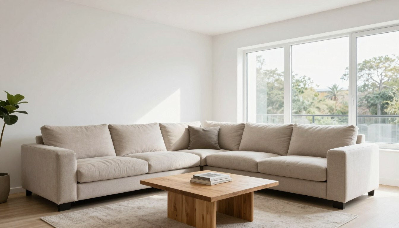
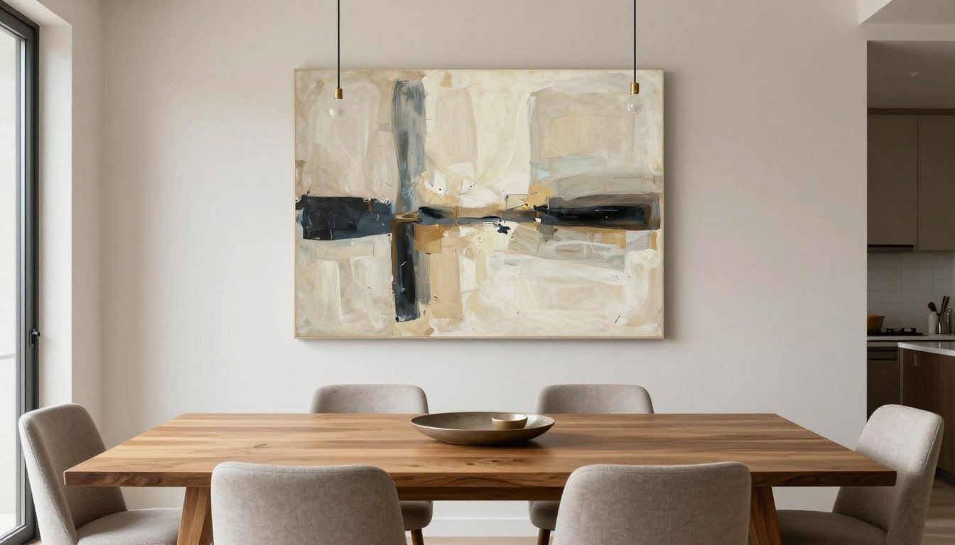
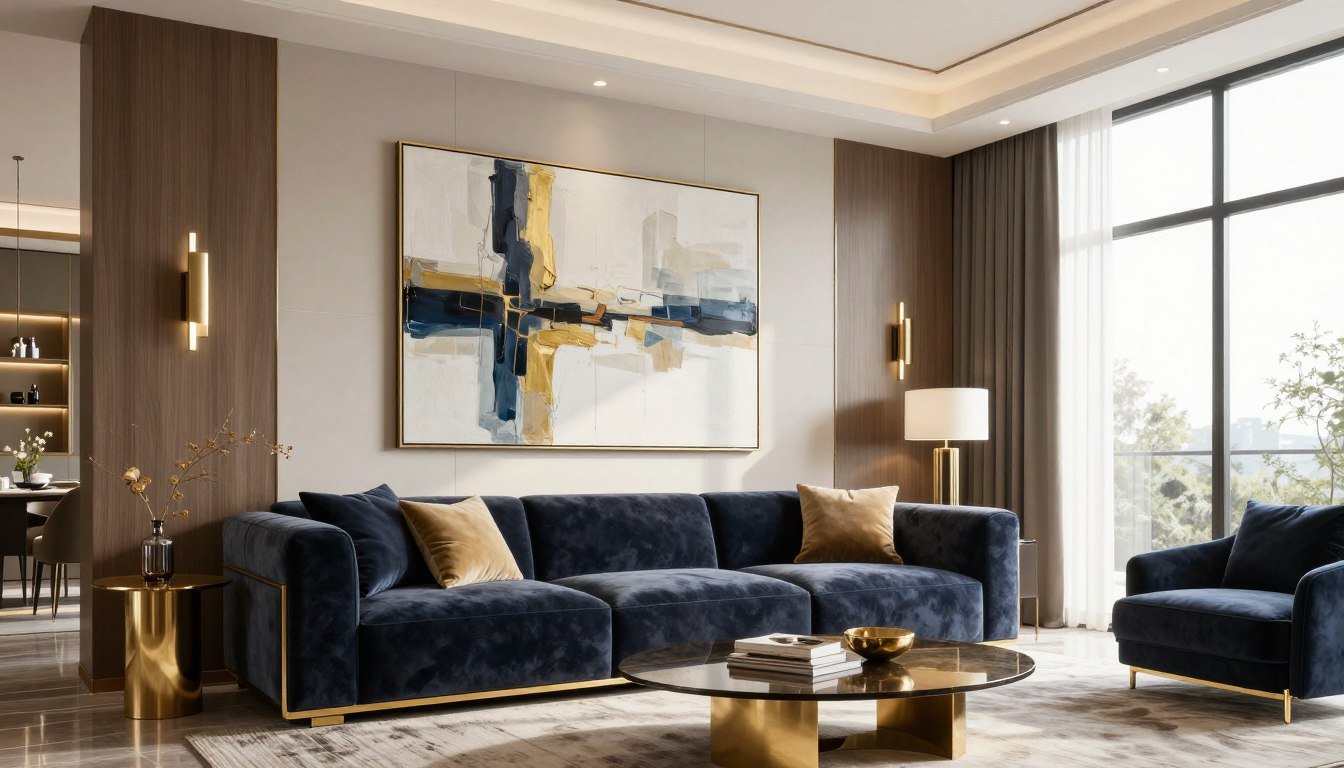
The golden rule: your wall art should span approximately two-thirds to three-quarters the width of the furniture below it. For a standard six-foot sofa, look for artwork between 48 and 54 inches wide.

This proportion creates visual balance. The artwork appears connected to the furniture rather than floating independently. Your eye naturally groups the two elements together.
Height Placement Guidelines
Art should hang at eye level for average-height viewers. The center of your artwork should sit approximately 57 to 60 inches from the floor. This standard works in most residential settings.
When hanging art above furniture, maintain 6 to 12 inches of space between the furniture top and the artwork's bottom edge. This creates breathing room while keeping the pieces visually connected.
Rooms with high ceilings can accommodate multiple pieces stacked vertically or a single, tall vertical piece. The vertical orientation draws the eye upward and makes the most of your ceiling height.
Single Large Piece Versus Multiple Smaller Works
A single large statement piece creates immediate impact. It simplifies decision-making and makes a bold declaration about your style. Gallery-quality canvas prints work beautifully for this approach, especially when you want drama without complexity.
Multiple pieces arranged together offer flexibility and visual interest. You can create a gallery wall that tells a more complex story. This approach works well when you have several pieces you love or want to build a collection over time.
Color Coordination and Design Harmony
Color creates emotion and sets the mood in your living space. The colors in your wall art should work harmoniously with your room's existing palette while potentially introducing new accent tones.
You don't need perfect color matching. Artwork that picks up one or two colors from your room creates sufficient connection. The remaining colors in the piece can introduce fresh elements.

Working with Neutral Spaces
Neutral living rooms provide a blank canvas for colorful artwork. Beige, gray, cream, and white walls welcome bold colors that become the room's focal point. This approach lets you change the room's mood through art selection alone.
Consider how different colors affect atmosphere. Blue tones create calm and serenity. Red and orange bring energy and warmth. Green introduces natural, peaceful vibes. The color you emphasize shapes how the space feels.
If you're hesitant about bold color, black and white canvas prints offer sophisticated drama without color commitment. These pieces work in virtually any neutral setting.
Complementing Existing Bold Colors
Rooms already featuring strong furniture colors need careful art selection. Your artwork can echo the existing bold color, making it feel intentional. Or choose a complementary color that balances the existing tone.
The color wheel guides complementary pairings. Blue walls or furniture complement orange-toned artwork. Green pairs with red or pink accents. These combinations create visual excitement through contrast.

Analogous colors (neighbors on the color wheel) create harmony. If your room features blue tones, artwork with blue-green or blue-purple hues feels cohesive and restful.
Creating Contrast and Visual Interest
Contrast adds depth and prevents rooms from feeling flat. This applies to both color and value (lightness and darkness). Light walls benefit from artwork with some darker elements. Dark accent walls can showcase lighter-toned pieces.
Texture creates another form of contrast. Smooth, modern furniture pairs beautifully with textured original paintings that add tactile interest. The mix of textures makes spaces feel layered and considered.
Selecting Art Style and Subject Matter That Speaks to You
Different types of art communicate different messages. The style you choose should resonate with your personal taste while complementing your room's overall design language.
Abstract art offers versatility and emotional impact without literal representation. These pieces work exceptionally well in contemporary spaces. The viewer interprets meaning personally, making abstract works conversation starters.

Geometric designs bring structure and order. These work beautifully in modern or mid-century spaces. The clean lines echo architectural elements and create a sense of intentional design.
Figurative and portrait artwork adds human interest and storytelling. These pieces create intimacy and can anchor a space with classical elegance. Figurative portrait canvas prints work particularly well in traditional or eclectic living rooms.
Understanding Different Art Mediums
Photography brings realism and can transport viewers to other places. Landscape photography works well for nature lovers. Urban photography suits city dwellers. The medium feels contemporary and accessible.
Original paintings offer unique, one-of-a-kind pieces with visible brushwork and texture. These investments become focal points and conversation pieces. The texture adds dimensional interest that photographs cannot replicate.
Canvas prints combine affordability with gallery-quality presentation. Modern printing technology with archival inks creates museum-quality reproductions. Hand-stretched canvas on wood frames provides the look and feel of original artwork.
Choosing Subject Matter
Your subject matter should reflect your interests and create the atmosphere you want. Nature scenes bring the outdoors inside and create peaceful environments. These work universally well across different design styles.
Abstract geometric patterns suit minimalists who appreciate form over representation. The clean lines and shapes create visual interest without narrative complexity.

Urban and architectural subjects appeal to those who love cityscapes and modern structures. These pieces bring energy and contemporary edge to living spaces.
The key consideration: choose subjects that you want to see every day. You'll look at this artwork countless times. It should bring you joy, interest, or peace each time you notice it.
📐 Not sure what size to choose? Use our free Wall Art Size Calculator → https://rossettiart.com/blogs/news/wall-art-size-calculator
Placement and Hanging Techniques for Professional Results
Proper placement elevates good artwork to great room design. The position, height, and relationship to surrounding elements determine whether your art looks professionally curated or haphazardly placed.
The 57-inch rule provides your starting point. Measure 57 inches from the floor and mark this height lightly on your wall. This represents the center point of your artwork.

For artwork above furniture, measure differently. Leave 6 to 12 inches between the furniture's top edge and the artwork's bottom. This spacing keeps them visually connected without crowding.
Creating Balance with Furniture Arrangement
Your wall art should center horizontally above the furniture below it. For a sofa, the artwork's center should align with the sofa's center. This creates visual symmetry that feels balanced.
If your furniture arrangement is asymmetrical, your artwork placement can be too. The key is intentionality. Deliberate asymmetry looks sophisticated. Accidental off-center placement looks like a mistake.
Consider the room's traffic flow. Artwork should be visible from main seating areas. The piece should draw the eye naturally as people enter the space or sit in primary seating.
Working with Architectural Features
Windows, doorways, and built-ins influence placement options. Avoid crowding artwork too close to windows. Leave at least 4 to 6 inches of wall space between the window frame and your art.
Fireplace mantels create natural focal points. Artwork above a mantel should be proportional to the fireplace's width. Leave adequate space between the mantel top and artwork bottom—typically 4 to 8 inches.

High ceilings permit vertical arrangements. You can stack multiple pieces or choose tall, vertically-oriented artwork. This approach draws the eye upward and makes the most of your ceiling height.
Tools and Hardware for Secure Hanging
Use proper hanging hardware for your wall type and artwork weight. Drywall requires anchors for pieces over 10 pounds. Studs provide the most secure mounting for heavy artwork.
A level ensures your artwork hangs straight. Even slightly tilted pieces look unprofessional. Take time to adjust until the level confirms perfect horizontal alignment.
For gallery walls with multiple pieces, create a paper template first. Trace each piece on paper, cut out the shapes, and tape them to the wall. This lets you experiment with arrangement before making holes.
Frame Selection and Material Quality Considerations
The frame surrounding your artwork matters as much as the art itself. Quality framing protects your investment and complements both the artwork and your room's design style.
Wood frames offer warmth and traditional elegance. Natural wood tones work in virtually any setting. Pine wood frames provide affordable quality, while oak floater frames create contemporary gallery appeal.

The frame style should match your overall design aesthetic. Traditional spaces call for classic wood frames with subtle detailing. Modern rooms benefit from simple, clean-lined frames or frameless presentations.
Understanding Frame Materials and Construction
Metal frames bring contemporary, industrial appeal. Black metal creates bold definition. Silver or gold metal adds luxurious touches. These work particularly well with modern wall art and minimalist spaces.
Floater frames create the illusion that artwork floats within the frame. The canvas edge remains visible, creating depth and a gallery-quality presentation. This style suits contemporary and transitional spaces beautifully.
Frame depth matters for canvas prints. Standard frames sit flush with the wall. Shadow box or floater frames add dimensional interest by creating space between the wall and artwork.
Canvas Quality and Print Durability
Canvas material quality directly affects how artwork looks and lasts. Gallery-quality canvas prints use tightly woven fabric that holds detail sharply. Cheaper canvases show texture that can interfere with fine details.
Archival inks resist fading and maintain color vibrancy for decades. UV-resistant treatments protect artwork from sun damage. These quality factors determine whether your art looks fresh for years or fades quickly.
Hand-stretched canvas creates superior results compared to machine-stretched alternatives. Proper stretching eliminates wrinkles and ensures the canvas remains taut over time. The corners should show clean, professional folding.

Protective Coatings and Finishes
Canvas prints benefit from protective spray finishes. These coatings resist dust, moisture, and minor contact. Matte finishes eliminate glare in brightly lit rooms. Satin finishes add subtle sheen.
Quality matters for long-term satisfaction. Made-to-order pieces allow customization to your exact specifications. This approach ensures perfect sizing and finish options that mass-produced art cannot match.
Lighting Considerations for Wall Art Display
Lighting transforms how artwork appears. The same piece looks dramatically different under various lighting conditions. Consider both natural and artificial light when selecting and placing wall art.
Natural light changes throughout the day. Morning light differs from afternoon sun. Observe your room at different times to understand how lighting affects your wall space.

Direct sunlight can damage artwork over time. If your chosen wall receives strong direct sun, look for UV-resistant prints or plan for window treatments that filter harsh rays during peak sun hours.
Artificial Lighting Options
Picture lights mounted above artwork create gallery-style illumination. These fixtures direct focused light downward, highlighting the piece and creating subtle drama. This works especially well for traditional spaces.
Track lighting offers flexible artwork illumination. You can adjust the light direction to eliminate glare and perfectly illuminate your piece. This approach suits contemporary spaces with multiple artworks.
Recessed lighting provides ambient illumination that can highlight wall art when properly positioned. Adjustable trim allows you to aim the light precisely at your artwork.
Avoiding Glare and Reflection Issues
Glass-covered artwork reflects light sources directly, creating glare that obscures the image. Canvas prints without glass eliminate this problem entirely. The matte surface absorbs light naturally without reflection.
Position light sources at 30-degree angles to minimize glare. Avoid placing lamps or overhead lights directly in front of artwork. Side lighting typically produces the best results with minimal reflection.
Test lighting before permanent installation. Temporarily position your artwork and observe it under your lighting at different times. Adjust lamp positions or light intensity until you eliminate unwanted glare.

Working with Multiple Pieces and Gallery Walls
Gallery walls showcase multiple pieces in coordinated arrangements. This approach adds visual interest and lets you display collections that reflect your personality through various artworks.
Start with your largest piece as the anchor. Position this central artwork first, then build around it with smaller complementary pieces. The anchor provides a focal point that organizes the entire arrangement.

Maintain consistent spacing between pieces. Standard gallery spacing runs 2 to 3 inches between frames. This creates visual connection without crowding. Measure carefully to keep spacing uniform throughout.
Planning Your Gallery Wall Layout
Create your layout on the floor first. Arrange pieces on the ground in different configurations until you find a composition that feels balanced. Take photos of arrangements you like for reference.
Consider the overall shape your gallery creates. Grid layouts feel orderly and modern. Organic, asymmetrical arrangements appear more casual and collected over time. Choose the approach that matches your style.
Balance visual weight across the arrangement. Distribute darker pieces, larger pieces, and more visually complex artworks evenly. Avoid clustering all heavy pieces on one side.
Mixing Frame Styles and Sizes
Uniform frames create cohesive, intentional looks. All-black frames feel sophisticated and let the artwork shine. Matching wood frames create warmth and traditional appeal.
Mixed frame styles can work if united by other elements. Mix frame colors but keep similar widths. Or vary sizes but maintain consistent colors. Some unifying factor prevents the mix from feeling chaotic.

Size variation adds interest. Combine large canvas prints with smaller works. Mix horizontal and vertical orientations. The variety creates dynamic visual movement across the wall.
Diptych and Triptych Arrangements
Diptychs (two pieces) and triptychs (three pieces) create impact through related images. These arrangements work well for wide wall spaces above sofas or beds.
Maintain minimal space between panels—typically 1 to 2 inches. The pieces should read as a single artwork that happens across multiple canvases. Too much space breaks the visual connection.
Ensure perfect horizontal alignment for multi-panel pieces. Any deviation becomes immediately obvious and looks unprofessional. Use a laser level for precise alignment during installation.
Frequently Asked Questions
Q: What size wall art is best for above a sofa?
Q: Should wall art match furniture or contrast with it?
Q: How high should I hang artwork in my living room?
Q: Is it better to have one large piece or multiple smaller pieces?
Q: What type of wall art works best in modern living rooms?
Q: How do I choose artwork colors for a neutral living room? A: Neutral living rooms provide the perfect canvas for introducing color through wall art. Choose artwork featuring colors that reflect the mood you want to create—blues for calm, warm tones for energy, greens for natural serenity. Since your walls and furniture are neutral, you have complete freedom to select bold, colorful pieces that become the room's focal point.
Q: Should I buy original art or canvas prints for my living room?
Choosing wall art for your living room combines practical considerations with personal expression. The right piece honors your space's proportions, complements your existing design, and reflects your individual taste.
Trust your instincts alongside these guidelines. You'll spend countless hours in your living room. Select artwork that brings you joy each time you see it.
Ready to find the perfect piece? Explore our living room canvas prints featuring hand-stretched canvas on quality wood frames, printed with archival inks designed to maintain their beauty for years to come.
Leave a comment
This site is protected by hCaptcha and the hCaptcha Privacy Policy and Terms of Service apply.