Can a tiny workshop change how the world builds and designs? The Bauhaus tradition began with a bold call to create new ways to merge craft, industry, and daily life. Walter Gropius framed a vision for a total work where design, form, and function unite.
The story moves from Weimar to Dessau and Berlin. At Dessau the famous bauhaus building used glass curtain walls and an asymmetrical plan that reshaped modern architecture. Faculty like Paul Klee, Wassily Kandinsky, and László Moholy-Nagy taught ideas that spread into furniture, typography, and product design.
What matters today is clear: simple geometric shapes, honest materials, and mass-producible solutions set the standard for 20th century modern art and design. This guide will trace origins, spotlight key figures, and show how a small art school sparked a global movement.

Key Takeaways
- The Bauhaus fused fine arts, crafts, and industry into functional design.
- Walter Gropius promoted a "total work of art" that shaped form and function.
- Dessau's bauhaus building became a model for modern architecture.
- Faculty like Klee and Kandinsky expanded the school's visual language.
- Its influence reaches U.S. design, from furniture to typography.
What We Mean by the German School of Minimalist Art and Architecture
This term names an approach that united fine arts and applied craft into a single, practical program. It serves as an umbrella for a movement that combined workshops, theory, and industry to produce useful objects and buildings.
The aesthetic favored simplicity: clear geometry, honest materials, and the removal of ornament so form followed function across design, graphics, and architecture.
The program reimagined education by treating painting, sculpture, textiles, typography, and building as one continuum. Students trained in basic principles, color theory, and industrial methods to prototype solutions for everyday life.
Its method blended modern technology with social needs. Good design had to be practical, economical, and ready for mass production.
- Unified fine arts and applied practice into functional design.
- Emphasized simplicity, clarity, and readable typography.
- Tied creative workshops to real-world manufacturing and building.
User Intent and How to Use This Ultimate Guide
This resource turns century-old methods into actionable steps for today's creators.
This guide serves students, designers, and curious readers who want a clear, practical map of the movement's ideas.
Who this is for: learners in a design school, studio practitioners, and enthusiasts seeking a concise bridge between history and practice.
Who this guide helps
- Students looking for workshop-led methods and project templates.
- Practicing designers adapting historic lessons to interior design and product work.
- Readers who want a visual, historical, and practical roadmap.
What you'll learn
Expect a structured tour: origins, Weimar–Dessau–Berlin phases, principles, visual language, materials, furniture, typography, U.S. adoption, and modern echoes.
Use this guide by scanning sections for principles, then apply checklists and visual cues to projects. The movement's approach prized experiment, iteration, and workshop practice—methods you can reuse in studio or classroom.
Actionable takeaways: furniture choices, color palettes, lighting tips, and typographic rules to use in interiors and graphics.
| Reader | Focus | Practical use |
|---|---|---|
| Student | Workshop methods | Prototype exercises, sketch-based briefs |
| Designer | Interior design & products | Furniture selection, material palette, lighting |
| Enthusiast | History to practice | Site visits, reading lists, visual cues |
Origins: From Arts and Crafts to the Bauhaus Movement (1919-1933)
A chain of ideas—craft reform, industrial quality, and civic rebuilding—fed the rise of a modern design movement. William Morris argued that arts crafts should serve society, insisting form and function belong together. That ethic seeded a belief that design could improve everyday life.
The Deutscher Werkbund, formed in 1907, pushed standardization and quality in industry. Leaders like Hermann Muthesius saw better products as national strength. This focus on mass production shaped later workshop methods.
Peter Behrens at AEG modeled integrated practice: product design, graphics, corporate identity, and the AEG Turbine Factory blended into one coherent work. His approach became a template for the modern architect who addressed industry as a whole.
The Weimar Republic welcomed New Objectivity after World War I. Architects such as Ernst May, Bruno Taut, and Martin Wagner built rational housing and public works designed for mass use.
When walter gropius founded an art school in 1919, he brought these threads together. Early fears about soulless manufacturing gave way to a new vision: designers and architects would shape everyday work and life with clarity, purpose, and craft intelligence.
- Arts crafts ideas made form and function inseparable.
- Werkbund linked industry to design quality and standards.
- Behrens showed how a unified design practice could serve production.
Weimar Phase: Founding a Design School for a New Century (1919-1925)
April 1, 1919 brought a decisive union: the Grand Ducal Academy of Fine Art and the School of Arts and Crafts merged to form a new design school. Walter Gropius led this effort, aiming to teach a practical total work where building, furniture, and graphics were planned together.
Gropius recruited an energetic faculty. Early names included Johannes Itten, Lyonel Feininger, and Gerhard Marcks. Later additions—Oskar Schlemmer, Paul Klee (1921), and Wassily Kandinsky (1922)—deepened the fine arts program.
Vorkurs: a foundation for material thinking
Itten’s Vorkurs trained students to read materials, color, and form as tools for problem solving. It ran from 1919 to 1923 and set a studio-based rhythm for workshops.
When Moholy-Nagy replaced Itten in late 1923, the curriculum shifted toward New Objectivity and industrial methods. This change moved the school from craft experiments toward standardized design thinking.
Workshops and collaborative practice
Workshops covered everything from metal and textiles to theater and typography. Faculty encouraged rigorous play and research so artists and makers could prototype real products.
Gropius acted as both architect and organizer, forging collaborations that linked creative practice with production and public need.
Haus am Horn: a public proof
The 1923 exhibition introduced the Haus am Horn as a living prototype. It displayed integrated interiors, furniture, and graphics, meeting state demands for practical results.
- Purpose: Demonstrate how a design school could produce usable housing and products.
- Impact: Showed integrated planning from room layout to lighting and furniture.
- Legacy: A pivotal public moment that linked the movement to everyday life.
| Feature | Weimar Phase (1919–25) | Example |
|---|---|---|
| Leadership | Gropius as architect-organizer | Merger on April 1, 1919 |
| Teaching model | Vorkurs + workshops | Material studies, color systems |
| Public proof | Exhibition-based validation | Haus am Horn, 1923 |
For a deeper look at these formative years and the larger cultural context, see this detailed essay on the movement.
Dessau Phase: Architecture, Industry, and the Iconic Bauhaus Building (1925–1932)
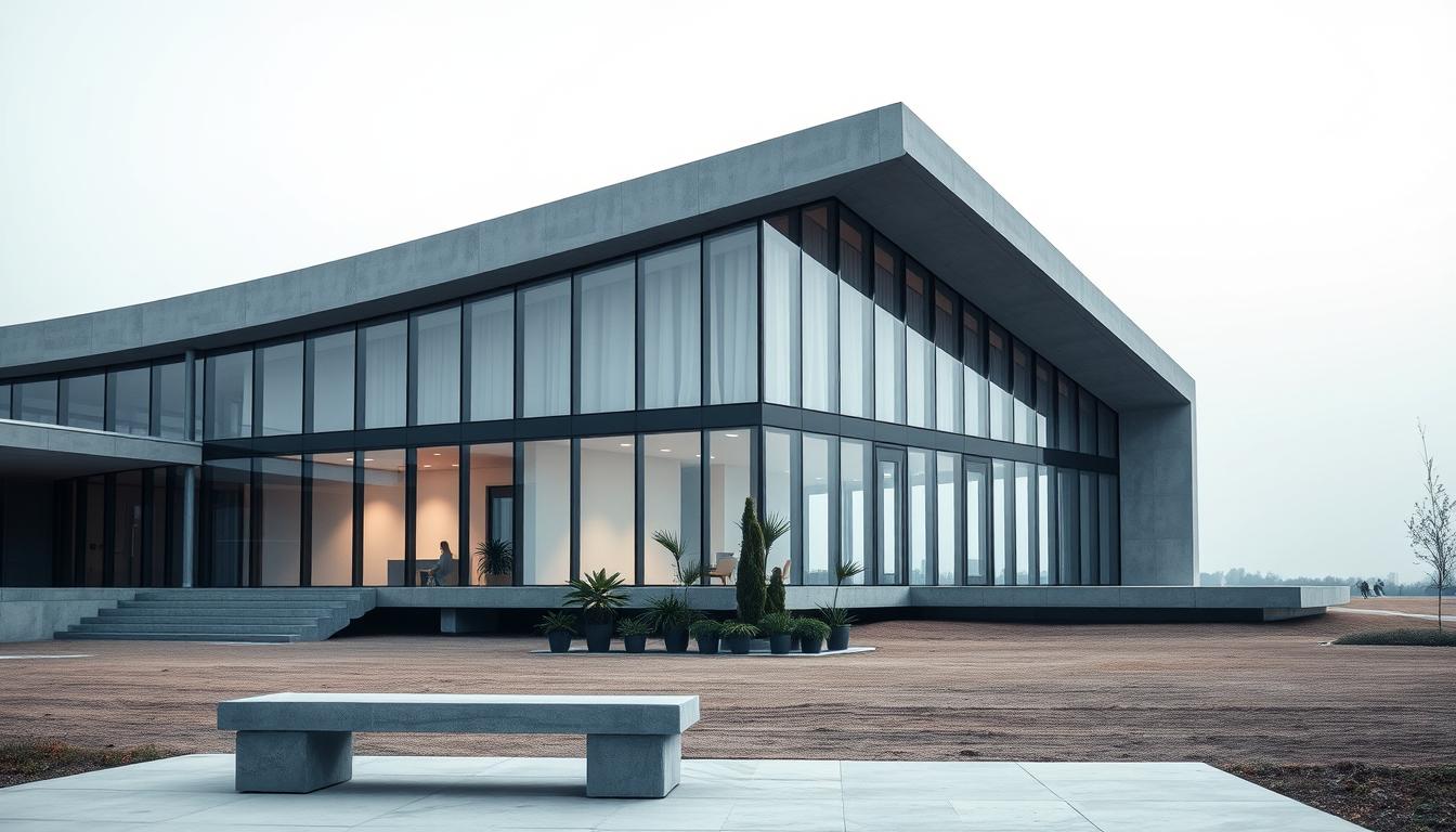
The Dessau move transformed workshop experiments into visible, built work. New facilities opened in 1926 and the famous bauhaus building showed a fresh approach to construction and transparency.
Gropius’s design used glass curtain walls and an asymmetrical pinwheel plan to express efficiency and openness. The layout separated functions and let daylight define interior order. This building became a model for modern architecture and for future building projects.
From craft to standardized components
Workshops shifted from bespoke prototypes to parts that factories could make. Designers matched forms to manufacturing constraints. This tightened the link between design, materials, and production.
Hannes Meyer and functional planning
Meyer, named director in 1928, pushed rigorous analysis and off-the-shelf components. His ADGB Trade Union School in Bernau showed planning at scale and cost control. By 1929 the program produced profitable commissions, proving design could support industry and municipal work.
- Gropius’s building signaled transparency and efficient layout.
- Workshops moved toward standardized parts for mass production.
- Meyer’s methods led to large commissions and the school’s first profit.
Tensions rose as Meyer reshaped staff and priorities. After his dismissal in 1930, the city appointed mies van der rohe as director, setting the stage for the final chapter in Berlin.
Berlin Phase and Closure: Mies van der Rohe and the School’s Final Months (1932–1933)
Facing political storm clouds, Mies van der Rohe tried a private restart in a hard-won industrial space in Berlin.
In late 1932, mies van rented a derelict factory and ran the program as a private institution for about ten months. The move aimed to keep teaching, workshops, and the core work alive despite rising threats.
Political hostility grew. Nazi officials branded modern design "un-German" and linked it to leftist politics. The Gestapo raided the site in 1933 and forced closure.
Private strategy, pressure, and decision
Mies’s private model bought time but not safety. Faculty tried a brief reopening, then agreed to a voluntary shutdown to protect colleagues and preserve dignity under coercion.
- Relocation to a reclaimed factory kept instruction active for ten months.
- State repression framed the movement as "degenerate," ending public operations.
- Faculty chose voluntary closure after Gestapo intervention.
Many teachers and students emigrated. This diaspora carried principles to new hubs in the United States and elsewhere, shaping post-1919 1933 design and architecture abroad.
| Topic | Action | Outcome |
|---|---|---|
| Private relocation | Reclaimed factory in Berlin | Ten months of limited teaching |
| State pressure | Gestapo closure in 1933 | Official end of operations |
| Faculty decision | Voluntary shutdown | Safety and preserved dignity |
| Legacy | Emigration of key figures | Transatlantic spread of ideas |
For a focused archival study, see a detailed resource on the period at Bauhaus 1919–1933: Weimar, Dessau, Berlin.
Core Principles: Form Follows Function and the Total Work of Art
At its core, the movement insisted that every element must earn its place through use. This principle meant that visual choices grew from purpose, not decoration.
Form follows function: every line, plane, and joint served a role. Designers removed ornament so objects and buildings read clearly. Simple geometric shapes and honest details made maintenance and manufacture easier.
Form follows function and New Objectivity
New Objectivity brought a matter-of-fact clarity to workshops. Teams measured, tested, and refined pieces until they met functional goals.
This iterative method turned studio experiments into repeatable solutions for industry.
Gesamtkunstwerk: uniting many arts
Gropius pushed a "new guild" where architecture organized sculpture, painting, furniture, and graphics into coherent spaces.
Rooms were planned as integrated scenes so each object supported the whole environment.
Minimalism, technology, and true materials
Minimalism became ethical and aesthetic: honesty in material and construction signaled integrity.
Industrial glass, steel, and standardized parts made beauty affordable and scalable.
- Clarity over ornament: design choices serve use.
- Workshops turned testing into production-ready solutions.
- Built environments combined arts into a single, readable plan.
- Technology and true materials made quality repeatable.
The Visual Language: Simple Geometric Forms and Primary Colors
Iconic blocks and primary hues formed a toolkit used across furniture, print, and buildings. This visual code relied on a few reliable elements to make compositions clear and repeatable.
Toolkit: triangles, circles, and squares paired with blue, red, and yellow gave instant hierarchy. These simple geometric tools set scale, contrast, and focal points in one glance.
The system worked across media. In furniture, tubular frames and crisp planes mirrored page layouts that used strong shapes and generous negative space. In buildings, rounded corners, long window bands, and plain frames showed the same geometric logic at a larger scale.

How artists shaped the method
Kandinsky mapped color to shape—yellow triangle, red square, blue circle—to teach balance and tension. Klee used concise sketches to train students to compose with economy. Herbert Bayer translated these lessons into type: legible letterforms that relied on space as much as line.
- Clear forms made visual hierarchy immediate.
- Negative space boosted legibility in type and furniture layouts.
- Fewer, standardized parts eased mass production and quality control.
| Element | Application | Benefit |
|---|---|---|
| Triangle / Circle / Square | Print, painting, product silhouettes | Fast recognition, clear hierarchy |
| Primary colors | Signage, textiles, graphics | Visual contrast, emotional clarity |
| Negative space & legible type | Books, posters, wayfinding | Readability, efficient communication |
| Rounded corners & window bands | Furniture edges, facades | Production ease, unified aesthetic |
Materials and Methods: Honest Construction and Industrial Techniques
Materials were not mere finishes; they became the language that declared a building's purpose. Designers chose a tight palette so structure, surface, and use read at a glance.
Material palette: steel tubing formed frames, glass curtain walls gave transparency, poured concrete handled spans, and modular parts sped assembly. These choices cut waste and simplified production.
Joinery and connections were visible by design. Exposed steel, plain concrete faces, and honest fastenings removed decoration so the form matched function.
Long horizontal windows and sometimes rounded corners did more than look modern. They brought daylight deep into rooms and smoothed circulation between spaces.
- Standardized elements made components interchangeable for easy repair.
- Industrial parts reduced cost and enabled mass production.
- Methods unified buildings and furnishings—tubular frames in a chair echoed window mullions on a facade.
Engineering choices became the visual order: structural logic doubled as aesthetic clarity, so every material and joint explained its use in the work.
Typography and Graphics: Herbert Bayer and the International Style
Herbert Bayer reshaped how letters behave, turning typography into a design tool that matched the school's building and furniture ideas.
Universal type stripped serif ornament and used simple sans-serif geometry. Bayer favored wide negative space and modular letter widths. The result improved legibility and made type scalable for posters, books, and signage.
The lowercase-only rule came from a practical idea: speech does not separate uppercase forms, so print should favor readability and consistency. This choice simplified layout rules and sped production in printing workshops.
From printed books to brand systems
The Bauhausbücher series tied images, type, and layout into a single program. Publications acted as prototypes for coherent identity systems.
That approach seeded the International Style in graphics and later influenced digital font design—modern product typefaces borrow the same geometric logic and emphasis on negative space.
- Breakthrough: Universal type matched geometric shapes used across the movement.
- System: Modular widths and grids produced repeatable, readable layouts.
- Legacy: Posters, signage, and brand guides still use these standards.
| Feature | Practice | Benefit |
|---|---|---|
| Lowercase-only | Consistent letterforms in print | Faster reading, simpler rules |
| Negative space | Wide letter spacing and margins | Clarity at distance and scale |
| Modular grid | Standard widths and alignment | Flexible branding and signage |
Furniture and Product Icons: Breuer’s Wassily Chair and Beyond
Marcel Breuer turned bicycle tubing into a new language for furniture, changing how we sit and see a chair. The Model B3, later called the Wassily Chair, used bent steel to replace heavy wood frames. Its lightweight frame made the chair visually open and easy to move.
Why it mattered: the exposed frame showed how the chair worked. Leather planes floated within a clear skeleton so form and function read as one. This made the piece a lesson in honest materials and visual clarity.
Club Chair (Model B3): bent steel as a modernist breakthrough
The B3 borrowed tubing techniques from bicycle handlebars. Breuer refined bends and welds so parts stayed minimal yet strong. The result was comfort earned by shape, not stuffing.
From workshop to mass production: Standard Möbel to Knoll
Breuer founded Standard Möbel in 1927 to move prototypes into production. Later, Gavina and then Knoll kept the chair in catalogues, proving that Bauhaus methods could survive markets.
"Lightweight structure, minimal parts, and honest joints turned a prototype into an enduring product."
Other products followed the same logic: fewer parts, clear joints, repeatable parts. Architecture principles—standardized elements, clean lines, ergonomic planning—guided the work of product makers and artists in the school.
| Item | Feature | Impact |
|---|---|---|
| Wassily Chair (B3) | Bent steel frame, leather planes | Lightweight, legible structure |
| Standard Möbel | Workshop-to-factory model | Scaled production, accessible price |
| Gavina / Knoll | Commercial distribution | Market longevity, design canon |
- Proved that good design could be produced at scale.
- Emphasized true materials and honest connections.
- Aligned product work with building principles for coherent living spaces.
Fine Arts Within the School: Klee, Kandinsky, and Moholy-Nagy
Teachers treated sketchbooks, color studies, and light experiments as laboratory work for real projects.
Klee’s sketches and practical poetics
Paul Klee taught from 1921 to 1931 and published his Pedagogical Sketchbooks in 1925. His exercises reduced complex ideas into small tasks.
Students learned to see line, point, and plane as building blocks. Those sketches fed studio briefs and influenced furniture and graphic work.
Kandinsky’s color-shape grammar
Wassily Kandinsky linked primary colors to basic shapes in works like Yellow-Red-Blue (1925) and in Point and Line to Plane (1926).
He used Gestalt ideas to show how color and form set visual hierarchy. That grammar became a shared vocabulary for artists and designers.
Moholy-Nagy’s light experiments
László Moholy-Nagy advanced photograms and cameraless photography to study light, transparency, and layering.
These experiments paralleled concerns in architecture: how light defines space, how layers create depth, and how materials reveal structure.
Why it mattered: fine arts research was not decorative. It supplied methods—visual grammar, sketch-based testing, and light studies—that strengthened product work and building practice.

| Teacher | Method | Impact on design |
|---|---|---|
| Paul Klee | Pedagogical Sketchbooks; line/plane exercises | Studio briefs, prototyping, visual systems |
| Wassily Kandinsky | Color-shape theory; primary-color mapping | Visual grammar for typography and products |
| László Moholy-Nagy | Photograms; light and transparency studies | Spatial thinking for facades and interiors |
| Legacy | Classroom methods | Generations of students shaped global design; see Bauhaus |
The German School of Minimalist Art and Architecture in the United States
After 1933, a handful of designers transplanted workshop methods and clean forms into American practice.
Émigré leaders introduced the International Style to U.S. skylines and campuses. Their work favored glass-and-steel structures, open plans, and functional clarity. Cities and universities adopted these building types fast.
Education, practice, and interiors
Walter Gropius shaped design school curricula with foundation courses, material studies, and studio-based problems. His model trained generations of architects and designers.
Ludwig Mies van der Rohe set standards for high-rise glass towers with spare structure and visible logic. His practice influenced both commercial architecture and teaching methods.
At home and office scale, mid-century interiors adopted modular furniture, restrained palettes, and clear circulation. Graphic systems and exhibition displays borrowed the same emphasis on legibility.
- Studios in the U.S. kept iterative model-making and material tests.
- Furniture firms translated prototypes into mass-produced products.
- Bauhaus ideas entered everyday life through buildings, furniture, and brand design.
| Area | Influence | Example |
|---|---|---|
| Education | Foundation courses, workshops | Harvard GSD, Cranbrook |
| Practice | Glass-and-steel towers | Seagram Building |
| Interiors | Modular furniture, open plans | Mid-century homes & offices |
From Bauhaus to Today: Contemporary Echoes and the New European Bauhaus
A clear lineage links early 20th-century workshop practices to modern sustainable design efforts.
Many modern brands and interiors borrow the movement’s clarity to communicate trust. They use strict grids, simple forms, and primary accents to make interfaces and rooms easy to read. Clean geometry and honest materials signal usability and quality.
The European Commission’s New European Bauhaus (2020) turns policy into practice. It acts as a forum, lab, accelerator, and network hub to link beauty with sustainability.
- Phase 1 — idea formation and co-creation.
- Phase 2 — delivery through pilot projects across member states.
- Phase 3 — diffusion to scale impact beyond Europe.
Why this matters: the program shows that good design can help meet climate goals while staying human-centered. It revives the core lesson from the 1919 1933 era—integrate arts, industry, and community—but now with sustainability as the brief.
How to Recognize and Apply the Aesthetic in Buildings and Interiors
Start by reading a building like a page: elevations, joints, and light reveal intent. This approach helps you spot whether a work aims for clarity, honesty, and practical use.
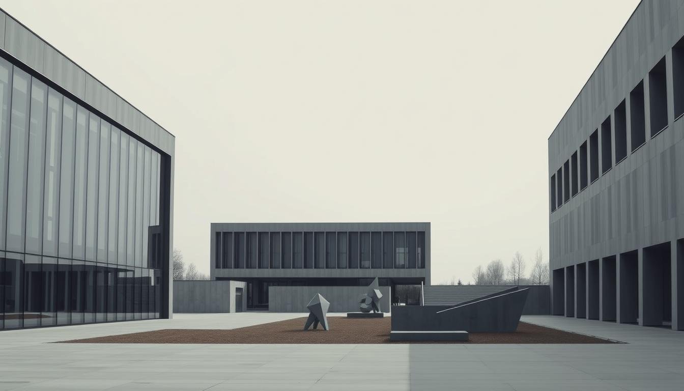
Look for geometric clarity, true materials, and functional plans. Long bands of windows, exposed structure, and rounded corners are visual signatures. When these elements appear, the building signals a straightforward plan and clear circulation.
Look for geometric clarity, true materials, and functional plans
Read facades for long window bands and clean volumes. Check exposed beams or mullions that show how loads transfer.
Favor finishes that tell the story: steel, glass, plywood, linoleum. Visible joints and simple edges make maintenance easier and reveal intent.
Practical tips for interior design: furniture, color, and lighting
Select lightweight pieces with clear frames—steel tubing or open plywood—so furniture reads as structure, not ornament.
Use neutral bases and add primary color accents sparingly to guide the eye. Typography for signage should be legible sans-serif with generous negative space.
Prioritize daylight and simple fixtures. Add task lighting where function demands it and avoid visual clutter that obscures purpose.
- For buildings: read elevations; seek window bands and exposed logic.
- For finishes: choose honest materials and show their joints.
- For interiors: pick lightweight frames, neutral palettes, and primary accents.
- For graphics: use clear sans-serif type and wide margins.
- For process: prototype, test, and refine until form follows function.
| Aspect | What to look for | How to apply |
|---|---|---|
| Facade | Long window bands, clear volumes | Align rooms to daylight; express structure |
| Materials | Steel, glass, plywood, linoleum | Reveal joints; avoid heavy ornament |
| Furniture | Open frames, taut surfaces | Choose lightweight, modular pieces |
| Lighting & Graphics | Daylight priority; sans-serif type | Use task lighting; keep signage minimal |
Conclusion
Practical experiments in studios and factories turned into a lasting visual and technical language.
The movement proved that a brief, focused program from 1919 1933 could become a century-defining force. A tiny school used strict principles to shape design, art, and architecture in ways that still matter today.
Key takeaway: treat form as service, link craft to production, and use simple systems to solve real needs. Each phase was a part that built a coherent method—classroom tests, built works, then global adoption.
Use these lessons as living tools: organize space, pick true materials, and make information clear. The spirit of experiment lives on wherever creators balance simplicity with purpose—just as mies van der and peers once did.
Enhance Your Space with Unique Modern Masterpieces by Chiara Rossetti

Are you inspired by the innovative mediums and conceptual depth highlighted in our exploration of contemporary art? You’re not alone! Today’s art enthusiasts are seeking cultural relevance and emotional connections in their artwork. However, finding pieces that resonate with modern themes and fit your unique style can be a challenge. That’s where we come in!

At Rossetti Art, we specialize in canvas prints, original paintings, and modern sculptures that celebrate the spirit of now. Each piece created by Chiara Rossetti brings a personal touch that connects deeply with current social narratives—just like the modern masterpieces discussed in the article. Don’t miss out on the chance to elevate your home decor with breathtaking artwork that speaks to your values and aesthetic. Explore our collection today and find your perfect piece! Act now, and transform your space into a gallery of inspiration!

FAQ
What is the German School of Minimalist Art and Architecture?
It refers to the Bauhaus movement (1919–1933) and its influence: a modern design and teaching approach that united fine arts with crafts, focused on simple geometric form, honest materials, and functional construction in art, furniture, and buildings.
Who founded the school and what was the original aim?
Walter Gropius founded the Bauhaus in 1919 with the aim of creating a Gesamtkunstwerk—a total work of art—that merged architecture, design, and craft to meet modern industrial needs while raising everyday aesthetics.
Which key figures shaped the movement?
Prominent figures include Walter Gropius, Ludwig Mies van der Rohe, Wassily Kandinsky, Paul Klee, László Moholy-Nagy, Marcel Breuer, and Hannes Meyer. Each contributed to teaching, architecture, product design, and visual theory.
What periods define the school’s history?
The main phases are Weimar (1919–1925), Dessau (1925–1932), and the final Berlin phase (1932–1933) under Mies van der Rohe, each marked by changing priorities from pedagogy to industrial architecture and political pressure.
What are the core principles of its design philosophy?
Key principles include "form follows function," minimal ornament, honest use of materials (steel, glass, concrete), geometric clarity, and integration of art, architecture, and industry.
How did Bauhaus influence furniture and product design?
Workshops translated craft knowledge into mass-producible objects. Iconic pieces, such as Marcel Breuer’s tubular-steel chairs, emphasized ergonomics, visual clarity, and production-ready solutions adopted by manufacturers like Knoll.
What visual language did the movement promote?
The language favored simple shapes—squares, circles, triangles—primary colors, clear typography, and modular composition to ensure legibility and easy reproduction across media and objects.
How did the school approach typography and graphics?
Designers such as Herbert Bayer promoted a rational, sans-serif aesthetic, universal type, and effective use of negative space. These methods influenced corporate identity and modern branding systems.
How did materials and methods change building design?
The movement embraced industrial materials—steel tubing, glass curtain walls, and poured concrete—and techniques that revealed structure, used modular parts, and favored open plans and long window bands.
What role did the school’s fine arts faculty play?
Artists like Klee and Kandinsky advanced abstract theory and pedagogy. Moholy-Nagy experimented with photography and light, linking fine art to design processes and new media.
How did the Bauhaus spread internationally, especially to the United States?
Emigré teachers and alumni carried its ideas abroad. Mies van der Rohe and others shaped the International Style in U.S. architecture and influenced mid-century interiors, design education, and corporate aesthetics.
What is the Bauhaus legacy in contemporary design?
Its legacy persists in minimalist interiors, functional product design, and sustainable initiatives like the New European Bauhaus, which connects Bauhaus simplicity with modern environmental goals.
How can I identify Bauhaus influence in buildings and interiors?
Look for geometric clarity, exposed structure, honest materials, flat roofs, curtain walls, modular furniture, and restrained color palettes focused on function and proportion.
Can Bauhaus principles be applied in modern interior design?
Yes. Prioritize function, use simple geometry, select true materials, choose multiuse furniture, and keep ornament minimal. These steps create clean, durable, and visually balanced spaces.
Are there recommended resources to learn more?
Read monographs on Gropius, Mies van der Rohe, Kandinsky, and Klee, visit museums with Bauhaus collections, and explore the Bauhaus Archive and educational materials on modernist design and construction techniques.

Leave a comment
This site is protected by hCaptcha and the hCaptcha Privacy Policy and Terms of Service apply.