What if removing everything but the basics made a work louder, not quieter?
Minimalism began in the late 1950s and early 1960s as a clear break from expressive painting. Artists turned to reduction, industrial materials, and simple geometry to test what an artwork really is.
This guide explains how pared-back choices—hard edges, limited color, and repeated forms—change how viewers meet a piece. You will see why figures like Donald Judd, Agnes Martin, and Dan Flavin mattered and how the 1966 "Primary Structures" show boosted the movement's visibility.
Expect plain language, visual examples, and tips for spotting core features in painting, sculpture, and installation. The aim is to make the concepts usable and clear so you can recognize form, surface, and objecthood in a gallery or online.

For a deeper timeline and examples, check this brief history at minimalism movement guide.
Key Takeaways
- Minimalism favors reduction, clear form, and surface over narrative.
- Works often use industrial materials, hard edges, and limited color.
- Artists like Judd, Flavin, and Martin helped define the movement.
- The 1960s New York scene, especially "Primary Structures," was pivotal.
- Recognize minimalist pieces by repetition, geometry, and object focus.
Minimalism in Context: From Abstract Expressionism to a New Movement
As the 1960s dawned, a new impulse favored plain surfaces, industrial materials, and repeatable systems over painterly drama.
The move began as a clear reaction to abstract expressionism. Younger artists grew tired of large, gestural canvases and highly personal expressionism. They wanted work that read as an object rather than a painting about feeling.
Primary Structures at the Jewish Museum in 1966 made that shift visible. The show presented works by Dan Flavin, Sol LeWitt, Robert Morris, Donald Judd, and Tony Smith.
Pieces used factory finishes, repeated modules, and literal geometry. The idea of the "artist as designer" followed when many works were fabricated rather than hand-painted.
National press coverage helped cement the movement in the 1960s art world. Critics and magazines brought attention to the new clarity and to debates about labels.
How this linked to conceptual art
Minimalism shared systems, serial approaches, and logical procedures with conceptual art. Still, it stayed rooted in physical, three-dimensional presence.
- Reaction against emotive, gestural painting
- Emphasis on objecthood, surface, and repeatable forms
- Public shows and media attention that shaped the 1960s art world
| Year | Event | Impact |
|---|---|---|
| Late 1950s | Shift from abstract expressionism | Artists seek reduction and clarity |
| 1960s | Rise of minimalist works | Industrial materials and modular series |
| 1966 | "Primary Structures" exhibit | National exposure; concept of artist as designer |
For a concise primer on the movement and its terms, see this note at Tate on minimalism. The next section will list the shared features that separate these works from earlier modern styles.
Characteristics of Minimalist Art
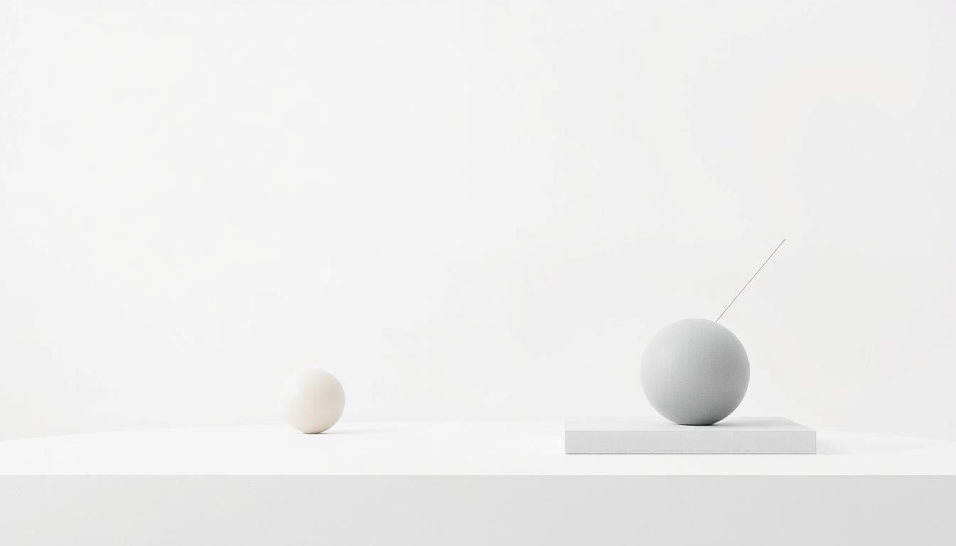
Minimalist works strip visual clutter so structure, scale, and surface read at once.
Simplicity, order, and hard-edged precision
Simplicity here means reducing a work to clear edges and essential elements. Surfaces are restrained so viewers see form, not story.
Order appears through grids, sequences, and evenly spaced modules that guide how the eye moves across a piece.
Hard-edged precision uses crisp boundaries and flat application. There is little blending or gestural brushwork.
Geometric forms, grids, and repetition
Geometric shapes—squares, rectangles, circles, and measured lines—become building blocks. Repetition creates rhythm and lets tiny shifts in scale or spacing matter.
Agnes Martin’s measured grids and Frank Stella’s line-based Black Paintings show how simple geometry drives meaning.
Limited colors, monochrome surfaces, and objective content
Limited palettes and monochrome fields downplay emotion. Color supports structure and surface rather than narrative.
Industrial materials and the art object as object
Metal, glass, and commercial finishes mute the artist’s hand. The result treats the work as an autonomous object in space.
For a concise timeline and examples, see this minimalism movement guide.
Materials and Methods: From Canvas to Industrial Fabrication
A turn toward shop-made materials let artists prioritize scale, finish, and placement over painterly touch.
Metal, glass, concrete, and commercial finishes became primary choices because they give uniform surfaces and clear reflections. Stainless steel, aluminum, and glass remove traces of the maker’s hand and focus attention on proportion and joinery.
Design and fabrication workflows started with drawings and specs, then moved to specialist shops. Outsourced production ensured repeatability and tight tolerances. The result: smooth panels, precise welds, and consistent finishes that read as a finished art object.
Eliminating the artist’s hand: design, fabrication, and series
Working in a series let an artist test spacing, height, and scale through repeated units. Small shifts in interval or orientation change how a room feels.
- Commercial coatings — anodizing, powder coat, house paint — deliver even, durable surfaces.
- Fabrication turns a concept into a three-dimensional object that responds to light and architecture.
- Canvas remained a valid medium but was sometimes treated like a panel or shaped support rather than a site for gesture.
Donald Judd’s stacks or Dan Flavin’s fluorescent installations show how materials generate meaning through presence and interaction. For a compact history that connects these material choices to the broader movement, see this overview.
Artists and Artworks: Essential Figures and Notable Examples
Meet the artists whose pared-back choices set the rules for visual clarity. This short roster shows how specific decisions—unit size, spacing, finish, and light—became signatures for the movement.
Frank Stella and literal surface
Frank Stella’s Black Paintings (1959) used black house paint on raw canvas in concentric stripes. His statement,
“What you see is what you see.”

Donald Judd and the autonomous object
Donald Judd’s stainless-steel stacks made the art object a module in space. Fabricated in series, these works remove the maker’s hand and heighten spatial clarity.
Robert Morris, Dan Flavin, Agnes Martin, and Ellsworth Kelly
Robert Morris used mirrored cubes to fold the room and viewer into the piece. Dan Flavin’s fluorescent installations turn fixtures and junctions into luminous fieldwork that changes with placement.
Agnes Martin’s grids study faint lines and calm tone. Ellsworth Kelly advanced shaped canvases and clear color fields that read as pure form.
Precedents and shared methods
Earlier studies—Josef Albers’s Homage to the Square and Malevich’s White on White—gave systematic color and geometry a head start. Together these makers defined minimalism through serial systems, limited palettes, and striking presence. Look for repeat decisions—spacing, reflectivity, light source—that signal intent across paintings and objects.
Forms and Mediums: Painting, Sculpture, and Installation
Artists turned canvas, metal, and light into tools that tune perception through scale and placement.
Minimalist painting: hard edge, shaped canvases, and surface
Painting here favors flat application and crisp edges. Large monochrome planes or sharp bands make lines and surfaces the subject.
Shaped canvas changes how a painting meets the wall. Ellsworth Kelly’s irregular panels and Kenneth Noland’s ovals show how the support becomes part of the form.
Look for seams, stretcher edges, and the finish. These details act like design decisions that guide sight and touch.
Minimalist sculpture: floor, wall, and spatial awareness
Sculpture often leaves the pedestal. Works sit on the floor or lean against the wall so viewers judge distance, alignment, and scale.
Robert Morris and Carl Andre used modules and repeated units to make rhythm across space. The arrangement turns architecture and movement into part of the work.
Installations—Dan Flavin’s fluorescent pieces, for example—use standardized fixtures to shift color and dissolve boundaries between object and room.
“What you see is what you see.”
- Compare how painting treats a surface while sculpture occupies space.
- Notice intervals, edges, and light; they shape how the work and room relate.
- Slow looking reveals subtle shifts in color, scale, and form across mediums.
The Viewer’s Experience: Space, Perception, and Presence
Walking into a room with spare geometry changes how your body times each step and how your eyes map distance. Site conditions—room size, wall height, and light—shift how a work reads in space. Viewers often adjust posture and pace to match scale and interval.
Site, scale, and the body in space
Scale is experiential. A stack feels monumental close up and quiet from far away. Moving around units alters alignments and reflections.

Seeing form, color, and materials without narrative
Minimalism asks you to look at form, color, and surface without hunting for a backstory. Let proportion and gaps set rhythm. Small shifts in lines or band width change balance.
“Simplicity of shape does not necessarily equate with simplicity of experience.”
Try this viewing approach: pause, change vantage points, and let movement animate the piece. The 1960s artists stripped away narrative so presence and perception become the primary content.
- Note how light and reflections change as you walk.
- Focus on object, scale, and interval rather than symbolism.
- Give time; perception unfolds across steps and sightlines.
Debates and Criticism: Expression, Elitism, and Accessibility
Some see spare geometry and factory finishes as austerity; others call them honesty in plain sight. Critics have long argued that this style can feel cold, especially to viewers who expect expressive brushwork or story.
Coldness, reduction, and the question of content
Limited color and impersonal surfaces often read as distant. For some, the lack of narrative makes the work feel empty.
Proponents counter that perception and structure are the real content. Looking shifts from story to scale, joinery, and finish.
Conceptual rigor vs. broader audience engagement
The link to conceptual art adds theory that can alienate people new to the movement. Specialized language sometimes turns simple visual facts into gated conversation.
Yet careful looking reveals subtle qualities—reflections, edges, tiny variations—that reward patient viewers and bridge gaps between theory and experience.
Elitism, context, and response
White-cube settings and insider discourse fuel claims of elitism. The same clarity that feels exclusive can also be an open entry point if institutions frame works plainly.
- Reframe reduction as revealing: strips show proportion and joins.
- Artists defended honesty by exposing materials and process.
- Writers and museums can pair short explanations with viewing tips to aid connection.
“Simplicity asks for attention; it rewards careful looking.”
Conclusion
Stripped-down choices proved they could heighten perception rather than mute it. ,
Minimalism gave the visual world a clear toolbox: geometric forms, measured repetition, limited colors, and a focus on the object.
In painting and sculpture, precise forms and steady intervals shape how we move and see. Industrial design and fabrication make materials, joints, and finish part of the message.
Rooted in earlier abstract art experiments, the movement keeps informing new works and exhibitions. Notice edges, spacing, alignments, and how light changes a piece; those clues reveal intent.
Minimalist art still asks for attention. Its lasting qualities—honesty, order, and visual clarity—reward careful looking and keep the concept alive in contemporary practice.
Enhance Your Space with Unique Modern Masterpieces by Chiara Rossetti

Are you inspired by the innovative mediums and conceptual depth highlighted in our exploration of contemporary art? You’re not alone! Today’s art enthusiasts are seeking cultural relevance and emotional connections in their artwork. However, finding pieces that resonate with modern themes and fit your unique style can be a challenge. That’s where we come in!

At Rossetti Art, we specialize in canvas prints, original paintings, and modern sculptures that celebrate the spirit of now. Each piece created by Chiara Rossetti brings a personal touch that connects deeply with current social narratives—just like the modern masterpieces discussed in the article. Don’t miss out on the chance to elevate your home decor with breathtaking artwork that speaks to your values and aesthetic. Explore our collection today and find your perfect piece! Act now, and transform your space into a gallery of inspiration!

FAQ
What defines the look and approach of minimalist work?
Minimalist work emphasizes simplicity, clear order, and precise edges. Artists reduce forms to basic geometry, often favoring repetition and measured arrangements to remove expressive gestures and narrative content.
How did abstract expressionism lead to this new movement?
In the late 1950s and 1960s many artists pushed back against emotional brushwork and dense composition. They adopted spare forms, straight lines, and neutral surfaces to prioritize objecthood and viewer perception over personal expression.
What was the role of the 1960s New York scene and “Primary Structures”?
Exhibitions like “Primary Structures” brought works made from simple geometry and industrial materials into the spotlight. The New York art world helped codify a shift toward clean forms and the idea that the art object could be autonomous.
Which kinds of shapes and systems recur in minimalist pieces?
Expect grids, rectangles, stacks, and repeating modules. Artists use these systems to explore proportion, rhythm, and spatial relationships without added symbolism or narrative.
What color strategies are common in this practice?
Many works use limited palettes or monochrome surfaces to emphasize form and surface. Color often serves structural clarity rather than emotional tone, as seen in monochromes or carefully chosen contrasting hues.
What materials and fabrication methods are typical?
Creators frequently use metal, glass, concrete, fluorescent tubing, and industrial paints or finishes. Many commissions involve design and fabrication processes that minimize visible brushwork and highlight manufactured precision.
Why do some artists avoid visible hand-made marks?
Removing the artist’s hand supports an objective approach. By relying on mechanical processes and serial production, the work becomes about design, scale, and material presence instead of personal signature.
Who are key figures connected with this practice?
Important names include Frank Stella, Donald Judd, Robert Morris, Dan Flavin, Agnes Martin, Ellsworth Kelly, and Josef Albers. Each contributed different strategies: shaped canvases, stacks, mirrored forms, light, measured grids, and color studies.
How do precedents like Malevich and Albers fit in?
Earlier experiments in reduction, flatness, and pure form from artists such as Kazimir Malevich and Josef Albers provided visual and theoretical groundwork that later practitioners developed into more object-focused work.
How does minimalist painting differ from sculpture and installation?
Painting often concentrates on hard edges, shaped canvases, and surface control. Sculpture engages floor or wall space and emphasizes volumetric relationships. Installations address site and viewer movement, turning perception into part of the work.
What sorts of experiences do viewers have with these works?
Viewers notice space, scale, and material presence. The works invite slow looking, measurement of distance and proportion, and awareness of the body in relation to object and room.
What criticisms does this practice face?
Critics point to perceived coldness, elitism, or lack of narrative content. Others defend its conceptual clarity and rigor, arguing the reduction opens fresh possibilities for perception and spatial thinking.
Can minimalist ideas be applied outside galleries?
Yes. Designers and architects borrow minimal strategies—clean geometry, limited palettes, industrial materials—to create functional spaces and objects that emphasize form, proportion, and clarity.


Leave a comment
This site is protected by hCaptcha and the hCaptcha Privacy Policy and Terms of Service apply.