Can the right frame truly turn a bold black abstract artwork into the defining touch of your room? This guide shows how framing and wall hues shape mood, contrast, and style so a piece reads as intentional—not an afterthought.

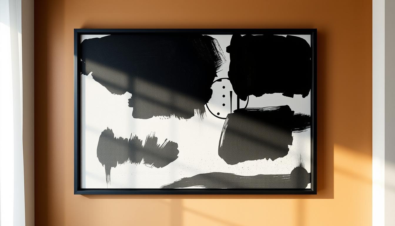
Frames protect artworks and create a visual edge that separates a picture from its surroundings. Neutral options—black, white, and natural wood—are versatile, while metallics like gold or silver react with light to make a piece a focal point.
We’ll preview practical choices, from matte versus glossy finishes to floating frames and correct frame size. Expect room-by-room tips for living areas, bedrooms, and offices, plus quick notes on gallery planning, lighting, and how furniture tones affect cohesion.
For a deeper how-to on matching frame options and finishes, see this short guide on choosing the right frame for abstract work: frame selection tips.
Key Takeaways
- Frames define focus: the right profile makes a piece feel intentional.
- Matte finishes reduce glare; glossy and metallic finishes add drama.
- Neutral frames pair well with many walls; gold or silver can lift dark tones.
- Scale matters: match frame width to piece size for balance.
- Consider nearby furniture and textiles to keep the look cohesive.
Why Framing Matters for Black Abstract Artwork
A surround does more than hold a painting—it shapes how viewers sense depth, tone, and mood in a space.
Visual separation, protection, and style impact
Frames provide protection from bumps and dust while giving every artwork a clear edge. That border prevents the image from blending into the wall and helps a viewer focus on the composition.
Using contrast to intensify depth, mood, and focus
Darker borders deepen drama and make moody pieces feel intimate. Lighter surrounds open a room and calm the eye. Metallic finishes like gold reflect ambient light to lift texture without stealing attention.
- Choose scale carefully: heavy surrounds can overwhelm small paintings.
- Thin profiles may under-define large pieces.
- Match frame tone to the dominant tones and textures in the artwork to guide attention.
| Surround Type | Visual Effect | Best Use |
|---|---|---|
| Dark solid border | Increases contrast, depth | Large moody pieces in intimate rooms |
| Light minimal edge | Opens the space, feels airy | Small works or bright interiors |
| Metallic finish (gold) | Reflects light, highlights texture | Showcase focal pieces with subtle tones |
How to Choose the Right Frame Style for Black Abstract Art
An informed surround choice makes a piece read intentional rather than accidental. Use the right profile to guide contrast, depth, and the overall mood in a room. Below are clear roles for common styles so you can match framing to your design goals.
Black frames: bold definition and timeless cohesion
Black frames intensify edges and unify mixed artworks in a gallery. They create crisp contrast that focuses the eye without competing with textures in the painting.
White frames: airy minimalism that lets artwork breathe
White surrounds open a space. Choose them for bright interiors when you want the art to feel weightless and modern.
Natural and walnut woods: warmth, craft, and balance
Oak or walnut adds tactile warmth and pairs well with organic textures nearby. These options soften contrast while keeping visual balance in the room.
Metal frames: sleek silver and luxurious gold for focal impact
Brushed silver reads cool and modern; gold introduces radiant richness. Both metal frames interact with light to increase depth and gallery-like polish.
- Pick thin profiles for contemporary interiors and gestural paintings.
- Use neutral woods or matte black to reduce visual noise on varied-toned artworks.
- Try a floating frame to add subtle shadow and museum-style depth.
Black Abstract Artwork: Frame Choices and Wall Color Pairings
A well-chosen border turns a strong composition into a deliberate design choice that ties a room together. Below are simple, actionable pairings to help your wall art read clearly in any interior.
White walls
On white walls, use black frames for crisp contrast that makes an image pop. Choose gold to add warmth and lift a restrained black white composition without overpowering it.
Dark walls
Against navy, charcoal, or forest green, pick gold or silver to create a luminous edge that separates the piece from the background. Walnut or medium wood adds grounded warmth for a cozier mood.
Neutral walls
Beige, greige, or taupe suit minimalist light wood frames that keep the palette soft. A matte black frame offers a calm, sophisticated line when you want subtle definition.
Colorful walls
For bold wall colors, stabilize the scene with neutral or metallic frames. Black, white, light wood, or brushed metal frames prevent clashes and keep the artwork’s form legible.
- Match nearby furniture finishes—mix metals and woods intentionally to unify framing with pulls, legs, and lighting fixtures.
- On bright surfaces use matte finishes to reduce glare; prefer brushed metals for low-reflection shine.
- For multiple pieces, repeat one finish or alternate two for a curated gallery rhythm.
Finish and Texture: Matte, Glossy, Metallic, and Textured Frames
Finish and texture decide how a piece interacts with light and the room's materials. These choices shape glare, depth, and how viewers read tones across a canvas.

Matte for clarity and low reflection
Matte finishes reduce glare and keep the eye on subtle tonal shifts. Use matte when a wall receives direct light or when the artwork has low-contrast details.
Glossy for drama and light play
Glossy edges catch light and animate a room. Reserve high shine for bold paintings where reflections add motion rather than distract from delicate textures.
Wood grain and natural textures
Natural grain adds tactile depth and warmth. Pair textured surrounds with interiors that feature wood, stone, or leather to create cohesion across materials.
Brushed vs polished metallics
Brushed metal offers subtle shimmer for refined interiors. Polished metal reads radiant and bold, amplifying highlights under directed light.
| Finish Type | Visual Effect | Best Use |
|---|---|---|
| Matte | Low glare, modern clarity | Bright rooms, detailed artworks |
| Glossy | Reflective, dramatic | Statement paintings in controlled light |
| Natural wood | Organic depth, warmth | Interiors with natural materials |
| Brushed metal | Soft sheen, refined | Transitional and contemporary styles |
| Polished metal | High reflectivity, radiant | Dim rooms needing sparkle |
- Match finish to the wall and light: matte near bright walls, brushed metal on darker surfaces for warmth.
- Keep finish families consistent when mixing pieces to maintain visual harmony.
Scale, Proportion, and Frame Size for Maximum Impact
Getting size and proportion right makes a piece read as intentional, not accidental. The goal is to let the art hold presence without overpowering the room. Measure the wall and consider viewing distance before ordering any surround.
Aim for proportional widths: For medium artworks, choose a surround about 2–4 inches wide. Larger canvases need wider profiles to feel balanced, but avoid massive borders that steal attention from the picture.
Floating surrounds add depth. These create a slim gap between canvas edge and surround. The subtle shadow makes the piece appear to hover, lending a gallery-like finish that suits gestural black abstract canvas paintings.
Oversized statement sizes such as 52"x32", 66"x33", and 68"x45" give immediate presence on expansive walls. Always mock up measurements first. Large sizes look impressive only when the room and furniture allow breathing space.
- Match profile to viewing distance: thicker surrounds work in open rooms; slimmer edges suit compact spaces.
- Dark, thick surrounds read heavy—on very large pieces, consider a slightly slimmer matte black or wood profile.
- When grouping pieces, keep surround widths consistent to create rhythm and reduce visual noise.
- Keep at least 6–12 inches clear above furniture to avoid a cramped composition.
| Artwork Size | Recommended Surround Width | Best Use |
|---|---|---|
| Medium (18"–36") | 2"–4" | Balanced presence in living rooms and bedrooms |
| Large (40"–60") | 4"–6"+ | Statement pieces on open walls |
| Oversized (60"+) | 6"–8" or custom | Expansive galleries or tall entry walls |
Matting Strategies to Elevate Black Abstract Pieces
A measured mat can change how a dark image reads in a room. Use neutral mats to add breathing space and lead the eye. This simple step refines presentation and helps textures read clearly.
Light mats to open space and guide the eye
White, cream, or pale gray mats create an inner margin that softens heavy tones. They act like a halo and focus attention on key gestures.
Dark frames with light mats for layered contrast
Pairing a dark surround with a light mat gives layered contrast that sharpens edges without competing with the picture. Wider mats suit larger works and feel gallery-caliber.
- Keep mat widths proportional to the image size to preserve balance.
- Choose archival, acid-free mats to protect deep blacks and subtle tones.
- For minimal rooms, use a slim mat plus a thin surround for a low-profile look.
- Avoid bold colored mats; neutrals keep the eye on the art.
| Mat Type | Visual Result | Best Use |
|---|---|---|
| White | Bright inner margin, clear contrast | Gallery prints, detailed textures |
| Cream/Pale gray | Warmth, softens stark blacks | Rooms with warm woods or textiles |
| Narrow mat (1") | Subtle separation | Minimal interiors, small images |
| Wide mat (3"+) | Gallery presence, added depth | Large paintings, statement displays |
Room-by-Room Tips: Living Rooms, Bedrooms, and Offices
Scale, finish, and placement together decide whether a picture anchors or fades. Use those three checks as you plan each room so pieces feel natural in a US home.
Living rooms: statement scale and cohesive palettes
Go big for a living room. A large central canvas can anchor seating and set the mood.
Keep frame finishes consistent across nearby pieces to tie a gallery group together.
If your furniture uses warm woods, choose walnut surrounds to harmonize with upholstery and tables.
Mix one large canvas with smaller framed prints to create depth and rhythm without clutter.
Bedrooms: calm neutrals, sleek textures, and balanced contrast
Start with a white base palette and add black accents for a calm, modern balance.
Use matte finishes and gentle light to cut glare and keep the space restful.
Select sleek textures for frames to maintain serenity—avoid anything too shiny near the bed.
Offices and lofts: minimalist edges and crisp definition
Lean into minimalist black frames or light woods for clean lines that suit focused work areas.
Repeat one or two finishes across a multipurpose room to preserve balance while varying sizes for interest.
In lofts, keep layouts uncluttered so large pieces can breathe; thin surrounds work well at distance.
| Room | Best Approach | Quick Tip |
|---|---|---|
| Living room | Large central piece + cohesive finishes | Use walnut to match warm furniture |
| Bedroom | White base, sleek textures, matte finishes | Soft light; avoid high gloss |
| Office/Loft | Minimal surrounds, repeated finishes | Thin black frames or light wood for clarity |
For inspiration on arranging pieces in social zones, see abstract wall art for living rooms.
Designing Gallery Walls with Black Abstract Artwork
Gallery planning begins with one bold piece that sets scale and tone. Use that work as an anchor, then arrange smaller artworks to step down in size so the composition reads as intentional rather than cluttered.
Keep cohesion by repeating finishes: pick one dominant frame color for continuity, or choose a small palette (for example, black frames plus a metallic) and repeat it across the group. This makes varied pieces feel like a single collection.
Anchor and balance: center a large centerpiece either by aligning centerlines or a top edge. Embrace balanced asymmetry—offset the main piece with grouped smaller works while keeping equal gaps to create visual rhythm.
Consider the wall shade and nearby furniture. On deep tones, add lighter or metallic frames to boost contrast and legibility. Echo a metal finish from a lamp or hardware to link the gallery to the room's decor.

Practical hang tips
- Lay pieces on the floor first and photograph the arrangement to test balance from different distances.
- Use mats to standardize breathing room when mixing paintings and photos.
- Prefer matte finishes across sunlit walls to reduce glare; reserve brushed metals for low-reflection accents.
For a practical step-by-step on arranging groups, see this guide on how to make a gallery wall.
Lighting, Contrast, and Mood Control
How you light a painting can make the same image feel like a quiet study or a gallery centerpiece. Thoughtful lighting sets contrast, controls mood, and ensures the design reads well no matter the time of day.
Using ambient and directional light with metallic frames
Layered light—ambient, task, and accent—lets you change how a piece appears from morning to night. Metallic frames reflect ambient light, so pair them with directional fixtures to activate subtle shimmer without causing glare.
Darker frames for intimacy, lighter for openness
Darker surrounds draw the eye inward and make a room feel smaller but more focused. Lighter frames open a space and reduce visual weight. Keep frame size proportional; oversized surrounds can overwhelm while slim profiles keep the picture calm.
- Angle lights to avoid hotspots on glossy finishes; matte surfaces are forgiving near windows.
- Use dimmers to tune mood—softer light deepens tones and boosts perceived depth.
- Mind nearby reflective surfaces; mirrors and metals can bounce light back onto the decor.
Current Trends in Framing Black Abstract Wall Art
Designers now favor trims that let bold canvases breathe while adding subtle luxury. This trend blends minimal silhouettes with selective metallic accents to update classic looks for modern interiors.
Gold reimagined on large abstracts
Gold is back—but used sparingly. For large abstract artwork, a slim gold surround adds warmth without overpowering dark tones. It lifts texture and works well on neutral or deep walls.
Thin minimalist profiles and floating frames
Thin profiles streamline the silhouette so gestures in the painting read clearly. Floating frames add a shadow gap that gives gallery-style depth and a subtle, museum polish.
Mixing frame styles to express personal taste
Curated mixes are popular. Repeat two or three finishes across a collection to feel collected rather than chaotic. In a living room, pair a statement piece in gold with supporting black frames to balance richness and definition.
"Repeat a small palette of finishes to create cohesion across varied sizes and styles."
| Trend | Effect | Best Use |
|---|---|---|
| Gold trim | Warmth, luxe highlight | Large paintings on neutral or dark walls |
| Thin profiles | Clean silhouette | Modern interiors, small to medium works |
| Floating surrounds | Gallery depth | Expressive canvases and textured pieces |
| Mixed finishes | Personalized, curated look | Gallery walls and living rooms |
- Align choices with popular interior style trends like Scandinavian and Japandi using light woods and matte surfaces.
- Reference wall pairing rules: neutral or metallic surrounds help colorful walls avoid clashes.
- Explore customizable collections to match size, finish, and proportion to your furniture and space.
Conclusion
Good framing sharpens intent: it makes art read like a deliberate part of your décor. The right frame enhances mood, works with wall tones, and turns a canvas into a true centerpiece for your home.
Smart choices sharpen focus, manage contrast, and align mood with interior goals. Pick finishes—matte, brushed, or glossy—based on light and the level of drama you want the piece to project.
Keep proportions in check: follow size guidelines, use floating frames for gallery depth, and repeat one finish for calm cohesion or mix a small palette for personal style. Measure, mock up, and test light angles so the final arrangement feels polished and at home.
Enhance Your Space with Unique Modern Masterpieces by Chiara Rossetti

Are you inspired by the innovative mediums and conceptual depth highlighted in our exploration of contemporary art? You’re not alone! Today’s art enthusiasts are seeking cultural relevance and emotional connections in their artwork. However, finding pieces that resonate with modern themes and fit your unique style can be a challenge. That’s where we come in!

At Rossetti Art, we specialize in canvas prints, original paintings, and modern sculptures that celebrate the spirit of now. Each piece created by Chiara Rossetti brings a personal touch that connects deeply with current social narratives—just like the modern masterpieces discussed in the article. Don’t miss out on the chance to elevate your home decor with breathtaking artwork that speaks to your values and aesthetic. Explore our collection today and find your perfect piece! Act now, and transform your space into a gallery of inspiration!

FAQ
How do I pick a frame style to suit a modern black abstract piece?
Choose a frame that matches the room’s mood. Sleek metal frames in silver or gold add a modern, gallery-quality look. Thin black profiles give sharp definition and work well when you want the picture to stand out. Natural or walnut wood softens the composition and ties the piece into warmer interiors. Aim for contrast that enhances depth without competing with the artwork.
What wall colors best complement dark abstract art?
High-contrast white walls create a dramatic, museum-like effect. Deep tones like navy, charcoal, or forest green make the artwork feel intimate and layered, especially with metallic or warm wood surrounds. Neutral tones—beige, greige, taupe—offer calm backgrounds that let minimalist frames and textures breathe.
When should I use a floating frame versus a standard one?
Use a floating frame to create a gallery-style presentation for medium to oversized pieces. It visually lifts the work from the wall and highlights the edges. Standard frames suit traditional display or when matting is desired for a contained, classic look.
Should I add a mat, and what color works best?
Mats add space and guide the eye. Light mats open the composition and are great with dark pieces to prevent crowding. Pair dark frames with light mats for layered contrast. For an ultra-modern feel, skip the mat and rely on a slim profile or floating frame.
How does frame finish affect lighting and mood?
Matte finishes reduce glare and feel contemporary. Glossy surfaces reflect light and introduce drama, which suits high-contrast displays. Brushed metallics give subtle, refined sheen; polished metals read brighter and more radiant. Match finish to the room’s lighting and the atmosphere you want.
What frame width works for large-scale abstractions?
For oversized pieces, use proportional frame widths—wider profiles balance the scale without overwhelming the art. A thin edge can get lost on large canvases, while a wider trim offers structure. Consider the artwork’s visual weight and the furniture nearby when deciding width.
Can I mix different frame styles in a gallery wall?
Yes. Mixing frame styles adds interest, but keep a unifying element—color, finish, or consistent mat widths—to maintain cohesion. Alternatively, use the same frame color across varied sizes for a curated, harmonious look.
Are metallic frames suitable for home offices or bedrooms?
Metallics work well in both. Gold or warm metals add luxury and focal impact in living rooms and bedrooms. Silver and cool metals pair with contemporary offices or lofts for crisp definition. Match metal tone to fixtures and furniture for a cohesive scheme.
How do I prevent glare on shiny finishes?
Position artworks away from direct sunlight and use directional or ambient lighting with diffusers. Choose matte or satin finishes if glare is a recurring problem. Museum glass or anti-reflective glazing can also help preserve clarity while minimizing reflections.
What framing options protect my piece long-term?
Use archival backing, acid-free mats, and UV-filtering glazing to protect pigments and paper. Solid joinery and durable hanging hardware ensure secure mounting. For canvases, consider professional stretcher reinforcement or floating frames that allow airflow.
How can I match frames to furniture and textiles in a room?
Pull tones and textures from existing elements—wood grains, metal finishes, or fabric hues—to tie the display into the room. Warm woods pair with leather and mid-century furniture; blacks and dark metals pair with monochrome textiles and industrial pieces. Consistent accents create visual flow.
Are there current framing trends I should consider?
Trends favor thin minimalist profiles, floating frames, and reimagined warm metals like gold on large-scale pieces. Mixing frame styles for a personalized look is popular too. Prioritize what complements your space rather than following trends blindly.
How much space should I leave between grouped pieces in a gallery arrangement?
For cohesive clusters, keep spacing tight—about 1.5 to 3 inches—so the group reads as a single composition. Larger spreads can use 3 to 6 inches to let each piece breathe. Adjust spacing based on wall size and furniture placement for visual balance.
Can textured or wood-grain frames enhance abstract works?
Yes. Natural textures and wood grain add organic depth and warmth, which counterbalances stark compositions. Use textured frames to introduce tactile contrast without shifting focus from the art. Keep texture subtle for minimalist interiors.

Leave a comment
This site is protected by hCaptcha and the hCaptcha Privacy Policy and Terms of Service apply.