In the vibrant art scene of New York City, where creativity and innovation collide, certain timeless principles continue to guide artists toward creating truly impactful work. Among these is the 80/20 rule in painting—a powerful concept that shapes how viewers experience and connect with art. This principle, rooted in mathematical proportion and visual psychology, offers a framework for creating balance that resonates in both traditional galleries and contemporary Manhattan lofts.
Whether you're an art collector seeking to understand the pieces that draw your eye, a decorator aiming to create harmonious spaces, or simply an enthusiast exploring artistic concepts, understanding this principle will transform how you experience and select artwork for your New York home or office.
What Is the 80/20 Rule in Art?
The 80/20 rule in painting, sometimes called the Pareto Principle as applied to art, suggests that 80% of a composition should be calm, neutral, or simple, while the remaining 20% provides energy, contrast, or focus. This balance creates visual harmony that guides the viewer's eye while creating a sense of both rest and interest.
In practical terms, this means that most successful paintings don't distribute elements equally. Instead, they create deliberate imbalance—allowing one aspect to dominate while another provides accent. This could manifest as 80% negative space with 20% subject matter, 80% neutral colors with 20% vibrant hues, or 80% smooth texture with 20% pronounced texture.
For New York artists and collectors, this principle explains why certain works command attention in crowded gallery spaces. The controlled imbalance creates visual tension that draws viewers in and holds their attention longer than perfectly balanced compositions.
Origins and Artistic Significance

The 80/20 rule derives from Italian economist Vilfredo Pareto's observation that 80% of effects come from 20% of causes. While originally applied to wealth distribution, artists and designers have adapted this mathematical concept to visual composition for centuries, often intuitively.
In Renaissance paintings, masters like Caravaggio used this principle through chiaroscuro—creating dramatic scenes where 80% of the canvas remained in shadow while 20% was illuminated, drawing the eye precisely where the artist intended. Similarly, Japanese minimalist art often employs vast negative space with a single, carefully placed subject.
The principle's enduring relevance speaks to how deeply it connects with human perception. Our eyes naturally seek balance but are more engaged by strategic imbalance—finding satisfaction in the tension between dominant and accent elements.
In New York's contemporary art scene, this principle continues to influence how artists guide viewers through their work, creating pathways for the eye that feel both natural and compelling.
How Artists Apply the 80/20 Rule in Painting

Artists in New York City and beyond implement the 80/20 rule through various techniques that create visual hierarchy and interest. Here are practical applications you'll recognize in galleries throughout the city:
These techniques aren't rigid formulas but rather flexible guidelines that help artists create work with both cohesion and interest. The most successful applications feel natural rather than calculated, guiding the viewer's experience without calling attention to the technique itself.
For collectors, understanding these applications helps explain why certain pieces resonate more strongly and maintain visual interest over time.
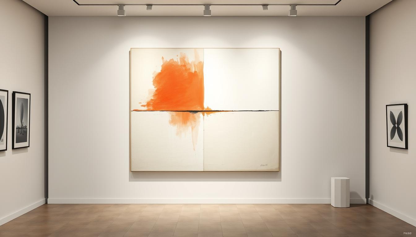
Eclipsed Horizon: The 80/20 Rule Embodied

Bold, exhilarating, and irresistibly modern, Chromatic Sail Voyage is an original hand-painted artwork by Chiara Rossetti Art—a celebration of motion, light, and vibrant energy.
Rendered in a striking palette of fuchsia pink, cobalt blue, emerald green, lemon yellow, jet black, and pure white, each sweeping stroke feels alive, pulling you into the rhythmic dance of a sailboat cutting through imagined seas.
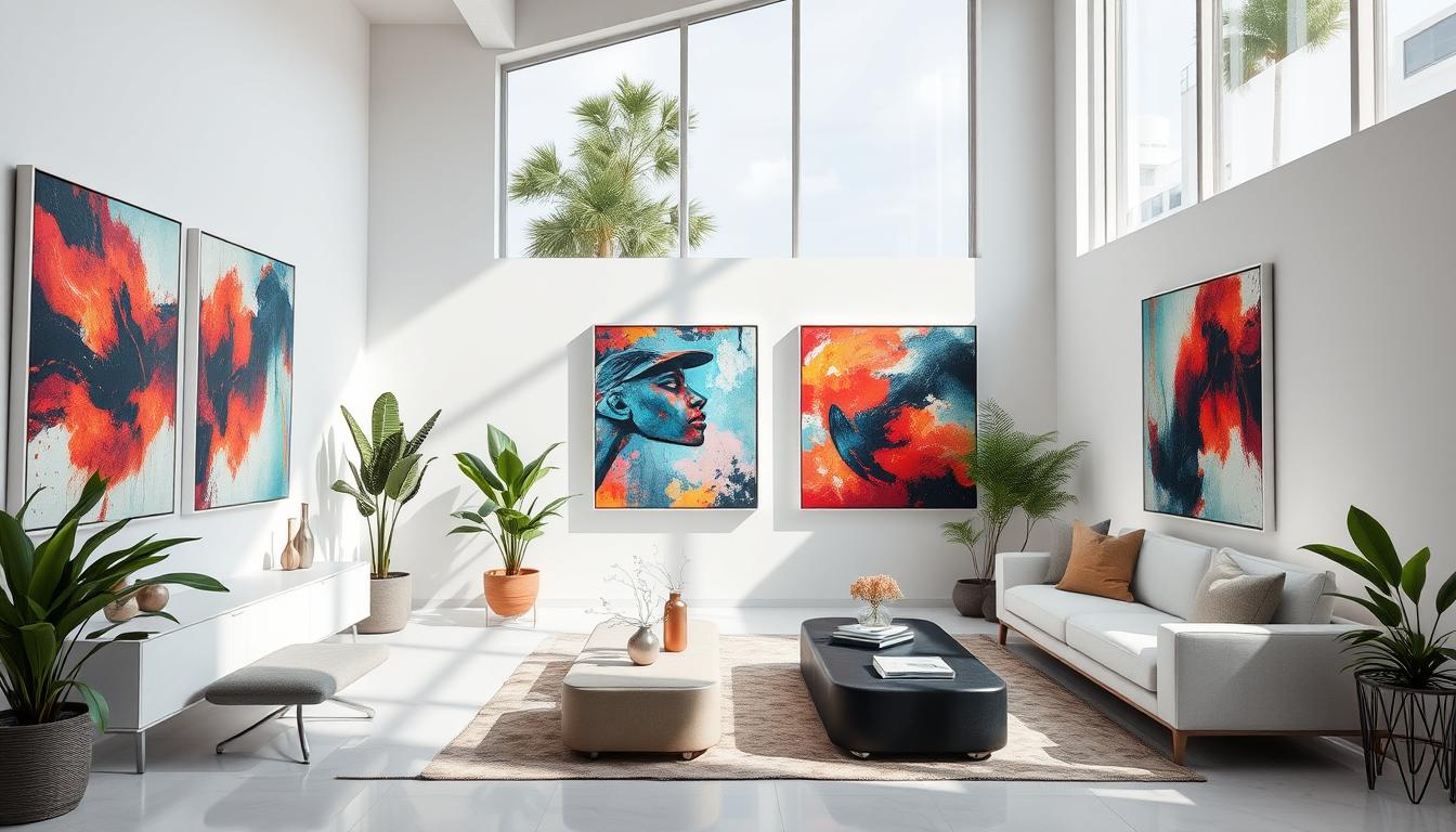
The 80/20 Rule in Interior Design

The 80/20 rule extends beyond the canvas to influence how art is displayed and integrated into New York's most stylish interiors. Designers and collectors apply this principle to create spaces that feel both cohesive and dynamic.
In practice, this often means dedicating 80% of a room to neutral, consistent elements while allowing art to provide the 20% that creates energy and personality. A minimalist Manhattan loft might feature predominantly white walls and neutral furniture, with carefully selected artwork providing concentrated visual interest.
When selecting art for your space, consider how it will function within this balance. A statement piece following the 80/20 rule internally (through its own composition) will create the most impact when placed in a setting that complements rather than competes with its visual rhythm.
For Collectors
For Decorators
In New York's compact living spaces, this principle becomes especially valuable—allowing residents to create visually rich environments without overwhelming limited square footage.
Earthen Whisper : Textural 80/20 Balance

"earthen whisper" perfectly demonstrates the 80/20 principle through textural contrast rather than color. This original Rossetti piece maintains a soothing neutral palette while creating visual interest through the interplay of smooth surfaces (80%) and pronounced textural elements (20%). The result is a piece that adds sophisticated depth to minimal interiors while maintaining a sense of calm—ideal for New York spaces where visual noise is already abundant.
Buy NowMinimalism and the 80/20 Principle

Minimalist art, particularly prevalent in New York's contemporary galleries, offers perhaps the clearest expression of the 80/20 rule in action. By reducing elements to their essential forms, minimalist artists create work where the relationship between dominant and accent becomes unmistakable.
The power of minimalist paintings lies in their ability to create emotional impact through carefully controlled restraint. When 80% of a canvas embodies simplicity, the remaining 20% carries extraordinary weight—each line, color shift, or textural element becomes purposeful and significant.
Rossetti Art's abstract works exemplify this approach, using the 80/20 principle to create pieces that feel both meditative and emotionally resonant. By limiting palette and compositional elements, these works achieve a visual clarity that speaks directly to the viewer without unnecessary complexity.
For New York collectors, minimalist works following the 80/20 principle offer particular advantages:
This approach to composition explains why certain minimalist works maintain their power over time—the controlled tension between dominant and accent elements creates a visual relationship that continues to engage rather than exhaust the viewer.
Wabi-Sabi Textured Neutral Original Painting: Spatial 80/20 Harmony

"Wabi-Sabi original painting" exemplifies the 80/20 rule through spatial arrangement—dedicating 80% to open, atmospheric space while concentrating detail and definition in 20% of the composition. This textured neutral piece creates a sense of expansiveness reminiscent of desert landscapes while providing enough visual anchor to hold attention. Perfect for creating a sense of space in New York interiors, this original Rossetti work demonstrates how minimalist art can be both calming and visually engaging.
View ArtworkFrequently Asked Questions
What does the 80/20 rule mean in painting?
In painting, the 80/20 rule suggests that 80% of a composition should be dedicated to one element (such as a dominant color, texture, or space), while 20% should provide contrast or focus. This creates visual harmony through controlled imbalance rather than equal distribution, resulting in more dynamic and engaging artwork.
How do artists use the 80/20 rule in composition?
Artists apply the 80/20 rule by creating deliberate imbalance in elements like color distribution, textural contrast, spatial arrangement, and tonal values. For example, using neutral tones for 80% of the canvas while introducing vibrant color in 20%, or maintaining smooth texture throughout most of the work while creating pronounced texture in select areas. Rossetti Art's minimalist pieces demonstrate this principle through careful balance of open space and defined elements.
Can the 80/20 principle apply to interior design?
Absolutely. In interior design, the 80/20 rule suggests dedicating 80% of a space to consistent, neutral elements while allowing the remaining 20% to provide accent and personality—often through artwork. This creates rooms that feel both cohesive and interesting. In New York apartments, this approach helps create visually rich environments without overwhelming limited space.
What makes minimalist art a good example of this rule?
Minimalist art distills composition to essential elements, making the relationship between dominant (80%) and accent (20%) particularly clear. By reducing visual noise, minimalist works like those from Rossetti Art allow viewers to appreciate subtle relationships between space, line, color, and texture. This clarity of purpose creates emotional impact through carefully controlled restraint.
Where can I find abstract paintings that use the 80/20 balance in New York City?
New York offers numerous galleries featuring work that exemplifies the 80/20 principle, particularly in Chelsea and the Lower East Side. Rossetti Art specializes in minimalist abstract paintings that masterfully employ this balance, creating pieces that work harmoniously in New York's contemporary interiors. Their online gallery allows you to explore pieces that demonstrate various applications of the 80/20 rule.
Bringing Balance to Your Space

At Rossetti Art, we specialize in original paintings, canvas prints, and modern sculptures that celebrate the beauty of balance, emotion, and design. Each artwork by Chiara Rossetti captures the essence of the 80/20 principle—where harmony meets expression.
Understanding the 80/20 rule transforms not only how you see art but how you integrate it into your New York space. By recognizing the power of controlled imbalance, you can select pieces that create lasting visual interest while maintaining a sense of calm and cohesion.
Bring the spirit of the gallery into your home. Explore our collection and discover your perfect piece—one that embodies the timeless principle of balance through beautiful imbalance.

Leave a comment
This site is protected by hCaptcha and the hCaptcha Privacy Policy and Terms of Service apply.