
Curious why some canvases speak in whispers?
This guide opens a friendly roadmap to a style that pares work back to shape, line and space. The aim is simple: help first-time viewers connect without jargon.
Minimalism rose in the mid-1960s as a clear turn away from the emotion of expressionism. Key moments include Frank Stella’s Black Paintings and the 1966 Primary Structures show, which helped fix the movement’s focus on the object itself.
The appeal on canvas comes from calm fields, measured edges and pared-down composition that invite lingering attention. This handbook will explain how to read a painting, spot materials on the canvas, and find examples by names like Mark Rothko and Stella.
Alongside history, you’ll get practical tips for collecting and styling pieces in UK homes, from scale and spacing to triptychs and framing. By the end, you’ll have clear criteria to judge any artwork with confidence.

Key Takeaways
- Minimalist work pares elements to shape, line and space for direct perception.
- The movement began in the 1960s as a reaction to Abstract Expressionism.
- Frank Stella and the Primary Structures exhibition were pivotal moments.
- Minimalism influences interiors, architecture and contemporary collecting platforms.
- This guide offers clear, practical steps to view, choose and hang minimalist pieces.
Defining Abstract Minimalist Art: Simplicity with Intent
The style focuses on elemental marks and surfaces so perception becomes the subject. It pares visuals back to the essentials—lines, shapes, space and surface—so the viewer meets structure without story. This method keeps clarity while leaving room for feeling.
Stripping to essence: line, shape, space, and material
Artists set limits: chosen materials, measured processes, repeated gestures. The result is content reduced to proportion, rhythm and balance. A placed mark or a quiet interval of canvas becomes the focus.
How it differs from stricter reduction
Strict minimalism often removes suggestion entirely. By contrast, this strain keeps restraint but allows subtle gesture. It feels less clinical and more open to interpretation.
| Feature | Strict Minimalism | Abstract Minimalist Style |
|---|---|---|
| Emotional Suggestion | Minimized | Allowed, subtle |
| Focus | Object and system | Structure, surface, perception |
| Materials | Industrial, uniform | Honest, varied |
| Viewer Role | Observe objectively | Bring feeling without instruction |
What is an abstract minimalist art?
A spare composition asks you to notice shape, space and the quiet between marks.
One-sentence definition: abstract art that uses clean lines, simple shapes and open space to create a calm, intentional visual experience without depicting real-world subjects.
A clear, accessible answer for first‑time readers
Clarity comes from measured spacing and geometric shapes rather than detailed imagery or storytelling. A work might show overlapping circles, a single brushstroke on white, or an off-centre arc with lots of breathing room.
Clean lines and quiet fields invite you to slow down and notice balance, edges and intervals. Small irregularities — a shaky pencil mark or soft edge — often add presence rather than weaken the work.
"Trust what you see: harmony, tension or rhythm matter more than hidden symbols."
- Spot motifs: subtle arcs, softened grids, centred forms or floating elements.
- Palettes tend to be neutral, with gentle accents like rust or sage.
- Works fit well in UK homes and offices, pairing with contemporary interiors.
From Abstract Expressionism to Minimalism: The 1960s Shift
By the late 1950s, many painters and sculptors began trading raw feeling for cleaner form and clearer rules. This change gave priority to how a piece looks and occupies space rather than to the artist’s biography or dramatic gesture.
Why artists moved away from emotion-driven expressionism
After the postwar surge of abstract expressionism, some creators found its dense layers and expressive brushwork hard to read. They wanted work that anyone could grasp at once. So they reduced marks, stressed materials and made composition the subject itself.
Primary Structures, 1966: launching the movement in the art world
Frank Stella’s Black Paintings (1959) hinted at this turn with hard-edged bands and flat house paint. The Jewish Museum’s Primary Structures (1966) then put makers like Dan Flavin, Sol LeWitt and Robert Morris into view, showing industrial finishes and modular forms that redefined sculpture and painting.
Key dates and the late 1950s–1960s rise
Roots reach back to early reductionists such as Kazimir Malevich and his Black Square (1915). But the 1960s movement made material truth and legibility the priority, shifting meaning into perception, scale and the viewer’s encounter in space.
| Moment | Year | Significance |
|---|---|---|
| Malevich, Black Square | 1915 | Early radical reduction; precursor to the later focus on form. |
| Stella, Black Paintings | 1959 | Stripped painting to surface and edge; repeatable structure. |
| Primary Structures exhibition | 1966 | Introduced industrial, modular sculpture to the art world audience. |
| Late 1950s–1960s | 1958–1966 | Shift from expressionism to work emphasizing material, form and perception. |
Philosophy and Purpose: “What you see is what you see”
Here the painting or sculpture speaks plainly: its material and form are the point. The movement asks viewers to meet the work directly, without allegory or biography. That clarity makes proportion, scale and presence the primary experience.
Objectivity, honesty, and the art object
Approach matters: makers removed expressive flourishes so attention stays on what is physically there. The result is an art object that reads as a coherent, self-contained thing.
The meaning unfolds as you move, measure and sense intervals. Materials are chosen for flatness, texture or reflectivity so the piece stands on its own.
Concept over craft: Sol LeWitt and the idea
Sol LeWitt put ideas ahead of making, often delegating fabrication to highlight authorship of the plan. This shift reframed how we value process and intent.
Agnes Martin shows how restraint can be inward and meditative, using soft grids to keep silence within strict limits.
“What you see is what you see.”
- Direct encounter over story.
- Honest materials and clear edges.
- Meaning made in real time by the viewer.
| Focus | Earlier Expressionism | Minimalist Approach |
|---|---|---|
| Feeling | Overt, personal | Reserved, situational |
| Authorship | Artist as maker | Idea-led; sometimes delegated |
| Materials | Layered paint, gesture | Flat surfaces, intrinsic qualities |
Core Characteristics: Forms, Lines, Color, and Space
Shapes, edges and the gaps between them act like a quiet grammar for the canvas. Look for clear choices rather than clutter. These choices make works readable to first‑time viewers.
Geometric forms and clean lines
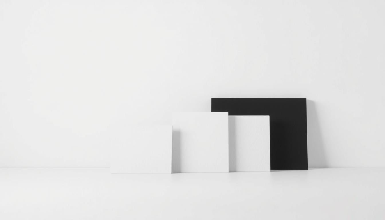
Geometric forms—rectangles, bands, arcs and circles—create legibility. Artists use clean lines to set order and rhythm. Imperfect marks, like a softened stroke or a slight arc, give life without adding noise.
Limited palettes, neutrals, and material truth
Color choices are spare: beige, sand, charcoal, soft black with rare accents such as rust, sage or navy. This keeps focus on structure rather than hue.
Material truth matters. Wood, metal or raw canvas appear as themselves, chosen for look and texture rather than to imitate something else.
Negative space, balance, and two-dimensionality
Negative space is active. The breathing room between forms sets a visual tempo and gives the eye places to rest.
Flatness and hard edges reinforce two-dimensional impact in painting. Proportion, alignment and tiny deviations—an off-kilter line or a pencil rule—offer calm and presence at once.
| Trait | How it appears | Effect for the viewer |
|---|---|---|
| Geometric forms | Rectangles, bands, arcs, circles | Immediate legibility and rhythm |
| Lines | Hard edges, occasional softened marks | Order with subtle human touch |
| Color | Neutrals with small accents | Focus on structure, calm mood |
| Space | Large negative areas, balanced gaps | Breathing room and tempo |
| Materials | Raw canvas, wood, metal finishes | Honesty of surface and perception |
Want to explore further? See a clear definition and historical context at the Tate's guide on minimalism. Noticing these traits helps you spot and compare pieces with confidence.
Minimalism vs Abstract Expressionism: Polar Approaches
Two very different languages of painting met in the mid‑20th century: one loud with gesture, the other calm with rule.
Emotion and gesture versus restraint and reduction
Expressionism foregrounded emotion, spontaneity and thick, layered surfaces. Viewers often step into an artist’s mood or biography to read meaning.
Minimalist practice removed the personal signature. It used basic shapes and materials so the work reads as an object, not a story.
From layered meanings to direct perception
Mark Rothko’s enveloping color fields invite deep feeling. They act as a foil to hard‑edged, reduced compositions that ask you to notice edge, interval and surface instead.
This shift democratized viewing: you do not need specialist knowledge to appreciate proportion, light and balance. Both approaches can feel powerful, but they demand different attention—feeling versus perceiving structure.
| Characteristic | Abstract Expressionism | Minimalist Approach |
|---|---|---|
| Gesture | Energetic, visible brushwork | Measured, controlled marks |
| Meaning | Layered, emotive narratives | Direct perception of form |
| Viewer role | Enter artist’s emotion | Attend to surface and intervals |
| Goal | Expressive intensity | Clarity, economy, objecthood |
“Side‑by‑side viewing makes the contrast clear: gestural energy next to the quiet authority of ordered elements.”
Influential Artists and Signature Works
A small set of postwar makers rewrote how we read surface, scale and repetition. Their choices shaped how paintings and sculpture claim space today.
Frank Stella: hard-edged clarity
Frank Stella made the edge the subject. His black paintings use concentric bands and house paint to set rhythm and surface.
Donald Judd: the art object
Donald Judd used serial metal and timber boxes. These industrial forms read as clear objects, not supports for meaning.
Agnes Martin: grids and silence
Agnes Martin drew pale grounds and whisper-soft grids. The result feels inward and quietly deliberate.
Robert Morris & Carl Andre: material and space
Robert Morris and Carl Andre made floor-based works and plates that foreground material and invite movement around them.
Dan Flavin & Sol LeWitt: light and systems
Dan Flavin turned fluorescent tubes into structure. Sol LeWitt offered instructions and systems, shifting value to concept and process.
| Artist | Signature | Primary medium | What to look for |
|---|---|---|---|
| Frank Stella | Black paintings; concentric bands | Paintings | Edge, rhythm, surface |
| Donald Judd | Serial boxes and modules | Sculpture | Industrial finish, objecthood |
| Agnes Martin | Hand-drawn grids | Paintings | Quiet lines, inward scale |
| Robert Morris | Floor plates, tactile units | Sculpture | Material presence, spatial play |
Earlier Foundations: Constructivism, Bauhaus, and Malevich
Early 20th‑century pioneers rewired visual priorities, trading storytelling for pure form and measured order.
Kazimir Malevich’s Black Square (1915) marked a radical reduction. The painted square removed depiction and made geometry the subject. This bold step helped generations of makers see simple shapes as expressive tools rather than mere signs.
Constructivism then pushed materials and structure forward. Soviet makers treated surface, load and joinery as key elements. That focus on objecthood fed the later movement’s interest in clarity and the literal presence of the work.
Bauhaus teaching linked design to function and to architecture. Workshops promoted geometric shapes, utility and synthesis across craft, interiors and building. Those lessons made geometry and usefulness central to modern practice.
These currents shared a taste for order and distilled references to nature, often translated into pure form rather than depiction. Minimalist tendencies refined these ideas into grids, modules and monochrome fields by the 1960s.

| Current | Key trait | Legacy for later makers |
|---|---|---|
| Malevich | Pure geometric focus | Prioritised form over depiction |
| Constructivism | Material and structure | Emphasised objecthood and clarity |
| Bauhaus | Function and design | Integrated geometry with architecture |
Painting, Sculpture, Architecture, and Design
Across canvas, floor and facade, this restrained language shapes how we move and live around objects.
Canvas and wall works: hard edges, grids, and fields
On the canvas, painters favour flatness, hard edges and measured bands. Grids and broad fields read as unified structures that ask for steady attention.
These painting choices create a stable visual pulse that fits contemporary interiors in the UK.
Floor pieces and fabricated forms: metal, wood, concrete
Sculpture moved toward fabricated modules and industrial material—steel, plywood and concrete—so surface and weight become the focus.
Robert Morris demonstrated how a floor-based work can make viewers notice scale and path through a room.
Spillover into architecture, interiors, and graphic design
The same aesthetic informed architecture and design: clean plans, pared palettes and grid systems in layouts and branding.
Artists often treated the gallery as part of the piece, aligning works with walls, floors and light to unite medium and space.
For further context on the movement’s reach, see this concise guide on how the style spans practice and.
Color Strategies: Neutrals, Monochrome, and Black Paintings
Neutral tones act like quiet rooms where shapes can speak clearly and without fuss. Beige, sand and charcoal create calm fields that let edges, spacing and surface show. Small accents—rust, sage or navy—add warmth without stealing focus.
Beige to charcoal: calm palettes with occasional accents
Limited color choices make a painting read at a distance and reward close looking. A spare palette highlights tiny shifts in sheen, fiber and brushwork.
Stella’s black paintings set a landmark for using dark fields to emphasise edge and rhythm. Such works show how restraint can strengthen presence and scale in a room.
Why black-and-white schemes resonate today
Black-and-white work removes distraction so forms and texture become primary. This clarity suits open plans and contemporary UK interiors, where calm and balance matter.
Compare with abstract expressionism: Mark Rothko used saturated color to evoke mood. By contrast, restrained palettes use hue sparingly and structurally, so compositions read cleanly from across a room.
- Neutral choices foreground spacing and surface variation.
- Monochrome encourages slower, closer looking.
- Pairing with wood, stone or linen amplifies quiet sophistication.
Start collectors often find a single-colour painting or neutral work helps build a cohesive wall. It’s a simple, enduring way to bring calm into a home.
Geometric Shapes, Patterns, and Clean Lines
Simple geometric motifs guide the eye and set a work’s tempo. Learn to read a piece by noticing which shapes lead and how they repeat.
Circles, arcs, stripes, and grids
Circles and arcs invite a gentle motion. They soften corners and focus attention toward a centre or path.
Stripes and bands create direction and scale. Repeated stripes can drive rhythm across a wall.
Grids give quiet order. A grid holds many small decisions together so the whole feels coherent.
Asymmetry, rhythm, and repetition
Asymmetry often fuels balance. Slight off‑centres or uneven gaps feel more alive than strict mirroring.
Repetition knits forms into a pattern without clutter. When elements recur, the eye reads structure quickly.
Watch for micro-variations: hand-drawn lines, tiny tonal shifts or imperfect joins add warmth within strict geometry.
- Viewing tip: step back to see order, then move in to enjoy edges and surface detail.
- Scale note: small pieces calm a nook; larger grids or bands command a wall with quiet authority.
Spotting these patterns and clean lines makes minimalist art and paintings easier to evaluate and enjoy.
Abstract Minimalism in Modern Interiors
A well-placed, spare image brings quiet focus to busy open-plan living in UK flats and houses.

Creating visual calm in living rooms, bedrooms, and halls
Start with a focal piece above a sofa or bed. One measured work sets scale and tone.
Use generous breathing room around each piece. This helps each composition read clearly without crowding.
In hallways, a single panel or a slim triptych guides movement and keeps sightlines serene.
Pairing with Japandi and contemporary UK design
Coordinate with natural woods, pale textiles and a restrained palette to match Japandi and modern British interiors.
Simple decor—ceramic vessels, textured throws and small greenery from nature—echoes the work’s calm vocabulary.
Triptychs, spacing, and scale on your walls
For wide walls, use triptychs with consistent gaps. Align tops or centers for a tidy, gallery-like finish.
Mix a variety of sizes but keep the same form language—repeated shapes or subtle patterns keep cohesion.
"Today, the right minimalist piece can make a room feel intentional and uncluttered without losing warmth."
| Space | Tip | Effect |
|---|---|---|
| Living room | Large focal piece above sofa | Anchors seating and balances scale |
| Bedroom | Single calm panel or small pair | Promotes rest and reduces visual noise |
| Hall | Vertical panels or narrow triptych | Guides movement and keeps sightlines clear |
Lighting matters: soft, indirect light flatters matte surfaces and keeps edges crisp. Minor spotlights or dimmable fixtures work well in UK homes.
How to Choose, Frame, and Style Minimalist Art
Begin with scale and sightlines; the right work should neither dominate nor disappear. Pick a single artwork that will anchor the wall first, then refine size, frame and styling to match the room.
Selecting size, form language, and color for your space
Measure the wall and test mockups at home. Aim for a piece that fills about two-thirds of the width above furniture so the canvas feels deliberate.
Match forms to architecture: tall panels suit high ceilings; wide bands or triptychs suit long walls. Choose a painting with forms and a color that echo existing tones in the room.
Thin frames, float mounts, and matting for clean presentation
Choose thin modern frames—oak, black metal or white—to keep edges crisp. Float mounts lift the work and emphasise negative space and lines.
Use narrow matting for looser compositions to contain the image without adding visual weight. This approach keeps the finish unobtrusive and refined.
Styling with ceramics, textiles, and greenery
Keep decor restrained: place one or two ceramic pieces, a tactile throw and a modest plant nearby so the works remain the visual lead.
- Keep consistent margins from furniture and architectural features.
- Repeat one accent tone from the piece in cushions or a vase.
- Allow breathing room; spacing and alignment make the composition feel intentional.
Tip: good lighting and careful spacing will make any art read like a natural part of the room.
Collecting Today: Where to Find Minimalist Abstract Art Online
Online marketplaces now make it simple to browse restrained paintings, prints and small sculpture from around the world.
Start searches on Saatchi Art, Artfinder, Etsy and Society6. Use filters for size, palette and style to narrow results fast. These platforms let you compare original works and prints at many price points.
Originals versus prints: quick buying rules
Originals carry unique surface qualities and higher resale potential. Prints offer affordable entry—check edition size, paper weight and ink type for longevity.
Tip: shortlist three to five pieces and view them side by side on your wall (digital mockups help). Message artists for framing advice; many will suggest finishes that respect the work’s design intent.
"The online art world makes it easy to discover emerging artists and a broad variety of work without leaving home."
| Platform | Strength | Best for |
|---|---|---|
| Saatchi Art | Curated international listings | Original paintings and mid-price sculpture |
| Artfinder | Independent makers | Unique works and direct artist contact |
| Etsy | Affordable, handmade | Prints, small originals, framing options |
| Society6 | Print-on-demand | Budget prints and design-led homewares |
- Compare scale, edge quality and material notes before buying.
- Check return policies, shipping protection and customs for UK buyers.
- Save searches and follow favourite artists to spot new releases.
Legacy, Impact, and Contemporary Echoes
The movement’s logic—less, but better—has become a design grammar for public and private life.
From the 1960s to today, those early ideas reshaped modernism by elevating line, proportion and surface. Galleries made these choices visible, while architecture and product design borrowed the same rule: clarity first, ornament second.
From midcentury shift to design culture
Architects used simple plans and honest materials to make calmer spaces. Graphic designers and brands adopted grids and restraint so messages read fast and clearly.
Neo‑Minimalist tendencies and everyday living
Newer artists revisit modules, grids and serial forms, updating them with new materials and tech while keeping reduction central. This refresh sits beside more emotive painting traditions like mark rothko, creating a balanced visual world.
- Practical echo: decluttering, thoughtful lighting and fewer objects in UK homes.
- Creative echo: public commissions, product systems and gallery shows that favour repeatable ideas.
"Systems, limits and measured choices remain a steadying counterpoint in a visually noisy world."
Conclusion
The goal was immediate visual clarity: fewer parts, stronger presence. This movement unites form and space to create calm, intentional display.
In short: abstract minimalist art pairs simplicity of shape with honest materials so perception becomes the main response. Since the 1960s the logic of minimalism has steered artists and design decisions toward clarity and order.
Trust edges, intervals and balance when you look. Start collecting with one modest piece that fits your room, then refine size, frame and spacing to keep the effect clean. Revisit Stella, Judd, Martin and the Primary Structures moment to deepen your eye.
Explore UK galleries and online platforms with confidence: fewer elements often deliver more lasting reward.
FAQ
What is Abstract Minimalist Art?
Abstract minimalist art pares visual language down to line, shape, color, and material. Works avoid narrative and ornament to let form and space speak directly. Think spare canvases, geometric sculpture, and installations that emphasize presence and proportion.
Defining Abstract Minimalist Art: Simplicity with Intent — how does it strip to essence?
Artists remove excess to focus on fundamentals: a single line, a plane, or the raw surface of metal or wood. This reduction highlights relationships between elements, light, and surrounding space rather than expressive brushwork or storytelling.
How does abstract minimalism differ from strict minimalism?
Abstract minimalism keeps openness and sensory subtlety; strict minimalism often follows rigid industrial forms and systems. The abstract wing allows more softness, painting-based fields, and quiet emotion while still favoring economy and clarity.
Why did the art world shift from Abstract Expressionism to Minimalism in the 1960s?
Many artists grew dissatisfied with large-scale gesture and subjective drama. They pursued clarity, objectivity, and reduced means to respond to postwar industrial culture and new ideas about what an artwork could be.
What was Primary Structures, 1966, and why did it matter?
Primary Structures was a landmark exhibition in New York that brought minimalist sculpture and reductive painting to public attention. It helped define the movement and showcased artists exploring geometric form and industrial materials.
Which earlier movements influenced this turn toward reduction?
Constructivism, Bauhaus functionalism, and Kazimir Malevich’s Suprematism provided a lineage of geometric reduction and material honesty that fed into mid-century minimalism.
What philosophy underpins much of this work — “what you see is what you see”?
That phrase, linked to Frank Stella, captures the movement’s insistence on objectivity: art should present itself plainly, without hidden symbolism. Honesty of materials and direct perception matter more than narrative or illusion.
How do concept and craft relate — where does Sol LeWitt fit?
Sol LeWitt emphasized idea over hand: systems and instructions could generate artworks. His approach made concept itself an art object, often executed by others but guided by a clear, reductive logic.
What are core visual traits: forms, lines, color, and space?
Expect geometric shapes, clean edges, limited palettes, and careful use of negative space. Balance, two-dimensional flatness or deliberately exposed materiality, and repetition or subtle variation are common tactics.
How do color strategies work in these pieces?
Many works favor neutrals or monochrome fields—beige, gray, charcoal, or single hues—to emphasize form. Black-and-white solutions, like Frank Stella’s early pieces, underscore structure and contrast.
How does minimalism differ from Abstract Expressionism in practice?
Abstract Expressionism centers on gesture, layered meaning, and emotional intensity. Minimalism strips back to restraint, repeated forms, and direct perception. One feels personal; the other invites object-focused reading.
Who are key artists and signature works to know?
Important figures include Frank Stella (black paintings, hard edges), Donald Judd (stacked boxes and industrial units), Agnes Martin (grids and subtle washes), Robert Morris and Carl Andre (material-focused sculpture), Dan Flavin (fluorescent light), and Sol LeWitt (conceptual systems).
How did earlier works like Malevich’s Black Square influence the movement?
Malevich’s radical reduction to pure geometric form and flatness paved the way for later artists to value nonrepresentational simplicity and focus on visual basics rather than subject matter.
In what media does abstract minimalism appear?
It spans painting, sculpture, installation, architecture, and design. Expect hard-edged canvases, floor pieces in metal or concrete, light installations, and minimalist interiors that translate art principles into living spaces.
How does this art fit modern interiors?
Minimalist works create calm and focus. Large fields suit living rooms; smaller grid pieces work in halls. Pairing with Japandi or contemporary design enhances serenity—scale, spacing, and neutral palettes matter most.
What should collectors consider when choosing and framing these works?
Match scale and form language to the room. Thin frames or float mounts maintain a clean look. Consider original pieces versus prints, edition size, and material quality for long-term value.
Where can I find minimal works online today?
Platforms like Saatchi Art, Artfinder, Etsy, and Society6 offer a range from originals to prints. Evaluate provenance, materials, and shipping; smaller galleries and artist sites often carry unique pieces.
What is the legacy of 1960s minimalism in contemporary culture?
Its influence shows in design, architecture, and lifestyle trends that favor restraint, clarity, and material honesty. Neo-minimalist art and everyday design continue to echo those mid-century ideals.
Leave a comment
This site is protected by hCaptcha and the hCaptcha Privacy Policy and Terms of Service apply.