
Can a faded wall or a chipped bowl teach us how to choose color for a home?

The palette here leans muted, earthy, and timeworn. Think bone white, warm clay, soft taupe, limestone, faded indigo, rust, antique gold, moss, soot, and ash.
This design lens prizes beauty shaped by time rather than glossy perfection. Hues feel softened and desaturated, often finished matte to echo limewash, plaster, and chalky paint.
Color and texture work together: patina, wear, and subtle shadows give depth. That makes these tones perfect for canvases, ceramics, textiles, and interiors that want a lived-in, calm look.
Later sections will map core families, show how light shifts these shades, and offer practical tips for home projects. For palette ideas, explore this wabi sabi colour palette to see washed clay, stormy indigo, and soft blush in context.
This guide aims to help you choose honest, enduring hues that fit a slower, more reflective life.
Key Takeaways
- Wabi sabi palettes favor muted, earthy, and timeworn tones.
- Finish and texture are as important as hue for authentic depth.
- These shades work across art, ceramics, textiles, and interiors.
- Matte, desaturated color reads calm and lived-in under natural light.
- Choose colors that feel honest and enduring, not trendy.
Wabi-Sabi Colors at a Glance: muted, earthy, and timeworn
Envision colors that echo rain-soaked stone and sun-bleached linen.
Quick scan: sandy neutrals like sand, chalk, and limestone form the calm base. Warm clay, taupe, and weathered gray add gentle warmth. Coal and soot read soft rather than harsh.
Timeworn accents—faded indigo, rust, moss green, and antique gold—bring subtle depth without breaking the muted aesthetic. The look borrows from nature: driftwood, dried grass, and wet stone guide choices.
"Simplicity and restraint let related tones sit together, making a room feel lived-in and human."
- Start with a neutral base and layer one or two subdued accents.
- Choose matte, chalky paint or limewash to keep finishes soft.
- Test swatches in daylight and evening light to see how shadow shifts tone.
| Role | Example Hues | Finish |
|---|---|---|
| Base | Sand, Chalk, Limestone | Matte / Chalky |
| Accent | Faded Indigo, Rust, Moss | Soft Matte |
| Shadow / Texture | Ash, Soot, Aged Metal | Textured Plaster |
| Detail | Antique Gold, Tea, Clay | Patina, Low Sheen |
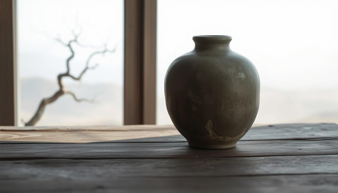
The philosophy behind the palette: imperfection, nature, and age
This palette grows from a quiet reverence for age and humble making.
Wabi celebrates rustic simplicity and modest craft. It welcomes visible joins, little asymmetries, and work that shows the maker’s hand. These quirks give color permission to sit softly, not shout.
Sabi honors patina and the calm beauty that comes with age. Faded surfaces, gentle scuffs, and repaired edges tell stories. In hue, that means softer, desaturated tones that read like memory.
Wabi: rustic simplicity
Wabi prizes restraint. Natural fibers, raw clay, and uncoated wood pair best with understated hues. Matte and chalk finishes amplify a humble presence.
Sabi: beauty in patina and age
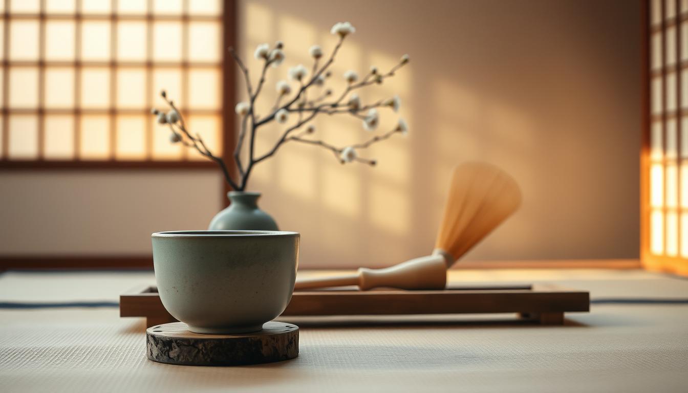
Sabi values history visible on surfaces. Kintsugi’s gold repairs, quiet tea rooms, and ink-stained paper guide a palette built from charcoal, parchment, and antiqued gold.
Why matte, lived-in tones feel true: Slight variations in application and small imperfections create depth. Those shifts make pieces read handmade rather than mass-produced.
"Marks, repairs, and fading are not flaws; they are the record of a life well used."
- Finish matters: limewash, chalk paint, and hand-applied plaster read honest.
- Choose related tones for harmony rather than stark contrast.
- Embrace wear: layered neutrals with muted accents feel timeworn and real.
| Concept | Visual Cue | Finish | Design Choice |
|---|---|---|---|
| Wabi (simplicity) | Hand-thrown ceramics, raw linen | Matte / Chalk | Uncoated wood, visible joins |
| Sabi (patina) | Faded metals, worn textiles | Low sheen / Patina | Kintsugi details, repaired edges |
| Age as layer | Soft neutrals with muted accents | Limewash, plaster | Layered paint, subtle distressing |
| Human touch | Brush variation, ink marks | Hand-applied texture | Irregular edges, local craft |
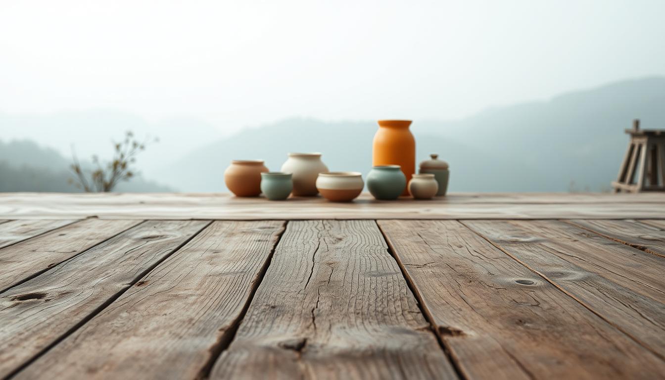
What are the colors of wabi-sabi art? Core families and tones
Imagine a palette rooted in clay, bone, and slate—quiet but full of story.
Earthy neutrals
Bone white, warm clay, soft taupe, and limestone form the calm base. These hues read like sun-bleached linen and carved stone.
Timeworn accents
Bring subtle history with faded indigo, rust, antique gold, and soot black. Use these as small, storied pops—textiles, hardware, or a single shelf.
Nature-derived greens and browns
Moss, bark, tea, and driftwood keep the palette grounded in landscape rather than trends. Pair these with raw wood grain or a stone sink for harmony.
Textured shadows
Ash, charcoal, aged metal, and weathered gray layer depth like patina on metal or the shadow in plaster. Choose matte finishes so the textures and tones stay readable.
"Layer near-neutrals across a room so tones feel lived-in, not flat."
- Match limestone with warm clay plaster.
- Pair driftwood with ash gray; add soot accents for contrast.
- Introduce timeworn color through small decor and ceramics instead of full repainting.
Expanded wabi-sabi color palettes you can try today
Try five ready-made mixes that help you repaint or restyle a room with gentle, time-softened tones.
Fog & Clay
Bone white, warm clay, ash gray, soot black. Great for kitchens and bedrooms. Pair matte plaster walls with warm clay ceramics and a soot-black accent for tactile contrast.
Sun-Faded Neutrals
Oat, pale ochre, dusted olive, antique brass. Use in living rooms. Choose creamy whites over cold hues and add antique brass for a subtle glint.
Ink & Kintsugi
Deep charcoal, indigo ink, parchment, antique gold. Suits moody corners. Layer near-blacks, add indigo textiles, and a thin gold thread for repaired, precious moments.
Pressed Florals
Blush beige, dried rose, dusty plum, tea-stained ivory. Soften bedrooms and baths. Avoid synthetic pinks; pick linens that read vintage and worn.
Coastal Weathering
Salt white, muted blue-gray, driftwood, pale sand. Calm for baths and bright kitchens. Pair with soft blue linen and concrete or pale sand tile.
"Start with one dominant color, add a supporting neutral, a single accent, and a metallic or shadow tone."
| Palette | Hues | Best Rooms | Material Pairing |
|---|---|---|---|
| Fog & Clay | Bone white; Warm clay; Ash gray; Soot black | Kitchen, Bedroom | Raw wood, matte ceramics |
| Sun-Faded Neutrals | Oat; Pale ochre; Dusted olive; Antique brass | Living room | Warm textiles, linen throws |
| Ink & Kintsugi | Deep charcoal; Indigo ink; Parchment; Antique gold | Study, Nook | Paper, gold leaf accents |
| Pressed Florals | Blush beige; Dried rose; Dusty plum; Tea-stained ivory | Bedroom, Bath | Soft linens, aged ceramics |
| Coastal Weathering | Salt white; Muted blue-gray; Driftwood; Pale sand | Bath, Kitchen | Concrete, soft blue linen |
Tip: Order sample pots and test swatches next to linen, wood, and your flooring. Light and material will make these tones sing in your specific space.
How to use these hues in interior design and art
Start with gentle, desaturated paints and add weathered materials to build depth and memory.
Walls and paint: Favor limewash, chalk paint, or hand-applied plaster to give a wall soft shadows and gentle variation. Matte finishes keep muted tones honest and prevent harsh glare.
Lived materials and texture
Combine raw wood, linen, ceramics, stone, concrete, and oxidized metal for tactile contrast. Let rough grain and soft textiles read as part of the palette.
Room-by-room ideas
Layer choices by room: living areas with warm clay and driftwood, bedrooms in blush beige or ash gray, kitchens in bone white with soot accents, baths in salt white and muted blue-gray, entries with moss and bark tones.
Accents with soul
Use oxidized brass pulls, kintsugi-repaired ceramics, and dried botanicals to introduce rust and antique gold sparingly. Keep furniture silhouettes simple and let patina and woven linen carry interest.
"Sample large swaths in morning and evening light before committing; brands like Farrow & Ball, Jotun, and Clare Paint offer subtle, muted options."
| Element | Recommended Finish | Why it works |
|---|---|---|
| Walls | Limewash / Chalk paint / Plaster | Creates soft shadow and tonal depth |
| Surfaces | Raw wood, stone, concrete | Tactile contrast that reads warm and real |
| Textiles | Woven linen, parchment cotton | Adds warmth and subtle variation |
| Details | Oxidized metal, gold leaf, kintsugi | Brings story and small, precious highlights |
Light, time, and patina: how color shifts in real homes
A room’s mood shifts with each hour; simple tones gain new character as day passes.
Reading daylight and shadow to select the right tones
Direction of light matters. North-facing rooms feel cool and flat. South light warms and can lean yellow. East brings crisp morning clarity. West adds soft evening glow.
Always test large swatches across a wall. Check them on sunny and cloudy days and at night under warm bulbs. That reveals how a single color will live in your living space.

Letting age show: embracing wear, variation, and layered palettes
Time improves tone: limewash mottles, wood deepens, and metals tarnish. Those shifts add subtle complexity and quiet beauty.
Layer related hues—ash, soot, weathered gray—rather than match one flat note. Use tactile textiles like linen and raw cotton to soften shadows and invite touch.
"The most compelling elements show their making: brush marks, hand-thrown rings, repaired seams."
| Element | How it changes | Design move | Tip |
|---|---|---|---|
| Plaster walls | Subtle mottling | Use limewash | Test large swatch |
| Wood | Deepens, warms | Leave raw or oiled | Accept small dents |
| Metal | Tarnish / patina | Choose oxidized finishes | Sparingly add brass highlights |
| Textiles | Soften light | Use linen / raw cotton | Layer for depth |
Common mistakes with wabi-sabi colors—and how to fix them
Small mistakes in tone or finish can make a calm room feel flat or staged.
Flat beige syndrome
Problem: a single neutral across walls and textiles often reads lifeless.
Fix it by layering warm clay, soft taupe, and weathered gray. Spread these across a wall, throw, and ceramic so undertones show up in different light.
Glossy or synthetic finishes
Shiny paints and plastics fight the quiet charm of this aesthetic.
Swap glossy paint for matte or limewash. Add natural fibers, raw wood, and oxidized hardware so surfaces feel tactile again.
Over-matching and over-minimalism
When everything matches perfectly, a room can feel staged rather than lived in.
Allow small variations: pottery that isn’t identical, mixed wood tones, and textiles with slight age. These choices bring warmth and subtle beauty.
- Layer undertones rather than one flat neutral.
- Test paint on multiple walls and view at night; lighting changes tone.
- Introduce a timeworn accent—faded indigo, rust, or antique gold—to warm a cold space.
- Borrow trends sparingly; favor pieces with hand and history.
"Keep the room edited but humane; simplicity in wabi sabi means quiet restraint, not sterility."
| Issue | Fix | Why it works |
|---|---|---|
| Flat neutral | Layer clay, taupe, gray | Creates depth across walls and decor |
| Shiny finish | Use matte paint, textiles | Restores softness and texture |
| Over-matching | Allow variation in ceramics and wood | Feels authentic and warm |
Quick note: wabi sabi design wins when you test, layer, and choose quality over trends. A few thoughtful edits will make any interior feel more humane and true.
Modern blends and current trends: wabi-sabi meets Mid-Century
Mix sleek lines with soft, time-softened textures to modernize a lived-in look.
Start simple: use a neutral base—chalky whites or warm taupe—then layer nature-led tones like moss or faded indigo. This keeps a clean Mid-Century silhouette feeling grounded and tactile.

Neutral base, nature-led tones, and subtle pops
Add small pops—mustard, teal, or burnt orange—in pillows, art, or a single painted accent. Keep colors muted so the room stays calm but lively.
Quality over quantity: thrifted wood and handmade textiles
Source solid teak credenzas, thrifted side tables, and local ceramics. Favor fewer, better pieces that age with time and tell a story.
- Pair a sleek teak credenza with a hand-thrown ceramic bowl and a linen runner for contrast.
- Shop vintage for honest wear and practical silhouettes; accept dings as charm.
- DIY texture: coffee-stain napkins, sand a frame, or brush a thin limewash over a feature wall.
"Let function guide layout, but let patina and variation give the space warmth."
| Strategy | Example | Why it works |
|---|---|---|
| Neutral base | Chalk white, warm taupe | Anchors forms and lets texture show |
| Accent pops | Muted mustard, teal, burnt orange | Adds spirit without breaking harmony |
| Materials | Teak, linen, hand-thrown ceramics | Ages well and reads handmade |
For a practical guide to mixing Mid-Century and wabi sabi styles, check this mid-century mashup resource.
Conclusion
, Let these softened, age-worn hues guide simple, human-centered rooms.
Bring it home with muted, nature-led tones that grow more interesting with time. Favor matte, textured finishes and layer near-neutrals with one small, moody accent.
Treat imperfection as elegance. Repairs, scuffs, and patina tell a richer story than flawless surfaces ever will.
Use this guide to build a color palette that suits your home. Test swatches in real light, feel the texture, and let tones unfold across wood, linen, and ceramics.
Design as a way to live: let art, objects, and elements stay connected by mood, and let patience bring quiet beauty into your world.
FAQ
What palette best captures wabi-sabi style?
Think muted, earthy tones with timeworn accents. Bone white, warm clay, soft taupe, ash gray, faded indigo, rust, and moss create a grounded, lived-in look that celebrates age and nature.
How does the philosophy shape color choices?
Wabi emphasizes rustic simplicity while sabi honors patina. That means choosing matte, subdued hues and materials that show wear, variation, and honest texture rather than slick perfection.
Which core families of tones work well?
Start with earthy neutrals like limestone and soft taupe, add nature-derived greens and browns such as moss and bark, and layer timeworn accents—faded indigo, rust, antique gold—and textured shadows like charcoal.
Can you suggest ready-made palettes to try?
Yes. Try Fog & Clay (bone white, warm clay, ash gray, soot black), Sun-Faded Neutrals (oat, pale ochre, dusted olive, antique brass), Ink & Kintsugi, Pressed Florals, or Coastal Weathering for coastal-inspired muted blues and driftwood tones.
How should I use these hues in a home?
Use limewash, chalk, or plaster for soft textured walls. Anchor rooms with raw wood, linen, stone, and ceramics. Add soul with oxidized metals, kintsugi details, and dried botanicals for warmth and story.
What finishes avoid the wrong look?
Steer clear of glossy or synthetic surfaces. Choose matte, handmade, or weathered finishes so light, shadow, and surface variation read as authentic rather than staged.
How does light change these colors over time?
Natural daylight and shadow reveal hidden undertones and grow richer with age. Test swatches at different times and watch how plaster, wood, and textiles shift throughout the day.
What are common mistakes and fixes?
Flat beige syndrome happens when a room feels one-note. Layer taupe, clay, and soft grays, add textured materials, and introduce small timeworn accents to restore depth and warmth.
How can I blend wabi-sabi with modern trends?
Combine a neutral base with nature-led tones and subtle pops like mustard or teal. Favor quality: thrifted wood, handmade textiles, and local ceramics keep the look authentic and current.
Which materials best support this palette?
Wood, stone, linen, clay, and aged metal work best. These materials develop patina and handle imperfect finishes beautifully, reinforcing a restrained, tactile aesthetic.
Leave a comment
This site is protected by hCaptcha and the hCaptcha Privacy Policy and Terms of Service apply.